Environmental Portraiture

“An environmental portrait is a portrait executed in the subject’s usual environment, such as in their home or workplace, and typically illuminates the subject’s life and surroundings”.
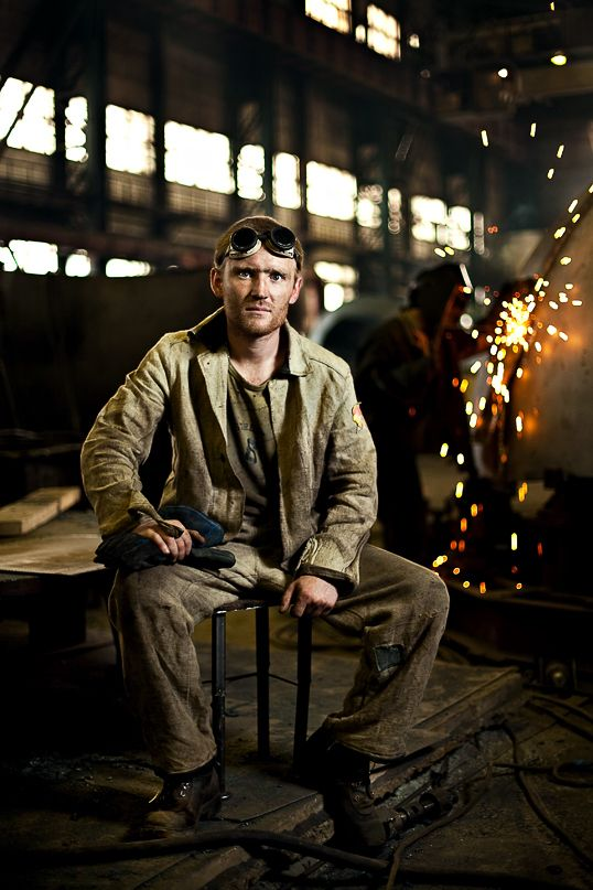
Throughout history, Environmental Portraiture has been an admired by artists and photographers. It is seen to be a form that addresses social and political issues relating to its natural or urban environment. The purpose of ‘Environmental’ portraiture is to illuminate the subject’s life and surroundings. The images are taken to instead appreciate a story or backstory to the person or the job/ activity they may be doing.

Key Features

  • formal (posed) – This is when a person is sitting or standing in a fixed position in a particular way to convey something
  • head-shot – only the head face and occasionally shoulders

  • half body – Only half of the body is on show, usually down to the torso
  • three quarter length – Only three quarters of the body is shown, usually up to knees / full length body shot

The angle of a photo can really influence the outlook . The impression of a photo can change depending on the angle that the person is is captured from, an example of this could’ve been from the side, diagonally above, or directly above. These angles are named high angle, low angle and canted angle.

  • The colour of the photograph can also be either black and white or colour. The difference between these two can completely change the impression of the photos taken. For example, a black and white photo can infer a more emotional impression of the portrait and add imagination, drama and mystery. However, a black and white image could also do the opposite and infer a less emotional and possibly a more formal, aged impression. The different shadows and effects on a black and white image could be used to juxtapose each other within a composition for a more dramatic effect.

However, a coloured picture can be used to guide the person looking at it, where you want them look and brighter colours can be used to highlight a focal point, where duller coloured can show less important elements. Coloured images can also influence how they feel about what they see and have a better idea of the message the image is trying to convey.

Artist Reference and Case Study

Vanessa Winship 

Vanessa Winship is a British photographer born in 1960 who works on long term projects of portrait, landscape, reportage and documentary photography. These personal projects have predominantly been in Eastern Europe but also the USA.

She uses black and white photographic film in natural light. For her work in a reportage or street style she has used a 35 mm hand-held camera, for her landscape work she has at times used a medium format camera and for her portraiture work she has at times used a 5×4-in large format camera. She says of the difference between using 35 mm and large format that “Each methodology makes for a different relationship with my subjects [and] both have their own beauty for me”.

In her series Sweet Nothings she has been taking photographs of schoolgirls from the borderlands of Eastern Anatolia. She continues to take all photographs in the same way; frontal and with enough distance to capture them from head to toe and still include the surroundings. Personally, I like her work because she is bringing political and realistic portraits to keep them natural. Environmental portraits are also to associate with the people being photographed and they tell a story of the people by using the background. This is a good way to make a photograph political which links to Vanessa’s work since she is a documentary photographer.

Winships work focuses on cultural diversity and lifestyle from using environmental portraits.

My emotional response to these portraits definitely varies depending on what aspect I focus on. Overall the photo reminds me the different cultural habit and lifestyles I forget exist in the world. In this album of images, she also uses young children from head to toe in the frame. She may be portraying the vulnerability and innocence of the children by showing them in as it looks school uniform and their height. She also uses a series of two children to portray connection and family. This makes her photos unique and reminds me that family is important and valued everywhere in the world.

These photos were taken in black and white possibly to make them look older and vintage which links to the theme nostalgia. As they are children as well this links to the theme as well. She uses natural lighting with a clear sense of shadowing. She may of used black and white to emphasize the depth of shadows. Especially in the middle one which seems to look like a school in the background which tells us they are educated.

As I can see, the two people are normally physically touching which gives off a sense of warmth and connection. However, this contrasts to the interaction they are giving with the camera as they are not really showing an emotion. They are numbly staring at the camera which doesn’t tell us a lot on how they are feeling. Overall the physical touch gives off a growing up in a family and caring lifestyle. However majority of her images are in black and white which ultimately make the images feel nostalgic which also links to the fact they are children, although it would be interesting to see the background, colours to be able to tell the weather and what time of day for the outside for pathetic fallacy. On another note, I like how the picture is a head to toe frame of the children and how there is more than one.

Arnold Newman – Image Analysis

Newman was a Jewish photographer who created environmental portraits as his main style of photography. Particularly after the war he captured a very famous shot of a man called Krupp. He started working with photography as a medium in 1938 while working in a chain of portrait studios in Philadelphia. It was here he found his love for creating documentary style photos himself. In 1941 his work was featured in it’s first exhibition and he began to produce environmental portraits as they are know today. After moving home due to the war in 1942.1 In 1945 his Philadelphia Museum of Art one-man exhibit, ‘Artists look like this’ was recognised around the world quickly allowing Newman to open his own studio in 1946 also becoming a member of the American Society of Magazine Photographers (ASMP.) His work grew greatly in popularity as more exhibitions and purchases of his work happened. Over his life time he won many awards and took photos that hoard such strong messages and reasons with what appears to be a simple snapshot portraits that even now his work is world widely famous.

This photo has many different aspects to it as it is a highly emotive, powerful photo. There is a lot of history and tension within the subject of the photo and the photographer which while I don’t find the tension is the main aspect of the photo there is a huge aspect of intimation within the image. Newman purposefully created this by using the lighting and pose of Krupp as he felt it was a great way of portraying Krupp’s true character. It was a unique situation in general as Krupp was a huge part of supporting the Nazi’s with suppling them with weapons and other equipment during WW11 so when Newman a Jewish photographer was asked to take the photo of Krupp he originally declined before then accepting and making it his aim to have a goal of personal revenge against Krupp hence the portraying of his true character from Newman’s composition of the photo. This led to Krupp being furious when he saw the shot but Newman felt satisfied with his accomplishment, ‘a little moment of revenge’ this quickly became one of Newman’s best photos.

Image Analysis

It is an emotional shot, holding a lot of anger and intimidation within it due to the historical context of the shot. Krupp who is the subject of the image is illuminated in an unusual manor by having the lighting rear and the side makes Krupp’s eyes become quite dark and less noticeable making him appear sinister and unfriendly. There are harsh lines though tout the image starting with the two large pillars ether side of the subject framing him with blocky, dark, imposing features, then leading onto the industrial background of the shot has lines of light filtering through the roof. The colours of the image are dark or a rusted orange adding to the feel of danger as it’s not inviting and instead almost forces the viewer to look into Krupp’s eyes which are also dark and not very visible in the shot. Krupp himself had a weathered face from age and Newman highlighted this in his choice of lighting creating deep lines and grooves all over Krupp’s face furthering his appearance of an imposing, harsh character. Newman used perspective to his advantage, by putting Krupp’s o a close depth of field and the rest of the shot has a fairly long depth of field it encourages the viewer to look at Krupp’s and enforces his not necessarily good authority.

August Sander – People of the 20th Century

August Sander was a German portrait and documentary photographer born on 17th of November 1876.

August Sander became invested in environmental portraiture during the 20th century. He lived in a large town in Germany and strived to complete a goal of taking images of every person who lived there. Although this is an almost impossible task due to the huge population, he managed to captured hundreds of people from different backgrounds, social status and occupations. This documented the German society’s ways of life in-between the two World Wars, revealing how each person had a different story to tell whilst living in a Nazi-powered country.

In a society where social status was crucial, he took images of upper class, middle and working class – this showed the relationship that each had with one another and the comparisons/differences they shared. He categorised each image in order of class and profession in typological studies. His work inspired many other photographers after him notably Bernd and Hills Becher.

Typology:

A Typology is:

 a set of images made with a common subject or idea in mind, repeated through out the set

August Sander had roots in this form in 1929 with his series of portraits ‘The Face of Our Time’. This was later continued by Bernd and Hills Becher who had been heavily influenced by Sander. They began documenting German industrial architecture in 1959. The couple described their subjects as ‘buildings where anonymity is accepted to be the style’.

Each image had been replicated as it was shot from the exact same angle and distance from the same building, documenting how the building would change over time going unnoticed. This not only makes the viewer become more considerate of their surroundings, but question the subject’s reasoning/place in the world.

August Sander’s work:

August Sander’s environmental portraiture was usually containing the subject’s full body and portrayed in black and white. The subject usually had a neutral expression in their workplace, people such as farmers, architects, nuns, gypsies and plenty more. This shown all sides of the German society where he lived.

Analysis of his work:

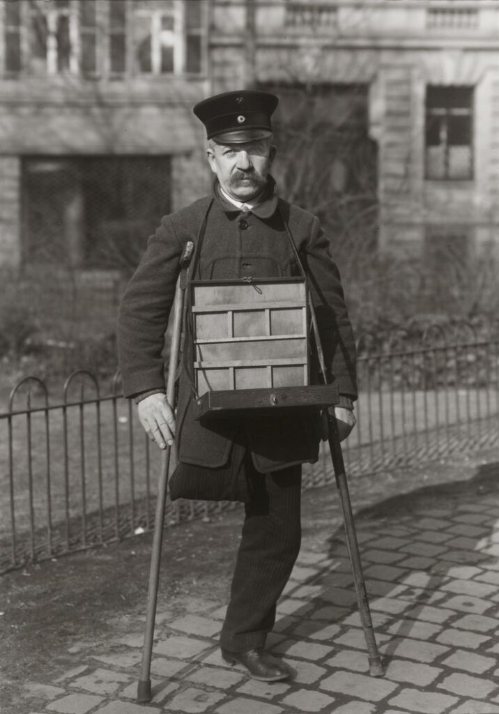
This image of a disabled miner caught my eye immediately. I feel that the solemn look the subject has on his face depicts how he must have a difficult life due to his injury which causes the viewer to feel sympathy. I feel that this image is extremely powerful because this image was taken in between the 2 World Wars which suggests that the injury is war-inflicted. The image has been put into grey-scale which may reflect on how it was an extremely difficult and gloomy life to lead/area to live in due to the war. Although he is sharply and cleanly dressed wearing what appears to be a thick winters coat and black tailored trousers, he appears to be of low status and be rather poor as this wouldn’t be a well paid job. He has to use crutches while continuing to struggle to do his job, with his equipment around his neck. There is full focus on the subject in the image as the background is softened due to a shallow depth of field telling us that a large aperture was used. You can see the nature in the background is wild in front of a quite industrial-looking building. All the stone around him is piled up with dirt, shoved into the cracks of each stone which makes the bricks on the ground look more 2D. You can see his shadow behind him in the natural light of the day. The subject is positioned centrally. This image contributes nicely to his aim of photographing as many people in his town in Germany that he could as this subject would represent the people who fought for others in the war, now having to struggle to get by, telling a story about his life that goes unnoticed.

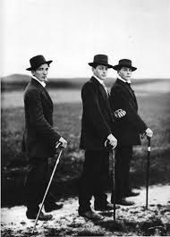
I also liked this image as it has three subject’s instead of one making the image more full. This contrasts to the last image as they appear to have high wealth and status as in this time period, the richest would only be able to afford these items. I think this is a very important image because it shows the difference in presentation of classes during the World War period. It appears to be during winter as the ground looks as if there is snow on it as they walk through the countryside yet the subject’s are the main focus due to the short depth of field used. The black suits on, black top hats and canes make the image flatter and smoother as the black all blends into one, however the snow that the stand on is combined with the grass underneath, giving a rough and crunchy feel to the image. Their neutral and lifeless expressions go nicely with the black and white tone of the image as it gives the impression of power and high status which was rare to see in this period. Natural light has been used as this is in the countryside, using a large aperture has given a short depth of field as the main focus of the image is sharply on the subject’s with the background softened. This contributes to Sander’s aim because these people are quite clearly the upper class of society and are being put on display, in which the predominantly poor section of society will be able to look to and picture a life like that.

Environmental portraiture- Artist Analysis

August Sander

“If we can create portraits of subjects
that are true, we thereby in effect
create a mirror of the times.”

I have chosen to write about August Sander because his work intrigued me. I think all of Sander’s photographs create a huge feeling of time as they are in black-and-white and are taken of people in the 20th century.

August Sander was a famous German photographer who lived a long life, 1876-1964. Sander’s photography career began when he was a teenager. Acquiring his first camera in 1892, he took up photography as a hobby and, after military service, pursued it professionally, working in a series of photographic firms and studios in Germany. After photographing local farmers, Sander was inspired to produce a series of portraits of German people from all classes of society. In the mid-1920s, Sander began his decades-long project ‘People of the Twentieth Century‘, but in the 1930s his work fell into disfavor and was banned by the Nazis. Although his project couldn’t have been completed, it includes over 600 photographs divided into seven volumes and nearly 50 portfolios. The photographs from this project are all mostly black-and-white portraits documenting Germans from various social and economic backgrounds in the 20th century.

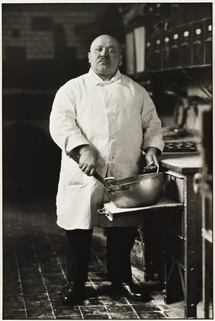
The Pastry Cook- 1928

I think this is my favourite photo that August Sander took because he made it really obvious what work environment the subject is linked to. The subject behind the photograph is anonymous, described simply by their occupation, with the stories of their lives, hard or soft, written on their faces with emotion. In this photograph, the subjects facial expressions make me feel intimidated as he is staring into the camera with full attention and looks as if he is ‘snarling’ towards the man behind the camera. Sander creates this emotional response by having the subject centre of the image, which reinforces the idea of him as intimidating and being the main focus of the photo. The subject is also wearing white which highly contrasts with the dark background and makes him stand out even more.

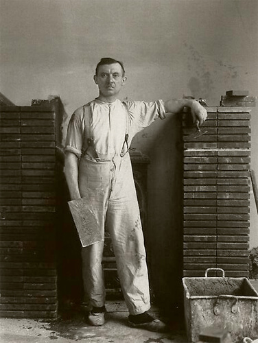
Master Mason- 1926

I also like this photo because it is a striking image that captures the essence of a craftsman in his element, but it also reveals emotion. The subject’s facial expressions gives us an idea that he is tired and is directly giving the audience a foul glare which is purposely to make them feel uncomfortable. The image was taken in black and white creating a really dull photograph. The subject of the photograph is centred, and the two columns next to him support this layout. Behind the subject is dark shadows, making him the main focus of the image. The shadows also create a contrast with the bright work clothes. I think this image creates an emotional response through his body language and the way he is staring into the camera with an uneasy, angry manner.