Still Life

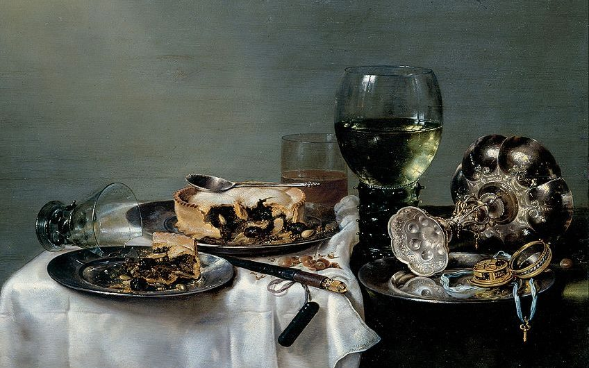
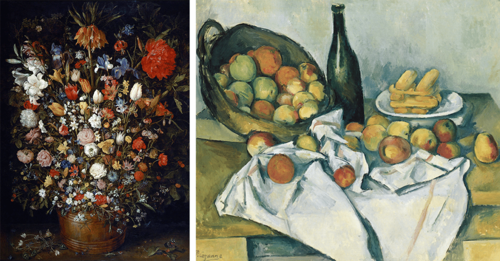
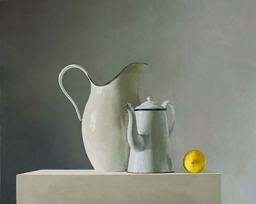
Still life is paintings or a drawing of an arrangement of objects. They are an arrangement of inanimate objects such as fruit, flowers, household items, and textiles. These paintings use different types of symbolic and religious objects to convey deeper meanings or narratives. Still life paintings began in the 16th and 17th centuries, The Golden Ages. Now in the 21st century still life paintings were edited and modernised still capturing the same and different kinds of objects in a more vibrant and modern way.

The Golden Age, 16th and 17th Century
Modern, 21st Century
Vanitas

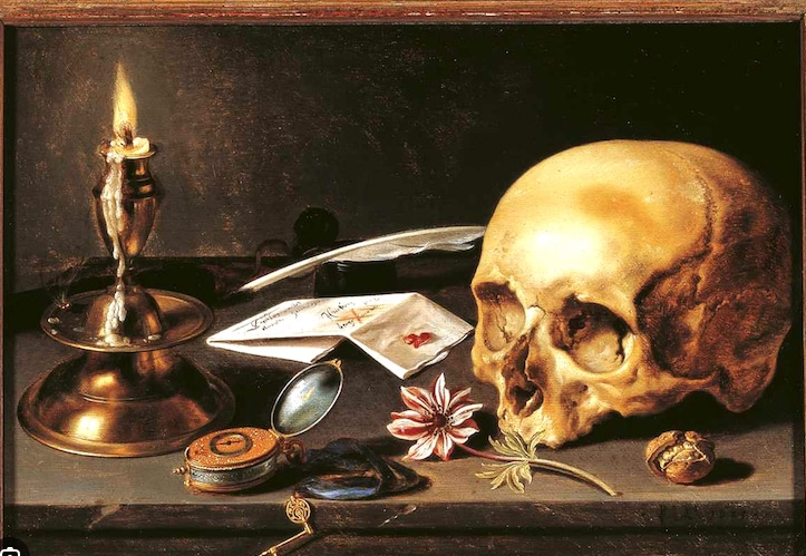
Vanitas are symbolic artwork, it is a genre of still life that shows the fleetingness of life. Vanitas are closely related to the Memento Mori, which is artwork of objects that reminds the viewer the fragility and shortness of life, for example some of the symbols include skulls and extinguished candles.
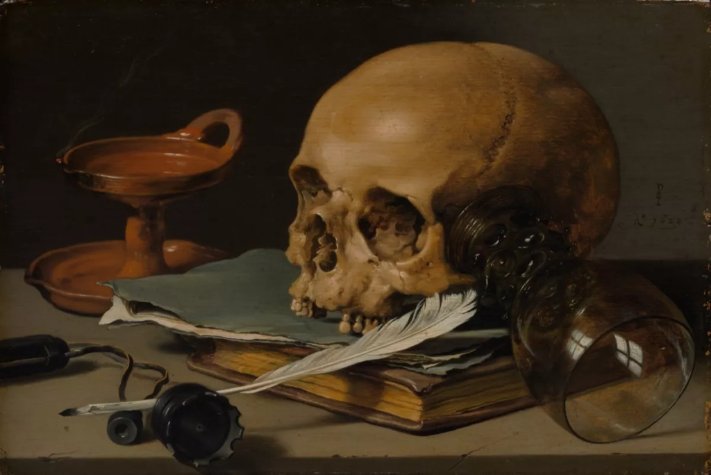
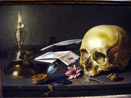
Paulette Tavormina
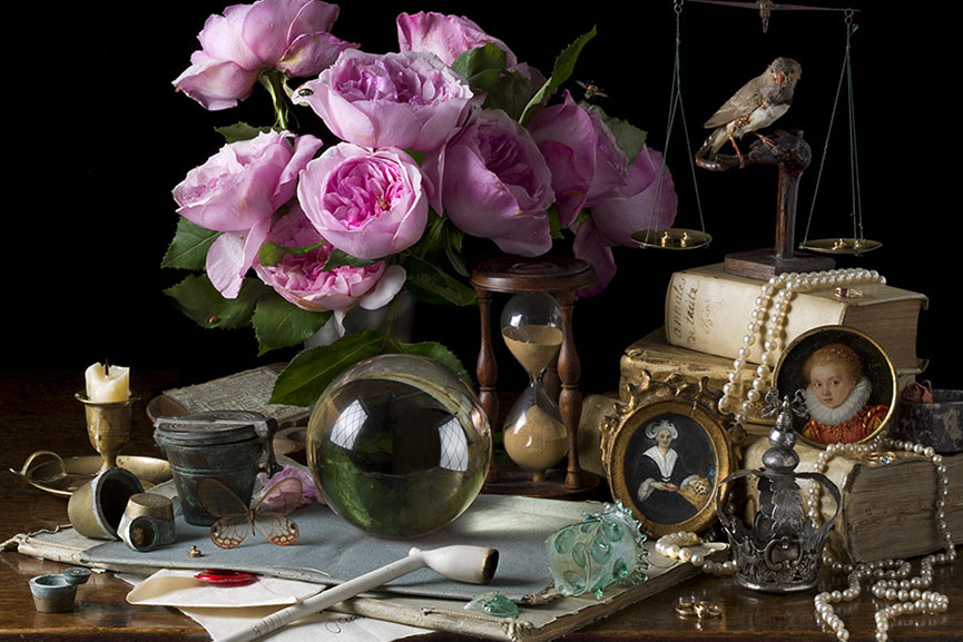
Paulette creates still life imagery of lit objects such as fruit and vegetables that are immersed in dark backgrounds. The dark background enhances the lit objects making each individual objects stand out from one another. This unique feature creates an interesting and unique depth, which leads the eye to each section of the photo while also creating a more deeper and meaningful photo. With fewer negative space, this draws your eyes in closer enhancing the abstract composition, enabling you to have more of a direct focus on the objects. This feature allows you to see and focus on more of the small and intricate objects placed around the photo, creating more texture and unique formations in areas that you wouldn’t notice from a distance.

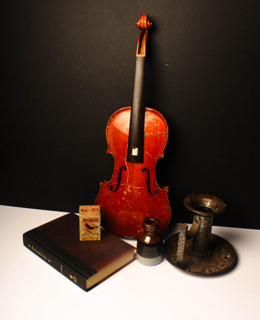
still life final selection

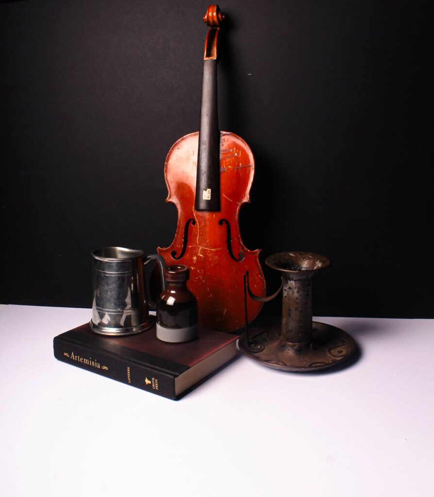
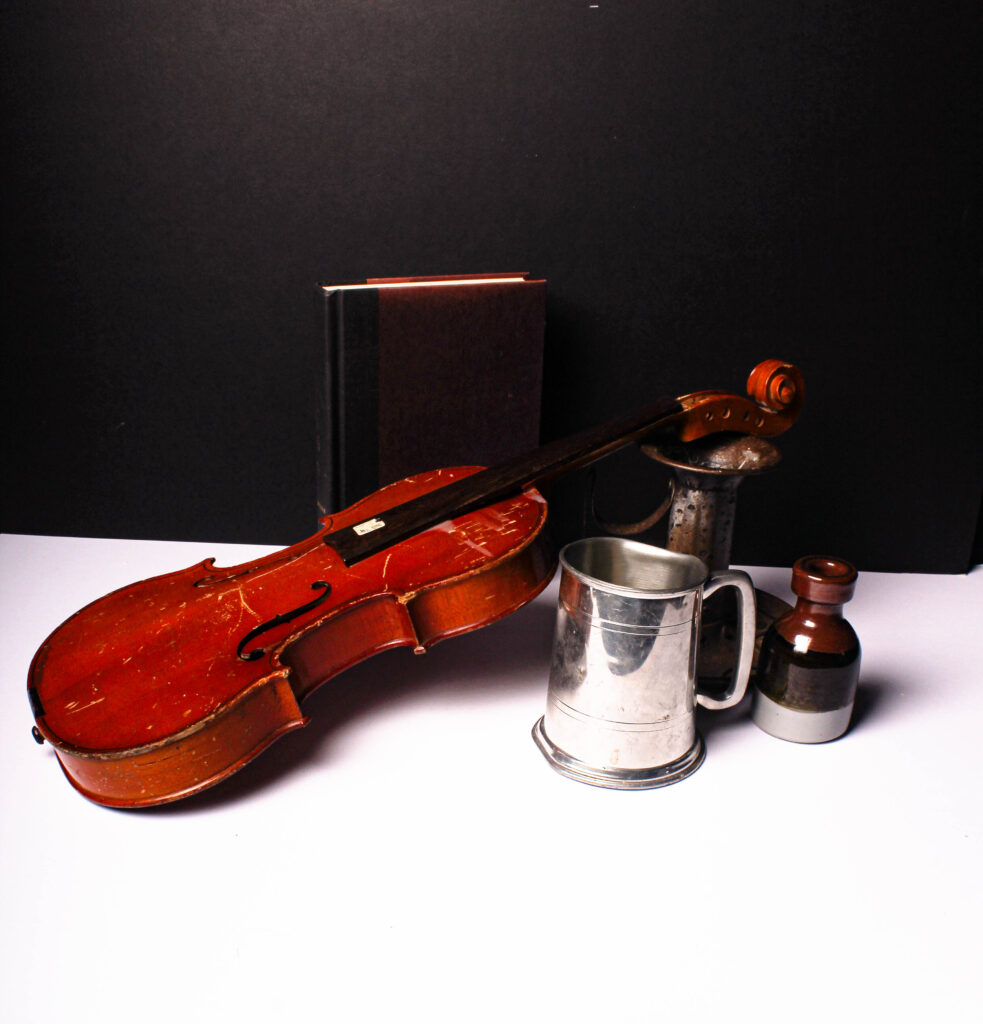
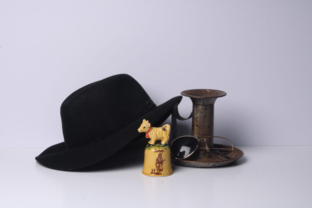
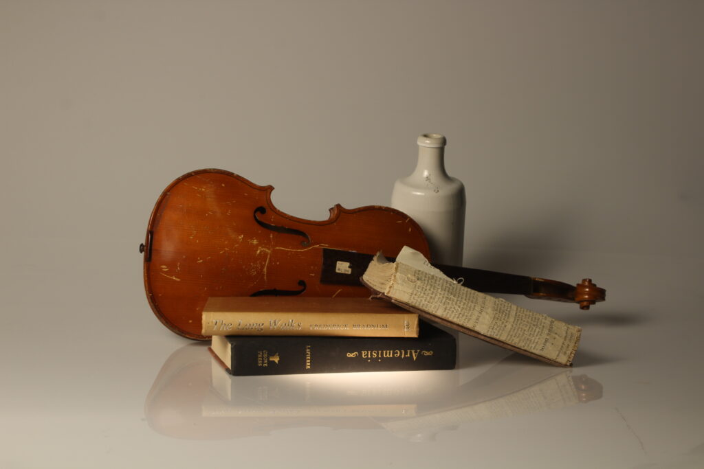
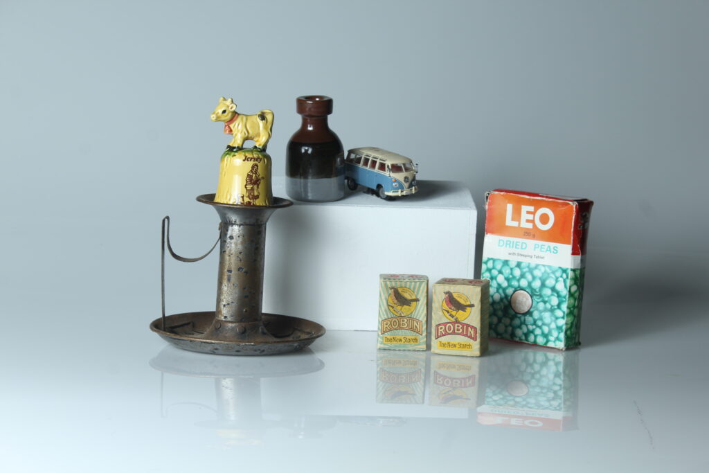
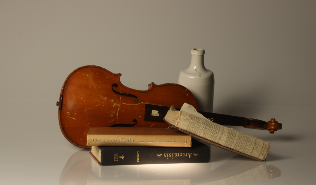
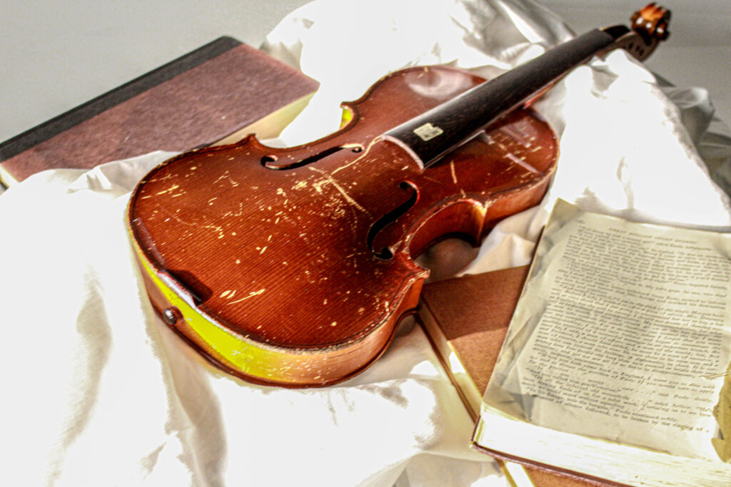
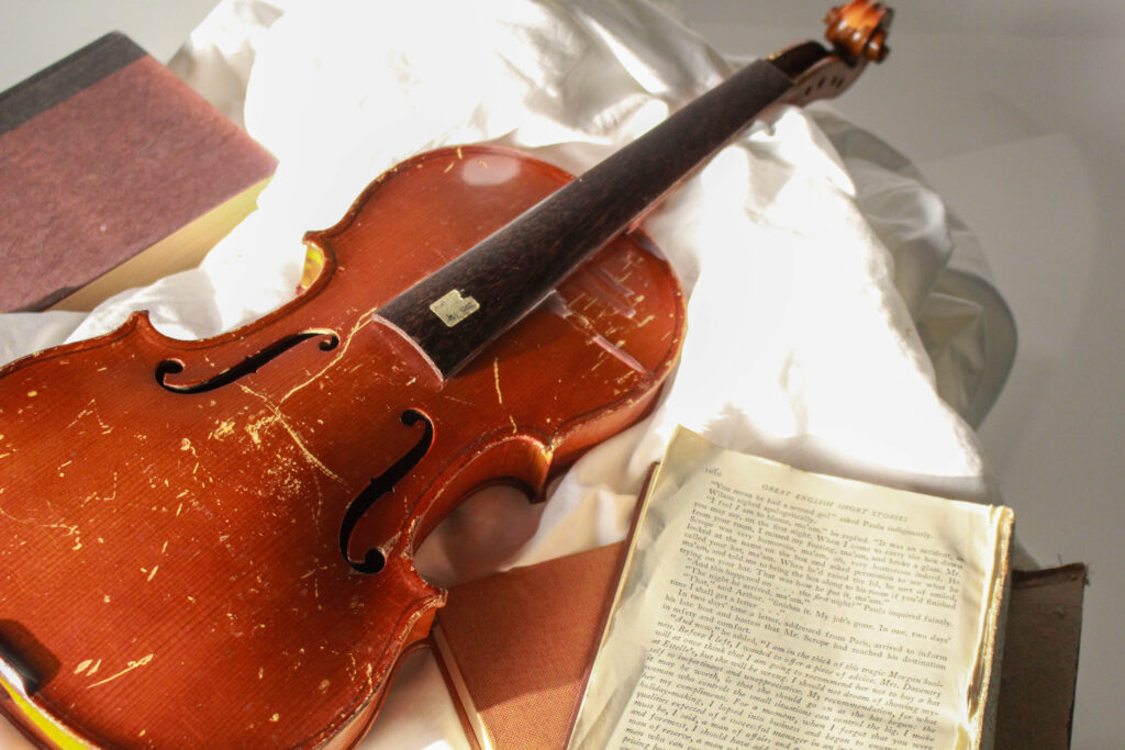
These wear the three pictures I liked the most. The lighting for all three photos didn’t change and neither did the background.

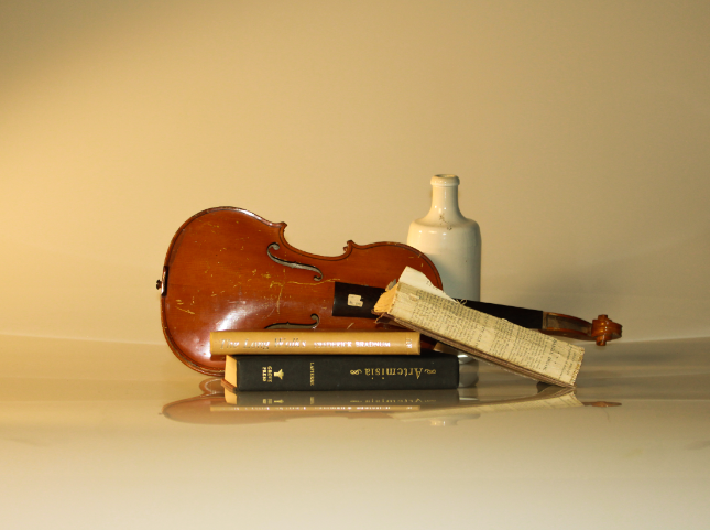
Growing up I played violin for six years and music has always been a part of my life so having a tattered stringless violin in the photos displayed how growing up music has changed around me and my taste in music has changed, whilst also reminding the viewer that eventually everything must come to an end like how this Violin was played for the last time before becoming a prop. I have also loved reading since I was younger, and I used to read with my mum when I was little.
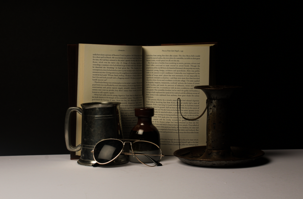
The candle stick holder and the little pot bulk out the images whilst maintaining a vintage sort of look the wear and tear on the holder helping to do so.
By having the background be black card and the objects on white card and creating this sharp corner it helps the image to seem more streamlined and elegant with how smooth it is. the violin almost stands as a separate being; and in the last image lays back and pulls the piece to gather like a lady in a renaissance painting.

Camera + studio set up + Canon Camera Simulator examples

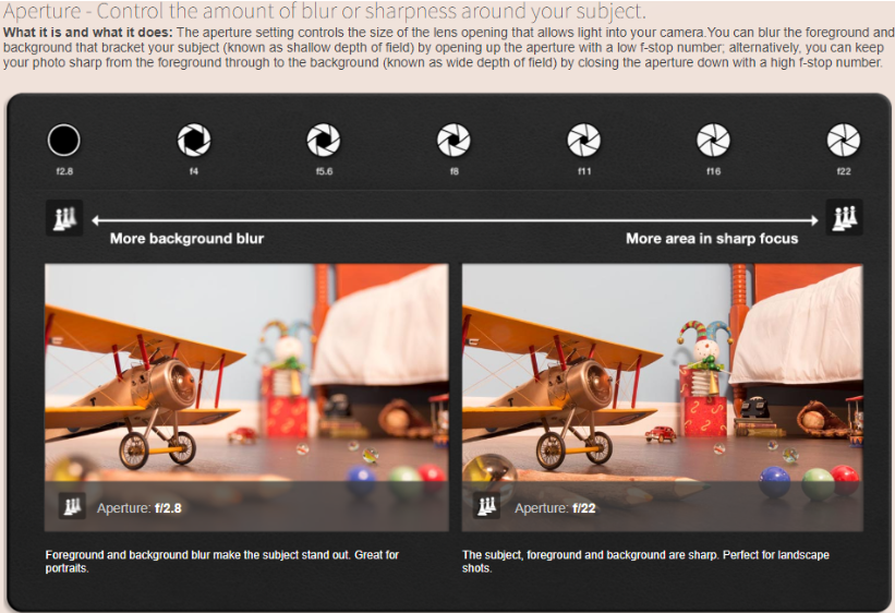
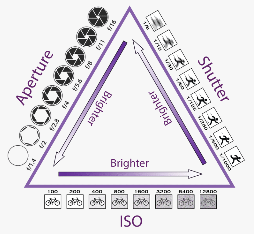
Aperture refers to the opening of a lens’s diaphragm through which light passes.

Shutter speed is the speed at which the shutter of the camera closes. 

This image has an empty alt attribute; its file name is image-1273.png

For digital photography, ISO refers to the sensitivity of the camera’s sensor. The ISO setting is one of three elements used to control exposure; the other two are f/stop and shutter speed. ISO originally referred to the sensitivity of film.

Still-Life Photo Shoot

I like all of these images because they are very simple and classic. The lighting is focusing on the objects in the photograph. There is good exposure with these images and they are in focus. they seem to look clear and the shutter speed is a good temp for the mood and tone of these photos.

Some of these images are edited in Lightroom, with higher contrast and iso.

They are all set up with objects that could potentially outline you as a person.

To conclude

Photographing inanimate still life subjects is a great creative and technical exercise. It allows you to take your time and carefully control your image, from the staging to the lighting, the shooting, and colorimetric management

Cannon camera simulator And Studio Set Up

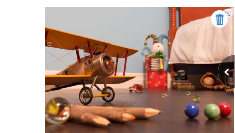
This image has a good level of exposure and low aperture. I slowed down the shutter speed so therefore it would be harder to see the wings moving on the airplane.

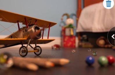
This image has good exposure and it very clear, however the aperture is low which is making the objects in the back blur.

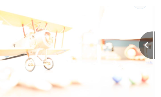
However, this image has way to much exposure, you cant even see the picture due to to much light being let in.

This image is underexposed because barley any light is being let in.

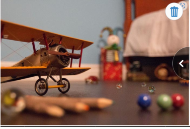
This image is by far the best, it has good exposure, low aperture which makes the wings clear and not blurry as well as the back round objects’ because of the fats shutter speed and ISO.

This image has an empty alt attribute; its file name is image-1415.png

Shutter sped- controls the amount of blur or sharpness added to your photographs.

ISO- ISO is your camera’s sensitivity to light as it pertains to either film or a digital sensor. A lower ISO value means less sensitivity to light, while a higher ISO means more sensitivity.

Aperture-Aperture refers to the opening of a lens’s diaphragm through which light passes. 

Still Life photoshoot & editing

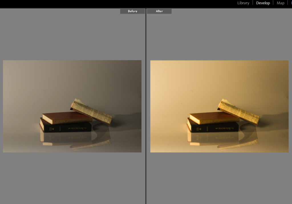
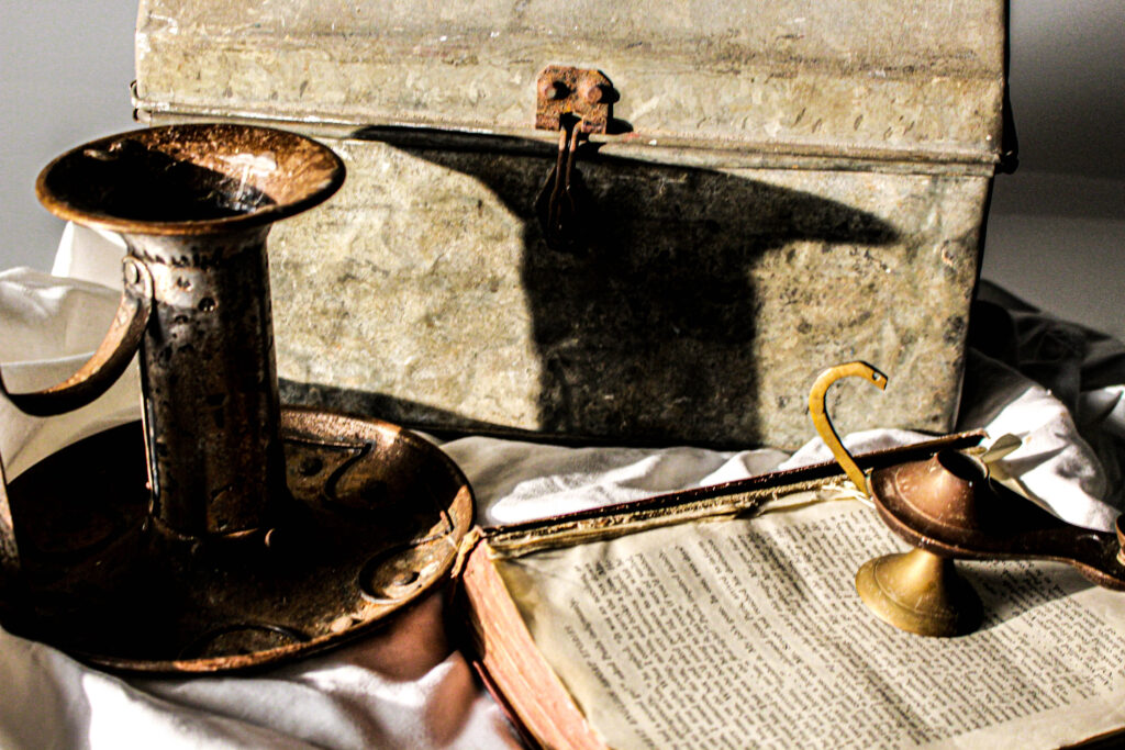
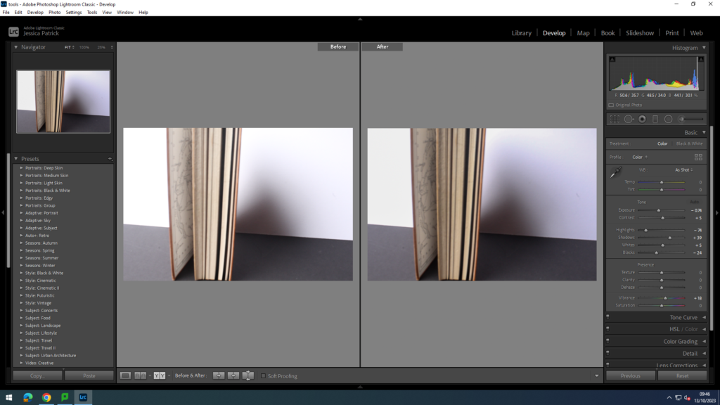
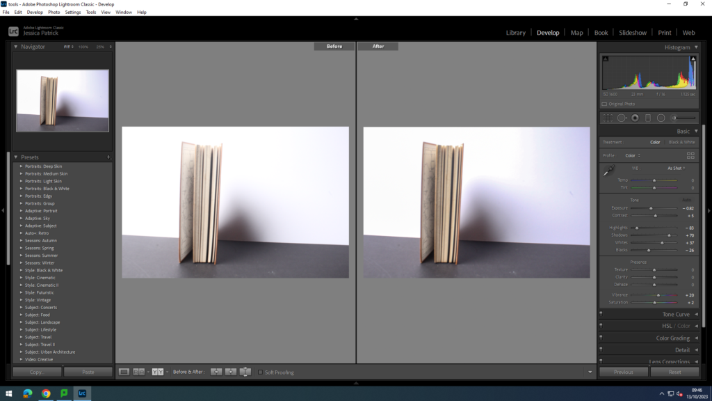
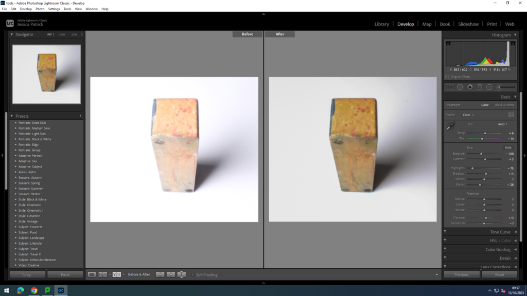
Before I had taken this photograph I used books as they give a nostalgic and vintage effect and placed them in the arrangement I thought looked best. Within this photograph, I edited the image in Lightroom and increased the temp to make it have a warmer tone which gives off a vintage effect which links to still life as it has existed from the 17th century until the modern-day, but in the 19th century, artists adopted photography as a new medium for still life art. I then increased the exposure and contrast so the shadowing had more depth and was more eye catching to make the image more interesting to look at. I decreased the highlights so the image stayed clear and detailed but at the correct amount so it didn’t look to bright nor dull. I increased the shadowing by a little to make the shadowing darker. Lastly, I increased the whites so the image wasn’t too yellow or bright and so it is the correct tone I want it to be.

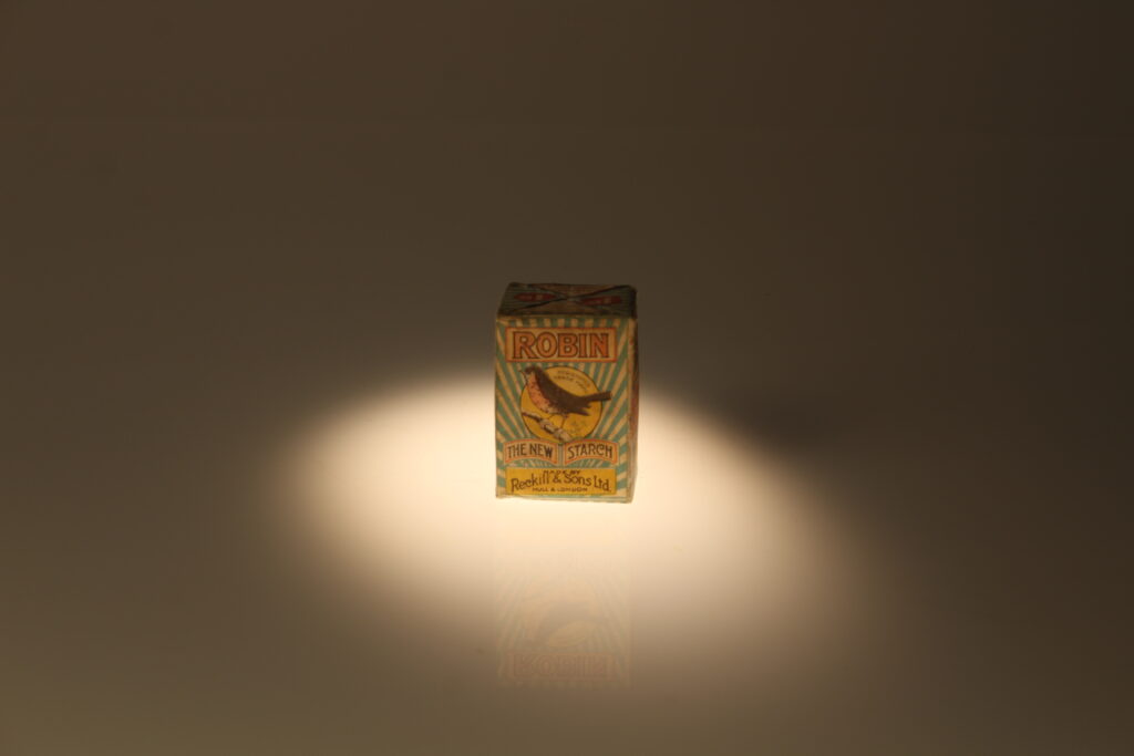
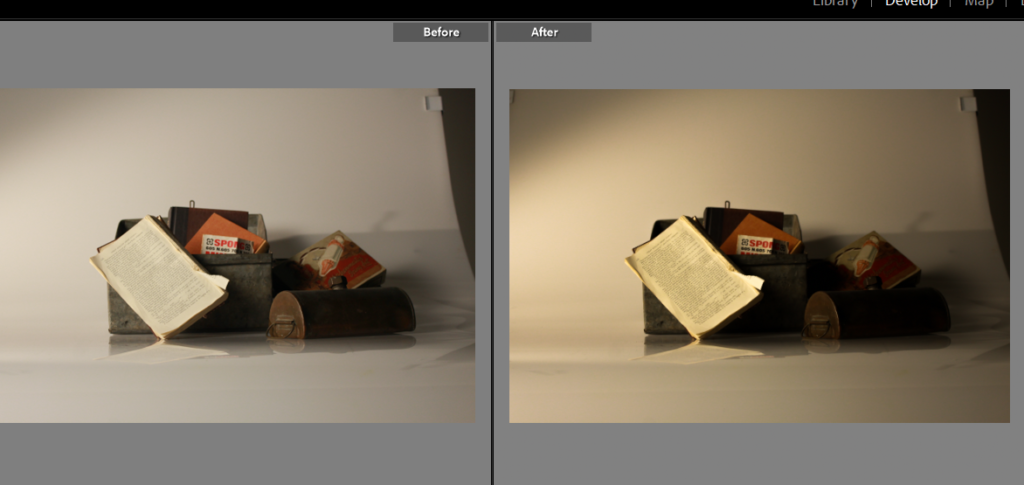
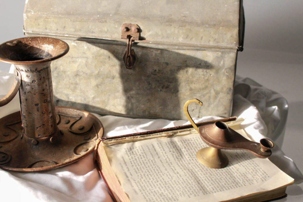
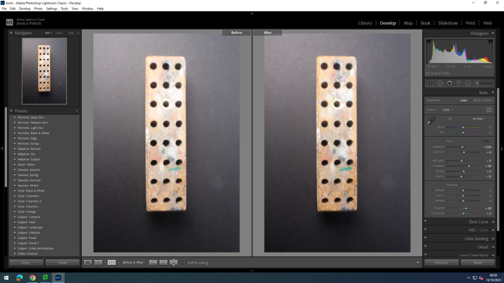
I then continued to do the same but with different objects for a variation. This time, I added metal vintage and ancient boxes and lids to make it nostalgic and fit the genre ‘still life’. Within this photograph, I increased the temp and tone ever so slightly to create a warmer tone which gives off a more ancient look to the image. I continued to increase the highlights to make the image clearer and brighter but contrast it with decreasing the shadows so it emphasises the shadows in more depth. After, I increased the whites and decreased the blacks so the image was less yellow.

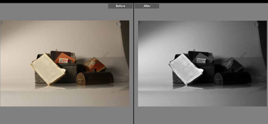
In the same image, I put it in black and white but overall, decided that I preferred the colour image as it adds more to the image and more eye catching colours and shadows. As the photograph has a warm tone with the objects, put together it creates an ancient and vintage look to it which shows similar qualities to ‘still life’ as most famous ones are in colour and are taken years ago as they started in the 17th century. I also prefer it in colour because the details are clearer on the writing on the book and you can tell what the objects are clearly, however the black and white oppositely could be better as it leaves a mystery keeping the viewer guessing. This links to ‘still life’ as most images from this genre have symbols to tell the viewer what the photograph is about. Whereas my photo do not have symbols but still keep the viewer guessing on what story the image is trying to tell.

Still Life History and Theory

A painting or drawing of an arrangement of objects, typically including fruit and flowers and objects contrasting with these in texture, such as bowls and glassware.

Such as..

An artist who does this is…

Vincent- Van Gogh

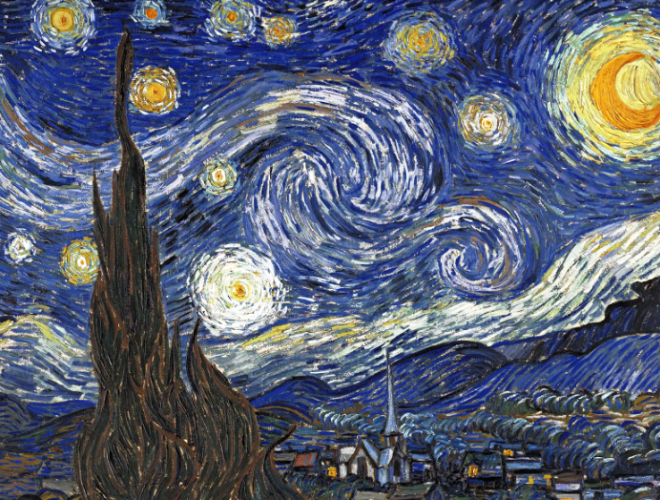
Vincent Willem van Gogh was a Dutch Post-Impressionist painter who is among the most famous and influential figures in the history of Western art. In just over a decade he created approximately 2100 artworks, including around 860 oil paintings, most of them in the last two years of his life. 

Here as some of his images.

Van Gogh is today one of the most popular of the Post-Impressionist painters, although he was not widely appreciated during his lifetime. He is now famed for the great vitality of his works which are characterised by expressive and emotive use of brilliant colour and energetic application of impastoed paint.

Here is some of my Still life posts.

I really like this image because I used random objects and placed them in a way to make it look nostalgic , as if it were taken many theres back. I like it because it has a cool and clear tone and texture as well as a little clarity in this photo. The tone is quiet dark , however you can still see the photo well.

Here is another Still- Life artist.

Henry Hargreaves.

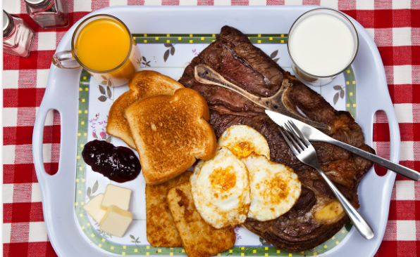
Former fashion model turned photographer, Henry Hargreaves , has a reputation for playing with his food. Born 1979 Henry is a Brooklyn -based artist and food photographer who spent his formative years growing up in New Zealand. He began working in fashion in early 2000, relocating to New York City.

Here are some of his images…

This image is very simple and plain. You could say that it could relate back to the past and what/ how they would eat back in the 1990s. I like Henrys work because it shows a lot of colour and contrast.

Still life, as a particular genre, began with Netherlandish painting in the 16th and 17th centuries, and the English term still life derives from the Dutch word stilleven. Early still-life paintings, particularly before 1700, often contained religious and allegorical symbolism relating to the objects depicted

To conclude,

this shows the history of a persons life and what they like to do. Still life is a genre that spans art history. It is found everywhere from ancient Egyptian tombs—decorated with paintings of objects from daily life—to works of modern art where it provided opportunities to experiment with new techniques, forms, and styles.

Final Photographs

Still-life

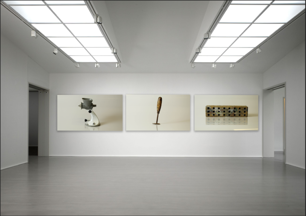
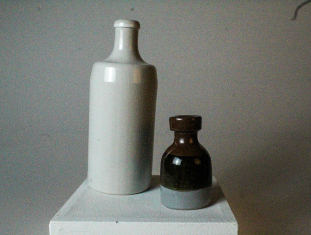
These are my top six final photographs after they have been taken in the studio and edited.

Mood Board

Conclusion

In conclusion, I think these images have come out well, as they have a good composition, lighting and are focussed. Next time, I would like to try new compositions of different objects, so I can experiment with my photographs and editing them.

Photoshoot:

Formalism

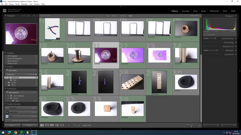
The pictures, which are highlighted green are the pictures I have chosen to edit, because they fit the seven themes of formalism the best and they have the best composition.

Lines

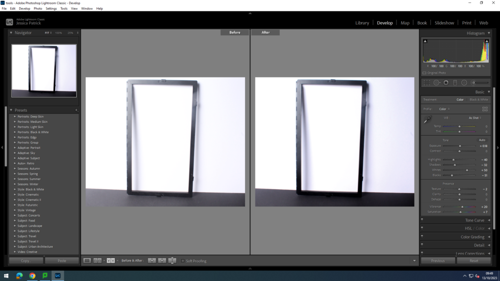
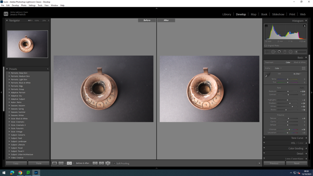
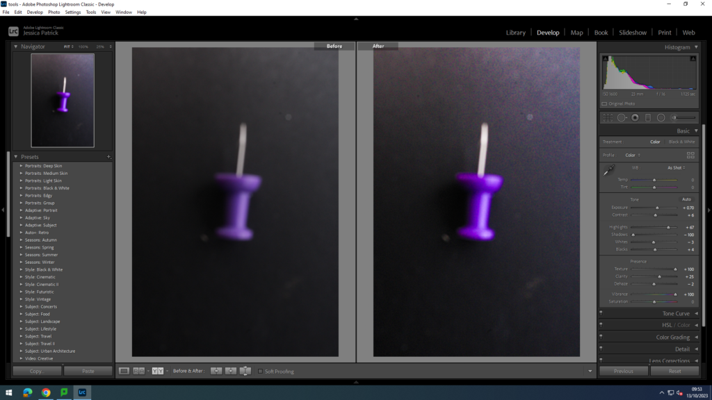
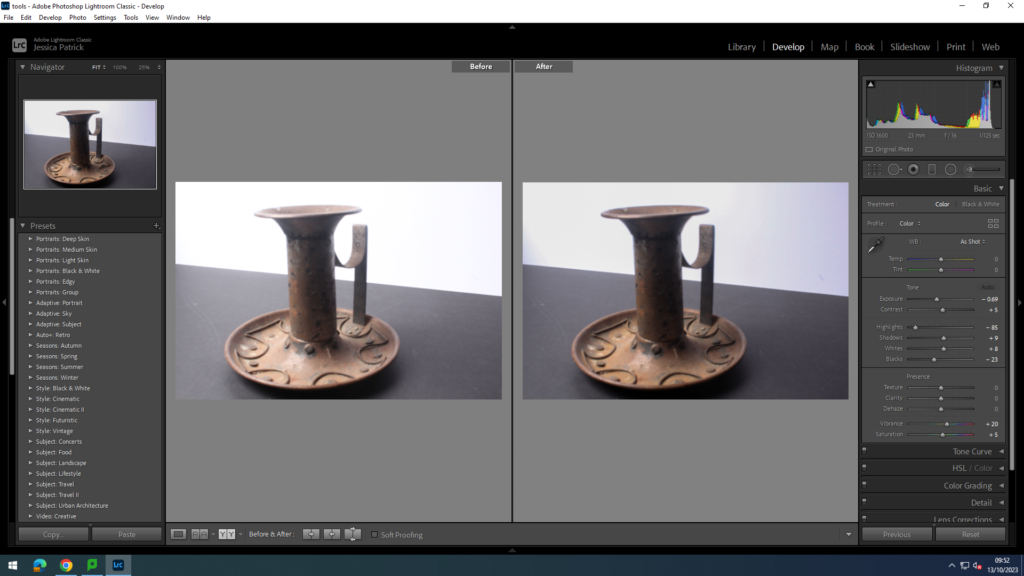
These two photos show lines in formalism. I edited the first one by increasing the contrast and shadows, while decreasing the highlights and blacks. I edited the second one, by increasing the shadows and whites, while decreasing highlights and blacks.

Shape

These two photos show shape in formalism. I edited the first one by increasing whites, while decreasing highlights, shadows and blacks. I edited the second one by increasing the shadows and the whites, while decreasing the blacks.

Form

This photo shows form and I edited this by decreasing the highlights, exposure and blacks.

Size

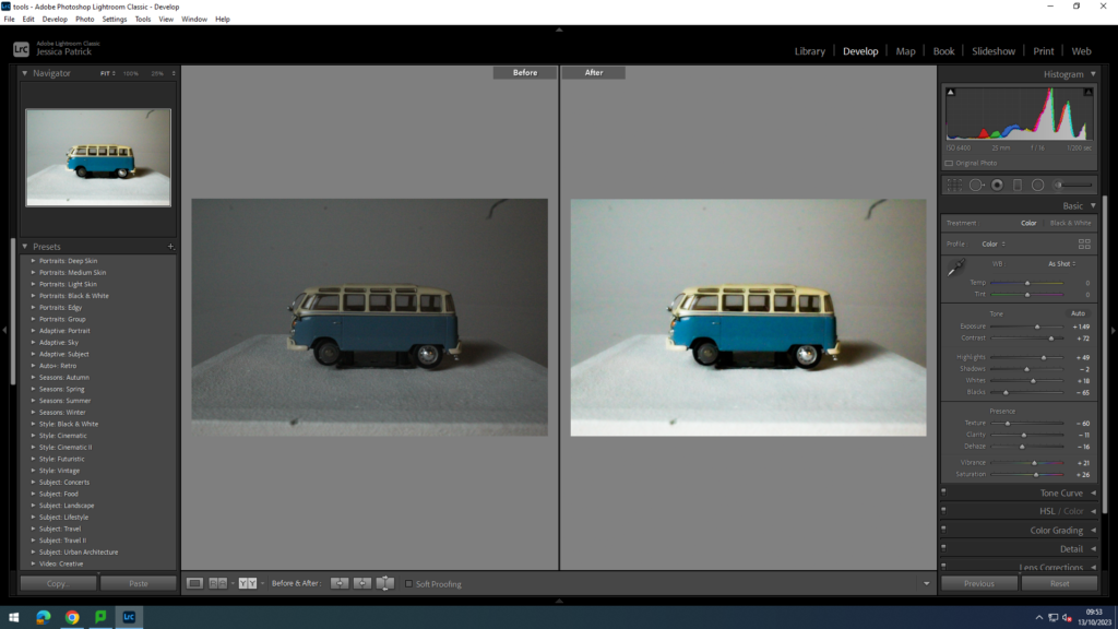
These two photos show size. I edited the first one by increasing the exposure, contrast, highlights and whites, while decreasing the blacks, texture, clarity and dehaze.

Colour

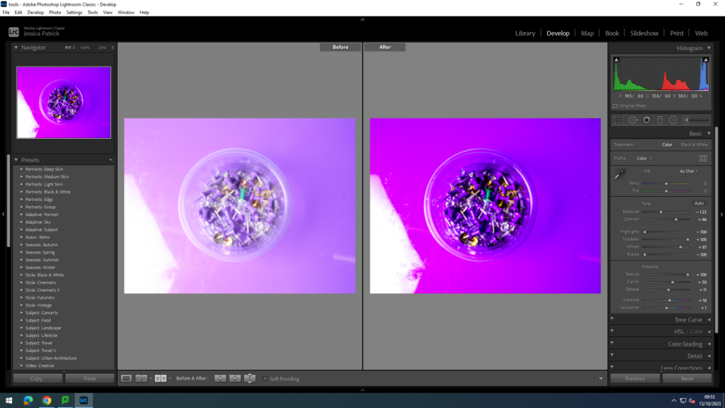
This photo shows colour and I edited it by increasing the contrast, shadows whites, texture and clarity, while decreasing the exposure, highlights and blacks.

Depth

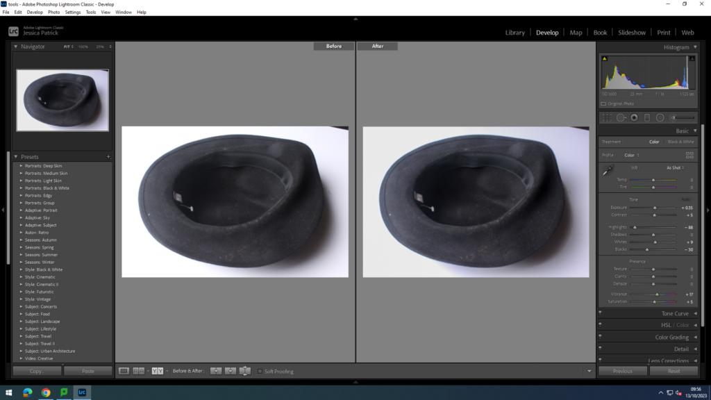
These two photos show depth. I edited the first one by decreasing the highlights and blacks. I edited the second one by decreasing the exposure, highlights and blacks.

Texture

This photo shows texture and I edited it by decreasing the highlights, whites and blacks.

Conclusion

In conclusion, I think this photoshoot went well, because it helped me to experiment with the seven different areas of formalism in my photographs. It also helped me to further experiment on Lightroom and taking photos in the studio.