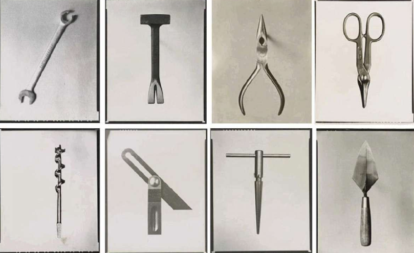
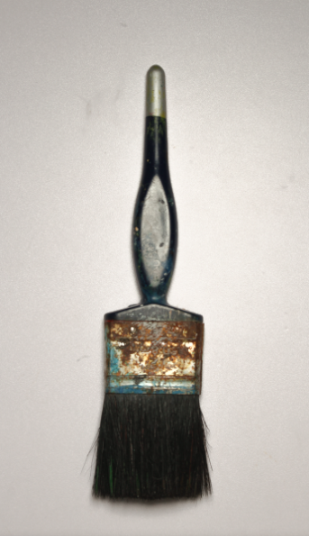
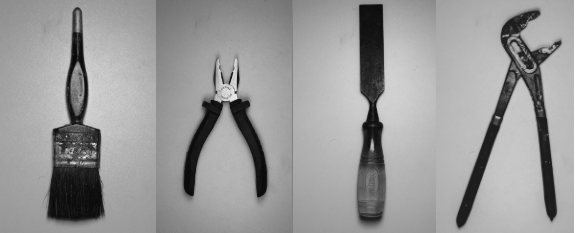
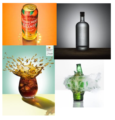
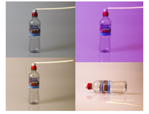
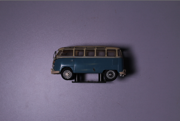
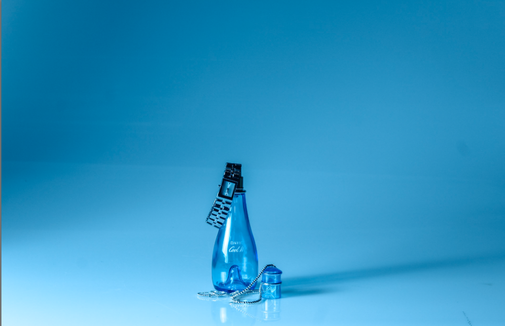
photoshoot tools

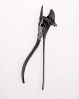
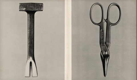
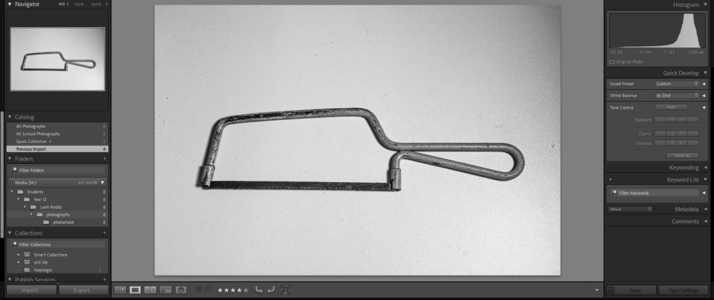
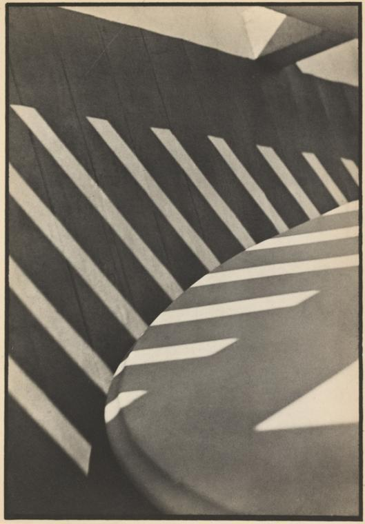
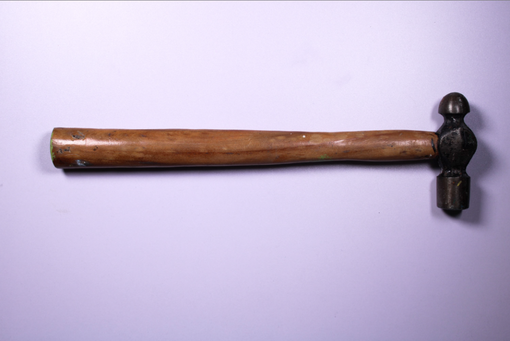
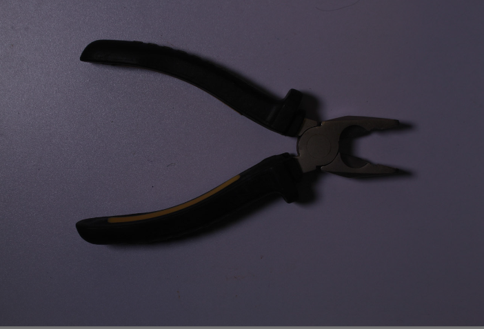
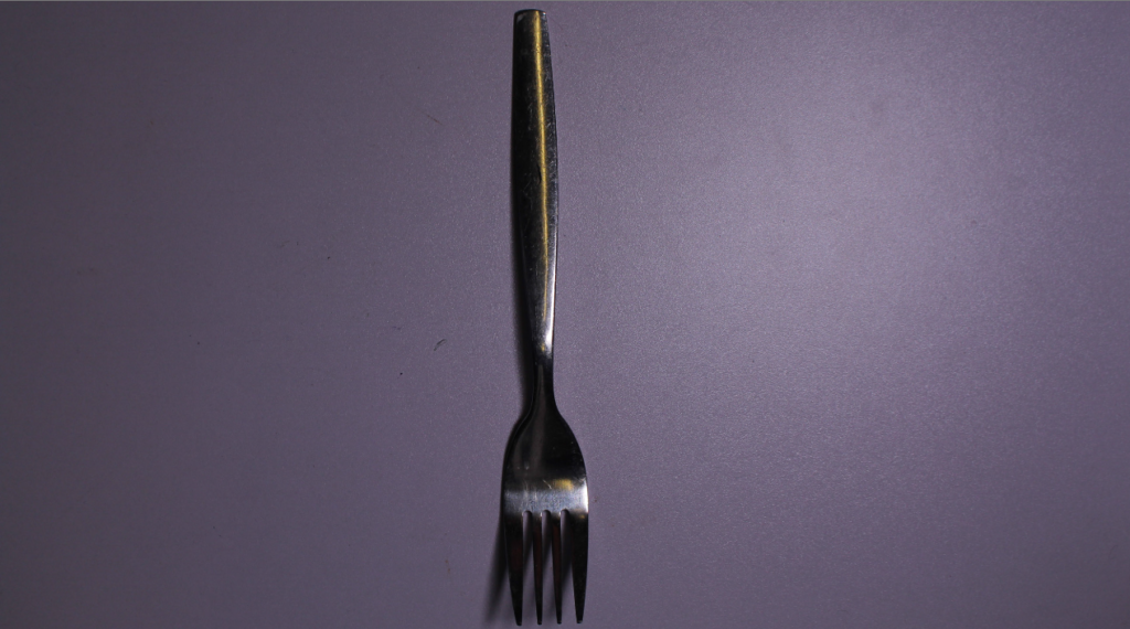
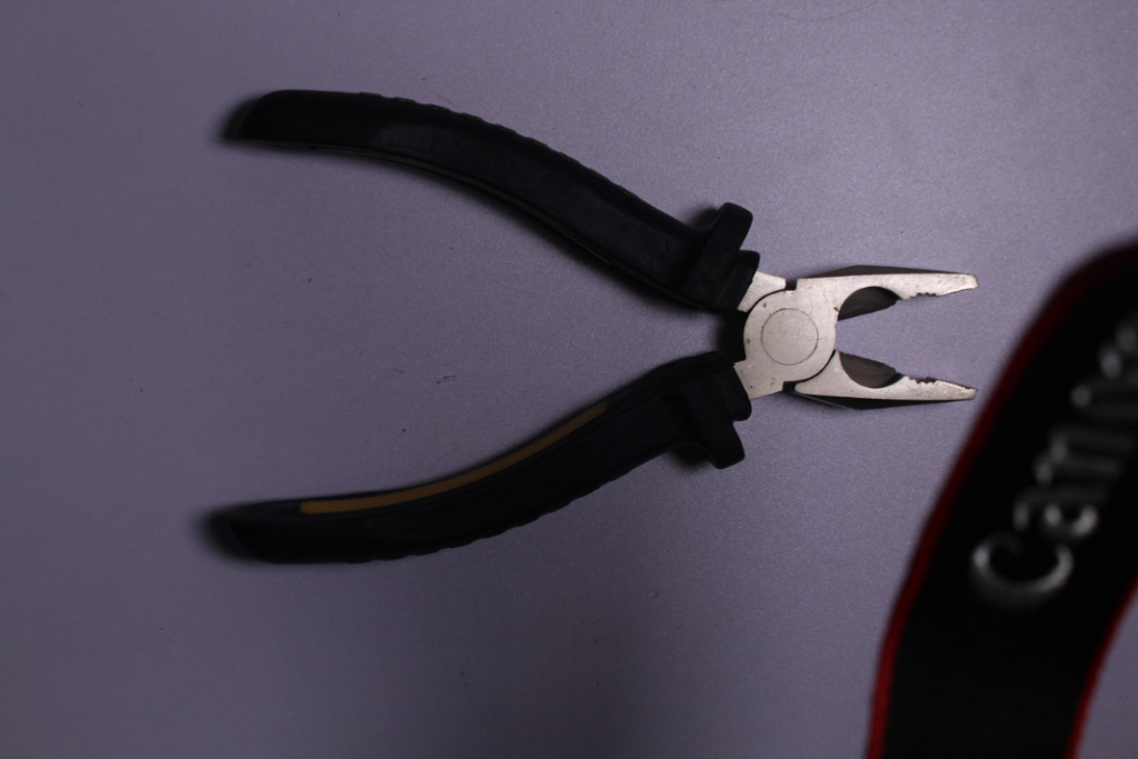
In this photoshoot, I took pictures under the inspiration of Walker Evans. He took many photos of tools.

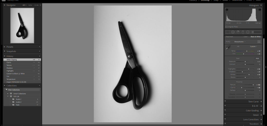
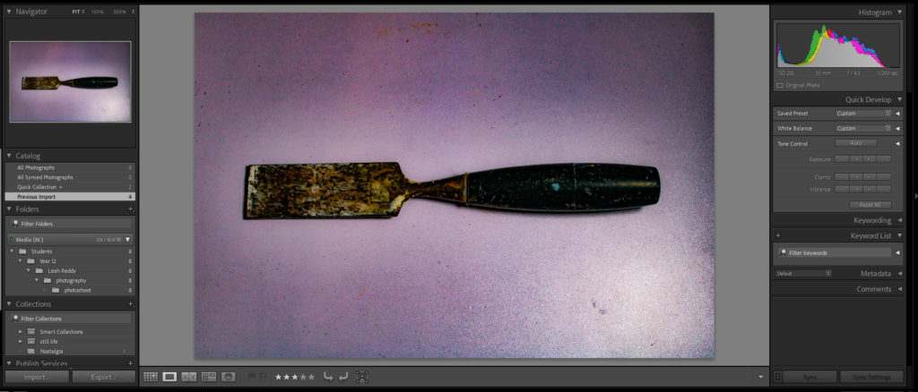
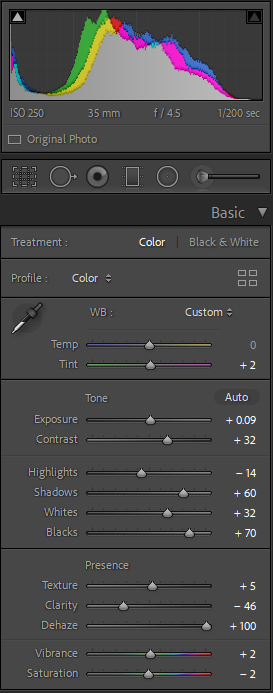
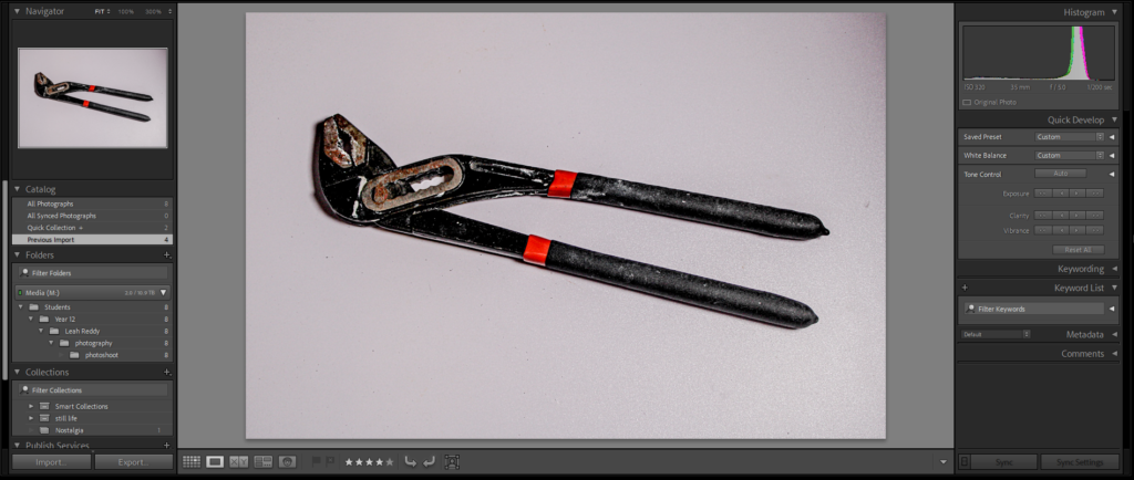
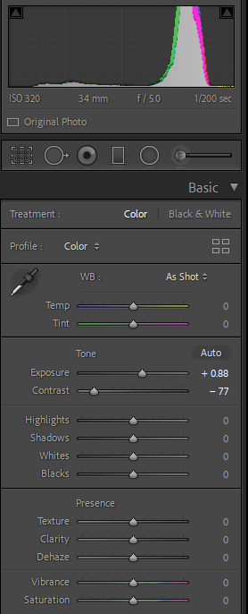
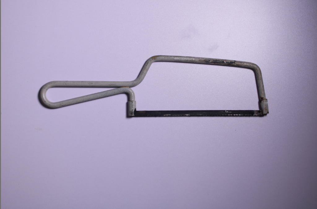
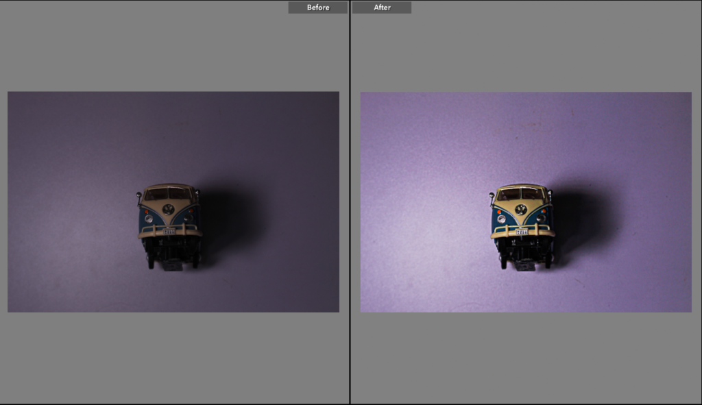
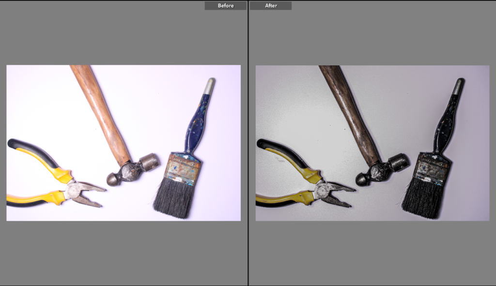
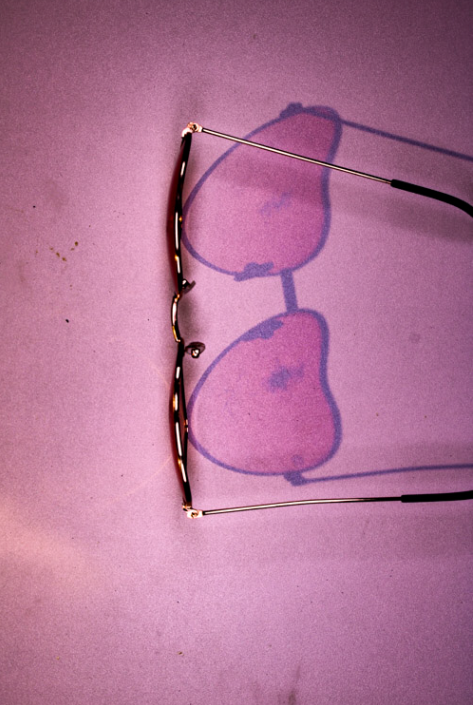
For this photo, I added contrast to show texture. I also adjusted the highlights, shadows, whites and blacks to what I thought looked appropriate for the photo. I also adjusted vibrance and saturation to add some colour.

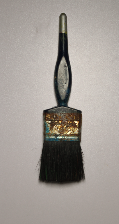
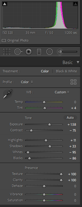
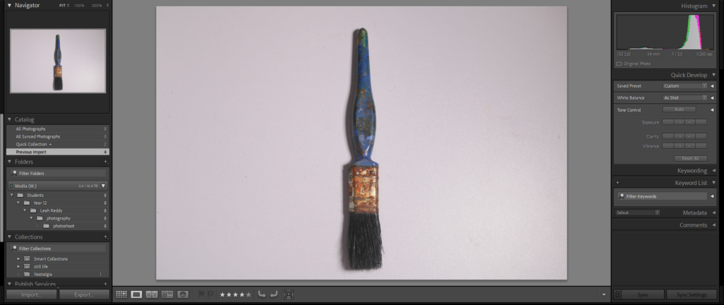
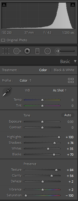
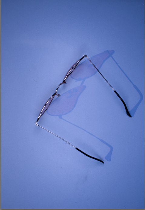
In this photo, I didn’t change too much as i liked the photo as it was.

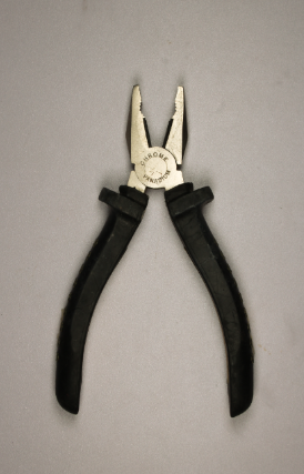
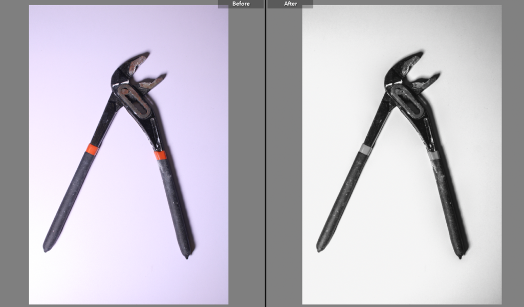
For this photoshoot, I picked a variety of different tools. I edited them using different sections of tone and presence. To take these photos I used the copy stand which takes pictures from above looking straight down.

Formalism

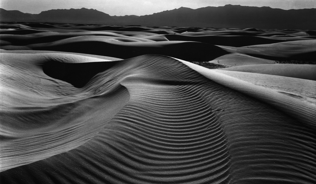
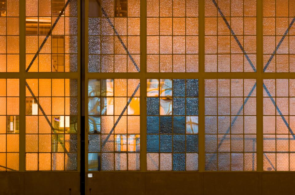
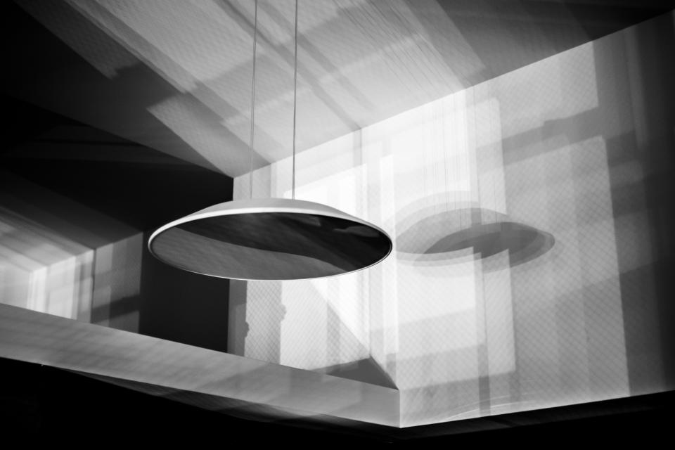
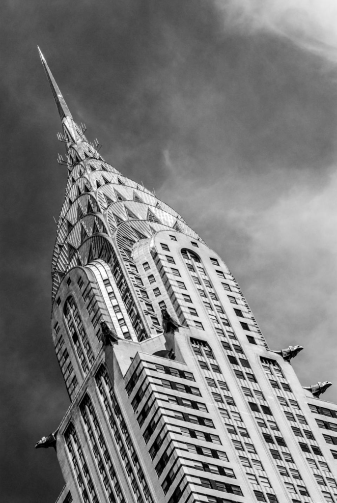
Formalism is a type of photography in which attention and accuracy is put into the composition, detail, lighting and camera settings, etc. over the main subject. The photographer often aims to draw your eyes to the formal elements of the photo. These elements include light, lines and shapes, patterns, colours, texture, value/tone, space and composition.

There are 7 different aspects of Formalism:

Line

Lines come in all different forms and types. For example, they can either be straight, curved or a combination of the two. They can also be:

  • Solid – Most commonly found in the physical world
  • Dashed – Easy to draw but not as prevalent in the physical world
  • Implied
  • Psychological – Imaginary, created by, for example, the gaze of a subject

Furthermore, they can also be vertical, horizontal or diagonal.

Shape

When a line, or multiple lines, connect or close, a shape is formed. Shapes can be the outline of an object, familiar or unfamiliar. When a shape is unfamiliar or unrecognisable, it is often when an object is viewed from a different perspective.

Different shapes can combine to create a new shape by intersecting or overlapping. The area containing a shape is often referred to as positive space and the outside area is called negative space, however, negative space creates its own shape.

There are two basic types of shapes in photography:

  • Geometric – standard shapes such as circles, squares, triangles, etc. Often man-made.
  • Organic – the outline of an animal or plant, etc. The shape of a cloud or rain puddle could also be defined as an organic shape. These shapes are often natural and not man-made.

Shapes are everywhere in photography and the world around us.

Form

Form is 3 Dimensional and has overall height, width and depth. Alike shapes, there are two different types of form, geometric (normal) and organic. Examples of geometric forms are: sphere, cube, cone and cylinder. Organic forms are the objects which surround us in the world. When a photo is taken of forms, they become 2 Dimensional as the image does not have depth, however forms can be perceived by shadows.
Texture

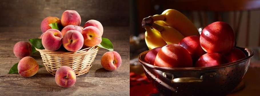
Texture can be defined as ‘the visual or tactile surface characteristics and appearance of something’. Textures in “real life” can be smooth or rough. Other ways of describing texture could be slimy, bumpy, shiny, soft, slippery, etc. Texture is similar to form in the way that it can be revealed by variations in tonality. Texture cannot be physically felt through a photograph but it can mentally. For example, if someone looks at a photo of a fluffy blanket, they could imagine what it would feel like if it’s a familiar feeling to them.

Colour

Colour can be described as ‘a specific combination of hue, saturation and brightness’ or ‘visual perception that enables one to differentiate otherwise identical objects’. Colour has 3 properties:

  • Hue – the description of the colour (e.g. blue, red, yellow, etc.)
  • Value – the relative brightness or darkness of a colour
  • Saturation – the intensity or purity of a colour

Colours can be perceived as meaning various things such as: red means danger, yellow is happy and blue is sad. Bold and bright colours are known for grabbing our eye. Having a bold and bright subject in a photo can be good but if the subject was muted and dull but there’s bright colours elsewhere it could detract your eye from the subject.

Harmonic colours are colours that compliment each other. These colours in a photograph can create a powerful image, this is the same with muted tones. The reflected light we see as colour is light from the sun or artificial sources that is absorbed and reflected by different objects.

Size

Size can be defined as ‘a physical magnitude’ or ‘relative or proportionate dimensions’. Size in a photograph is relative and can be an illusion. When a familiar object appears within a photo, we can determine the scale by looking at it. Optical illusions can make it difficult to determine the size of an object within a photograph. Things that are unfamiliar to a person in a photograph would make it almost impossible for them to determine its size. This is called size constancy, which does not exist to a child as everything is new to them. The size of a common object in the photography gives the scene a sense of scale. To emphasize the size of an object in the photograph, you could brig the lens closer to it. Overlapping objects also gives hints to size as when one object is close in front of another and is smaller than the object behind it, we generally know the relative sizes of the two objects.

Depth

Depth can be defined as ‘the direct linear measurement from front to back’. How well the depth is shown in a photograph depends on the objects in the frame, choice of composition and your perspective in relation to the objects in the frame. Depth is provided by visual cues. Depth can be show by a road narrowing as it gets further from the camera. This is called linear perspective as the road doesn’t actually narrow, it just looks like it does. Aerial perspective, also known as atmospheric perspective refers to how the distant objects in a photograph have less clarity, indicating depth. Texture gradient shows depth in a photograph, as we,, as size diminution (when an object is smaller, it appears more distant). Finally, upward dislocation shows depth.

Still Life photo-shoot

These are some of my photos I have taken, a lot of the photos I used a 3D further away look, but for a lot of the other ones I also used the 2D over-head look with capturing all the tools, books and other objects.

Strongest photos:

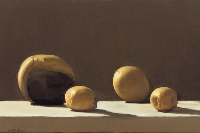
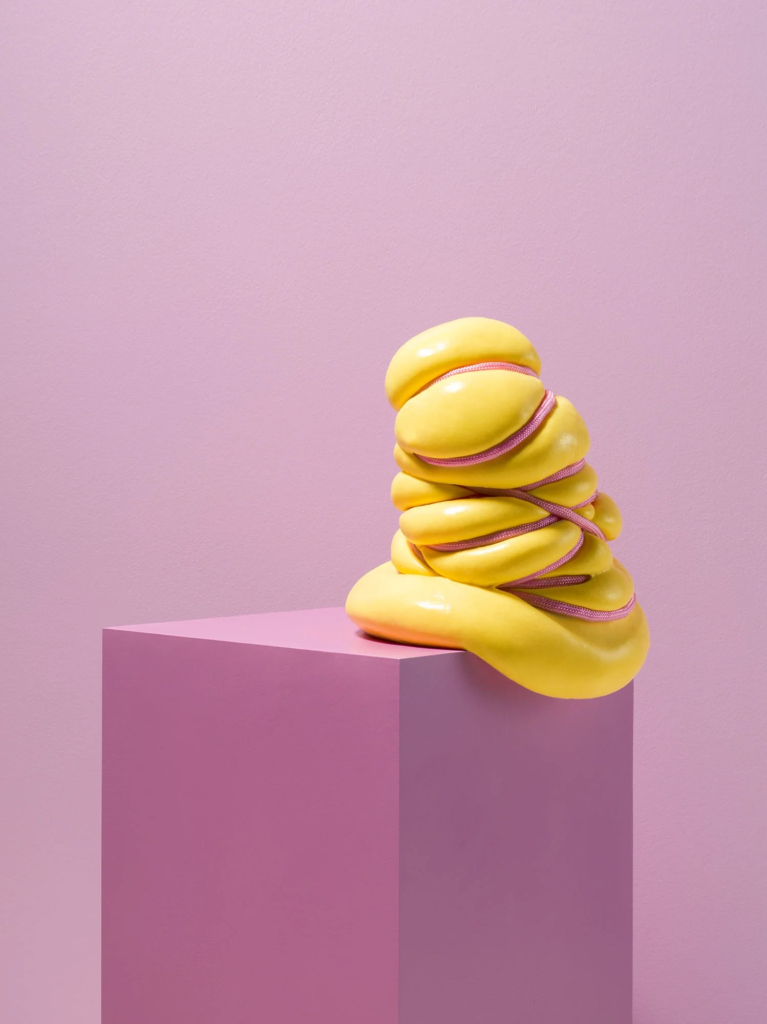
For these photographs, what I did was use the infinity curve for the objects to go on. I placed the different objects in the centre apart from the shoes which I put the middle of them in the centre. Then turned all the main lights off, but kept a still standing light on with the cool side of it on. Faced it towards my objects and then took the picture.

But for the camera what I did was put the aperture around f/16 which is kind of high because I don’t need to blur the background as it is plain and dark already. A low shutter speed because the object is still, it doesn’t need a high shutter speed. Finally, a high ISO because I wanted it to be fairly dark and that is what gives the gloomy/dark feel especially for the tower.

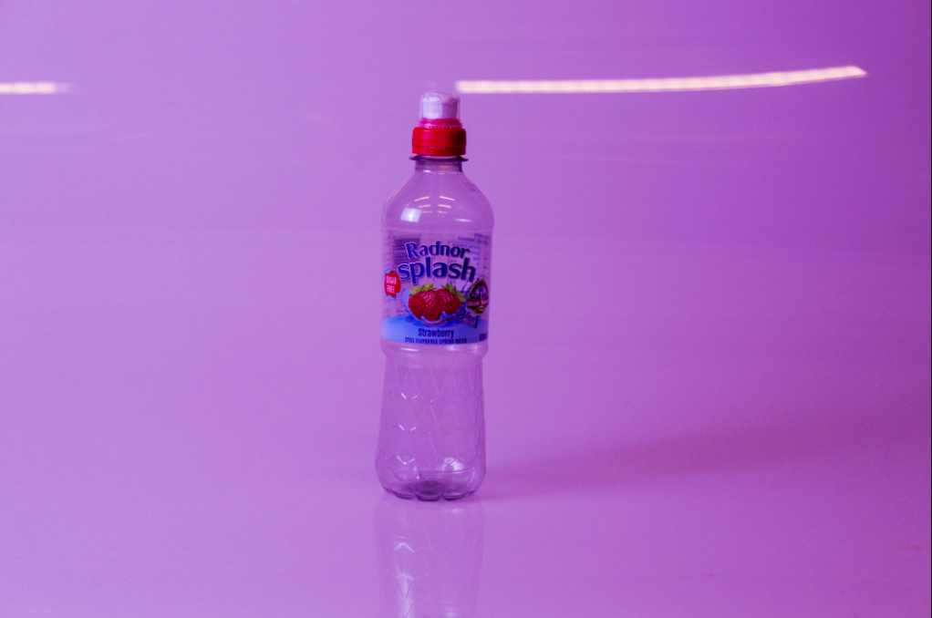
In this photo this is old objects but gives the viewer a lightened feel with the background having a pinkish tint, and with the texture being very smooth it gives a friendly/young feel.

Still life

What is still life ?

Still life photogrpahy is a genre of photography used for the depiction of inanimate subject matter, typically a small group of objects.

Richard Kuiper, Photographer

Image analysis:

  • There are 15 objects in the photo all placed together and arranged.
  • There is darkness behind them which implies emptiness.
  • There is a skull which represents death and the objects around are very random.
  • it creates a sense of oldness with the feather and ink.
  • The gold vase along with the gold key, coins and gold stripes on the book represnt wealth.
  • all the objects are plastic
  • There is hight created by the aragment of the objects correlates to being a higher class.
  • it is a vanitas.

The start of still life.

The painting generally considered to be the first still life is a work by the Italian painter Jacopo de’Barbari painted 1504. The “golden age” of still-life painting occurred in the Lowlands during the 17th century.

main still life artists from 1571-1954

-Michelangelo Merisi da Caravaggio (1571 – 1610)
-Clara Peeters (1594 – 1657)
-Jacob Van Es (1596 – 1666)
-Pieter Claesz (1597 – 1661)
-Rachel Ruysch (1664 – 1750)
-Paul Cézanne (1839 – 1906)
-Paul Gauguin (1848 – 1903)
-Henri Matisse (1869 – 1954)

popular still life artist nowadays.

Michaël Borremans

Johnathon knowles

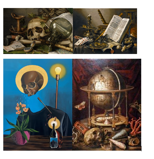
what is vanitas?

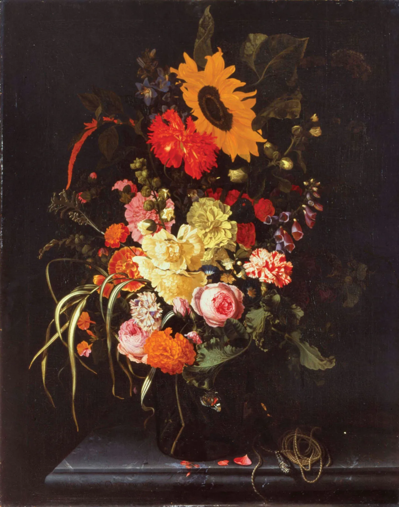
A vanitas contains a collection of objects symbolic of the inevitability of death and the transience and vanity of earthly achievements and pleasures.

response picture.

what is Memento Mori?

memento mori translation form latin means  “Remember that you must die.”A basic memento mori painting would be a portrait with a skull but other symbols commonly found are hour glasses or clocks, extinguished or guttering candles, fruit, and flowers.it is similar to a vanitas.

metaphors and symbols in still life.

FRUIT: Varying Symbolism In Still Life Paintings

SKULLS: The Certainty Of Mortality.

CANDLES: The Passing Of Time. 

FLOWERS: Symbols Of Life And Growth.

SEASHELLS: Birth, Purity, And Fertility.

BIRDS: represent the resurrection of the soul after death.

BOOKS: they mean learning or transmitting knowledge.

Johnathon Knowles response shoot.

Single object photoshoots and edits

Formalism:

Formalism is the study of art based on analysis of its form, the way it is made and what it looks like. Formalism photography is where the design, composition and lighting are dominant over the subject matter, and concentrates on the desired subject while eliminating everything else, to make the subject the main focus. Paying attention to the formal elements will help you emphasise the most critical aspects of the shot.

The seven formal elements are commonly known as:
– Line
– Shape & Form
– Pattern
– Tone
– Colour
– Texture
– Space

For my artist response, I chose to use the artist Walker Evans as inspiration for my photographs because I found his work really interesting as he uses tools to take single object photographs.

Importing photos

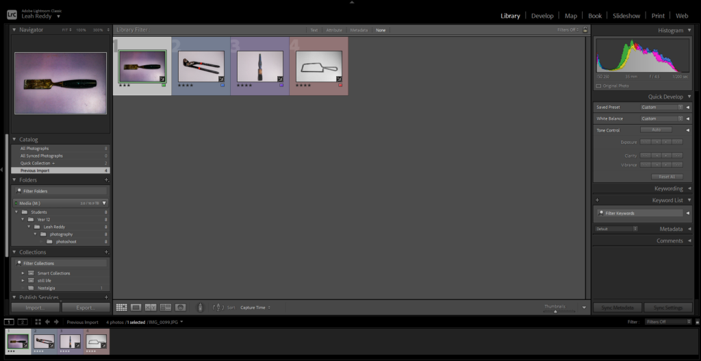
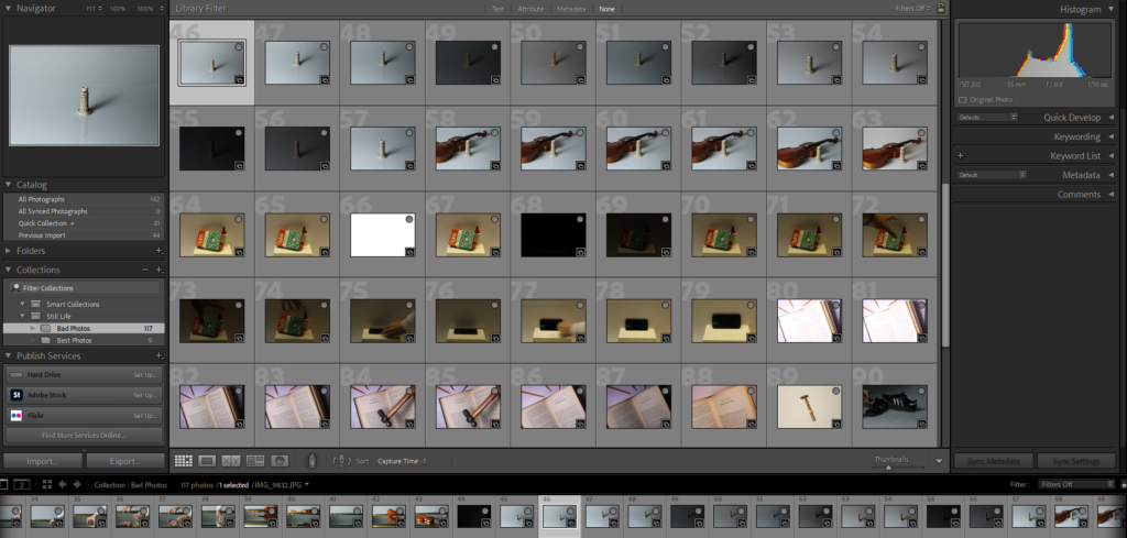
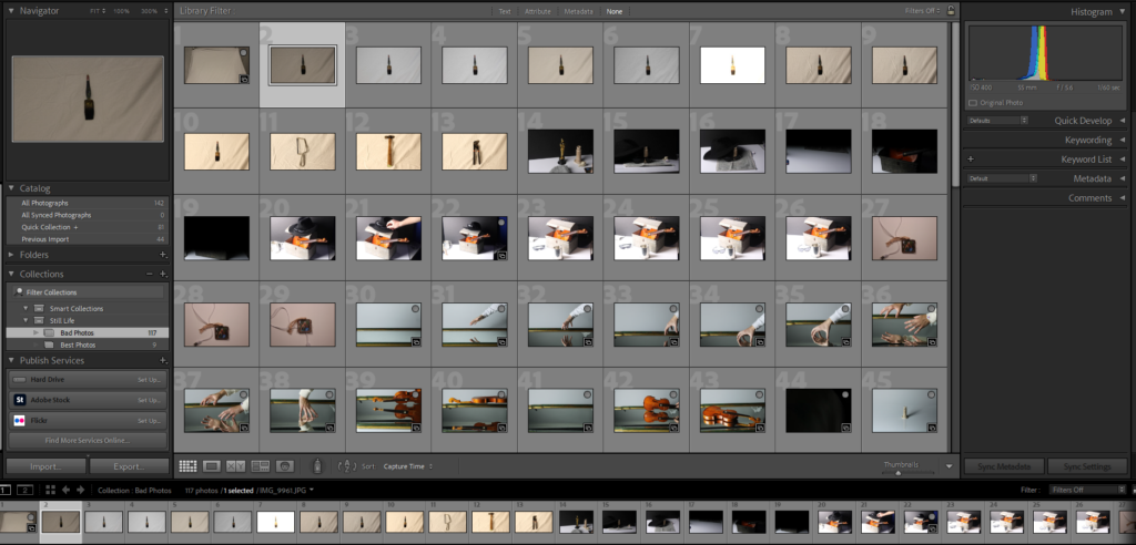
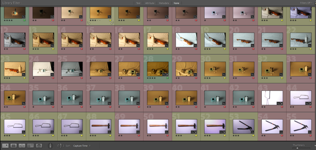
I used Lightroom Classic to edit and organise my photographs. Using this, I have learnt the skills of importing images from the computer files into Lightroom Classic, I can also rate my images from 1-5 stars depending on the quality and pick my best images from the photoshoot.

Flag colour representation:

  • RED: Images that could’ve been improved
  • YELLOW: Good images that I could potentially use
  • GREEN: My best images

Single object photoshoot:

Single Object editing:

Edit 1:

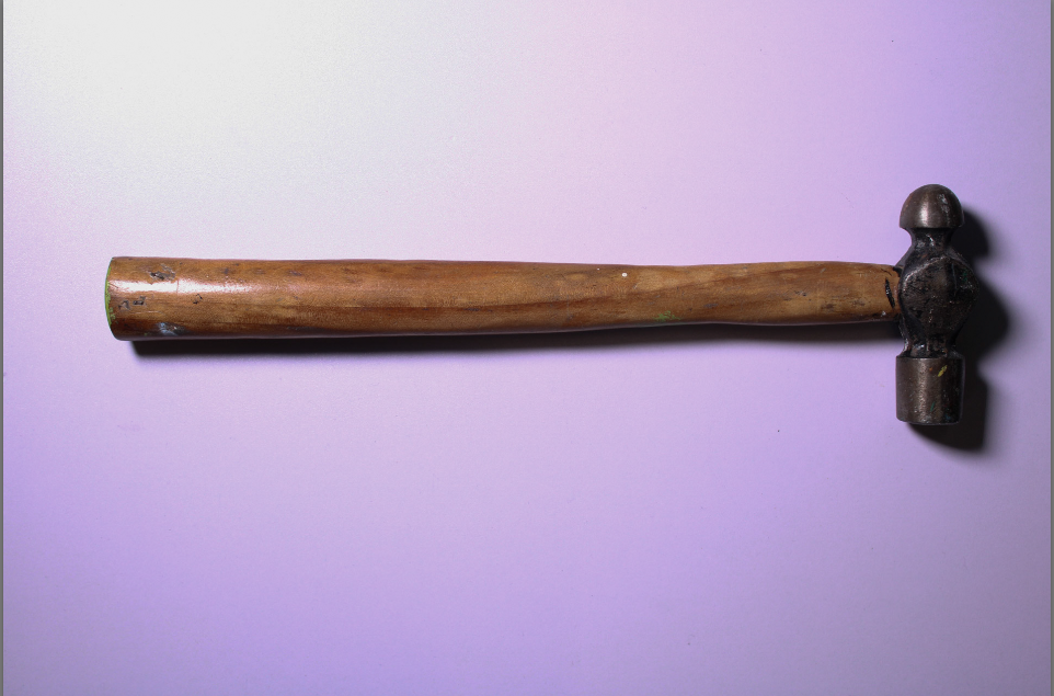
Before editing:

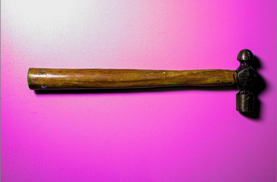
After editing:

In the unedited photo above, I found that the image seemed too dull, with no colour. I decided to edit the image so that the hammer had more texture to it and stood out so the viewer’s focus was only on the tool. I also increased the saturation, this made the background colour brighter and a heavier pink tone.

Edit 2:

Edit 3:

Edit 4:

Still life best and final images:

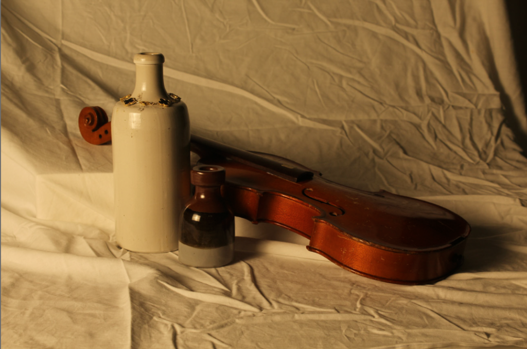
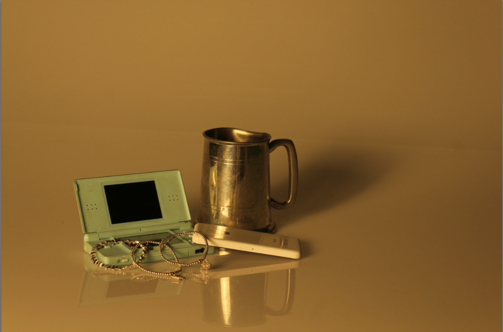
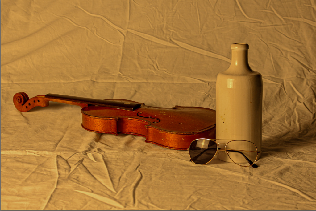
I chose these images as my ‘best’ ones because the quality of the photography is high and, in most of the images, I like the way the texture of the background contrasts with the smoothness of the objects. In the other ones, I like how the background looks so smooth so the focus is mainly on the objects.

Single:

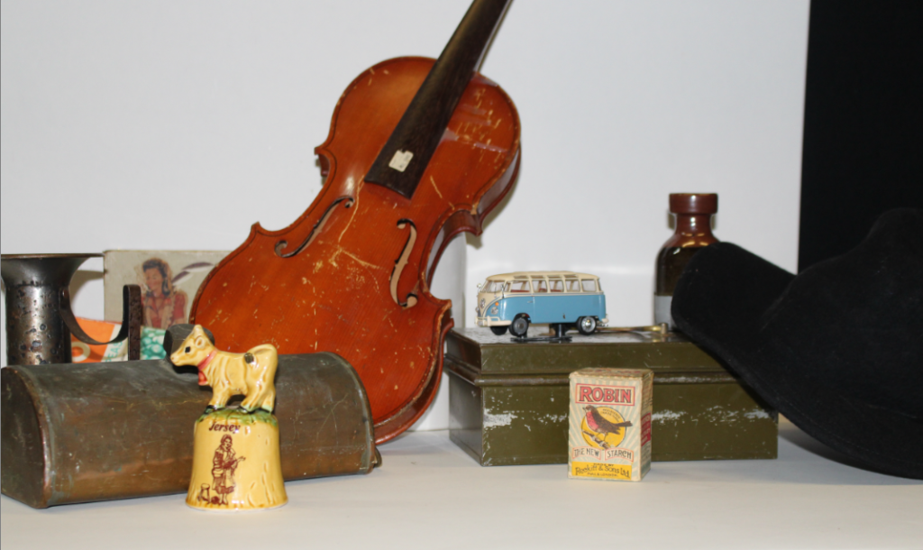
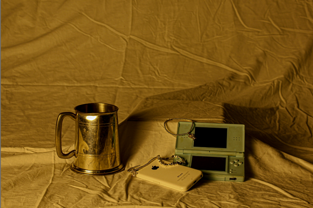
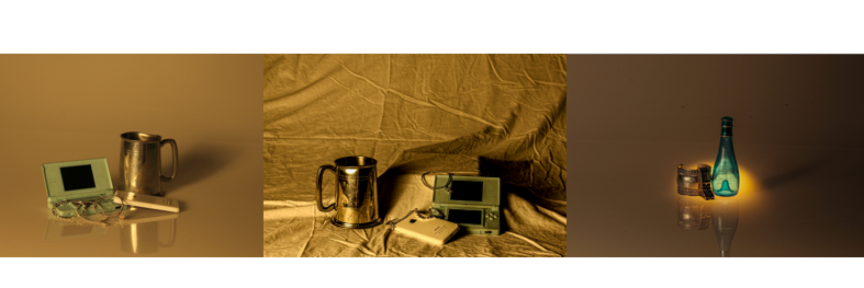
I like these images because they all have a similar warm tone which gives off a feeling of nostalgia and could be categorised as ‘vintage’, as if these images were taken a long time ago.

Comparison:

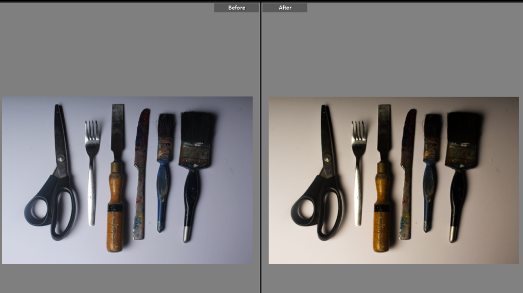
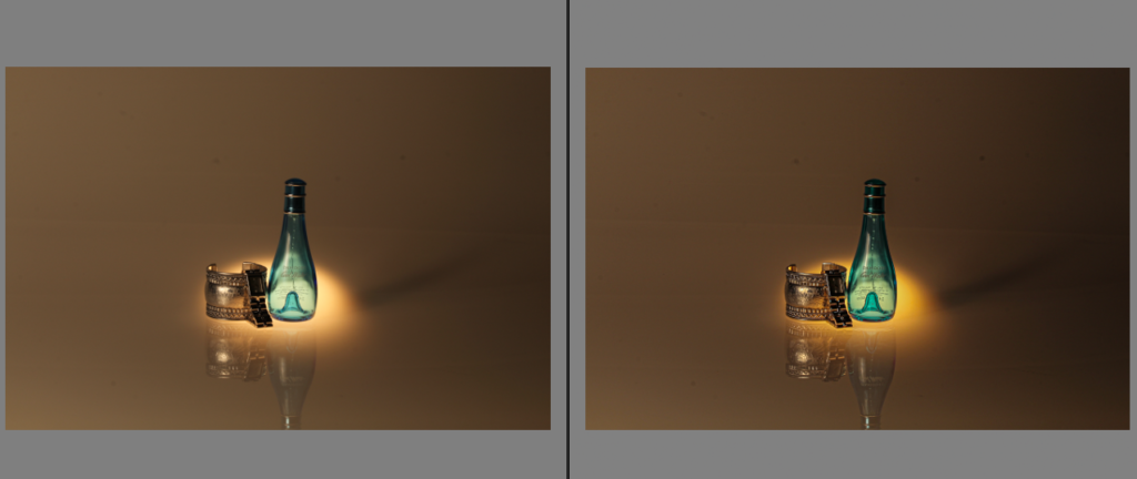
before vs after

I chose to edit this image because out of all of my still life images, this was the best one and also my favourite. I edited this image using Adobe Lightroom Classic. I found that increasing the colours made a huge impact on the detail of the photograph. I decreased the whites to make the background seem a bit darker than it was. I also increased the vibrancy and saturation so the light shining on the objects came across as a warmer tone.

Experimentation on presentation:

Triptych:

A triptych is when you present a group of three images. So finally, I decided to use triptych as a way to present these images because I like the layout and it is therefore easier to compare them. I chose to use these 3 photos because I found that they stood out to me the most, as they all are higher quality and are similar in a way as they all represent a warm tone.

Single Object Photoshoot inspired by Walker Evans

First Photoshoot:

In this photoshoot, I collected objects such as tools like Walker Evans. I ensured each one was of a specific shape or a different colour from the others so that every other photograph from this photoshoot looked different. I also took lighting as a big factor in the photo shoot as I believe in the photoshoot lighting was a big contributor to how the photo shoot turned out as it was important for it to be brightened up.

Development Photoshoot 2 Contact Sheet: Using multiple objects

In this photoshoot, I experimented with different textures, and layers and thought about how I could potentially rotate and position multiple objects similarly to the artists (Walker Evan and “Beauties of the Common Tool”).

I played around with the cutlery with different backgrounds and different textures. In this photoshoot, the photographs didn’t turn out as well as I wanted to therefore I decided to experiment with the same silverware and other objects in another photoshoot. What I would improve in the net photoshoot is the angle of the camera lens to make it look inspired by the photographer Walker Evans with his silver tools.

In this photograph, the camera is positioned at a low angle to add perspective to the silverware. I like the outlook of the photograph and how the strong shadows and artificial lighting creates a clear silhouette of the silverware.

In this particular photograph, I wanted to crop out the odd black dots around the edges of the photograph and I wanted the different tonalities of the photograph to be around in different areas so I decided to make beneath the tape a light point.

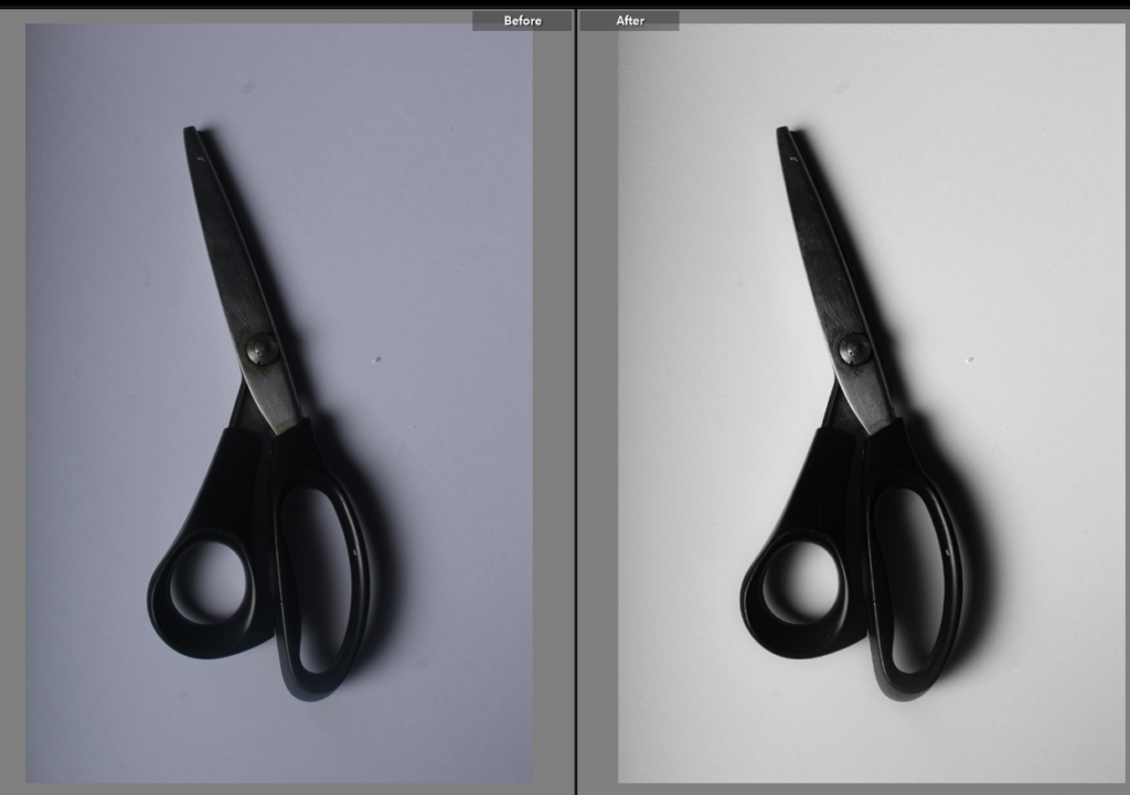
The photograph below is presented as the one presented above (editing process). To create the specific shadows and depth in the photograph consisted of narrowing down the exposure, and shadows and dehazing the photograph. I increased the temperature (warm) and the highlights of the photograph so that the highlights are illuminated and the images is bolder and has more depth.

Third Photoshoot:

Similar to the work of Walker Evans, the shadows are not visible in these photos and the objects are taken from a face-on angle. The camera settings used for this particular photograph on the top was taken at a 43mm range of depth on the lens, at a f/6.3 aperture and at a 1/100 sec shutter speed. The photograph was also set at an ISO 100 meaning that the camera lens’ sensitivity to light was slightly lower than the much higher settings.

This could have an effect on the outcome of the photograph as the red and purple glossy overlay could mean that if the settings are high then the outcome of the silver ware will look too light and pastel therefore having the shadows and outline of an objects increased the result looks increasingly better and advanced.

In the second photograph on the bottom, the camera settings are set at a manual mode of the lens 47mm and an aperture of f/6.3. The photograph has a shutter speed of 1/100 sec and an ISO of 100.

In this photograph, I tried to bolder the shadows/highlights and the exposure levels so that the contrasting colours can look striking and look brighter than all the other colours. The camera settings used manually to create this photograph were: a 55mm lens close-up, an aperture of f/6.3, a shutter speed of 1/100 sec, an ISO of 10 and no flash as the image itself does not have many shadows and darker areas therefore does not require the additional light.

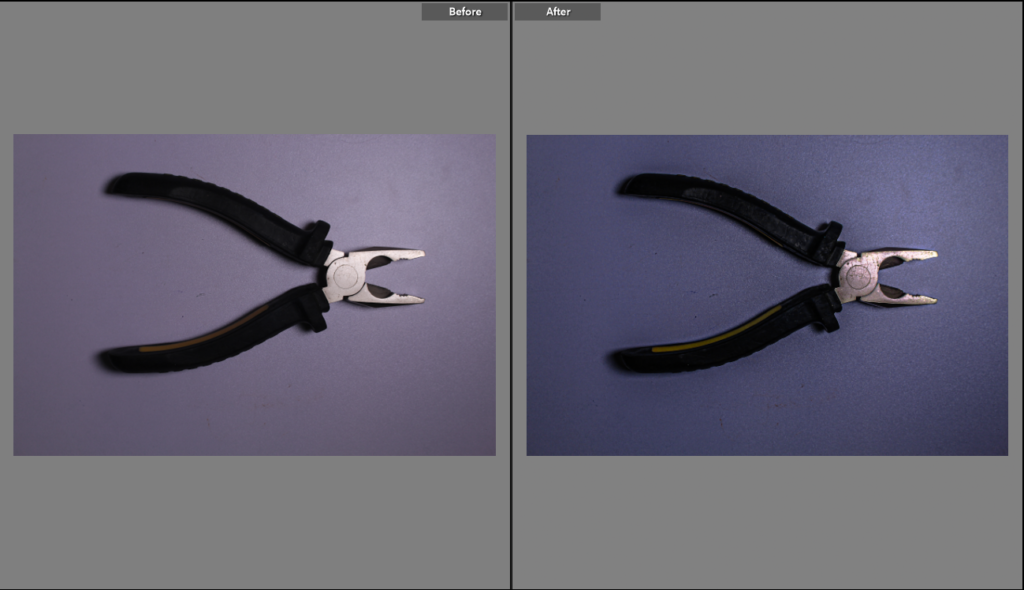
This print screen demonstrated the editing process changing the photo filter to a cooler undertone, I chose to do this as it represents the cooler-toned colouring pencils. It may also link to a story/ feeling/ theme of nostalgia as the colouring pencils may be remembered as a thing that was used when you were younger/ a child so that cool undertone of the blues may represent that sadness/ memory and thought of the past.