Still Life Photos

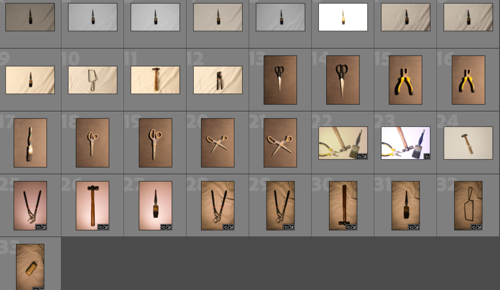
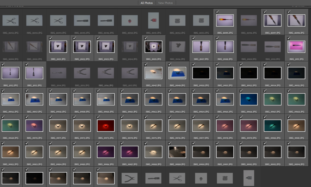
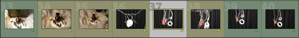
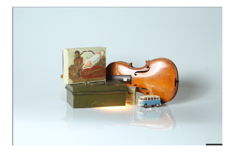
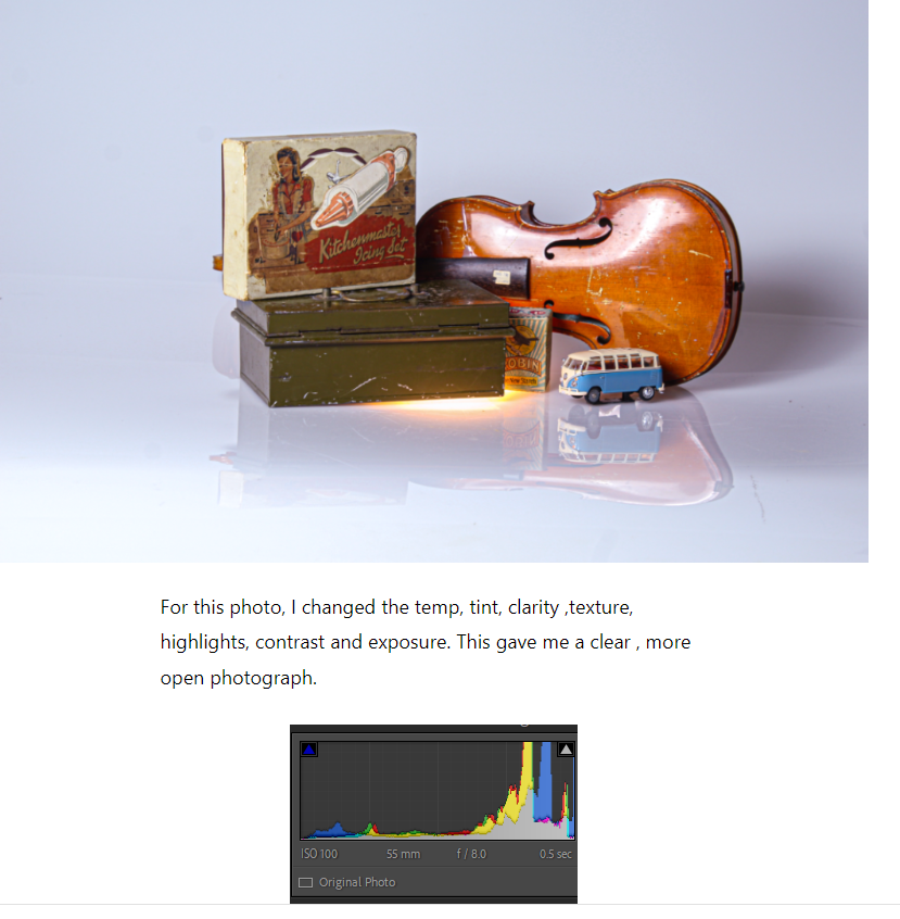
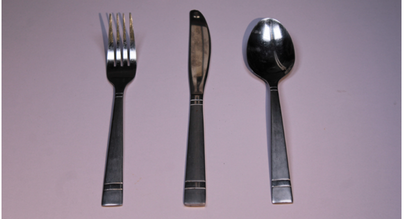
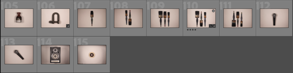
This is all of the photos that I have taken so far in my study of still life. I have utilised the techniques that Still Life photographers and painters used, such as using objects like books to symbolise knowledge and wealth. The majority of the photos are singular objects where I have experimented with lighting and the positioning of the object in the frame. I used a variety of lighting to give different tones and tints to the photo and to add warmth or coldness to the picture. I also used a variety of backgrounds, such as an infinity curve and a flat background. Throughout all of the photoshoots, I kept the depth of field wide on all of the photos as I found through my study of Still Life that having every object in focus is a key element to Still Life photography. Some of these photos are a bit experimental, adding different and contrasting objects that usually would not be seen together, such as the wooden block and the painted cutlery.

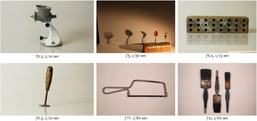
Here are what I believe to be the best photos. Most of these are singular objects, with some experimental photos in there as well. There are a couple Walker Evans inspired photos in the bottom right. I have used lots of different backgrounds such as an infinity curve or just a flat white background. Not much editing was done to these photos, only slight changes to bring up the exposure of the image. I did this because the lack of colour in a photo generally gives it a very solid, still feeling.

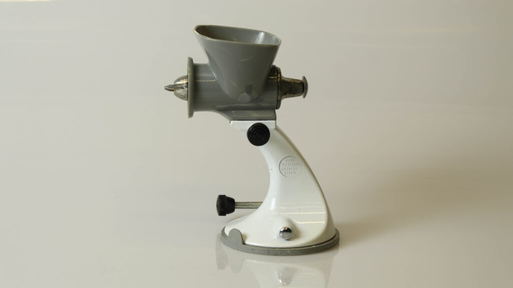
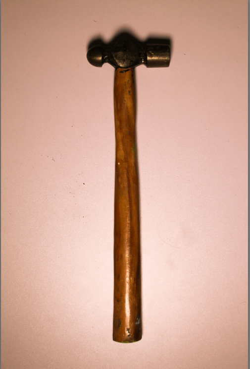
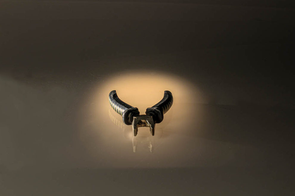
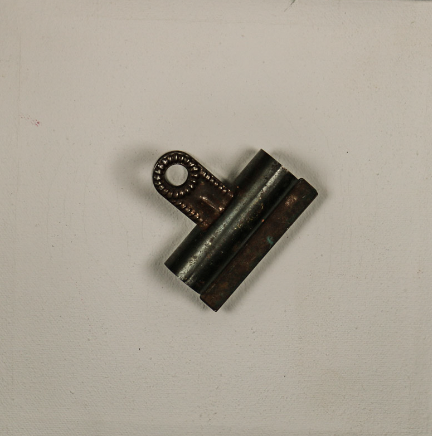
This photo depicts what appears to be some kind of kitchen appliance like a meat grinder. It was taken using an infinity curve, which works well in this case as it looks as if there is no background at all. The photo lacks colour, which emphasises the aspects of still life as colour generally tends to bring a sense of movement, like something is going on in the photo, whereas here it is a still object. This photo was taken with a slow shutter as well, which further implies the stillness of the photo as a slow shutter means that the object cannot move. Older still life paintings used to depict flowers, books or skulls as metaphors for happiness, knowledge or death, but nothing significant derives from the kitchen appliance in this photo, which coupled with the drab colour scheme, puts further emphases on the stillness of the object.

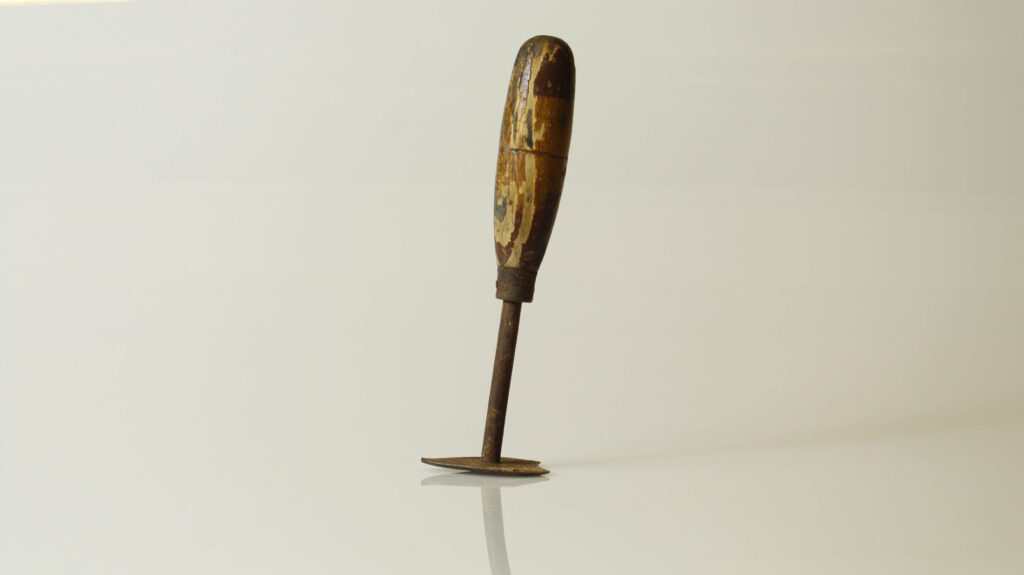
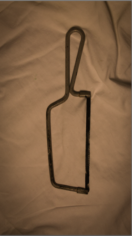
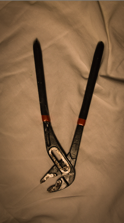
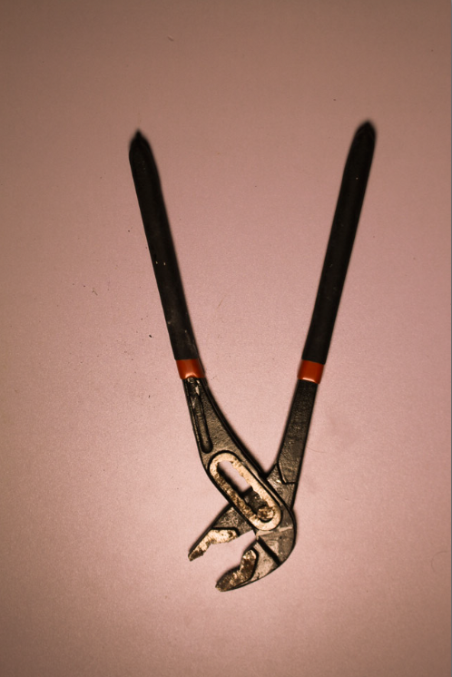
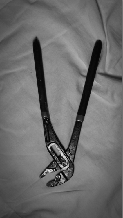
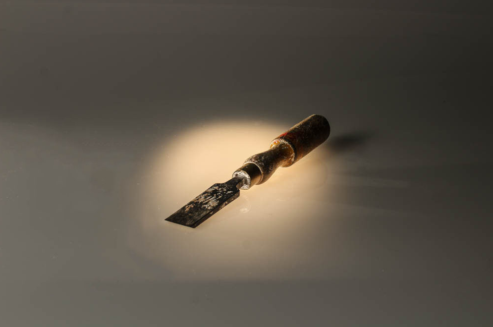
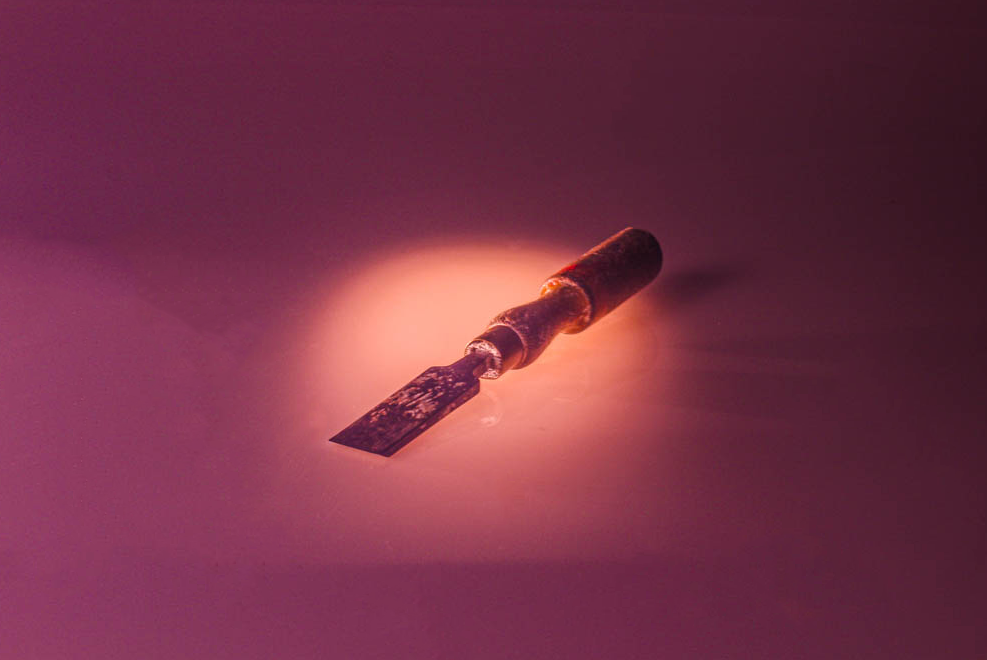
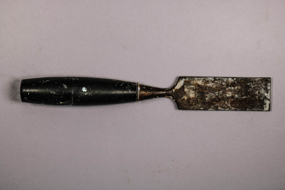
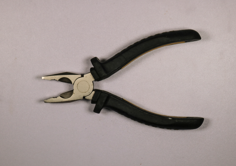
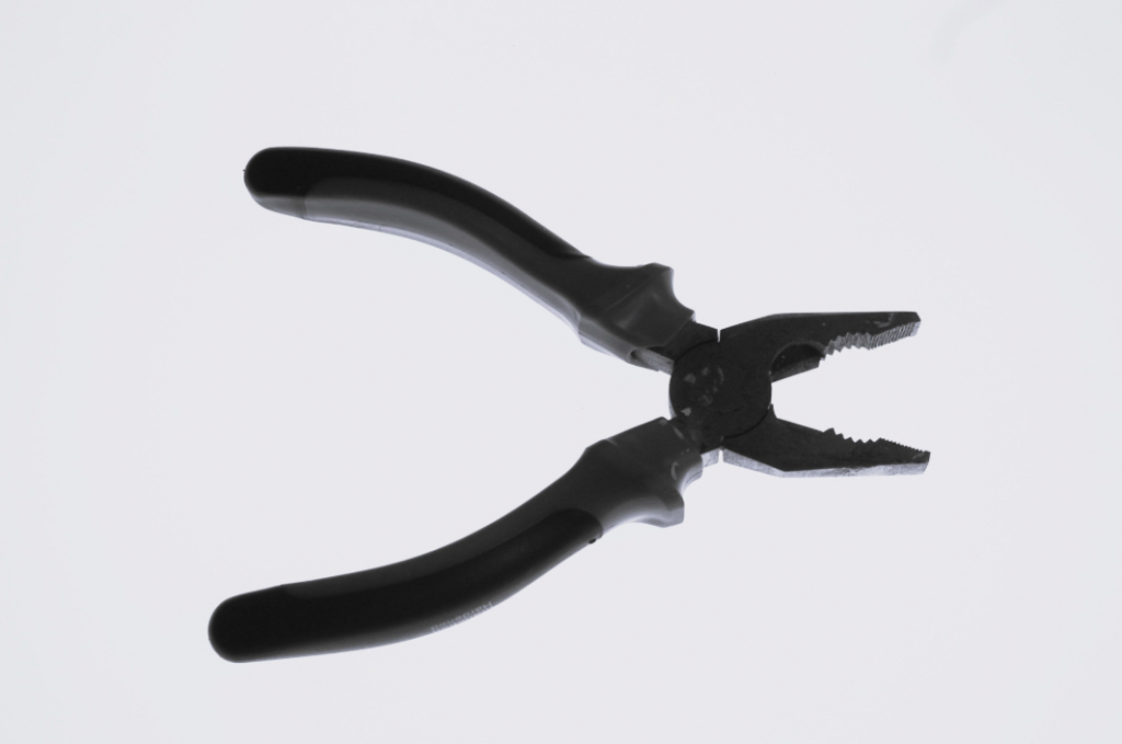
In this photo, there is an object that appears to be some kind of flat tool which was used a very long time ago. This adds mystery to the photo immediately as it gives uncertainty to what the object actually is, where it has come from, what it does. This lack of context is prevalent in most still life photographs as still life is not about the context of the photo, but the content. Also, the object has a slight tilt, which adds another layer of uncertainty because it looks as if it will fall, but it doesn’t and remains still. The shutter on this photo was also slow, which applies further emphasis on the stillness of the object. The tool is rusted everywhere there is metal, which adds texture to the photo and also aids the photo in keeping a brown colour scheme. Although there is more colour in this photo compared to the previous one, the colours are still dull, which again depletes the photo of movement.

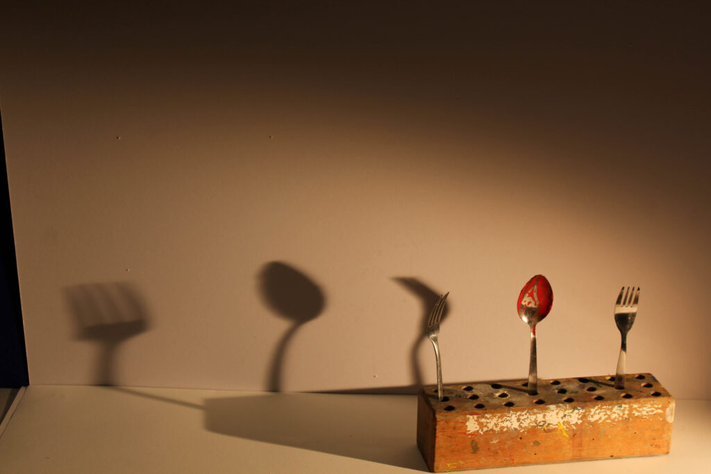
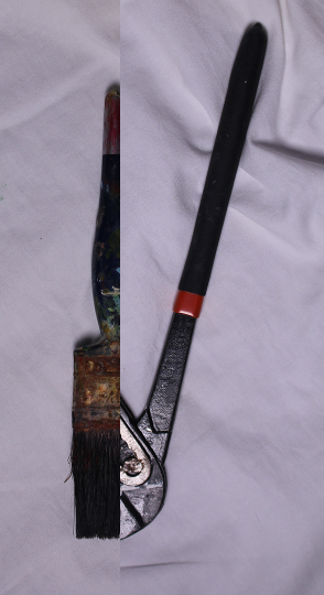
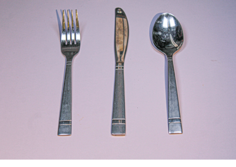
This photo was one of the more experimental ones out of all of the photoshoots, and it is the odd one out of all the selected photos because it features warm lighting, a few colours and has a shadow. I also wanted to include this photo because I felt that I needed to show how shadows can be used in still life. In this example, the shadow is used to stretch the object across the photo so that the frame doesn’t appear empty. The texture that appears on the wooden block also adds to the photo as it adds roughness to the otherwise smooth background. The painted cutlery also adds an interesting element as it removes the smoothness that would be on the spoon and replaces it with a gritty, unclean texture that, again, adds roughness to the smooth background.

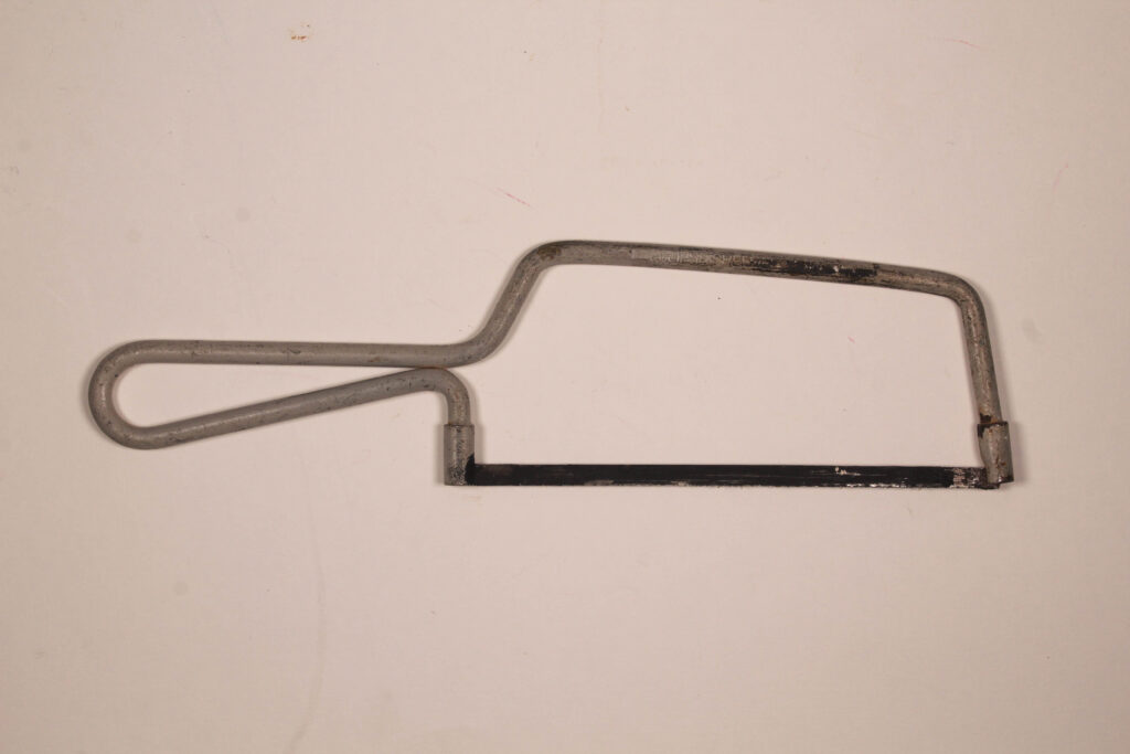
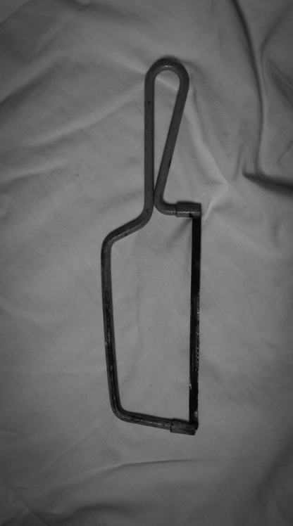
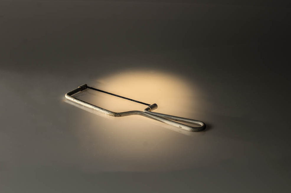
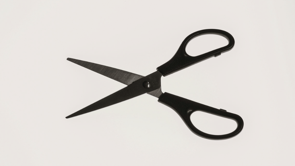
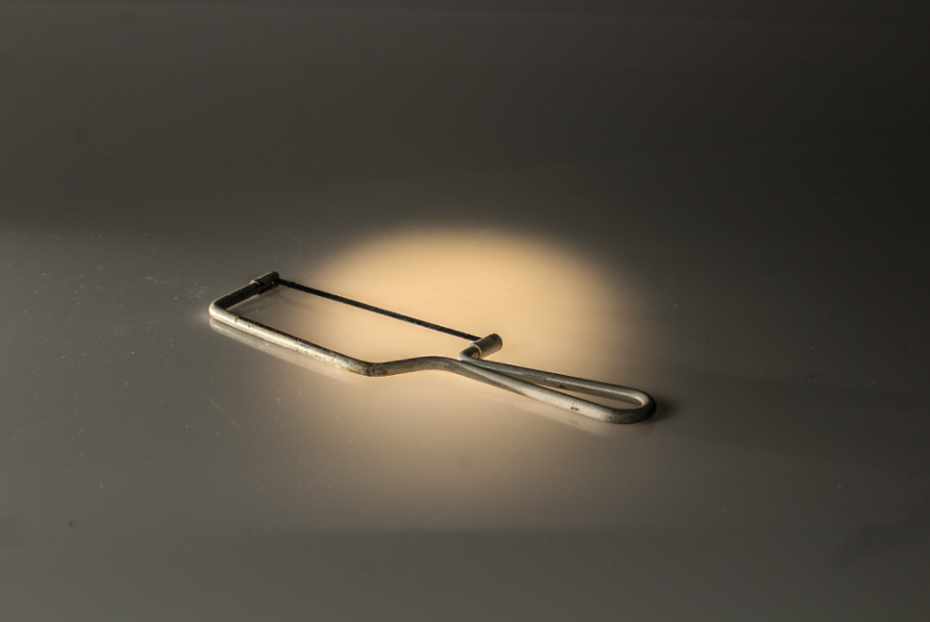
This photo is one of the two out of the selection that is inspired by Walker Evans. It depicts a saw on a flat background. Nothing is happening in the photo, which makes it a perfect example of still life. There is no colour, the saw is only grey and black and the background is just flat white. The texture that appears on the saw gives the photo a rough feeling, but it also shows that this tool has been used a lot. This allows the viewer to question the context, despite there not being any context at all, it is just a saw on a flat background.

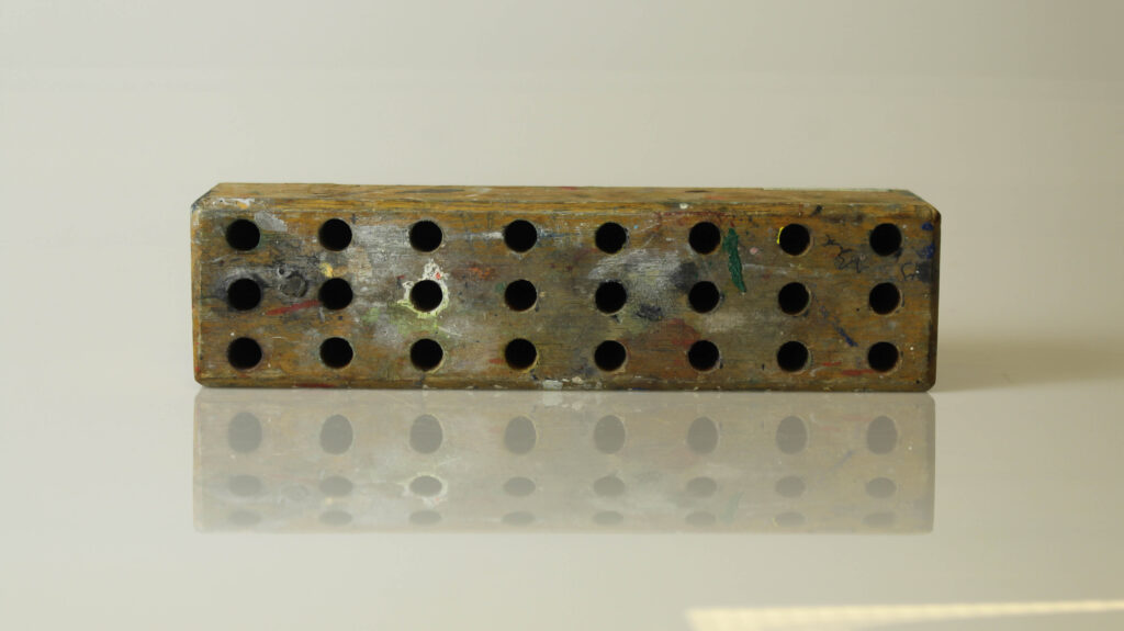
This photo depicts a wooden block used to hold scissors. This type of object usually appears in a classroom, which adds an element of nostalgia to the photo. Also, the texture of the wooden block, with the random splodges of paint and wear to the wood adds a worn element to the photo. Unlike the other photos taken with an infinity curve, this photo actually has a lot of colour. Despite this, the object continues to appear very still and solid. Also, the lighting is almost warm, which emphasises the brown colour of the wood and gives the photo a bit of vibrancy compared to the other ones.

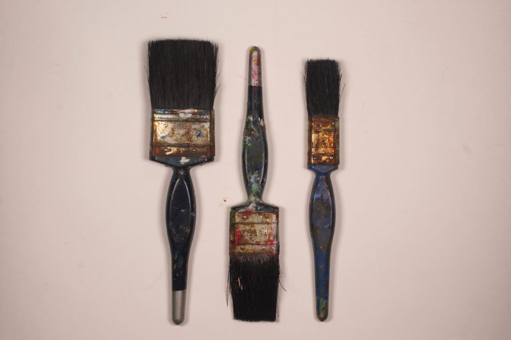
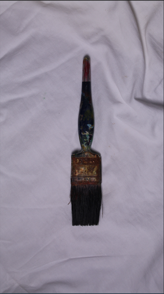
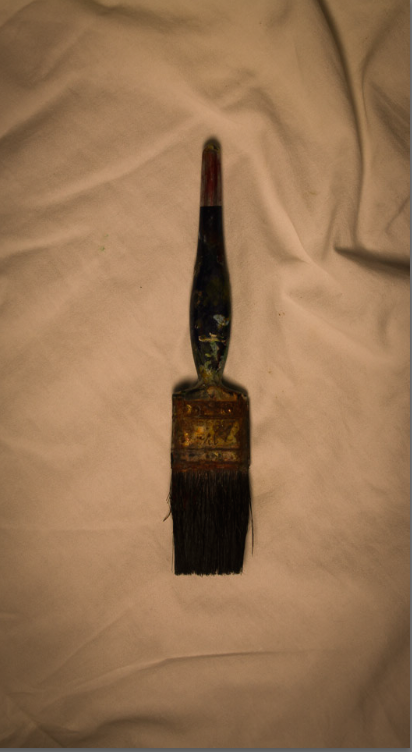
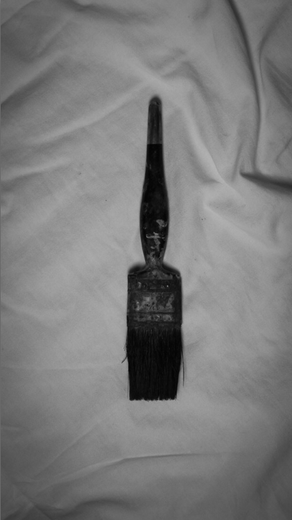
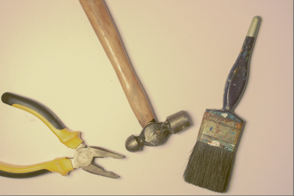
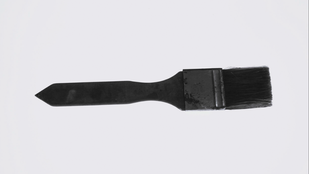
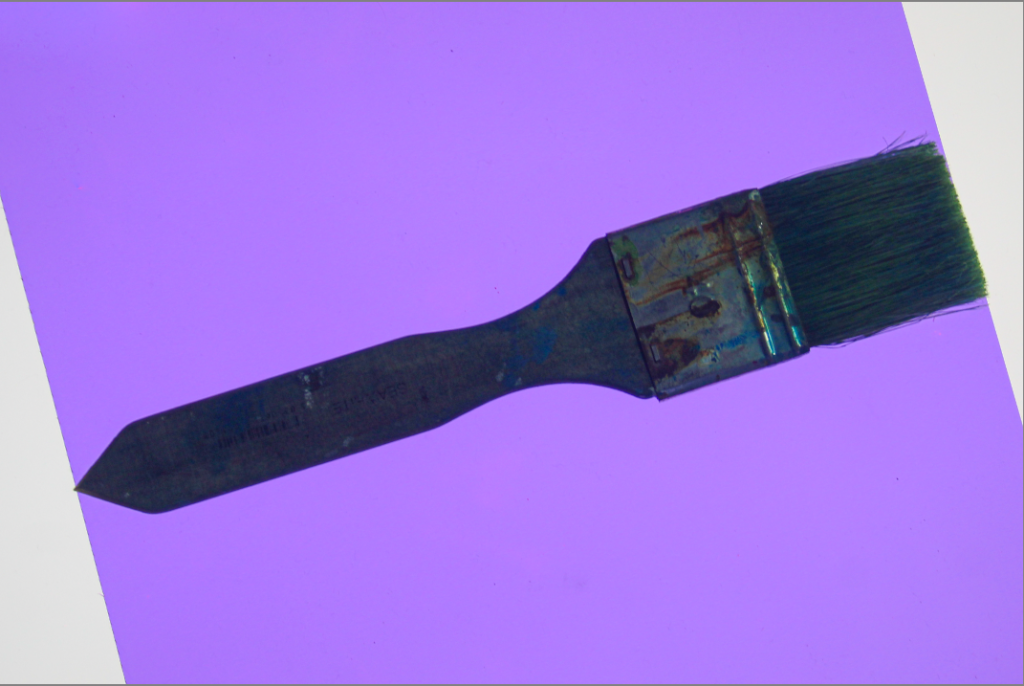
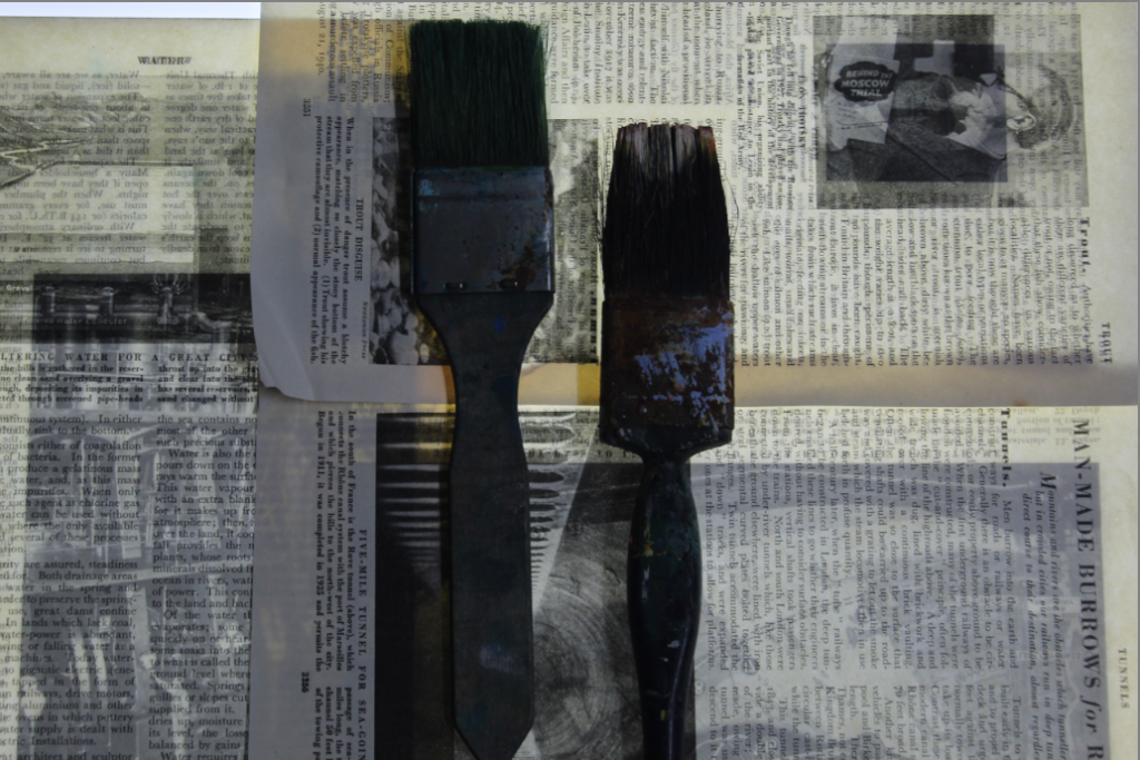
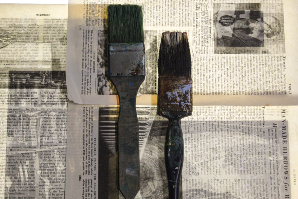
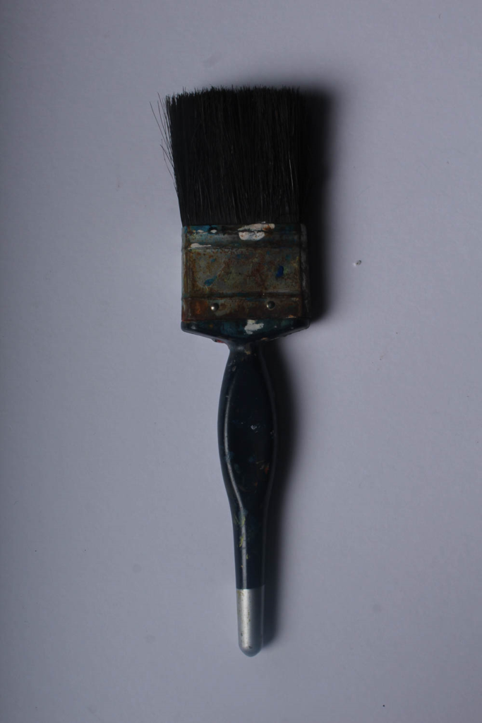
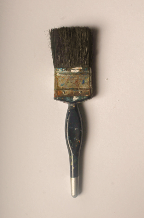
This photo is the other example of a Walker Evans inspired photo. It features three paint brushes on a flat white background. In this case, the shape of the paintbrushes and the pattern that they are arranged give the photo an interesting quality. As well as this, the paintbrushes have clearly been used a lot as there is lots of remnants of dried paint on them. This also adds texture to the photo, as without it the paintbrushes would look new, which is counterintuitive to the still life photos that were taken by Walker Evans, as they tend to feature used tools with obvious marks or dents that clearly show signs of wear.

Single object photoshoot – (inspired by Walker Evans)

For this photoshoot I tried a few different techniques, for example I used plain backgrounds, textured backgrounds (using a cloth or cardboard), different exposure levels and lighting. However, all these photos where taken using a top down camera setup. I used common basic tools without context behind them because the photos are meant to show only the object, which are designed for functionality, not for form. The concept of ‘form follows function’ can make the object beautiful in a sense as they ae not trying to be anything else. This is why Walker Evans kept the photos very basic just like the tools he was taking photos of.

Here, 4 images of common tools are laid out over a sheet (the top image is unedited). The camera settings where all the same (f/10, exposure time 1/40, iso-100). I used a low iso so the images will be more crisp. For the editing process, I created a present and used that for all the images:

These where taken using the same setup just with a different background. The editing was using the same present as the ones above. The top images is unedited and has a purple hue due to the lighting used. I prefer more yellow and orange hues for images trying to show a nostalgic effect so I just bumped up the temperature.

Here are some of the images from the photoshoot in B/W. Walker Evans took his photos in B/W because it was still normal to have B/W photos. B/W photos also means that colour will not almost distract the image for what it is, making it seem raw and pure. It also amplifies negative space (parts of image without subject), giving a more dramatic image.

2 Images of common tools fused together using photoshop. (inspired by darren harvey-regan who was inspired by Walker Evans 🗿)

Here is an image of multiple tools placed randomly, for the editing:

Black and white photo interpretations –

I wanted to give some variety to the photos I have already edited by using inspiration from Walker Evans to show the black and white effects he used in his work.

still life –

The objects I used for this image definitely gave me the feeling of nostalgia and age, so I wanted to accentuate that by giving it a black and white feeling to it. I lowered the contrast and reduced the vibrancy by changing the shadows and highlights to give the black and white effect.

I also put a mask over the photo to make the black and white feel more retro and older. I wanted to change the warm lighting used in the original photo without using one of my cool lighted photos, so I did this by adding this mask over the photo.

For this photo, I did somewhat the same thing as the Still Life photo but instead of heightening and lowering the shadows and highlights, I found a more prominent black and white mask to go over the photo.

I did however change the clarity of the photo making it slightly higher to give the photo some definition. After adding the mask, I was playing around with the highlights and lowlights again and decided to heighten the highlights slightly just to make the photo a little bit lighter.

Walker Evans and Darren Harvey-Regan

Walker Evans

Walker Evans was an extremely influential photographer of the twentieth century, this is greatly demonstrated by the work of Darren Harvey-Regan. His photography ,which consisted of elegant crystal clear photographs, as well as his articulate publications have inspired several generations of artists. Evans had the extraordinary ability to see the present as if it were already the past, and to translate that knowledge and historically inflected vision into an enduring art.

Walker Evans began his journey in photography during the late 1920s by taking snapshots whilst being on a European trip. Once he returned to his home, New York, he published his first set of photos in 1930. During the great depression Evans to photograph for the Resettlement Administration, later known as the Farm Security Administration. These photos were a documentation of workers and the architecture in the southeastern states.

Analysis

Walker Evan photos of tools are interesting as the tool is composed to the center of the photo and the background is completely empty which gives it a clean and sharp look.

The black and white effect causes the photo to look old despite it being taken years ago it appears that the photo was old even when it was taken back then.

Darren Harvey-Regan

Darren Harvey-Regan was hugely influenced by the work of Walker Evans and this is shown through his photography of tools which portray the similar clean and sharp look of Evans work. Darren Harvey-Regan is a graduate of the Royal College of Art. His work has appeared in exhibitions and publications all over the world and is part of the permanent photography collection at the V & A Museum, London. 

Darren Harvey-Regan is not only a photographer but is also a sculptor. Harvey-Regan’s work often sees a hybridisation of the conventions of photography and sculpture. As quietly humorous as they are frustrating, his works challenge the viewer to distinguish where representation ends and the object begins.

Comparing

Darren Harvey-Regan and Walker Evan have taken extremely similar photographs of tools, with the composition being the same. However Walker Evan’s photos appear much older so Darren Harvey-Regan is almost like a modern version of Evans.

Darren Harvey-Regan

Walker Evans

Photoshoot: Tools

For this photoshoot I used a range of different tools that were provided to me. These included:

  • Scissors
  • Pliers
  • Paintbrushes
  • Cutlery

Most of my photos were taken in the studio using a white background with the camera angled at a Birdseye view. 3 of my photos were also taken using a light box in the classroom and a ladder to create enough height to get the Birdseye view.

My photos have been edited to black and white to make it more inspired by the artist.


Contact sheet of all my photos:

Photos from Front View:

These photos were taken with a simple warm toned light and back light to make the object stand out. I lowered the brightness on these photos and increased the clarity for better quality. I used the spot like behind the surface to allow the light to make the object stand out. I made sure the object was centred in the light and that it was not off-centred.

These photos were taken using coloured transparent card that was held over the camera lenses to create the desired colour. I like these because they differ and are unique from the standard natural colours photos. To edit these I either increased or decreased the brightness and I made sure it had more clarity. in some, I also upped the vibrancy. I use the spot healing brush tool on photoshop to erase any marks on the camera or scratches on the surface that my object was on.

The images above were all taken in the Studio

Photos at Birds-Eye View

These 3 images above were taken using a light box. I like these images however I think I should’ve experimented using colours more and not just kept the plain white background. I like the light box as it makes the objects stand out and its also an easy but affective outcome. I decided to make these 3 images black and white like the artist tended to do as well.

For these photos, the background of the photo made it produce a purplish tone to the photograph. To fix this I simply pressed auto on the white balance to make it more white than purple.

My Favourite photos

Camera settings: Taken on Canon Camera, F-Stop=f/5.6, Exposure setting= 1/60 second, ISO Speed= ISO-200, Exposure bias= 0, Focal length 38mm, No flash

Camera settings: Taken on Canon Camera, F-Stop= f/8, Exposure Time 1/8 second, ISO-Speed= ISO-100, Exposure bias 0, Focal length 35mm, No Flash

Though these photos are very different, they are both my favourite shoots. I think this is because I prefer the white/brighter backgrounds on the first image to contrast with my objects as the other background turned out with a purple tint which I didn’t particularly like. The second image was taken at a different angle and not Birdseye view. I still like this image because my group made sure to make the backlight sit directly under the object to give it a spotlight. in addition to this, I like the amount of clarity this photo has.

To edit my photos, I only simply changed the exposure by lowering it, as on my camera the outcome of the photos was quite bright and it did not look good. If needed, I also adjusted the clarity and vibrancy.

Formalism Edits

To edit and categorize these images I decided to rate my photos from 1 star ‘*’ to 5 stars ‘*****’ as a way to pick my favourites.

I also colour coded them with ‘green’ for my best, ‘yellow’ for my unsure and ‘red’ for my low quality bad ones. This helps me to easily display favourite and least favourite images more specifically.

I took these photographs in the studio using a DSLR camera and a studio light.

I really like this image because of the gold shimmer that the jewellery creates. I also really like the warm tone that the gold creates, I think this differs from my other photos I have taken because I have focussed on more cooler tones. If I was to change two things it would be: 1. I would erase the shadow of the jewellery and how it takes the focus away from the bracelets. To do this I would need to change the camera angle, background or camera settings.

2. I would also change the setup of my jewellery, I think I should’ve thought more clearly about my setup in order to escalate the image and give it higher quality.

These are the camera settings that I used to achieve these photos.

Shutter speed : 1/40 sec.

ISO: 150- 160

Aperture: f/5.6

I edited this photo and focused on making it slightly brighter. I did not particularly need to edit the photo as it would lose quality and quickly become too bright or too dark. I also edited this photo whilst mainly focussing on and getting rid of the texture in the top and bottom part of the red paper. Erasing this texture helps my photo to become a higher quality and more effective.

I did not like this part of the texture of the picture so I attempted to erase it to make the image more effective. I had to experiment with the tools in order to find out how to erase this part of the image. However, this worked by helping me to gain more skills whilst working in Adobe Lightroom.

I also edited this photo to give it a higher quality and make the background a bit darker so that the details of the objects and light from below stands out more. I think that this makes my image stand out more and become more focussed.

I also took these photos however, whilst taking them I was unsuccessful with gaining a clear, controlled image and they came out very blurry. Next time, I should increase the shutter speed so that I am able to capture the moving image more quickly. These photos also do not particularly represent formalism and I think would fit well under still life if I was able to capture a less blurry image.

I edited this photo to make it clearer and focus on the small details of the scissors whilst also still maintaining the brightness and vibrancy of the pink background. This was difficult as my aperture was already low which lowered the exposure. To help brighten up this photo more I had to subtly heighten the exposure whilst editing in Adobe Lightroom.

These are my two favourite edited version of a paintbrush I photographed. I think these signify formalism very well because It is a single object and the images focuses on appreciating the object rather than a variety of things.

I do not really like this image I took because I think the background is effective, however, the brightness and shape of the scissors clashes with the background colour and creates a confusing image with too many colours not working together. To improve this image I could use a single coloured object so that the background can bring out the shape and dimensions of the object.

Whilst editing this photo, I thought about attempting to maintain the colourful background whilst showing the details of the scissors. I placed the scissors in a way so that they are both displayed clearly and look good. I think this really helped to make my image look interesting and appealing to look at because there is two objects that are the same, his is to maintain the idea of formalism and appreciation of one object whilst having two of the same object.

I really do not like this image because It is far too dark and is very low quality, however, I attempted to edit it anyway and see if I can elevate it and help it look better.

After editing this photo and focusing mainly on improving the whites and definitions I much prefer it. I think that once the image is brightened up, you can see the details and different textures from the object. However the newspaper behind the paintbrushes clashes slightly with the different colours and shades on the old paintbrush which I think makes the image look confusing and unappealing to look at. To improve I should change the objects on top of the newspaper to an object on one solid colour. If I did this, I think that the newspaper would bring out the detail of the objects much more.

I only had to briefly edit this photo because It was already high quality and does not include a wide range of colours. This photo helps to appreciate the object whilst pairing it with whites and yellows on a subtle spotlight.

I also decided to take this photo from the same angle so that you can see the object from a direct point of view. I think if I took this from above it would not be as good and would not be as effective. The bright blue and orange really makes this image so much more eye-catching and structured. I really like this image however, the bright spotlight causes a slight blur from the bottom of the car. This takes detail away from the wheels and sign at the bottom of the car.

Single Object Editing

This photograph is before I edited it and made any changed to it.

However, this is after.

Here’s another one of my photos that I really like and think has a better texture and clarity after I used photo shop for it.

This is before…

After…

It brings out the refection’s and tones and textures. It gives the image almost like a drawing type texture which I really like.

Here is the how I edited it, I prefer these photos a lot more rather than the original ones without photoshop.

What is an object photography?

In object photography, everything revolves around photographing three-dimensional objects and arrangements. The most common type of object photography is the so-called table top photography, in which smaller objects are draped on a table or shelf.

This image has an empty alt attribute; its file name is image-1160.png

To conclude


I think that I edited these photographs’ quiet well and really brought out the colour it needed.

Single Object Editing – Inspired by Walker Evans

My original photo:

My editing Process:

My photo after editing:

To achieve this photo, I went down to the studio and completed my camera set up in order for my photo to reach its full potential. I placed my tools onto a plain neutral piece of card which allows the brush to be the focus point in the image. The angle of my camera was placed at a birds-eye view, because it looks similar to Walker Evans’ photos, and gives the photo a sense of uniqueness.

Finally, I chose one of my best images that I had put a green flag on and rated it 5 stars. This technique is useful because it makes it easier for me to decide which photos I want to use and which ones I can retake / not use. I then cropped the image so there was less background around the paintbrush, and I edited the saturation of the photo because our artist inspiration Walker Evans often has his photos in low saturation for a dull effect.