Environmental Portraits – Mood Board

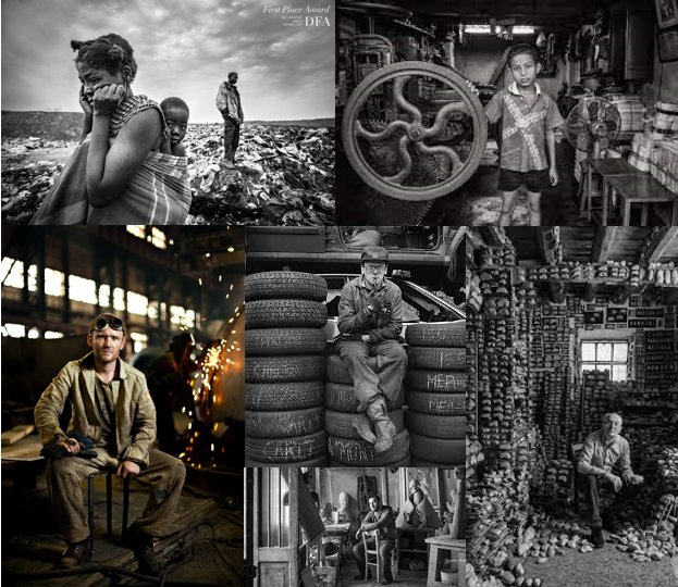
Environmental portraits are used to portray people in their usual environment, such as their place of work. It fundamentally shows the subject’s life and the environment they are surrounded with on a day to day basis. The purpose of environmental portraits is to tell a person’s story via the background of the photo and the connections they have with these surroundings. In an environmental portrait you will often notice that the subject is making eye contact with the camera which portrays a strong portrait photo and also creates emotion from their facial expressions and their eye expression. The aim of an environmental portrait is to capture peoples interactions with their natural surroundings to tell a story that generates emotion for the viewers, and giving insight into where these people are from, what they do and who they are.

Arnold Newman was the first person to create an environmental portrait in 1918. Since then he has created several famous photographs that many people have taken interest in. He placed his subjects in surroundings that represent their profession, aiming to portray the subjects life and environment.

Typology

Intro to environmental portrait.

What is a environmental portrait?

Environmental portrait photography is the art of taking pictures that is used to tell a person’s story via its connection to what they are surrounded (environment) by in the picture. This connection regularly reviews the message that the environmental portrait photographer wants the viewer’s eye to receive.

Environment portrait is not as important for the end result as it is for other types of images that are produced. Environmental portrait photos can be obtained by doing either a candid or a staged photoshoot. However staged pictures are much more professional than candid pictures because most of the times candid pictures are taken there is movement which is not really professional.

Environmental photographers.

what is environmental photography?

The surroundings or background is a key element in environmental portraiture, and is used to convey further information about the person being photographed.

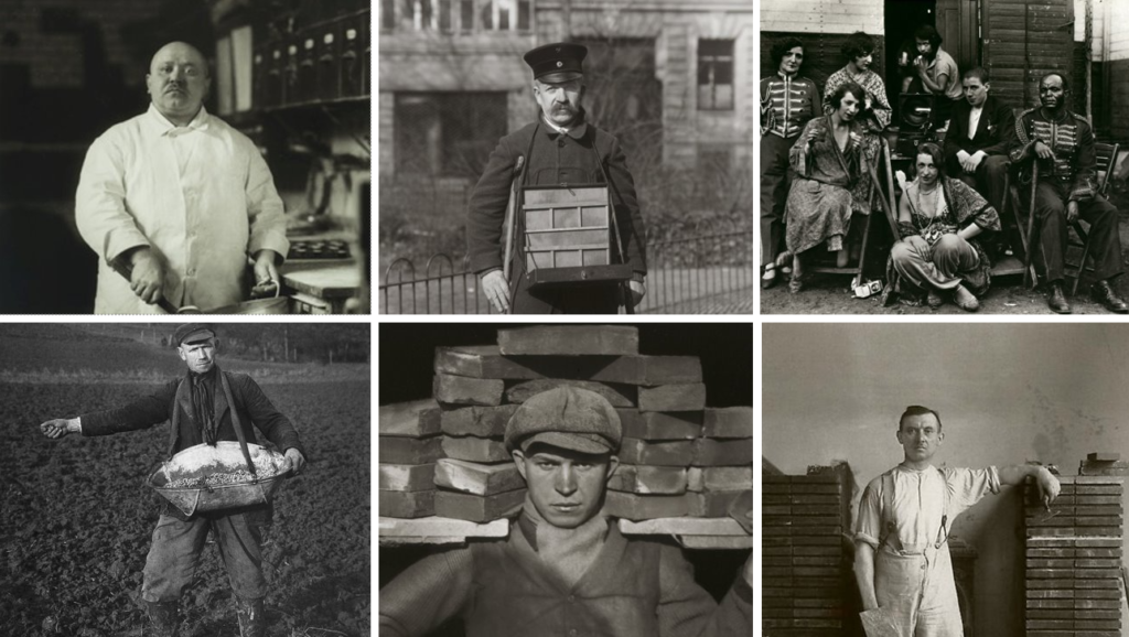
Some environmental portrait photographers, like August Sander, create typologies. A typology is commonly a single photo or a body of work that shares a high level of consistency, like ideas in mind or angles or framing. In environmental portraiture, when each photo is taken with a similar idea/meaning, it emphasises comparison and analysis between photos.

Influential environmental photographers.

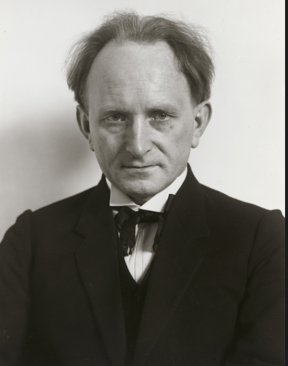
August Sander (1876 – 1964)

“If we can create portraits of subjects
that are true, we thereby in effect
create a mirror of the times.”

-August Sander

August Sander was a German Portrait and documentary photographer. He began his decades-long project People of the Twentieth Century. Though Sander never completed this exceptionally ambitious project, it includes over 600 photographs divided into seven volumes and nearly 50 portfolios.1 The seven volumes Sander used as his organizing principles were The Farmer, The Skilled Tradesman, The Woman, Classes and Professions, The Artists, The City, and The Last People.

some typology i picked up on here is how all the people are looking at the camera and centered this shows how each person photographed all had an equal experience.

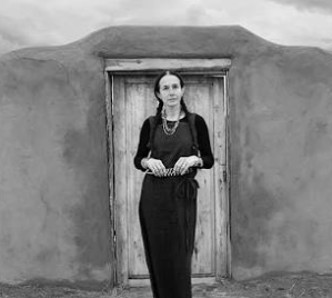
Mary Ellen Mark

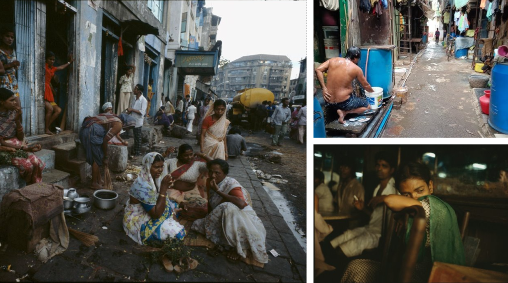
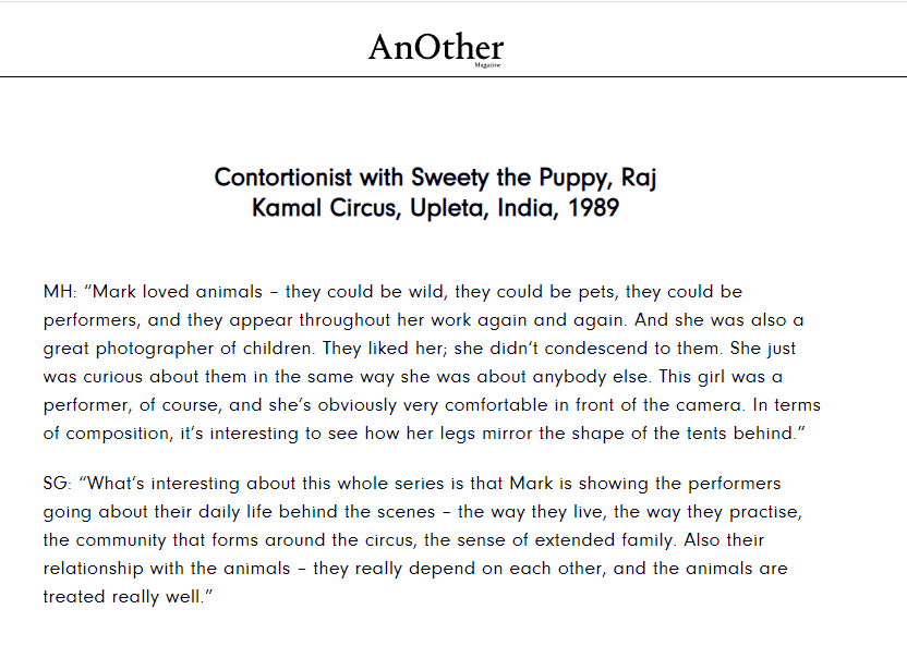
Mary Ellen Mark (March 20, 1940 – May 25, 2015) was an American photographer known for her photojournalism, documentary photography, portraiture, and advertising photography. She photographed people who were “away from mainstream society and toward its more interesting, often troubled fringes”

“she portrayed the street girls of Bombay (now Mumbai) in all their exoticism and ennui, as well as the often cramped and dirty spaces they were forced to work in. Her images were never vicarious or salacious, but always shot through with a sense of her own humanity.”

She returned to India to shoot travelling circuses,

-Another magazine

Virtual Gallery

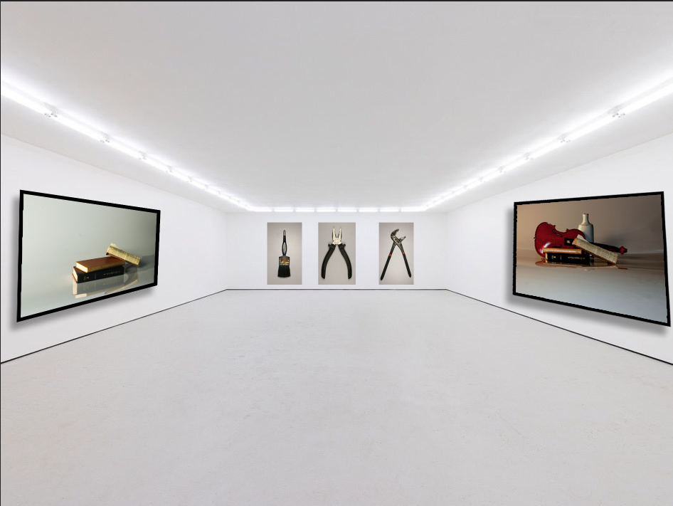
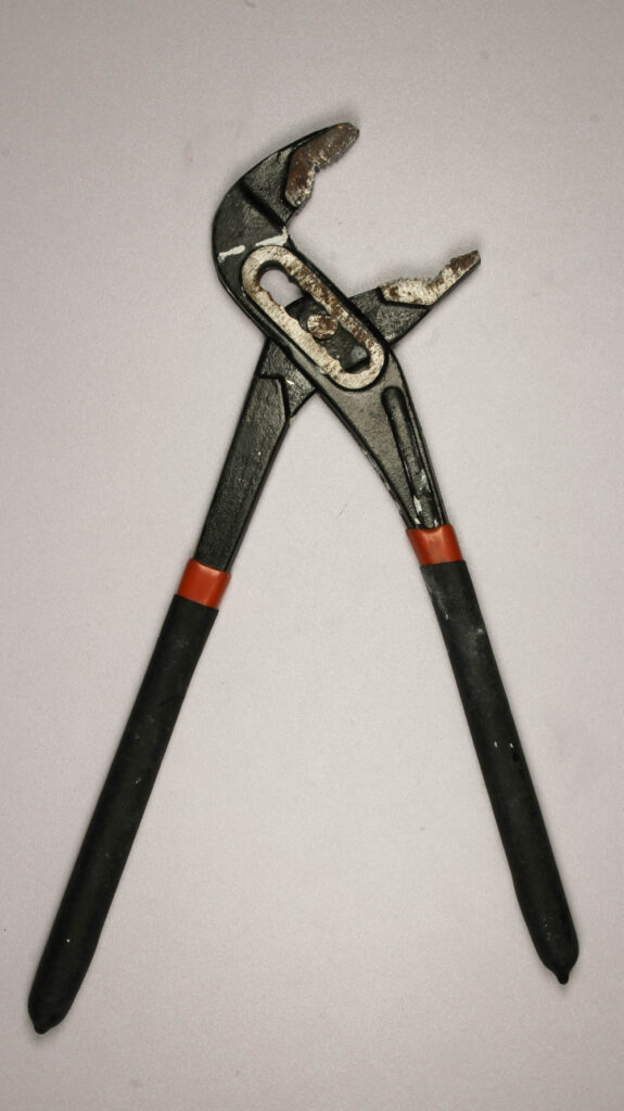
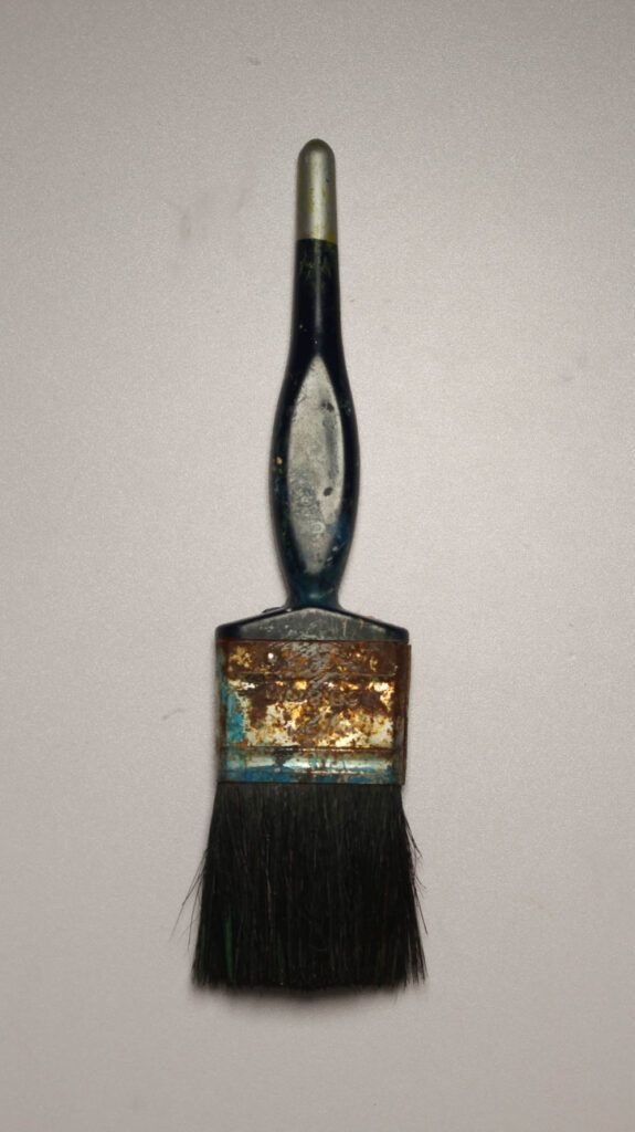
This is my virtual gallery where I have presented my favourite photos that I have taken. I chose this layout because it is very plain and lets you focus on the photos without having any distractions in the background. I have put in two of my favourite still life images on the side and my tools object photos at the back in a row for an organised gallery. The frames around the still life images are plain black to make the photos easily visible and make them stand out more. They are angled forwards and with shadows for a 3D look to make it look like they are in an actual gallery.

I chose this photo because I like the colder tones of this photo rather than the warmer tones of the violin picture opposite it. it is a nice comparison in still life and shows how there is both cold and warm tones in both photos that has similar vibes but different contrasts.

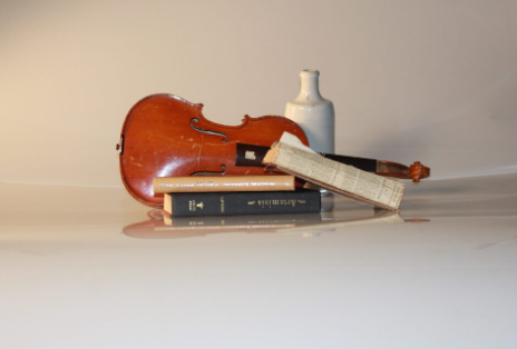
I used this photo because I really like the angle its shot at and it contrasts nicely with the other still like imagine in the gallery. the violin is a warm tone and it looked better than when it was originally dull and neutral.

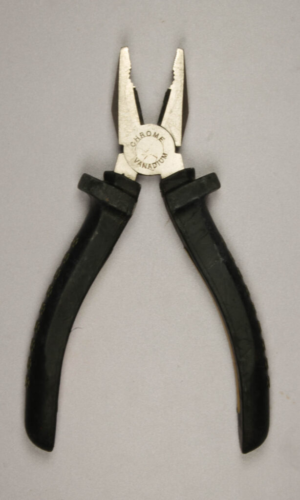
For these formalism photos I have presented at the back of my gallery because I think it looks organised and neat compared to if they were spread around on the walls. I chose these three photos as I think they are the best looking out of the tools photoshoot and I like how I have presented them in the gallery.