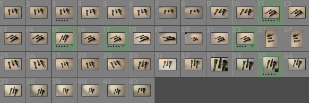
Contact sheet for my photoshoot inspired by Walker Evans, I have highlighted my favourite photos in green.
For this photoshoot, I experimented using more than one of the same objects. Overall, I thought this created an interesting photograph when captured at different angles because it gives a 3 dimensional view, rather than photographing from a birds eye view which gives a 2 dimensional effect – this was what William Eggleston did. He captured his photographs from one angle as this was done to get your direct focus solely on the object, however I wanted to achieve this from different angles and with a few objects. This overall effect created a really interesting photo to look at, as it created a unique look. For each photo below, the first ones I haven’t edited whereas the second ones I have. I thought they didn’t need much editing as I had experimented using different light, which gave the right warmth and contrast of tones that I wanted. However, I still edited most as I wanted to make them more clearer and highlight each individual object making them bolder. This also enhanced the detail on the brushes making a bolder look.
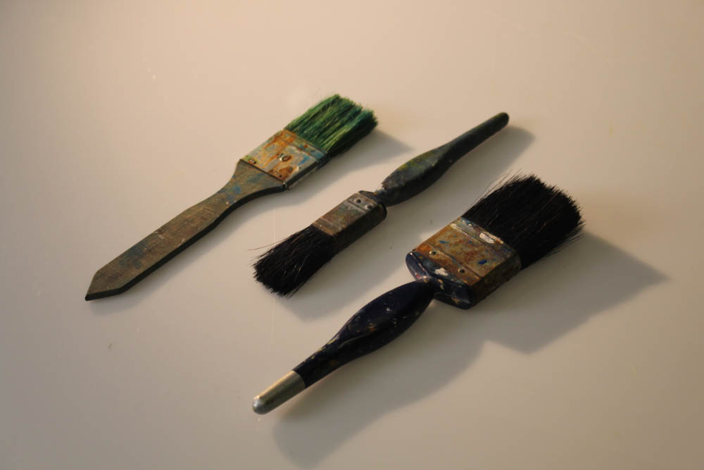
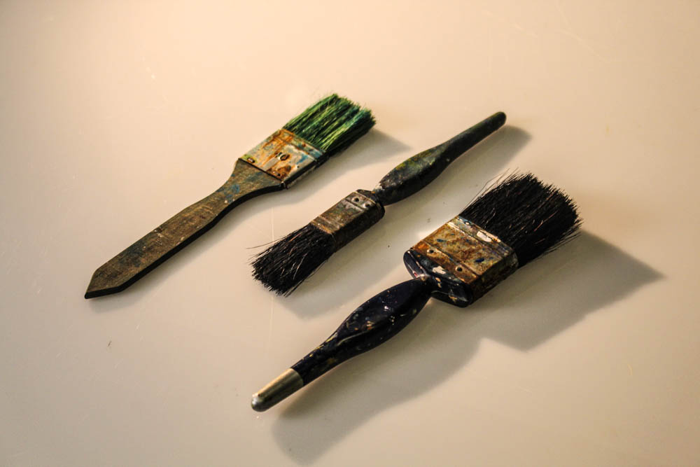
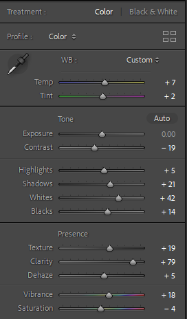
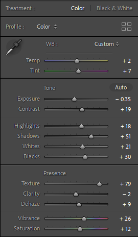
I edited the photo on light-room, as you can see I sightly edited the tone and presence which enhances the tones and colour of the photo, overall achieving a really bold and unique look. I also like how the shadows are captured on the side which really enhance the objects.
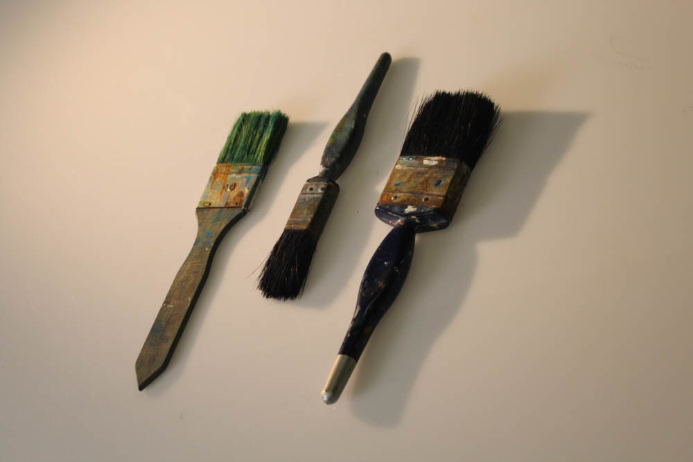
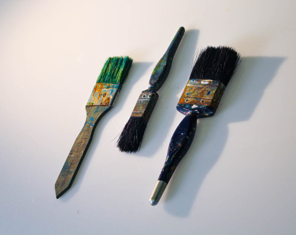
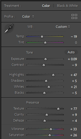
Here I edited this photo to give a cooler and more modern look, instead of a warmer tone. I think this made the photograph look more bolder as it is bright and gets your focus easier.
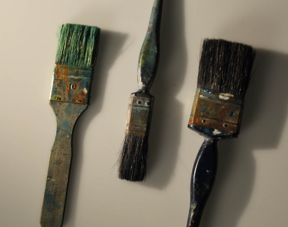
I didn’t edit this photo as I already preferred the look it gave. I thought the way I positioned the objects made it a really effective photo as creates an interesting look leading your eye into different parts of the photo, as it draws you in, in from many angles.
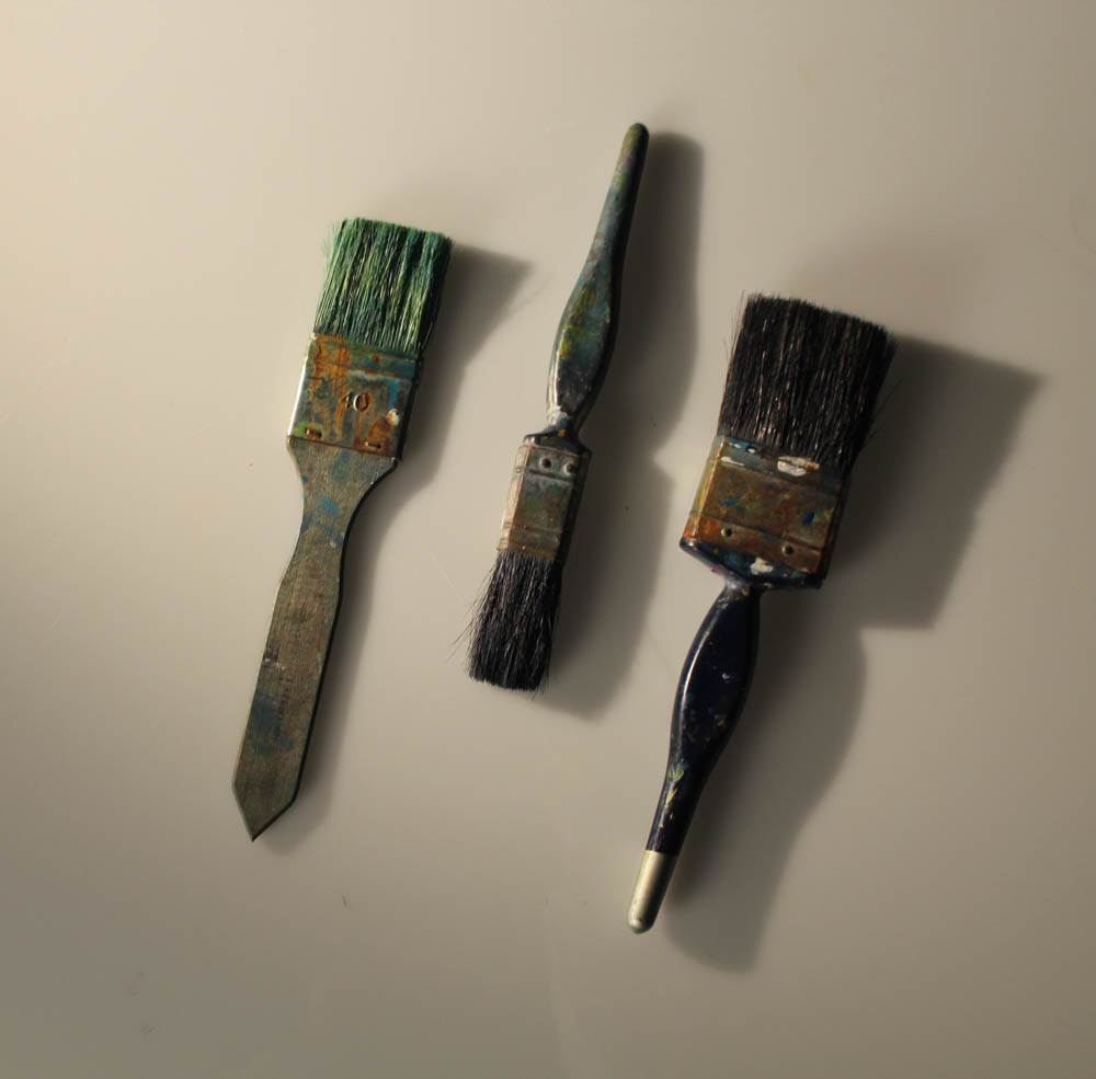
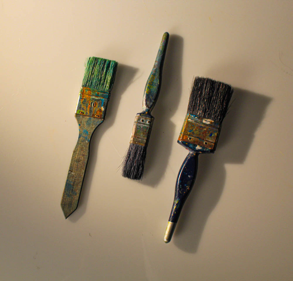
For this photo, I edited it to really emphasise the details and colours on the brush while also capturing from a straight on birds eye view inspired by William Eggleston. I left the negative space around the objects because I wanted to create depth and a fixed focus on them.
