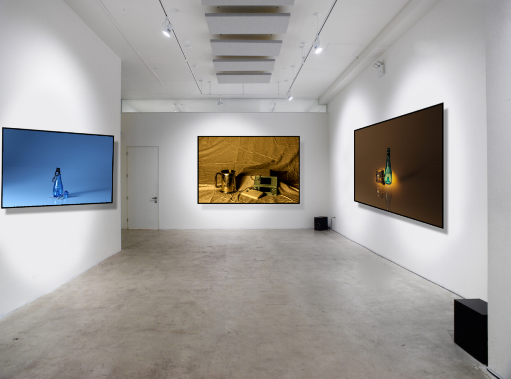
In this virtual gallery, I used my favourite ‘still life images’. I like this layout because the smooth and textured photos contrast really well together. I like the way that the two photos that are opposite to each other include similar objects but are photographed with two different tones, cool and warm. Both of these images have a smooth textured background, and the photo that is centred has a rough textured background which creates a contrast between all of these photographs.
