The photos I used:
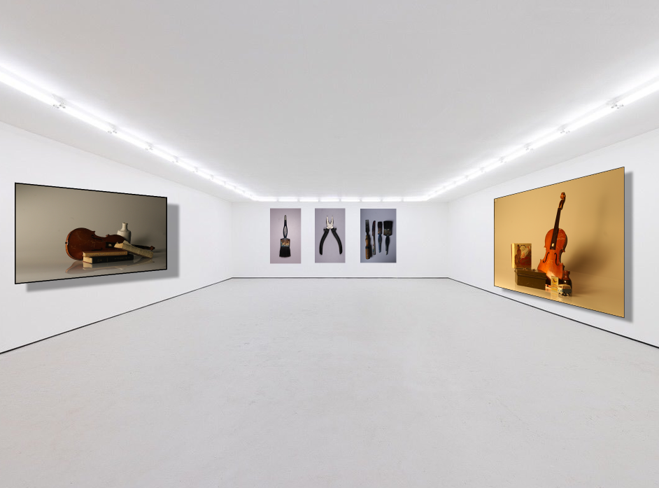

Firstly, I used this photograph in the genre (still life) so I included all genres we have covered so far. I used this image as it has a warm tone, landscape and therefore differs from the other images I used. It also has outstanding and unique objects in a special arrangement so in my opinion, without this image the gallery may look dull and boring to look at. However, in order for not all the attention and eye catching features to draw the eye to the one image I attempted to balance it out by using another still life photograph shown below.
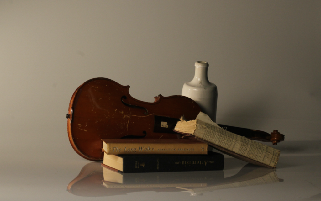
Although this photograph has a dull tone, it is still eye catching by the correct amount with the amount of depth to the shadow, increased highlights and exposure. It also has unique qualities from the objects and the arrangement. Since I have used 2 landscape still life photos. I then added 3 portrait formalism images to break up the pattern of still life and landscape.
Formalism images I used:
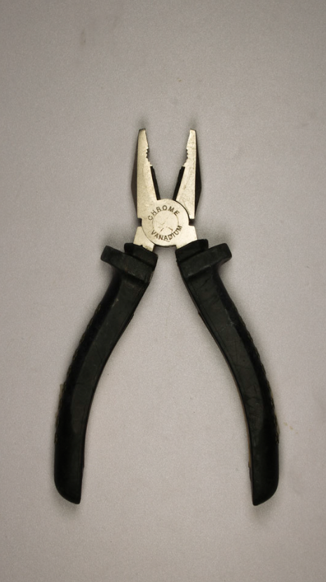
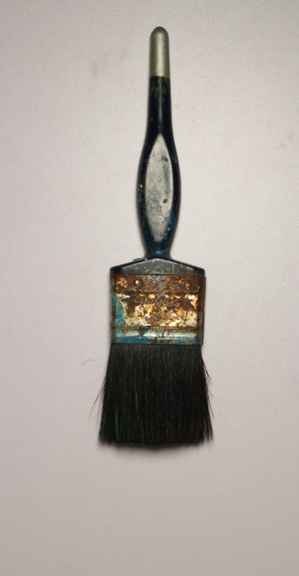
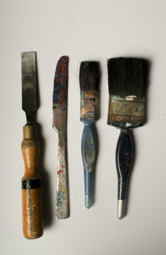
I have chosen these images as they are a wide variation of formalism. The first photo includes a daily and useful object which relates to Evan’s work since his purpose is to value and celebrate the man-made objects. The singular object symbolizes the importance of the image and eye catching with a plain background. I then used a paintbrush behind a plain white background which is similar to the first. To create a variation I added an image with 4 other objects to make it differ. Another quality that contrasts with the other images is that I included a knife in the image. This could possibly signify that although we do not think about it. Cutlery is a daily and necessary object in our lives. This relates to Evans work just simply in more of a hidden way.
I could improve my gallery by making my formalism photographs black and white so it relates to Evan’s and Regan’s work and also differs from my still life photographs on the side to create a variation and contrast in my gallery.
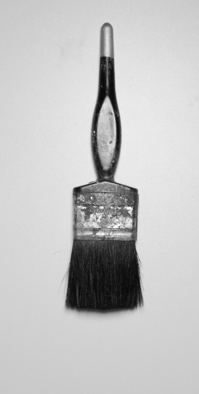
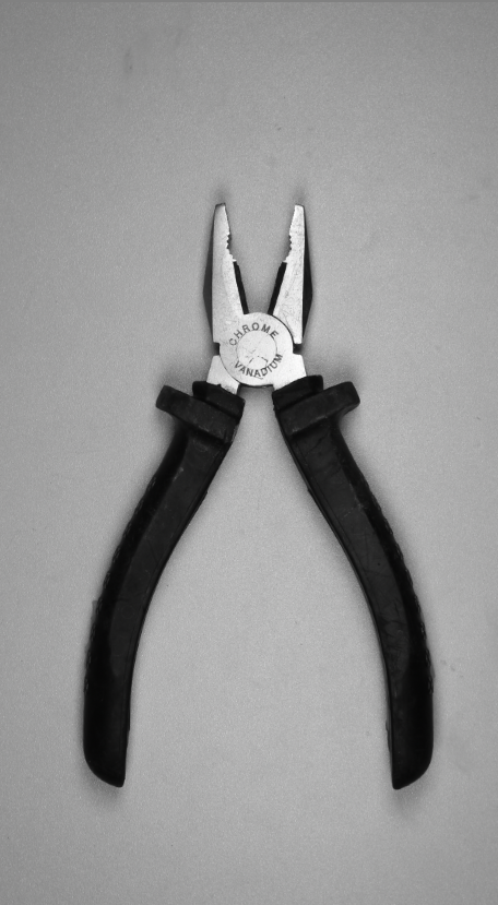
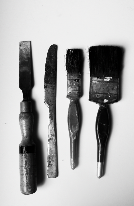
In these photos, I increased the exposure to make it more clear meanwhile decreasing the contrast to create more vivid detail. Lastly, I decreased the shadows to create more interesting features to make the objects look as if they are levitating so they are similar to Evan and Regan’s work and increased the highlights.

Lainey
JAC 23 Oct: there are some confident images amongst your blog posts, with a good effort being made to make sense of the process too. Use this to help…
Follow the 10 Step Process and create multiple blog posts for each unit to ensure you tackle all Assessment Objectives thoroughly :
Mood-board, definition and introduction (AO1)
Mind-map of ideas (AO1)
Artist References / Case Studies (must include image analysis) (AO1)
Photo-shoot Action Plan (AO3)
Multiple Photoshoots + contact sheets (AO3)
Image Selection, sub selection, review and refine ideas (AO2)
Image Editing/ manipulation / experimentation (AO2)
Presentation of final outcomes (AO4)
Compare and contrast your work to your artist reference(AO1)
Evaluation and Critique (AO1+AO4)