Photo #1
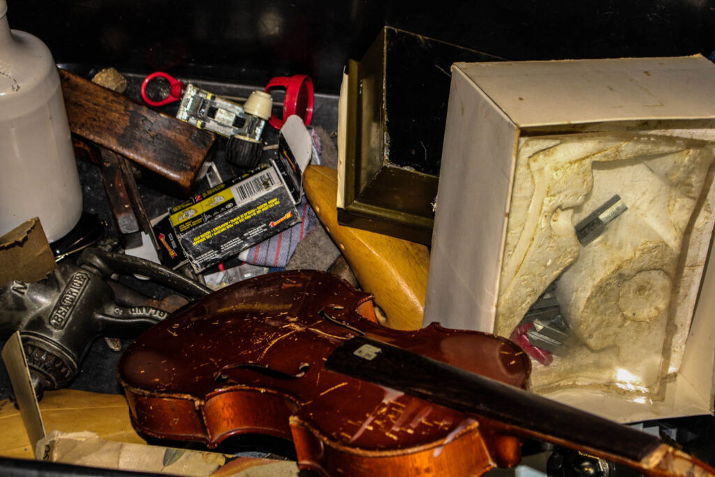
Within the technical aspect of this photo, I would say it has a dimmer type of lighting, the flash on the camera makes it seem as if the room was dimly lit but the flash lights up the objects I am taking photos of. I think its tonal range is quite different, it seems to have many variations, there is a big difference between the photos light parts such as the glare you can see on the plastic, compared to its dark points like the black box the objects are in. Within the visual elements of this photo, its colours are very beige and just dull in general. You can see the glare on the plastic which reflects too its texture. These are all clearly 3D objects/shapes. Some context behind this photo, would be that these are all the objects other people were taking still life photos of, so rather then being the same as all of them and propping these objects up someone where in a neat order I instead have shown them how they really were. You can see the everyday wear to theses objects in my photo and I think that’s what makes it really special as you can see these objects are really helping students produce the work they are wanting too.
Photo #2
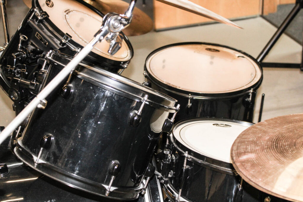
This image is very brightly lit, you can see the florescent lighting in the celling lighting up the drum kit and the glare of the lighting really shows the rings on the cylinder which show the texture. You can see that this image is more zoomed in then how the human eye would see it and I did this because i really wanted the pure texture and the dirt on the drum kit really proves life, it proves how many songs have been played on this drum set, how many people have persuade there passion and just purely how many people this drum kit has made happy.
Photo #3
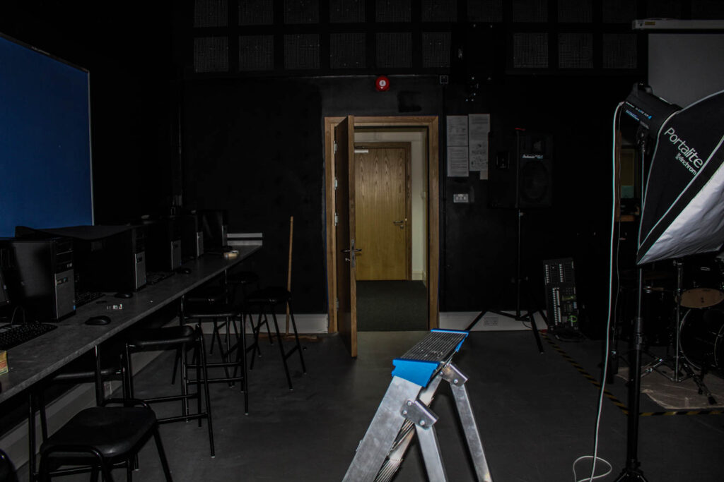
I think that this is my personal favourite photo, it may not be your typical still life photo but I personally love the contrast of the lighting within this photo. The sharp harsh flash on the camera provides a shine on the step ladder but then there is a dim area between the doors and the ladder, the dimly lit room could contain anything. The light within the door and the corridor is florescent lit my average school lights, but these lights have lit up so many people, so many different lives, lives that have gone onto so many different things, proving that everyone may come from the same place but not everyone is the same.
Photo #4
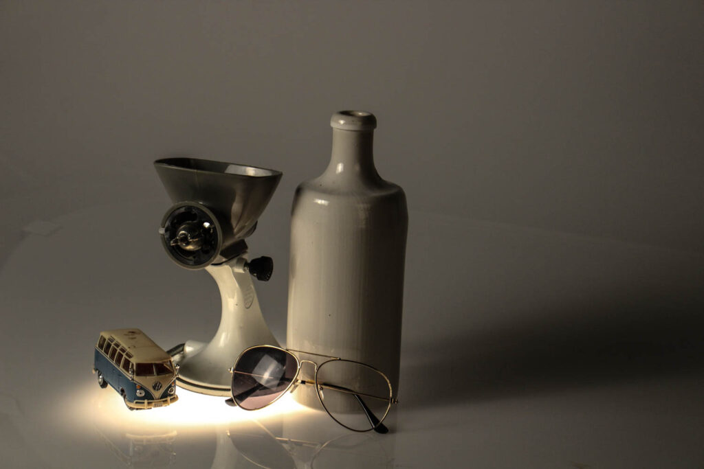
This photo has very key elements of white, the photos colour contrast makes you really focus on the blue caravan as the background is white and the other objects are white discarding the sunglasses. The light coming up through the bottom aims more focus onto the objects and really makes them clear in your point of view. The tone of this image, the clear light bottom compare too the darker background really makes you focus onto the shadows of the image, showing the size of the items I am taking photos of. The white bottle has a glare on it of the light reflecting which portrays its smooth ceramic texture. This image has a sort of repetition pattern, there are two larger objects, then two smaller objects placed in front of them, this yet again portrays the effect of size, which is part of the composition.
Photo #4
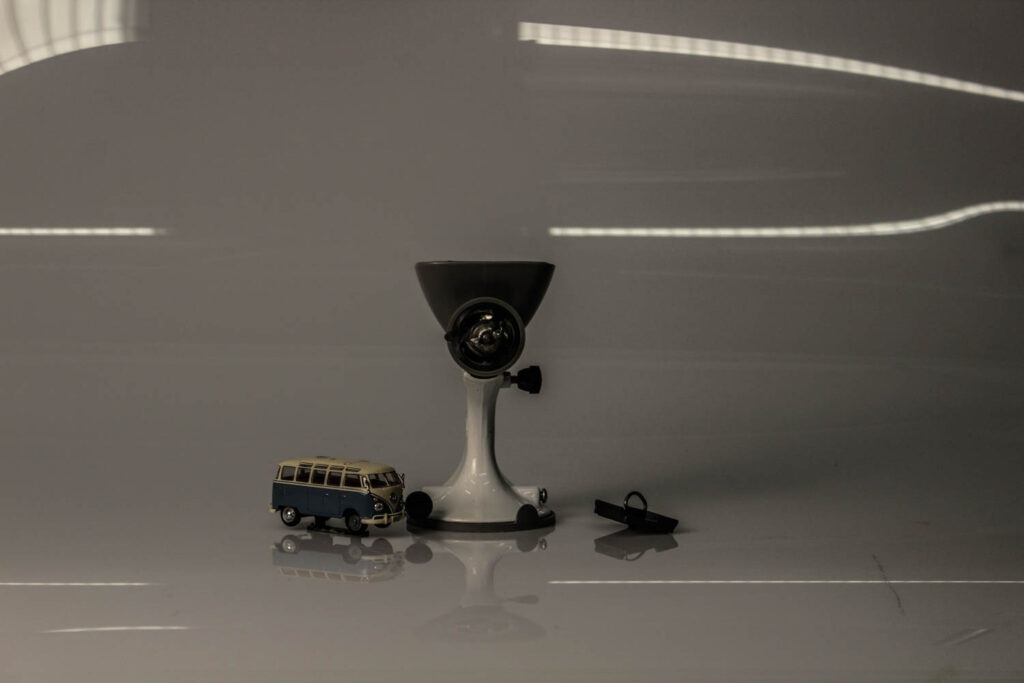
This photo has very dim lighting, some may say this photo isn’t “useable” due to how unlit it seems, but I personally like the dullness of this photo, I fell like it leaves a sense of mystery and just darkness in general, almost as if its portraying a season, the season of winter, the dull morning and the dull nights, and i feel like the emptiness of the photo which is helped with the objects composition represents the coldness. This image is a bit under exposed, leaving a little bit of a blur in the photo and a mysteriousness of what the objects of the right actually is because its so dimly lit. The image has a 3D form, you can clearly see that these are real life 3D objects, objects that are useable and grabbable. This photo mainly lead the eye to the foreground the objects which are right in the centre, but it also leads the eye to the massive white sheet in the background purely due to its vast emptiness. almost like a blackhole. I feel like the emptiness of this image has a deeper meaning, the big spaces between the objects, compared with the how far away the camera is leaving spare on the left and on the right of the objects.

Shelby
Aim to keep to this logical yet creative sequence of blog posts to help you make sense of what we are doing.
Follow the 10 Step Process and create multiple blog posts for each unit to ensure you tackle all Assessment Objectives thoroughly :
Mood-board, definition and introduction (AO1)
Mind-map of ideas (AO1)
Artist References / Case Studies (must include image analysis) (AO1)
Photo-shoot Action Plan (AO3)
Multiple Photoshoots + contact sheets (AO3)
Image Selection, sub selection, review and refine ideas (AO2)
Image Editing/ manipulation / experimentation (AO2)
Presentation of final outcomes (AO4)
Compare and contrast your work to your artist reference(AO1)
Evaluation and Critique (AO1+AO4)