Edited Single Object Photoshoot

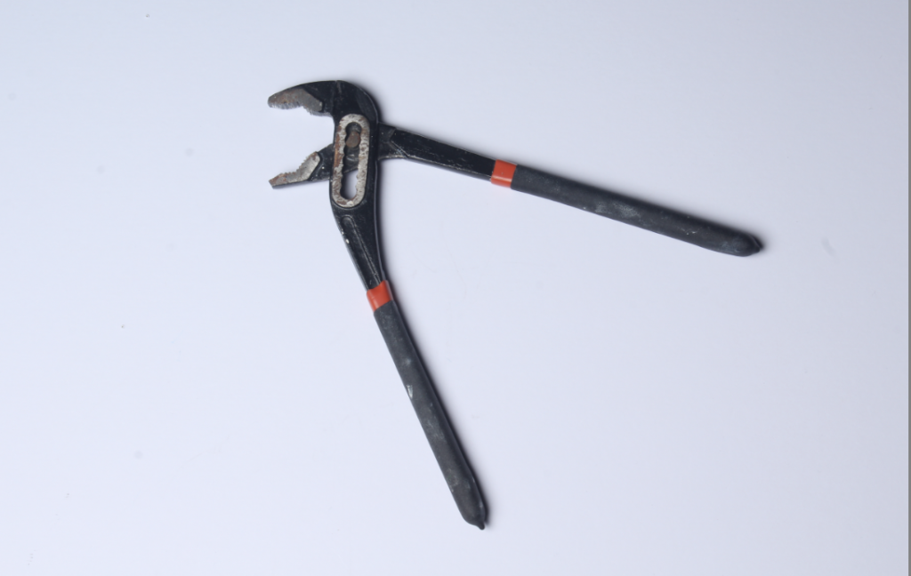
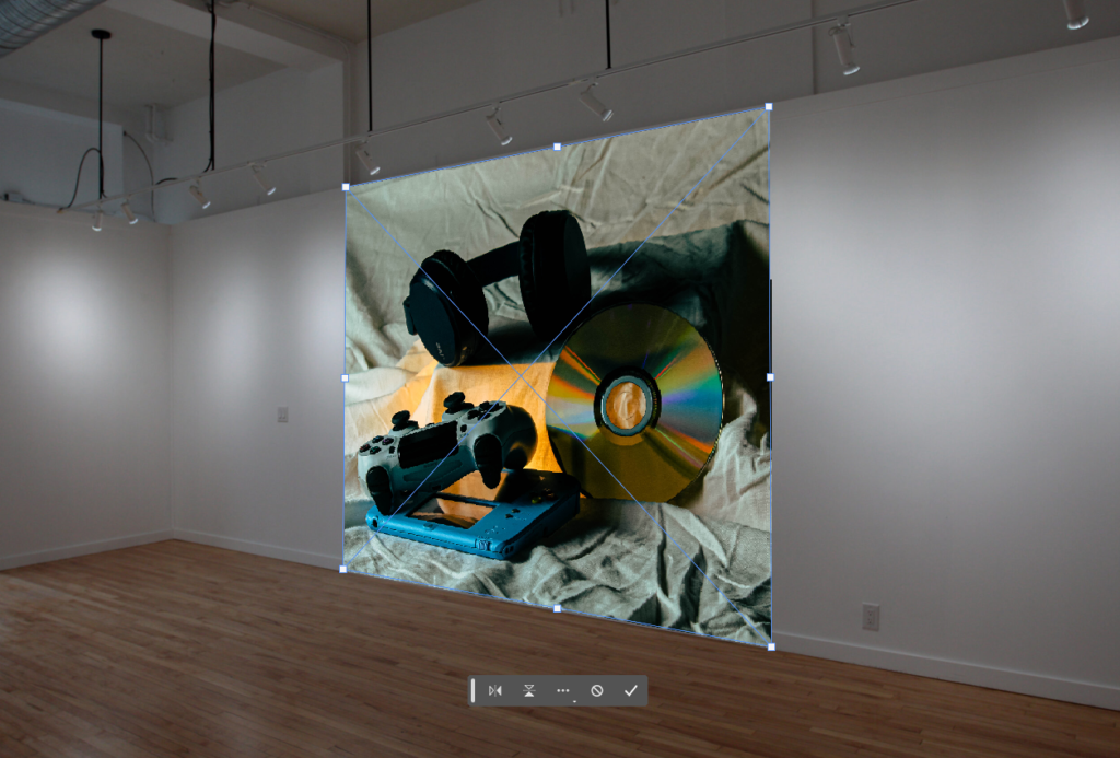
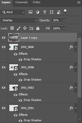
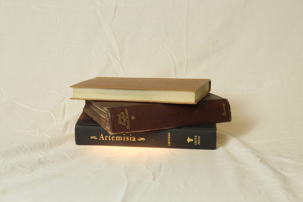
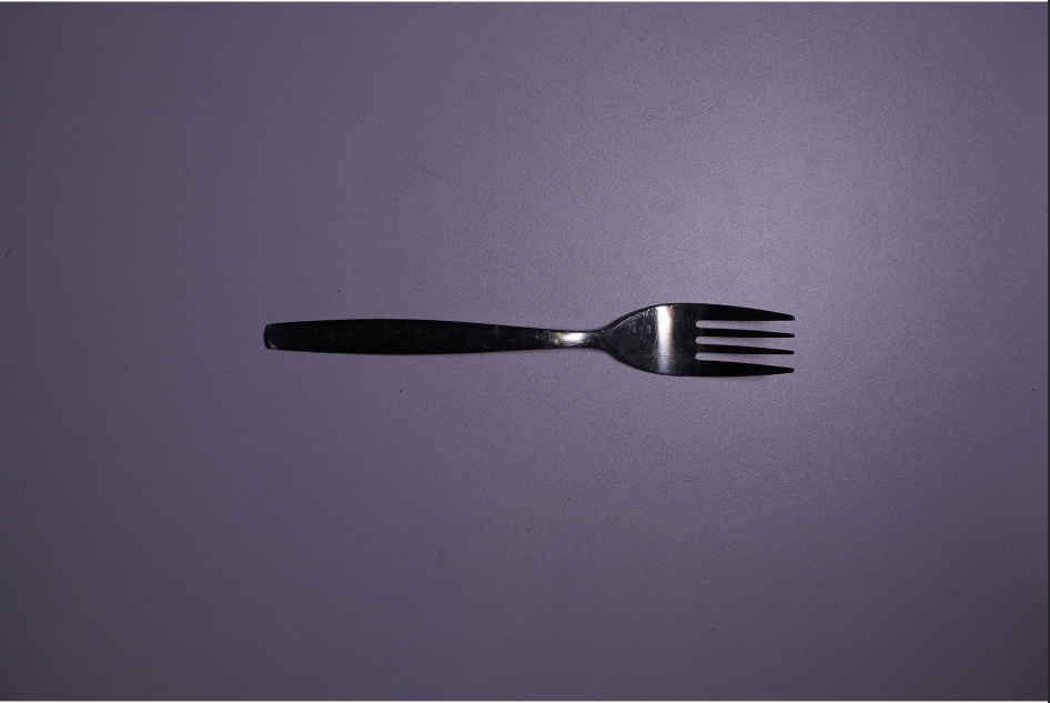
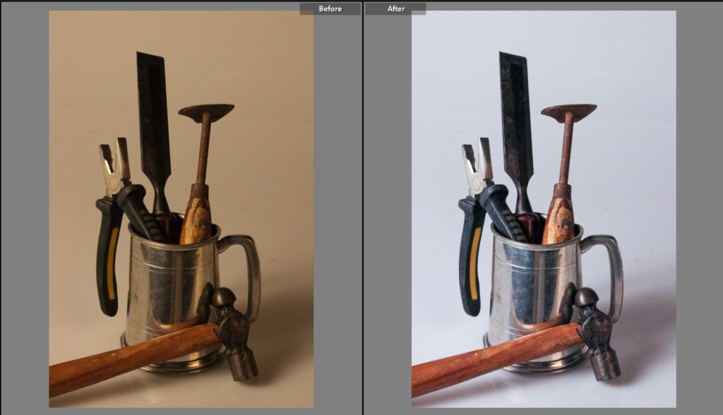
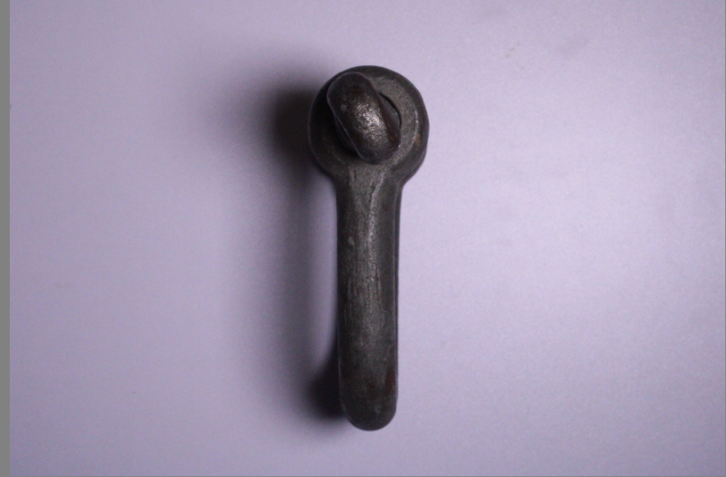
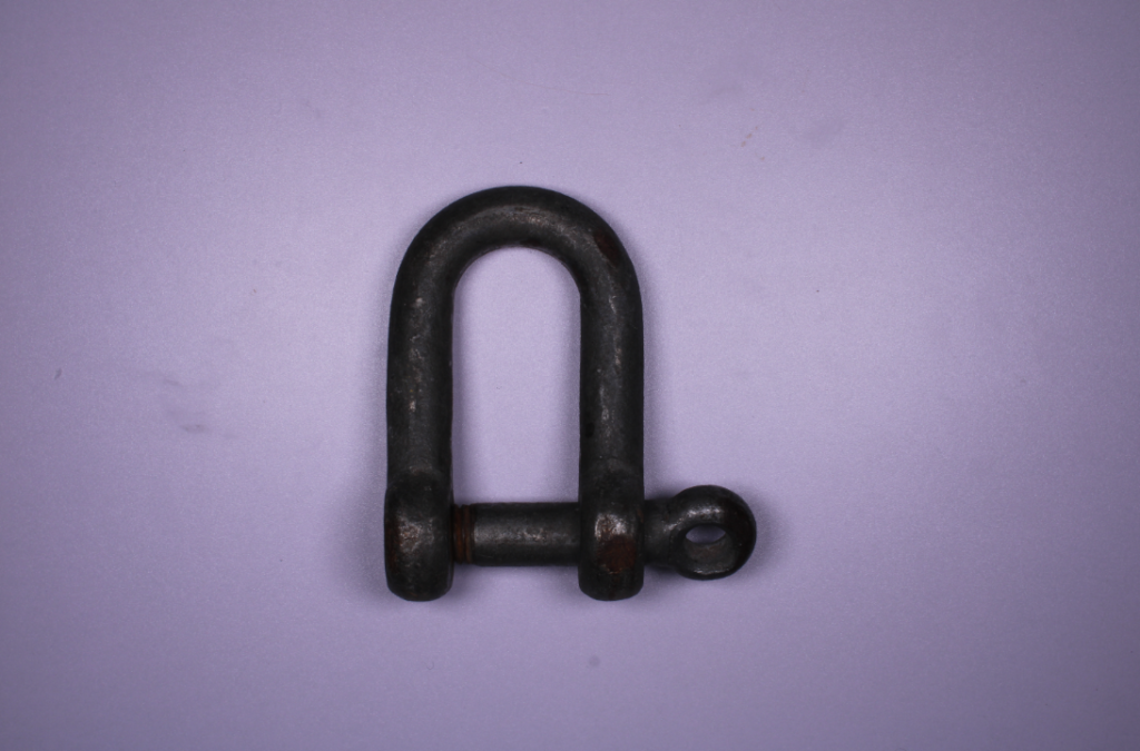
This is one photo I took of a single tool using different lighting, This is the image before I started editing.

this was the image once it was edited.

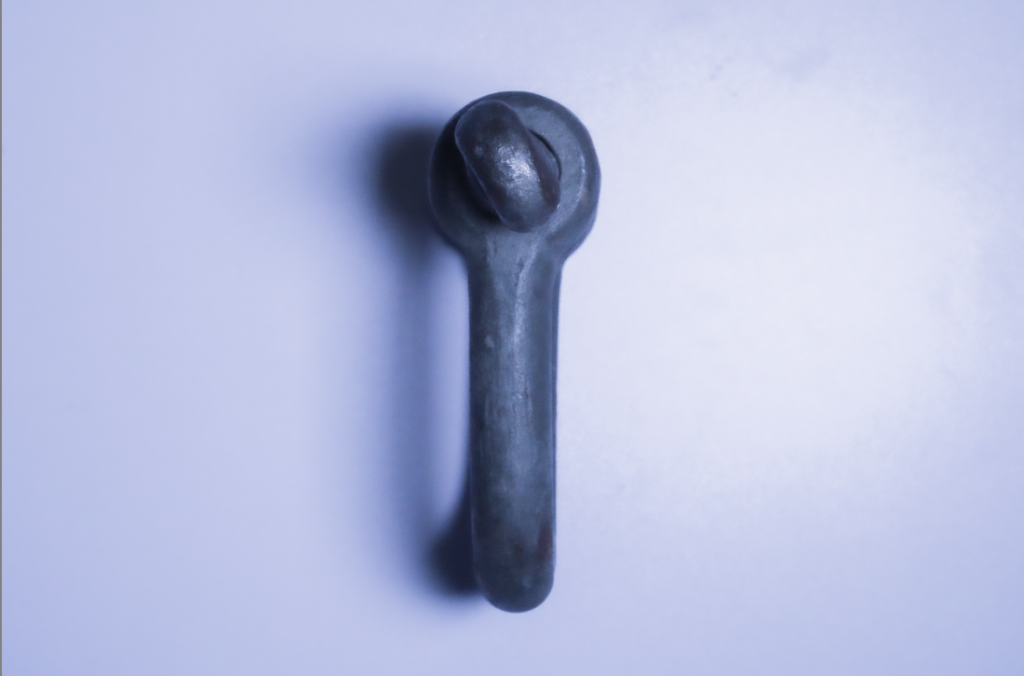
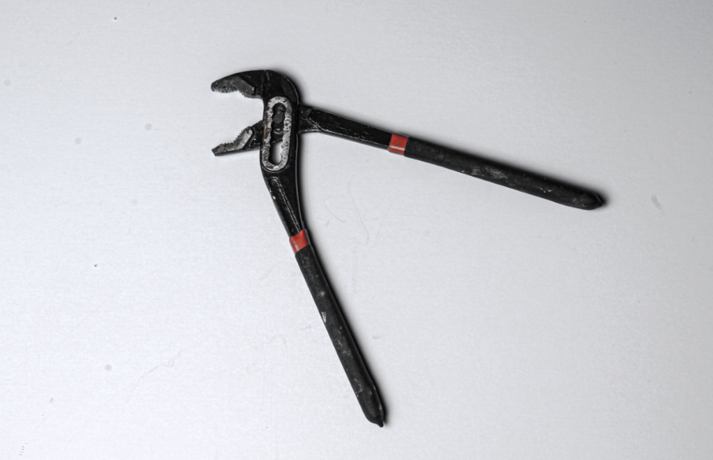
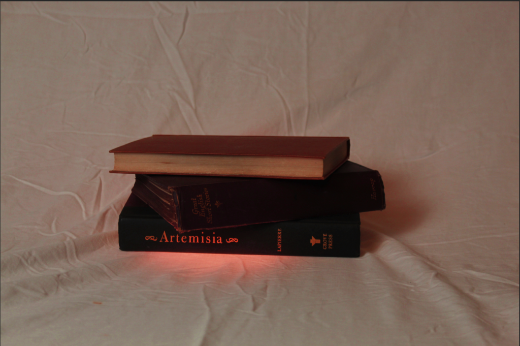
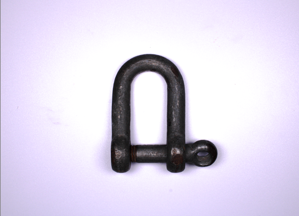
The reason I edited it like this was because I was being inspired by Walker Evans. What I like about Walker Evans is the grey and white dark effect, giving the emotion and thought of loneliness with the single object and lighting, so I tried this effect with this image.

I lowered the temp of the photo very slightly as I thought that when I lowered it more it turned to cold and too blue which wasn’t what I was going for and if I bright it up it would be too yellow or orange which would also be wrong.

With the exposure I put it up, again not by much as if i did it too much it would be very bright and just white or too dark and then practically black, so I had to get it right so it was dark enough it gave the gloomy effect I wanted but not too dark you couldn’t even see the image.

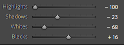
when it came to the highlights, shadows, whites and blacks all corporate together so I had to bare with and focus as i got them all correct. I had the whites high enough you could see the shaping and lighter parts of the tool and the background so that the tool and shadow stood out but not enough it took away the theme and emotion i was going for. but too dark would have blended in the shadow and tool too much to not distinguish the contrast of the colours and object’s.

when I first edited I tried the texture and thought I wanted it to be +100 but when I did it I didn’t like it because although I wanted the tool to be textured to give more character and effect, but once I did it, it gave the background a blurry and fuzzy textured look which is not what I wanted. As I lowered the texture I really like the non textured look on the tool. it also fixed the background problem. But the smooth tool just looked really good in my mind and actually worked with the emotion and look I wanted better then I thought it would have.

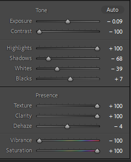
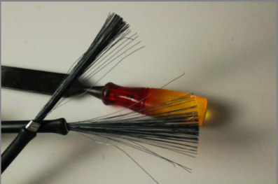
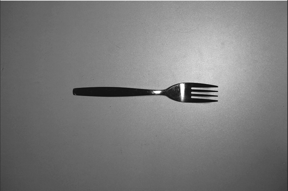
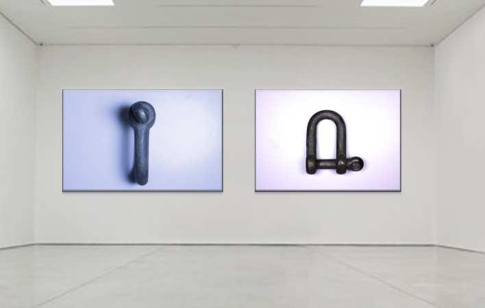
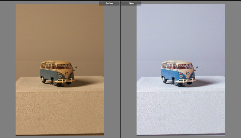
This was another image I took of the same tool but from a different angle of it, I liked it but wanted to edit and change it differently but still along the same Walker Evans idea.

this was it once it was edited because I went for a different but same affect.

firstly I cropped it so the actual object was more centre, because I wanted the tool to take centre spotlight, and be the main thing that people notice, obviously there isn’t much else in the image but with the object being off centre I think it just looked wrong and gave too much attention to the background.

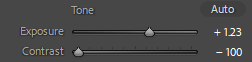
After that I changed he exposure and contrast they are quite opposite of each other and this is because when i did this i realised that it made the darkness of the tool pop out of the whiteness of the background even more because they are both opposite colours I could really make it pop out without being too dark, you couldn’t even see the detail of the the tool.

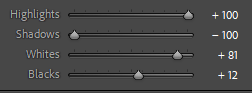
With the whites, blacks, shadows and highlights i had them all practically opposite each other so the dark of the tool stood out and the whites of the background contrasted.

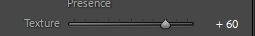
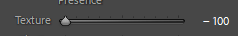
lastly I changed the texture as I actually wanted to see the texture of the tools but not the whole way so I couldn’t see the texture of the background and the tool stood out more.

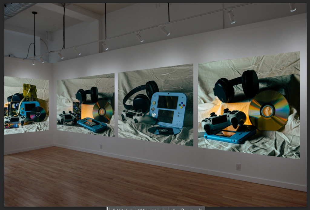
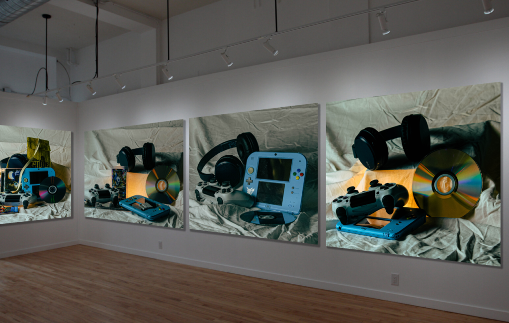
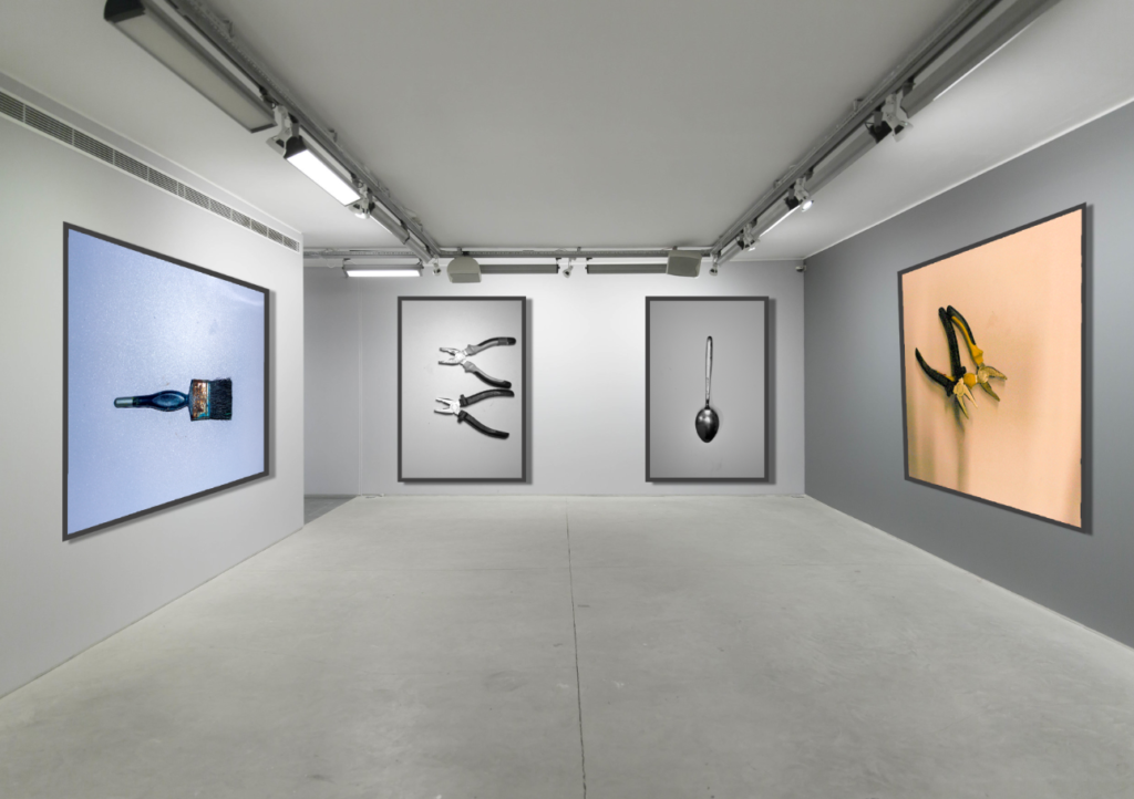
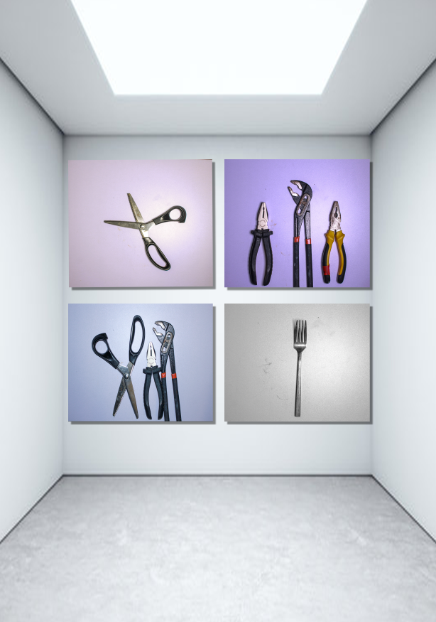
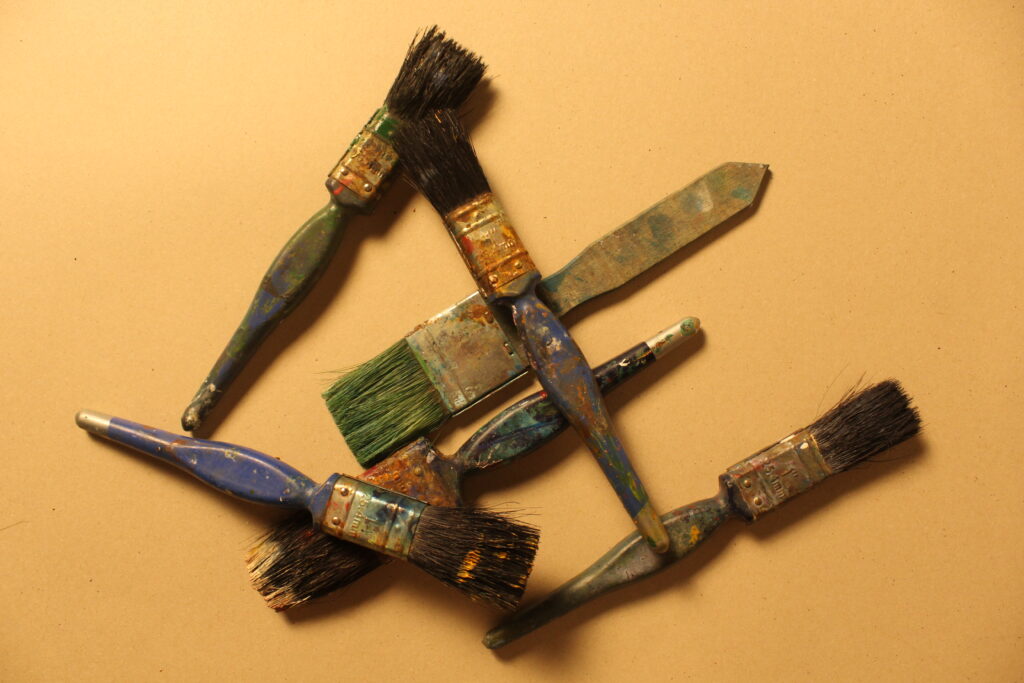
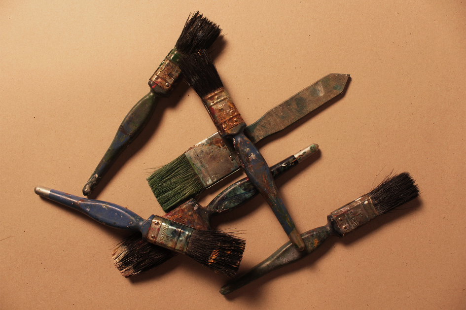
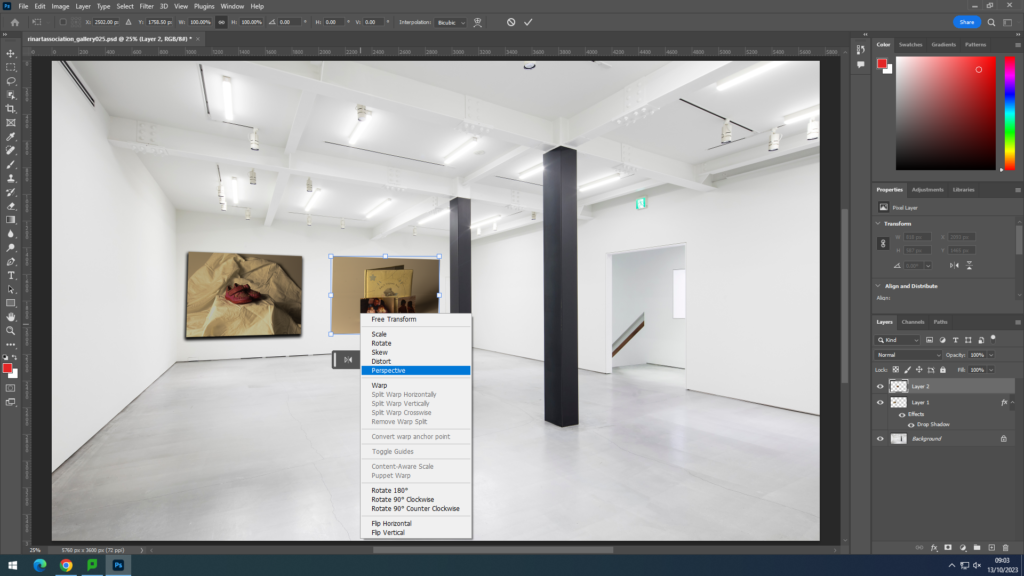
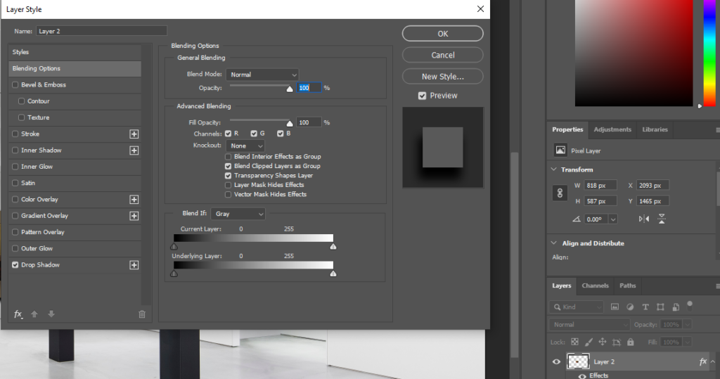
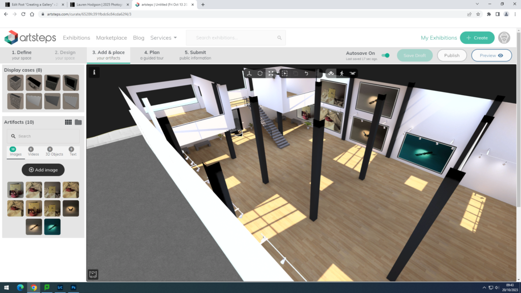
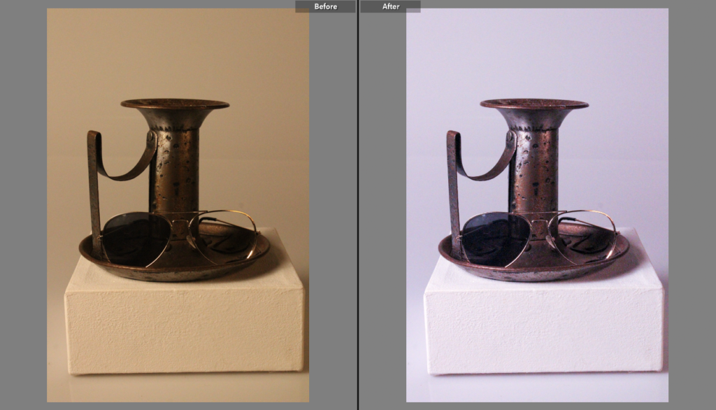
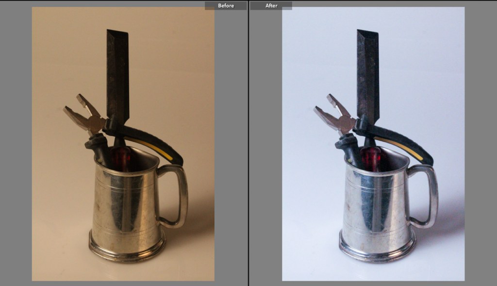
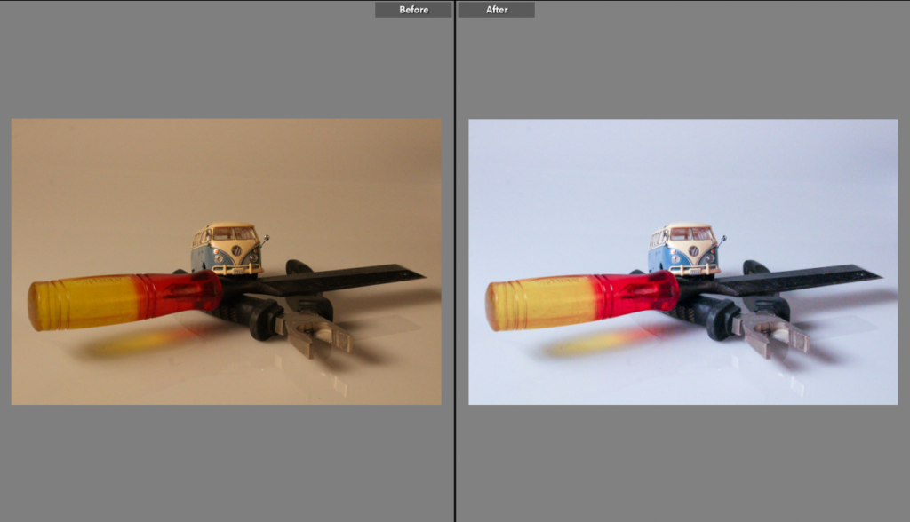
These are some more images next to there edited one and what I did to them.

Gallery – Still Life

Gallery

Edits on Photoshop How I created the gallery of my still life photos on:

Editing the perspective of the images, so they look naturally displayed on the wall

Drop Shadow

Layers

I duplicated the background and changed the blending option to overlay, to make the images look more natural in the gallery space

Final Still life images

The shape and the colour of the objects contrast between the white background and make the handle of the object stand out and also helps make the other object stand out against the coloured background.

These are my final images for the Single Object photoshoot as they capture the “Wonders of the common tool” the best out of all other images and they make the objects used look much more fascinating than they would before.

Photoshop edits –

I wanted to try and change up how I was editing my photos by using a different platform to edit so I decided to use photoshop to change my style a little and to give variety to my editing skills.

Still Life photos –

Before editing :

After editing :

As you can see, I decided to add a red hue to the lighting through photoshop, making the lighting more of a focus point in the photo.

This was the first edit I have done on photoshop but for the next one I want to try and create something more exciting.

formalism –

before editing :

after editing :

For this photo I decided to change the hue of the background to more of a colder orangey brown to almost give it a vintage look trying to stay on the theme of nostalgia.

I wanted to also bring clarity to the photo, to help show finer details that may have been unclear in the first initial shot. This also brought more dimension to the paint brushes in the photo which in affect enhanced the shadows created in the photo.

single object photos :

before editing :

after editing :

I wanted to take a different approach with this photo changing the colours to black and white.

I did this to enhance the highlights that are shown on the object ( fork ). The exposure was also changed to make sure that the photo didn’t look gloomy or too dark, I wanted it to be as clear as possible but still keeping the black and white effect.

On this photo, the clarity was also heightened to help the viewer see the smaller details of the object in the photo. With the clarity being heightened it made the darkness of the shadows creep back but that was sorted with slight gamma control on the exposure.

Single Object Gallery And Evaluation

I selected these two photos for my final presentation, I presented them in a gallery form using adobe photo shot. I picked these two because out of all of them I liked them the most, I thought they went well in the topic and was most lie my inspiration of Walker Evans.

This wasn’t my favorite topic as I didn’t find it as exciting taking photos of just single objects and dint show the best of my ability, I also thought while i’m still getting used to the camera and editing on adobe light room it is not the best I can do.

Even when looking at these final images now i see improvements that can be made, with the image on the left although i wanted that cooler temperature it was still too bluey and i think it was because there was something not right with my lighting and when i first took the photo there was a purple background. The image on the right is actually better i think because i increased the contrast so the darker colour really stands out more on the white background. You cant see very well in these photos but there are slight smudges in the background that i also dont like and when improving and learning more about photo shot i can edit those out.

Overall, i do like these images and of course they can improve but this was not my favorite topic.

Virtual Gallery – Artsteps

I have used Artsteps to create a virtual gallery as an exhibition with some of my best images.

I exported each image to my best images folder so I could easily access them. Then I imported them into Artsteps. This was really quick and easy.

Then, I dragged and dropped each image into the exhibition.

I altered the images sizing and placement on the wall, before adding a silver frame to make it look presentable.

Creating a Virtual Gallery

Photoshop:

My first attempt of the photo gallery was created on photoshop. I first had to open up google to search ‘Blank gallery space’ to find my background. after I chose the one that is shown above, I put it into photoshop and then went to my files to open the image I wanted to present. the images I chose were ones that I had edited previously on Lightroom. I got my images from Lightroom which were already edited beforehand and imported them into photoshop. I used ‘control T’ to highlight the imported image to be able to move it to where I needed it. I also used the Ctrl icon when adjusting the image to make the angles change and for the photo to sit nicely on a wall. Using a drop shadow effect, I could make the image look more realistic and 3D when on the wall.

In the screenshot below, it shows how I was able to create the drop shadow on the images to make them more look like a photo on a wall. all I had to do was double click on the layer I wanted to edit and then tick drop shadow at the bottom. from there, I was able to adjust the amount of shadow and the angle I wanted it at.

Artsteps:

This was my attempt of the photo gallery using Artsteps. This was an easier process than photoshop as you can move around and choose the wall you want your image on while being in a large space. it doesn’t involve the added work of adjusting the image to a certain angle on a wall ands you can also add your own borders. You are also given the option to add more fixtures for your photos to go on so I experimented with that and added 2 walls on top of each other in the middle of the room. I chose my favourite photos from my Still Life Nostalgia photoshoot and then my favourite photos from my Formalism/Tools photoshoot.

Evaluation

Overall, I like how my gallery turned out on Artsteps. I like the gallery space I chose as I have a lot of areas to choose from and add my images to. I prefer this more than photoshop as its an easier process and on photoshop the angles of the images sometimes don’t turn out right or look the wrong angle.

single object tools photoshoot :

Here is my first edit from my single objects tools photoshoot, from this photoshoot my images didn’t quite come out as I expected as they came out with a darker orange kind of tint on the images so I used Lightroom and changed the tint of the images to create the effect I originally wanted on the images.

For these final two images that I have edited I played around with the tint a bit more leaving a more blue kind of tint on my images which almost makes them stand out even more then my first pre-set I made.

these are my tools still life photos inspired by Darren Harvey-Reagan.