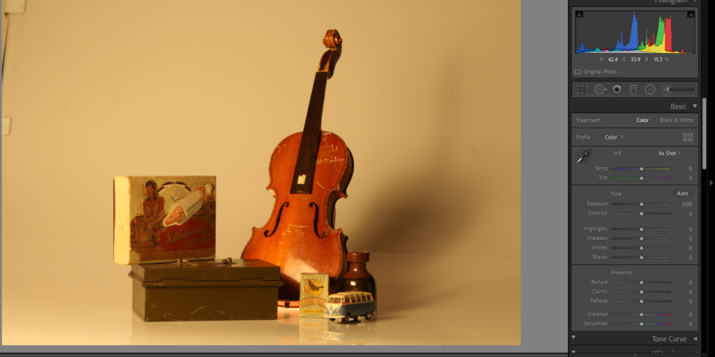
This image I took for still life, this is completely unedited on adobe light room. The only way it looks like how it does is from lighting I controlled in the studio
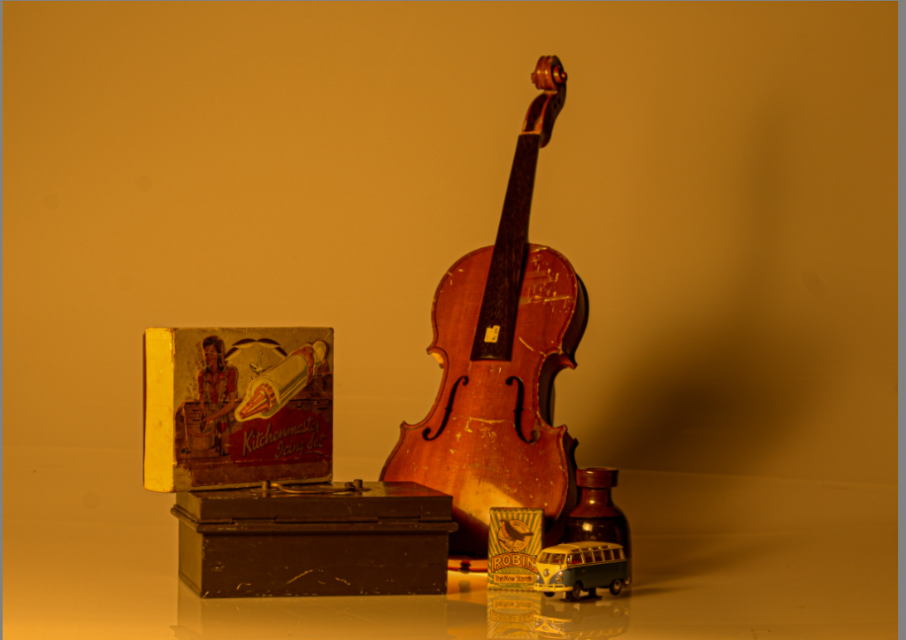
This was the finished product I do still believe there is work and more editing to make it perfect.
How I edited .

I firstly cropped the sides of the photo because you could see some of the side from the infinity light and I didn’t want that.

After that I added a tint of +30 to darken it but still have it that warm tone but make sure everything was tinted with that.


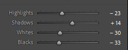
When it came to change shadows, highlights, blacks and whites, I mainly got rid of the whites and highlights not completely because I didn’t just want a black photo but just so the shadows and darker nit really stood out to deepen the story.

For texture I put it on +100 I love being able to see all the detail in every scratch and bump on all the objects I think it shows an antique, worn look.
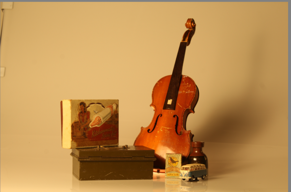
I took more of these photos with the same objects because I still think there is room for improvement with my last edited one I thought with this one I might try and do thing differently to see if I prefer.
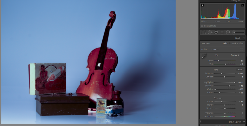
firstly I changed the temp -67 as it gives a cooler blue colour and makes it look colder which already starts the affect i am going for.

I didn’t change the tint because it would add to much of a bright unnatural colour when I wanted a natural cold look to tell a story of death and continue an empty lonely vibe when a bright green would not do that.

i lowered the exposure so it is less bright and continues that darker lighting, because it continues the affect

As you can see I put the highlights up to 100 as i really wanted you to be able to see where the light in shining from adding the effect of the shadows behind the objects but making the shadows bigger and darker by putting the shadows to 46 as it makes them look larger then the object and adds to the emotion and depth of the image that I was going for. It also links me back into nostalgia in a way if you are looking at it like the shadows is an older version looking down on the childhood that made them who they are yet they left it behind.
The whites and blacks are similar because I didn’t want the photo to genuinely be too light or dark and be overtaken by a completely different look.
