Here are my 3 final images:
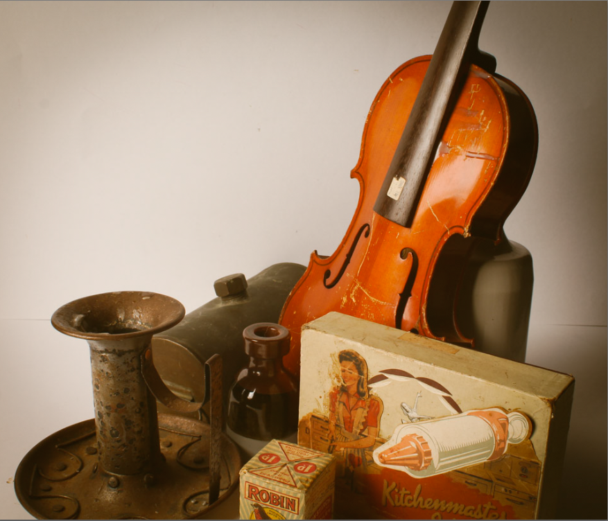
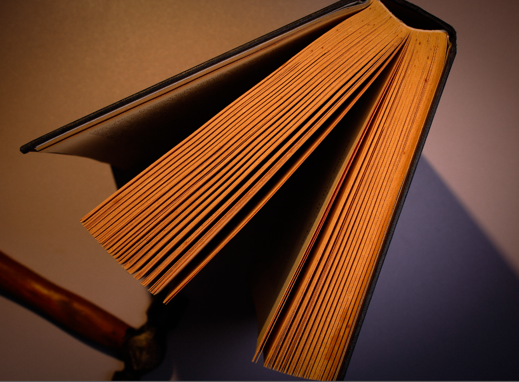
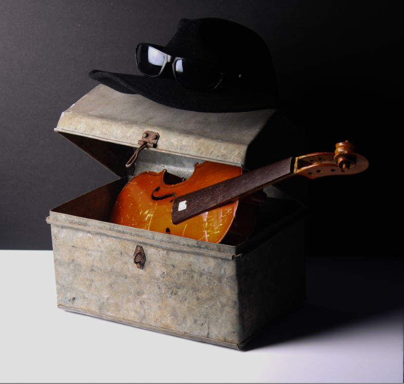
I chose these three as they are all very unique yet still have a nostalgic effect due to the old, worn objects :). I also think they will look good next to each other.
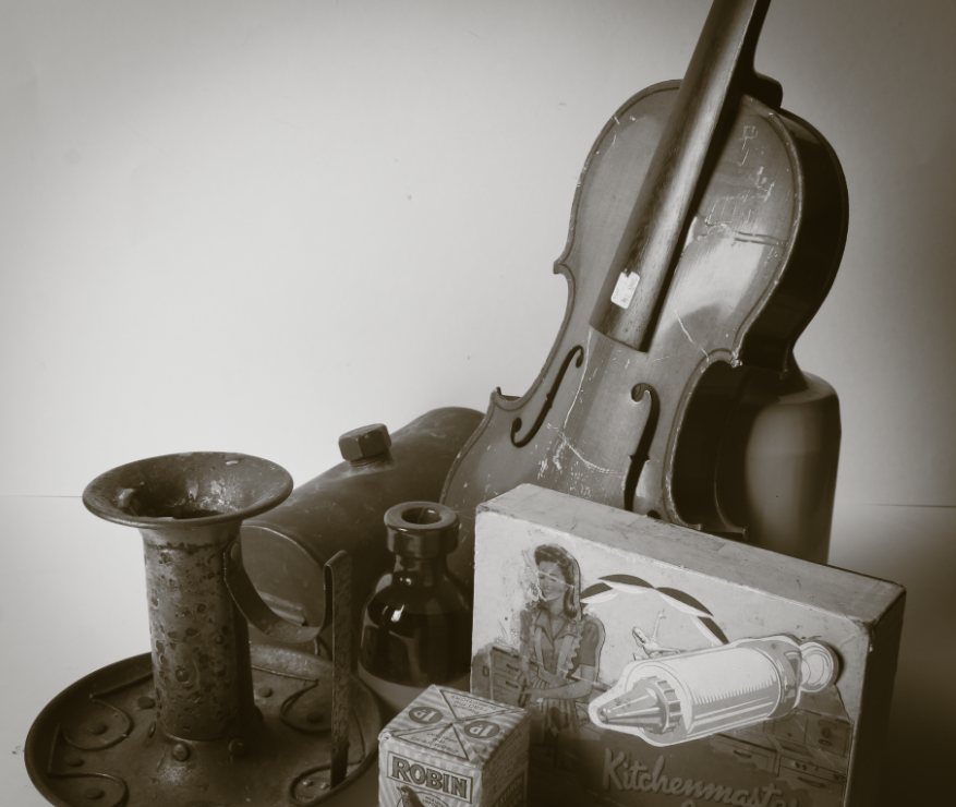
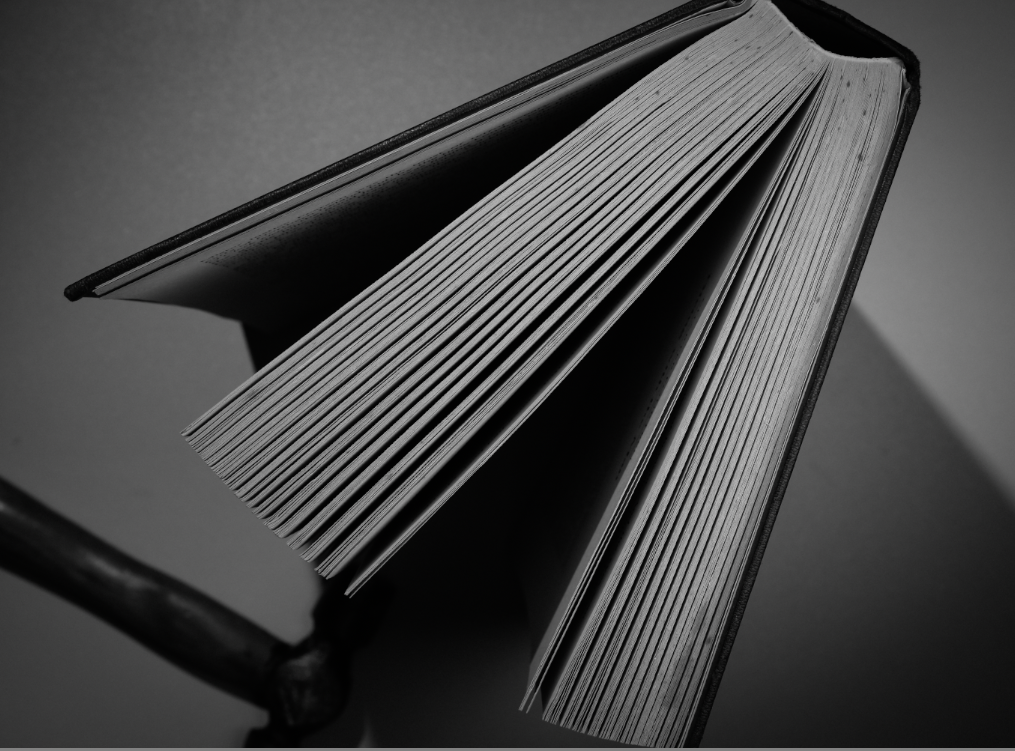
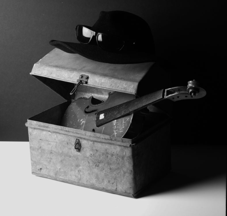
Then, I decided to Make them all B/W as the theme is nostalgia, and B/W images brings out a nostalgic feel for many people including me. B/W also removes any distraction of colour and helps the viewer focus on other aspects of the photo, such as the subject, the textures, shapes and patterns, and the composition. Contrast is also more noticeable with B/W photographs, which can bring out more emotion. For example, the middle photo of the book has a powerful and dark shadow due to the continuous, directional light used. This makes the book more noticeable, increasing the emotion from the image.
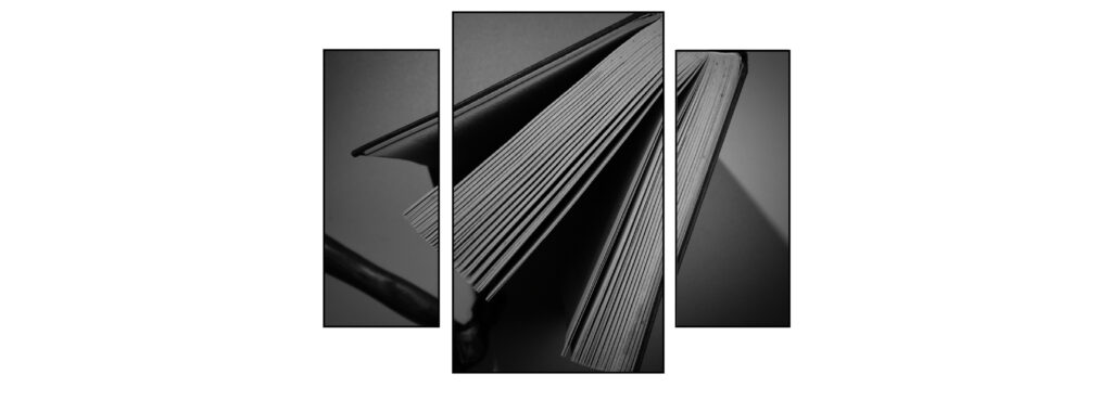
Here, I split up one of my final images using the triptych method. I think I makes it look very clean and professional.
