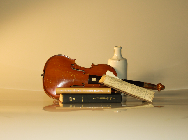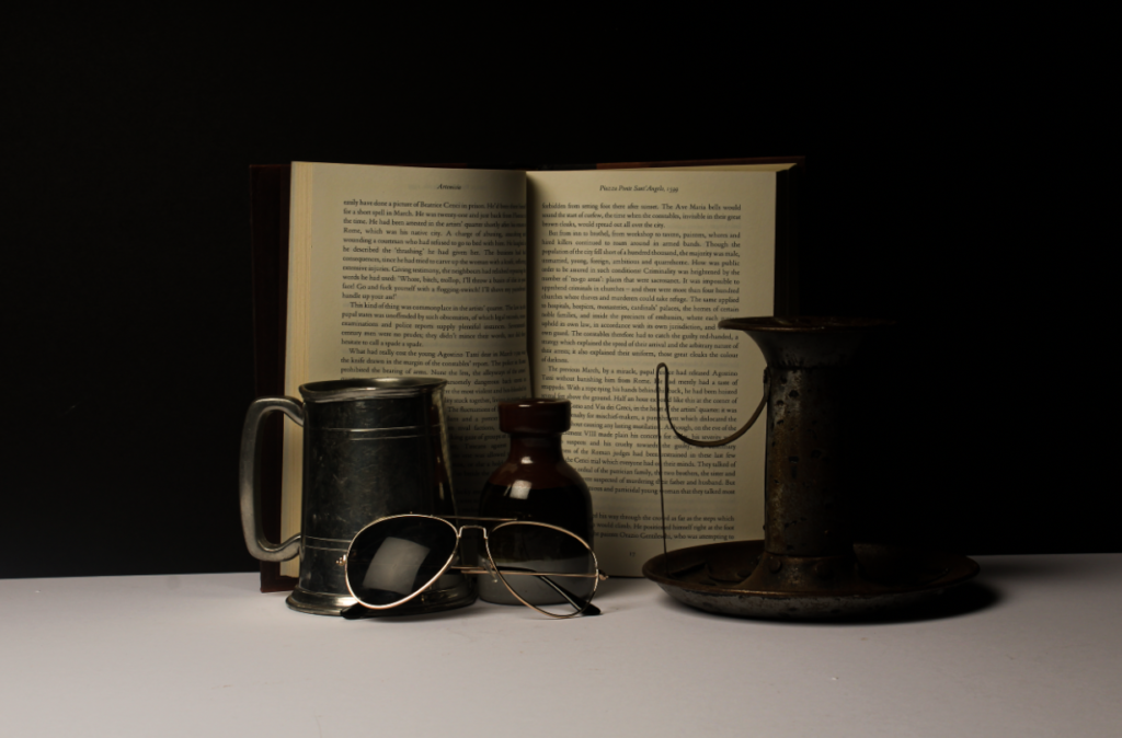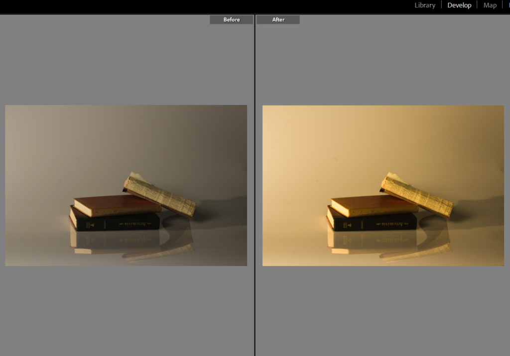
Before I had taken this photograph I used books as they give a nostalgic and vintage effect and placed them in the arrangement I thought looked best. Within this photograph, I edited the image in Lightroom and increased the temp to make it have a warmer tone which gives off a vintage effect which links to still life as it has existed from the 17th century until the modern-day, but in the 19th century, artists adopted photography as a new medium for still life art. I then increased the exposure and contrast so the shadowing had more depth and was more eye catching to make the image more interesting to look at. I decreased the highlights so the image stayed clear and detailed but at the correct amount so it didn’t look to bright nor dull. I increased the shadowing by a little to make the shadowing darker. Lastly, I increased the whites so the image wasn’t too yellow or bright and so it is the correct tone I want it to be.
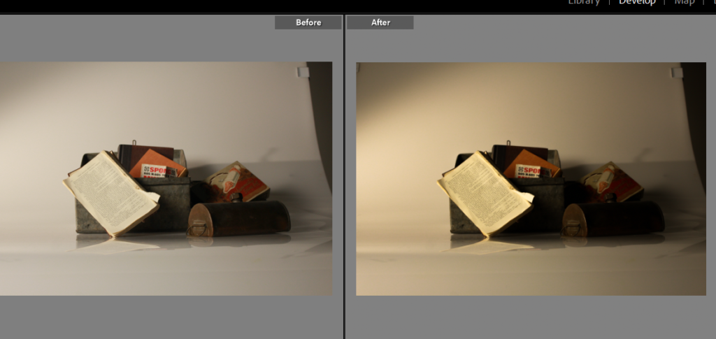
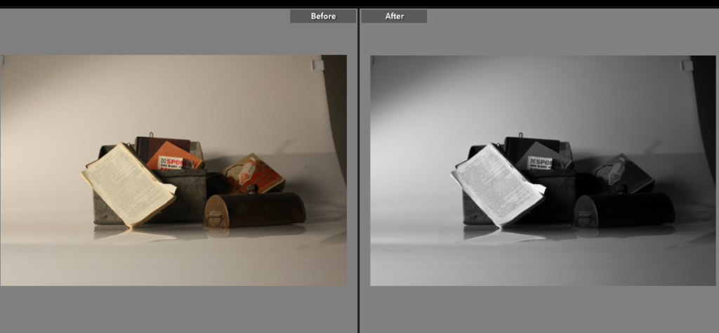
In the same image, I put it in black and white but overall, decided that I preferred the colour image as it adds more to the image and more eye catching colours and shadows. As the photograph has a warm tone with the objects, put together it creates an ancient and vintage look to it which shows similar qualities to ‘still life’ as most famous ones are in colour and are taken years ago as they started in the 17th century. I also prefer it in colour because the details are clearer on the writing on the book and you can tell what the objects are clearly, however the black and white oppositely could be better as it leaves a mystery keeping the viewer guessing. This links to ‘still life’ as most images from this genre have symbols to tell the viewer what the photograph is about. Whereas my photo do not have symbols but still keep the viewer guessing on what story the image is trying to tell.
