Formalism
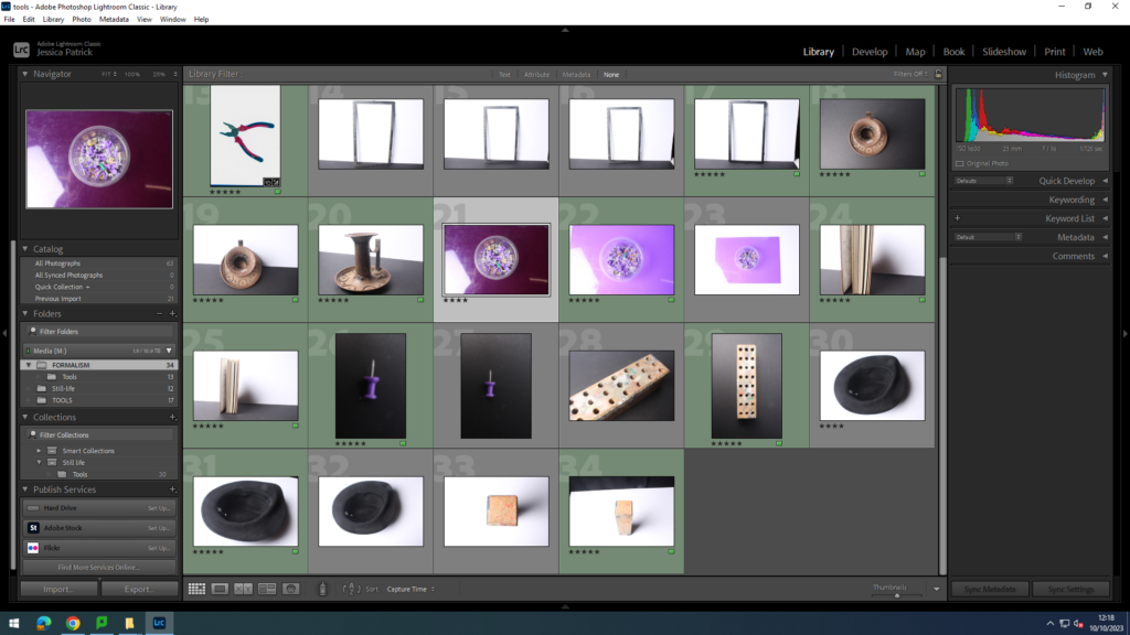
The pictures, which are highlighted green are the pictures I have chosen to edit, because they fit the seven themes of formalism the best and they have the best composition.
Lines
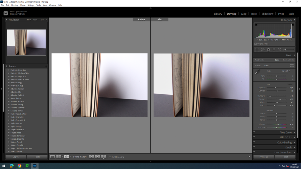
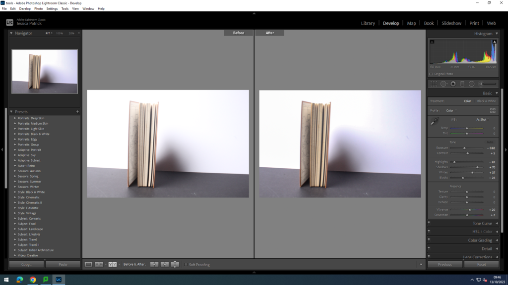
These two photos show lines in formalism. I edited the first one by increasing the contrast and shadows, while decreasing the highlights and blacks. I edited the second one, by increasing the shadows and whites, while decreasing highlights and blacks.
Shape
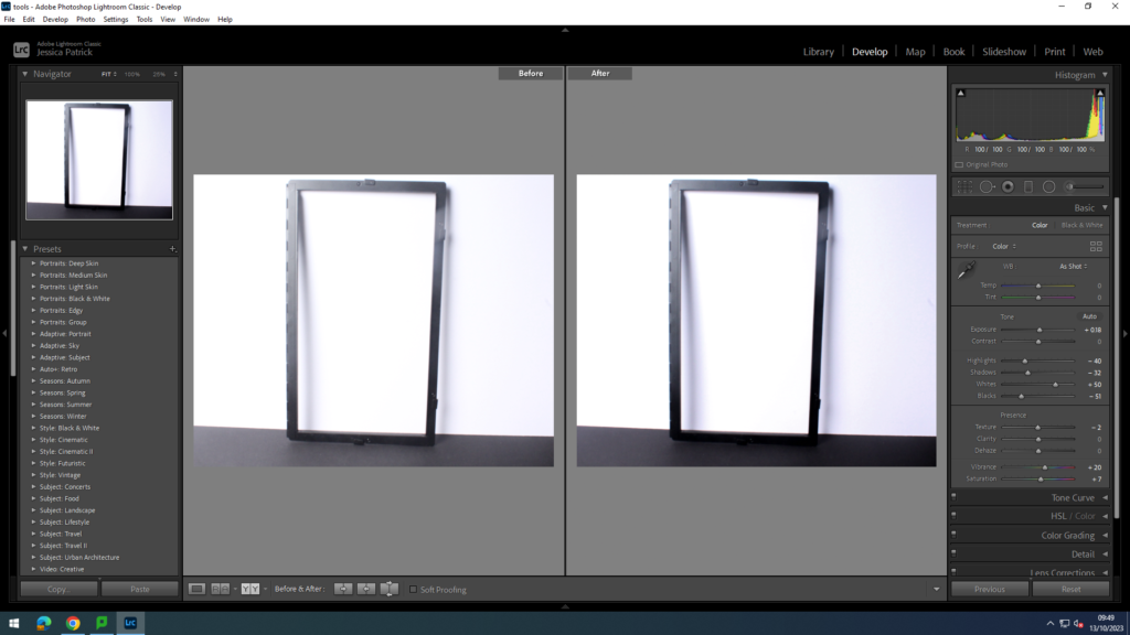
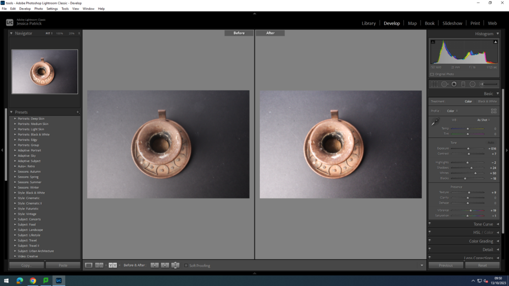
These two photos show shape in formalism. I edited the first one by increasing whites, while decreasing highlights, shadows and blacks. I edited the second one by increasing the shadows and the whites, while decreasing the blacks.
Form
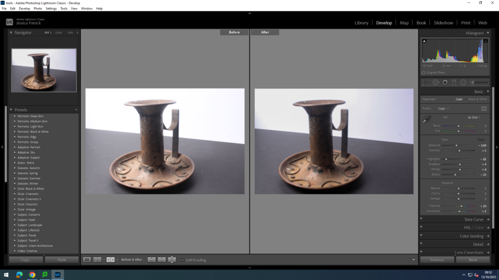
This photo shows form and I edited this by decreasing the highlights, exposure and blacks.
Size
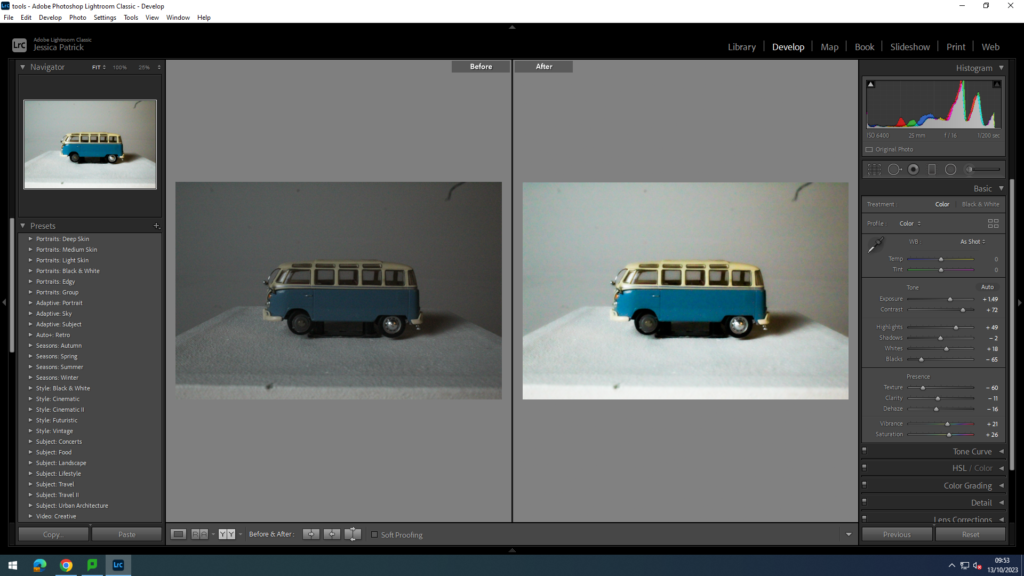
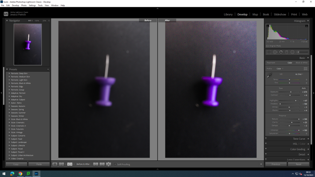
These two photos show size. I edited the first one by increasing the exposure, contrast, highlights and whites, while decreasing the blacks, texture, clarity and dehaze.
Colour
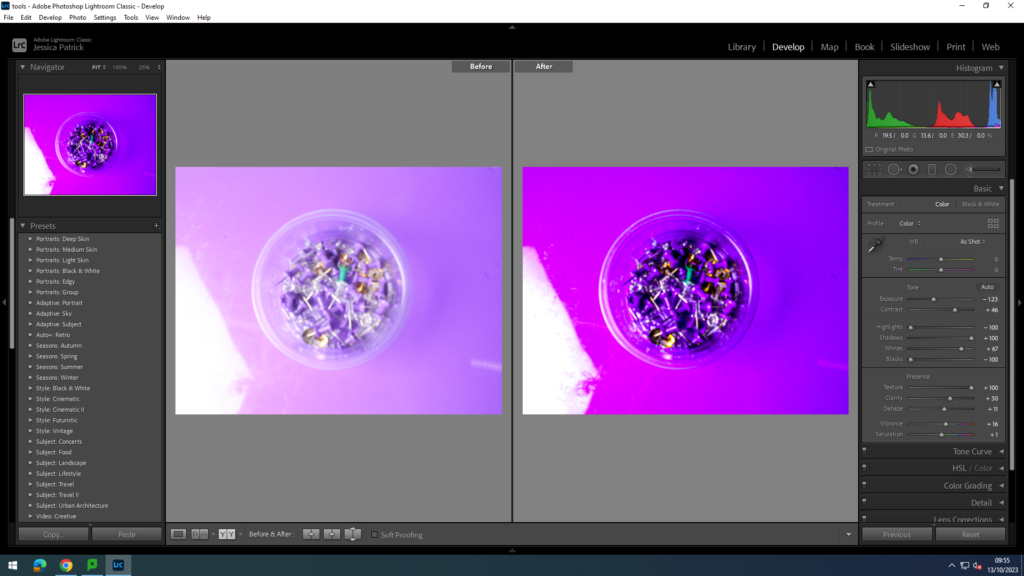
This photo shows colour and I edited it by increasing the contrast, shadows whites, texture and clarity, while decreasing the exposure, highlights and blacks.
Depth
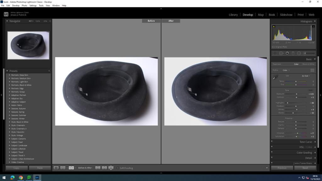
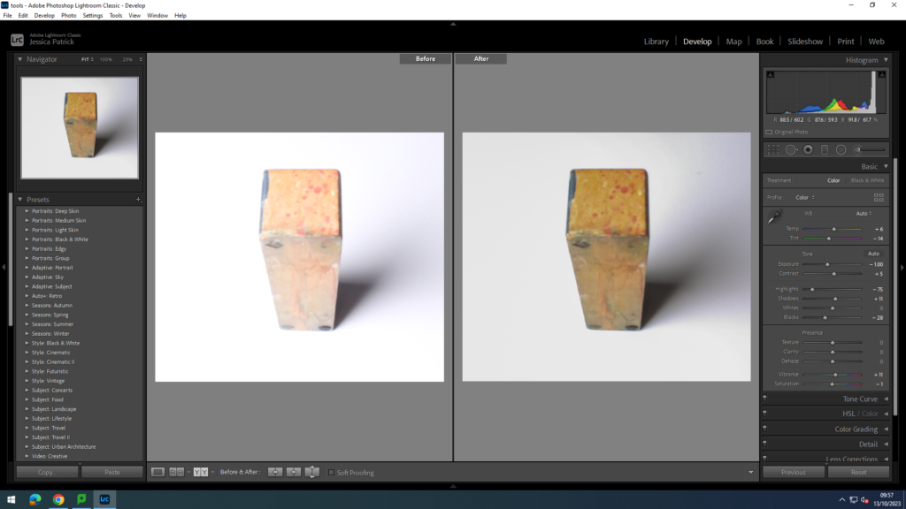
These two photos show depth. I edited the first one by decreasing the highlights and blacks. I edited the second one by decreasing the exposure, highlights and blacks.
Texture
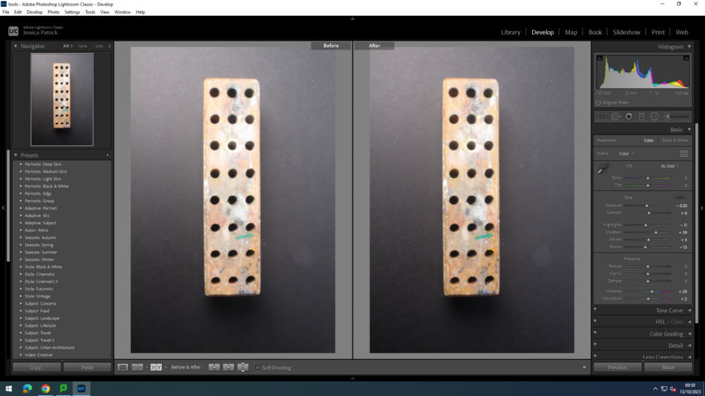
This photo shows texture and I edited it by decreasing the highlights, whites and blacks.
Conclusion
In conclusion, I think this photoshoot went well, because it helped me to experiment with the seven different areas of formalism in my photographs. It also helped me to further experiment on Lightroom and taking photos in the studio.
