Photoshop
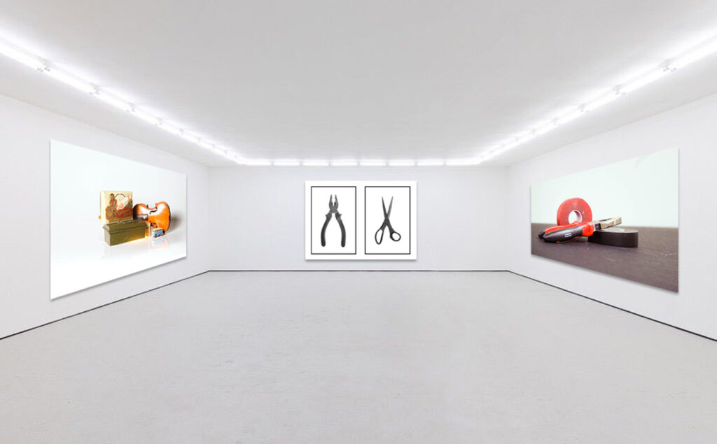
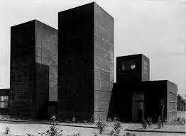
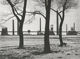
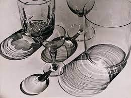
To create this virtual gallery I opened a blank gallery space in photoshop and each image to add separately. I opened all 4 images together and arranged them onto each wall. The two angled walls didn’t fit the image so I changed the perspective of each image. Then using the fx drop shadow I created a shadow under each image and made sure each one had the same.
Artsteps
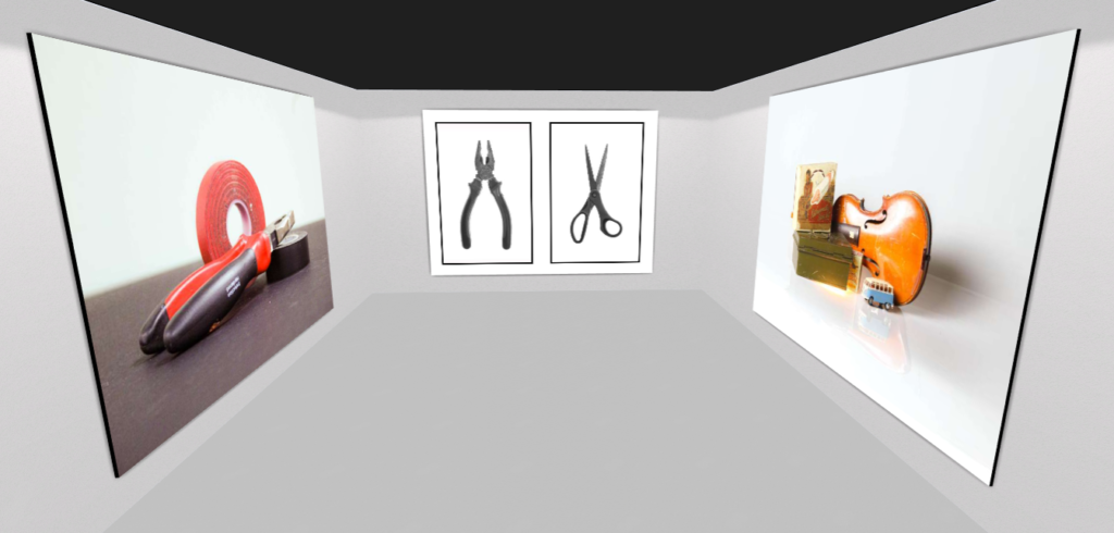
Using Artsteps I created an empty room and opened up the same three photographs. I arranged these on the walls and sized them up since they loaded in really small. In this virtual gallery the side images looked better because in photoshop the perspective made the images look wonky. However the room I used in photoshop looks better because It has lights and a skirting board which makes the room feel more real. The room was also a little claustrophobic. I wouldn’t want it as wide as the photoshop room but somewhere in the middle which wont make the centre image look too small or big. It should frame it nicely. Maybe next time I could use Artsteps to get the perspective right and layer it on the photoshop layer.
Evaluation
Arrangements
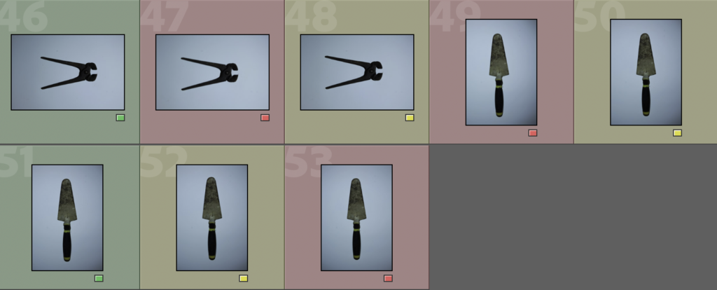
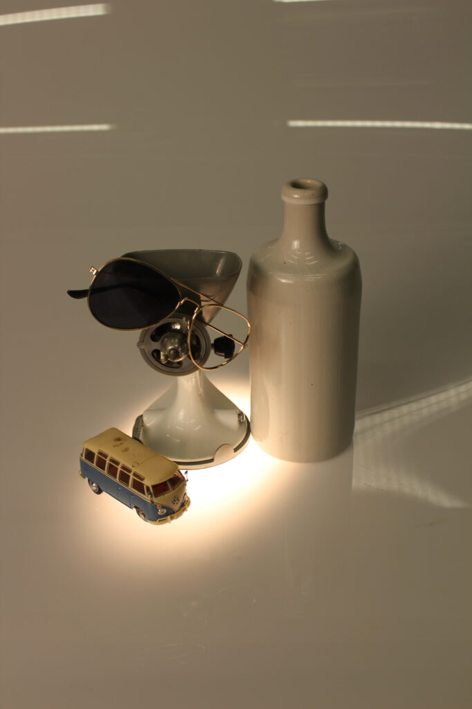
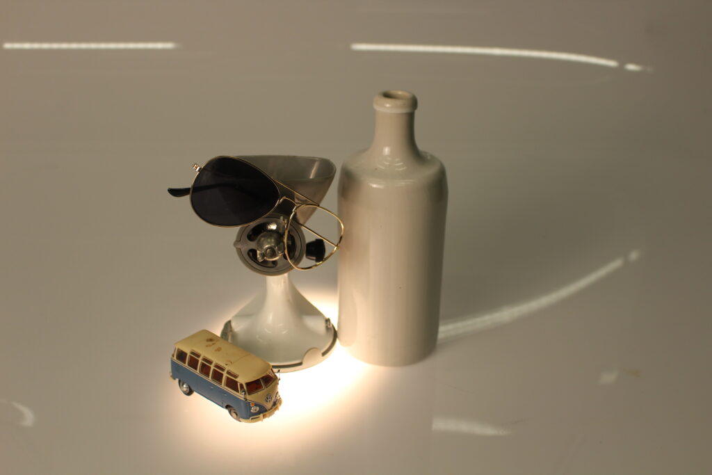
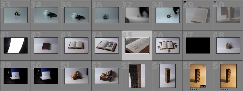
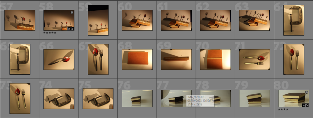
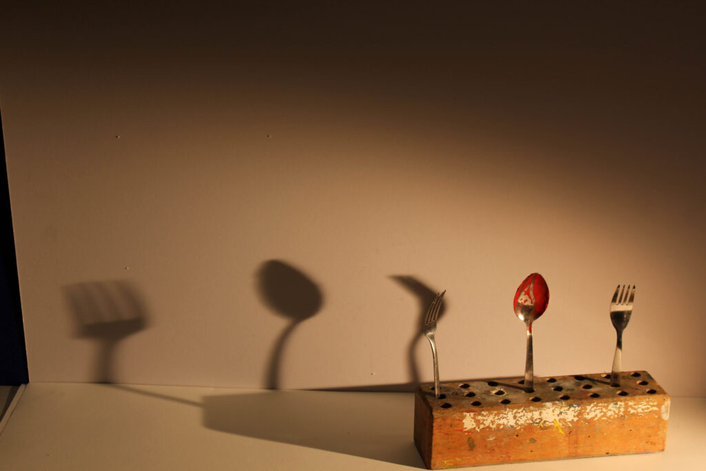
I began this project with still-life arrangements were I used the infinity screen with a continuous studio light. The light was at an angle to the side so that the objects were well lit with shadows to create depth and variation. These was inspired by 1600 Dutch still life paintings so they included assortments of many different objects, sizes and colours.
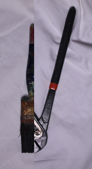
The second photoshoot was inspired by modern still-life arrangements with one main focus and less going on. I used two pieces of card to replicate the table often holding the objects and got up close for a tighter frame.
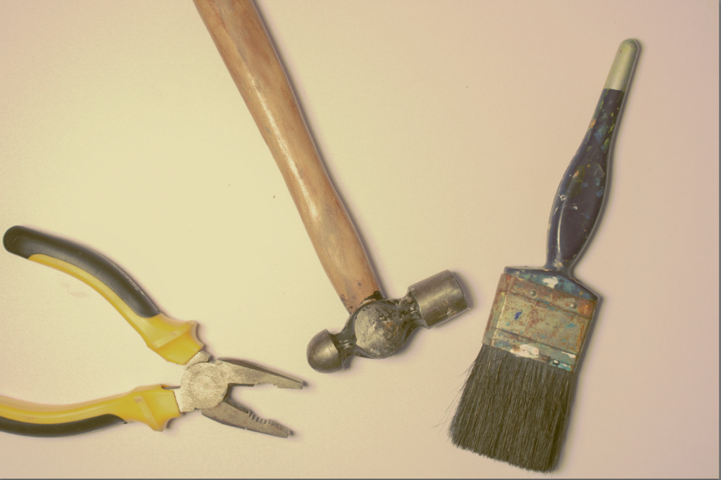
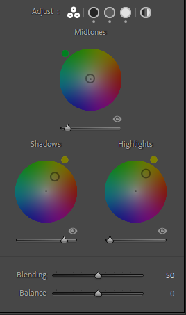
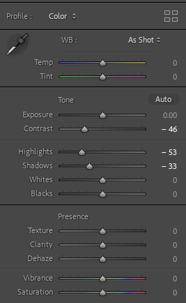
When editing I had to rotate and crop the images especially in the second photoshoot because there was a horizontal line which was obviously not straight. I adjusted the white balance so the background was bright and clearly white.
I think I should have dulled colours and lighting to represent the aesthetic of he paintings and combined more objects into the arrangements. I would also like different levels of objects and cloths on tablesw with neutral colours and rustic wooden tables to look more like an old painting.
Singular
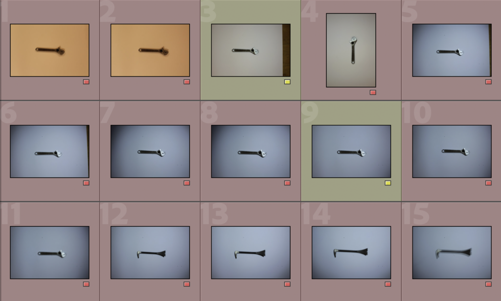
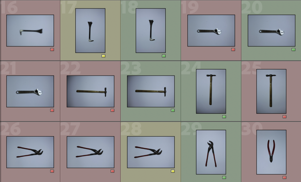
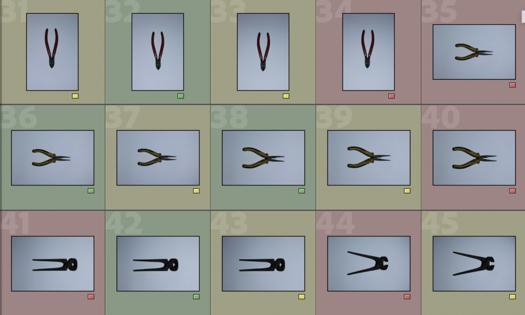
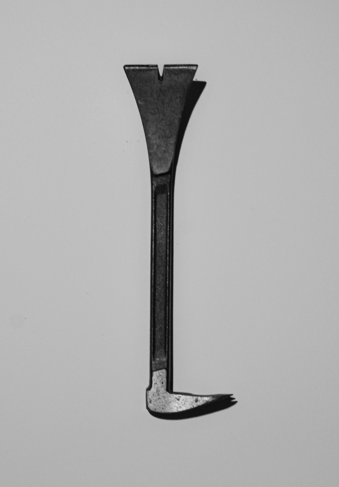
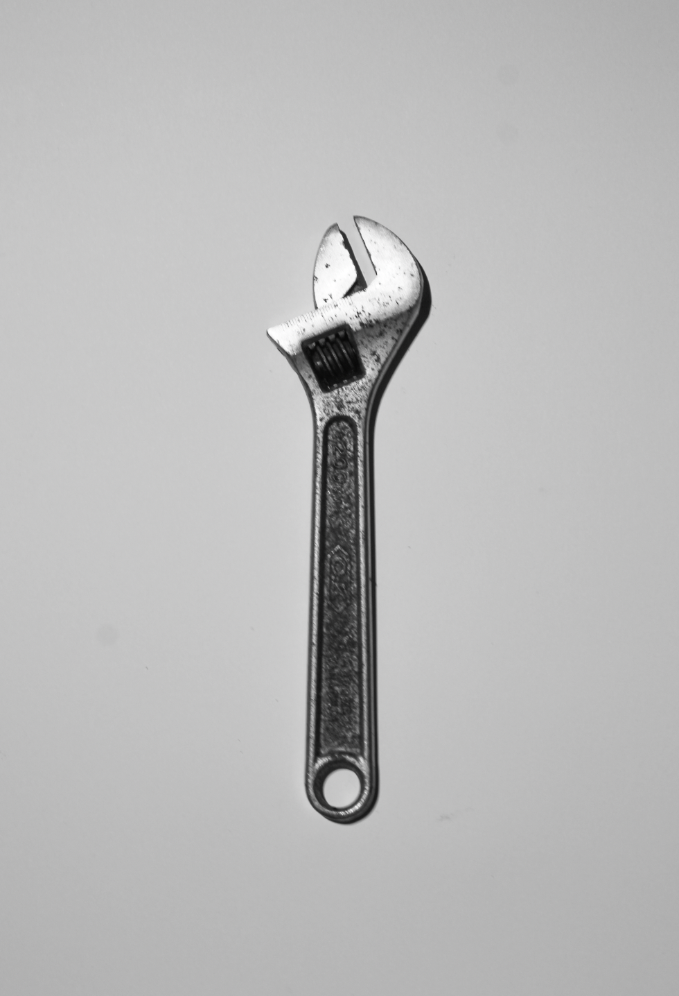
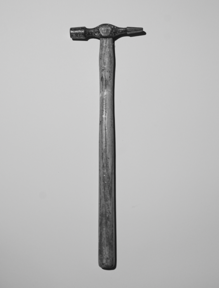
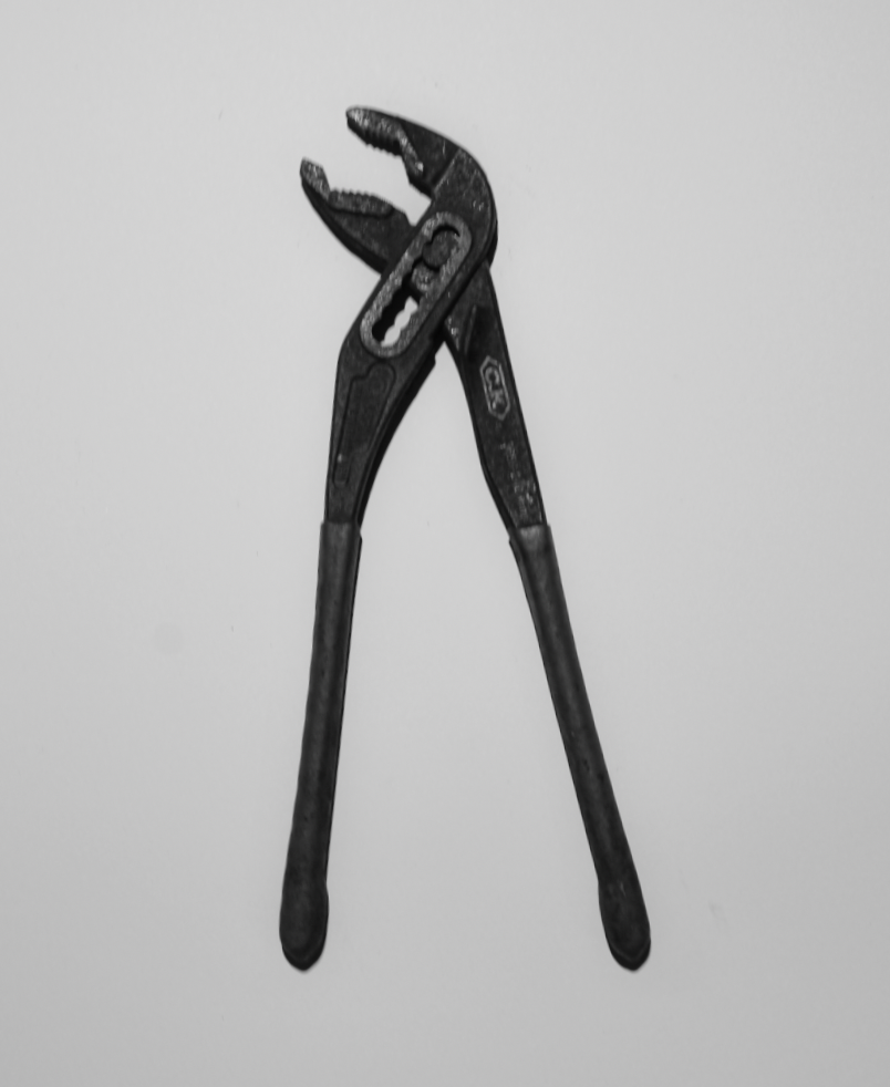
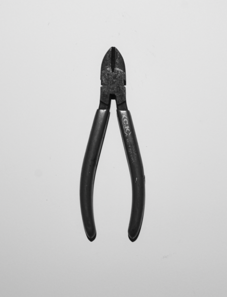
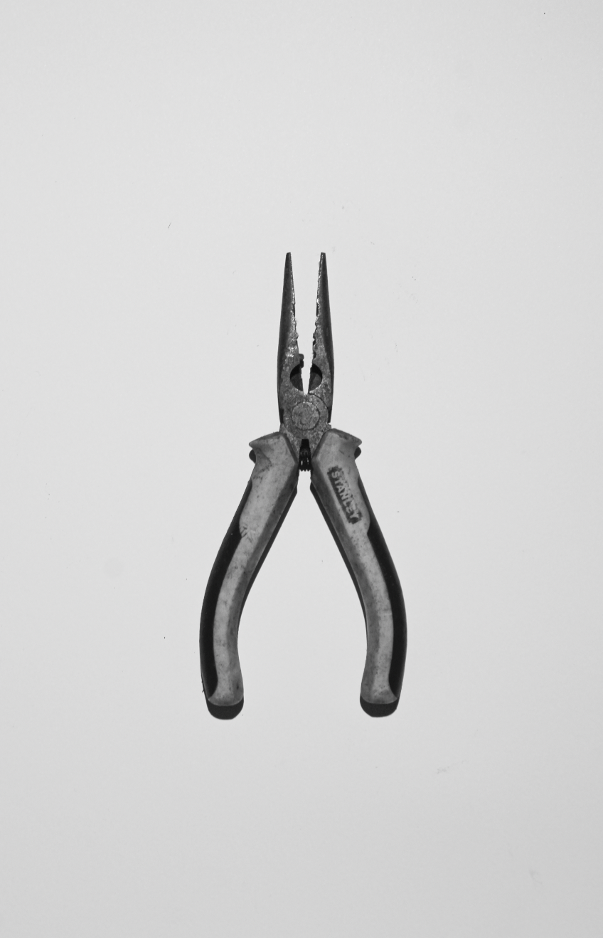
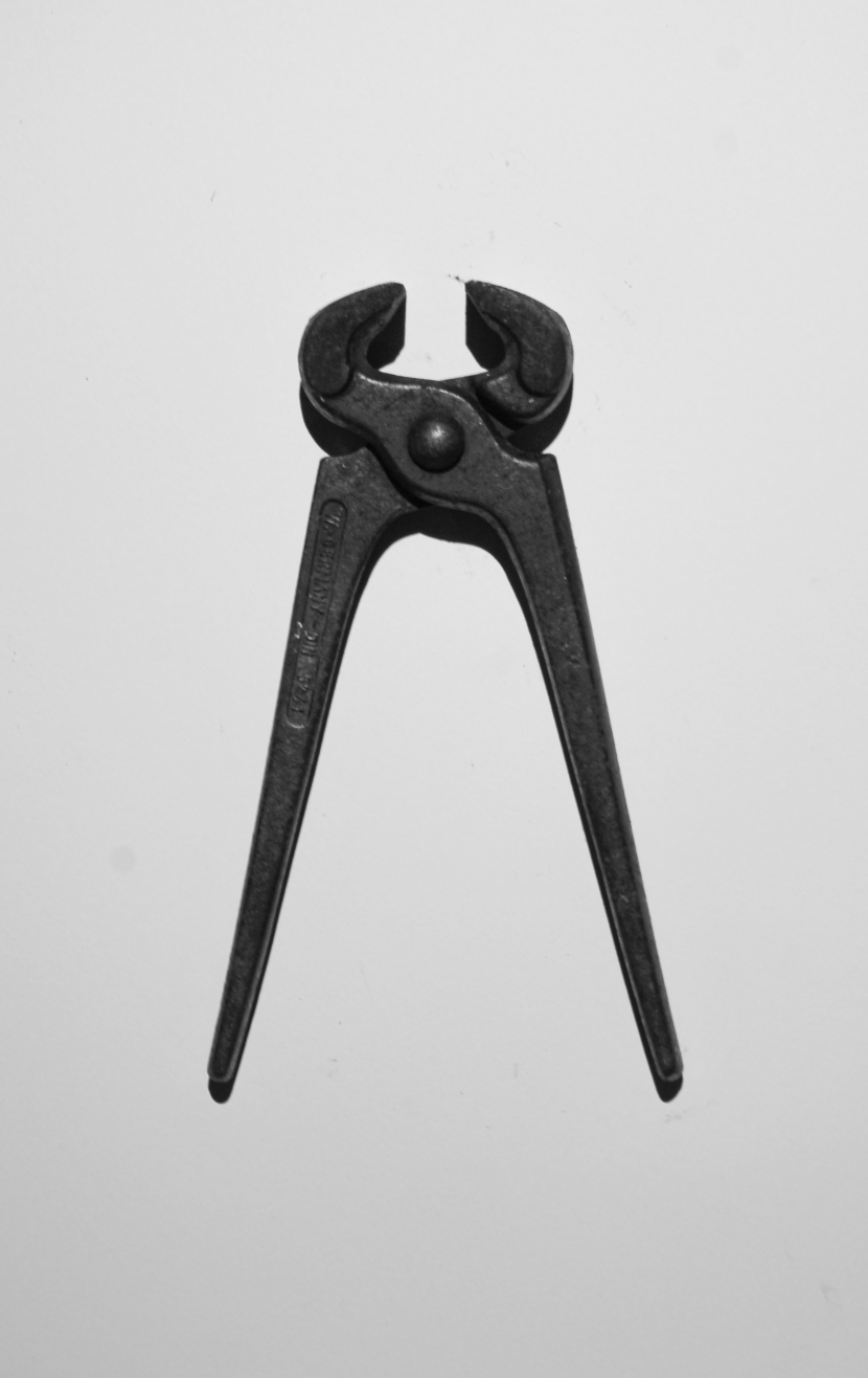
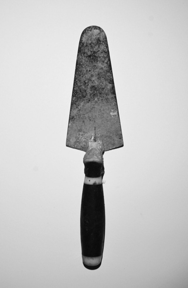
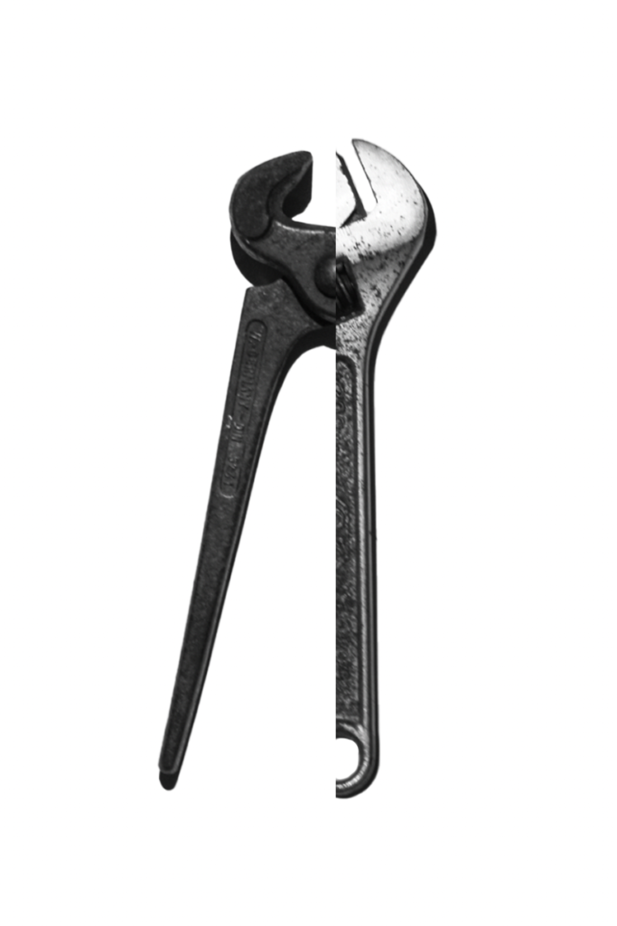
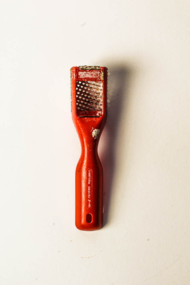
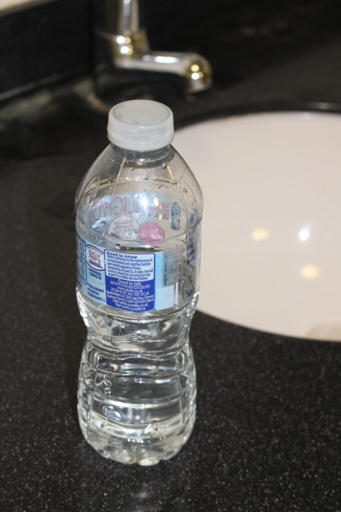
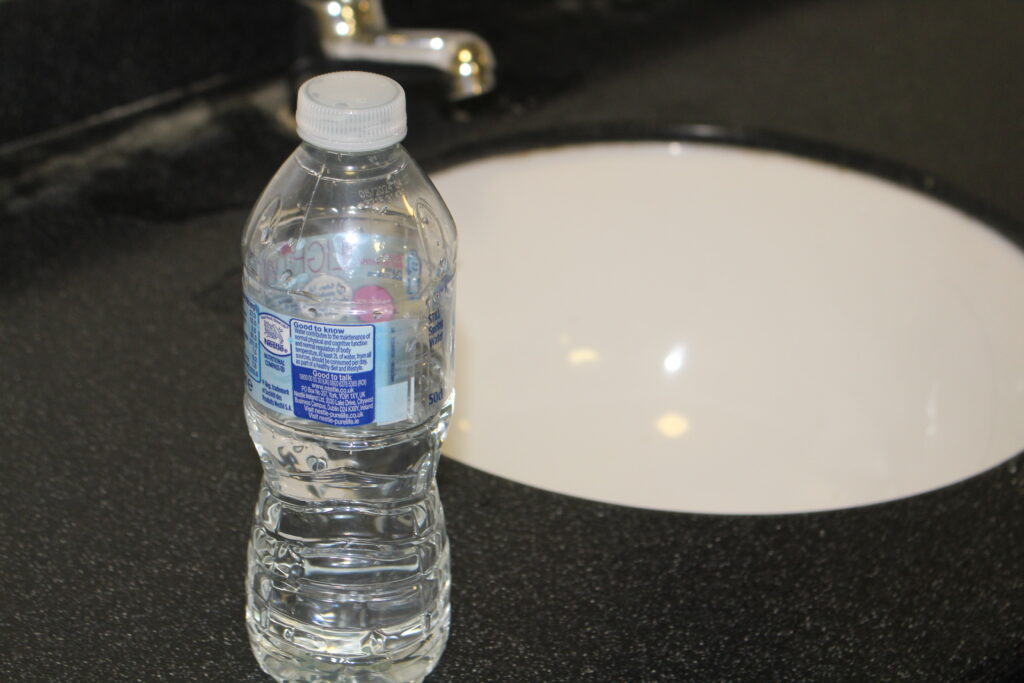
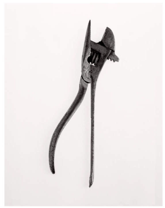
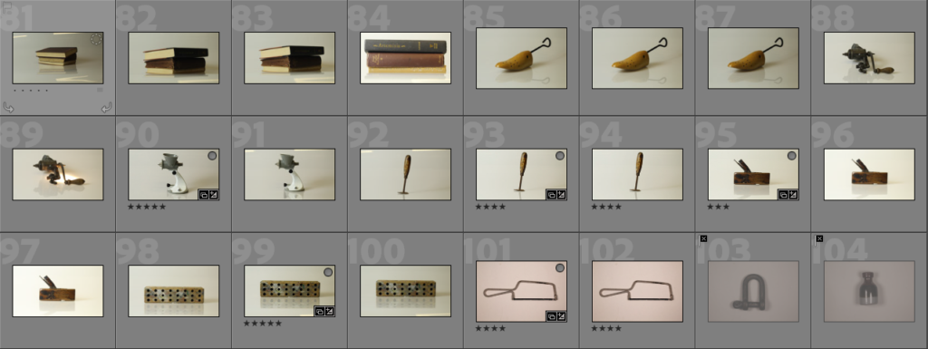
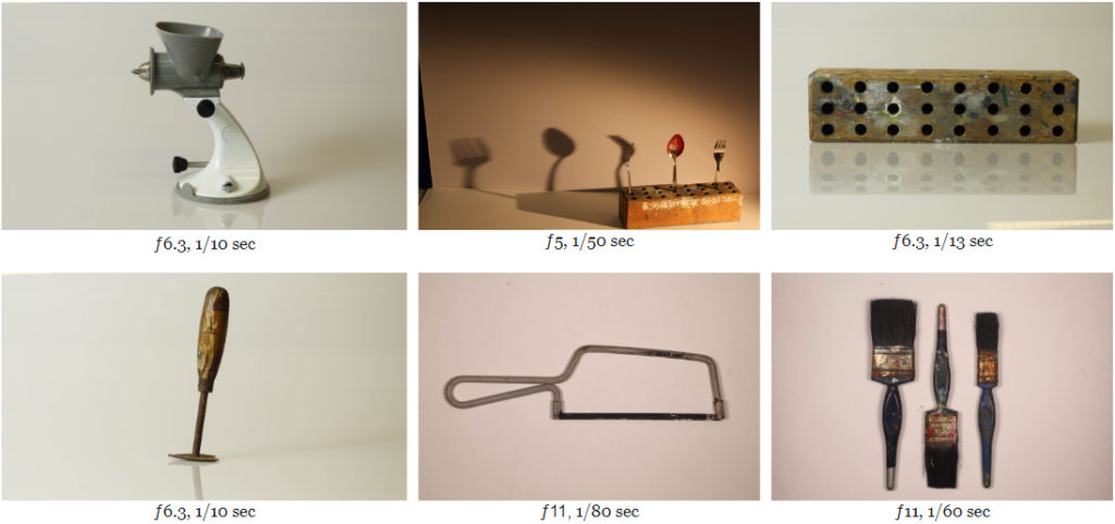
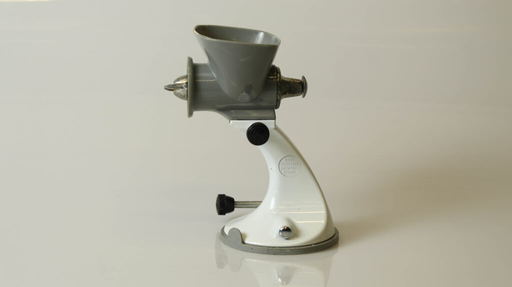
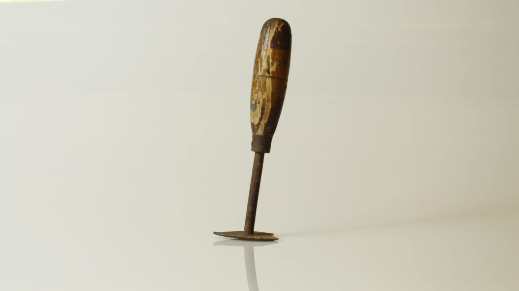
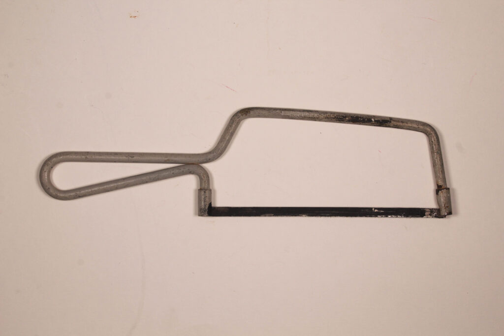
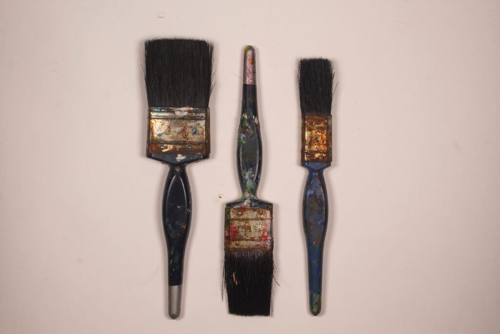
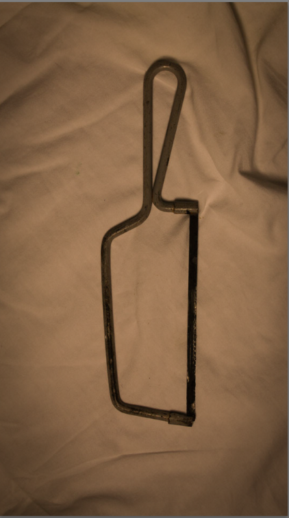
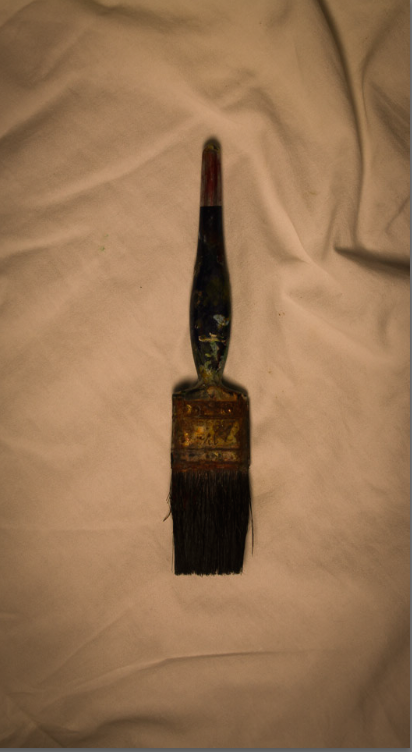
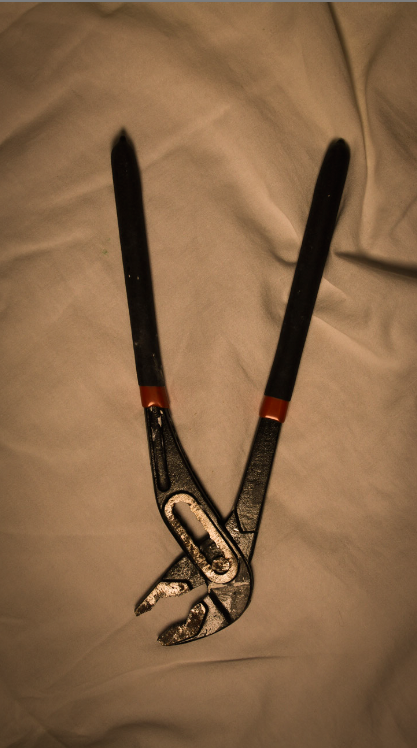
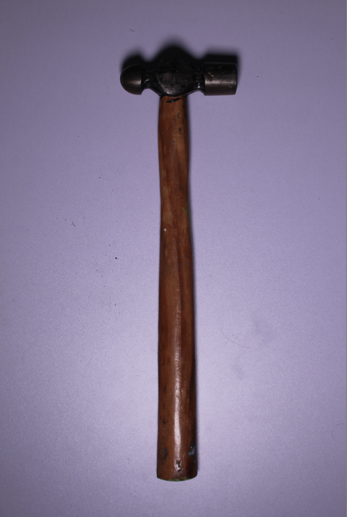
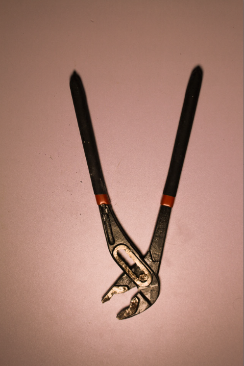
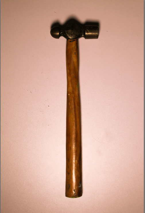
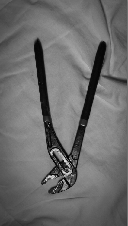
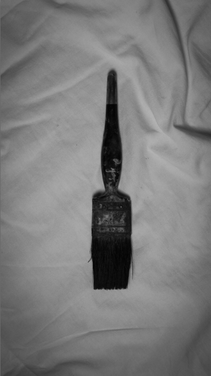
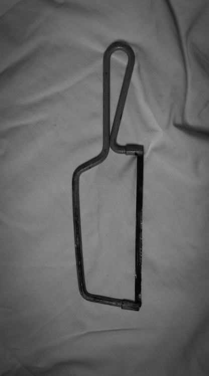
The singular tools were inspired by Walker Evans. They were household items in front of a plain background with simple overhead lighting to reduce shadows.
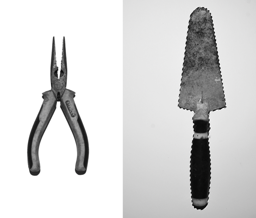
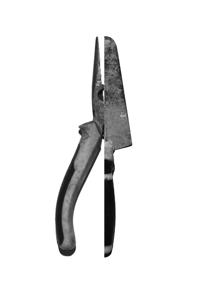
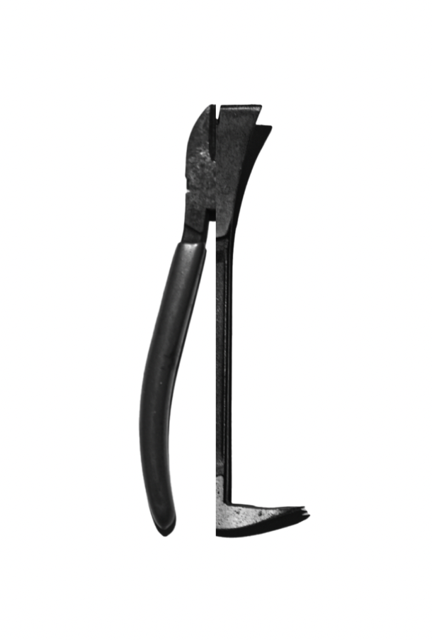
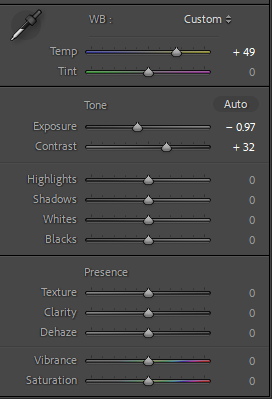
I edited these photographs in Lightroom with black and white pre-sets, exposure settings and white balance. To present them I used photoshop to over crop and add a boarder which is different to the inspiration but presents the photographs well.
I wasn’t able to raise each item like Walker Evans however with a lightbox there were no shadows. I should have photographed a wider variety of objects and not be limited to household tools. I could have found other shapes with more meaning to me like a hairbrush for example to take ownership over this project however it wouldn’t have been as much of a response to the artist.











 )
)