My Top 3 edited Still-Life images.


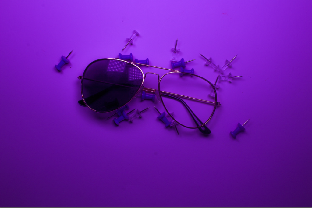

My Top 3 edited Still-Life images.


For this photoshoot I used a range of different tools that were provided to me. These included:
Most of my photos were taken in the studio using a white background with the camera angled at a Birdseye view. 3 of my photos were also taken using a light box in the classroom and a ladder to create enough height to get the Birdseye view.
My photos have been edited to black and white to make it more inspired by the artist.
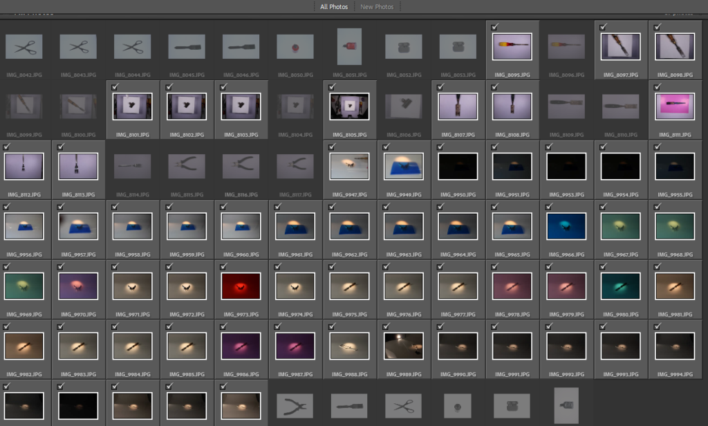
Contact sheet of all my photos:
Photos from Front View:
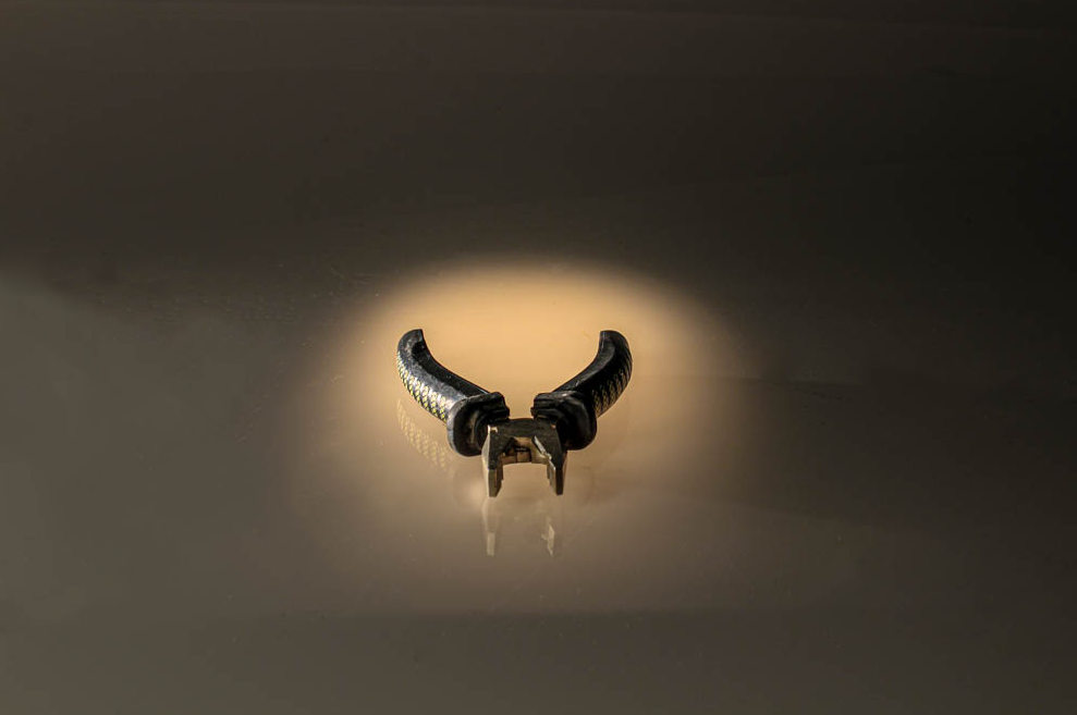
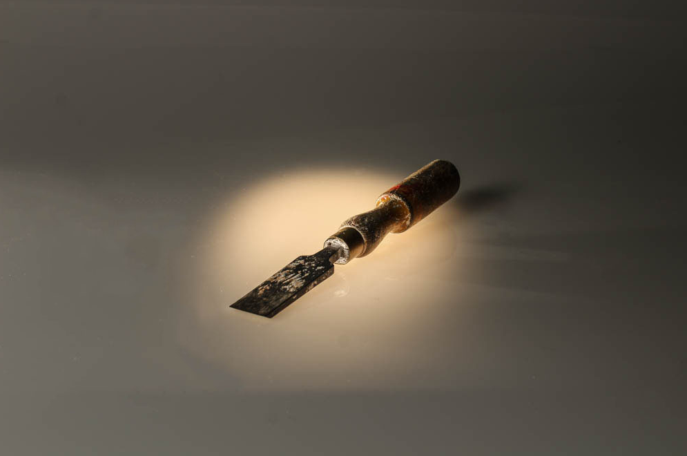
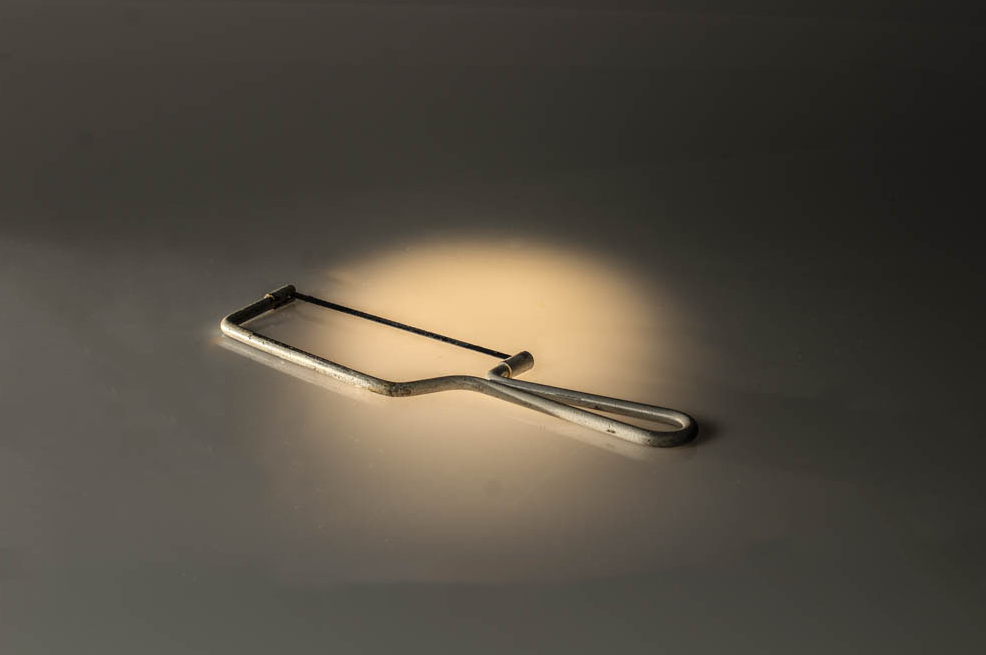
These photos were taken with a simple warm toned light and back light to make the object stand out. I lowered the brightness on these photos and increased the clarity for better quality. I used the spot like behind the surface to allow the light to make the object stand out. I made sure the object was centred in the light and that it was not off-centred.
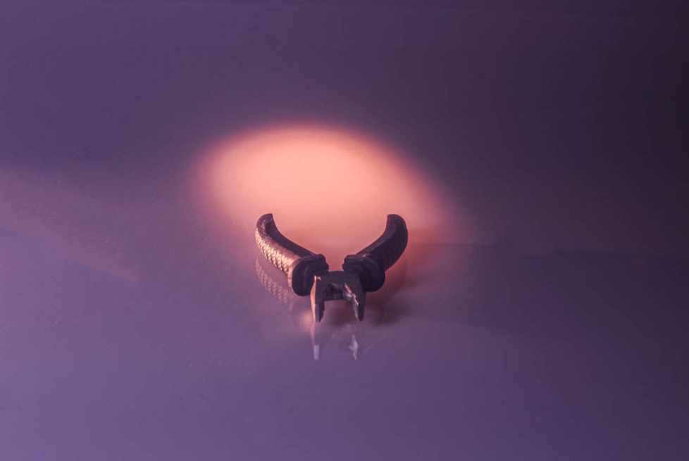
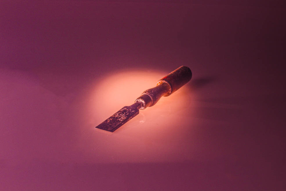
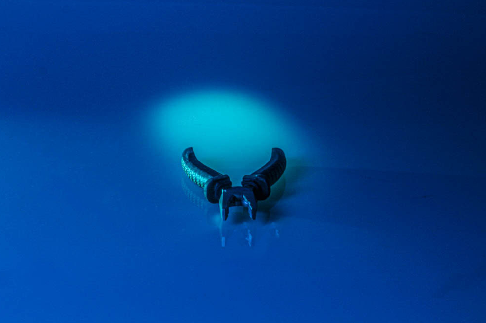
These photos were taken using coloured transparent card that was held over the camera lenses to create the desired colour. I like these because they differ and are unique from the standard natural colours photos. To edit these I either increased or decreased the brightness and I made sure it had more clarity. in some, I also upped the vibrancy. I use the spot healing brush tool on photoshop to erase any marks on the camera or scratches on the surface that my object was on.
The images above were all taken in the Studio
Photos at Birds-Eye View
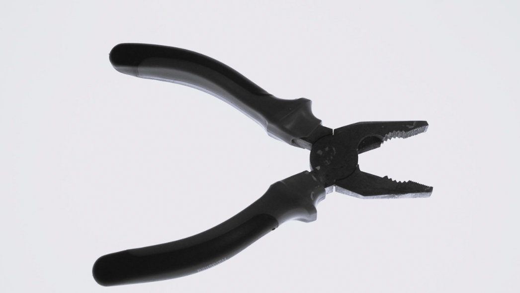
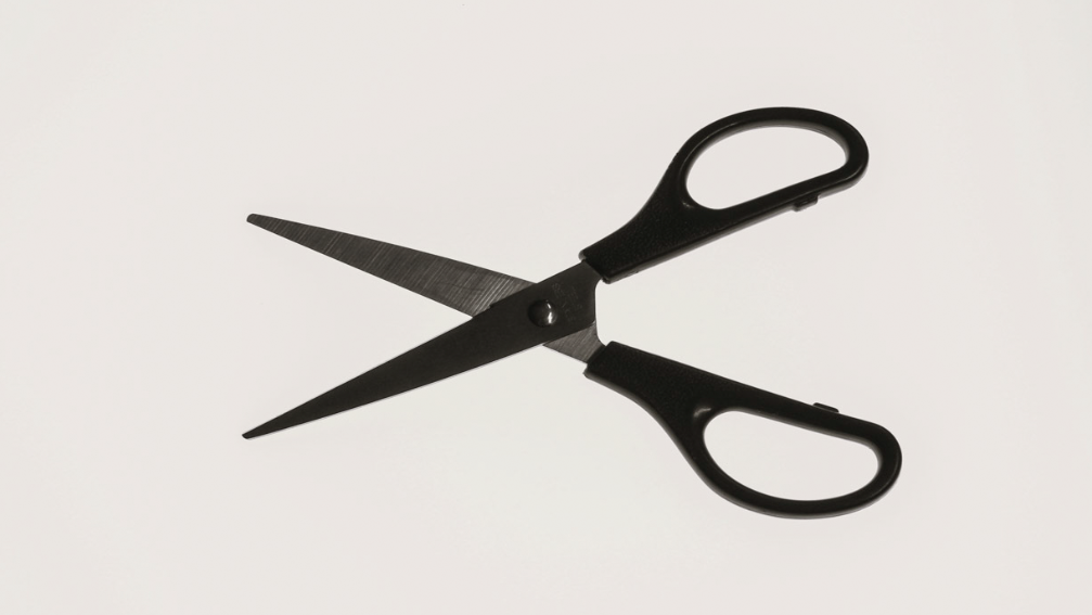
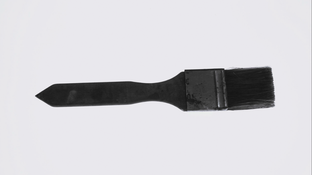
These 3 images above were taken using a light box. I like these images however I think I should’ve experimented using colours more and not just kept the plain white background. I like the light box as it makes the objects stand out and its also an easy but affective outcome. I decided to make these 3 images black and white like the artist tended to do as well.
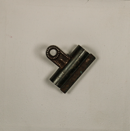
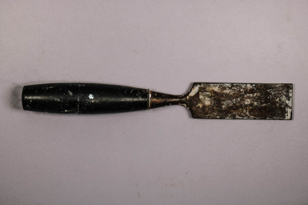
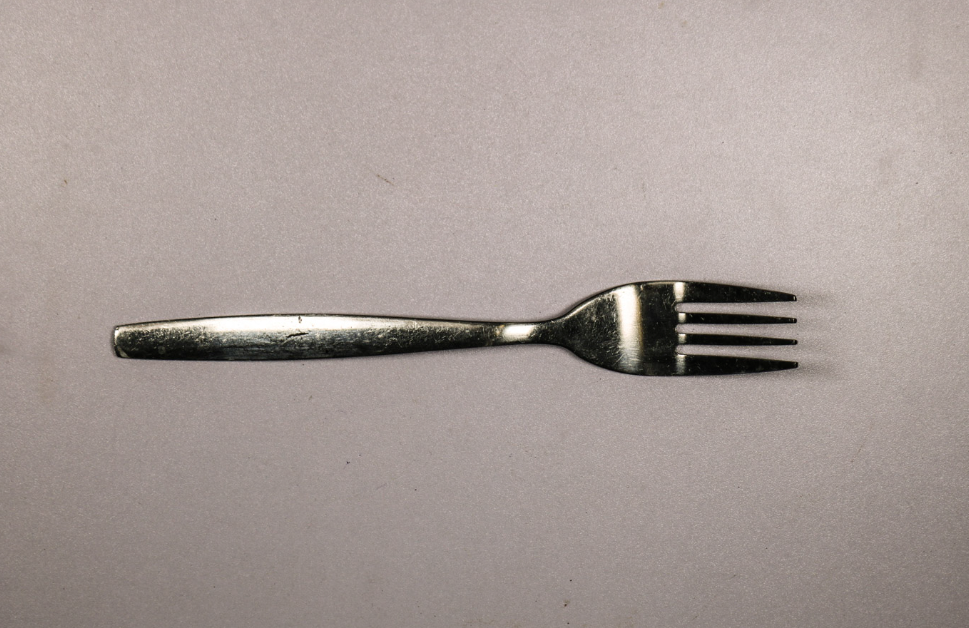
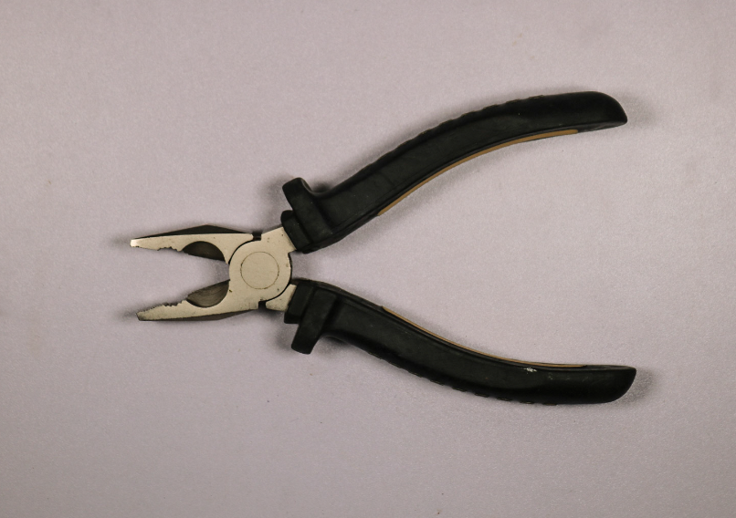
For these photos, the background of the photo made it produce a purplish tone to the photograph. To fix this I simply pressed auto on the white balance to make it more white than purple.
My Favourite photos
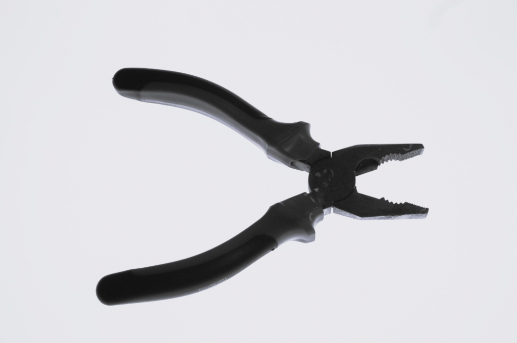
Camera settings: Taken on Canon Camera, F-Stop=f/5.6, Exposure setting= 1/60 second, ISO Speed= ISO-200, Exposure bias= 0, Focal length 38mm, No flash
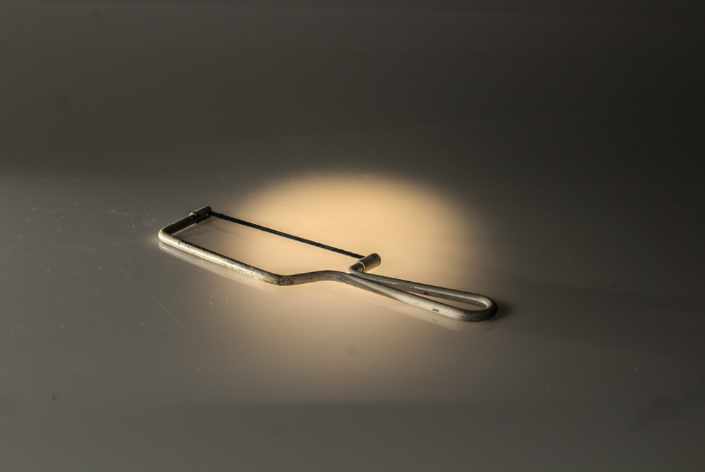
Camera settings: Taken on Canon Camera, F-Stop= f/8, Exposure Time 1/8 second, ISO-Speed= ISO-100, Exposure bias 0, Focal length 35mm, No Flash
–
Though these photos are very different, they are both my favourite shoots. I think this is because I prefer the white/brighter backgrounds on the first image to contrast with my objects as the other background turned out with a purple tint which I didn’t particularly like. The second image was taken at a different angle and not Birdseye view. I still like this image because my group made sure to make the backlight sit directly under the object to give it a spotlight. in addition to this, I like the amount of clarity this photo has.
To edit my photos, I only simply changed the exposure by lowering it, as on my camera the outcome of the photos was quite bright and it did not look good. If needed, I also adjusted the clarity and vibrancy.
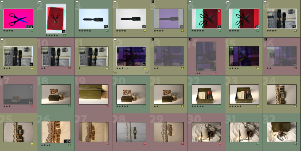

To edit and categorize these images I decided to rate my photos from 1 star ‘*’ to 5 stars ‘*****’ as a way to pick my favourites.
I also colour coded them with ‘green’ for my best, ‘yellow’ for my unsure and ‘red’ for my low quality bad ones. This helps me to easily display favourite and least favourite images more specifically.
I took these photographs in the studio using a DSLR camera and a studio light.
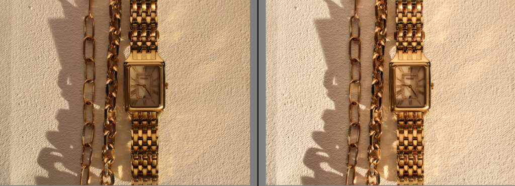
I really like this image because of the gold shimmer that the jewellery creates. I also really like the warm tone that the gold creates, I think this differs from my other photos I have taken because I have focussed on more cooler tones. If I was to change two things it would be: 1. I would erase the shadow of the jewellery and how it takes the focus away from the bracelets. To do this I would need to change the camera angle, background or camera settings.
2. I would also change the setup of my jewellery, I think I should’ve thought more clearly about my setup in order to escalate the image and give it higher quality.
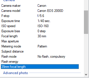
These are the camera settings that I used to achieve these photos.
Shutter speed : 1/40 sec.
ISO: 150- 160
Aperture: f/5.6
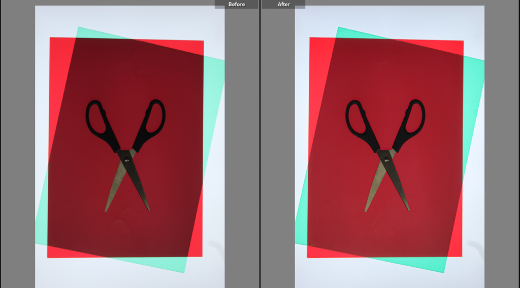
I edited this photo and focused on making it slightly brighter. I did not particularly need to edit the photo as it would lose quality and quickly become too bright or too dark. I also edited this photo whilst mainly focussing on and getting rid of the texture in the top and bottom part of the red paper. Erasing this texture helps my photo to become a higher quality and more effective.
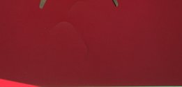
I did not like this part of the texture of the picture so I attempted to erase it to make the image more effective. I had to experiment with the tools in order to find out how to erase this part of the image. However, this worked by helping me to gain more skills whilst working in Adobe Lightroom.
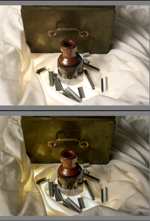
I also edited this photo to give it a higher quality and make the background a bit darker so that the details of the objects and light from below stands out more. I think that this makes my image stand out more and become more focussed.
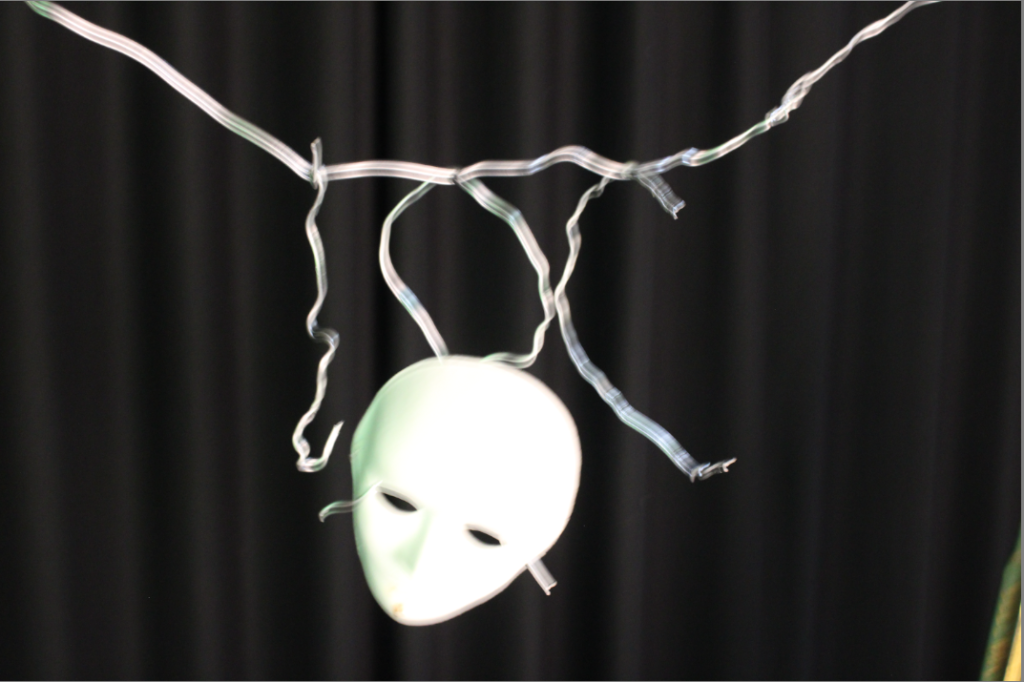
I also took these photos however, whilst taking them I was unsuccessful with gaining a clear, controlled image and they came out very blurry. Next time, I should increase the shutter speed so that I am able to capture the moving image more quickly. These photos also do not particularly represent formalism and I think would fit well under still life if I was able to capture a less blurry image.
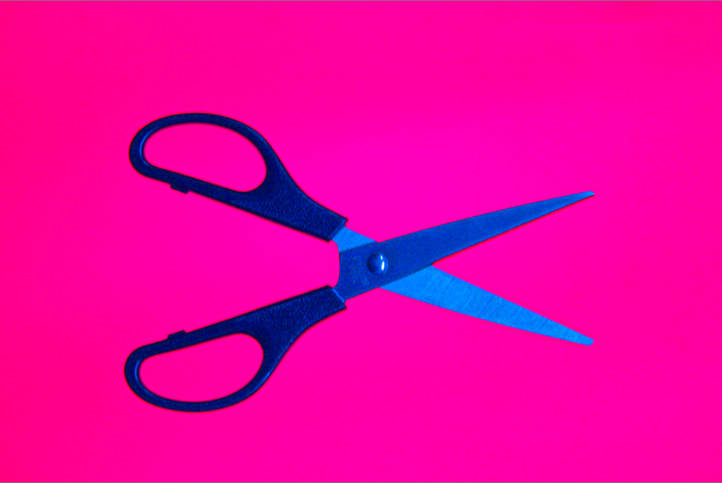
I edited this photo to make it clearer and focus on the small details of the scissors whilst also still maintaining the brightness and vibrancy of the pink background. This was difficult as my aperture was already low which lowered the exposure. To help brighten up this photo more I had to subtly heighten the exposure whilst editing in Adobe Lightroom.
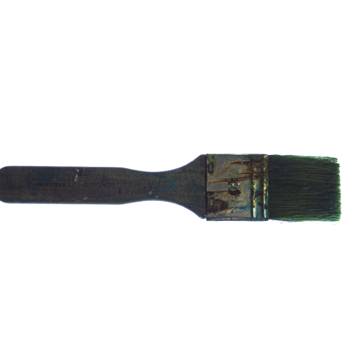
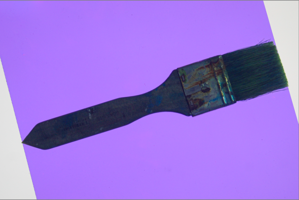
These are my two favourite edited version of a paintbrush I photographed. I think these signify formalism very well because It is a single object and the images focuses on appreciating the object rather than a variety of things.
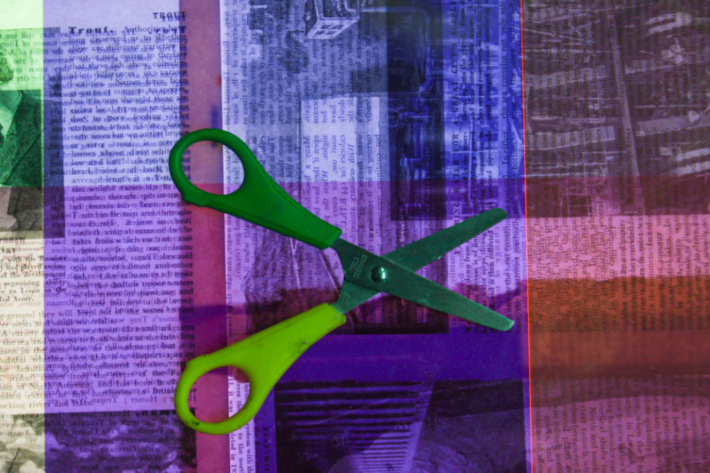
I do not really like this image I took because I think the background is effective, however, the brightness and shape of the scissors clashes with the background colour and creates a confusing image with too many colours not working together. To improve this image I could use a single coloured object so that the background can bring out the shape and dimensions of the object.
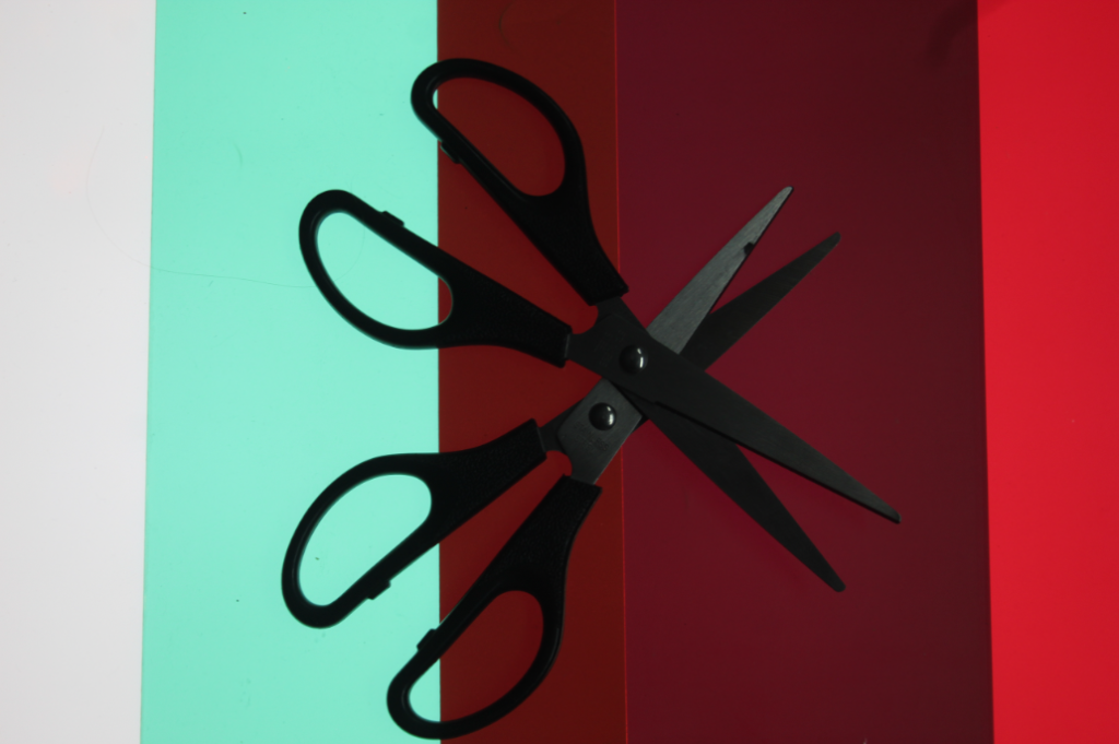
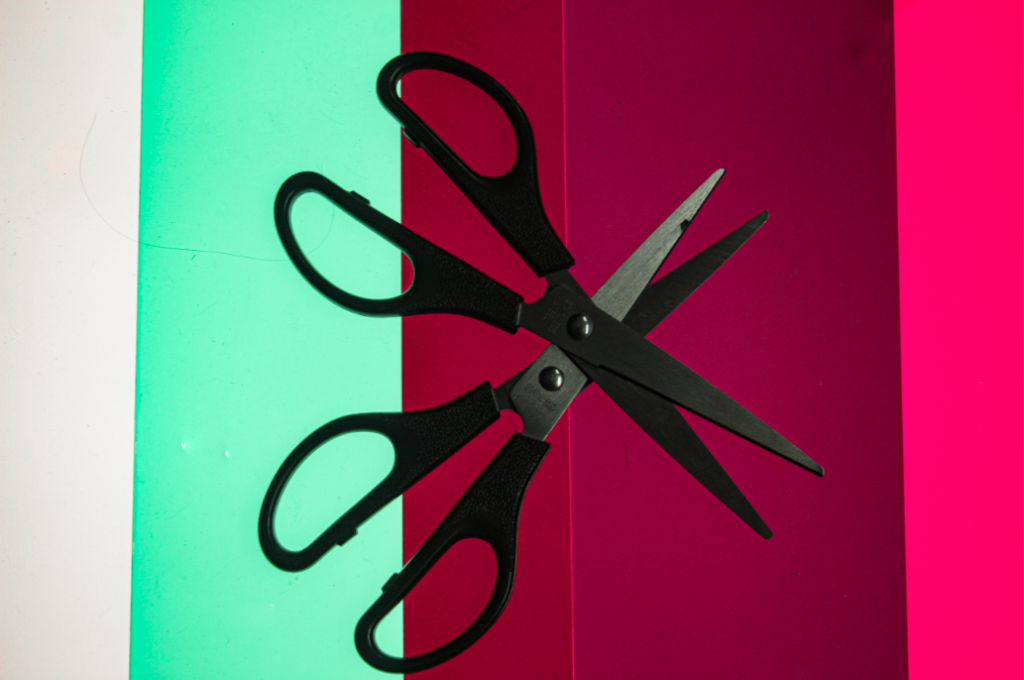
Whilst editing this photo, I thought about attempting to maintain the colourful background whilst showing the details of the scissors. I placed the scissors in a way so that they are both displayed clearly and look good. I think this really helped to make my image look interesting and appealing to look at because there is two objects that are the same, his is to maintain the idea of formalism and appreciation of one object whilst having two of the same object.
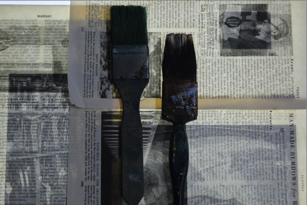
I really do not like this image because It is far too dark and is very low quality, however, I attempted to edit it anyway and see if I can elevate it and help it look better.
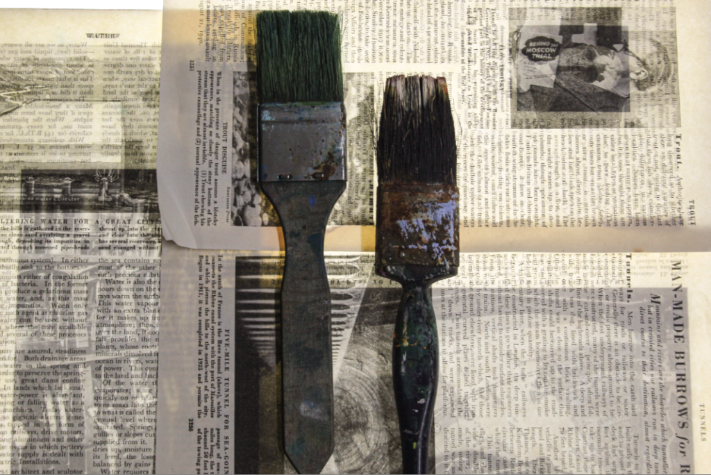
After editing this photo and focusing mainly on improving the whites and definitions I much prefer it. I think that once the image is brightened up, you can see the details and different textures from the object. However the newspaper behind the paintbrushes clashes slightly with the different colours and shades on the old paintbrush which I think makes the image look confusing and unappealing to look at. To improve I should change the objects on top of the newspaper to an object on one solid colour. If I did this, I think that the newspaper would bring out the detail of the objects much more.
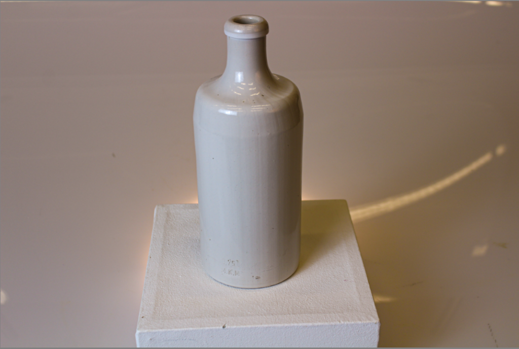
I only had to briefly edit this photo because It was already high quality and does not include a wide range of colours. This photo helps to appreciate the object whilst pairing it with whites and yellows on a subtle spotlight.
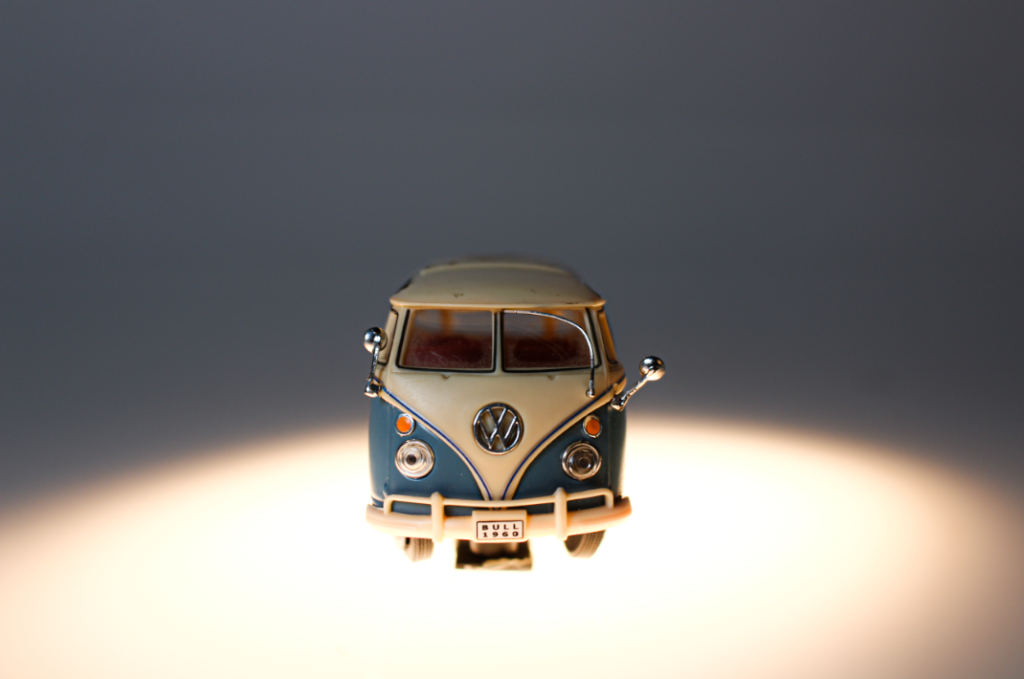
I also decided to take this photo from the same angle so that you can see the object from a direct point of view. I think if I took this from above it would not be as good and would not be as effective. The bright blue and orange really makes this image so much more eye-catching and structured. I really like this image however, the bright spotlight causes a slight blur from the bottom of the car. This takes detail away from the wheels and sign at the bottom of the car.
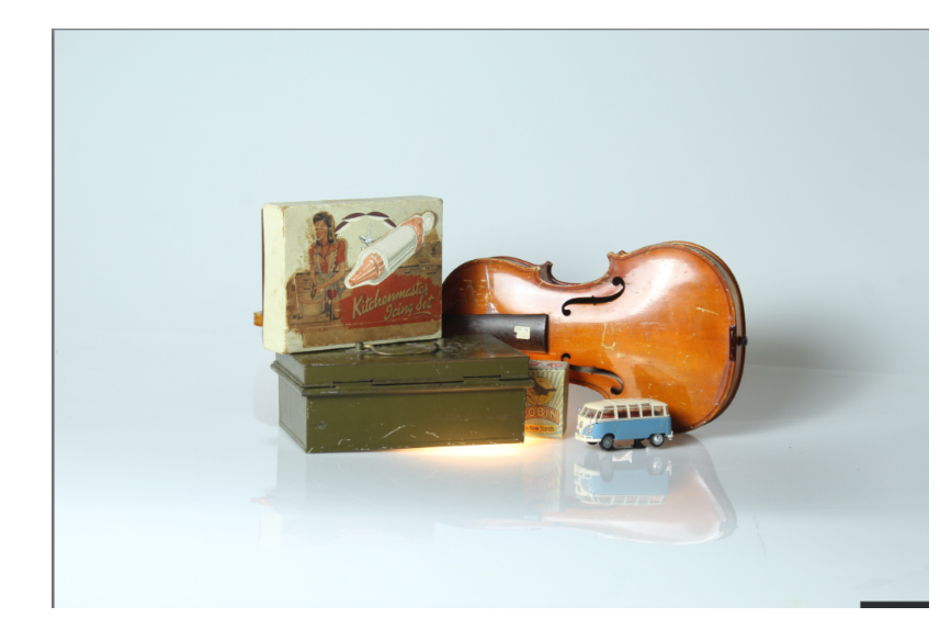
This photograph is before I edited it and made any changed to it.
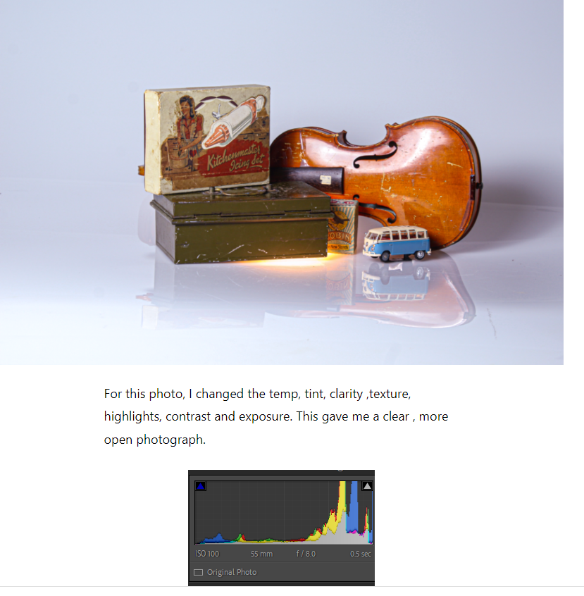
However, this is after.
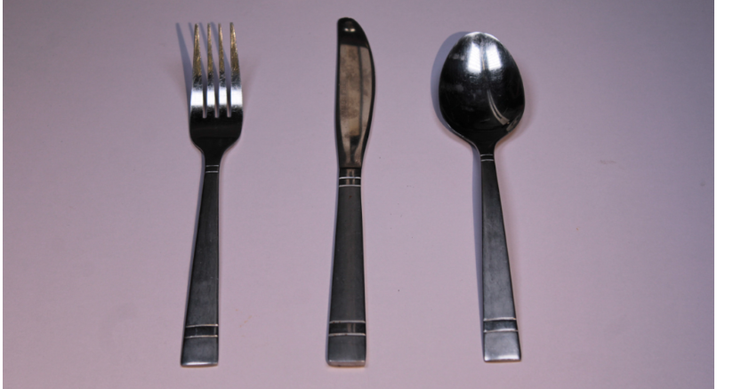
Here’s another one of my photos that I really like and think has a better texture and clarity after I used photo shop for it.
This is before…
After…
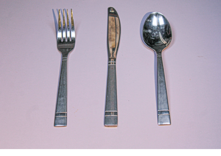
It brings out the refection’s and tones and textures. It gives the image almost like a drawing type texture which I really like.
Here is the how I edited it, I prefer these photos a lot more rather than the original ones without photoshop.
What is an object photography?
In object photography, everything revolves around photographing three-dimensional objects and arrangements. The most common type of object photography is the so-called table top photography, in which smaller objects are draped on a table or shelf.
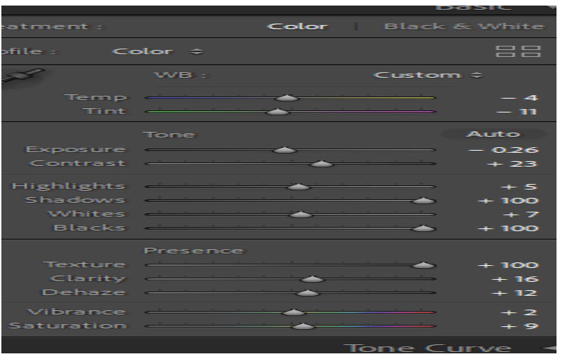
To conclude
I think that I edited these photographs’ quiet well and really brought out the colour it needed.
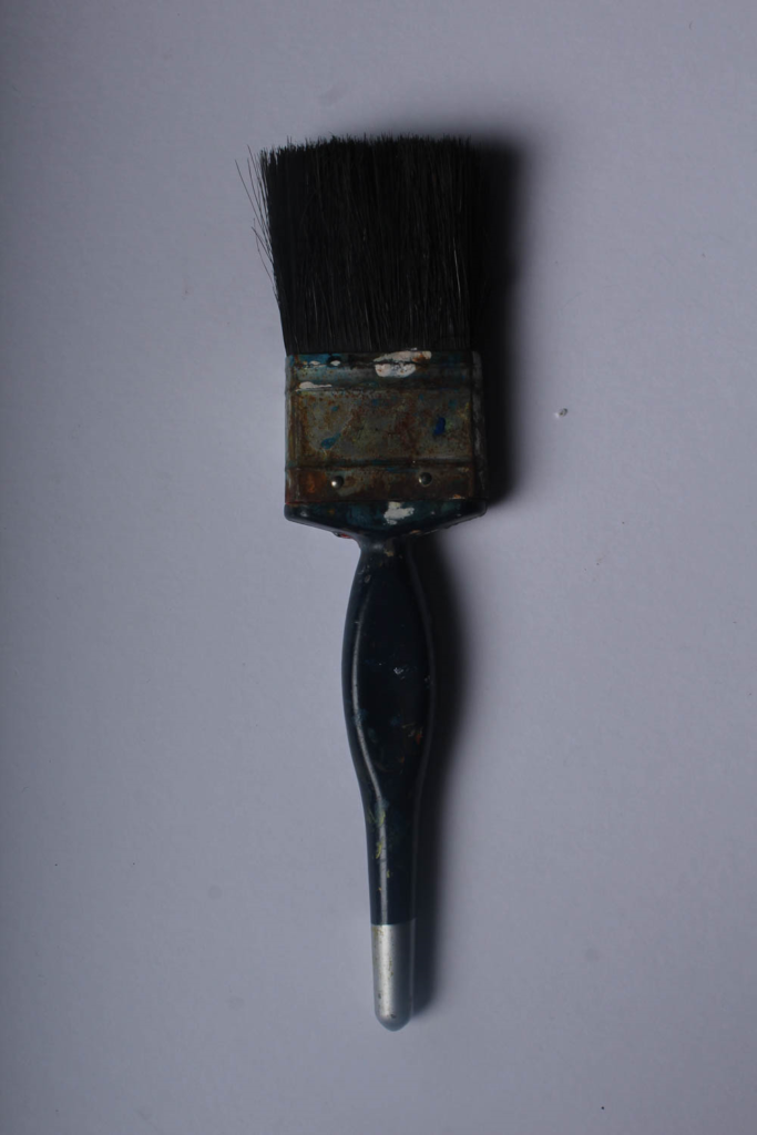
My original photo:
My editing Process:
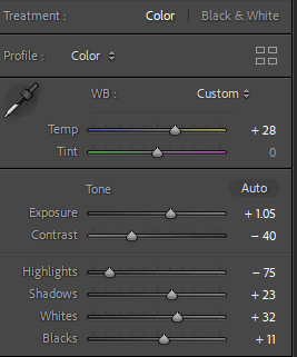
My photo after editing:
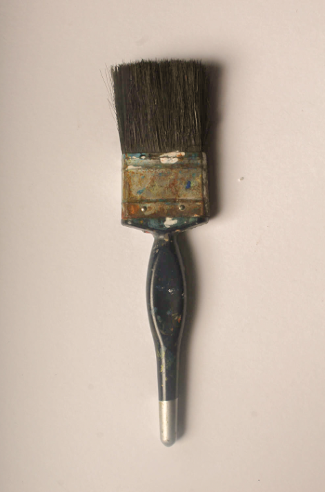
To achieve this photo, I went down to the studio and completed my camera set up in order for my photo to reach its full potential. I placed my tools onto a plain neutral piece of card which allows the brush to be the focus point in the image. The angle of my camera was placed at a birds-eye view, because it looks similar to Walker Evans’ photos, and gives the photo a sense of uniqueness.
Finally, I chose one of my best images that I had put a green flag on and rated it 5 stars. This technique is useful because it makes it easier for me to decide which photos I want to use and which ones I can retake / not use. I then cropped the image so there was less background around the paintbrush, and I edited the saturation of the photo because our artist inspiration Walker Evans often has his photos in low saturation for a dull effect.
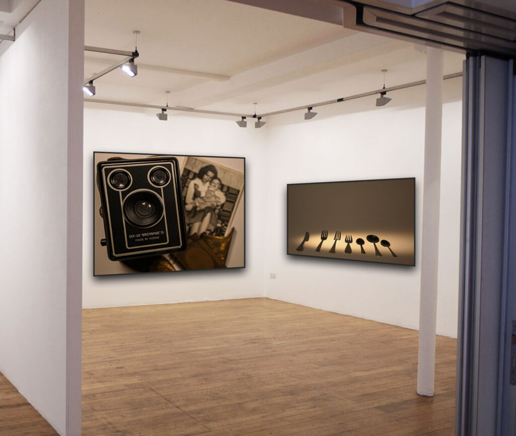
This is how I decided to display some of my favourite images from this topic. Although I do have other photos that I liked I choose to do these ones together because I thought the colour tones were quite similar so they worked really well together.
William Eggleston
Since the early 1960s, William Eggleston used color photographs to describe the cultural transformations in Tennessee and the rural South. He registers these changes in scenes of everyday life, such as portraits of family and friends, as well as gasoline stations, cars, and shop interiors. Eggleston looks at the world with the eyes of a documentarian rather than a curator: He shoots from unexpected angles or when the subjects are looking away. This creates the impression that the photographer isn’t there, and makes the images all the more intimate. He calls attention to familiar places, the people, and the objects that inhabit it. Here he has created a picture of an everyday scene. Shooting from an unusual angle, the mundane subject matter and cropped composition combines to produce what is considered a snapshot.
This is one of William Eggleston’s works. I have chosen this artist because his work may seem random but makes it seem alive with the vivid colours in the images. His photos show me that anyone can make any boring picture into looking more joyful. The lighting, texture and tone look beautiful and it doesn’t even look edited, it looks soft and natural.
These pictures reminds me of childhood because as a child I would always want to see the sunset and go on the scutter. The last picture is the original and the others are edited. I tried to make them as different as possible. I think this is connected with william eggleston’s work because he takes pictures of things that interest him most and edited them to make them look better and my favorite part of the day since a child was watching the sunset.
These pictures represent the road trips I would always have as a child. The first picture is the original and the others are edited. I changed lightings as much as i could so most them of could see more bright.
I decided to take pictures of the park since that’s one of the places I would be most as a child. My favorite photo out of all of these park pictures is the second one. Just love how it’s set.
My final piece is the photo above because I like the brightness of the picture. Also love how it is set and it makes it look alive.
Still life photography is a genre of photography used for the depiction of inanimate subject matter, typically a small group of objects. Similar to still life painting, it is the application of photography to the still life artistic style. Still-life photography’s origins reside in the early 20th century. Art photographers emerged such as Baron Adolf de Meyer. Most still lifes can be placed into one of four categories: flowers, banquet or breakfast, animal(s), and symbolic.
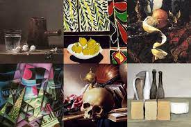
First still life painting:
The painting generally considered to be the first still life is a work by the Italian painter Jacopo de’Barbari painted 1504. The “golden age” of still-life painting occurred in the Lowlands during the 17th century.
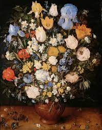
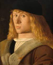
Most famous still life artists:
Most famous artists these days:
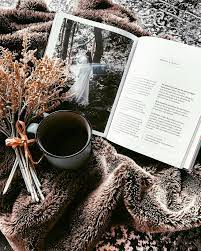
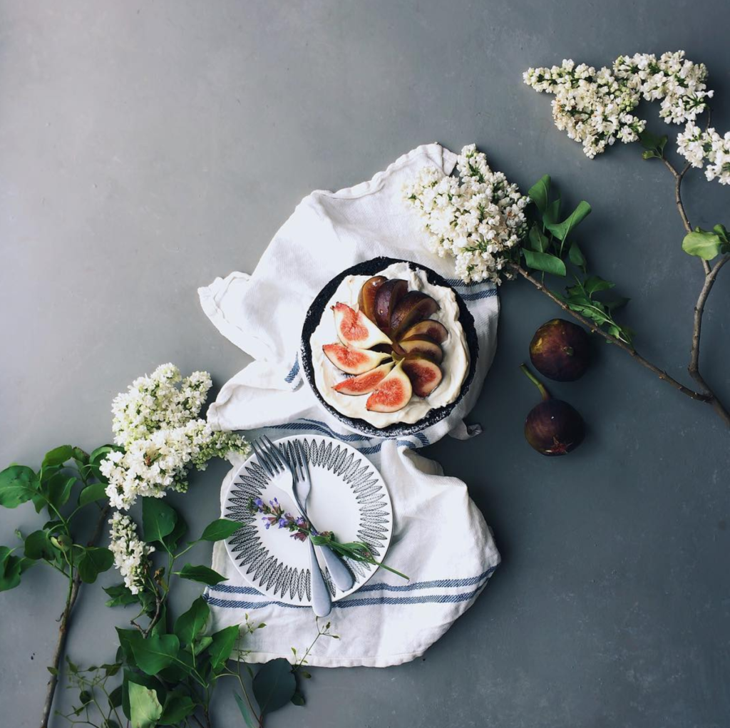
Vanitas is a still life painting of a 17th-century Dutch genre containing symbols of death or change as a reminder of their inevitability. Vanitas is also a still life artwork which includes various symbolic objects designed to remind the viewer of their mortality and of the worthlessness of worldly goods and pleasures.
Memento mori is an artistic or symbolic trope acting as a reminder of the inevitability of death. The concept has its roots in the philosophers of classical antiquity and Christianity, and appeared in funerary art and architecture from the medieval period onwards. Memento mori is a Latin phrase meaning ‘remember you must die’. A basic memento mori painting would be a portrait with a skull but other symbols commonly found are hour glasses or clocks, extinguished or guttering candles, fruit, and flowers.
Photoshoot 1
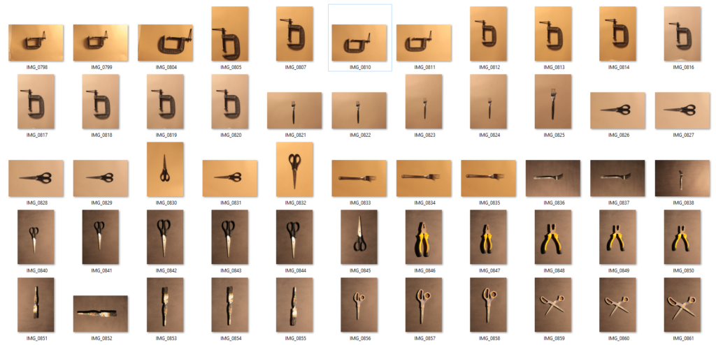
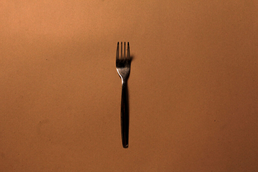
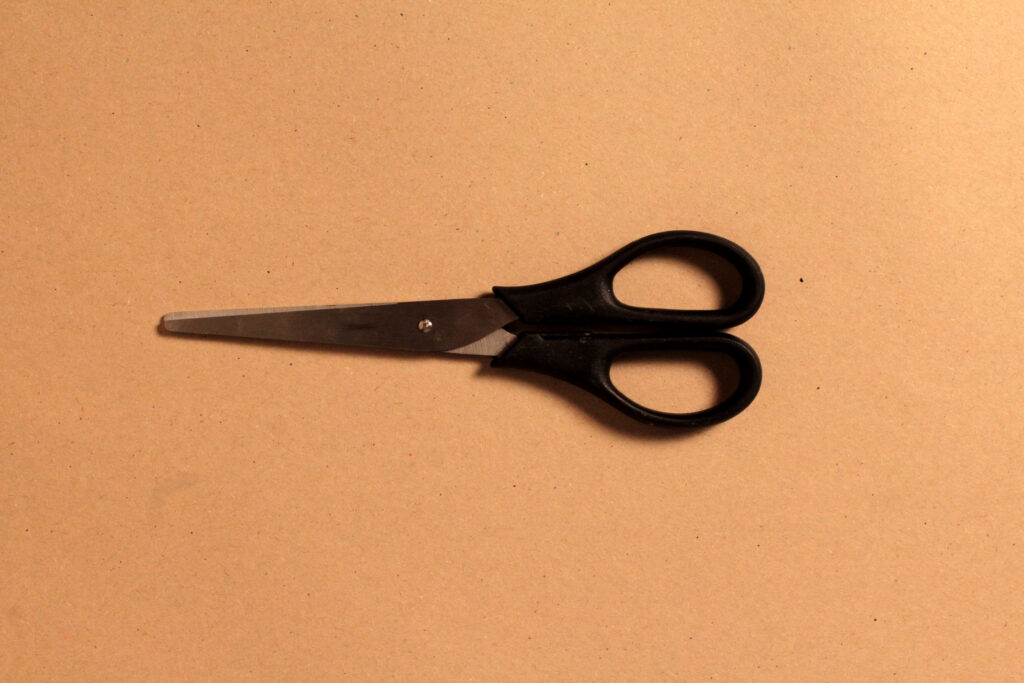
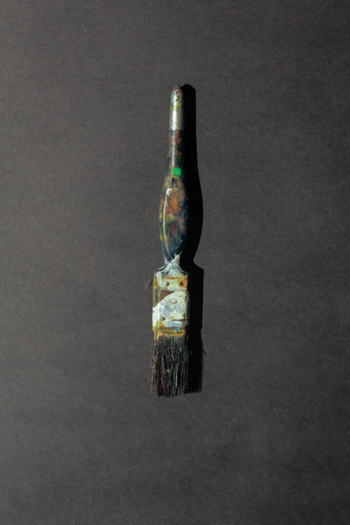
This is the first photoshoot I did based on Formalism. This one is inspired by Walker Evans and Darren Harvey-Regan. However, some of the photos didn’t turn out with good quality. I also don’t appreciate the lighting and backgrounds so for the second shoot, I used different objects and backgrounds.
Here are a couple of photographs from this shoot that turned out well:
Photoshoot 2
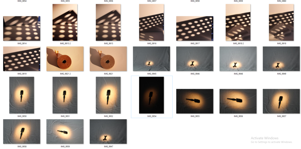
In this photoshoot, I experimented with using different lights and unique objects to create circular shadows on the white paper. I like how these photos turned out and have different shape, patterns and lines from the shadows. For these photos, I used the studio light and positioned it in certain ways to allow the objects to create shadows. For the photographs with just the circle shadows, I put an object which had holes all over it, in front of the light to project circle shadows onto the white paper. I really like how this turned out.
Edited Photo
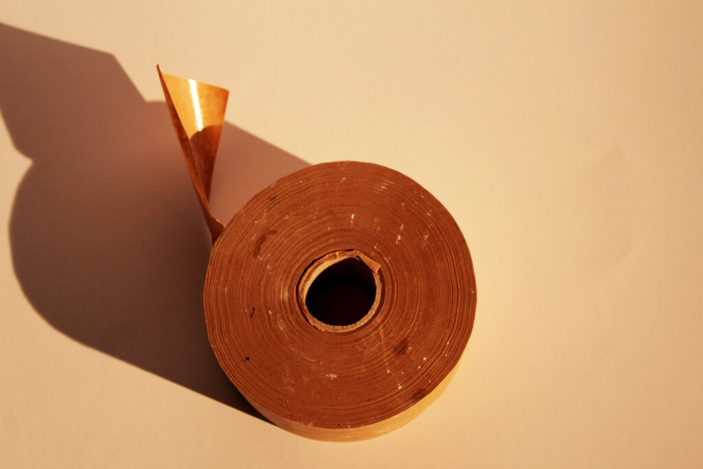
These are my favourite photo from this shoot, I like how the lighting was manipulated to make the photograph unique and eye catching. I slightly edited this photo by changing the levels and curves through photoshop.