what is formalism?
Formalism focuses purely on the visual elements of how a photo is taken, rather than its narrative context.
It emphasises seven different visual elements.
line:
Line is the most fundamental of the seven.
The Merriam-Webster definition of “line” comprises 15 parts, 46 sections, and 41 subsections. With all of that, the part that we, as photographic artists, are concerned about is this:
Lines can be present in many different ways. such as curved, straight, disrupted, dashed, and so on. Straight lines can be from man made items, and organic lines from nature.
Lines can also help convey a feeling or an emotion in an image. Straight vertical or horizontal lines create a still, stable and static image, while lines with movement and shape create flow.

shape:
Definition:
The Merriam-Webster definition of “shape” that we are concerned with as photographic artists is:
1 a : the visible makeup characteristic of a particular item or kind of item.
1 b (1) : spatial form or contour.
1 b (2) : a standard or universally recognized spatial form.
Shapes are two dimensional, in all different proportions.
Shapes that may be recognizable to the viewer may differ under the camera, depending on the angles the photo was taken. On top of this, shapes can be positioned or viewed in such a way that the various shapes combine and overlap to create one larger shape.
Shapes can be defined as the closing or intersection of lines as well and the contrast of lighter and darker areas of a photo, like a shadow, or varying texture or value.

form:
Form varies from shape as it introduces the 3 dimensional into our images. it has height width and depth.
The Merriam-Webster definition of “form” comprises 12 parts, 27 sections, and 4 subsections. As photographic artists, the part we are concerned with is:
1 a: the shape and structure of something as distinguished from its material.
One type of form is geometric meaning harsh polarising forms that have a distinct shape such as a cube or cone. another kind of form is organic, these are items that we interact with in day to day.
Form uses negative and positive space. positive space being the area obstructed by the object/item, while negative is what remains.
For centuries, people have been creating form and depth using shading with dark shadows, mid tones and highlights.

texture:
The Merriam-Webster definition of “texture” that we, as photographic artists, are concerned with is:
The visual or tactile surface characteristics and appearance of something.
Texture, in everyday life, can be present in loads of different ways. texture can be smooth, rough, grainy etc as well as descriptors like shiny, wet, dry.
Texture is presented similarly in photographs, but is completely visual. we can observe the texture of an item in a photo by recognising highlights and shadows that indicate the texture of the surface. smoother objects tend to have a more uniform colour and tone while rough shapes may display variety. We can also assume a photo has texture from the shape present like how we can look at a photo of fish scales and conclude there is texture.

colour:
The Merriam-Webster definition of “colour” that we, as photographic artists, are concerned with is:
1 a : a phenomenon of light (such as red, brown, pink, or grey) or visual perception that enables one to differentiate otherwise identical objects.
b (1) : the aspect of the appearance of objects and light sources that may be described in terms of hue, lightness, and saturation for objects and hue, brightness, and saturation for light.
Also : a specific combination of hue, saturation, and lightness or brightness.
(2) : a colour other than and as contrasted with black, white, or grey.
Colour has three properties. Hue, value, and saturation.
Hue describes the colour itself (red, green, Blue…).
Value is how light or dark the colour is.
Saturation is how intense the colour is, the most intense have no white, black or grey added.
Each colour can be utilized to elicit an emotion or reaction, green can symbolize nature or money, red could symbolize lust or danger, yellow could be positivity and purple could be prosperity and status.
Colour can be altered and utilized in different ways to give a photo a different feel. A highly saturated colour gives a more positive feeling, while a desaturated image may feel limp and vacant.

size:
The Merriam-Webster definition of “size” that we, as photographic artists, are concerned about is:
1 a : physical magnitude, extent, or bulk : relative or proportionate dimensions.
When looking in an image and we find something familiar, we automatically can understand the proportion of the image. If a human is photographed next to a large fish, we know by scale, the fish must be big. However, if the fish is photographed alone it may be difficult to determine the dimensions.
Size in an image can be utilized to create an illusion. Perspective can alter the appearance of the objects size. Getting closer to an object will emphasize its size.
Things we photograph can be small, medium or large.

depth:
The Merriam-Webster definition of “depth” that we, as photographic artists, are concerned about is:
2 b: the direct linear measurement from front to back.
As previously stated, images themselves are 2D. The image appearing 3D is created using depth among other things.
All objects will give an image depth unless it is a blank flat surface taken from a paralleled angle.
Most images have a foreground, middle ground and background. The more obvious the split between each, the greater the sense of depth will be portrayed in your image.
Depth can be recognised in many ways. this could be lines (such as train tracks) gradually reaching the horizon eventually narrowing into convergence. This is called linear perspective.

Walker Evans.

Walker Evan (1903-1975), was a working class American photographer who explored the diversity of people and how people were effected by the American civil war. He was able to capture poverty with exacting frankness, and didn’t like how people romanticised the
living conditions people suffered with.
Born on November 3, 1903 in St. Louis, MO, he went on to attend Williams College in Massachusetts, he later relocated to New York where he perused a career in writing. After a few years, eventually he had moved his medium into photography.
Walker worked for the Farm Security Administration, which was an accusation aiming to document the lives of rural Americans.
His subjects may give the rough dramatized appearance, but they are real people. He was able to capture a lot of elements such as texture in his work. This is seen in the organic wrinkles and impurities on his subjects faces, representing decades of struggle situated on a face.
He also photographed objects like common house hold tools. this work really shows us an object for the object itself and not its context, unlike his portraiture.
Image analysis.

Walker uses a striking black and white film that was available to him at the time and eliminates the story of colour from his images.
The backdrop this photo is taken on has a grainy texture.
The lighting is coming from the left, it casts a shadow towards the right of the object that is placed in the centre of the frame.
The handle has a form that catches shadows giving the image depth.
His focal length is most likely f/64.
Darren Harvey-Regan
Born in 1974, British photographer and artist Darren Harvey-Regan embraces the equilibrium of genres: abstract, landscape and still life. His images often hold few objects, tending to focus on one main object. Often utilizing natures organic lines and forms, in order to create abstract photographs with mixed dimensions and clean contours. Darren Harvey-Regan is a graduate of the Royal College of Art and is based in London.


Harvey-Regan’s work has appeared in exhibitions and publications internationally and is part of the photography collection at the Victoria and Albert Museum in London.
Darren often utilizes sculpture in unconventional ways in his work to covey a story, such as this photograph. It symbolises the movement of objects when a glacier melts and transports an object to a polarising location.


Darren Harvey-Regan was very inspired by Walker Evans in a lot of his works. In these photographs, Darren uses tools photographed in an unassuming way to portray formalism.
photo analysis.
In this photo it appears that artificial lighting has been used. this creates a very sterile appearing photo. There is very little shadow being cast as a result of the positioning of the object to the light.
This this photo is taken facing down. it is placed in the centre of the frame. rule of thirds is used to bring attention to the tops of the tools.
The aperture is probably a bit lower is the contrast is balanced, and everything is in focus.
The iso could be around 200-400 as the photo gathers a good amount of light, so it is more light sensitive.
The image has been taken in black and white.
Both these artists hold similarities. such as the fact they both shoot on black and white, they both photograph mundane objects. They also both use blank backdrops to bring the focus on the object they are photographing. Both artists utilize negative space to emphasize the object they want to bring attention to.


Walker Evans uses a higher aperture as his images have more contrast, while Darren utilizes a higher aperture as his images are much brighter.
The biggest difference between them is that Walker Evans uses film while Darren’s work is digital.
I am going to create photos inspired by both Darren Harvey Regan’s work and Walker Evans.

my photoshoot.


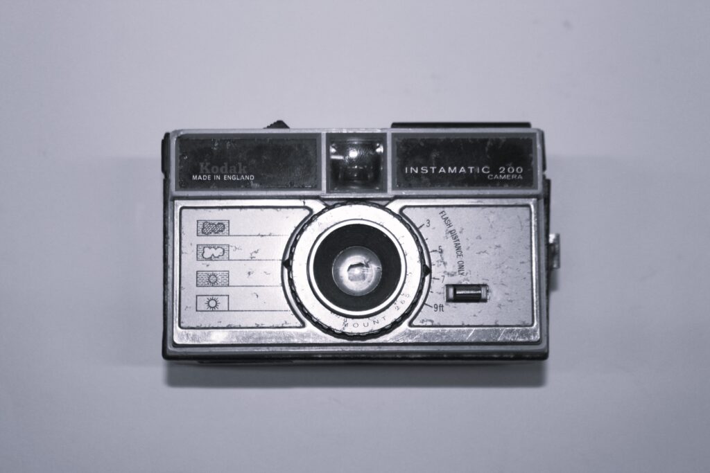
I used a filter on Lightroom to make the images black and white, a characteristic of walker Evans and Darren.
I used a continuous light and let a shadow cast on the left of the object.
I like the contrast between the white backdrop and the darker camera.
I made sure the subject was placed in the centre of the frame.


