Walker Evans was an American photographer and photojournalist best known for his work for the Farm Security Administration documenting the effects of the Great Depression.
He document the authentic, ordinary, and transitory details that he now saw in his homeland. Evans was among the first documentary photographers to display his work in the context of beautifully bound and expensively designed books.
Some of his most notable photos are from his project ‘Beauties of the Common Tool’
“Among low-priced, factory-produced goos, none is so appealing to the senses as the ordinary hand tool. Hence, a hardware store is a kind of offbeat museum show for the man who responds to good, clear ‘undesigned’ forms.”
– Walker Evans The objects are framed in the middle photos with a lot of negative space. Without any context. so we appreciate them in their own right. he uses different shades of grey so that the whole focus is on the objects.
– Walker Evans
Untitled 1928
Dimensions2 1/2 × 1 9/16″ (6.3 × 4 cm)
His work – analysis
– There is a warm white light on the right side of the photo.
there is a lot of harsh lines and squares although those lines are complimented by the curve of the building
all these lines have geometric qualities making me believe it is man made
the darkness creeping in on each corner gives a dramatic effect.
the windows are the only object we can see the whole of this shows how he may have been zoomed in or close to the building this also leaves us not knowing how big the building is.
the curved left side of the building has many rectangles going up on the side like a harmonica and as the building gets higher the rectangles are getting smaller like the pitch in the music higher.
The image also has many tones from very dark to very light. There are deep shadows but also mid tones. The photograph is monochrome but has a brownish old sort of tint.
Darren Harvey-Regan
united kingdom 1974
Harvey-Regan finds photography that photographs objects – whilst in itself being an object – interesting as a concept. “It’s a means of transposing material into other material, adding new meaning or thoughts in the process. I think photographing materials is a way to consider the means of creating meaning, and it’s a tactile process with which I feel involved. Touching and moving and making are my engagement with the world and my art”.
Darren Harvey-Regan saw the ‘beauties in the common tool’ and played on a similar concept translation and representation, but he took it a step further and reversed the usual directions on the photographs. He hybridised objects in reality, by buying, deconstructing, and reconstructing actual tools. he was also different because he was beginning with an image, then creating the object, before re-photographing it to complete his peculiar new photographs.
Darren Harvey-Reagen
The Erratics – analysis
there are many harsh lines.
dark geometric shapes.
grey background to emphasises the black and white
the darkness creates emphasis on the objects.
In geology, “erratic” refers to a rock that differs from its original environment because it was carried and deposited there by a long-gone glacier. Similarly, in his latest series, Darren Harvey-Regan deploys both photography and physical action to lift something out of context, playing with overlapping exposures and processes.
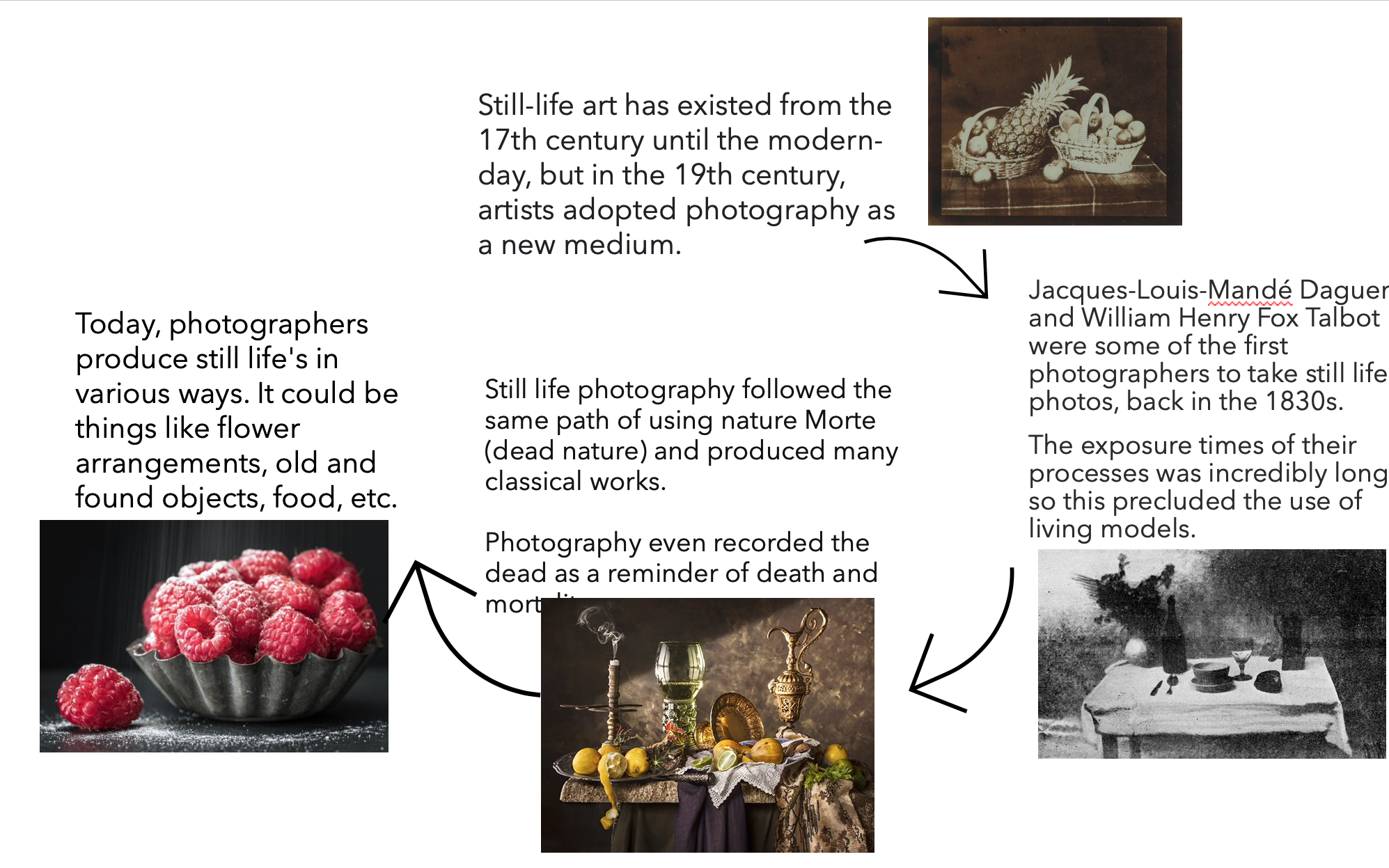
Show examples of still life painting and photography
Include specific artist references and choose one image for analysis using matrix
Provide a chronological timeline of still life photography
Then Answer
What is Vanitas?
What is Memento Mori?
What kind of metaphors and symbols are used in still life and why
What is still life?
Still life is a genre of photography that focuses on capturing a group of inanimate objects. These objects can be natural or man-made. They are photographed or painted. Edouard Manet once called still life “the touchstone of painting.”
The term “still life” is derived from the Dutch word stilleven, which became prominent during the 16th century. During this time, still life became recognized as a genre.
Each object symbolizes something, whether that is wealth, poverty, love, etc..
Still life originally began with Netherlandish painting of the 16th and 17th centuries and then developed into a genre of photography.
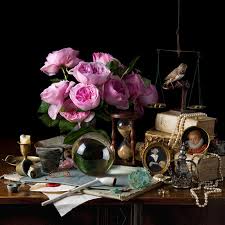
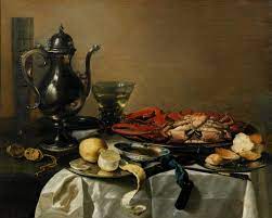
Examples of still life paintings:
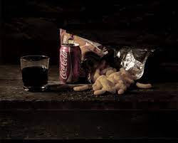
Examples of still life photography:
These images are from photographers:
Paulette Tavormina
Laura Letinsky
Pieter Claesz
Mat Collishaw
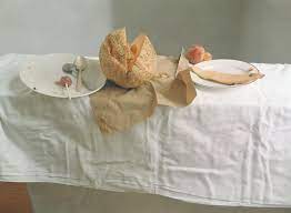
Mat Collishaw:
Mat Collishaws work may appear to be strange, but the real meaning makes the images even more daunting.
Each piece is inspired from prisoners last meals on death row. This makes an eerie atmosphere, not only because of the negative space created by the dark background. There is low light on the images, so it creates dark shadows around the food so you can just about see it with details on the main areas. Even the colour of the food which would normally be vibrant has become dull and appears to look older than it is, reflecting the meaning behind the images. The bag has been torn open to which may reflect the violence behind this prisoners act.
A timeline of still life photography:
What is Vanitas?
the Latin for vanity, in the sense of emptiness or a worthless action.
Vanitas are a form of still life artwork which includes at least 3 symbolic objects. They are designed to remind the viewer of their mortality, death and how worthless of worldly goods are compared to living a moral life. They caution the viewer to be careful about placing too much importance in the pleasures of this life with objects of wealth as they could become an obstacle on the path to salvation and happiness.
Vanitas generally feature:
Skulls,
Books,
Playing cards,
Maps,
Wilting flowers,
Goblets of wine,
Jewellery,
Hourglasses,
Recently extinguished candles.
What is Memento Mori?
a Latin phrase meaning “remember you must die.”
Memento Mori is an artwork formed to remind the viewer of their mortality and of the shortness and fragility of human life. This ties in with Vanitas as they both want the viewer to be aware that expensive objects that show wealth, status and power are worthless and unnecessary in life and shouldn’t be concentrated on in the so little time we have.
This reminder is motivating the viewer to use their limited time wisely.
Photos consist of formal and visual elements, without these there would be no photo. Its like having a sentence without gramma, it would be impossible. Examples of formal/ visual elements include:
Light – e.g. areas of brightness?
Line – do objects in the image act as lines? Lines can guide the viewer through your shot or to a specific focal point. These are known as leading lines. Lines don’t need to be straight either, they can be curved, angular, ext. Angular lines that converge into a central point, commonly known as a vanishing point, are often used to add perspective to an image.
Repetition – this could be done to create a larger emotion on the viewer
Shapes – organic/geometric shapes. Circles for example are often used to create a feeling of balance and harmony.
Space – is there depth to the photo or shallow, is there negative space? A positive space is the part with the subject in.
texture – how do the objects feel? Texture is often used to bring a feeling of realness. A picture with little texture can often look too flat.
Value/tone – Is there a range of tones? are they balanced?
Colour – saturated, black and white, ext. Can heavily effect mood.
Composition – how have elements in picture been arranged
Photo Literacy:
Its the language of the image. People have an ability to ‘read’ a photograph, to analyse its form and meanings. For example, an image taken with certain camera lenses or angle, ext can portray different time periods of photography. People admire different things in photos so not every photo will impact 2 different people in the same way.
Formalism examples:
Formalist photos are where The Design, Composition and Lighting are dominant over Subject Matter:
Walker Evans
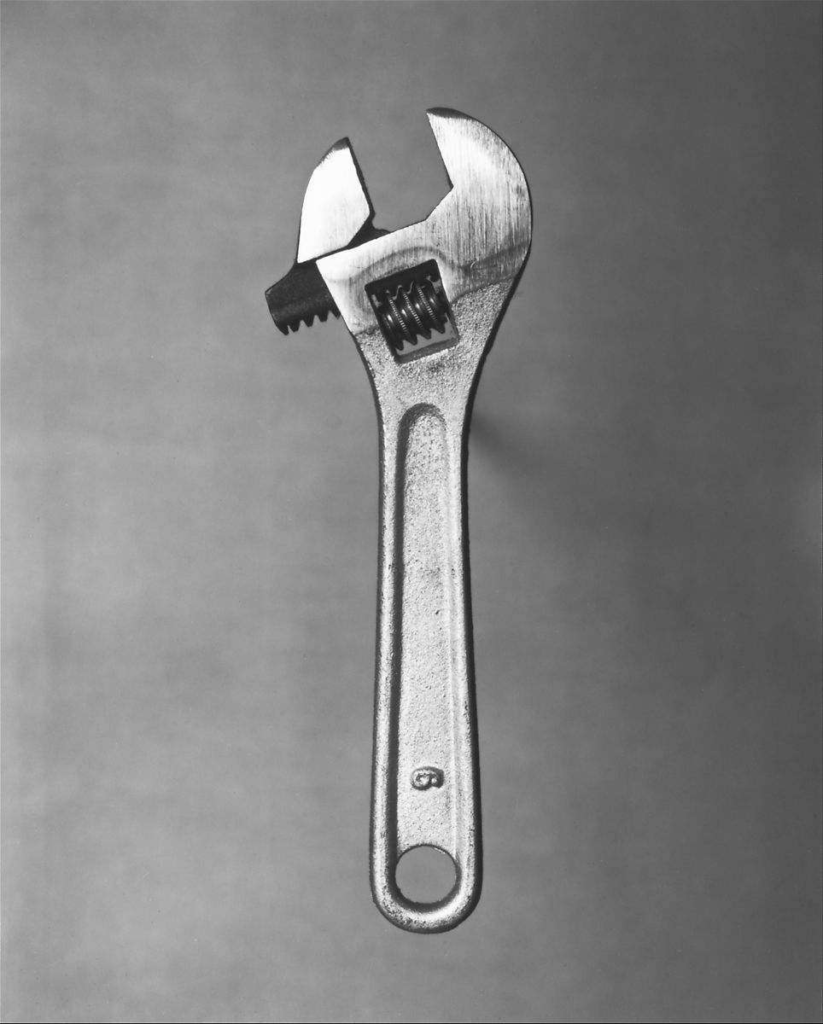
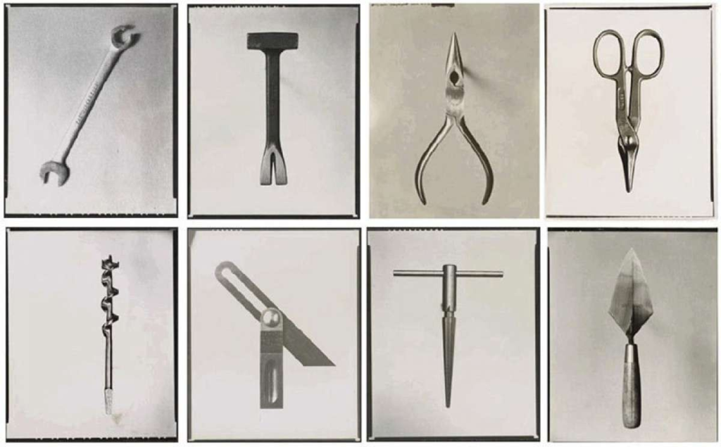
Walker Evans began to photograph in the late 1920s, making snapshots during a European trip and published his first images in NY 1930s. The photographs of Walker Evans told the story of American working-class life with an exacting frankness that was truly revolutionary for its time. His iconic portrait of Allie Mae Burroughs – a farmer’s wife, and mother of four – whose unforgettable eyes seem to stare right through us – is one of the most firmly embedded images in American consciousness. Beauties of the common tool was another famous piece of work that he published in 1955 and tries to capture the good, clear, ‘undesigned’ forms.
This B/W image of a wrench has hard shadows and soft highlights. There is a very basic background elements so your eyes are drawn into the only object in the scene. The roughness on the surface with geometric shapes makes it feel heavy duty and useful.
Darren Harvey-Regan
Darren Harvey-Regan (born in 1974) was greatly influenced by Walker Evans where they paid large amounts of attention to the choice of objects used, how they are arranged, the lighting and exposure values. This allowed both of them to create striking images that portray different feelings. His work often sees a hybridisation of the conventions of photography and sculpture. His works challenge the viewer to distinguish where representation ends and the object begins. Here are some photos from his album Beauties of the Common Tool, Rephrased II, 2013 which is inspired by the origional:
with modern camera and lighting systems this image was able to eliminate all background elements leaving the object on a plain white background. These images also differ as it combines two common tools. Its done in a way to make it seem like the objects belong together.
Formalism in photography is the design, composition and light of the photo. Formalism describes the most critical aspects of the images and the visual aspects, whether than the narrative aspects and the relationship with the visible world.
Example of formalism – the composition with blue, red and yellow (Primary Colours).
Formalism:
>Light
>Space
>Shape
>Repetition
>Texture
>Form
>Depth
Walker Evans
Walker Evans is an American photographer who took pictures in the later 1920’s during his trip around Europe. During the ‘Great Depression’ Walker Evans took pictures to portray the resettlement admiration. He is best known for documenting the affects of the ‘Great Depression’.
This is Walker Evans formalism photography. He uses different still life objects to create a simple photoshoot. He uses black and white images to portray a relaxed mood. For these images I can make an assumption that he uses artificial light for his images. I know this because the light is slightly dull which makes the mood of the photo quite low and makes us as the viewer wonder what the tool is being used for and whether the tool is being used for the correct things.
The shapes in the images are harsh, this shows that the tools in the images are used to fix hard objects because of the strong sharp edges of the tools. This makes the viewer think about the different uses of the tools.
There is also repetition in his photoshoot as in the all the photos include a tool of some sort, there is repetition in the shade and level of lighting used in the photos, the colour is a dull grey colour which makes the photos look morbid and eerie. I really like the repetition in this photoshoot and I like how all the tools are different however all come under the same category. It makes the viewer wonder where the tools have came from and makes us wonder what the different tools could be used for, or what they were used for.
Darren Harvey-Regan
Darren Harvey – Regan is an English artist who took the simplicity of an image of the object and made the still life have a meaning and made the objects have meaning rather than having a purpose.
He uses tools similar to Walker Evans, however they are slightly different because Darren Harvey-Regan uses a plain white background to display his work. I really like his work because I think it is very simple however very affective and portrays a story behind the photo.
Just like Walker Evans, the objects in his images have sharp edges and present a harsh aesthetic with the different tools that he uses. One thing I like about his work is the simplicity in making a tool have a meaning. His aim was to make simple objects have a meaning and I think he executes this objective extremely well because I become interested in the tools by looking at this photo, whereas usually I wouldn’t be satisfied by a picture of a tool.
I like the lighting he used to execute this strong piece of artwork is a soft cool tone light. I can infer that he used artificial lighting because the lighting is very even and there are no shadows which make the photo look like a painting. I like the tone of colour he used because it makes the background extremely bright which contrasts with the dark colour of the tool.
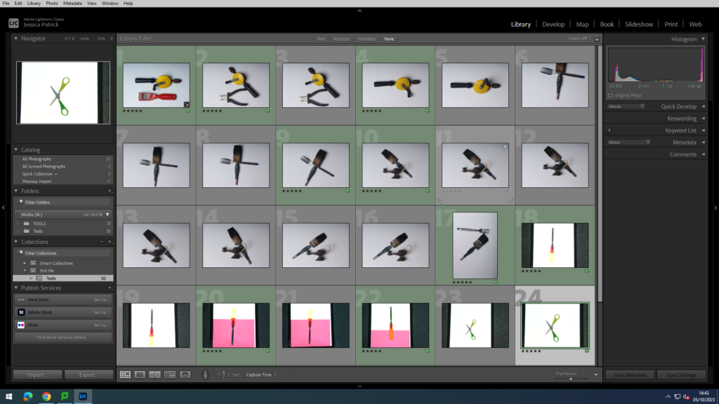
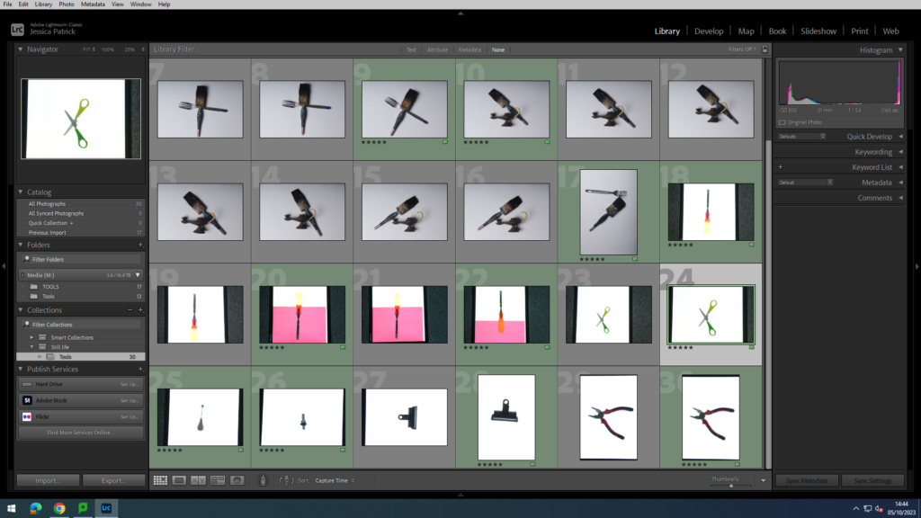
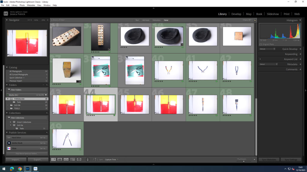
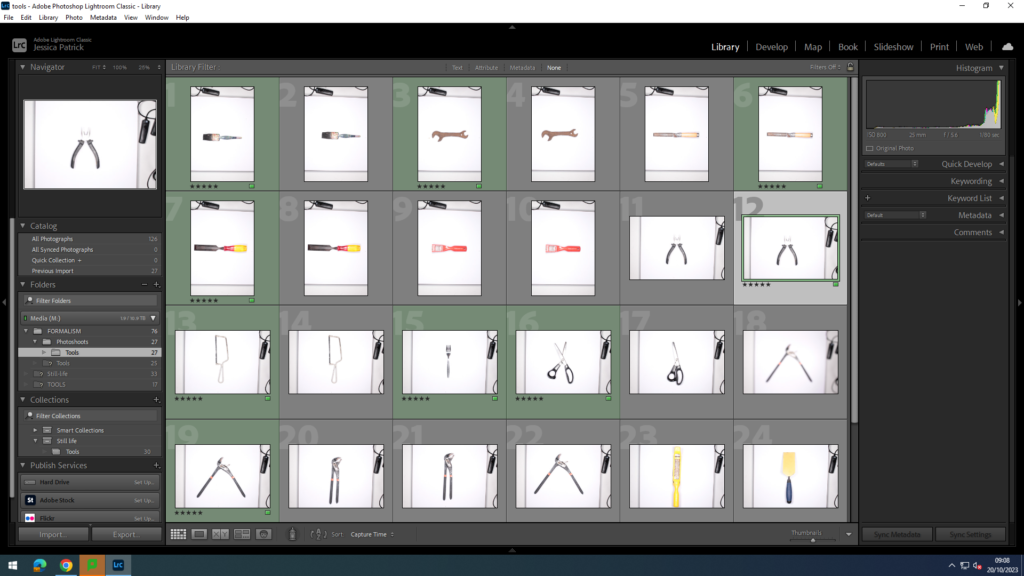
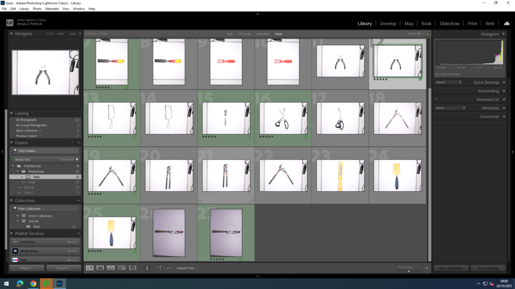
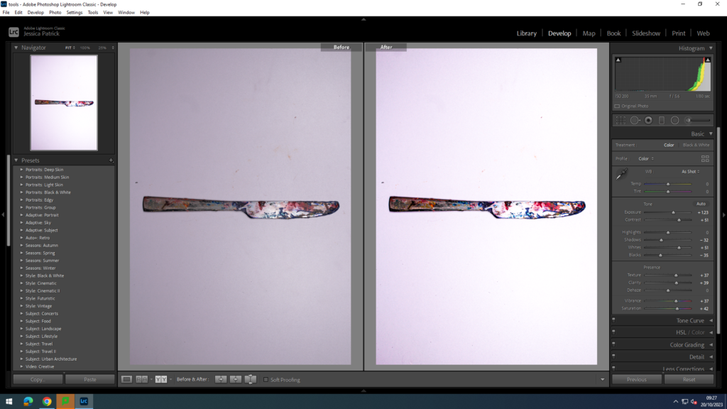
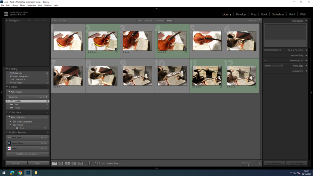
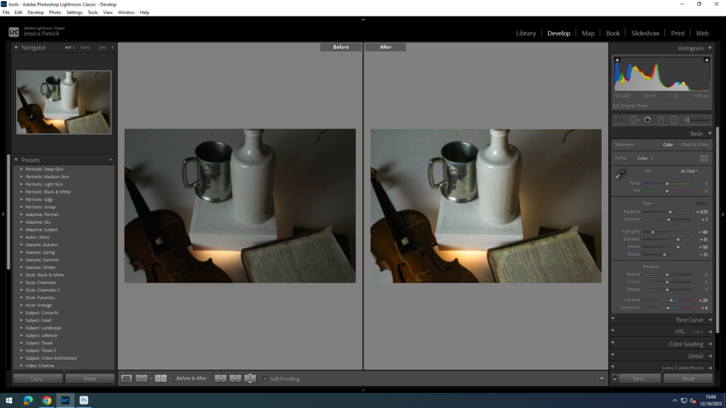
The photos I have chosen to edit on light room are the photos, which are highlighted green. I chose these photos, because they have the best composition and the best colour. I also highlighted a selection of photos with one tool or two tools.
I edited the photo on the right to make it brighter and more colourful, compared to the dull photo on the left. I did this by increasing the contrast, shadows, whites, blacks, texture, clarity, vibrancy and saturation.
Aperture: f/16
Shutter speed: 1/200 secs
ISO: ISO-100
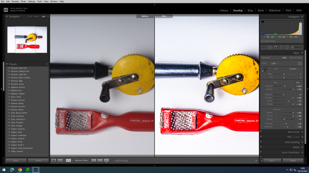
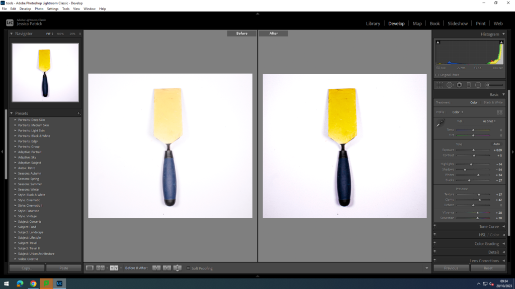
I focussed on making this picture brighter and enhancing the yellow colour. I did this, by increasing the texture, saturation and by decreasing the blacks.
Aperture: f/16
Shutter Speed: 1/200 secs
ISO: ISO-100
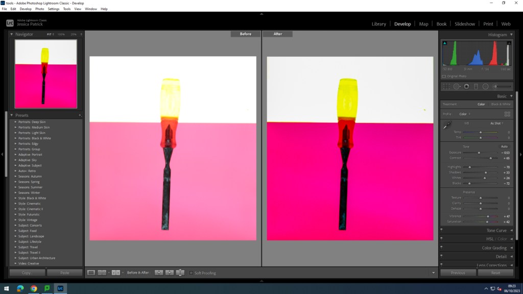
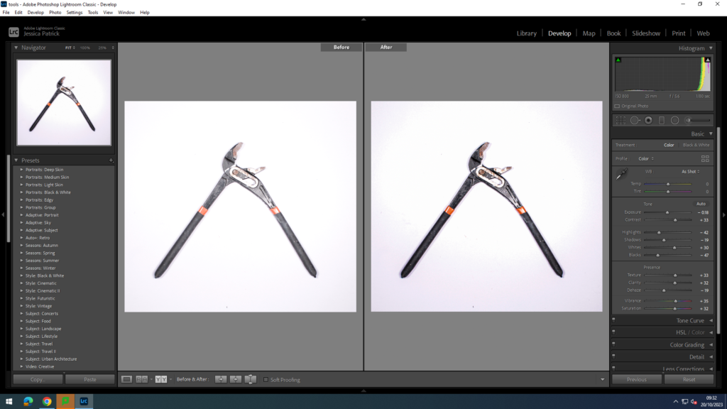
I edited these photos to make the tool more clear, by enhancing the yellow and red colours on the handle, so the yellow was less transparent. I did this by decreasing the highlights and increasing the whites, texture and the shadows.
Aperture: f/16
Shutter speed: 1/200 secs
ISO: ISO-100
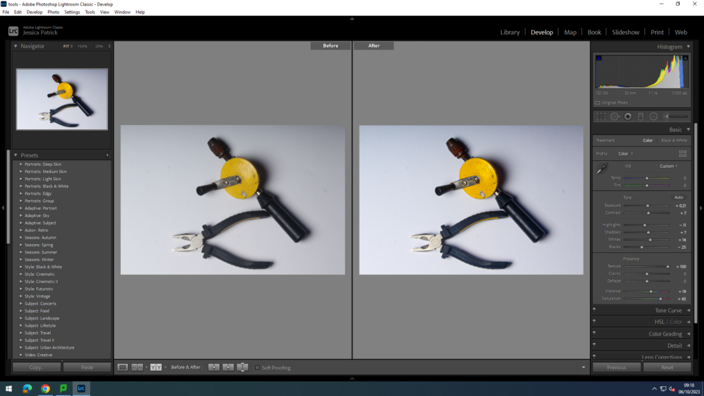
I edited this picture by increasing the contrast, shadows and texture, so I could enhance the colours in this photo and to make it brighter.
Aperture: f/16
Shutter speed: 1/200 secs
ISO: ISO-100
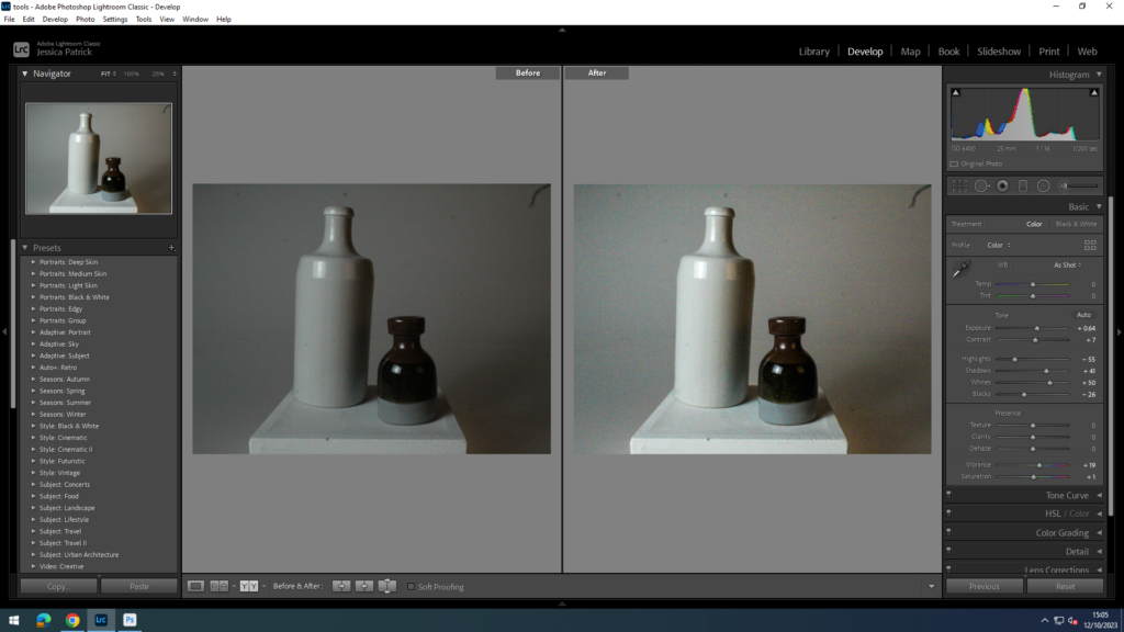
Walker Evans- Single Tools Inspo
The photographs of the single tools which are highlighted green are the photographs I have chosen to edit, because they are the clearest photos and are more centred.
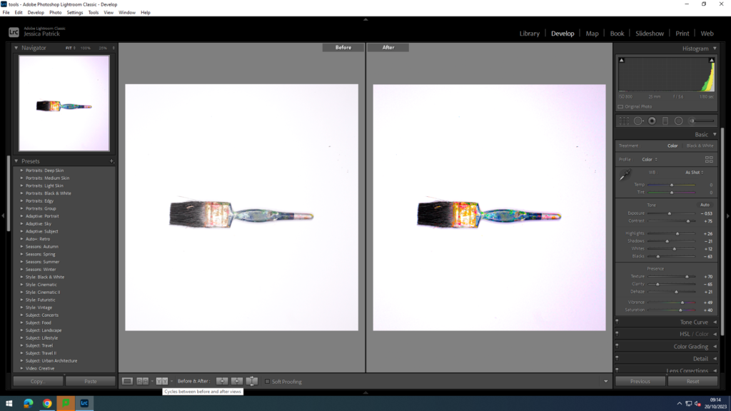
I edited this photo by decreasing the exposure, shadows, blacks and clarity, while increasing the contrast, highlights, whites, texture, dehaze, vibrancy and saturation. I did this to enhance the colours on the paintbrush and to make the image and colours much brighter.
Aperture: f/16
Shutter speed: 1/200 secs
ISO: ISO-100
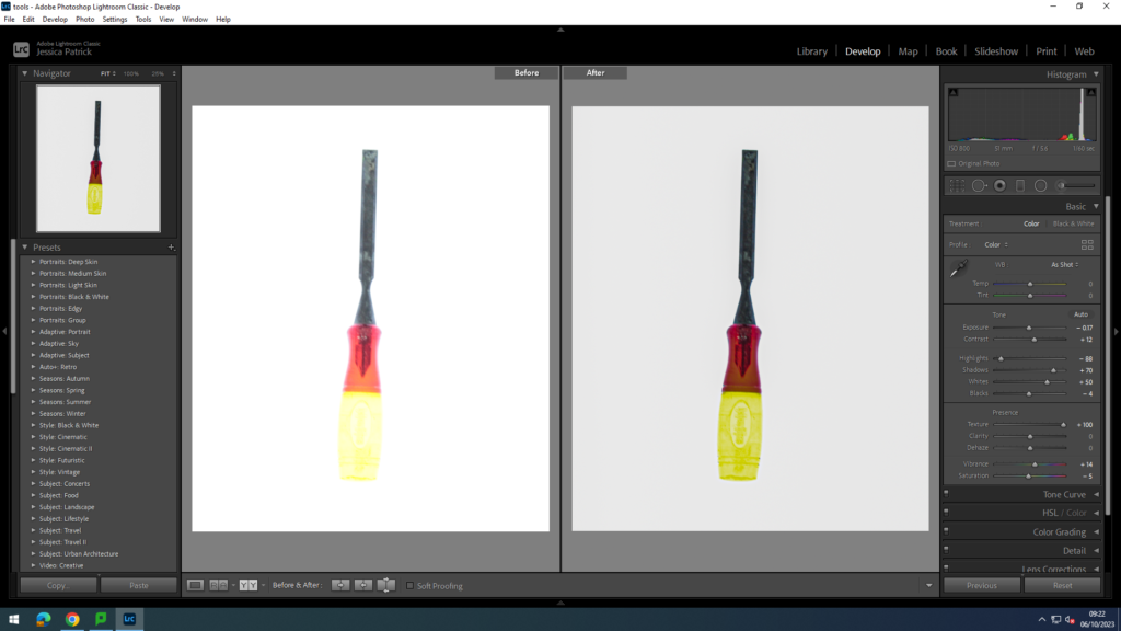
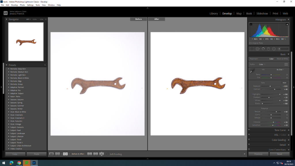
I edited this photograph by decreasing the exposure, shadows and blacks, while increasing the contrast, highlights, whites, texture, vibrancy and saturation. I did this to make the single tool stand out more, by being brighter and appearing more rustic.
Aperture: f/16
Shutter speed: 1/200 secs
ISO: ISO-100
I edited this photo by increasing the contrast, whites, texture, clarity and vibrancy, while decreasing the highlights, shadows, blacks, clarity and dehaze. I did this to make the tool darker, so it could be more visible on the white background.
Aperture: f/16
Shutter speed: 1/200 secs
ISO: ISO-100
I edited this photo to make the colours more vibrant and the photo brighter. I did this by increasing the exposure, contrast, whites, texture, clarity, vibrancy and saturation, while also decreasing the highlights, shadows, blacks and dehaze.
Aperture: f/16
Shutter speed: 1/200 secs
ISO: ISO-100
I edited this photo to make the blacks and orange stand out more and to make the photo brighter. I did this by increasing the contrast, whites, texture, clarity, vibrancy and saturation, while decreasing the exposure, highlights, shadows, blacks and dehaze.
Aperture: f/16
Shutter speed: 1/200 secs
ISO: ISO-100
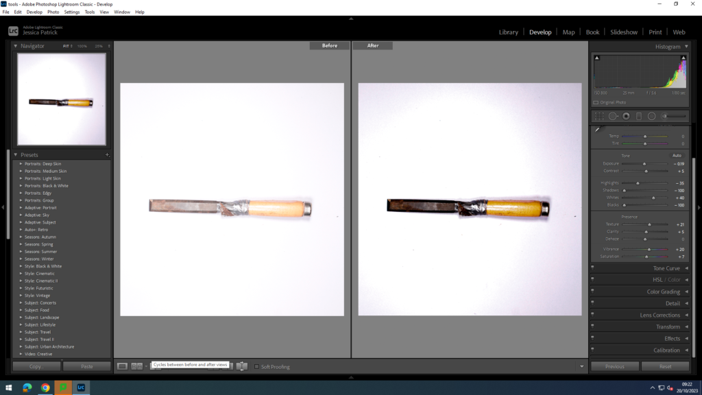
I edited this photo by increasing the whites, texture, clarity, dehaze, vibrancy and the saturation, while decreasing the highlights, shadows, whites, blacks and dehaze. I did this to enhance the yellow, blue and black colours on the tool, while also making the tool darker, so it is more clear and visible on the white background.
Aperture: f/16
Shutter speed: 1/200 secs
ISO: ISO-100
Conclusion
Overall, I think this photoshoot went very well, because I focussed on making all my images very clear and in focus, so they all came out well. I also had time to experiment with taking photos of single tools, like Walker Evans and taking photographs with two tools, like Darren Harvey-Regan. My editing also went well as I was able to make the photographs more colourful, bold, brighter and clearer.
“Among low-priced, factory-produced goos, none is so appealing to the senses as the ordinary hand tool. Hence, a hardware store is a kind of offbeat museum show for the man who responds to good, clear ‘undesigned’ forms.”
– Walker Evans
After beginning photography in the 1920’s, he published his first photos in the 1930’s. Evan’s was best known for his work for the Farm Security Administration and capturing images of Great Depression.
Whilst working at at Fortune magazine, Evans produced an array of photos named Beauties of the Common Tool,” which was displayed in the July 1955 issue.
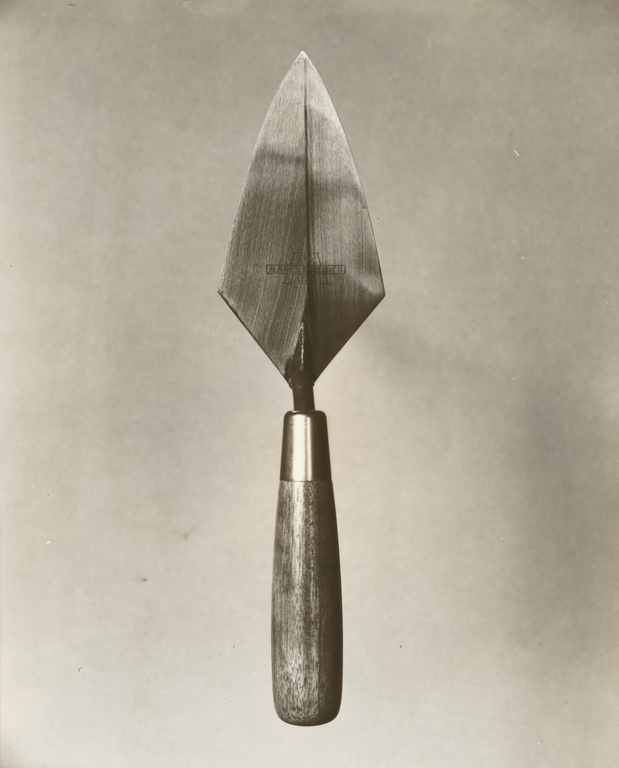
Much of Evans’ work from the FSA period uses the large format, 8×10-inch view camera. The variety of objects consisted of:
1- a reamer 2- an awl 3- a bill hook 4- an auger 5- various pliers 6- T-squares 7- wrenches
The main way that Walker Evans photographed his objects is with them above a blank background. He also elevated the objects with something underneath, this helped to create a heightened effect and prevent a shadow from happening.
Here is my interpretation of Walker Evan’s Work
I turned this image from coloured to black and white to match Walker Evans. Whilst editing I paid close attention to Walker Evan’s ideology of ‘The Beauty of the Common Tool’ and how it could influence my work.
I think to improve this photography I could take more photos of the same angle that he did. This would make my photos look even more like his. Another thing Evan’s did was elevate the object to avoid a shadow, in this image there is a shadow. To improve I am going to do this with my object.
I then did another photoshoot and focussed on taking the object photos from above and elevating the object to avoid the shadow. I think this really made my object photos look like Walker Evans’s work of ‘The Beauty of the Common Tool’.
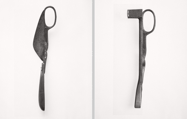
Darren Harvey- Regan
After Walker Evan’s July 1955 issue was released, Harvey-Regan first constructed a montage of Evans’s images to make new forms.
Walker Evan’s work truly inspired Darren Harvey- Regan and helped him to become the photographer that he has become. He took Walker Evans’ work and montaged it into an array of combined images.
The montaged tools that Darren used were shown to become both beautiful and bizarre objects.
The odd yet unique objects consisted of items such as:
Scissors
Ratchet Wrench
Pliers
“It’s a means of transposing material into other material, adding new meaning or thoughts in the process. I think photographing materials is a way to consider the means of creating meaning, and it’s a tactile process with which I feel involved. Touching and moving and making are my engagement with the world and my art”. Darren Harvey- Regan.
Darren Harvey Regan claims he is interested in the concept that photographs do not exist just to show things, but are physical things that become objects themselves. – This is what introduces the idea of appreciation of one object.
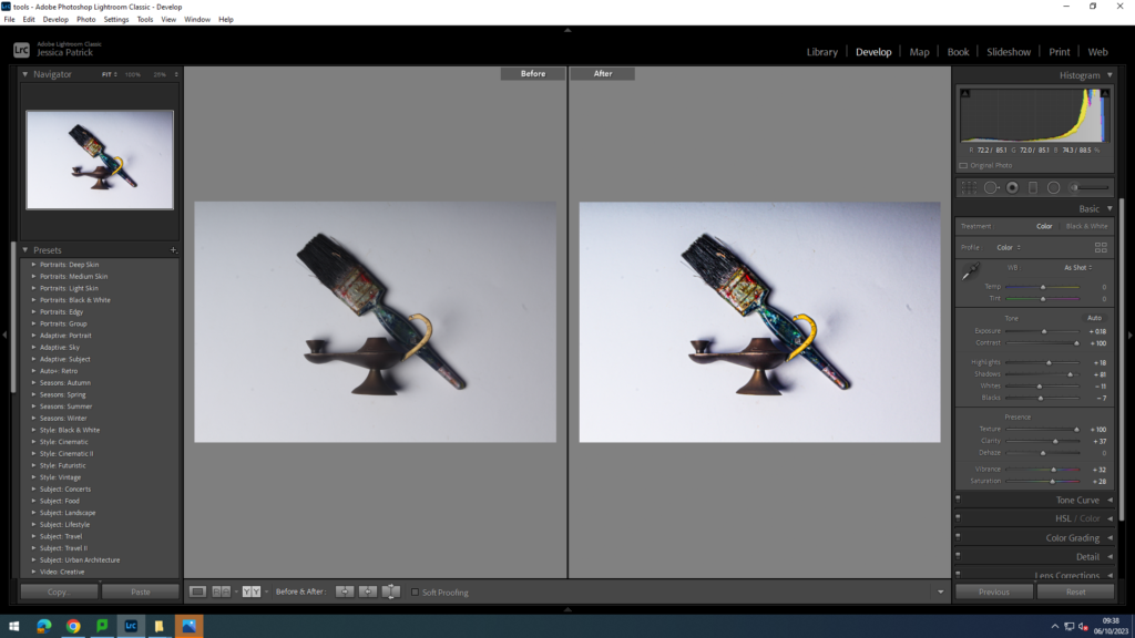
I attempted to take this photo to represent formalism in a different form that is different from Darren Harvey Regan’s interpretation however, this image ended up being very over exposed and incorrectly taken. This resulted in a blurry and dark image that I cannot edit or improve.
We chose this photograph to analyse because I can see it is particularly bright and eye-catching in the centre and the background is particularly dark which creates cool dimensions and makes it appealing to people. This image has inspired my photography as it has introduced me to different lightings being used in one photos. The contrast of light and darks really brings out the definitions in the photo. To create this effect I would have to challenge myself to work with multiple lightings for one shot. this could bring my photos to the next level and test my skills whilst in the studio.
We quickly picked up mostly on the:
Bright yellow tint on the man and how it helps bring him out in the image.
The contrast of warm colours on the inside and cold colours on the outside.
The mixture of ambient and artificial lighting with the small amount of natural lighting.
The white light around him that helps him stand out.
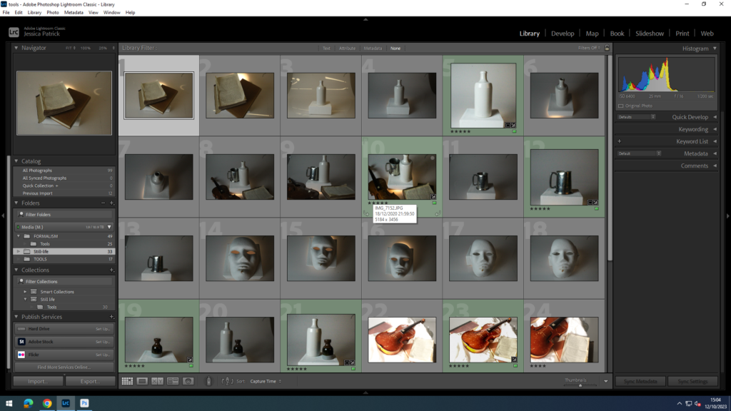
I chose to edit the photos, which are highlighted green, because they have the best composition and are the clearest photos, as some of the other photos I had taken were a bit blurry and out of focus.
I edited this photo to make the colour clearer and to give the photo more texture and lines. I did this by increasing the texture and clarity, while decreasing the contrast, highlights, blacks and whites.
Aperture: f/4.5
Shutter speed: 1/50sec
ISO: ISO-2000
I edited this photo to make it clearer and to have the words stand out more on the page, by giving the photo more texture. I did this by increasing the shadows and the whites, while also decreasing the highlights.
Aperture: f/4.5
Shutter speed: 1/50sec
ISO: ISO-2000
I edited this photo to make it more bright and bold, and giving it a lot more texture and shadows. I did this by increasing the contrast, whites, texture and contrast, while also decreasing the highli8ghts, blacks and shadows slightly.
Aperture: f/4.5
Shutter speed: 1/50sec
ISO: ISO-2000
I edited this photo to enhance the colour slightly and make it more clear. I did this by increasing the shadows slightly and decreasing the highlights and blacks slightly.
Aperture: f/4.5
Shutter speed: 1/50sec
ISO: ISO-2000
I edited this photo to enhance the whites in the photograph. I did this by increasing the shadows and whites, while decreasing the highlights and blacks.
Aperture: f/4.5
Shutter speed: 1/50sec
ISO: ISO-2000
I edited this photo by increasing the shadows and whites, while decreasing the highlights and blacks. I did this to brighten the photo and enhance the white.
Aperture: f/4.5
Shutter speed: 1/50sec
ISO: ISO-2000
Conclusion
Overall, I think my photoshoot went well, as I do like the photos I have chosen and edited. However, next time I would like to play around with my presentation for and experiment with different objects and compositions. I also need to practise keeping a steady hand and making sure the camera is in focus, so I can get clearer photographs. However, I think my editing went quite well, as I was able to give the photographs more contrast and make them clearer.
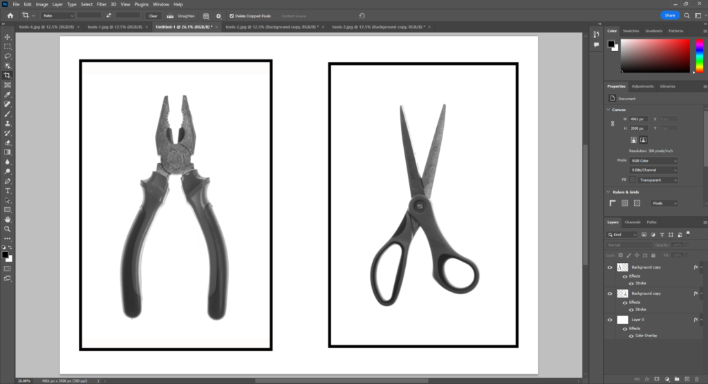
I chose four images overall as my final images. This included two single tools and two arrangements. The single tools were set in black and white inspired by Walker Evans.
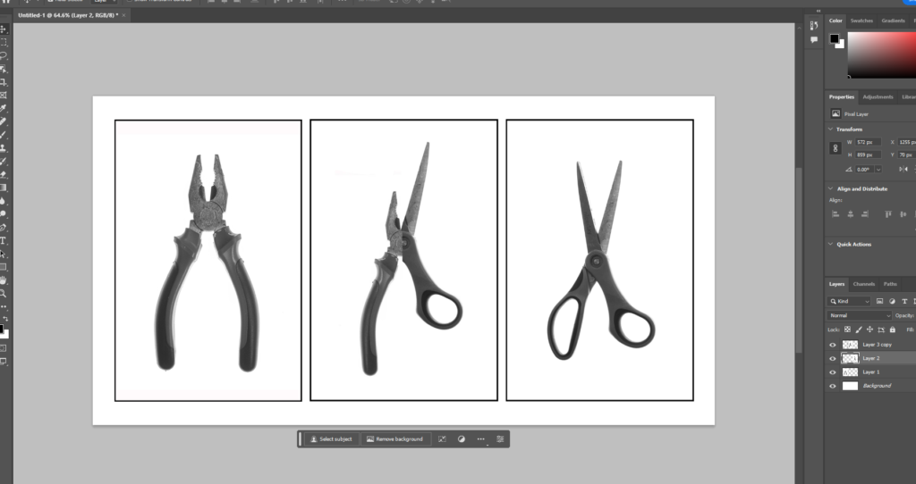
I used a black and whitepreset which had high contrast. I then opened them in photoshop to add a border with the stroke option. I added this because the white background meant that the frame around the objects wasn’t clear. The framing was different between both images also, scissors were wide and pliers were thin. In photoshop I couldcrop outside of the image to add in more white around the plyers so they’d both have similar boarders.
Both of these images now look like they should be together so in photoshop I opened a A4 landscape page which I added both images to. I really like how the boarders look when the images are together and this helped visualise what the images would look like mounted. I chose the diptych style of presentation which places two similar photographs together. This process taught me how to experiment with arrangements as well as how to edit in photoshop.
I tried a triptych including the mixed photograph too but I don’t think the three sit together very well. The two are similar enough but the edited one is changed a little too much from the other two. Both halves are smaller and moved which becomes obvious next to the original.
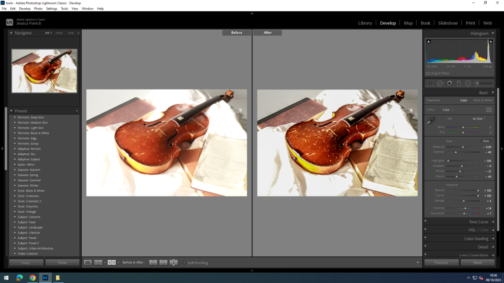
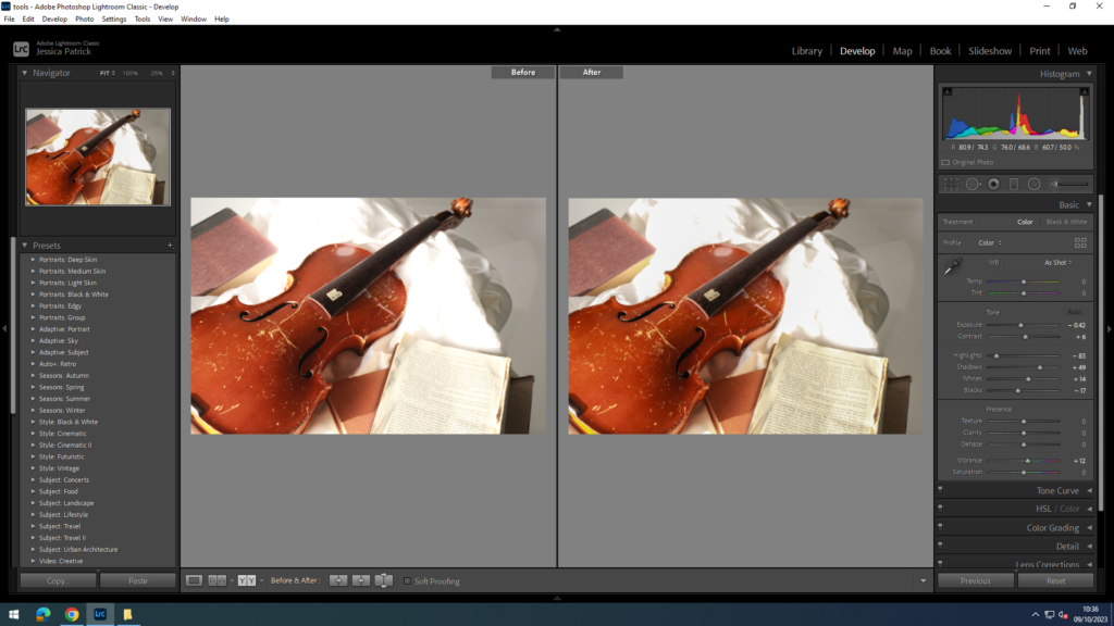
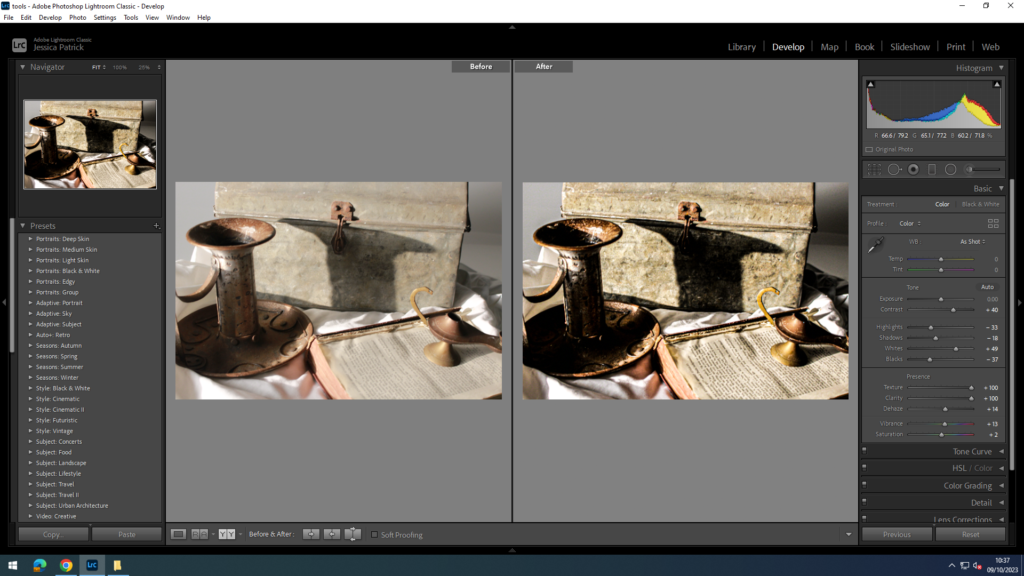
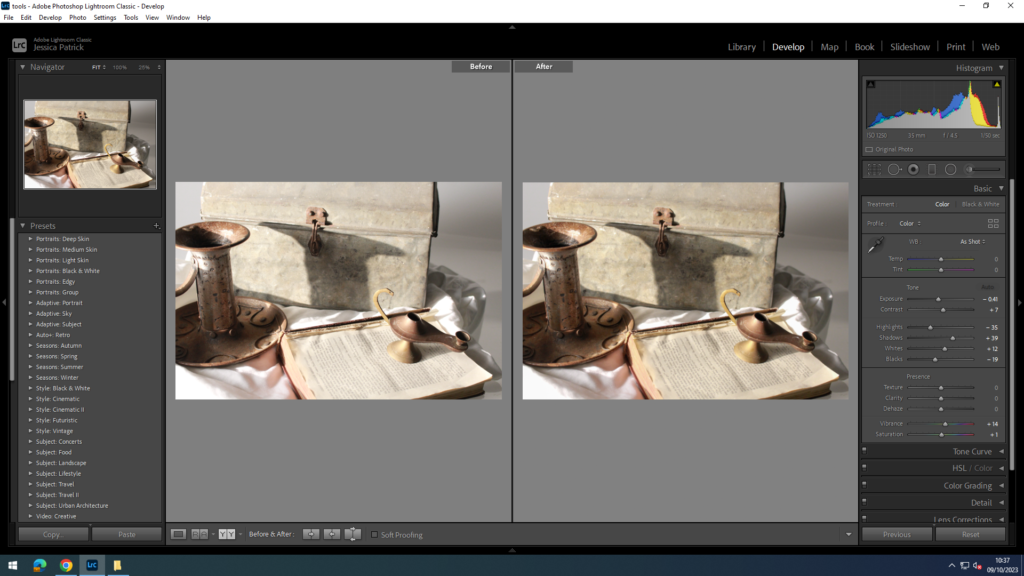
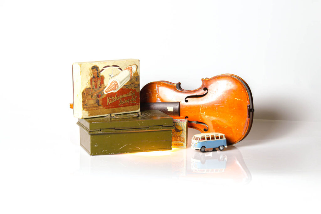
Still-life arrangement
These two images don’t look like they would look right in a collage together and I believe this is because they are at different angles at different distances from the camera. The plyers are much closer to the camera than the violin. Also the set ups are different. I took the plyers in front of two pieces of card with a harsh split between the two. The card is matt and the lighting was just natural lighting. This looks significantly different to the infinity screen I used with the violin which used a continuous spot light, a backlight and a reflective white background without any harsh lines behind.
I tired arranging both photographs into a diptych but I think presenting these as single photographs looks better. This is because the objects used are extremely different. The plyers are balancing with tapes which have anindustrial style while the violin uses household items which creates a homely feeling. This shows the importance of items as they can completely change the meaning of a photograph.
Formalism focuses purely on the visual elements of how a photo is taken, rather than its narrative context.
It emphasises seven different visual elements.
line:
Line is the most fundamental of the seven.
The Merriam-Webster definition of “line” comprises 15 parts, 46 sections, and 41 subsections. With all of that, the part that we, as photographic artists, are concerned about is this:
Lines can be present in many different ways. such as curved, straight, disrupted, dashed, and so on. Straight lines can be from man made items, and organic lines from nature.
Lines can also help convey a feeling or an emotion in an image. Straight vertical or horizontal lines create a still, stable and static image, while lines with movement and shape create flow.
shape:
Definition:
The Merriam-Webster definition of “shape” that we are concerned with as photographic artists is:
1 a : the visible makeup characteristic of a particular item or kind of item.
1 b (1) : spatial form or contour.
1 b (2) : a standard or universally recognized spatial form.
Shapes are two dimensional, in all different proportions.
Shapes that may be recognizable to the viewer may differ under the camera, depending on the angles the photo was taken. On top of this, shapes can be positioned or viewed in such a way that the various shapes combine and overlap to create one larger shape.
Shapes can be defined as the closing or intersection of lines as well and the contrast of lighter and darker areas of a photo, like a shadow, or varying texture or value.
form:
Form varies from shape as it introduces the 3 dimensional into our images. it has height width and depth.
The Merriam-Webster definition of “form” comprises 12 parts, 27 sections, and 4 subsections. As photographic artists, the part we are concerned with is:
1 a: the shape and structure of something as distinguished from its material.
One type of form is geometric meaning harsh polarising forms that have a distinct shape such as a cube or cone. another kind of form is organic, these are items that we interact with in day to day.
Form uses negative and positive space. positive space being the area obstructed by the object/item, while negative is what remains.
For centuries, people have been creating form and depth using shading with dark shadows, mid tones and highlights.
texture:
The Merriam-Webster definition of “texture” that we, as photographic artists, are concerned with is:
The visual or tactile surface characteristics and appearance of something.
Texture, in everyday life, can be present in loads of different ways. texture can be smooth, rough, grainy etc as well as descriptors like shiny, wet, dry.
Texture is presented similarly in photographs, but is completely visual. we can observe the texture of an item in a photo by recognising highlights and shadows that indicate the texture of the surface. smoother objects tend to have a more uniform colour and tone while rough shapes may display variety. We can also assume a photo has texture from the shape present like how we can look at a photo of fish scales and conclude there is texture.
colour:
The Merriam-Webster definition of “colour” that we, as photographic artists, are concerned with is:
1 a :a phenomenon of light (such as red, brown, pink, or grey) or visual perception that enables one to differentiate otherwise identical objects.
b (1) : the aspect of the appearance of objects and light sources that may be described in terms of hue, lightness, and saturation for objects and hue, brightness, and saturation for light.
Also : a specific combination of hue, saturation, and lightness or brightness.
(2) :a colour other than and as contrasted with black, white, or grey.
Colour has three properties. Hue, value, and saturation.
Hue describes the colour itself (red, green, Blue…).
Value is how light or dark the colour is.
Saturation is how intense the colour is, the most intense have no white, black or grey added.
Each colour can be utilized to elicit an emotion or reaction, green can symbolize nature or money, red could symbolize lust or danger, yellow could be positivity and purple could be prosperity and status.
Colour can be altered and utilized in different ways to give a photo a different feel. A highly saturated colour gives a more positive feeling, while a desaturated image may feel limp and vacant.
size:
The Merriam-Webster definition of “size” that we, as photographic artists, are concerned about is:
1 a : physical magnitude, extent, or bulk : relative or proportionate dimensions.
When looking in an image and we find something familiar, we automatically can understand the proportion of the image. If a human is photographed next to a large fish, we know by scale, the fish must be big. However, if the fish is photographed alone it may be difficult to determine the dimensions.
Size in an image can be utilized to create an illusion. Perspective can alter the appearance of the objects size. Getting closer to an object will emphasize its size.
Things we photograph can be small, medium or large.
depth:
The Merriam-Webster definition of “depth”that we, as photographic artists, are concerned about is:
2 b:the direct linear measurement from front to back.
As previously stated, images themselves are 2D. The image appearing 3D is created using depth among other things.
All objects will give an image depth unless it is a blank flat surface taken from a paralleled angle.
Most images have a foreground, middle ground and background. The more obvious the split between each, the greater the sense of depth will be portrayed in your image.
Depth can be recognised in many ways. this could be lines (such as train tracks) gradually reaching the horizon eventually narrowing into convergence. This is called linear perspective.
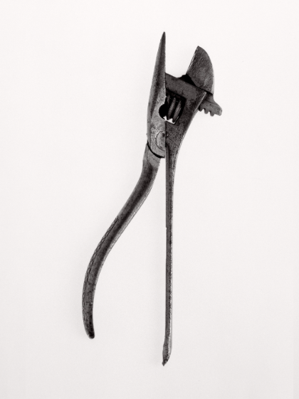
Walker Evans.
Walker Evan (1903-1975), was a working class American photographer who explored the diversity of people and how people were effected by the American civil war. He was able to capture poverty with exacting frankness, and didn’t like how people romanticised the
living conditions people suffered with.
Born on November 3, 1903 in St. Louis, MO, he went on to attend Williams College in Massachusetts, he later relocated to New York where he perused a career in writing. After a few years, eventually he had moved his medium into photography.
Walker worked for the Farm Security Administration, which was an accusation aiming to document the lives of rural Americans.
His subjects may give the rough dramatized appearance, but they are real people. He was able to capture a lot of elements such as texture in his work. This is seen in the organic wrinkles and impurities on his subjects faces, representing decades of struggle situated on a face.
He also photographed objects like common house hold tools. this work really shows us an object for the object itself and not its context, unlike his portraiture.
Image analysis.
Walker uses a striking black and white film that was available to him at the time and eliminates the story of colour from his images.
The backdrop this photo is taken on has a grainy texture.
The lighting is coming from the left, it casts a shadow towards the right of the object that is placed in the centre of the frame.
The handle has a form that catches shadows giving the image depth.
His focal length is most likely f/64.
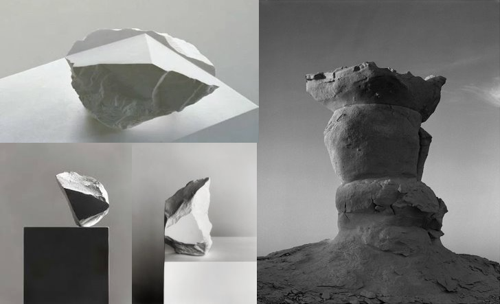
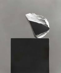
Darren Harvey-Regan
Born in 1974, British photographer and artist Darren Harvey-Regan embraces the equilibrium of genres: abstract, landscape and still life. His images often hold few objects, tending to focus on one main object. Often utilizing natures organic lines and forms, in order to create abstract photographs with mixed dimensions and clean contours. Darren Harvey-Regan is a graduate of the Royal College of Art and is based in London.
Harvey-Regan’s work has appeared in exhibitions and publications internationally and is part of the photography collection at the Victoria and Albert Museum in London.
Darren often utilizes sculpture in unconventional ways in his work to covey a story, such as this photograph. It symbolises the movement of objects when a glacier melts and transports an object to a polarising location.
I am analysing this photo.
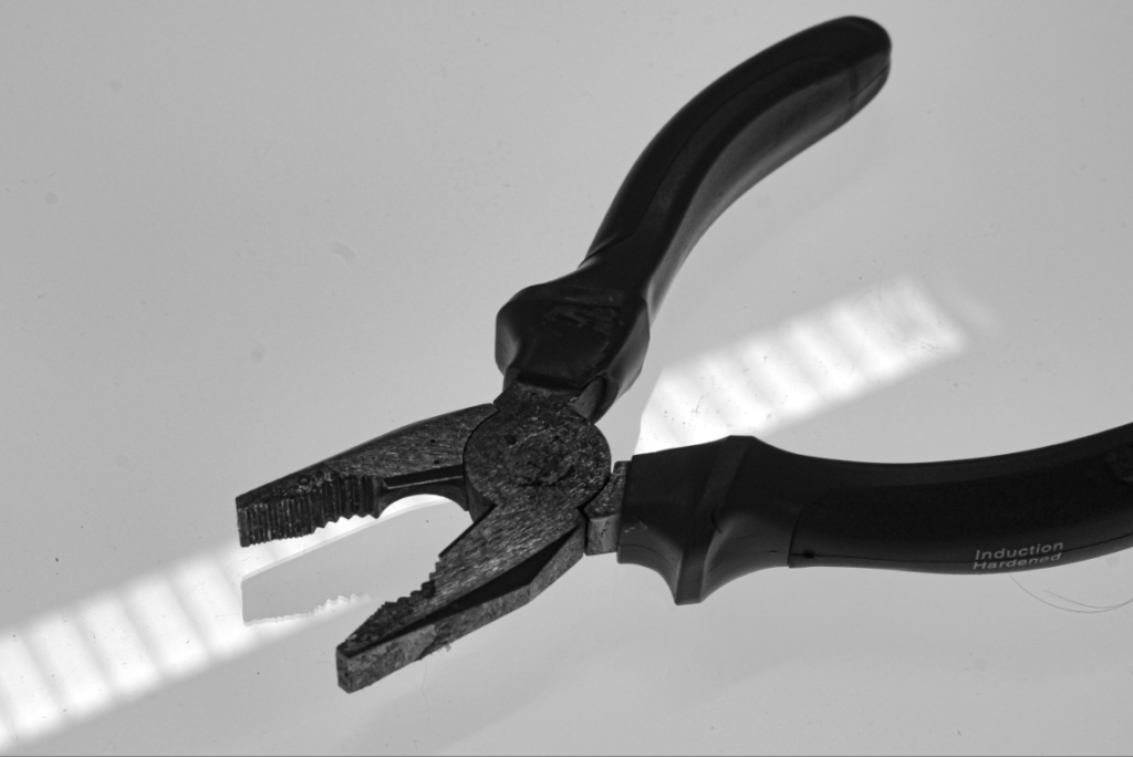
Darren Harvey-Regan was very inspired by Walker Evans in a lot of his works. In these photographs, Darren uses tools photographed in an unassuming way to portray formalism.
photo analysis.
In this photo it appears that artificial lighting has been used. this creates a very sterile appearing photo. There is very little shadow being cast as a result of the positioning of the object to the light.
This this photo is taken facing down. it is placed in the centre of the frame. rule of thirds is used to bring attention to the tops of the tools.
The aperture is probably a bit lower is the contrast is balanced, and everything is in focus.
The iso could be around 200-400 as the photo gathers a good amount of light, so it is more light sensitive.
The image has been taken in black and white.
Both these artists hold similarities. such as the fact they both shoot on black and white, they both photograph mundane objects. They also both use blank backdrops to bring the focus on the object they are photographing. Both artists utilize negative space to emphasize the object they want to bring attention to.
Walker Evans
Darren
Walker Evans uses a higher aperture as his images have more contrast, while Darren utilizes a higher aperture as his images are much brighter.
The biggest difference between them is that Walker Evans uses film while Darren’s work is digital.
I am going to create photos inspired by both Darren Harvey Regan’s work and Walker Evans.
my photoshoot.
My final photo.
I used a filter on Lightroom to make the images black and white, a characteristic of walker Evans and Darren.
I used a continuous light and let a shadow cast on the left of the object.
I like the contrast between the white backdrop and the darker camera.
I made sure the subject was placed in the centre of the frame.