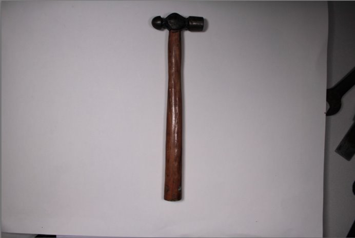
Walker Evans
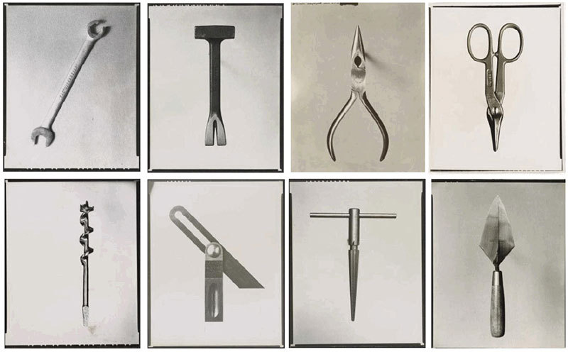
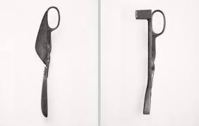
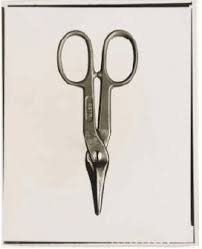
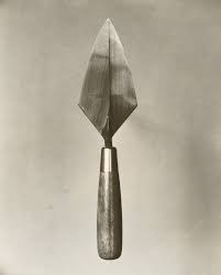
These are from his work called Beauties From The Common Tool. Which he created in 1955.
However Evans was most well know for his work about documenting the farm security administration from the effects of the great depression.
His preferred style of work seems to be documentary photography. Although those wont be the work I will be focusing on from him.
I really like this work its all very similar and uniform all from a birds eye view with no colour the image seems really dull and no vibrancy too it which I think really works for the image.
I like how all the shapes in these photos are very sharp angular I think it really works. The texture in the images is another thing I think works really well because the objects look quite rough and almost dirty.
One thing I really like about Walker Evan’s work is that he makes all of this image look quite old ands vintage looking which is something Darren Harvey-Regan doesn’t do so that really sets them apart
Darren Harvey-Regan
This work is his version of the “beauties of the common tool” which he did in 2013.
Darren Harvey is most known and appreciated for his melding photography and sculptures though which he started in 1974.
His work is also very similar to Walker Evan’s the photographer above. Evan’s Darren Harvey-Regan seems to take most of his photos on a very plain and clean.
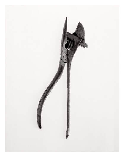
The white background which contrasts from the tools which have connotations of being really dirty. Although the images themselves look quite clean and sleek even. similarly his photos have this really dull and blank feel to them although there is something in the image it feels quite empty. This could be because lots of photography at the moment seems to have so many different objects and have lots going on so this is quite different to that.
I really like his work I think it really unique with using the everyday objects and yet he makes them seem very interesting and cool like things we don’t see very often. Although the tool is the only thing in the image it feel as if he still tries extra things like the rule of thirds, having it directly the middle, to make it stand out.
He also does these image of rocks which I really like they contain lots of sharp lines and geometrical shapes which I think works really well.
MY OWN PHOTOSHOOT
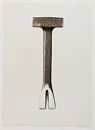
For this photoshoot I tried to recreated Walker Evans work I did this slightly with my still life photoshoot by having the camera coming from a birds eye view however for this photoshoot I’ll be doing the same but also trying to use singular objects are create the negative space like he has in his images.
Like these:
My Work:
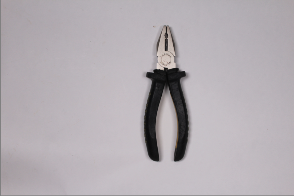
This is my original image on the right .
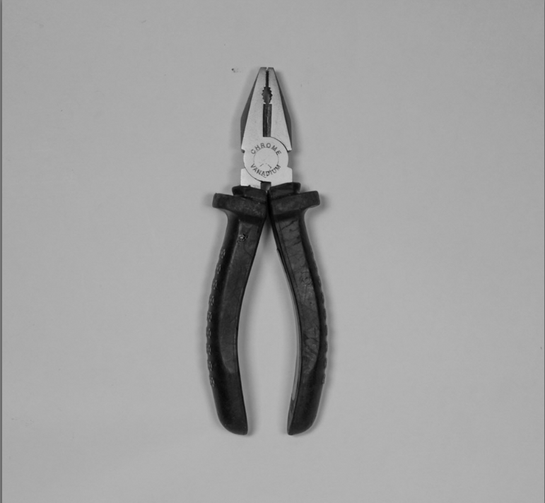
Now the edited one is underneath although here isn’t a major difference I feel the quality is so much better.
The centering on the edited image is a lot better as it was too far over to the right before leaving lots of negative space on the left-hand side which didn’t work for the image.
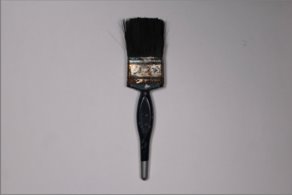
I think this photo shoot was really effective and you can see/tell that I used Walker Evans as inspiration for this photoshoot. I think my favorite image from this photoshoot would be the paintbrush I think that one worked really well the brush is very straight (which I realised some of the others weren’t so if I was able to fix it I would) and looks quite crisp and the details of the brush bristles look really good contrasting against the clean white background.
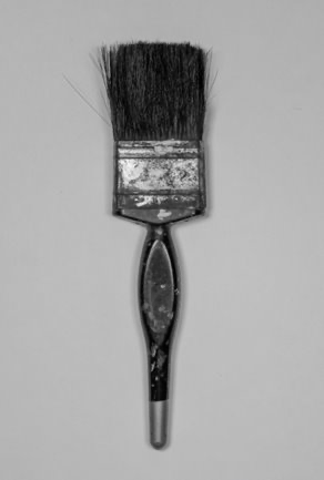
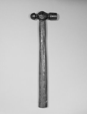
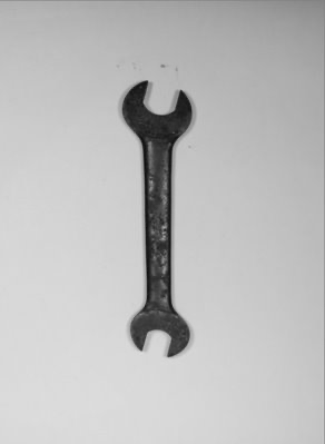
These are some of the original photos-
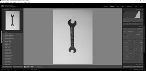
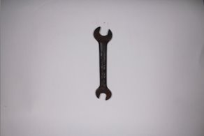
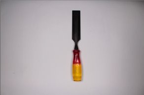
These photos have a really easy but effective editing style all I had to do for these were change them to black and white even if the photo already didn’t have any colour too it. Changing to black and white seemed to add more texture and dimension.

