Formalism Artist Research

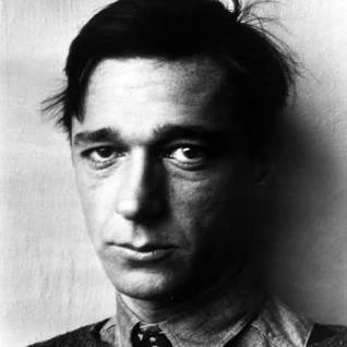
Walker Evans

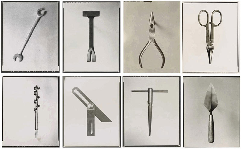
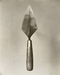
Evans is best known for creating black and white ‘simple’

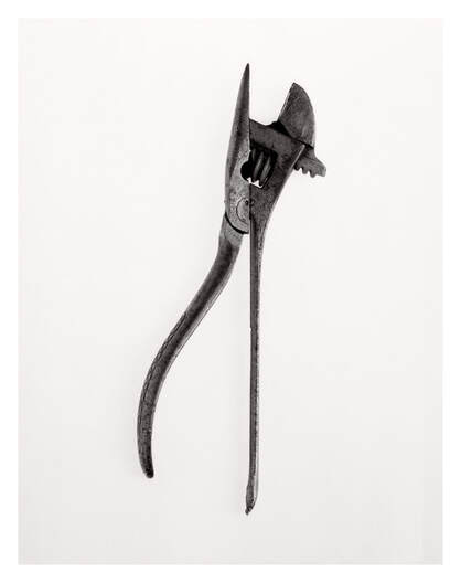
photos. in some of his other photos not related to objects, he said he wanted to focus on capturing the beauty of everyday events. in his object photos he does this by taking simple everyday objects and photographing them. many people look at hi work and think its nothing interesting. he likes his work because he has taken an uninteresting object and attempted to make it into art. Hi project was called ‘Beauties of a common tool’ and he usually placed his objects onto plain backgrounds (usually brighter colours than the object itself) this makes the object stand out to the viewers eye.
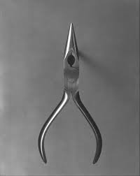
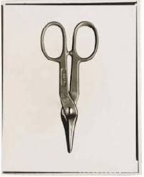
In his work, he used lighting to reflect off of his objects as they are usually metallic. I think this is good because it makes them stand out from the background. the glare is also positioned in different places of the tool so that you can see the different shadows.

The angles of his photos are generally taken from a Birdseye view and rarely from many other angle. Even though its from this angle you can still tell that all his photos are 3D because of the shadows he made sure to make visible. There is also a lot of empty space in his photos so that the viewer can understand that the photo is about the tools beauty and nothing else.

Photo Analysis (Walker Evans)
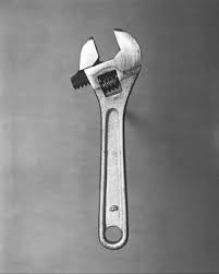
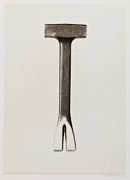
In this image, Evans has chosen to photograph a wrench. Along with his other photos, this tool is metallic which make the effects of lighting stand out. I am unable to be sure if the lighting projecting from the left is natural or unnatural lighting however it still greatly shows the effects of shadows and different shades in the image. I think the shadows that outline the tool work really well to create the illusion that the object is floating above the background and also shows us that it’s a 3D image. Evans purposefully creates this effect by using wooden sticks of prop up the image on the paper. the empty space in the background the image makes me focus only on the object Evans is showing the beauty of, as well as have different lightings on the background colour to make it less like a solid basic colour.

Darren Harvey-Regan
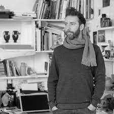
Darren Harvey Regan created photos that was inspired by Walker Evans ‘Beauties of a common tool’ photoshoot where he takes photos of usual everyday objects, such as tools, and makes them into photography. he created montages of Evans work and then made it into his own. He would do things like take two separate images of his own and split then in half for them to then be re-joined to become one. His work differs from Evans in different ways, as well as the split images he also uses more of a pale pink background to add colour to the photographs where as Walker Evans’ photos are in black and white with a white background.

Photo Analysis
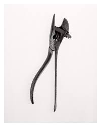
One example of his work is this photo. I really like how subtle the split is down the middle of the photo because of the detail and work he pits into it. I like the colour he has used in the photo to create more of a brighter image compared to Evans work. I can see that his photos are taken from a bird eye view to be further inspired by Evans work but also to capture the whole object and not from one side where the full thing can’t be seen. Contrasting to Evans, his photos don’t include reflections from interior/ exterior light and does also not include shadows.

Nostalgia Still Life Photoshoot

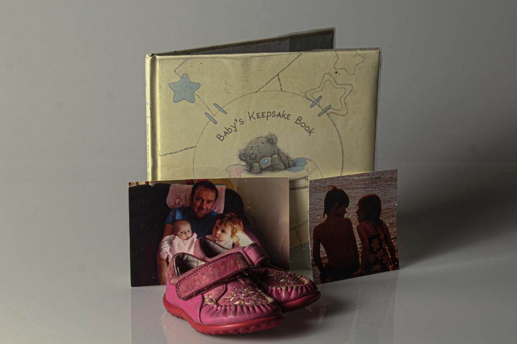
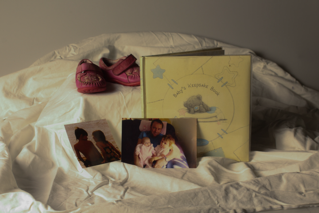
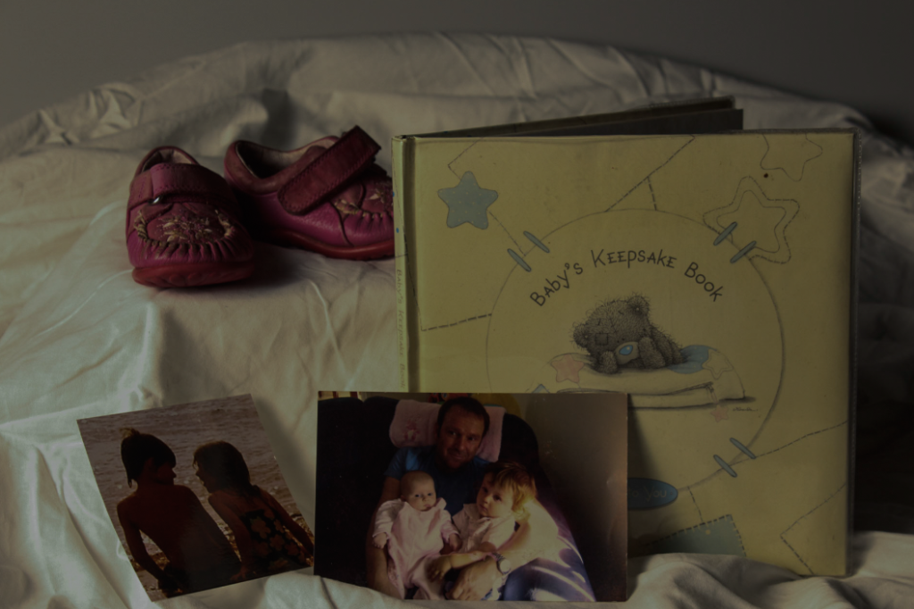
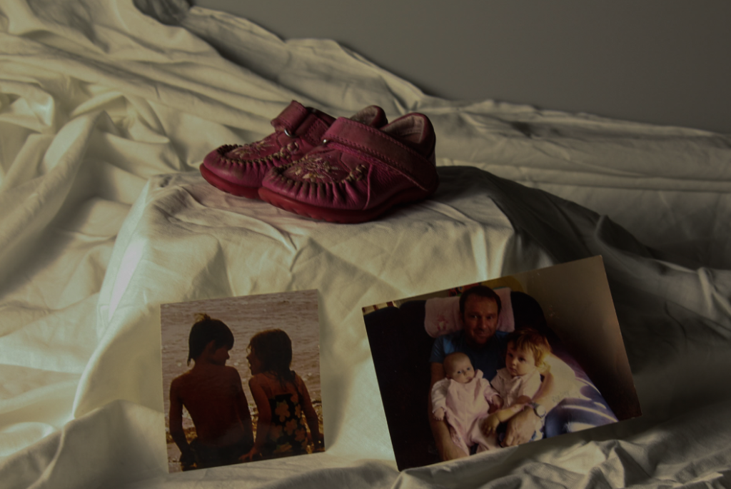
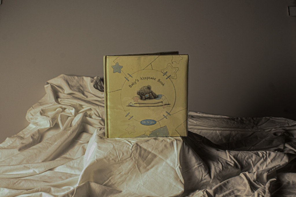
For this photoshoot I brought in object that were nostalgic from my childhood. These objects included:

  • Baby Book
  • First pair of shoes
  • Photo (Grandad, Brother and myself)
  • Photo (My Brother and I)

All of my shoots were taken in the studio on the main photo shoot area. I had access to a light that changes warmth so I was able to use that to my advantage and create more of a warming nostalgic affect. I also liked how this light worked with shadows behind my objects.
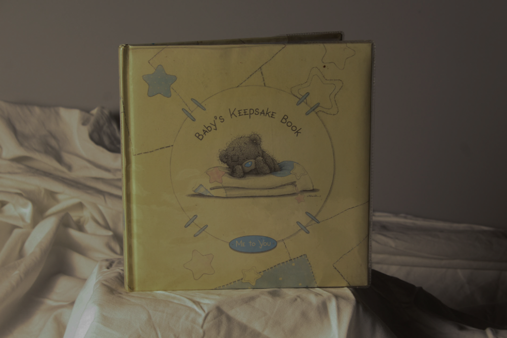
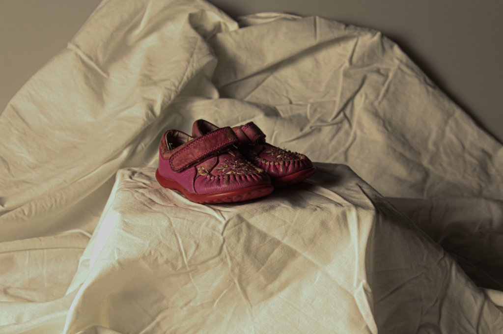
I also decided to use objects such as boxes and cloths to create more levels in my photos so that it wasn’t just a flat surface. I liked how this worked with my single object photos.

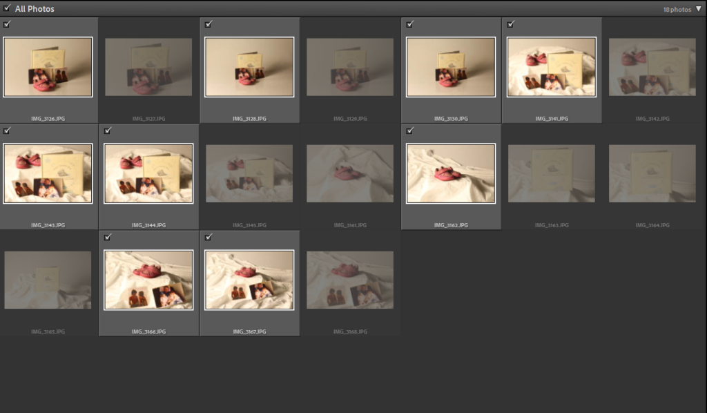
Contact sheet of all photos:

My Photos:

My Favourite Photos:

Both of these photos are my favourite shoots. I think because it is one singular object it draws more attention to that object instead of the shoot being too busy or packed. I think the use of the levels work well to centre the objects more and show their importance. I think the cloth I used on both photos works well to add more texture to the photo and less dullness to it. I also like how the top photo was more zoomed out to show more of the background as I think he cloth sits really well.

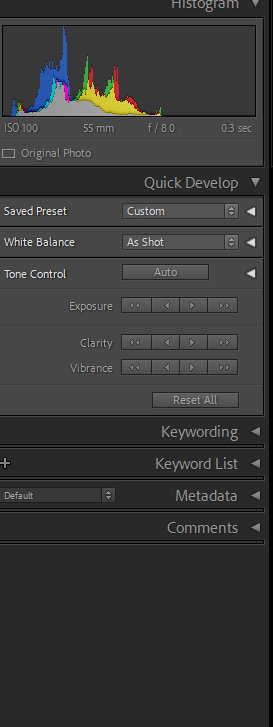
To edit my photos, I only simply changed the exposure by lowering it, as on my camera the outcome of the photos was quite bright and it did not look good. If needed, I also adjusted the clarity and vibrancy.

For the photo above, it was created on one of the Canon cameras with an exposure time of 1/3 second and an ISO speed of ISO-100. The focal length was 55mm, the F-stop of f/8 and the exposure bias was 0 step. I did not use flash for any of my photos.

Photography Introduction Quiz

Q1: What is the etymology (origin & history) of the world photography?

A: Writing with light

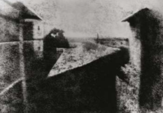
Q2: What year was the first photograph made in camera?

A:1826 ( Joseph Nicephore Niepce)

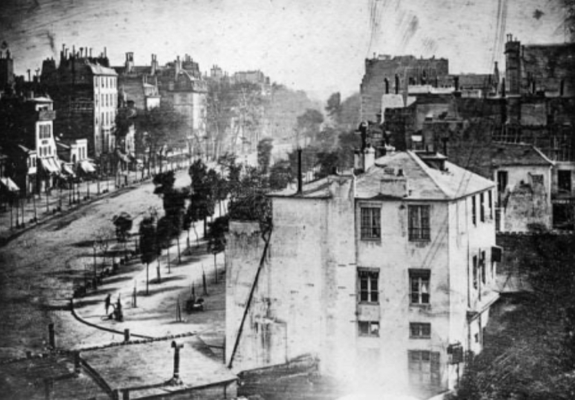
Q3) When did the first photograph of a human appear?

A: 1838 (Louis-Jacques-Mande Daguerre

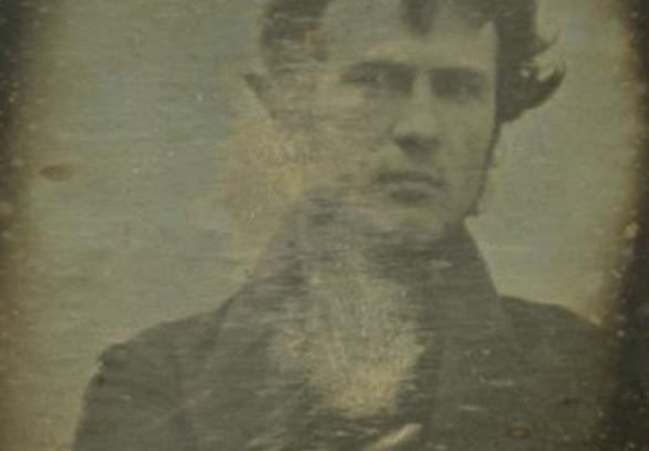
Q4: Who made the first ‘selfie’?

A: Robert Cornelius (1839)

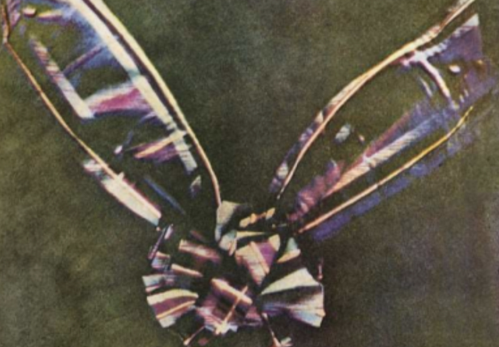
Q5: When did the first colour photograph appear?

A: 1861 (James Clerk Maxwell)

Q6: What do mean by the word genre?

A: A style or category of art

Q7: What do we mean by the genre of still-life?

A: An image that shows inanimate objects from the natural or man- made world

Q8: What was the main purpose of the Pictorialist movement?

A: To affirm photography as an art form.

Q9: How do we describe the term documentary photography?

A: Captures images that truthfully portray people, places and events.

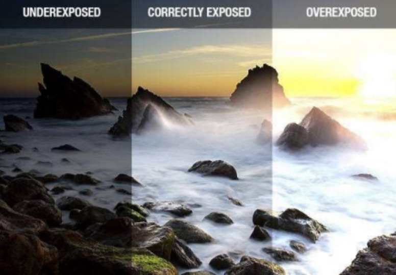
Q10: What is exposure in photography?

A: The amount of light that reaches your cameras sensor

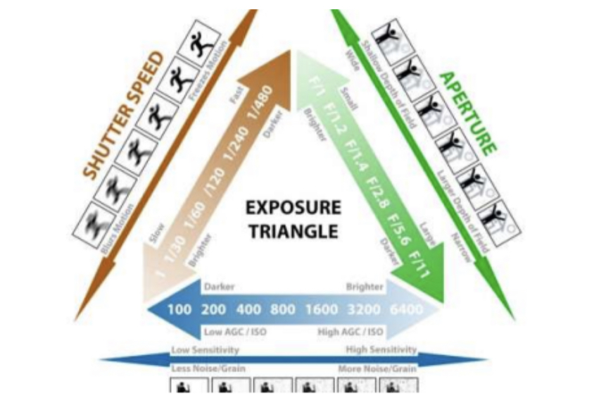
Q11: What controls exposure on your camera?

A: Aperture, shutter speed, ISO

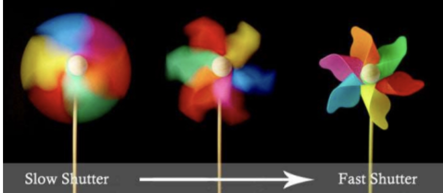
Q12: What control on our camera records moving objects?

A: Shutter

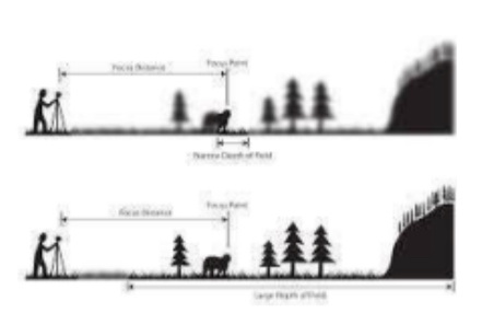
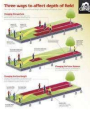
Q13: How do we explain depth of field?
A: How much of your image is in focus

Q14: What factors affect Depth of Field?

A: Lens aperture, distance from camera to subject, and lens focal length.

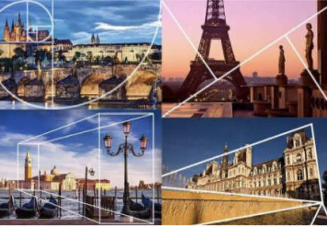
Q15: What is composition in photography?

A: The arrangement of visual elements within the frame.

Q16: What is your understanding of aesthetics in art?

A: Concerned with the nature of beauty and taste.

B: It is subjective and in the eye of the beholder.

C: Aesthetic qualities refer to the way and artwork looks and feels.

D: Making a critical judgement based on observation and understanding.

Q17: What are contextual studies in photography?

A: To provide historical, cultural and theoretical understanding of images.

Consider factors outside of the image, as well as inside the frame.

Q18: How many images are captured on average every day world wide?

A: 4.7 billion

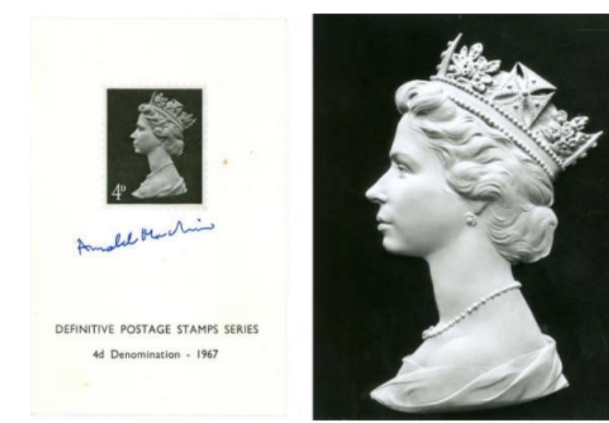
Q19: Which portrait is the most reproduced in the world?

A: The Queen (Elizabeth II)

Photoshoot tools – Formalism

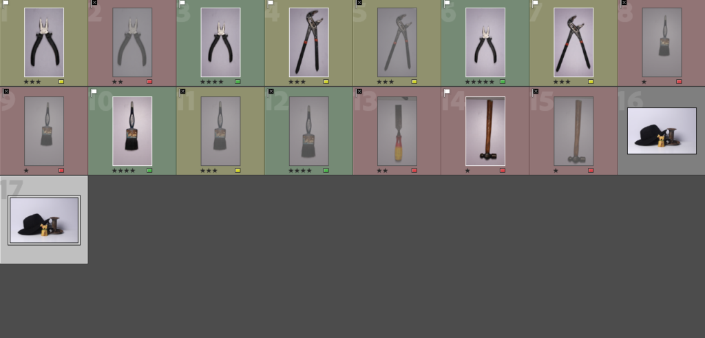
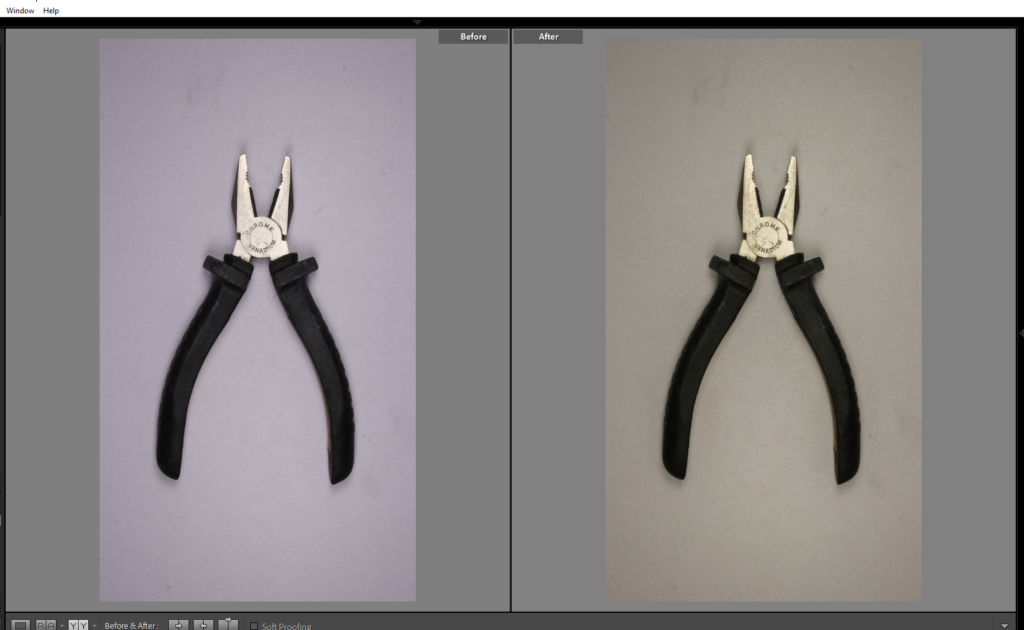
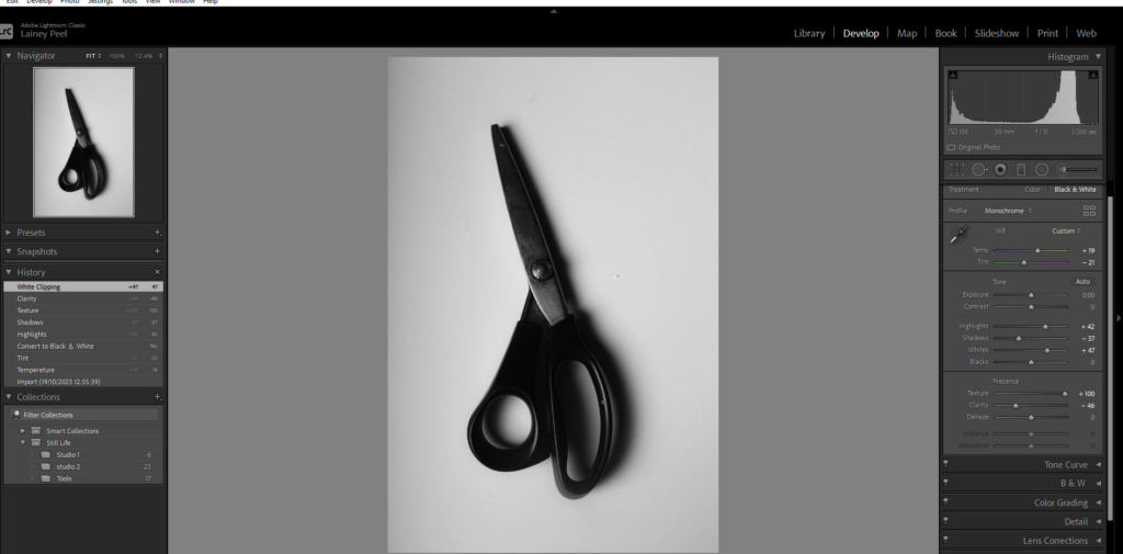
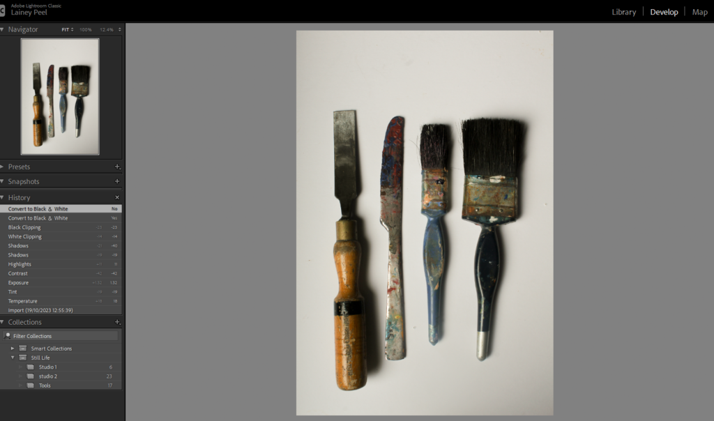
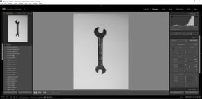
In todays lesson, we moved all of our photographs we took in the studio and imported them from our media drive onto Adobe Lightroom classic. We placed them into colour co-ordination and star rating to make it more organized to see our personal ranking of our photos. A range from green and red with green the best and red the worst.

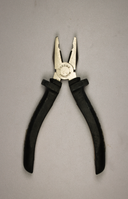
Lastly, I chose this photograph as it was green flagged and 5 star rated as it was my favourite and personal best. After, I edited the photo to make it look even clearer and more similar to Evans ‘ Beauty of the Common Tool’. I did this by changing the white balance to auto the make it more white and clear, I then adjusted the photo with exposure, highlights, and saturates. With the correct adjustment I created more depth of the shadows and clearer, brighter details. This contrasts to Regan’s work as Evan’s work has more depth of shadows and different shades of white, whereas my photo is more similar to Evans.

There are formal elements of this photo to make it a formalist photograph such as,

Form- This photograph relating to Evan’s and Regan’s work is 3D which is proven by the dark and clear shadowing. The effect on both of their work is that the object is slightly hovering from the blank sheet or background underneath them throughout the shadowing and highlight of the photo. This signifies the importance of the object. This creates the image to not look flat and dull.

Texture- The surface and purpose of the subject is mechanical and to sort regular problems. The texture is metallic and rubbery but slightly smooth. The objects are also man- made which links to the choices of texture which will work best for these tools to be functional.

Colour- the colour of these photographs is black and white however edited to be so they have similar qualities to Evan’s work.

Size- although photographs can be manipulated to make the object seem bigger or smaller, in these photographs they are the size as they appear to be in the photographs.

Depth- the depth of field shows how much the camera is in focus. Within my photos and Evan and Regan’s in the ‘ Beauty of the common tools’, the objects are close up and in focus behind a blank white background so the photographer is showing the viewer where to look, which may be to value the objects because of their function for the world.

More photographs from editing in lightroom

In this photograph, I edited the white balance so the background and the image itself was far clearer and whiter so the image looked more modernized and had a better background. The reasoning for this is because as you take a photo the camera should already have the setting ‘ white balance’ on however if your camera doesn’t capture the photo correctly or you forget to put it on Adobe Lightroom can do it to make the photo look more professional. This stops the photograph from looking off and dull.

After I edited the white balance I edited the images to be in black and white so it has more similarity to Walker’s and Regan’s.

Walker Evans inspired photoshoot

Walker Evans​

These are from his work called Beauties From The Common Tool. Which he created in 1955.

However Evans was most well know for his work about documenting the farm security administration from the effects of the great depression.

His preferred style of work seems to be documentary photography. Although those wont be the work I will be focusing on from him.

I really like this work its all very similar and uniform all from a birds eye view with no colour the image seems really dull and no vibrancy too it which I think really works for the image.

I like how all the shapes in these photos are very sharp angular I think it really works. The texture in the images is another thing I think works really well because the objects look quite rough and almost dirty.

One thing I really like about Walker Evan’s work is that he makes all of this image look quite old ands vintage looking which is something Darren Harvey-Regan doesn’t do so that really sets them apart

Darren Harvey-Regan

This work is his version of the “beauties of the common tool” which he did in 2013.

Darren Harvey is most known and appreciated for his melding photography and sculptures though which he started in 1974.

His work is also very similar to Walker Evan’s the photographer above. Evan’s Darren Harvey-Regan seems to take most of his photos on a very plain and clean.


The white background which contrasts from the tools which have connotations of being really dirty. Although the images themselves look quite clean and sleek even. similarly his photos have this really dull and blank feel to them although there is something in the image it feels quite empty. This could be because lots of photography at the moment seems to have so many different objects and have lots going on so this is quite different to that.

I really like his work I think it really unique with using the everyday objects and yet he makes them seem very interesting and cool like things we don’t see very often. Although the tool is the only thing in the image it feel as if he still tries extra things like the rule of thirds, having it directly the middle, to make it stand out.

He also does these image of rocks which I really like they contain lots of sharp lines and geometrical shapes which I think works really well. 

MY OWN PHOTOSHOOT

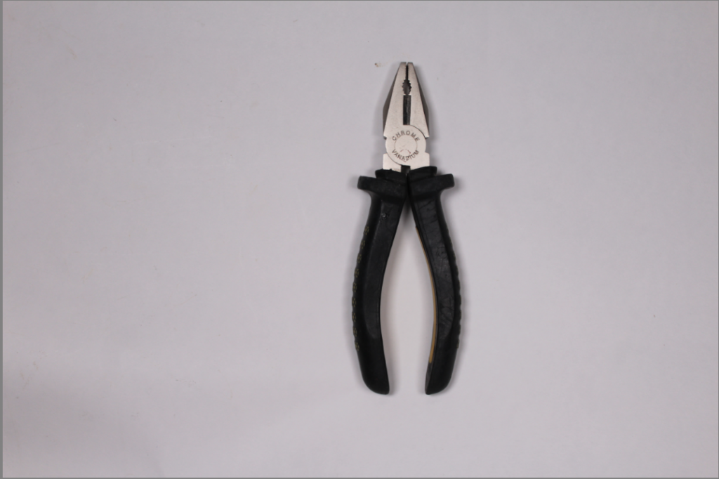
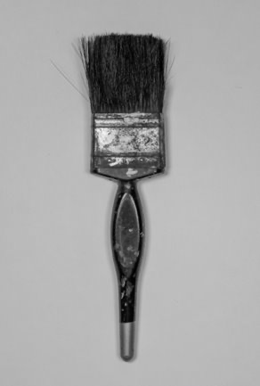
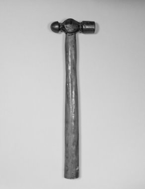
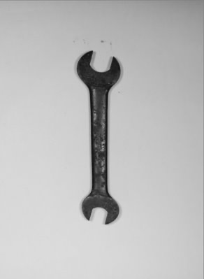
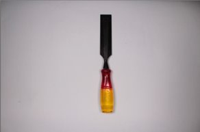
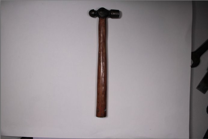
For this photoshoot I tried to recreated Walker Evans work I did this slightly with my still life photoshoot by having the camera coming from a birds eye view however for this photoshoot I’ll be doing the same but also trying to use singular objects are create the negative space like he has in his images.

Like these:

My Work:

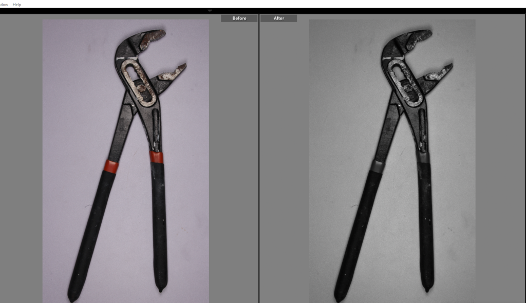
This is my original image on the right .

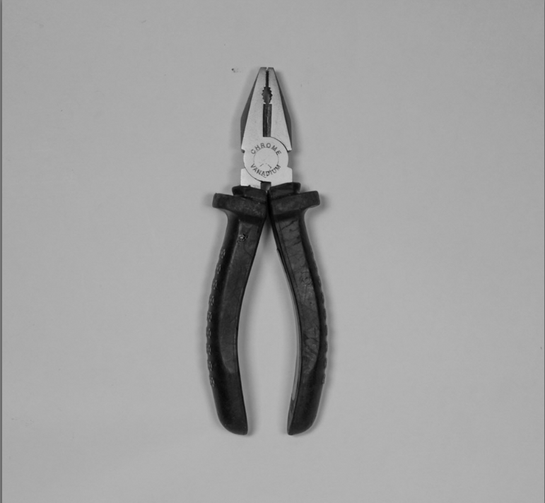
Now the edited one is underneath although here isn’t a major difference I feel the quality is so much better.

The centering on the edited image is a lot better as it was too far over to the right before leaving lots of negative space on the left-hand side which didn’t work for the image.

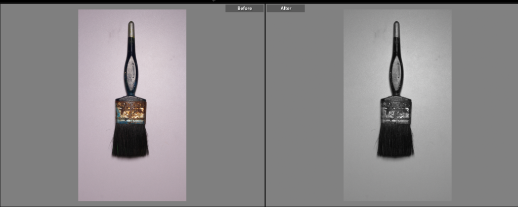
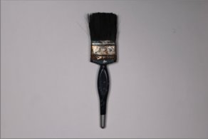
I think this photo shoot was really effective and you can see/tell that I used Walker Evans as inspiration for this photoshoot. I think my favorite image from this photoshoot would be the paintbrush I think that one worked really well the brush is very straight (which I realised some of the others weren’t so if I was able to fix it I would) and looks quite crisp and the details of the brush bristles look really good contrasting against the clean white background.


These are some of the original photos-


These photos have a really easy but effective editing style all I had to do for these were change them to black and white even if the photo already didn’t have any colour too it. Changing to black and white seemed to add more texture and dimension.

Formalism shoot

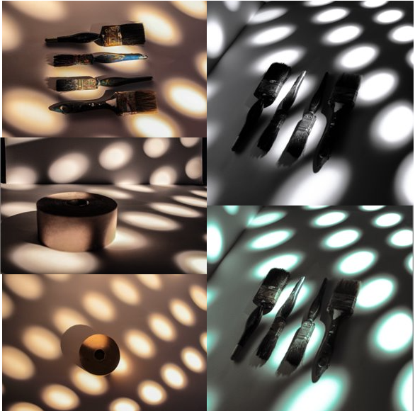
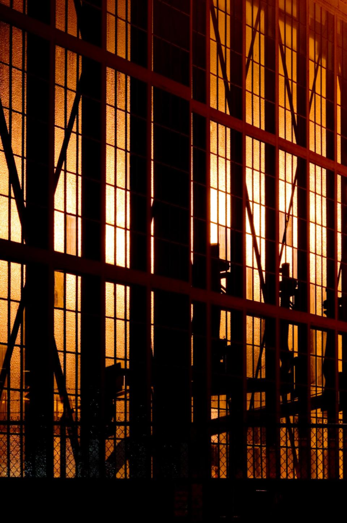
Lighting is a key factor in creating a successful image. Lighting determines not only brightness and darkness, but also tone, mood, and atmosphere.

playing with light, I did this by using a music stand with holes in and using the light behind it to create shadows and depth.

Formalism

What is Formalism?

Formalism is the design, composition and lighting of the subject. It describes the critical position that the most important feature of a work of art is its form, the way it is made and its purely visual aspects, rather than its narrative content or its relationship to the visible world.

Photographers have to impose order, bring structure to what they photograph. It is inevitable. A photograph without structure is like a sentence without grammar—it is incomprehensible, even inconceivable.

— Stephen Shore

The 7 basic elements to photographic art are;

  • Line

Lines in photographs can be straight, curved or both and can be presented in many different ways. They can appear in man-made things and natural and can be captured on purpose or by chance.

  • Shape

Shapes are created when a line, or more, conjoins or closes off. Shapes in photographs may be familiar or unique, unfamiliar shapes which draw your attention. Shapes are everywhere in photography, everything is a shape.

  • Form

Form is when you take the two-dimensional shapes and turn it to three-dimensional. The two types of form are geometric and organic, this is the same for shape.

  • Texture

Textured can be described in many ways, such as, smooth, rough, wet, bumpy and more. Photography presents the textures in a way that can be ‘felt’ with the eye.

  • Colour

Colour has three properties, these are: hue, value, and saturation. Hue is the description of what colour something is (red, blue, pink etc).Values the brightness or darkness of the colour. Lastly, saturation is the intensity or purity of a colour. The purest colour is a hue with no white, black, or grey added to it.

  • Size

Size in photographs is relative and can be an illusion. Different size types are large, medium and small. The size of objects in photographs can be manipulated to look bigger or smaller.

  • Depth

Most photos have a foreground, middle ground, and background. The stronger the portrayal between those successive “grounds,” the stronger the sense of depth is in the image.