I chose these images as my ‘best’ ones because the quality of the photography is high and, in most of the images, I like the way the texture of the background contrasts with the smoothness of the objects. In the other ones, I like how the background looks so smooth so the focus is mainly on the objects.
Single:
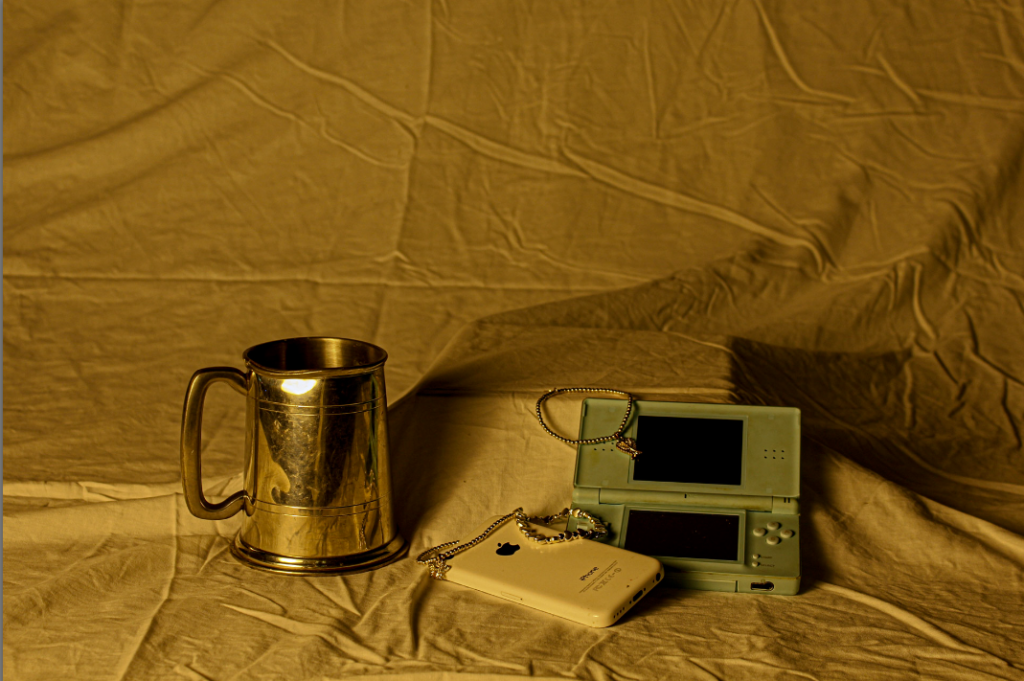
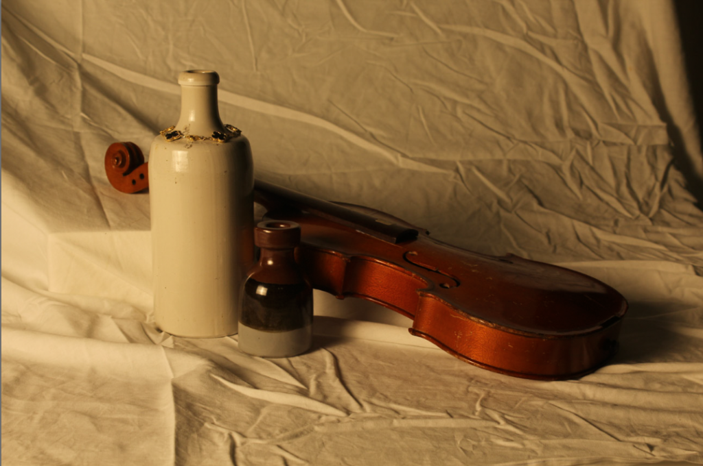
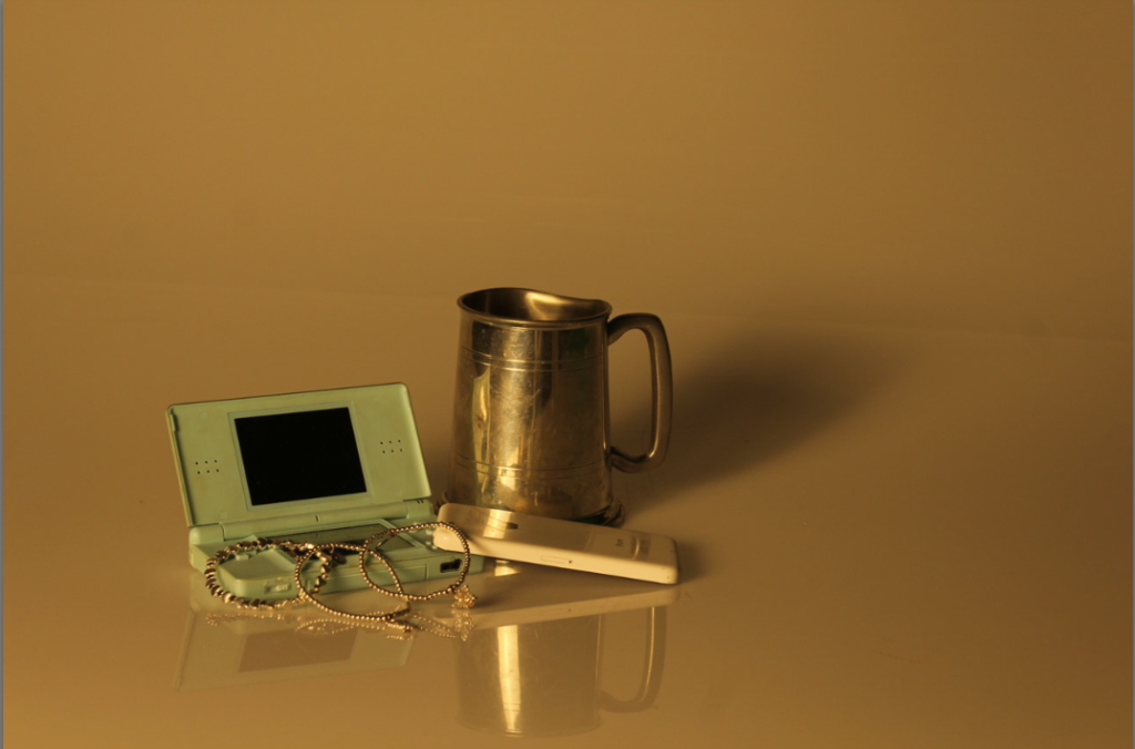
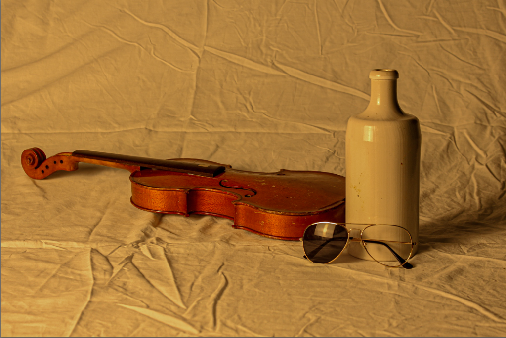
I like these images because they all have a similar warm tone which gives off a feeling of nostalgia and could be categorised as ‘vintage’, as if these images were taken a long time ago.
Comparison:
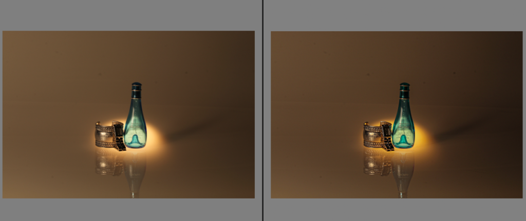
before vs after
I chose to edit this image because out of all of my still life images, this was the best one and also my favourite. I edited this image using Adobe Lightroom Classic. I found that increasing the colours made a huge impact on the detail of the photograph. I decreased the whites to make the background seem a bit darker than it was. I also increased the vibrancy and saturation so the light shining on the objects came across as a warmer tone.
Experimentation on presentation:
Triptych:
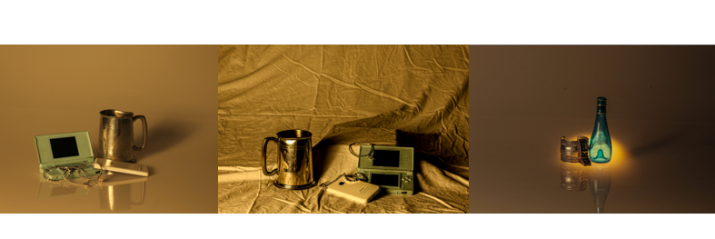
A triptych is when you present a group of three images. So finally, I decided to use triptych as a way to present these images because I like the layout and it is therefore easier to compare them. I chose to use these 3 photos because I found that they stood out to me the most, as they all are higher quality and are similar in a way as they all represent a warm tone.

Try to use the develop mode in LightRoom more to experiment with enhancing the light in your images and reducing the colour case. Experiment with different presents to help. Remember, once you get it right for one image, you can save your preset to use again.