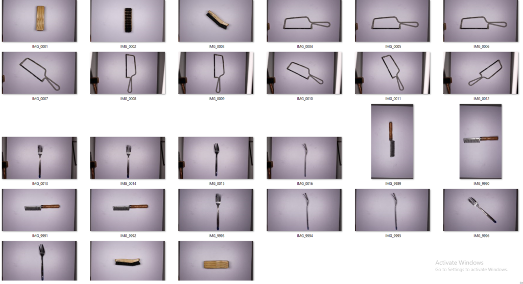
My response to Walker Evan’s and Harvey Regan’s work, was a very similar style, looking at how the object is presented in the photo. I started by trying different lighting settings until I found one that worked. I also used a few different objects, some that were particularly nostalgic to me personally and another that I thought was really quite interesting and could make a great result.
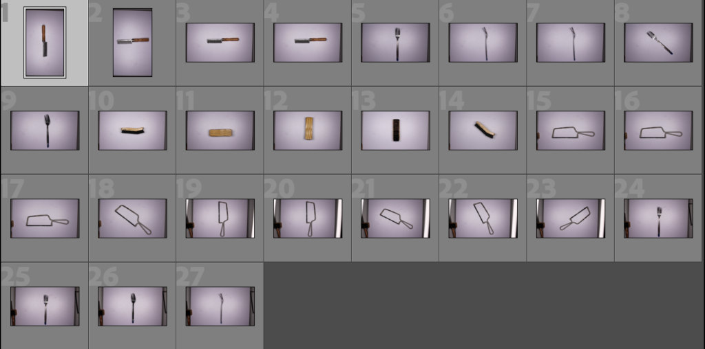
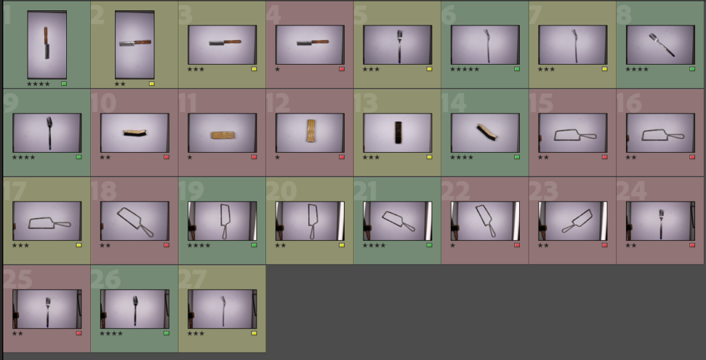
I started by adding all my photos into a collection on Lightroom and then rating each image and putting a corresponding colour code, red- low star rating, yellow for photos that have a middle ground rating, and then having green for any high rated photos that I will go onto edit.
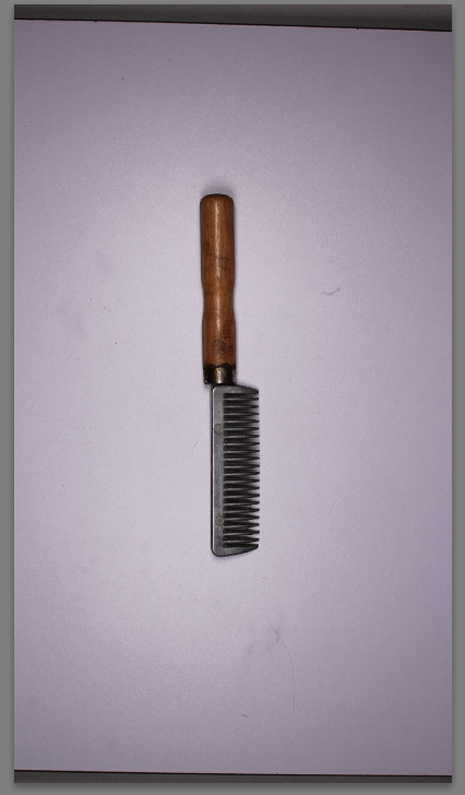
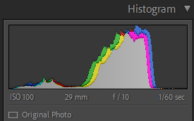
This is the original image and the settings I used on the camera. I used a low shutter speed as the setting was static and fixed into a tripod with a low iso as the lighting was LED studio lighting. I took the image on a copy table as well so I will have to crop out the edges of the photo.
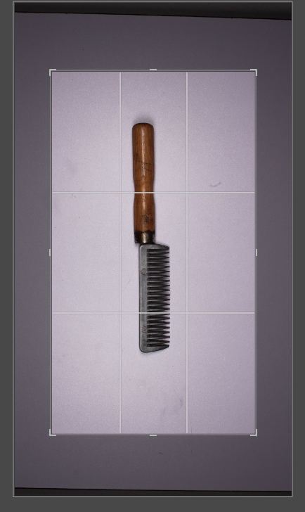
I started by cropping the image to get rid of the excess background and to focus the subject of the photo in the frame.
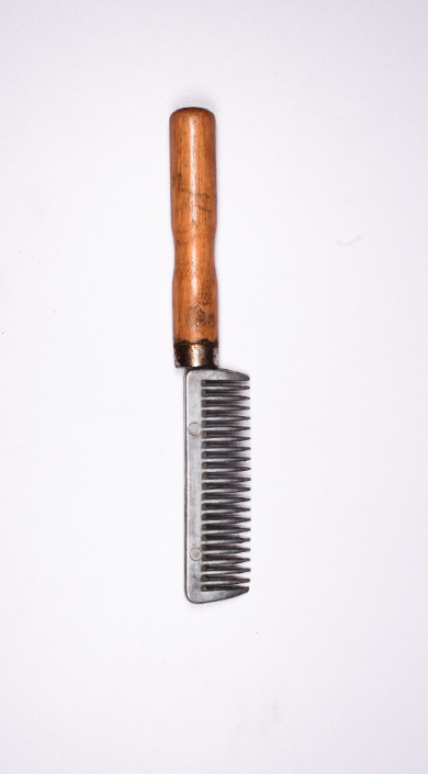
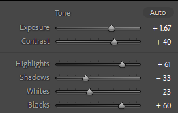
I then chose to adjust the tone by increasing the exposure to produce a whiter background and really highlight the comb.
Second Shot
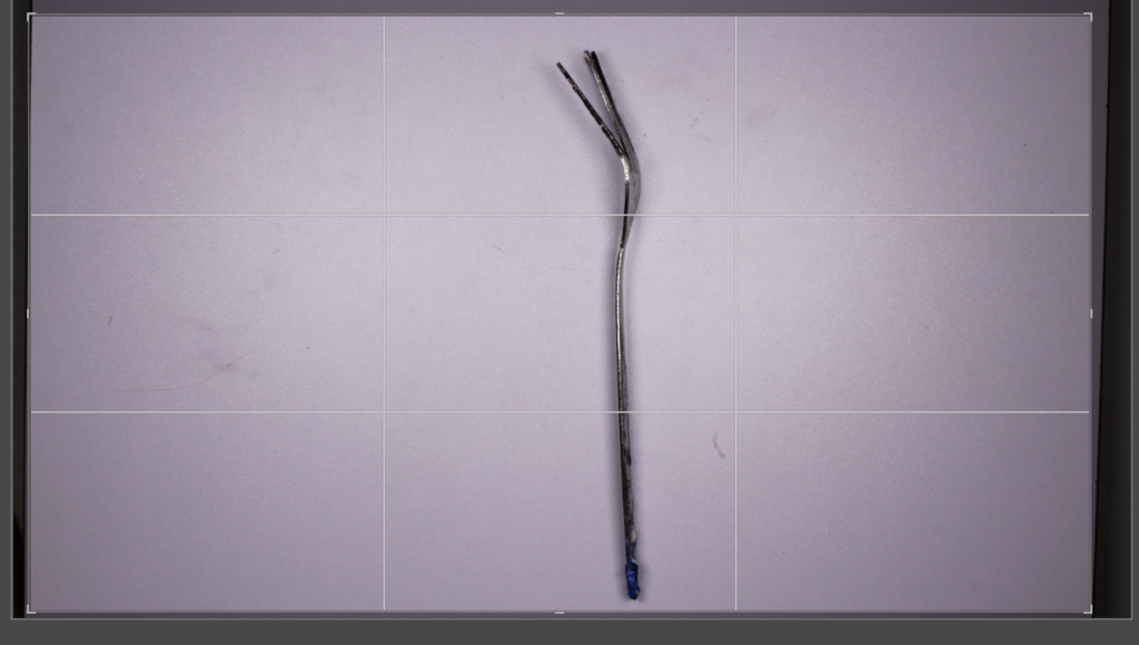
I started by cropping this image as well, to again focus the subject.
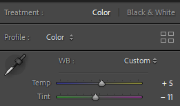
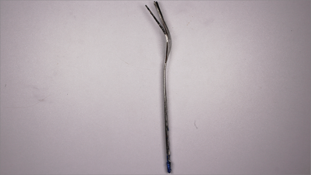
I then changed the colouring slightly using the temperature toggles and the tint, this allowed me to level out the lighting as there was some small glares in the original photo.
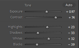
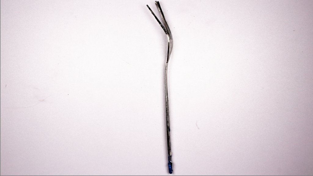
My next step was to adjust the tone settings to create a whiter background while keeping fork true to real life colourings. By adjusting the exposure lower and the contrast higher to washed pout the background while bringing out the silver metal.

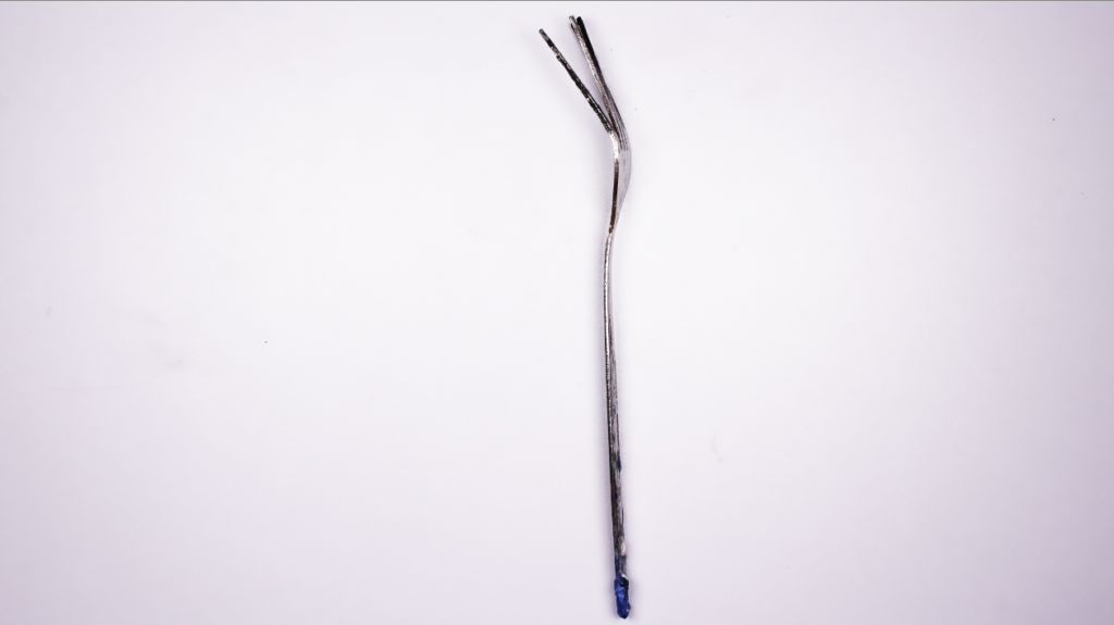
Choosing to next alter the presence as I didn’t like the purply light around the edges of the fork created by the previous editing, I reduced the texture as the fork is already fairly smooth it was unaffected however this removed the haze from the edges when used along side altered clarity and dehaze settings.
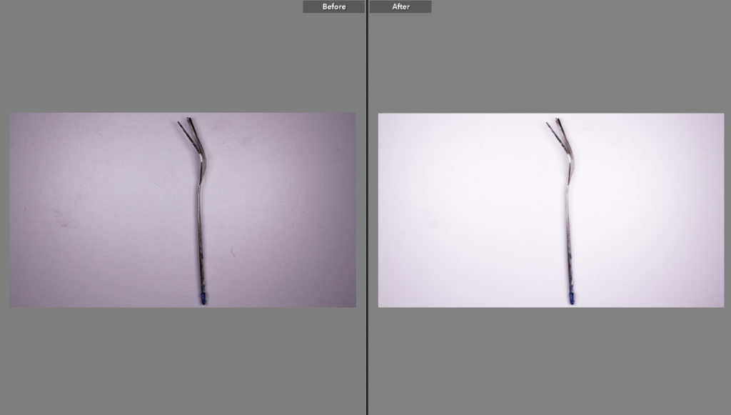
(This before and after doesn’t show the image before cropping) Overall I am very happy with the results as the editing has greatly benefitted the image. I have one more photo left I would like to edit using the skills and ideas of settings I have just learnt.
Third Shot
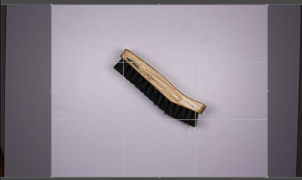

For my final image I chose to first again crop the shot, making sure the original is unlocked so I can individually adjust a side over having each side effect the rest.
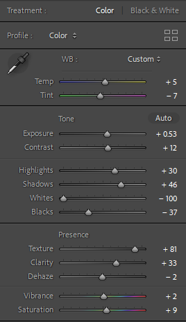
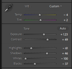
These are the adjustments I did to make the photo slightly different. Originally I liked this edit, however I will go onto to remove some of the yellow as it looks slightly over saturated.

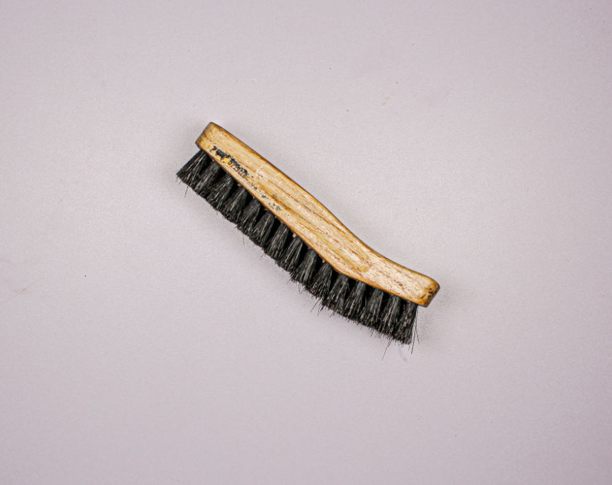
I much prefer this photo as it’s much more true to life with its’ colours. The background was effected meaning some of the purple tint came back but it doesn’t appear as purple and instead provides a solid, smooth background.
Fourth Shot
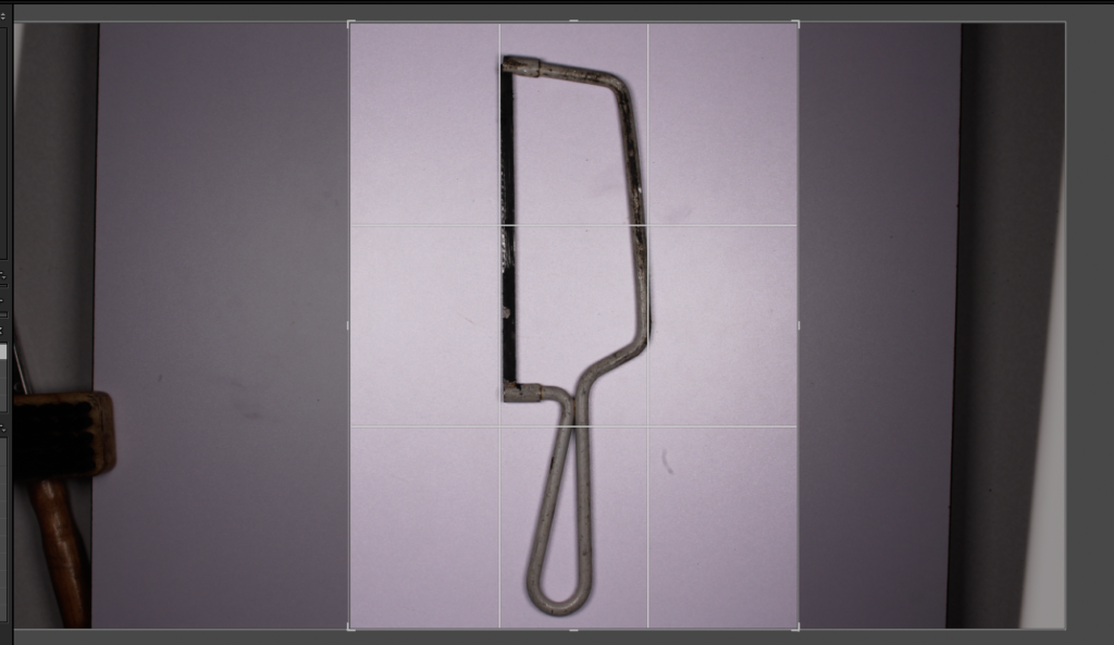
Starting again with cropping the image gives me a nice base to the editing. I try to frame all the images using the rule of thirds and removing as much of the unnecessary background as possible, like Regan and Evan’s style, instead focusing on the subject.
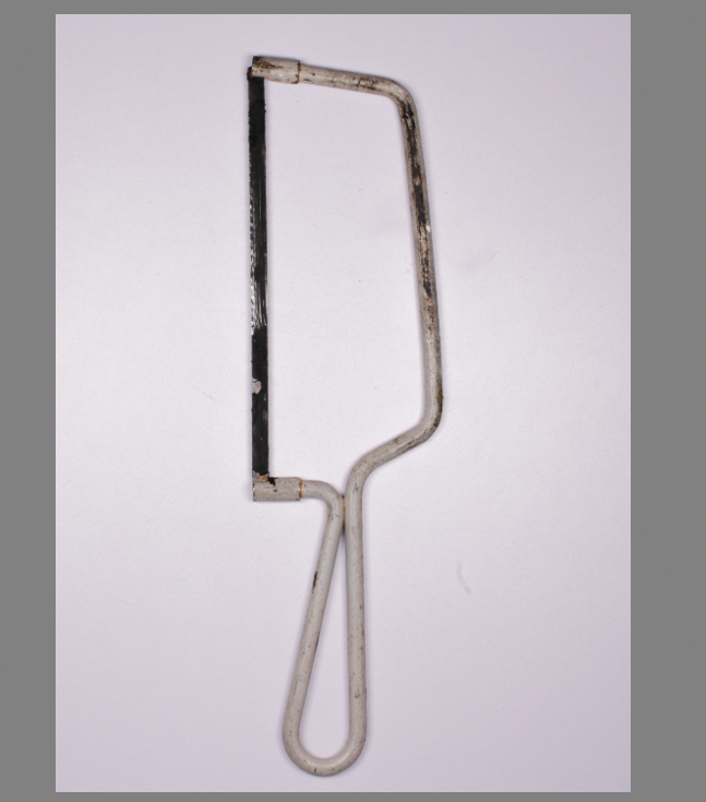
Looking at the colours in the photo, white background, white handle, black/ tarnished blade. I wanted the saw to stand out, which while it can be tricky to have white on white and make it stand out, as the saw is dirty and marked. (a reflection of how it has been used) The off white handle means it is bold on the page even without shadowing. This emphasises the shape and wear and tear with the tool.
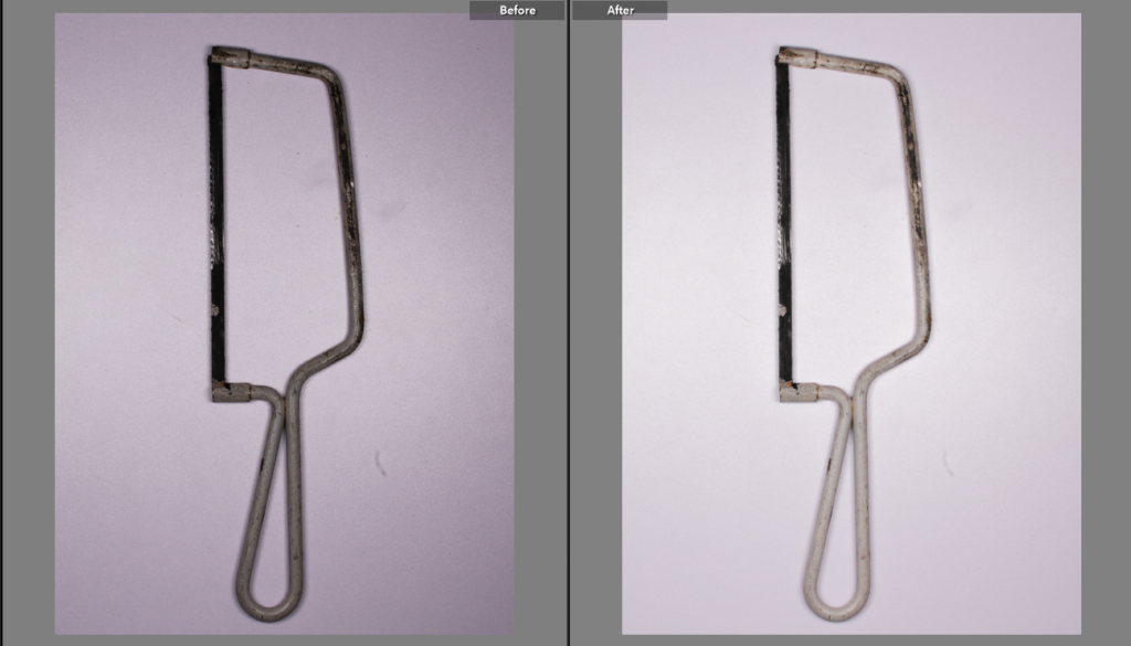
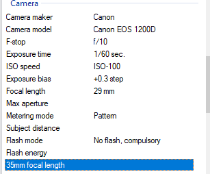
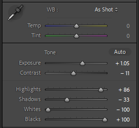
This is the final image after editing, I like the follow on from the research of Evan’s and Regan’s work with the object in focus and a plain background keeping the focus on the subject and not everything around it. I used continuous hard lighting on a table with the camera on a tripod suspended over the object, ensuring the lighting didn’t wash out the saw if it was too harsh for the camera settings. Using white, harsh lighting made sure the object had little to no shadow, wasn’t an overly tonal image and didn’t feel warm and inviting instead intriguing and almost clinical in the attention to detail. While the photo started slightly under exposed as the shutter speed was 1/60 but the room was fairly poorly lit, after editing it was much improved by the increased exposure and decreased contrast. I’m happy with the image as unlike some of my previous work it does not have a purple tint, instead being a rather neutral boarding cold image, this is only emphasised by the saw handle being off white and showing high contrast between the pristine white background and the used saw handle.
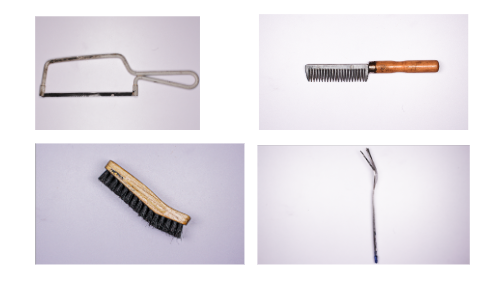
These are my final images, by using a mixture of objects I created a varied array of shots which I then developed further with editing to produce my best four photos. The comb and boot brush are very nostalgic items for me personally and I love the way this style has captured every detail of each item making it very easy to at a glance remember all the good memories. the saw and the fork are not personal items to me but instead objects I found very intriguing to look at and are items that are very often used but never properly looked at, for the details and the flaws, or even the wear and tear of each object.

Great work. Some of these photos achieve better lighting than others. You can try to evaluate why and help yourself improve next time. E.g. did you use the overhead setup in the studio? Did you need to adjust camera settings? Can any of the photos be edited slightly to lift their exposure. You could try placing them next to Walker Evans’ photos to compare.