Formalism is a type of photography in which attention and accuracy is put into the composition, detail, lighting and camera settings, etc. over the main subject. The photographer often aims to draw your eyes to the formal elements of the photo. These elements include light, lines and shapes, patterns, colours, texture, value/tone, space and composition.
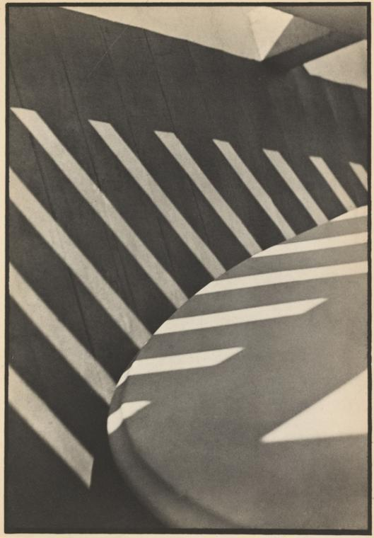

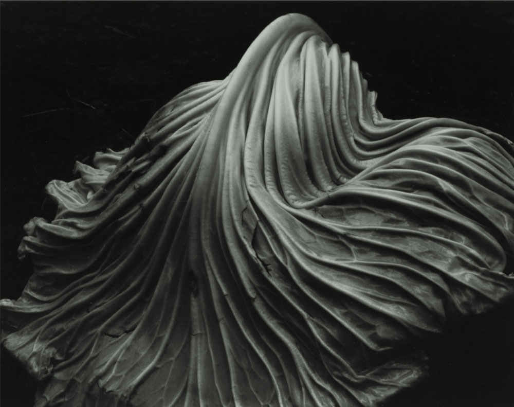
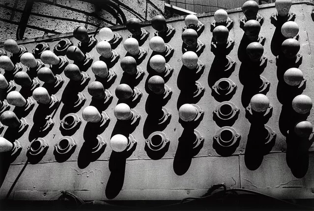
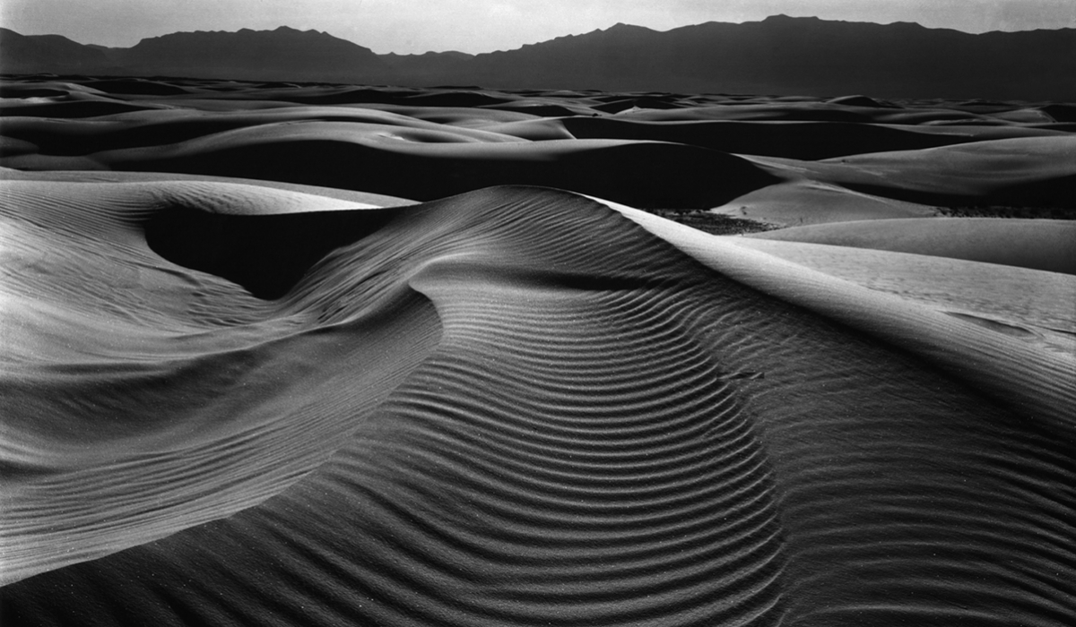
There are 7 different aspects of Formalism:
Line
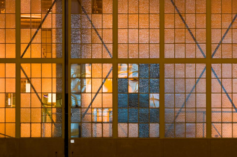
Lines come in all different forms and types. For example, they can either be straight, curved or a combination of the two. They can also be:
- Solid – Most commonly found in the physical world
- Dashed – Easy to draw but not as prevalent in the physical world
- Implied –
- Psychological – Imaginary, created by, for example, the gaze of a subject
Furthermore, they can also be vertical, horizontal or diagonal.
Shape
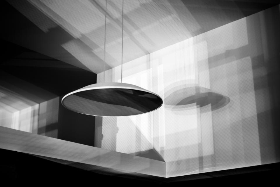
When a line, or multiple lines, connect or close, a shape is formed. Shapes can be the outline of an object, familiar or unfamiliar. When a shape is unfamiliar or unrecognisable, it is often when an object is viewed from a different perspective.
Different shapes can combine to create a new shape by intersecting or overlapping. The area containing a shape is often referred to as positive space and the outside area is called negative space, however, negative space creates its own shape.
There are two basic types of shapes in photography:
- Geometric – standard shapes such as circles, squares, triangles, etc. Often man-made.
- Organic – the outline of an animal or plant, etc. The shape of a cloud or rain puddle could also be defined as an organic shape. These shapes are often natural and not man-made.
Shapes are everywhere in photography and the world around us.
Form
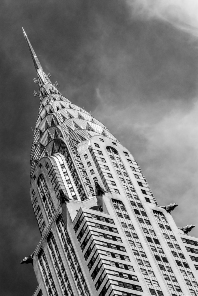
Form is 3 Dimensional and has overall height, width and depth. Alike shapes, there are two different types of form, geometric (normal) and organic. Examples of geometric forms are: sphere, cube, cone and cylinder. Organic forms are the objects which surround us in the world. When a photo is taken of forms, they become 2 Dimensional as the image does not have depth, however forms can be perceived by shadows.
Texture

Texture can be defined as ‘the visual or tactile surface characteristics and appearance of something’. Textures in “real life” can be smooth or rough. Other ways of describing texture could be slimy, bumpy, shiny, soft, slippery, etc. Texture is similar to form in the way that it can be revealed by variations in tonality. Texture cannot be physically felt through a photograph but it can mentally. For example, if someone looks at a photo of a fluffy blanket, they could imagine what it would feel like if it’s a familiar feeling to them.
Colour
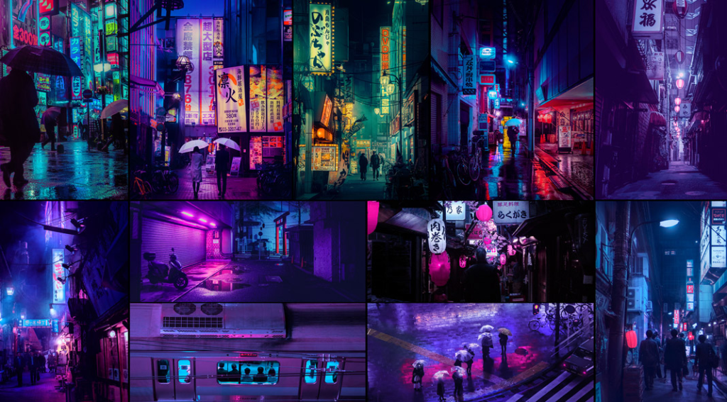
Colour can be described as ‘a specific combination of hue, saturation and brightness’ or ‘visual perception that enables one to differentiate otherwise identical objects’. Colour has 3 properties:
- Hue – the description of the colour (e.g. blue, red, yellow, etc.)
- Value – the relative brightness or darkness of a colour
- Saturation – the intensity or purity of a colour
Colours can be perceived as meaning various things such as: red means danger, yellow is happy and blue is sad. Bold and bright colours are known for grabbing our eye. Having a bold and bright subject in a photo can be good but if the subject was muted and dull but there’s bright colours elsewhere it could detract your eye from the subject.
Harmonic colours are colours that compliment each other. These colours in a photograph can create a powerful image, this is the same with muted tones. The reflected light we see as colour is light from the sun or artificial sources that is absorbed and reflected by different objects.
Size

Size can be defined as ‘a physical magnitude’ or ‘relative or proportionate dimensions’. Size in a photograph is relative and can be an illusion. When a familiar object appears within a photo, we can determine the scale by looking at it. Optical illusions can make it difficult to determine the size of an object within a photograph. Things that are unfamiliar to a person in a photograph would make it almost impossible for them to determine its size. This is called size constancy, which does not exist to a child as everything is new to them. The size of a common object in the photography gives the scene a sense of scale. To emphasize the size of an object in the photograph, you could brig the lens closer to it. Overlapping objects also gives hints to size as when one object is close in front of another and is smaller than the object behind it, we generally know the relative sizes of the two objects.
Depth

Depth can be defined as ‘the direct linear measurement from front to back’. How well the depth is shown in a photograph depends on the objects in the frame, choice of composition and your perspective in relation to the objects in the frame. Depth is provided by visual cues. Depth can be show by a road narrowing as it gets further from the camera. This is called linear perspective as the road doesn’t actually narrow, it just looks like it does. Aerial perspective, also known as atmospheric perspective refers to how the distant objects in a photograph have less clarity, indicating depth. Texture gradient shows depth in a photograph, as we,, as size diminution (when an object is smaller, it appears more distant). Finally, upward dislocation shows depth.

Good investigation into Formalism – could you add a photo for each formal element you have detailed?