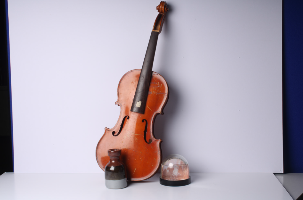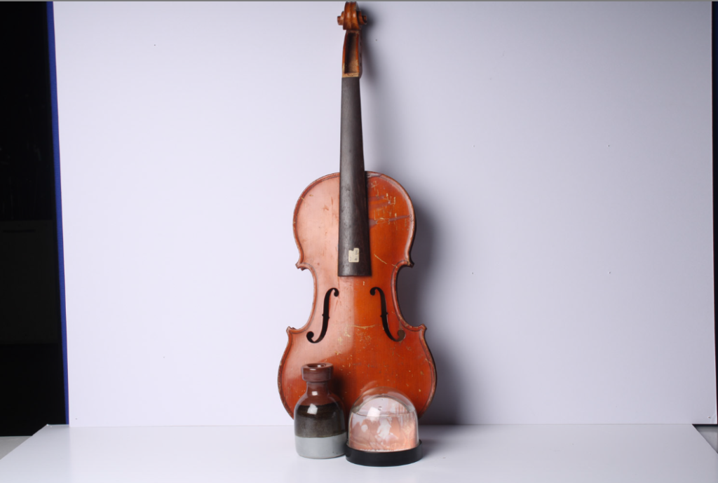
This image is my best image because the tilted angle of the violin along with the placement of the objects makes the image very pleasing to look at and the angle and shape of the violin complements the other objects by making them become more visible so they are not washed out by the violin.

This is another strong image as the colour contrast between the snow globe and the violin makes both objects stand out as the colours compliment each other making the violin look darker and a stronger colour of brown and the snow globe a brighter white.

Good set of still-life images using simple shapes. Analyse your best image with reference to Formalism and formal elements using photo-literacy matrix
https://www.photopedagogy.com/photo-literacy.html
If you have made more still-life images, either multiple objects or single objects make similar blog posts