
I have chosen to colour code my photos into my favourites and my least favourites. This is to easily access my favourite image whilst editing them. I can also then easily discard of my least favourite images
To take these photos my camera settings were:
- Shutter speed- 1/125 sec
- ISO-100
- Aperture- f/16
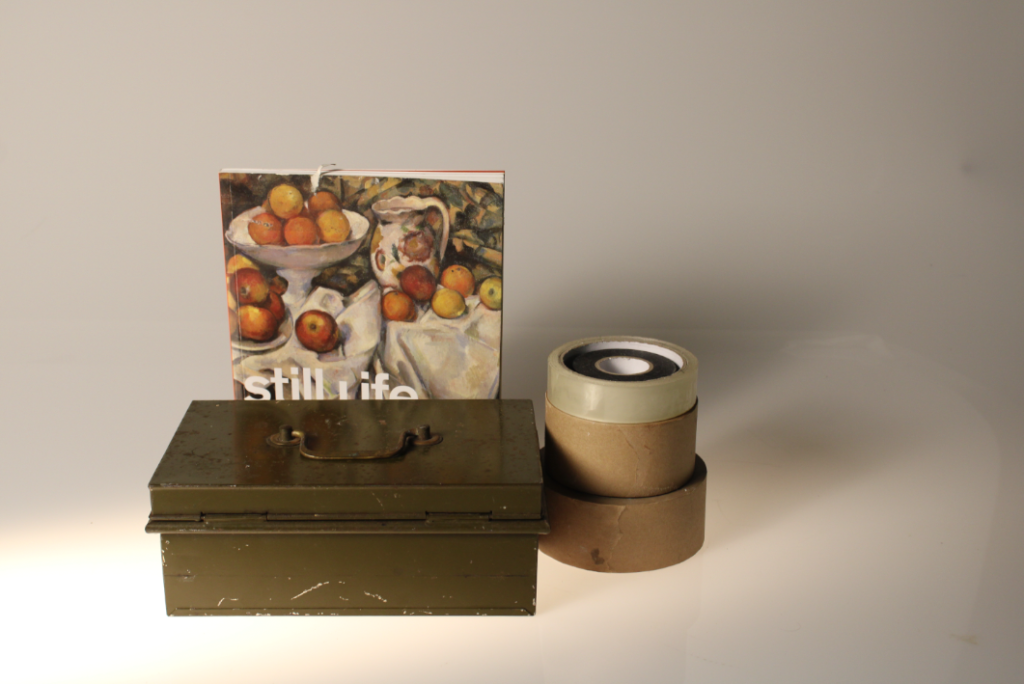
Here is my favourite and best photo unedited:
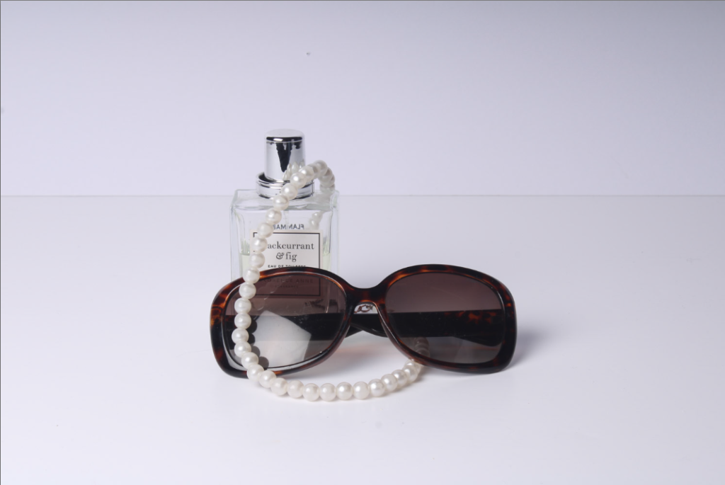
I like this this photo because it focuses on every object being visible and acknowledged. I also like the angle and the pearls draped over the objects. This creates a good dimension and the objects look well balanced out.
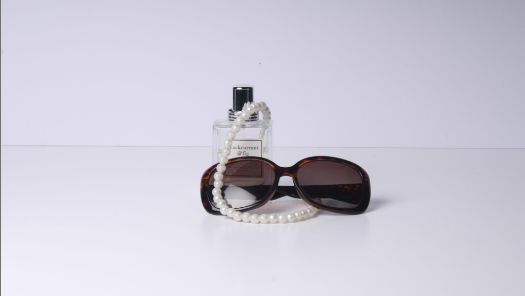
Here is my worst photo unedited:

I don’t like this photo because I think the main focal point is covered. This makes the photo look muddled up and untidy. I think that the necklace wrapped around the object makes the image look messy and unappealing to the eye. I also do not like the angle that it is taken at and to improve this I would like to take it at a better angle to make the photograph look more professional.

I edited this photo first by focusing on detail and texture by increasing the contrast, texture and clarity. This however makes the image look colder and darker, this was my first time editing an image so experimenting with the different editing tools helped to expand my knowledge.
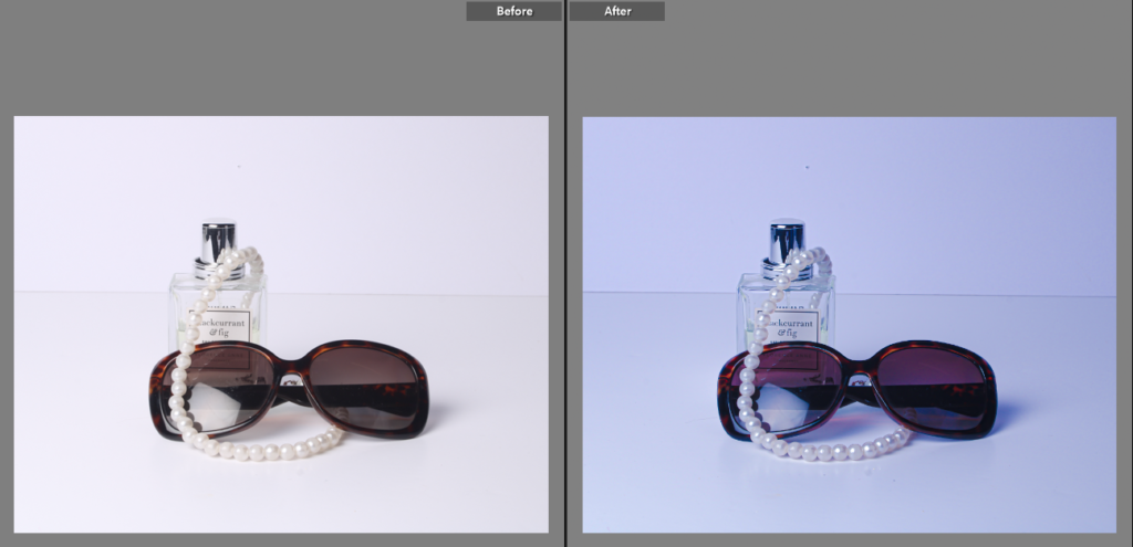
I then decided whilst editing this photo that I wanted to also focus on a more colourful eye-catching approach. This differs from my other edits of this photo by introducing a more colourful and lively impression. This really transformed the image from very white and plain to a more edited look. For this I focused more on colour, vibrancy and detail.

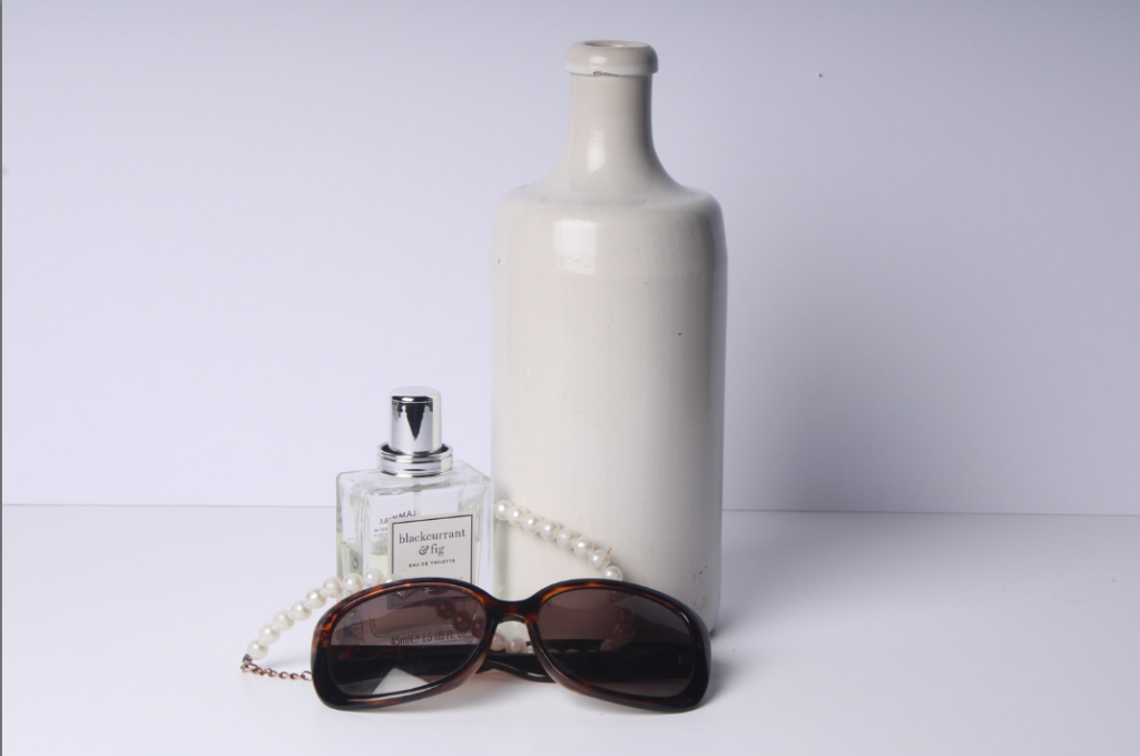
I edited this as my second favourite photo as it has 4 objects instead of 3. This image could be improved by possibly being taken from another angle and I could attempt to remove any imperfections off the larger object to make the photograph look tidier and cleaner. The reason it is not my favourite is because the larger object is not balanced with a similarly tall object so the photo looks slightly unbalanced. This could be prevented by having the smaller objects elevated on a white block to match the colour scheme, but also to heighten the objects to make the difference in sizes less obvious and make the objects look like more of a collective.
These are my main photos I took using these objects.


I then added a different object with a more eye catching object to see if It could improve my image.

This is the unedited version, when I took this photo it was slightly blurry, this is due to a slow shutter speed. To present this next time I should increase my shutter speed so that it is
able to capture the photo in a clearer way. Increasing the shutter speed the lens is open for a shorter length of time, so less light enters the lens. This would help me to take the photo better.

I then edited this photo to improve the clarity and texture mostly. This has made the photo look more realistic and detailed. Whilst editing I also erased some imperfections on the wall behind to make the image look stronger and more professional.
Still Life Transition into Formalism
I then took some images to help transition from still life to formalism. These images are still linked to still life as there are multiple objects, however, they link to formalism as they are shown in their critical positions and that my most important aspects of work are in their true form.

I really like the edited version of this photo better as it shows so much more depth and interest into the image instead of just a whiter, plainer photo which makes my picture look more dull. I edited this by mainly focussing on the shadows and

UNEDITED VERSION ^^^^^^^^^

EDITED VERSION^^^^^^^^^^^^
I really like this photo because I think the paint on the cutlery, which I previously disliked, really compliments the dull colours and brings out a vibrant edge to the photo. I think that the focal point of the image is the red paint on the spoon as the red immediately catches the human eye.

I also took these photos however, whilst taking them I was unsuccessful with gaining a clear, controlled image and they came out very blurry. Next time, I should increase the shutter speed so that I am able to capture the moving image more quickly. I think these photos have potential to look very interesting and look good, but I would have to work very carefully with my camera settings and test my skills.

I also edited this photo to give it a higher quality and make the background a bit darker so that the details of the objects and light from below stands out more. I think that this makes my image stand out more and become more focused. I however think that this image could’ve been improved by being taken at multiple angles. I also think that the smaller objects could’ve been arranged in a more tidier ideal way so that the image looks more carefully thought about and constructed.

Rosie, a quality blogpost that clearly demonstrates how you have edited your still-life images, I particularly like that you have included camera settings. To further improve, it would be good if you analysed your best image with reference to Formalism and formal elements using photo-literacy matrix
https://www.photopedagogy.com/photo-literacy.html
If you have made more still-life images, either multiple objects or single objects make similar blog posts as above.
Good work!