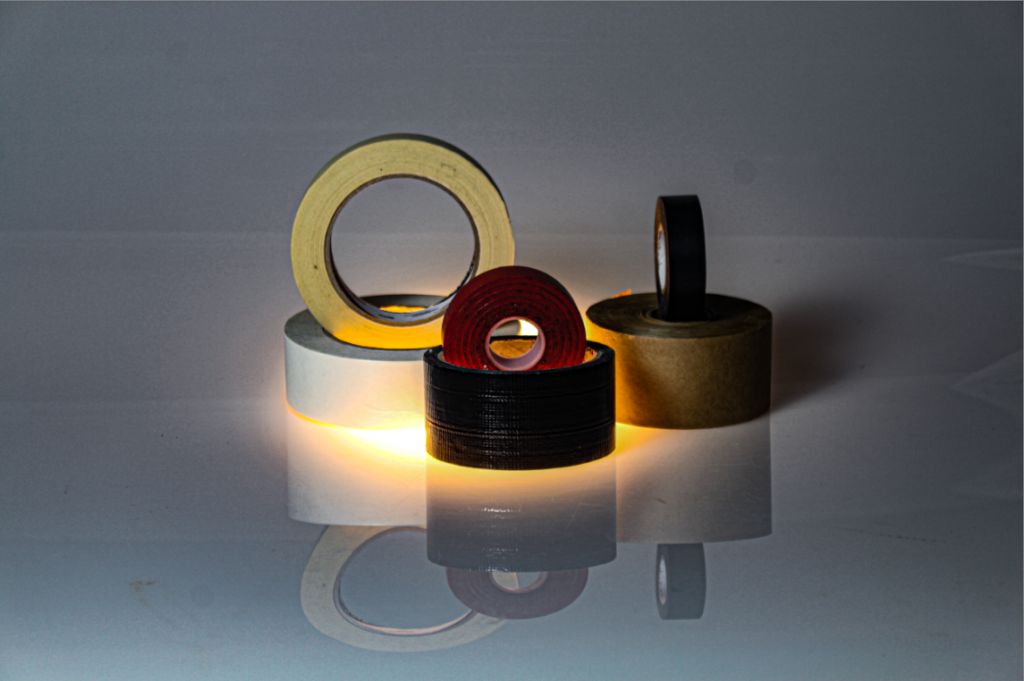
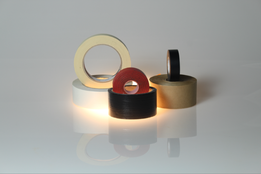
Adding different filters to your photos can make a big difference as it can add contrast and different textures. There are effects that you can control like the sharpness of the photo and the texture. If you make the texture strong then you will get a photo that looks like it has a gradient effect or if you put it quite low then you can make your photo look like a painting.
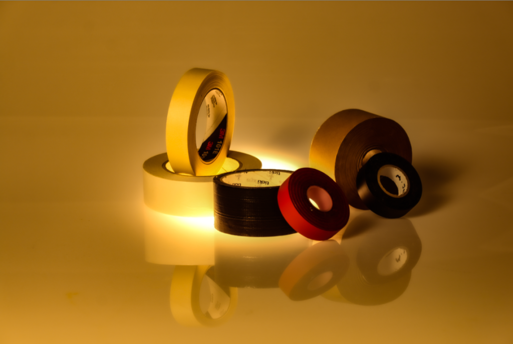
here I made the texture of this photo quite low and made it almost look really smooth, the photos texture is very low and makes me feel very calm whereas if the texture was quite high I would feel more rough and weird. I feel that the original photo looks rather dull but fits the theme of still life more and its quite simple and not too complex. I really like how this has turned out but I do feel that this photo looks really dark and old fashioned.
photoshoots
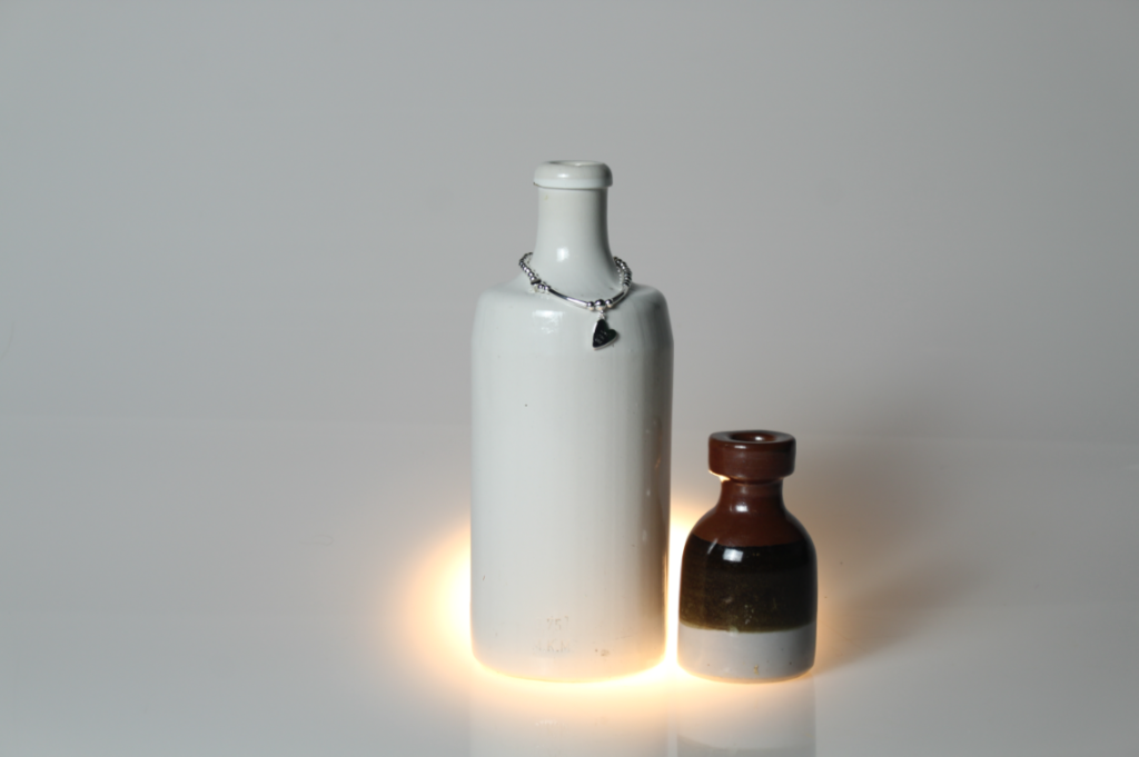
during my photoshoot I went down to the studio and placed a few items down, I then proceeded to move them around to see what items fitted best. I believe that the lighting on the items do change a lot, for example when adding a warm colours to the photo it can show a precious moment, almost as if it was a memory however when using quite a bright and bold light that can make the photo look a lot more colder and more modern as more technology and lighting was involved.
Some of my photos:
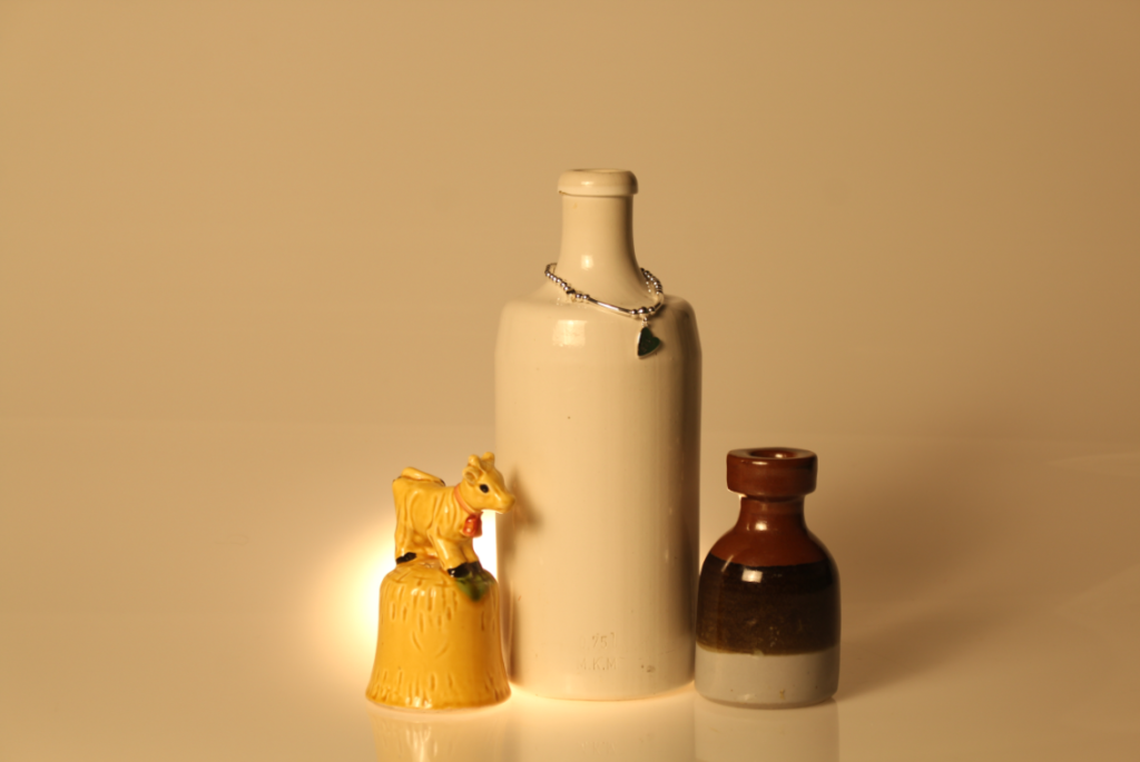
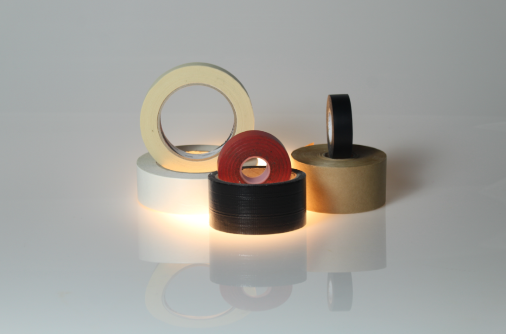
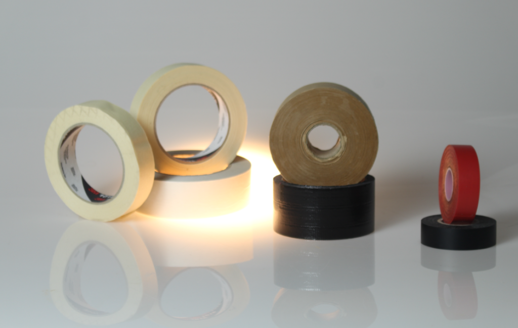
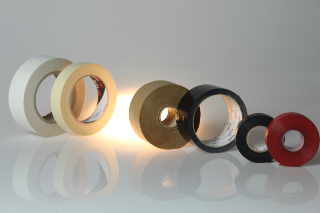

If I were to recreate this I would have liked to take pictures of some of the tapes individually as sometimes putting too many items can complicate the the photo and the idea of still life. I like to keep my photos quite simple and not too abstract, What I really like about my photo’s is that you can see the reflection of the object, this means that the line of reflection is the perpendicular bisector between the preimage and the image.
The reason I chose to take pictures of tape is because they are really basic and simple, they don’t necessarily hold meaning but they are easy to work with. I managed to get tape in different sizes and colours which make the photo look minimalist.
Photo Analysis
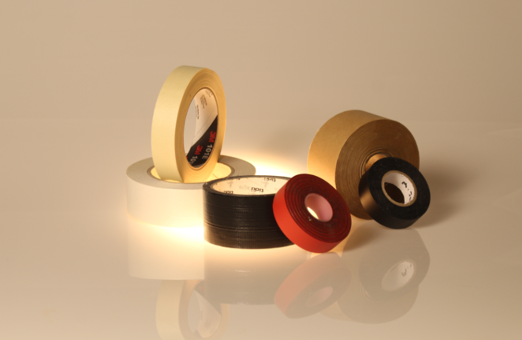
overall I really like how this photo has turned out as its very original to me and the way I have positions the items. I really like how you can see the reflection of the objects as it adds a contrasting look and also makes the photo look more interesting.

Excellent set of quality still-life images using simple objects and shapes. If you have made more still-life images, either multiple objects or single objects make similar blog posts
Would be good to end post with analysis of an image looking at formalism and formal elements using photo-literacy matrix
https://www.photopedagogy.com/photo-literacy.html