Adding different filters to your photos can make a big difference as it can add contrast and different textures. There are effects that you can control like the sharpness of the photo and the texture. If you make the texture strong then you will get a photo that looks like it has a gradient effect or if you put it quite low then you can make your photo look like a painting.
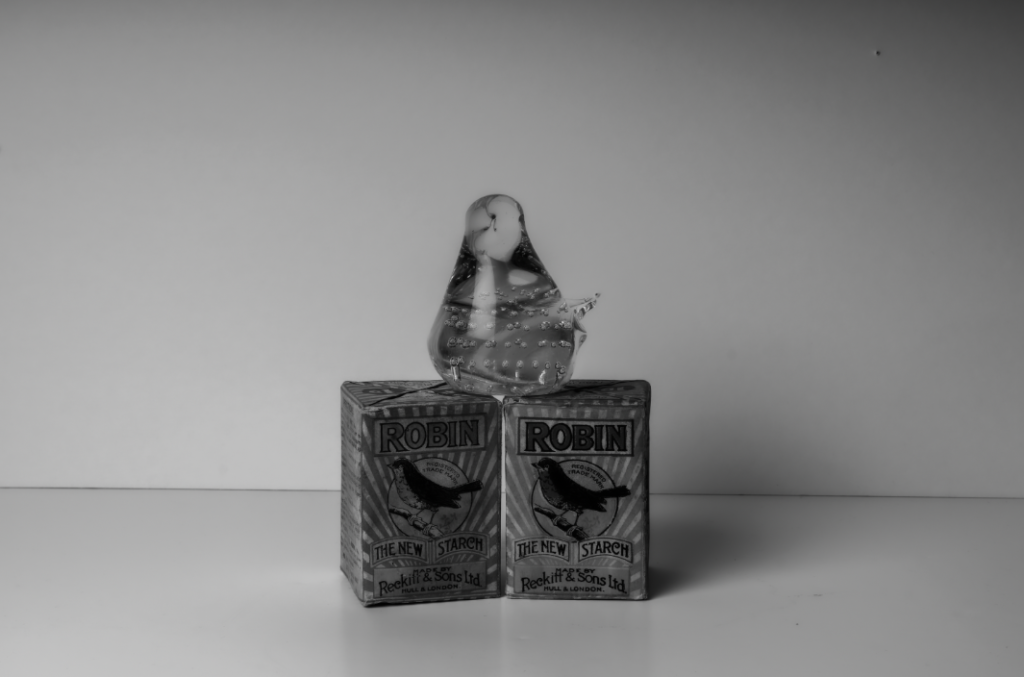
here I made the texture of this photo quite low and made it almost look really smooth, the photos texture is very low and makes me feel very calm whereas if the texture was quite high I would feel more rough and weird. I feel that the original photo looks rather dull but fits the theme of still life more and its quite simple and not too complex. I really like how this has turned out but I do feel that this photo looks really dark and old fashioned.
photoshoots
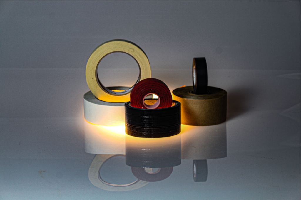
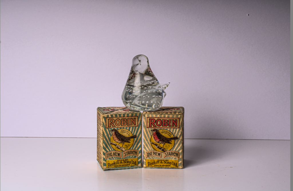
during my photoshoot I went down to the studio and placed a few items down, I then proceeded to move them around to see what items fitted best. I believe that the lighting on the items do change a lot, for example when adding a warm colours to the photo it can show a precious moment, almost as if it was a memory however when using quite a bright and bold light that can make the photo look a lot more colder and more modern as more technology and lighting was involved.
Some of my photos:
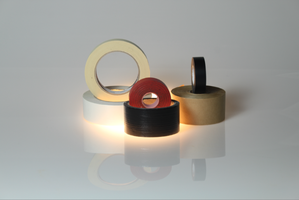
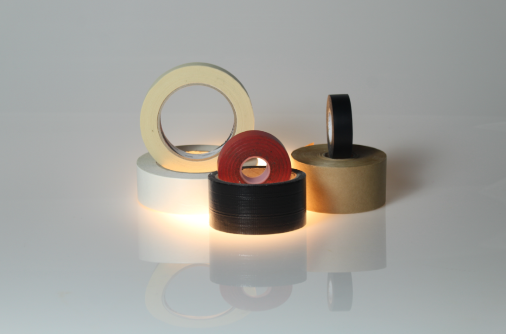
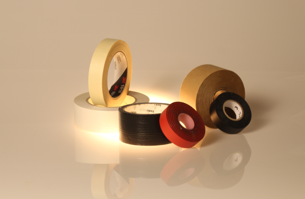
If I were to recreate this I would have liked to take pictures of some of the tapes individually as sometimes putting too many items can complicate the the photo and the idea of still life. I like to keep my photos quite simple and not too abstract, What I really like about my photo’s is that you can see the reflection of the object, this means that the line of reflection is the perpendicular bisector between the preimage and the image.
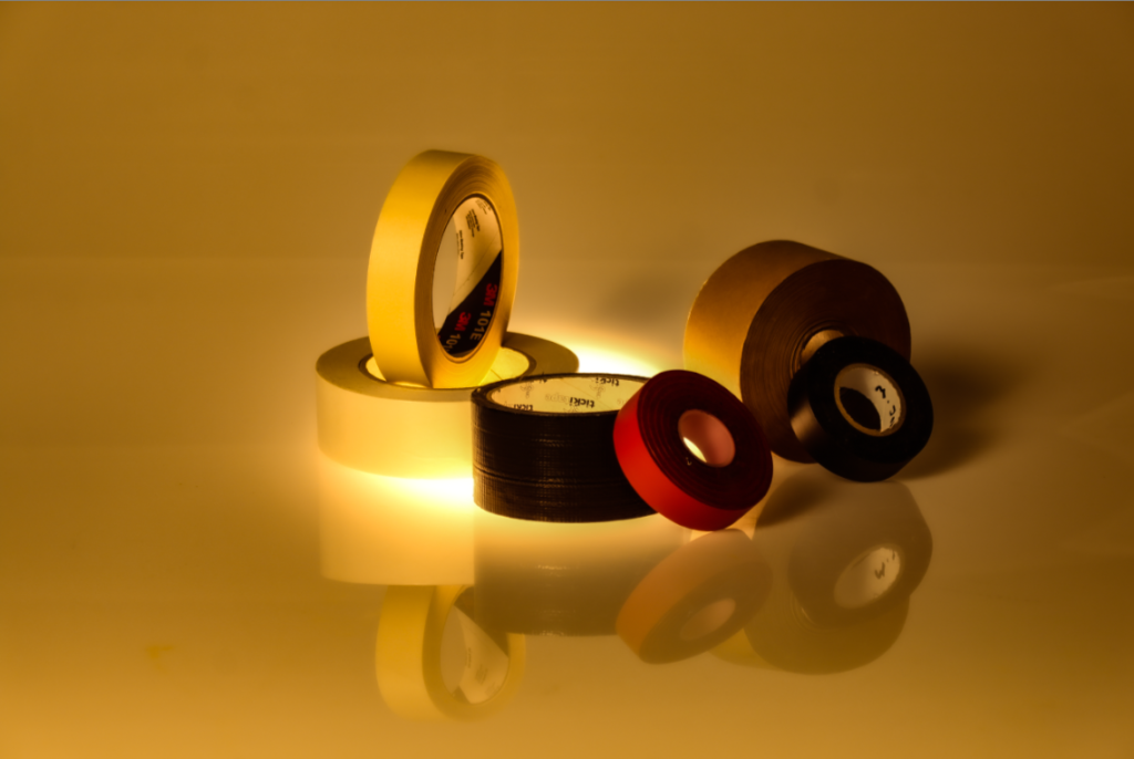
The reason I chose to take pictures of tape is because they are really basic and simple, they don’t necessarily hold meaning but they are easy to work with. I managed to get tape in different sizes and colours which make the photo look minimalist.
Photo Analysis
overall I really like how this photo has turned out as its very original to me and the way I have positions the items. I really like how you can see the reflection of the objects as it adds a contrasting look and also makes the photo look more interesting.
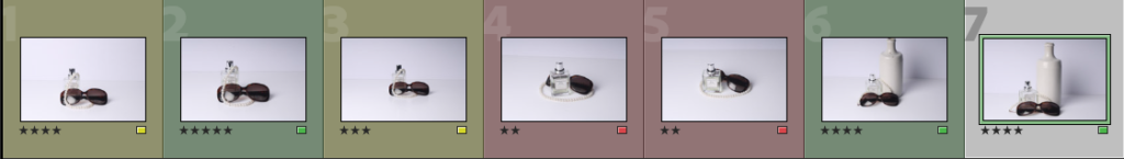
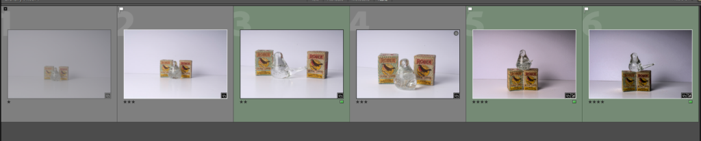
I have chosen to colour code my photos into my favourites and my least favourites. This is to easily access my favourite image whilst editing them. I can also then easily discard of my least favourite images
To take these photos my camera settings were:
Shutter speed- 1/125 sec
ISO-100
Aperture- f/16
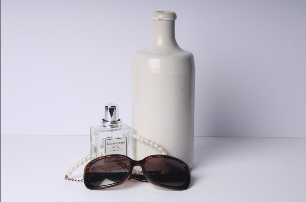
Here is my favourite and best photo unedited:
I like this this photo because it focuses on every object being visible and acknowledged. I also like the angle and the pearls draped over the objects. This creates a good dimension and the objects look well balanced out.
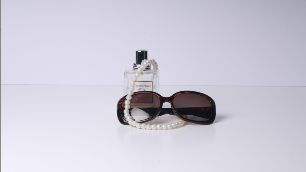
Here is my worst photo unedited:
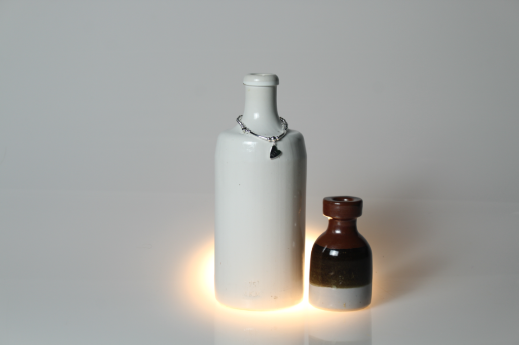
I don’t like this photo because I think the main focal point is covered. This makes the photo look muddled up and untidy. I think that the necklace wrapped around the object makes the image look messy and unappealing to the eye. I also do not like the angle that it is taken at and to improve this I would like to take it at a better angle to make the photograph look more professional.
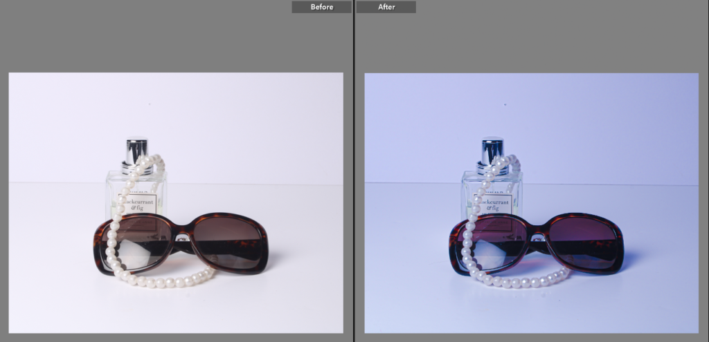
I edited this photo first by focusing on detail and texture by increasing the contrast, texture and clarity. This however makes the image look colder and darker, this was my first time editing an image so experimenting with the different editing tools helped to expand my knowledge.
I then decided whilst editing this photo that I wanted to also focus on a more colourful eye-catching approach. This differs from my other edits of this photo by introducing a more colourful and lively impression. This really transformed the image from very white and plain to a more edited look. For this I focused more on colour, vibrancy and detail.
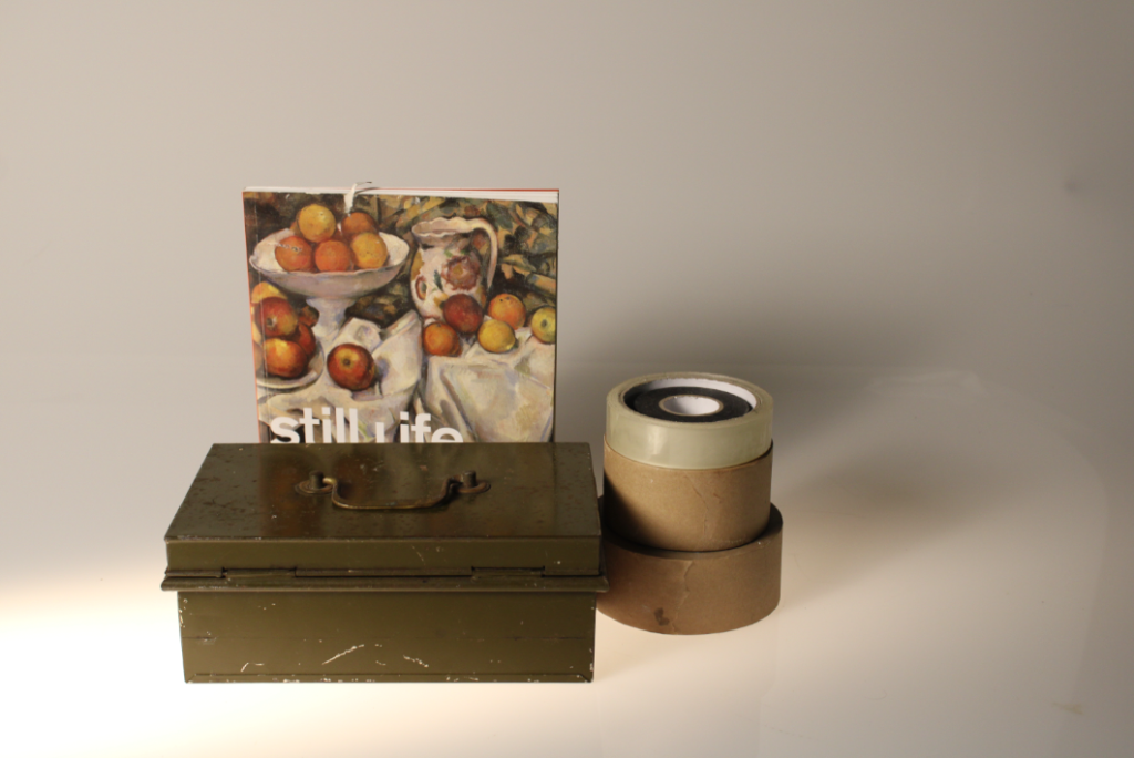
I edited this as my second favourite photo as it has 4 objects instead of 3. This image could be improved by possibly being taken from another angle and I could attempt to remove any imperfections off the larger object to make the photograph look tidier and cleaner. The reason it is not my favourite is because the larger object is not balanced with a similarly tall object so the photo looks slightly unbalanced. This could be prevented by having the smaller objects elevated on a white block to match the colour scheme, but also to heighten the objects to make the difference in sizes less obvious and make the objects look like more of a collective.
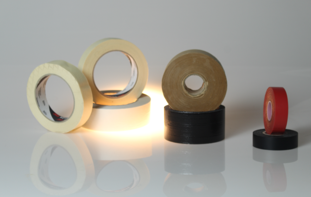
These are my main photos I took using these objects.
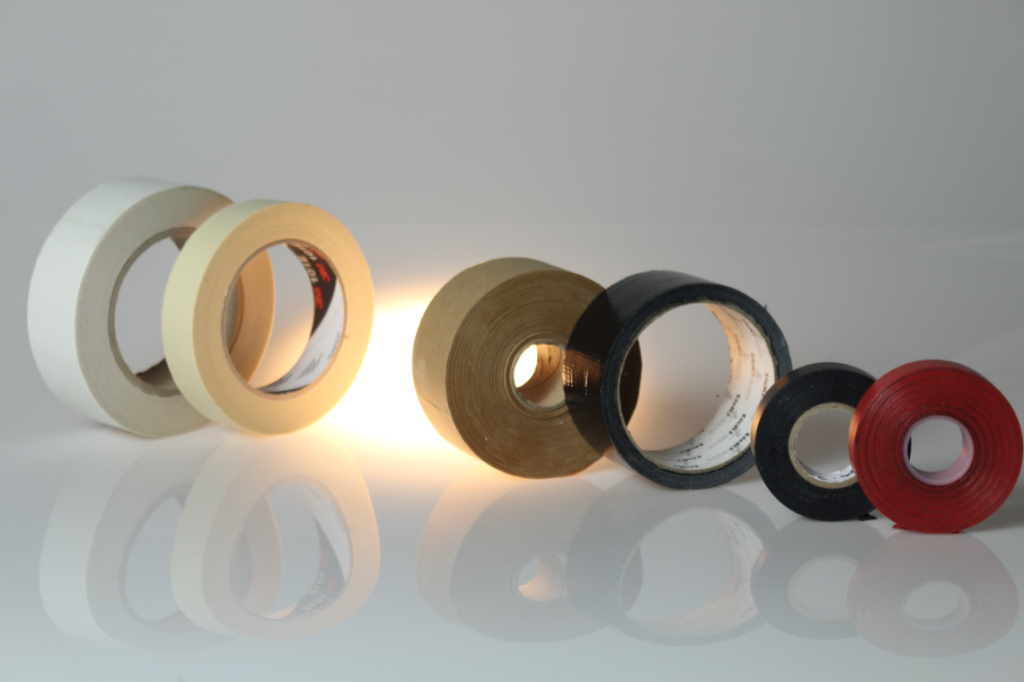
I then added a different object with a more eye catching object to see if It could improve my image.
This is the unedited version, when I took this photo it was slightly blurry, this is due to a slow shutter speed. To present this next time I should increase my shutter speed so that it is
able to capture the photo in a clearer way. Increasing the shutter speed the lens is open for a shorter length of time, so less light enters the lens. This would help me to take the photo better.
I then edited this photo to improve the clarity and texture mostly. This has made the photo look more realistic and detailed. Whilst editing I also erased some imperfections on the wall behind to make the image look stronger and more professional.
Still Life Transition into Formalism
I then took some images to help transition from still life to formalism. These images are still linked to still life as there are multiple objects, however, they link to formalism as they are shown in their critical positions and that my most important aspects of work are in their true form.
I really like the edited version of this photo better as it shows so much more depth and interest into the image instead of just a whiter, plainer photo which makes my picture look more dull. I edited this by mainly focussing on the shadows and
UNEDITED VERSION ^^^^^^^^^
EDITED VERSION^^^^^^^^^^^^
I really like this photo because I think the paint on the cutlery, which I previously disliked, really compliments the dull colours and brings out a vibrant edge to the photo. I think that the focal point of the image is the red paint on the spoon as the red immediately catches the human eye.
I also took these photos however, whilst taking them I was unsuccessful with gaining a clear, controlled image and they came out very blurry. Next time, I should increase the shutter speed so that I am able to capture the moving image more quickly. I think these photos have potential to look very interesting and look good, but I would have to work very carefully with my camera settings and test my skills.
I also edited this photo to give it a higher quality and make the background a bit darker so that the details of the objects and light from below stands out more. I think that this makes my image stand out more and become more focused. I however think that this image could’ve been improved by being taken at multiple angles. I also think that the smaller objects could’ve been arranged in a more tidier ideal way so that the image looks more carefully thought about and constructed.
In response to the Walker Evans and Darren Harvey-Regan research, I have taken a range of different photos of objects and narrowed them down to my best seven images that I have edited and developed in lightroom.
I have selected the spot removal tool to get rid of the visible dust spots on my best image, that have been caused by the camera lens.
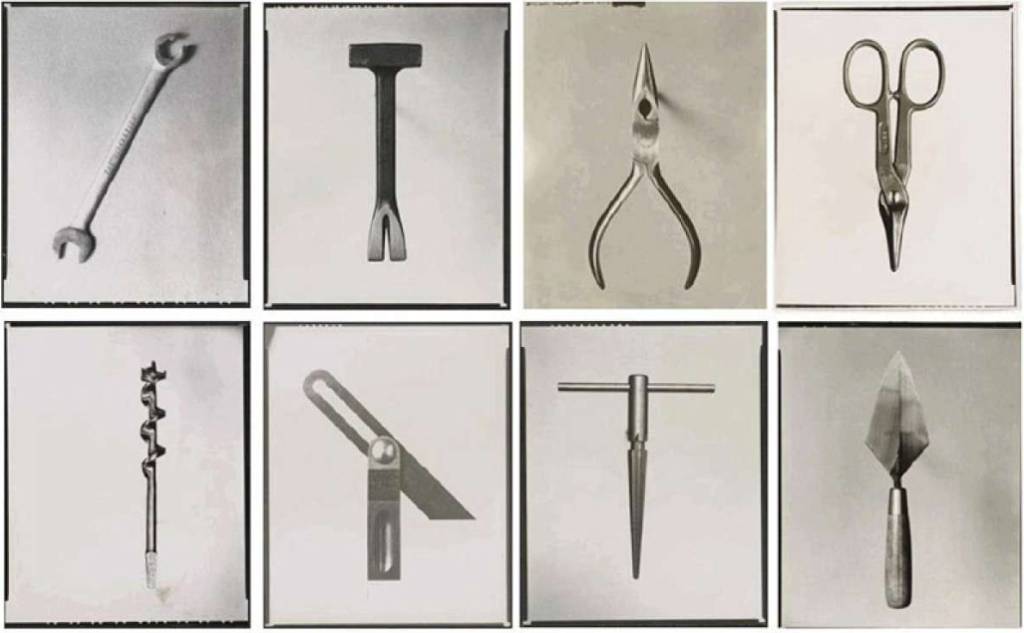
Below are examples of Walker Evans’ work, I have used them to get an idea and compare my work with his to try and make mine match the style of his.
Annotations
I have edited my final images by using a black and white pre-set filter and then adjusting the strength of the shadows and highlights, textures and exposure.
I have used a low sensitivity in my images so that they ended up looking sharp and not grainy. I’ve used a range of tone and texture in my images to try and capture the style of Walker Evans.
I experimented with the layout of my objects with the aim of trying to make them look 3D by placing an object on top of the other as well as positioning them in different ways. I had kept a white background to try and contrast with the darker objects to try and make them stand out more.
I have cropped the images so that the objects stayed in the middle of the image and are the main focus point. I have also left some shadow in the background to try and keep depth in the images too.
Best Image
I have chosen this as my best image because it looks the most appealing and accurate to Walker Evans’ style.
I have kept the layout simple like Evans’ own images and adjusted the tone to make it darker and tried to keep the highlights bright but still a bit muted.
I experimented with the contrast of the background and the tool itself to try making the object stand out more. I’ve also confined the background to keep the attention on the object.
I’ve also kept the shadows in the background to try and mimic the old or worn affect that Evans’ has in his own images, I’ve also done this to try and keep texture in the background.
For the experimentation in this image I have changed some of the setting on the image such as the enhancement, the highlights, shadows and contrast to create a deeper, darker effect. For the next edit I am going to turn the image into a more ominous feeling to replicate walker Evans.
for this edit I have taken inspiration from Walker Evans by changing the photograph into black and white to represent his work. I also played around with the contrast and brightness of the image changing the blacks, whites and shadows within the image.
for this third edit again its not completely how I would have hoped it to turn out as you can see there is a grainy kind of background feel to it which makes the image not as clear and crisp as I would’ve hoped it to have turned out.
Here are my images, the ones selected in green are the images I feel have the best composition and ultimately just stand out better then the rest of the images.
This image is taken from a head on plane, facing the objects directly.
The lighting is ambient and is coming from the left., this creates a moody feel to the image.
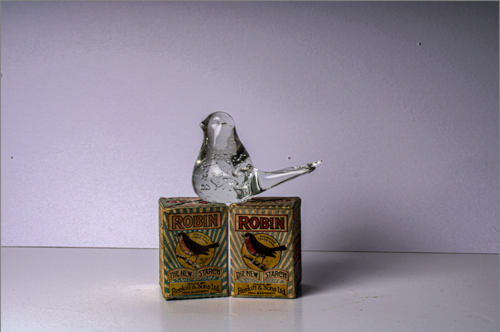
The artist uses a skull to symbolise death.
The artist uses rule of thirds to draw attention to the bubble in the top right.
this image represents the exploration and growing prosperity of the European continent in the golden age of discovery.
the artist uses a wide depth of field, this makes sure all elements of the photo are in focus.
The stone counter top has a rough texture.
still life artist: Paulette Tavormina.
Paulette Tavormina was born in 1949 in Rockville Centre. inspired by the 17th century still life movement, she uses photography to reconstruct and replicate the popular artist movement.
The now New York photographer was inspired by the Dutch masters who really created still life as a movement. She enjoys the transformation still life has had, saying it started simple with items like bread and milk but over time formed to be a big display of prosperity and abundance using food to show off their trade.
She believes the way she photographs gives the mundane objects importance that they would not hold in everyday life. She utilizes moody lighting perfectly, almost achieving the effect that her sill life is glowing from within.
Her artwork captures the most thoughtfully curated arrangements of flowers and luxury foods in an attempt to capture the fleeting perishables often valued in the 17th century and today.
my photoshoot.
This image is my favourite as I like the exposure and the composition. The B necklace is placed with rule of thirds in mind bringing the viewers attention to the necklace.
I used a continuous light throughout the photoshoot.
I also utilized a wide depth of field to keep everything in focus.
I like the texture created by the sheet placed under the items.
contact sheet
some of my photos were out of focus when I was reviewing my shoot so i will need to check my depth of field when I’m taking photos.
the images I have taken of the book shows the lines as each page is a new line, I set the camera up to an angle to really capture the full extent of how many lines were lying within my images.
Depth :
for the depth of these images i played around with it by taking some images closer up which also brought out more detail within the images however i also took some images further away to capture more of the surrounding area as well as the objects.
Color :
for the images to do with color I decided to use some colored sheets to create a layout and take photos of them with the images in that set arrangement to show the variation of color which I had chosen to use.
Form :
to represent form i used a block which had holes in it to not only create the feel of texture which links to the texture section of my blog post about formalism but also as the holes created a new dimension in the image as the block was creating lots of different shadows and figures within the images as it was 3D.
texture :
to link to the formal images both these images link together as they both show form and texture with the holes creating shadows and texture within the images.
size :
for size i decided to not only do some close up images but also some further away to create and have a different range of images rather then just one set of images.
shape :
for shape i used a few different objects and moved them around creating different shapes in the images and layouts which created different types of layers and dimensions.
For the photos I took, I chose my favourite ones and flagged them green and rated them five stars, for the ones I disliked I flagged them red. The photos coloured yellow were the photos I wasn’t sure about.
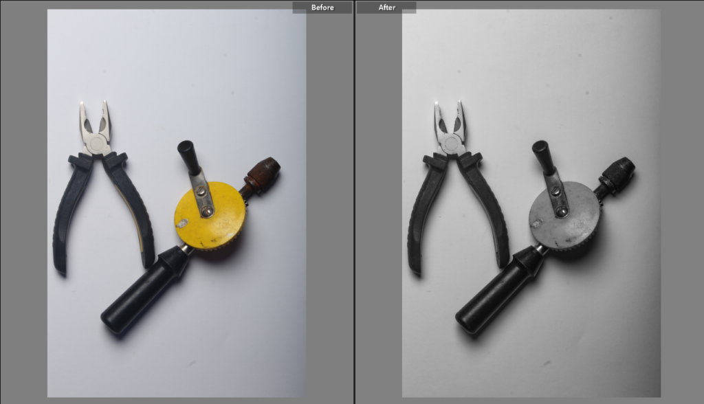
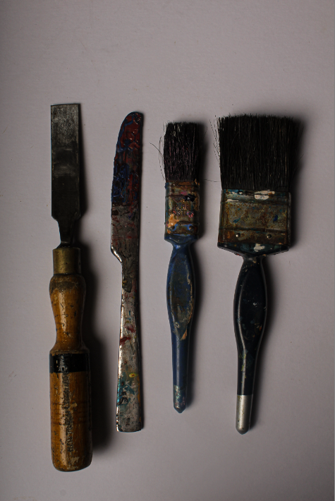
This photo of plyers was my favourite and the best looking photo I took. I edited the plyers to have a darker ambience and sharp shadows around the tool.
For this photoshoot I arranged tools on the copy stand. These were well lit and didn’t require much editing after. As a result lots of the photographs looked well lit and bright and I edited the photos after to have a darker vibe like Walker Evans has in his photos. The six photos I edited all matched this vibe.
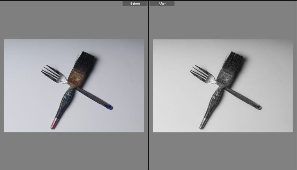
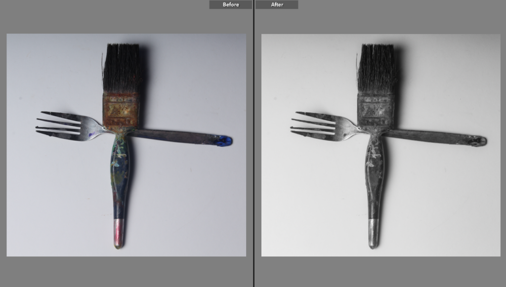
This photo is before and after I edited the paintbrush on adobe Lightroom. I edited the temperature to be darker and have more colour and changed the exposure to -50 to have a darker feel in the picture.
Today we opened up Adobe Lightroom and created a new collection called “Tools”. I then selected all my photos of tools that I took in yesterdays lesson, and ranked them based on how good they are and how accurate they are to the inspired artist’s. This gives us a good idea on which images we would like to use in the future on projects etc. The images that are ranked green are my best photos, they are the ones I like the most and will definitely use in projects etc. The yellow images are the ones that I could potentially still use, however improvements could be made. For example, most of my yellow images do not have good angles, or are slightly blurry. The photos that I ranked red are ones I will not be using in my projects.
I edited all my photos using Adobe Lightroom classic.
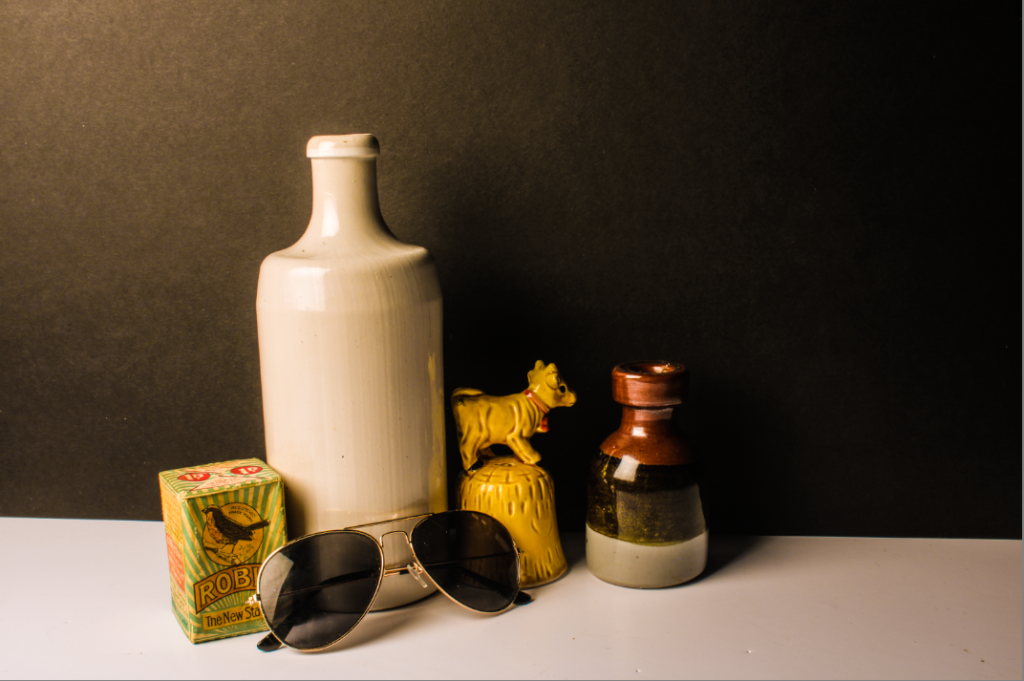
I warmed this photo up by giving it a yellow tint. I did this to create a nostalgic feeling almost as if it was a memory. I picked these objects because they feel homely, again creating a good, joyful image in your head.
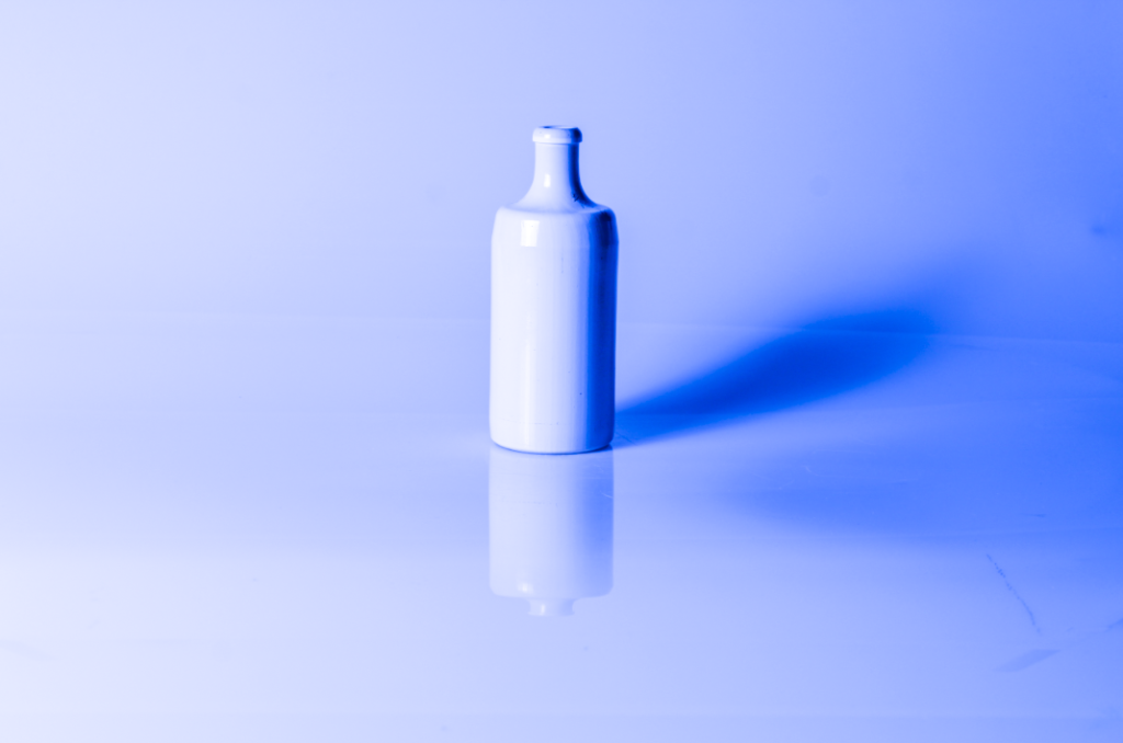
For this picture, it was basic and white. I turned the temperature all the way down to -100. I did this as it drew me in to the picture more than the original colour. It brings peace and tranquillity to mind. I picked this object because it was simple, but with some editing made it effective.
In this picture, I turned the temperature down to make a colder and darker effect. I also put the contrast all the way down to get strong texture. I picked this object as i thought it was quite unique.
Walker Evans began to photograph in the late 1920s. Walker Evans is known for his black and white images. He uses low light in his work which helps create the shadows he focuses on.
Darren Harvey
Darren Harvey’s photography has similar vibe but a different ambience as the colours used are a lot of brighter colours or more light involved to make the picture look sharp with the shadows behind the photos.