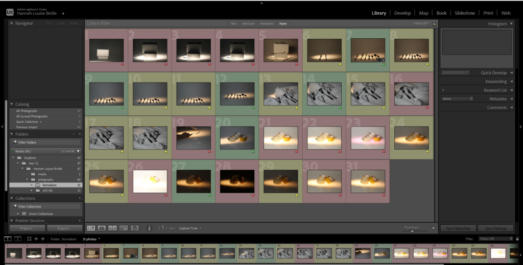
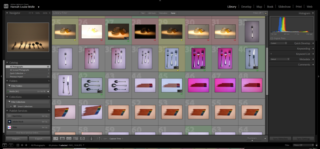
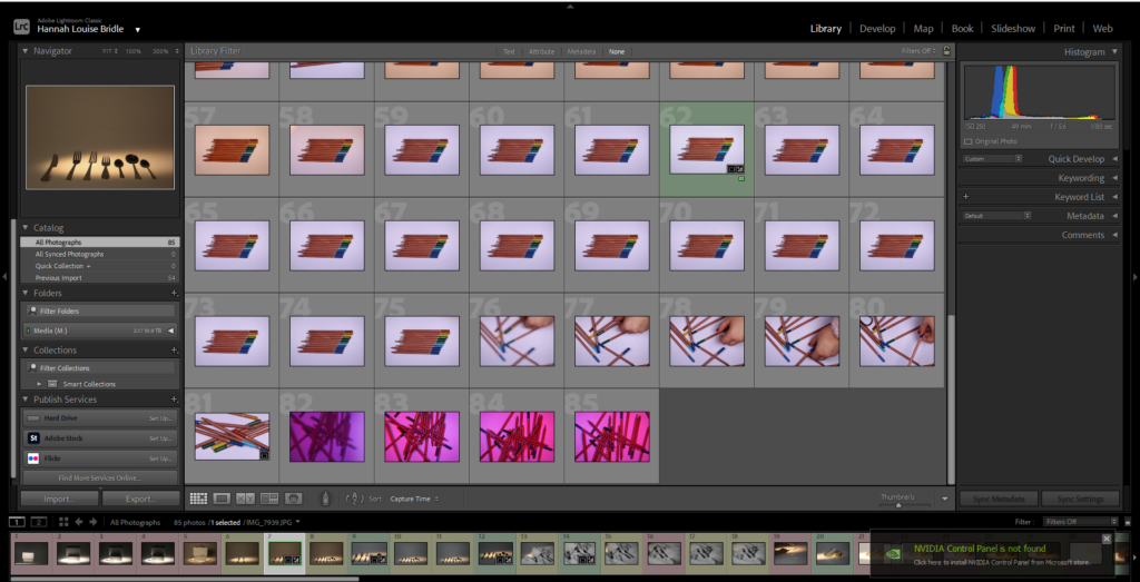
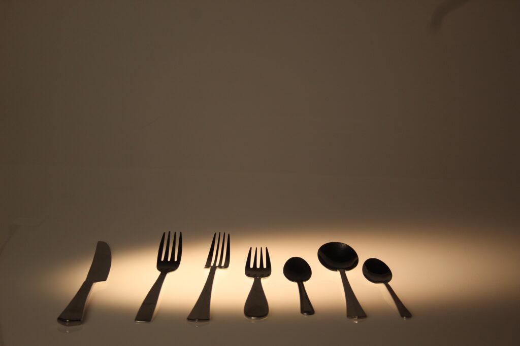
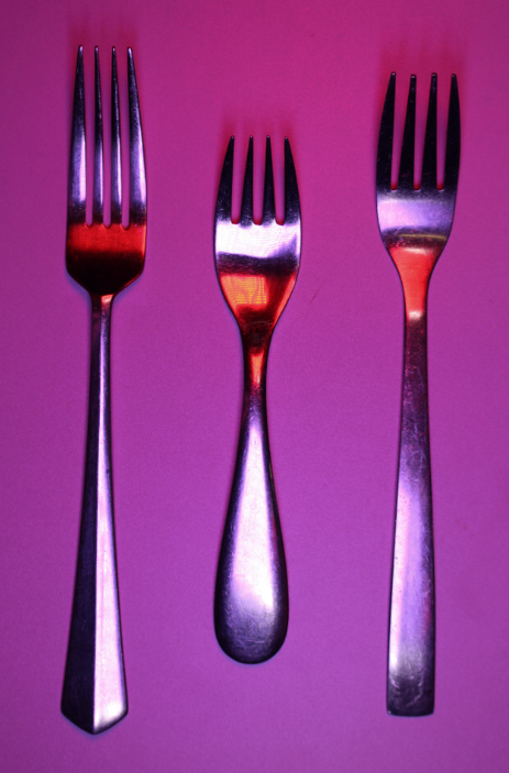
for these photoshoots I was trying to focus on only having a couple objects in the image and trying to focus more on shadows and depth.
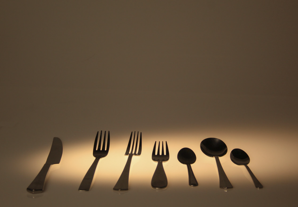
Original picture on the right ->
For the image I had the shutter speed set at 1/80 secs and I had the aperture set at f/5.6
For the editing all I did was change the hue slightly, changed the highlands and shadows and crop the image so it was more even with negative space surrounding it.
Overall I think its a good image I think the slight reflective shadows from the cutlery looks really interesting as it gives the image lots of depth. However I do think it would have been to try and get some more photos with lots more different and harsher shadows if possible.
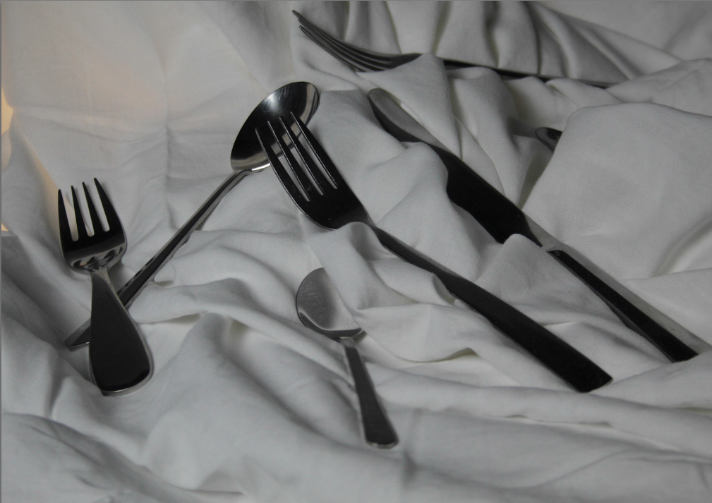
I do quite like this photo I think there is a lot of interest texture and depth due to the boxes and the sheet underneath the cutlery adding these new dimensions into the image. However because of the material the objects where on and the lighting it means there aren’t any shadows which was I what I was wanting for the photoshoot.
For this photo I had the setting set at 1/80 secs for the shutter speed and f/5.6 for the aperture.
Once again there wasn’t much editing needed for this photo I changed the shadow and highlights slightly cropped the image and for this was I changed the clarity by a very small amount because it gave more detail to the photo which I though looked really good.
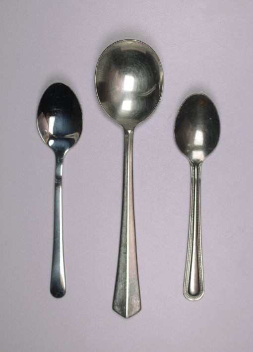
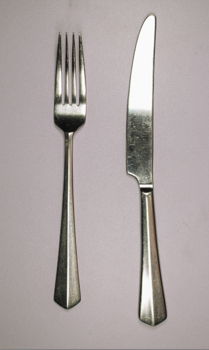
I really like these photos I think they work really well especially compared to Walker Evans work with the classic white background with the seemingly quite basic everyday object.
I think for these the birds eye view shot I got works the best as it would be hard to photograph then from eye level as they are flat and cant be stood up.
For these i had the shutter speed set up at 1/100 secs and the aperture was at f/6.3. For these I had two ring lights on either side for the lighting was even and I had the lights on cool toned because it felt like it worked better based on the inspiration. However I did also take some with coloured gel sheets in font of the lights which did end up looking really interesting.
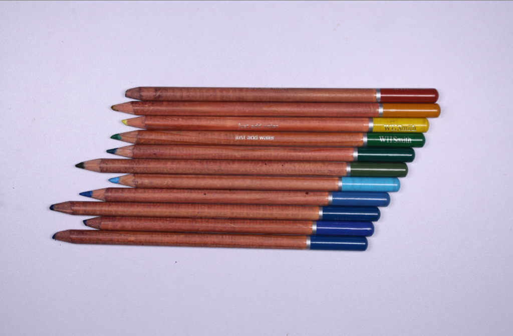
I think the photos I took of the colouring pencils although don’t fit the inspiration artist Walker Evans like I was originally planning they seem more nostalgic. This is because of the bright and vivid colours were something I liked a lot as a child.
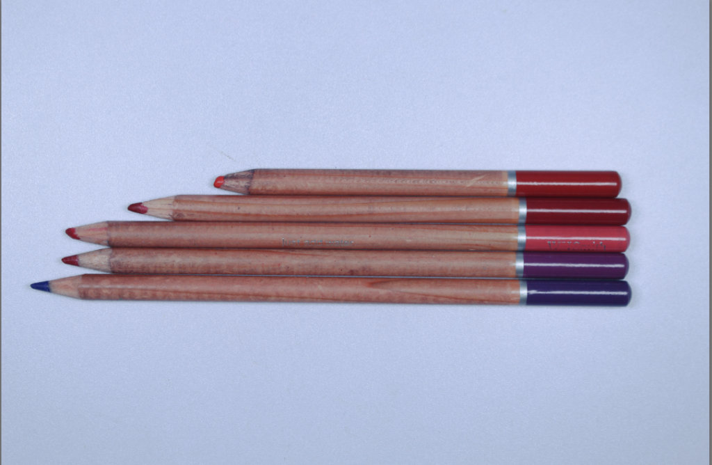
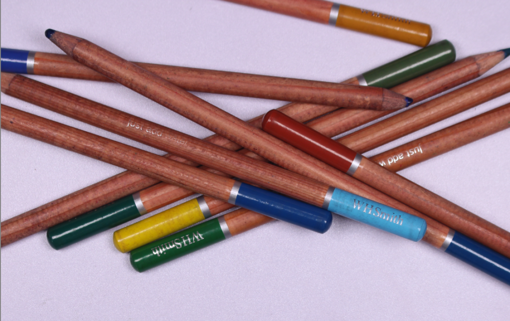
For these images I used a tri-pod to stand up the camera so I could take the photo from that point of view and so that the photos would be extremely still. I used two spot lights either side of the object to illuminate the objects. I think the two photos contrast together from the one on the left being so uniform and organised compared to the one on the right which is very chaotic and messy.
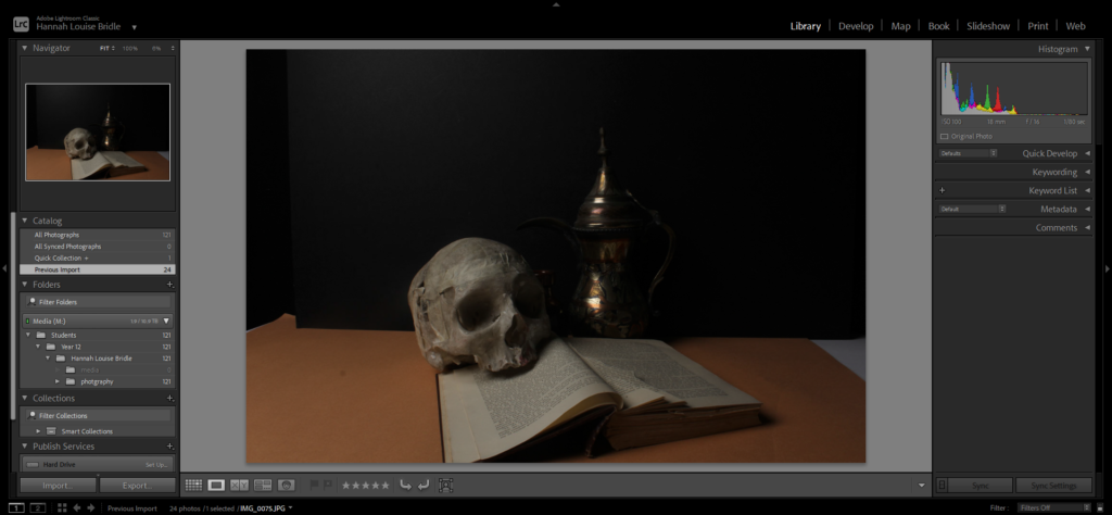
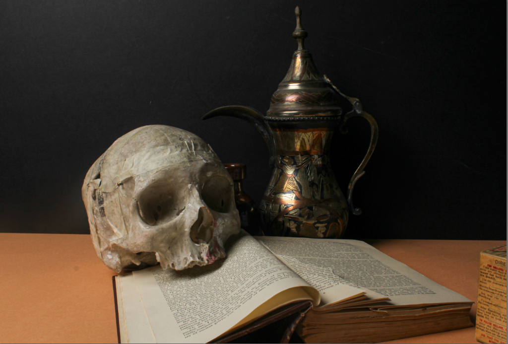
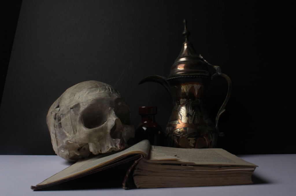
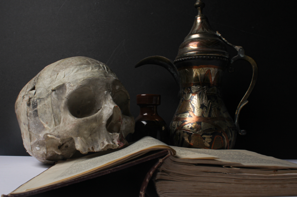
This photoshoot was a different way to interpret and represent still life and i took more inspiration from Vanitas style photos where they often tried to represent and have themes of death in their photos. I tried to recreate that why having the skull to show a quite literal idea of death but then I also used a book for more of an abstract idea of it suggesting the story of your life.

Make sure you include your single image photoshoot, after your post about Walker Evans / Darren Harvey – Regan