Walker Evans
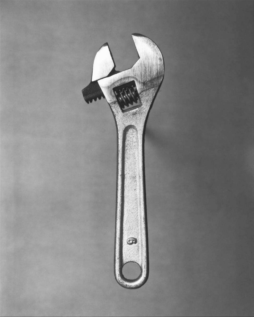
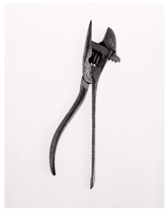
“Beauties of the Common Tool” was originally published in 1955 by Walker Evans with several photographs of individual tools.
The tool is clearly made of metal which reflects light and creates a clean, elevated appearance which demands respect. Depth is clearly shown with the tools harsh shadows that the lighting provides giving the tool a more complex appearance.
This photograph shows a utility tool raised in front of a plain background. This is a birds eye view with an overhead light and raised so that the shadow is kept to a minimum. This ensures that the tool is shown like you would see it and is clearly in focus showing that the subject is deserving of attention and easily draws the eye.
The photographer made sure that there were no distractions in the photograph by using having a plain colourless background framing the object. This ensures that focus is purely on the tool and forces the viewer to see the subject in an isolated environment and appreciate it in a way they wouldn’t have before.
Response
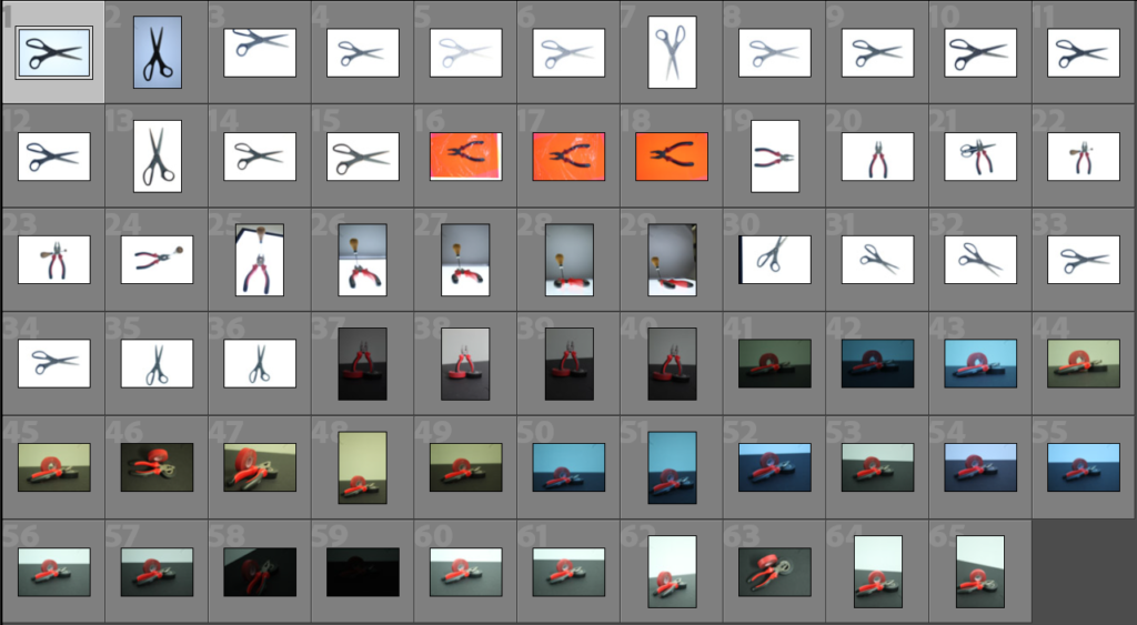
For this photoshoot I arranged tools in front of a lightbox for a bright white background, this made sure the objects were well lit. The second part used two sheets of card with only the pre-existing natural light. This meant that the images were much darker. To adjust the camera settings was difficult and required the ISO to be largely increased as well as the shutter speed and white balance changed. As a result lots of the photographs looked blue or dark because I had to trying out each option. Only the final 6 were bright and the correct white balance.
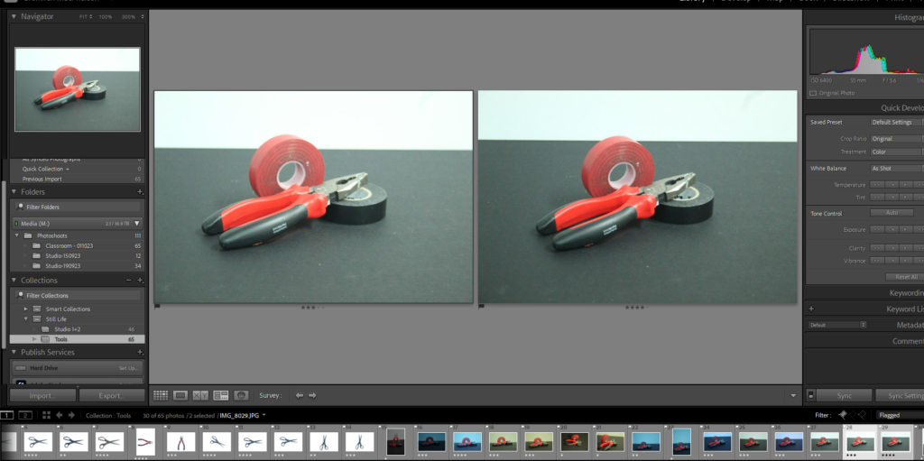
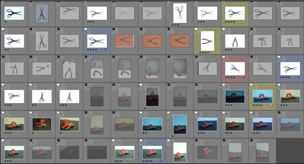
To narrow down the selection of photos I compared a few images at a time and selected the better one either with stars of colours. I managed to narrow the images down to 3 photographs highlighted with yellow.
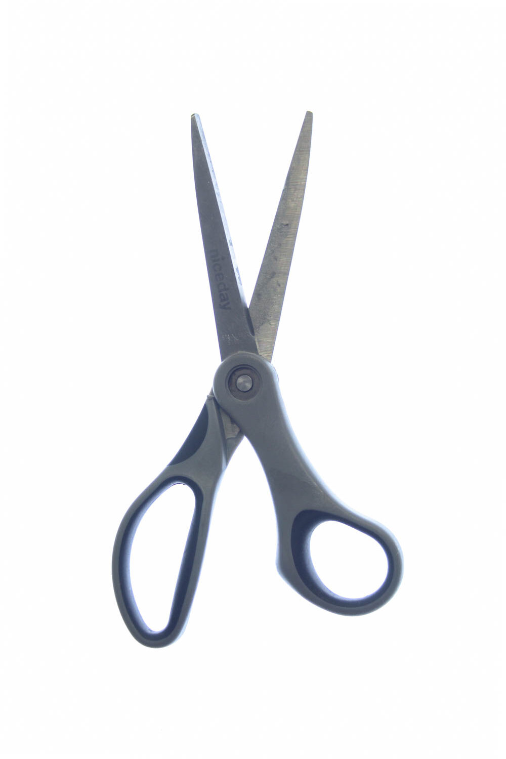

Final Image
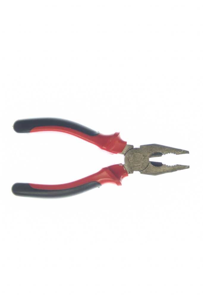
Darren Harvey-Regan
“Beauties of the Common Tool” was created in 2013 by Darren Harvey-Regan inspired by Walker Evans photographs of the same name.
This photograph combines two work tools through editing. They would have been two separate photographs that were joined together down the centre for a a clear line of separation.
I believe that this line was vertical because it purposefully shows both the head and handle of both the tools. This is significant because had the split been horizontal, one of the tools would have been beheaded. This would look more like the photographer was picking and choosing his favourite parts of the tools rather than appreciating both tools for their usefulness. A tool is useful as a whole rather than dismembered parts
Similar to Walker Evans, this photograph is to celebrate and appreciate house tools for what they are. The tools are infront of a plain background as to not draw attention however this time the background is much lighter. I believe this is because the photograph isn’t supposed to be as dramatic, it is brighter and more celebratory. Both the tools have different functions and different appearances but by stitching them together, this shows that they are equal. The tools are significantly darker also which contrasts with the background making them stand out more.
For this image I set the ISO to 100 since the lightbox was really bright and didn’t need any higher. Since it was so bright I also used a low aperture so that only a small amount of the light was allowed into the camera. This meant that the tool would actually be visible. I used 1/13sec shutter speed which was higher than the others to balance out the light slightly and the camera was zoomed to 41mm so that the whole tool was in frame.
Response
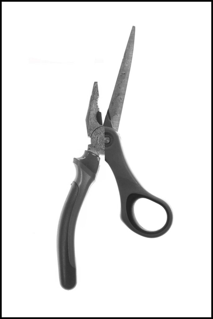
For this photograph I used the two Walker Evans photographs in black and white with a frame. Using photoshop I halved the plyers and layered the cropped image on top of the scissors. I tried to line up the round middle for both and arranged the handles on the same half. I think this image works best in black and white.
