Still Life – Photos
Photoshoot – Contact sheets
Edits
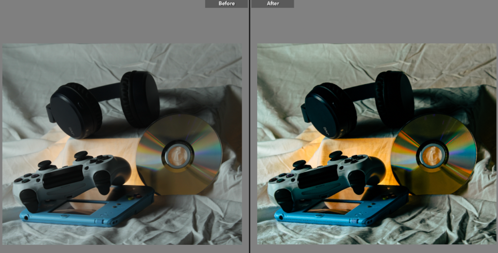
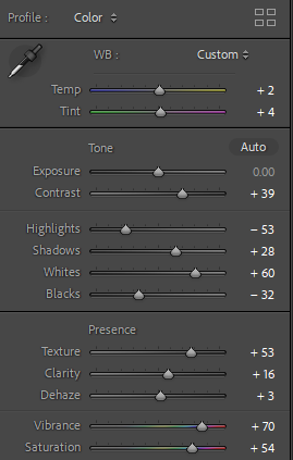
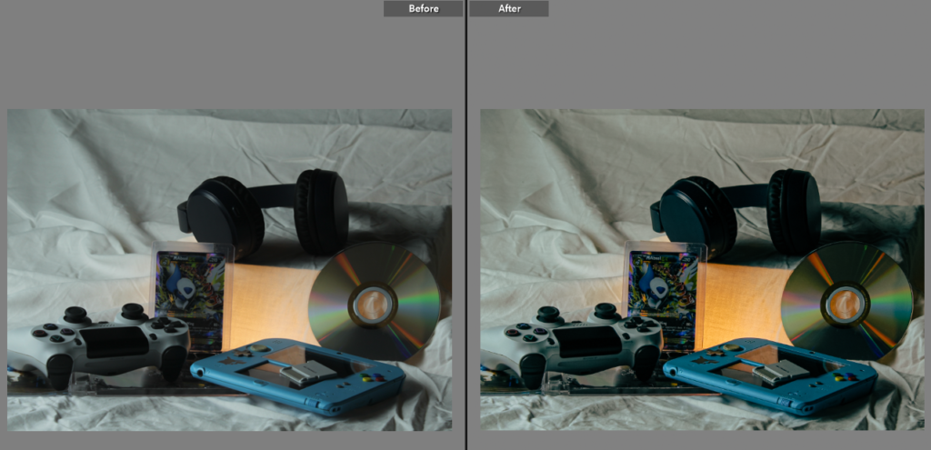
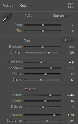
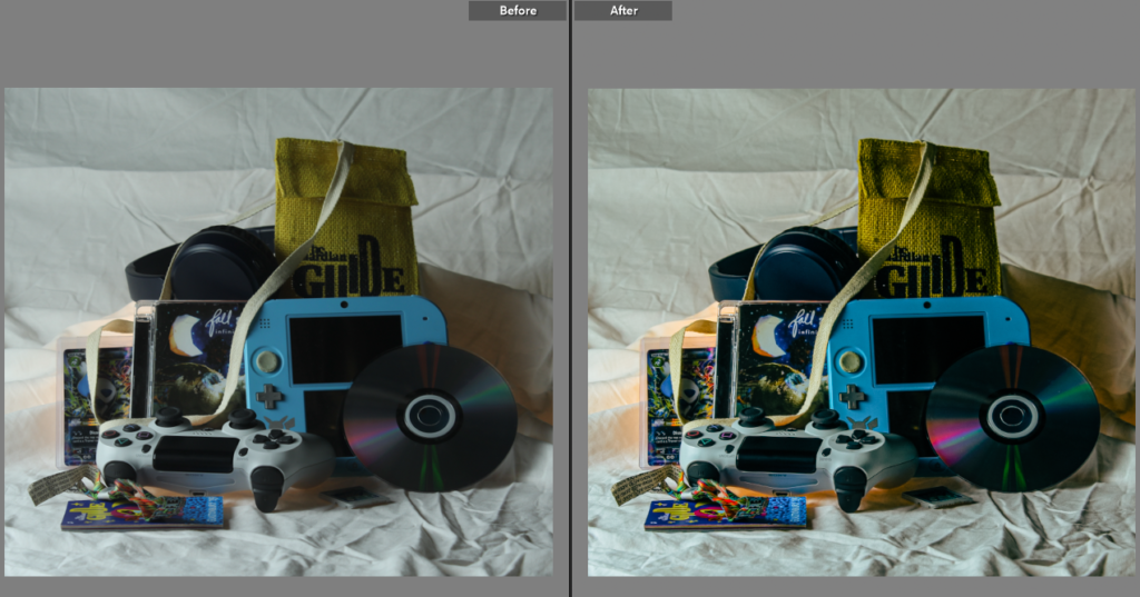
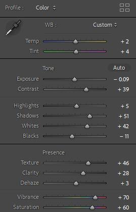
Final Images

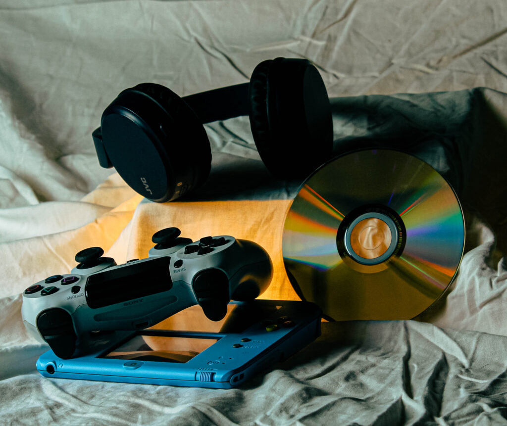
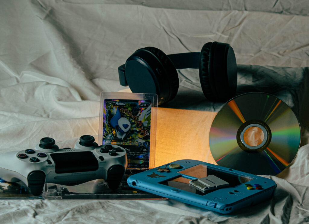

Still Life – Photos


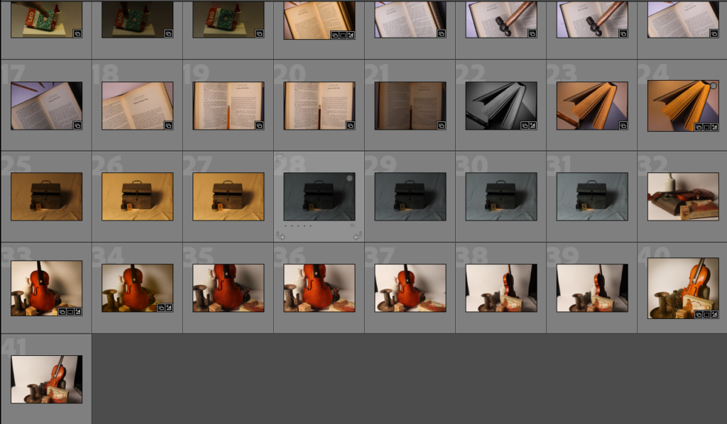
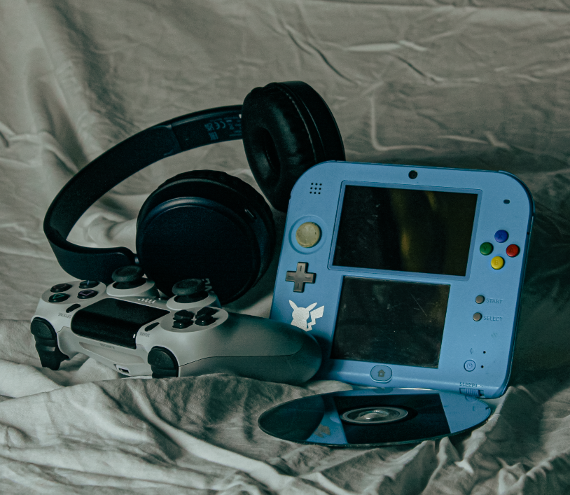
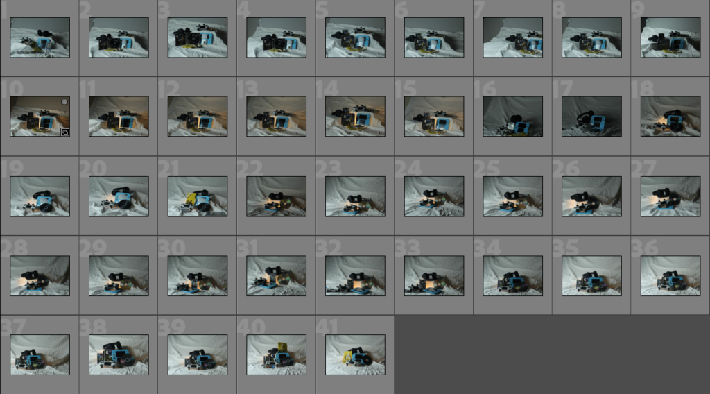
Here are most of the photos I took over 2 different photoshoots. I used multiple different camera setups, some with a top down view using multiple lighting set ups, others using an infinity curve with soft box lighting and some with the camera placed straight on with a powerful flashlight to capture striking shadows (requires a high shutter speeds to keep exposure levels at a normal amount). I took a few photos with a single subject with no background noise to make the subject more important, other photos have multiple images to create a chaotic and unorganised look, as if it wasn’t placed there on purpose.
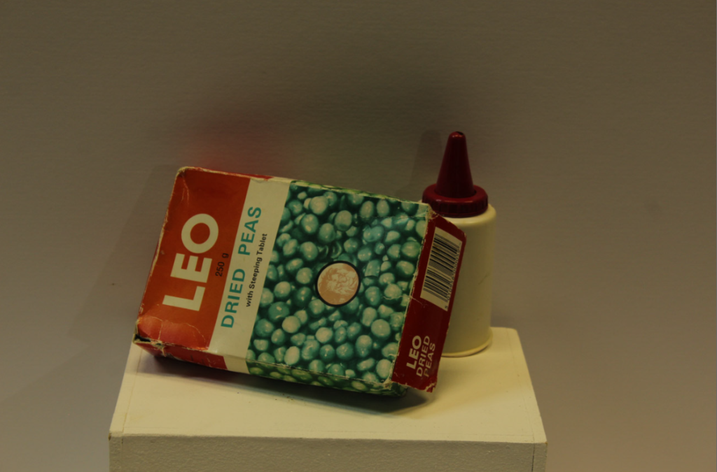
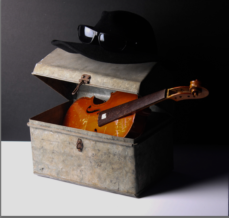
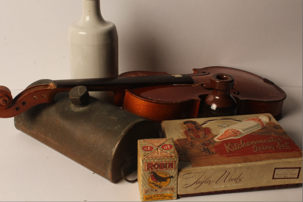
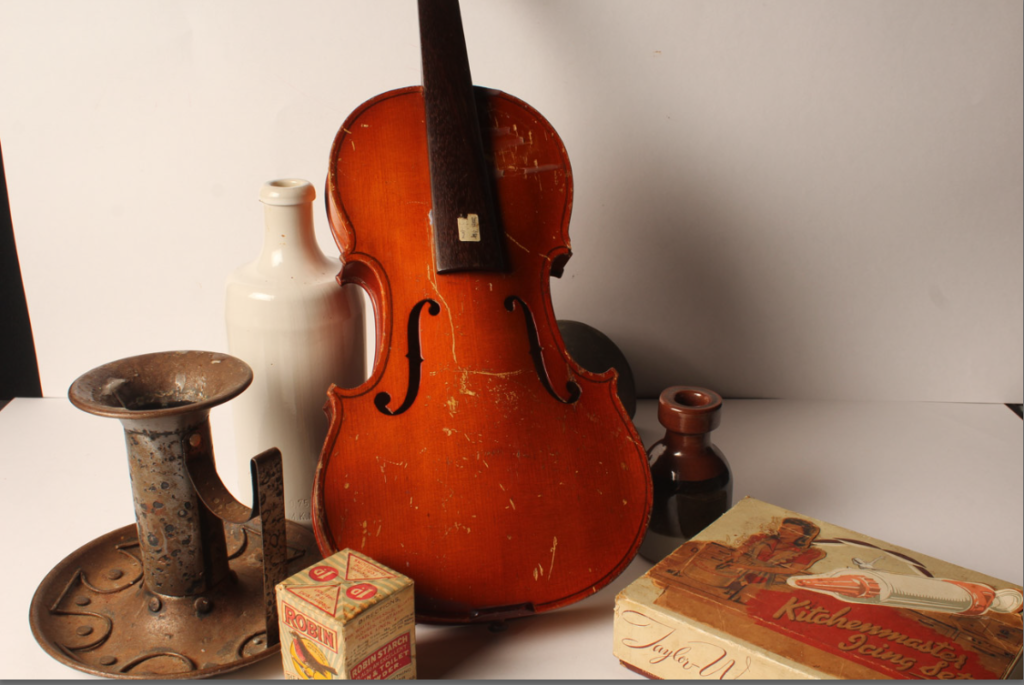
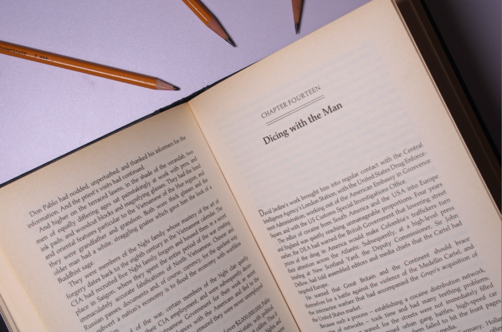
Here are 5 unique images that where taken in different ways, using different angles, lighting and object setups. Keeping with the theme of nostalgia, I used objects that are from the past like the old violin, flower holder, books, old packaging, tower of pisa, ext. These objects all have a nostalgic effect on me due to there old, worn appearance. I kept the subjects in the centre of the frame to make them more important. For the camera settings, I used manual focus and exposure, so I can adjust the image to how I like it.
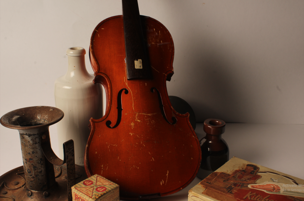
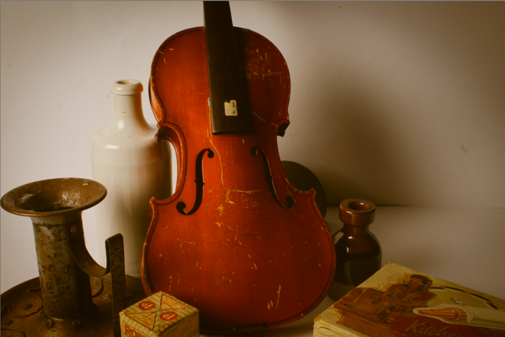
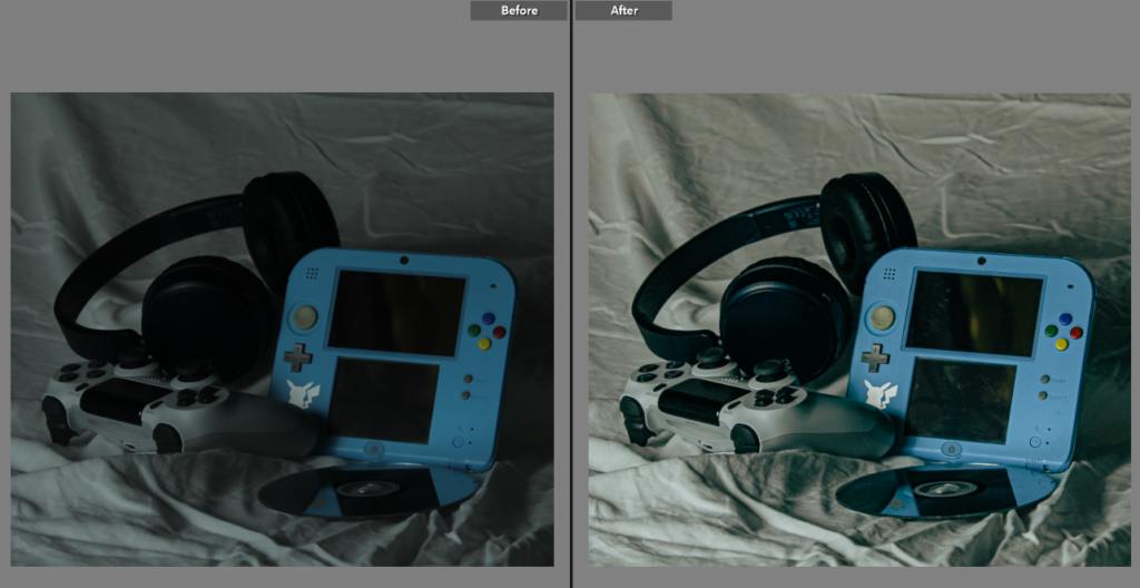
For this Image I only really changed the colour grading to be more yellow for the shadows and added a vignette, I also slightly increased the contrast. Old camera photos where often very yellow because Photo paper and chemicals deteriorate over time and change their properties. The strong shadows makes it seem like it was taken in a dark room (it was). The violin is almost fully in frame, in the centre of the frame, making it the main subject and the most important one.
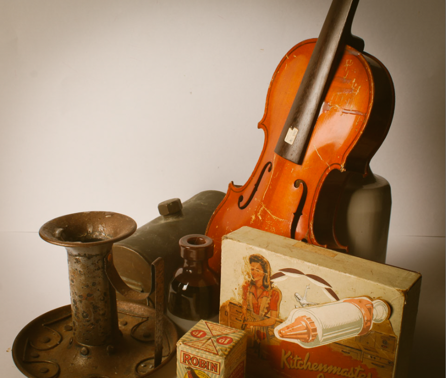
For this one I used the same camera setup and editing settings, but just adjusted the placement of objects. A flash light was used for these images (requires a fast shutter and small aperture) to increase the contrast.
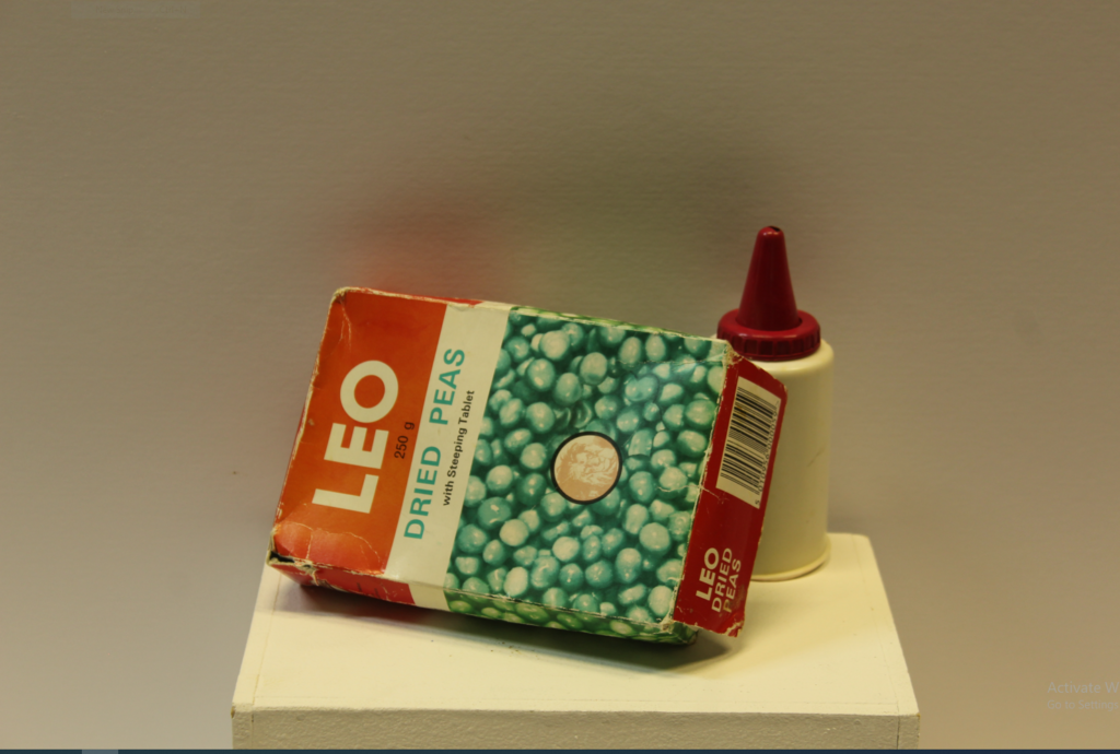
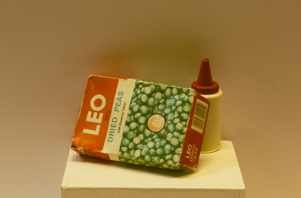
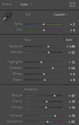
For this one I did a similar thing to the one above (increasing the yellow in the shadows) and bumped the exposure up (+30). I also added some grain in adobe light room too replicate pictures taken a while ago with worse camera quality.
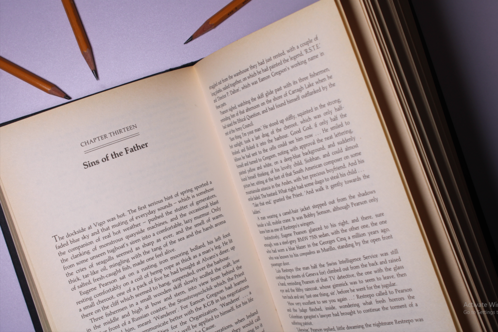
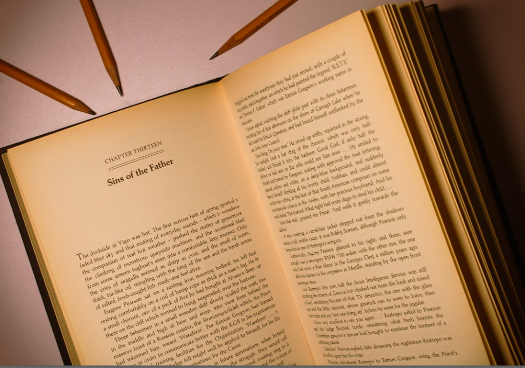
I used a top down camera setup and placed the pencils to point at the chapter, leading the eyes to the text. I edited it similarly again, but with a more dramatic vignette. Continuous lighting with 3 different angles to reduce the shadow intensity. There is a slight over exposure so to combat that I reduced the exposure and contrast In editing.
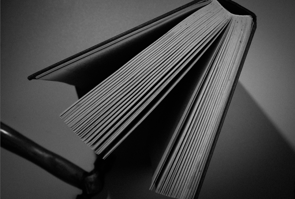
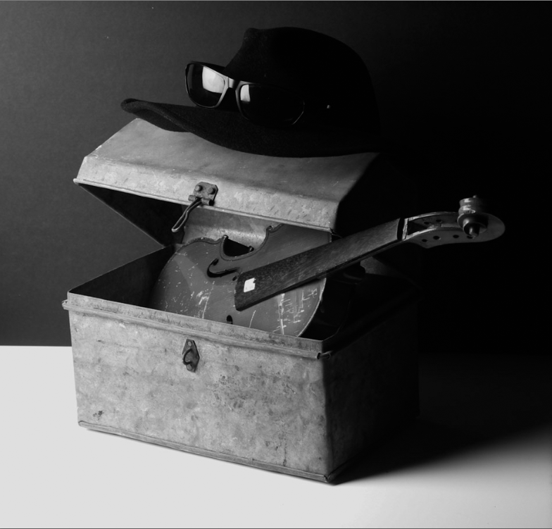
Here I added the B/W editing pre-set to these to images and bumped up the exposure for more dramatic lighting. For the top image, I changed the camera settings to have a low f-stop (aperture) So the hammer will be out of focus. This gives for a more dramatic image, as it appears less flat. I tried to make the bottom image almost have a comedic effect as the box is like a mouth eating a violin 💀.
What is formalism?
Formalism is said to be “the design, composition and Lighting are dominant over Subject Matter. The photographer becomes a visual designer whenever a frame is captured”.
There are said to be 7 basic elements in photography which are:
1)Line-
lines are everywhere they connect shapes they draw you attention to objects in images

2)Shape-
there are multiple definitions of the word shape “the visible makeup characteristic of a particular item or kind of item” is one I like best. shapes are all around in your images you will have loads of shapes.

3)Form-
form is very similar to shape however shape is 2 dimensional and form is 3 so you have that added depth to the image which shape doesn’t have. There are 2 main types of form which are organic and geometric organic is more natural and nature based shapes and geometric are usually harsher manmade shapes.

4)Texture-
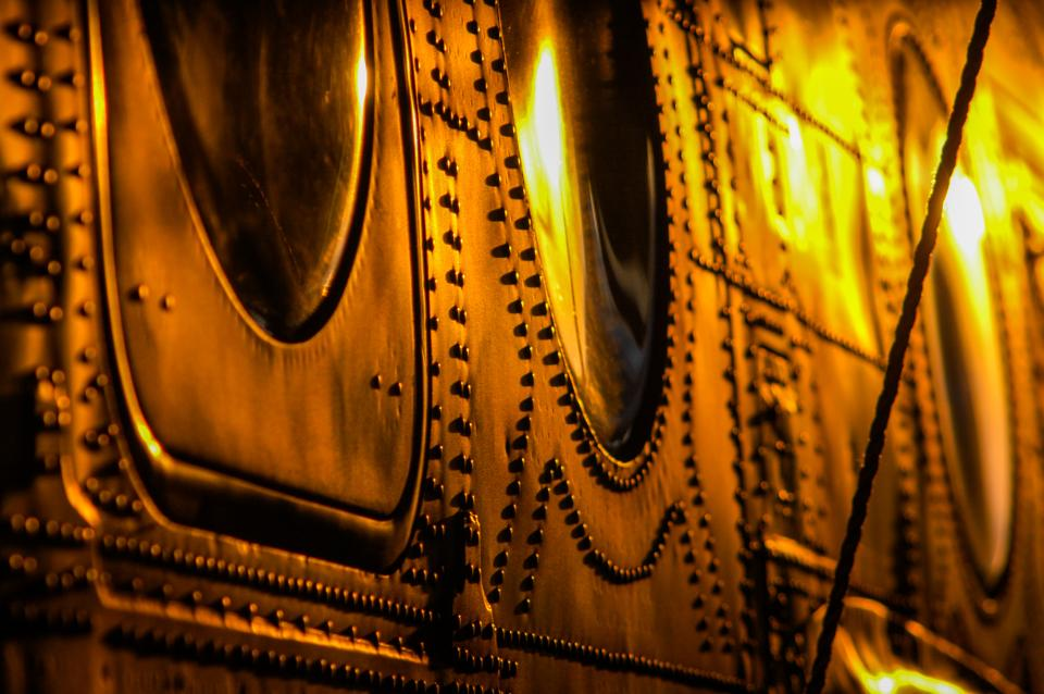
texture is said to be the physically appearance of an object. You can have lots of different types of texture like matte glossy bumpy smooth and rough etc… texture is something you can feel. Texture can also change depending on different situations like the lighting.
5)Colour-
colour is said to be “a phenomenon of light (such as red, brown, pink, or grey) or visual perception that enables one to differentiate otherwise identical objects“. colour has three properties which are hue (description of the colour) value (brightness/darkness) and saturation (intensity of the colour).

6)Size-
size is often described as “physical magnitude, extent, or bulk: relative or proportionate dimensions’. Size in images can be seen either as an illusion or relative. The most used size options are small, medium, and large. There is something called overlap which is when you have multiple objects and their size causes them to block off the other objects.

7)Depth-
Depth can be described as “the direct linear measurement from front to back“. Depth is thinking about the size of the object but also the space around it. The only time you won’t have any depth in your image is if you have a white blank background.

