STILL LIFE HISTORY & THEORY

Still Life

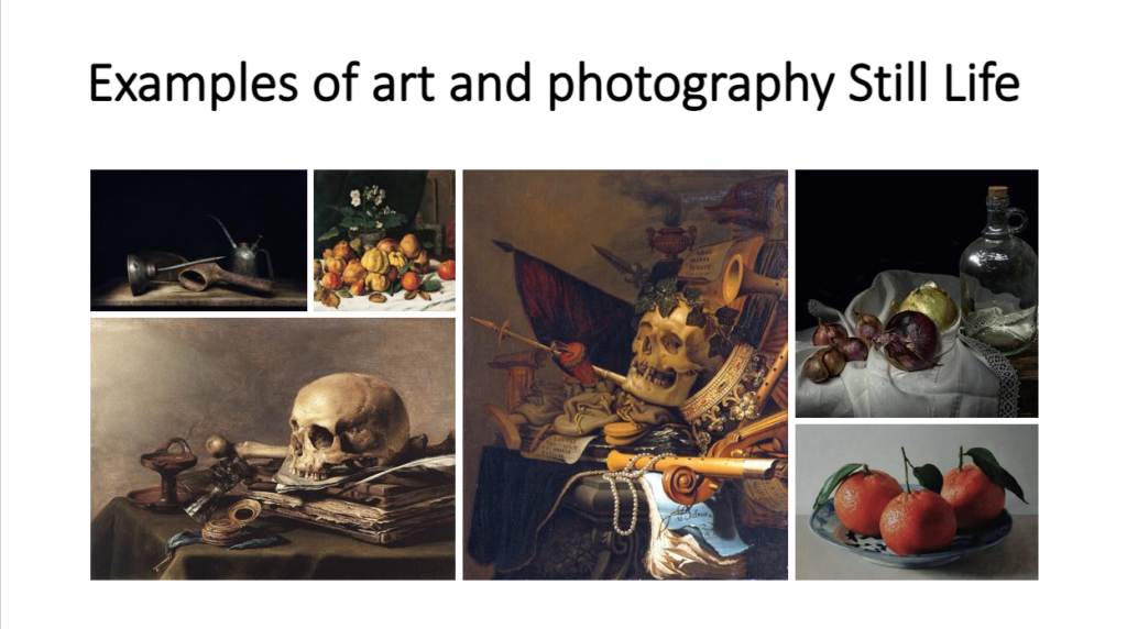
A work of art that shows inanimate objects from the natural or human-caused world, typically fruit, flowers and objects that contrasts with texture, like as bowls and glassware 
Still life has origins in Ancient Greco-Roman art and the Middle Ages. Still life painting appeared as a distinct genre in Western painting in the late 16th century and has remained significant since then.  

The earliest example of still life is in the beginning of the 1600s and later influenced by ‘tulip-mania’, were the popular floral paintings; these were followed by flowers with fruit, then the humble ‘breakfast pieces 
17th Century Still Life peaked by the 1670s and seemed to stagnate thereafter, maybe because of the deaths in the 1680s and 1690s. What survived was the two aspects fixed in the Dutch psyche: decorative hunting still lives and the flower paintings. 

Mood board

One artist that is highly focused in still life is a talented man called Mat Collishaw. Mat Collishaw, born in 1966, received his BFA from Goldsmith College, London, in 1989 and began his career exhibiting the acclaimed work Bullet Hole alongside his Goldsmiths contemporaries at the legendary show Freeze in 1988, and at Modern Medicine in 1990.

The beauty of Collishaw’s work is compelling, seductive, captivating, hypnotic yet repelling as we realise the darker fantasies within. His work is quite dark because he states that “I am fuelled by things in my past which were suppressed or held at a distance, which have generated some form of hunger to make my work.”

This is quite concerning as his work explores things like Pornography, the crucifixion, gleaming fairies, syphilitic child prostitutes, bestiality, bondage, addiction, religion, exaltation and despair, even the final hours of a death-row inmate but Mat has no dark corner he is unwilling to explore which is fascinating.
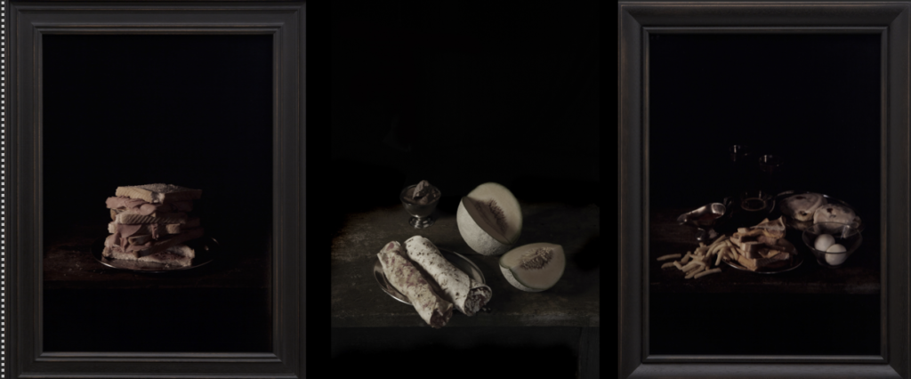
These pictures are from his project called ‘last meal on death rows’ taken in 2011. The pictures show the bizarreness of death rowers last meals and how different their priorities are within meals. Some meals are massive yet some meals are little to nothing. I think that it shows how unique and different death row meals can be.

Mat Collishaw project that was an innovative body of work was to show a different perspective of criminals last meals. He somehow brought ‘light’ yet darkness to their last meals. Some images are quite simple yet some show chaos.

One of the pictures that I am going to analyse is the picture below that was in the project ‘last meal on death rows’
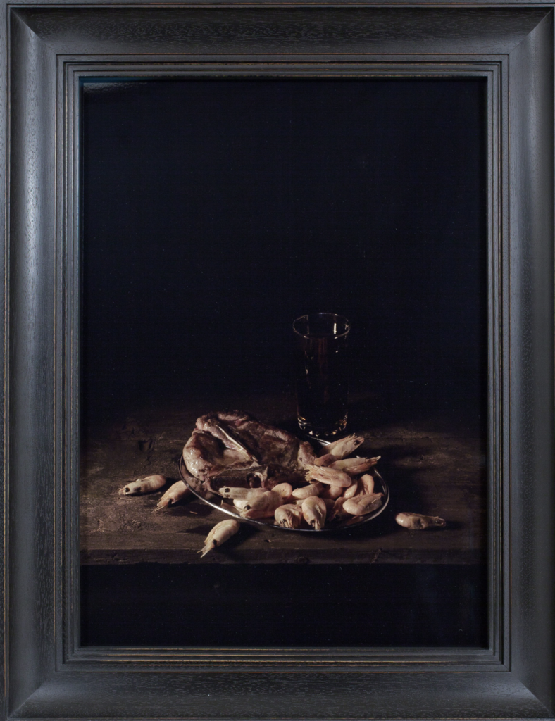
Technical: The lighting in this photo isn’t natural. its quite dark and has no source of bright lights.
Visual: There is shrimps, what looks like some type of sandwich and sometime of beverage.
Contextual: This photo is a photo representing a prisoners death row meal.
Conceptual: It shows the how criminals in death row prioritised in food. it shows how different their food choices can be. I also think that the food choice is quite bizarre.

History of still life painting.

Ancient Egypt: The earliest known still-life artwork was produced in ancient Egypt. The paintings were produced in temples as offerings for the gods. Realism was not important.
Ancient Greece and Rome: these were more realistic than the Egyptians efforts. Still-life appears in mosaics on the floors and paintings, especially at Pompell colours and shading re more realistic.
Northern European renaissance:
After the fall of Rome, interest in still-life disappeared until the 1500s in Northern Europe. While Italian renaissance had renewed interest in ancient Greece and Rome. the north developed oil paint, which allowed for greater detail in paintings. objects began to take on symbolism, as well as depicting wealth and showing the artists skill. realism was essential to these artists.
Northern European renaissance:
in addition to being an art form of its own still-life objects were included in other types of paintings. the items chosen were meant to be symbols about the subjects of the paintings.
Northern European Renaissance:
a very specific type of still life is the vanitas painting. the idea was that people love the pleasures of life, the things that make them feel important or wealthy. and yet it all means nothing because time soon passes and we die. Artist used symbols to show this, like skulls, burnt candles, and witting flowers.
Impressionism:
after the renaissance ended. impressionist and post-impressionist artists in the 1800s continued to paint still lives instead of realism. they experiences with colour , shapes, and the wet paint was applied to the canvas to create beautiful; works. symbolism becomes less important.
Cubism:
Pablo Picasso and Georges barques invented cubism as a way of showing several sides of an objects at once. they felt it was better representation of an object because you could see more to it.
Modern still life painting:
modern painting is more of a reflection of an artists style. so paintings during the 20th century have developed into more abstract and unrealistic images. some artists use collage, paint, or photography to create modern-art still lives.

Vanitas: A still life painting of a 17th-century Dutch genre containing symbols of death or change as a reminder of their inevitability.

Memento Mori: Memento mori is a Latin phrase meaning ‘remember you must die’. A basic memento mori painting would be a portrait with a skull but other symbols commonly found are hour glasses or clocks, extinguished or guttering candles, fruit, and flowers.

Types of metaphors in still life and why?
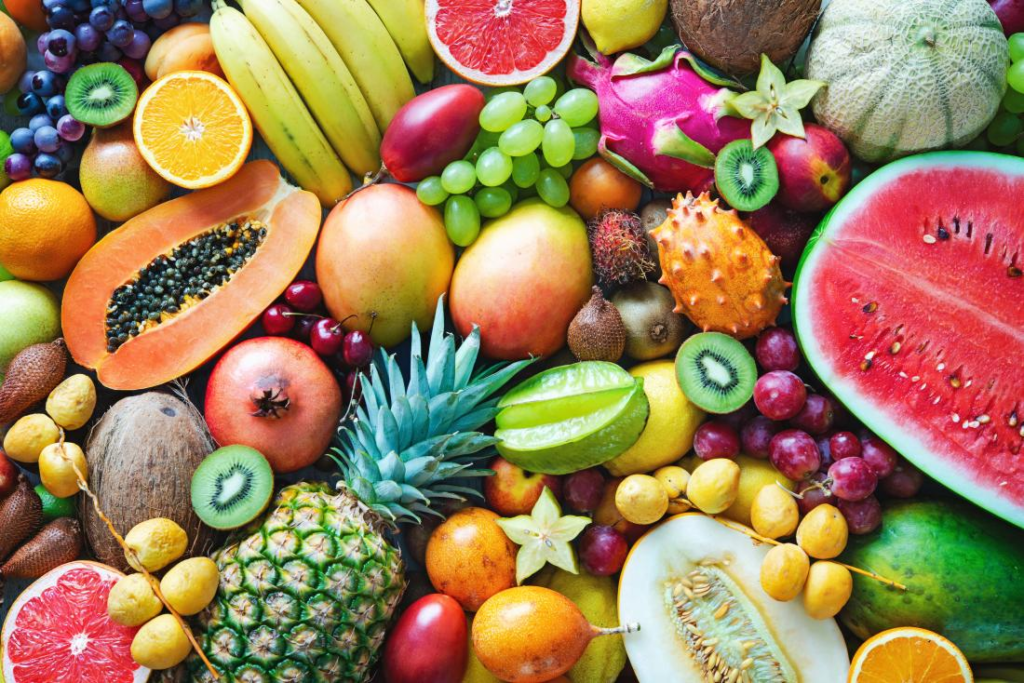
Fruit: Varying Symbolism In Still Life Paintings.

Skulls: The Certainty Of Mortality.

Candles: The Passing Of Time. 
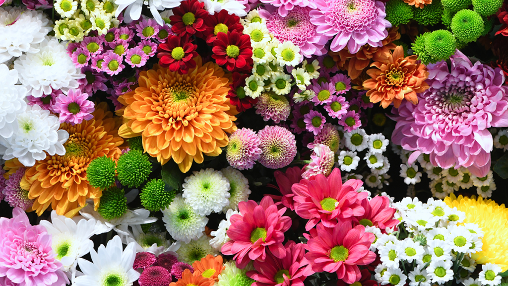
Flowers: Symbols Of Life And Growth.

Seashells: Birth, Purity, And Fertility.

Mirrors: The Soul In Reflection.

Insects: Transformation And Decay

First Edits Still Life – George Blake

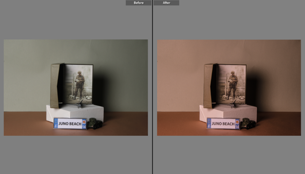
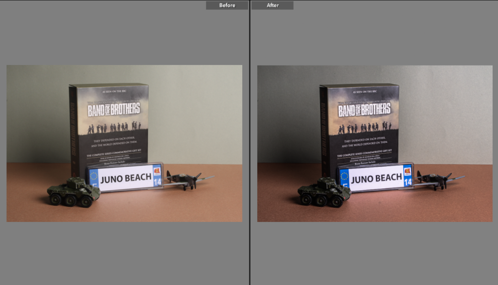
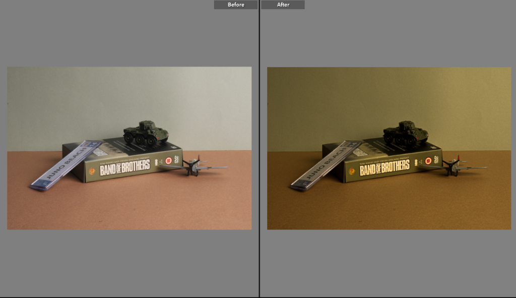
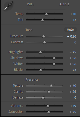
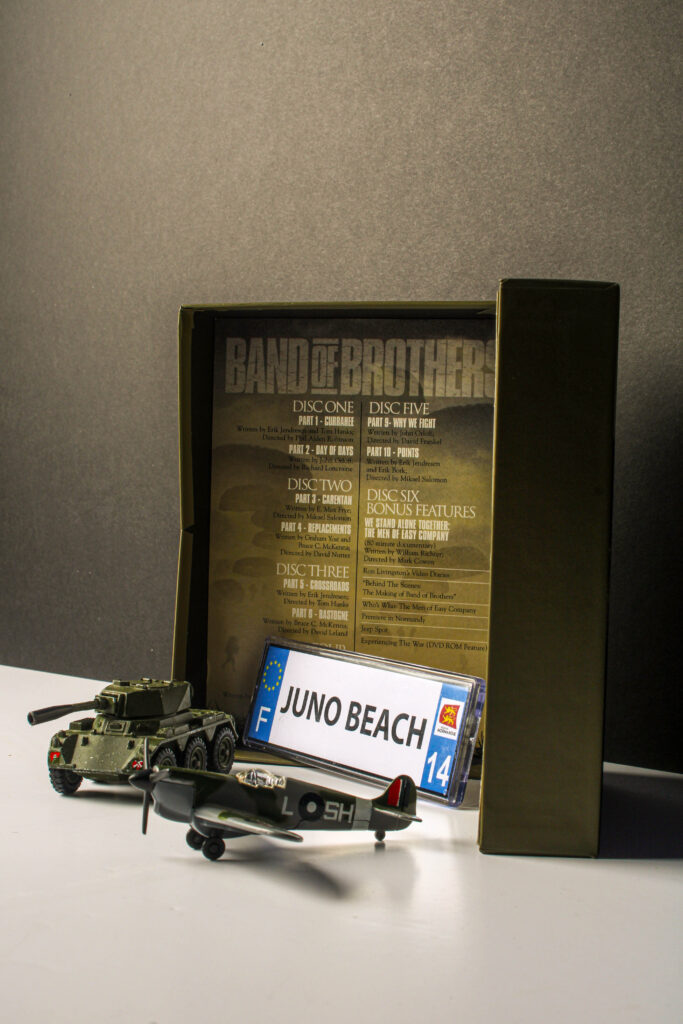
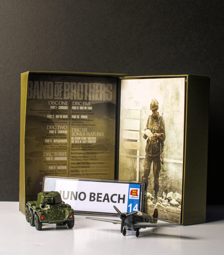
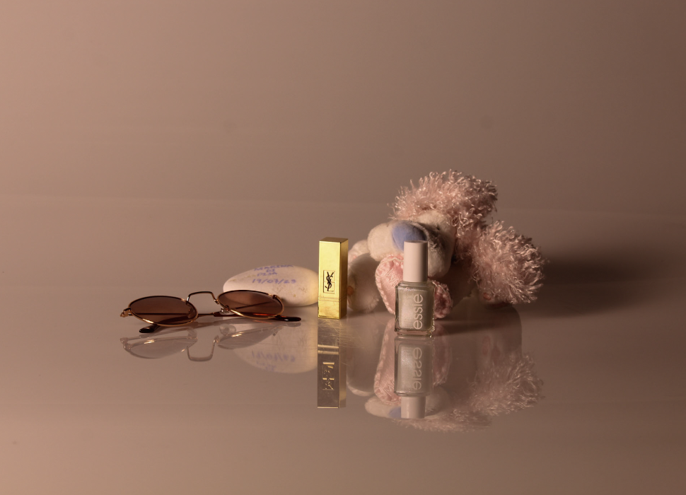
These are my Edits from my still life photoshoot.

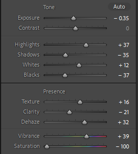
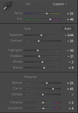
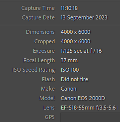
Camera settings –

Before and after –

Edits –

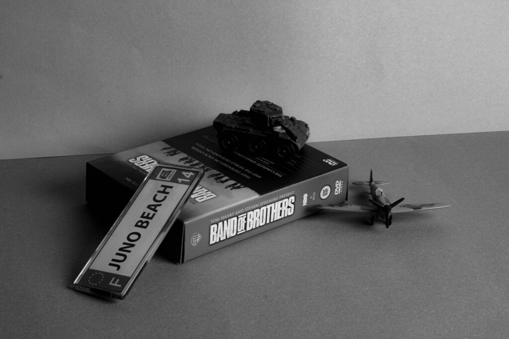
I feel like these images look good however the first 1 looks to highly saturated compared to the second one because of the the shadows merging with the light better.

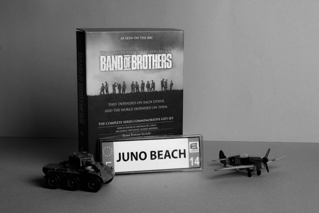
I like how these came out as I think the use of greyscale helps bring out the details of the image.

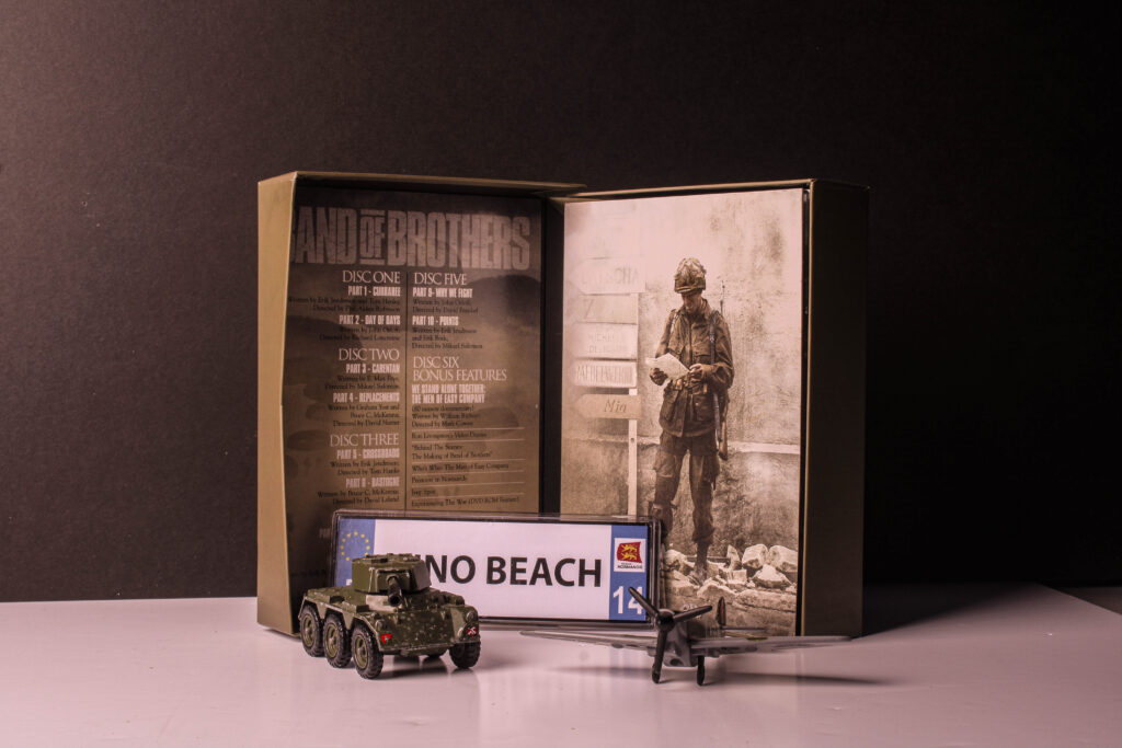
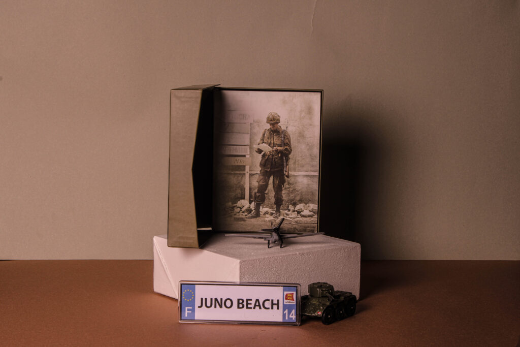
These photos were edited well in my opinion, by using a brown background I converted the lighting to be warmer.

These are my best edits, and believe they best reflect the theme of Nostalgia.

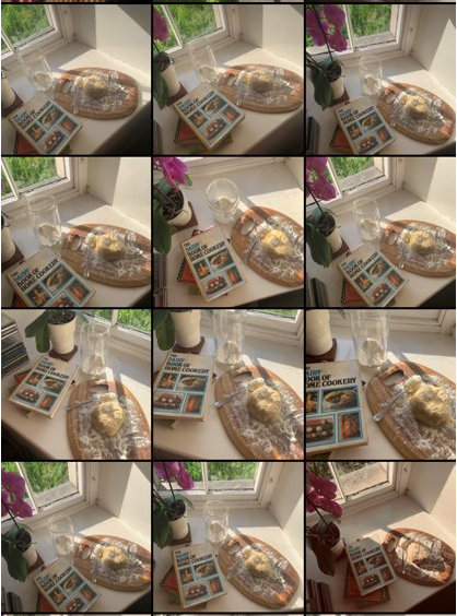
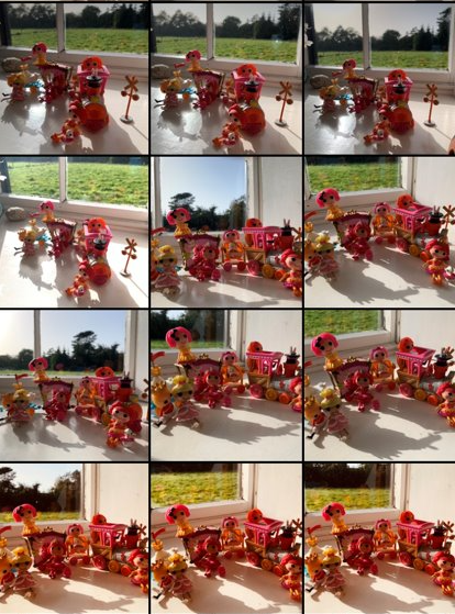
Nostalgia Still Life Contact sheet – George Blake

These images are from my Still Life photoshoot, for my Nostalgia Project.

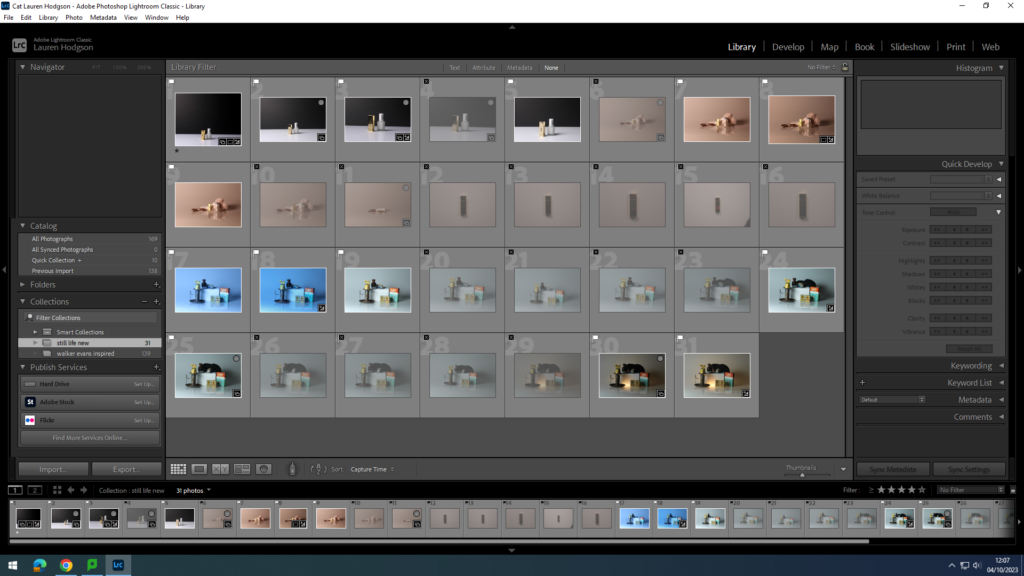
4 – 5 star rated photos:

(These are also white flagged – meaning they consist of clearly taken photos).

These images, to me best represent the idea of nostalgia, this is identified through good camera positioning, lighting and arrangement of objects within the photo.

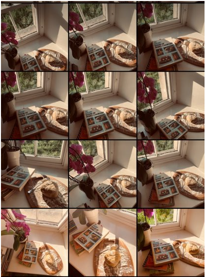
3 – 2 star rated photos:

(These are also white flagged – meaning they consist of mostly clearly taken photos).

These images, are on the middle ground of appearances, being taken well but not quite to the standard of being rated higher.

(These are also yellow coloured but have been black flagged – meaning they consist of some partially blurry photos but have been taken with a good angle or lighting).

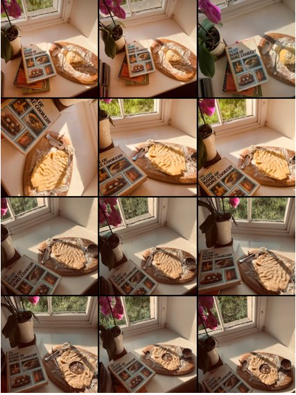
2-1 star rated photos:

(These are black flagged meaning they do not appeal to what I was aiming for during the nostalgia photoshoot).

These images are either poorly taken, blurry or not what wanted to achieve.

Camera settings and lighting –

For these photos i took them on a Canon EOS 4000D, using the manual focus to then adjust the, using a lens size of 55m.

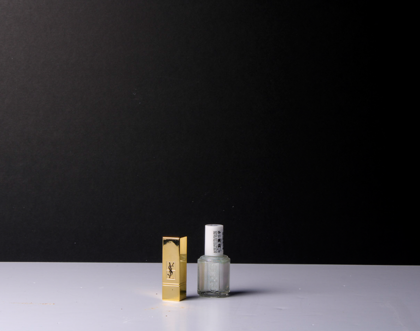
Using artificial studio lighting and a flash adapter, I was able to get strong lighting, creating interesting shadows.

In this photoshoot, my studio set up consisted of a tripod for the camera, studio lighting and a white and black backdrop to create a pop effect for my items in the photographs.

Still Life Photoshoot

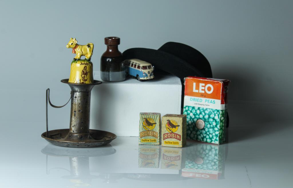
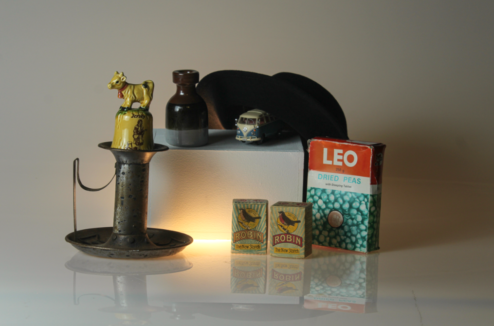
For this photoshoot, I was inspired by my previous research on Still Life and so decided to take some pictures of old/ vintage looking objects that I found in a box in the studio. I also used some of my own objects that bought up feelings of nostalgia to me. I chose to use old looking objects as a common theme in the still life images I looked at is that most of the objects looked old and expensive, so I thought I would try and recreate that tone in my photographs too.

Whilst in the studio, I used a variety of the setups such as the infinity curve. I then tested out using different lighting eg a warmer toned light and cooler toned light. There was also a light that I put on underneath the objects in some of the photographs.

Once I had taken the photographs, I put them into my media folder and imported them into Lightroom. I then gave them either a white flag (if I liked the picture) or a black flag (if I didn’t like it). Once I had decided what pictures I liked I rated them out of 5 and gave them a colour (green=good, yellow=alright and red=bad). By doing this, it allowed me to narrow down my selection and make it easier to see what images I wanted to use as my final images and edit.

For this photograph, I decided to use more of a warm tone as that is what I associated those objects and memories with. I like the clarity of the photograph and the reflection of the objects on the infinity curve. When editing it on Lightroom, I went onto the develop tab and then experimented with different settings eg bringing the contrast and highlights down and trying different levels or clarity/ texture.

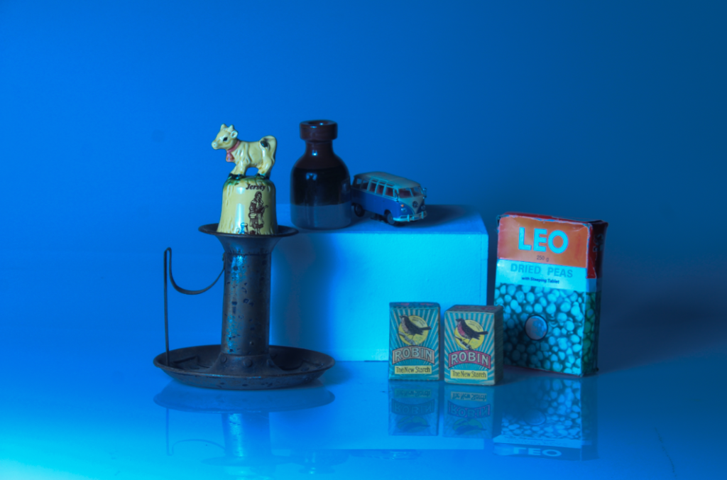
For this image, I decided to attempt to create a cool toned image utilising an abstract approach in the style of Daniel Sigg recreating the monochromatic effect of his photography. I did this by going onto the colour setting and enhancing the blue in the image. I then changed the exposure and contrast of the image too.

Daniel Sigg- The Blue Series

In this picture, I decided to add a light underneath my objects. I think this helped to bring more of a soft, comfy feel to image. However, if I were to edit this again, I would make the clarity of the image more clear as the objects look a bit blurry making it look less professional.

Overall, I like how this photoshoot came out as a first attempt of recreating still life images because I managed to grasp and understand the essence of still life photography as shown in my earlier blog post on still life. I really enjoyed using the infinity curve and will remember that for future projects, as well as beginning to experiment with other setups and attempting to refine my images further.

Camera Settings

For this photo, I used a high aperture in order to get a wide depth of field and a fast shutter speed to show that the propeller is in motion. I also used the lowest ISO so that the final image is clear and not over exposed as the setting is already a very bright atmosphere.
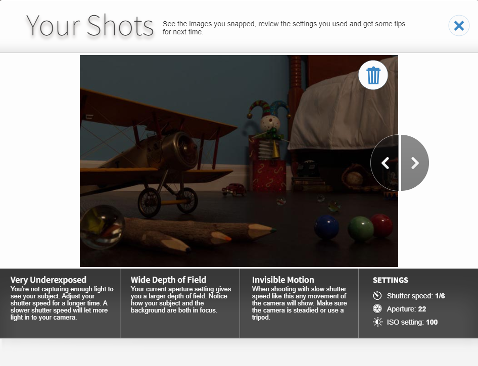
When I decrease the shutter speed, you can see that the image becomes very under exposed. This is because it lets in less light to the photograph.
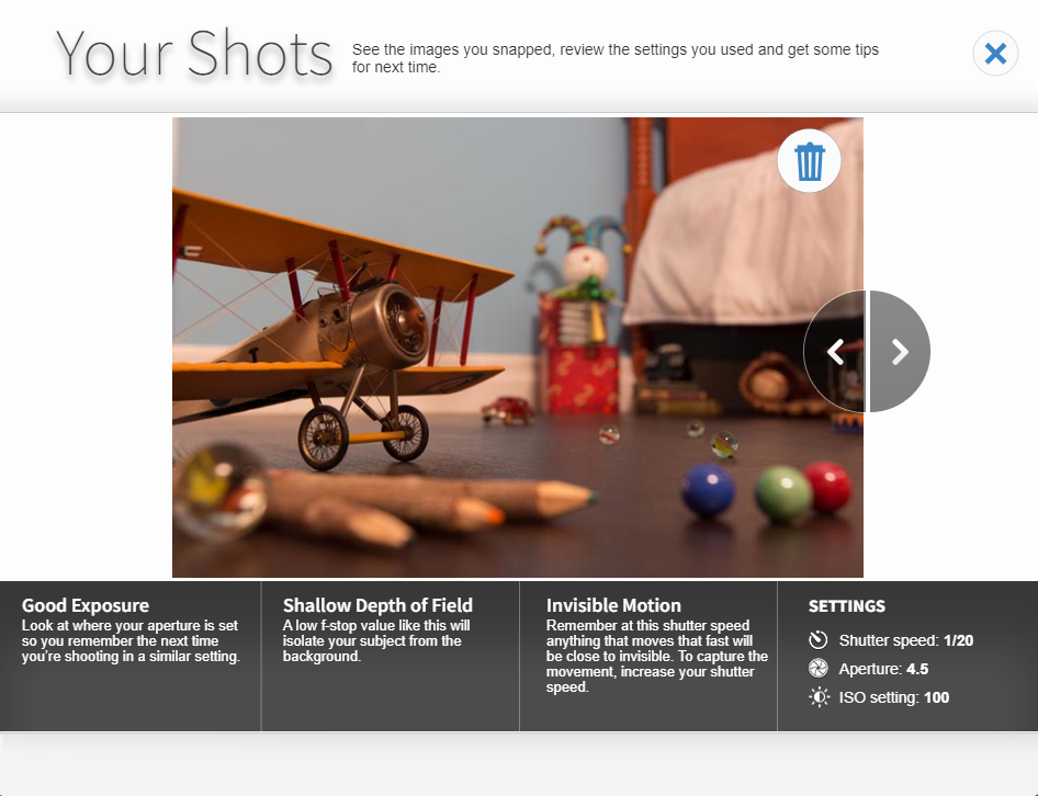
When I decrease the Aperture and Shutter Speed, certain areas of the photo become blurred as there is a shallower depth of field. This highlights the subject of the photo.
When I have a slow shutter speed, shallow depth of field and high ISO, you can see that the image is very overexposed and out of focus. This means that there is too much light going into the photo. To fix this i could decrease the shutter speed and ISO.
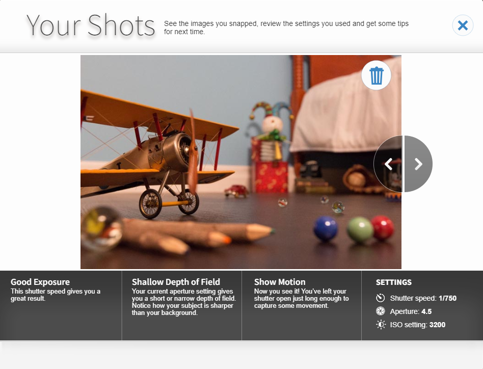
This picture has good exposure and the propeller of the plane looks almost like it’s not moving due to the high shutter speed. The high shutter speed also makes sure that, with such a high ISO, too much light does not get into the camera. The background of the image is blurred because there is a shallow depth of field.

Nostalgia

William Eggleston

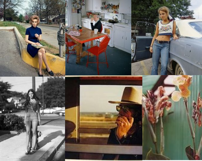
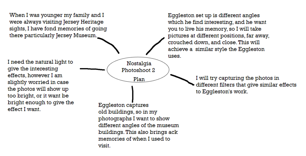
Eggleston began his work by taking snapshots of the world changing around him during the 1940s and 50s, where he lived in South America. Eggleston was fascinated by the cultural shift, so he began capturing this on his camera; cars, shopping malls, and new suburbs. During the 70s he wanted to experiment with colour, he wanted an in-depth saturated colour, so to achieve this he began to experiment with dye-transfer. Eggleston captured things that were happening around him such as, drugs, booze, guns and women, he experimented with Polaroids, automatic photo-booth portraits, and video art, but became particularly inspired by Pop art and how it was advertised with bright saturated colouring and how it was displayed. I have chosen Eggleston because I love his simple but effective snapshots he captures, I like how each photograph has its own unique composition and style, each expressing their own story

William Eggleston style is documenting his life, he shoots from unexpected angles or when people are looking away, this shows a more realistic view on his photographs as they portray a more meaningful and engaging message.

Eggleston captured the present day as he wanted to show this in his photography, his iconic work is captured in South America, where he was born. When he began experimenting with colour, Eggleston also combined his new style with Southern Gothic imagery. I think Eggleston’s work is mainly fact, as he captures his current memories. However, his work is a perfect example of Southern Gothic imagery because his work has a vintage theme, with colour that brings it to a more modern print but still is old. ​

Eggleston’s work really inspires me as I love the snapshots he captures in his day-to-day life; I like how each photo has a unique formation and how each one shows a different memory or experience.​

My Ideas:

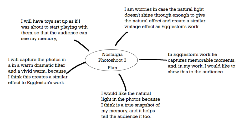
These images are my favourite because I love how each shows my memory of playing with the toys in different ways. I was inspired by Eggleston to keep the set up simple, which also has an interesting effect as it shows nostalgia. For the first photo, the dramatic warm filter exaggerates the train giving that nostalgic theme of being in the past. It brings back the memory for me but also for the audience, as they get an insight into my memory. 

Final 3 Images:

For the second photo, I used a lightly brighter filter to elevate the natural light and the shades created. This is like Eggleston’s work as he captures his photos from the natural light. I really like this effect as it shows what I saw in that moment.​


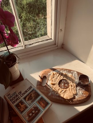
For this photo I decided I wanted to create more of a focus point. The cut-out shape explains more of what my memory was because it is showing you the story.  ​

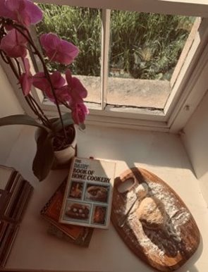
For this photo I didn’t angle the camera. This was because I thought it was an interesting position to capture, as it shows a more focused and direct snapshot. I used the same dramatic warm filter and I think it engages you from a different perspective, having the photo at a different point of view.


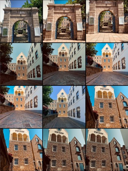
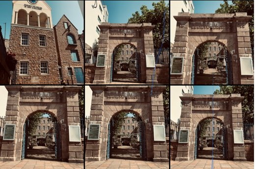
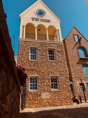
I used vivid warm for the filter; I captured this by  crouching and at an angle. This was because it created an interesting composition which showed the building from a different angle. I think this is effective because it has a more in-depth and intricate look as this draws you into the picture catching your full attention.

Final Photo

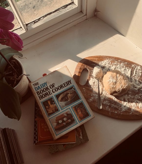
Here is my final photo, the filter is dramatic warm. I chose this image because by looking at the photo it reminds me of my memory of baking. I was inspired by Eggleston’s work, and the vintage style he uses. As he uses dye-transfer I thought I could create this in my own way by adding the dramatic warm filter, where is gave a similar effect. It gave it the vintage style I was hoping for and had dark areas which really highlights the focus point. I like how is an old rustic style, but still has a lot of colour. The tones created by the filter compromise each other, as together they create a unique photograph. Overall, I am really pleased with the result, because it showcases nostalgia as I am instantly reminded of my childhood. I think this engages the audience as it tells them a story of my memory, like Eggleston’s work does.