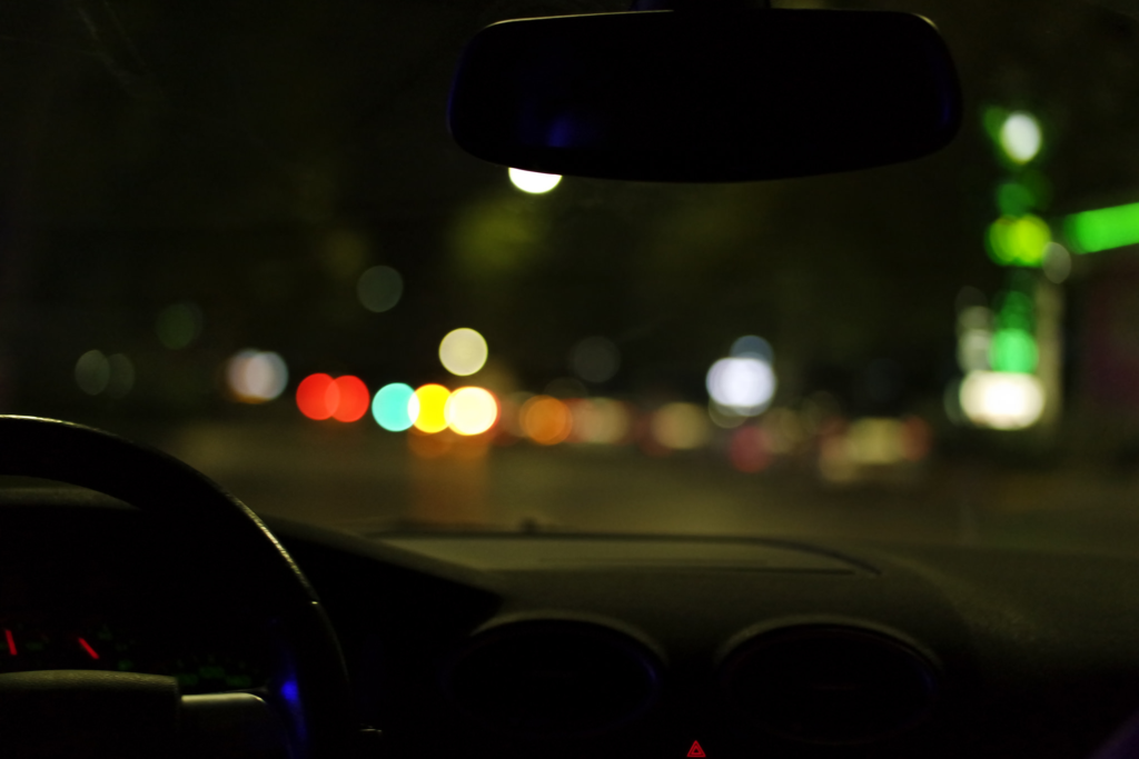
Single Object Photoshoots –

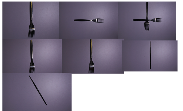
first photoshoot :

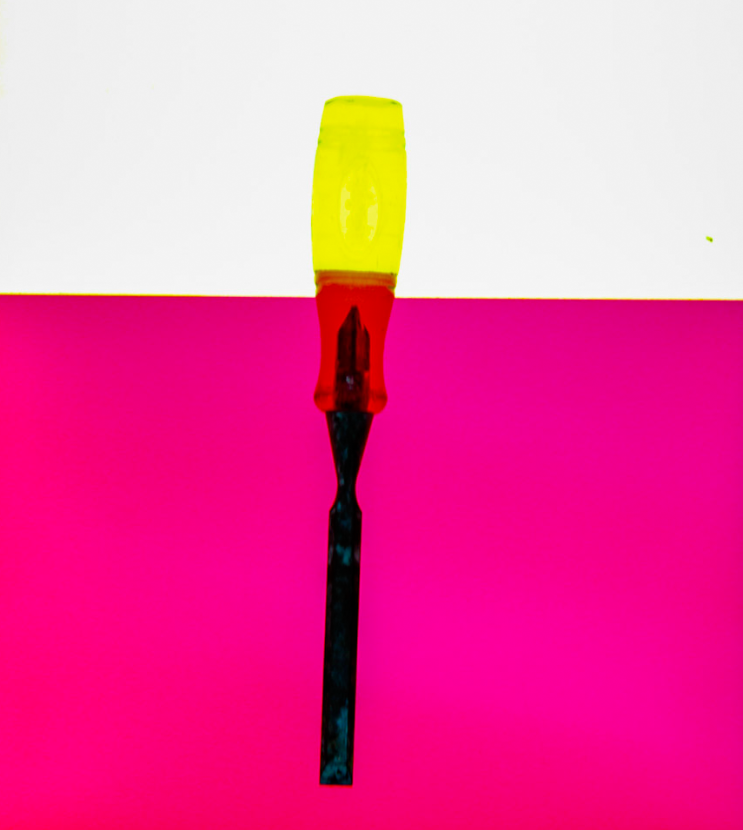
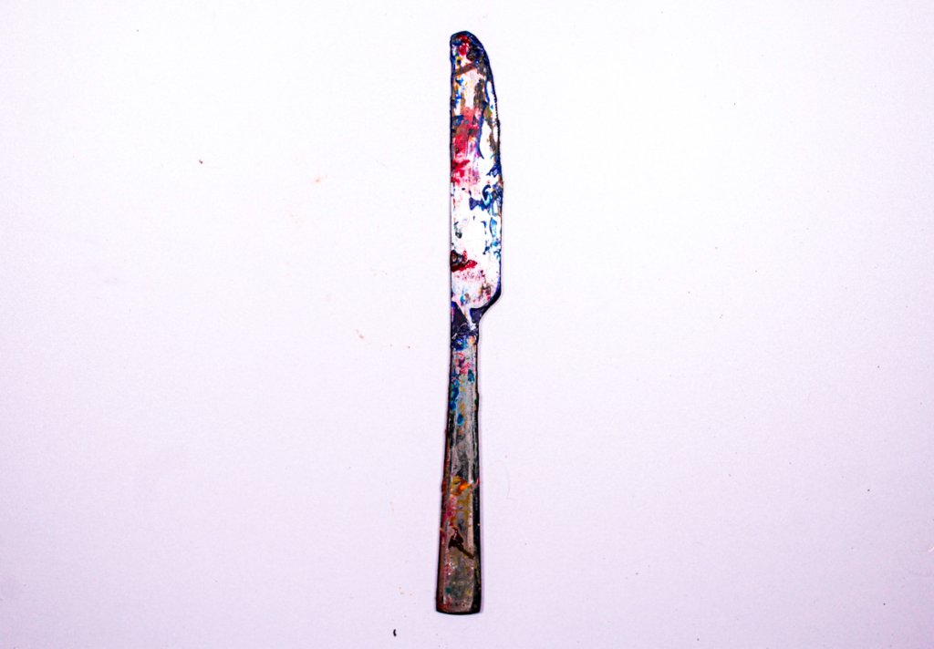
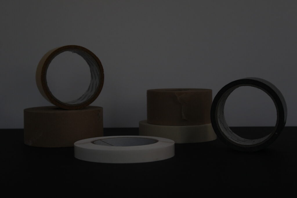
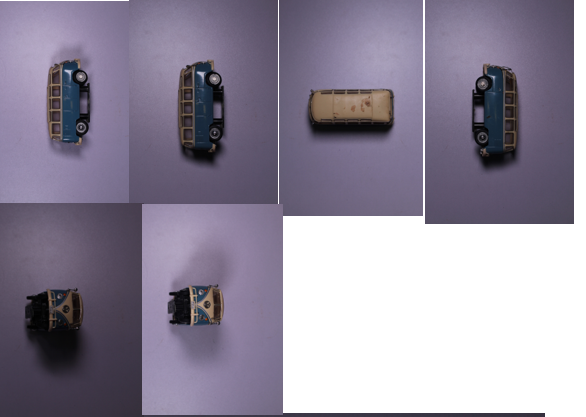
For this photoshoot I wanted to use inspiration from Walker Evans and how he photographs single objects using different lighting and shadows.

As you can see the quality of some of the photos are not the best but that is going to happen with every photoshoot. I changed the perspective of the photo after every few I took just to give some variation.

The lighting was also changed as well as lighting techniques to give different shadows and ‘feelings’ to each photo.

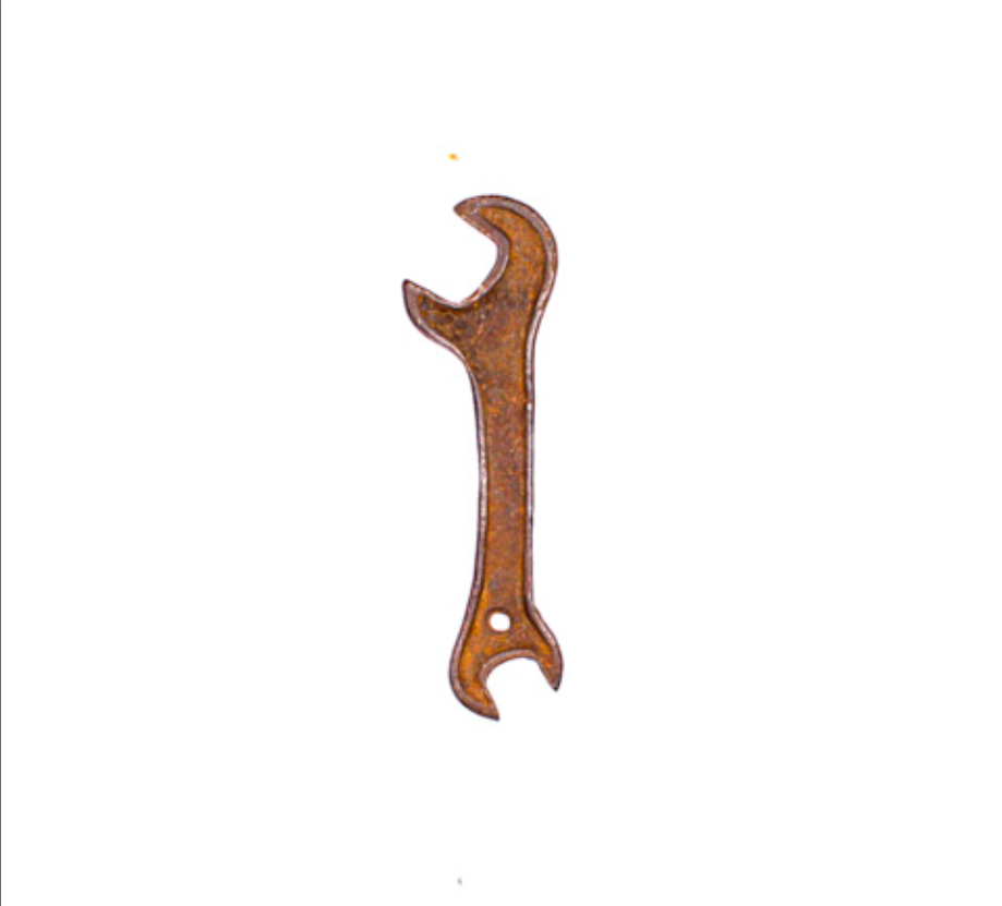
second photoshoot :

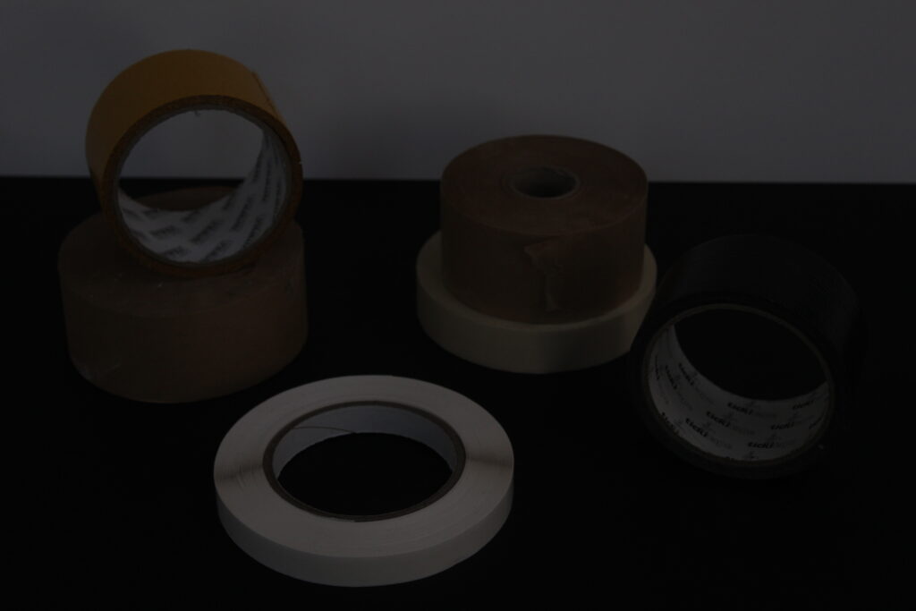
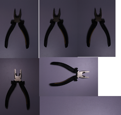
This photoshoot was not very successful. The lighting and angles were not good or flattering and the photo quality was a bit dodgy too.

With the last photo in the shoot I tried too change the lighting slightly to make the photo brighter and more clear but overall, the photos were not great.

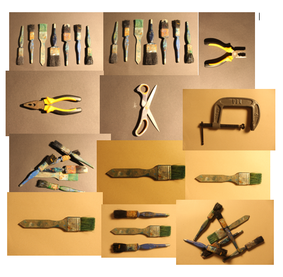
third photoshoot :

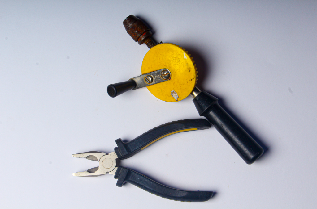
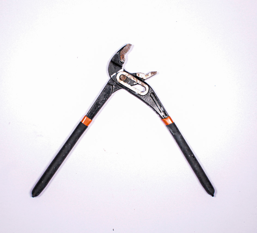
For this photoshoot, I managed to get the lighting a bit better and include in one of the photos, more then one object to give the photo dimension.

I like the shadows created and the almost glass like look to the metal that was created through the lighting. I focused again on the inspiration from Walker Evans for the single object photos, changing the perspective and placement of the objects.

fourth photoshoot :

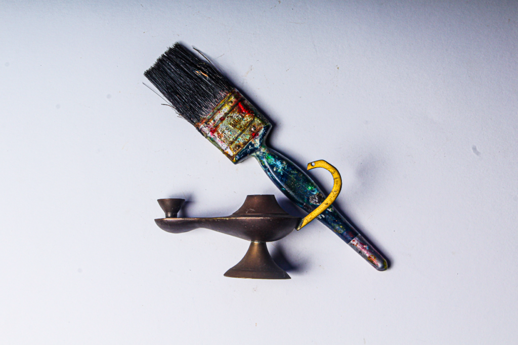
This final photoshoot was the most successful. The lighting was working perfectly for the type of photos I wanted and the two different backgrounds used gave a kind of contrast to the paintbrushes and other objects I used.

I used two different perspectives for this photoshoot:

  • birds eye view
  • free hand photo

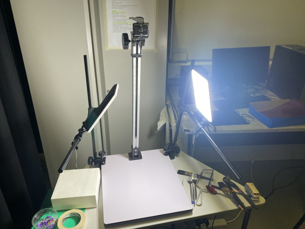
The birds eye view was used with a set of equipment to hold the camera above to get a clear, stable photo, while the free hand photos are seen as more ‘ wobbly ‘ and ‘ unstable ‘.

The use of free hand doesn’t change the quality of the photos however if I used the equipment the photos would have been to a better standard.

My use of warm lighting accentuated the idea of the tools being worn down and obviously used.

Final Photographs

Tools

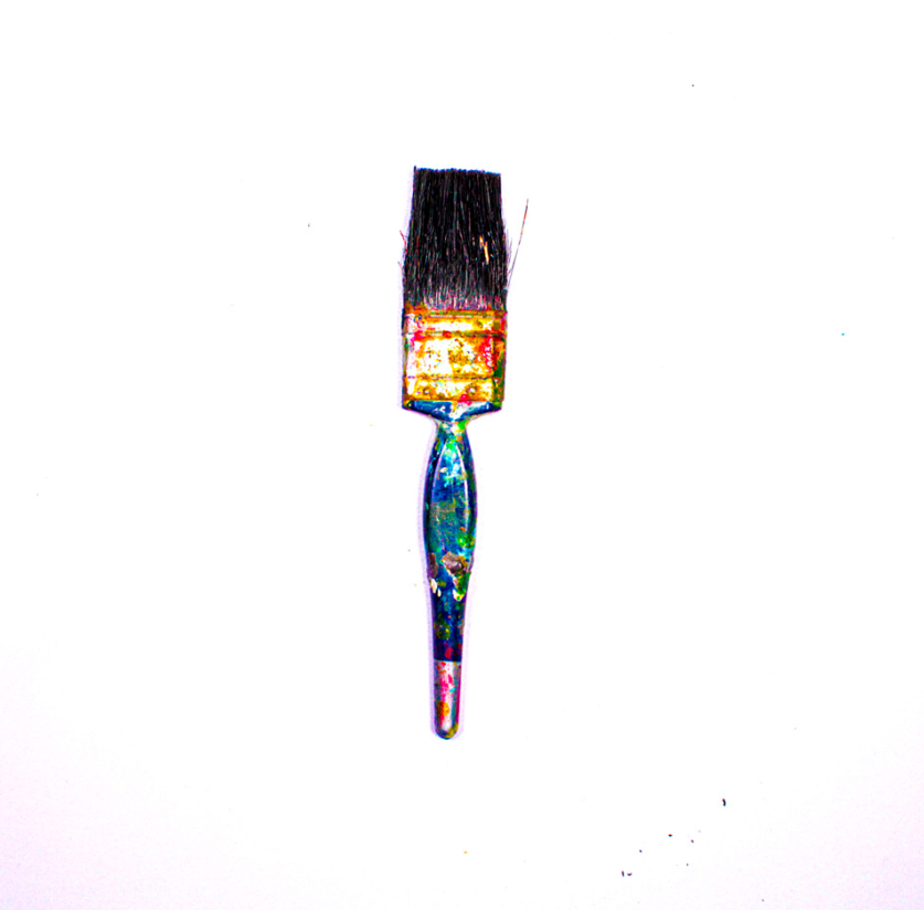
These are my best nine final photographs, after they have been taken in the studio and edited in Lightroom.

Mood Board

Conclusion

In conclusion these were my best nine photographs, because they were the brightest and were the most colourful, after I edited them. They were also all in focus and I was able to experiment with more than one object and single objects.

Walker Evans

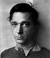
Walker Evans was an American Photographer and photojournalist, best known for his work for the farm Administration documenting the effects of the Great Depression. He died April 10th 1975. His most characteristic pictures show American life through outdoor advertising, the beginnings of its automobile culture and its domestic interiors.

Image Analysis

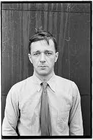
Walker Evans takes pictures with a narrow depth of field to keep the man in focus. The pictures are in black and white which gives the pictures a dramatic and ominous feel to them. Walker Evans pictures are very true and honest which makes his pictures believable and his models don’t hide and everything is very raw and exposed. The black background that the man is leaning against contrasts against his white shirt giving a sense of positive and negative feelings about America in the time of the Great Depression.

Darren Harvey-Regan

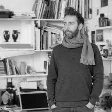
Darren Harvey-Regan is a graduate of the Royal College of Art. His work has been in Exhibitions and Publications all over the world. His work focuses on photography but has an emphasis on the mediums relationship to language and to sculpture.

Image Analysis

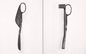
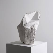
Darren Harvey-Regan’s photos are very bold and powerful and this picture in particular has a very strong contrast between the block and the shadow. This makes the object used stand out and look more powerful. The use of shape and line in this image makes the object appear more interesting to look at and gives the object a different composition. Darren Harvey-Regan’s photos were inspired by Walker Evans photos because Darren Harvey Regan constructed a montage of Evans’s images and made new forms out of them and then sourced matching tools, cut them in half and joined various different half’s together with the resulting physical objects being photographed to create his final work.

Still Life

By Yann

What is still life?

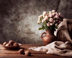
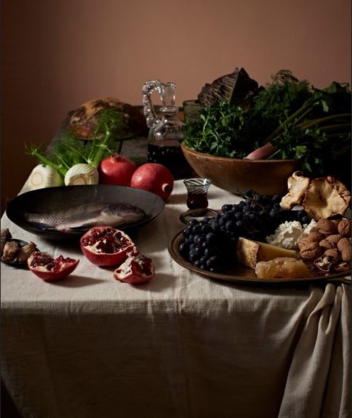
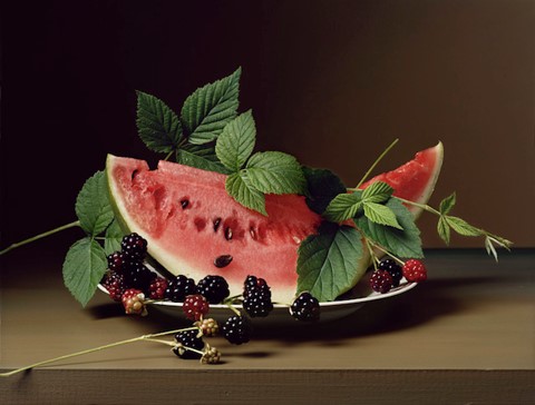
  • Still life comes from the Dutch word ‘stilleven’ and is a popular genre in photography which captures inanimate objects.
  • It originated from Dutch colonialism where the Dutch would take back fruits and other objects from other countries and photograph them to show their wealth and value 
  • Flowers and food are commonly photographed in still life, however it can be anything you like that’s still.

Some examples of still life

Still life photographers

Some famous still life photographers are:

  • Olivia Parker
  • Krista van der Niet
  • Henry Hargreaves
  • Sharon Core
  • Josef Sudek

Choosing a photographer to analyse

After looking the still life photographers on the previous slide I chose Sharon core as I really like her still life photography and the dynamics of it.

Taking some Still Life photos

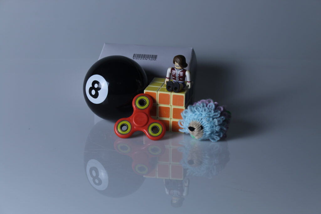
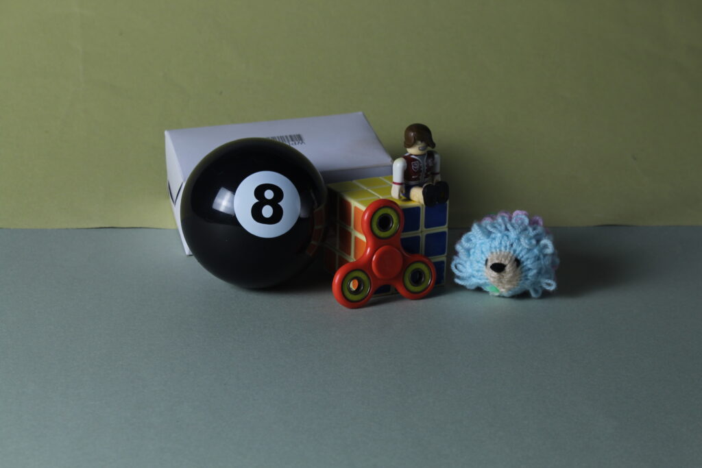
We went into the lighting studio and took some still life photos

What is Vanitas?

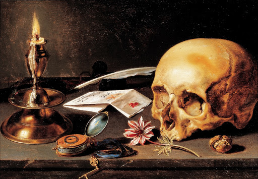
Vanitas is a sub-genre of still life which is used to symbolise the shortness of life and the inevitability of death.

The word Vanitas is Latin and means Vanity which is referenced in the bible’s old testaments.

It became popular with Dutch painters during the Baroque period. However some Spanish painters also created Vanitas paintings.

Vanitas paintings were first made by a group of Dutch artists as early as the 16th century but didn’t become popular until the 17th century.

The work usually contains skulls as it helps symbolise death.

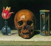
Memento Mori

Memento Mori is incredibility similar to Vanitas and is Latin for “remember you must die” and also contains skulls and other objects to remind us of death. Like with Vanitas it also became popular during the 17th century.

Formalism

There are seven basic elements of photographic art: line, shape, form, texture, colour, size, and depth. 

Line

Lines are either straight, curved, or both.  Lines can be solid, dashed or interrupted,  implied, or psychological. The type and direction of the lines inside the image convey meaning of the photograph.

Vertical or horizontal lines – convey a sense of stability or a static feel to an image.

Horizontal lines – can indicate distance

Vertical lines – can indicate height, balance, strength.

Diagonal lines – convey a more dynamic scene.

Shape

The Merriam-Webster definition of “line” comprises 15 parts, 46 sections, and 41 subsections. With all of that, the part that we, as photographic artists, are concerned about is this:

8: A straight or curved geometric element that is generated by a moving point and that has extension only along the path of the point

Shapes are 2-dimentional, some shapes intersect and overlap to create a new shapes. Shapes are often visually defined by the intersection or closing of lines. The area containing a shape is often referred to as positive space while the outside area is called negative space, the negative space also creates a shape of its own. Shapes can be geometric or organic such as birds or fluids.

Form

The Merriam-Webster definition of “shape” that we are concerned with as photographic artists is:

1 a : the visible makeup characteristic of a particular item or kind of item

1 b (1) : spatial form or contour

1 b (2) : a standard or universally recognized spatial form

There are two types of forms, organic and geometric. In photographs the positive space is the forms and the negative space is what is left. Three dimensional forms are created into two dimensional forms in the photo, so to create the 3D effect we use shadows. Painters create 3D forms by shading, this reveals depth, highlights and mid-tones. The tonality changes and cast shadows of an object, create direction and intensity. The light relative to that object can change how we perceive the depth of the object in a photograph.

Texture

The Merriam-Webster definition of “form” comprises 12 parts, 27 sections, and 4 subsections. As photographic artists, the part we are concerned with is:

1 a: the shape and structure of something as distinguished from its material

Texture is similar to form, it creates variations of tones that are two dimensional. Smooth and ruff objects creates different types of hightlights, while smooth creates mirror image reflections, ruff objects creates more of an aggressive shadow with out the exact reflections. To be able to see texture, it depends on the subject, lighting, and forms of the image. Shadows is what emphasizes texture, making you able to see texture whether smooth or rough.

Colour

The Merriam-Webster definition of “color” that we, as photographic artists, are concerned with is:

1 a : a phenomenon of light (such as red, brown, pink, or grey) or visual perception that enables one to differentiate otherwise identical objects

b (1) the aspect of the appearance of objects and light sources that may be described in terms of hue, lightness, and saturation for objects and hue, brightness, and saturation for light.

also : a specific combination of hue, saturation, and lightness or brightness

(2) : a colour other than and as contrasted with black, white, or grey

Different colours have different emotional responses for example red represents danger, blue represents calm. We can see different types of colours bold, bright colours, muted tones and harmonic colours. As you recognise the colours in the photograph you will be able to see the subject and it will show the mood of the photo.

Size

The Merriam-Webster definition of “size” that we, as photographic artists, are concerned about is:

1 a : physical magnitude, extent, or bulk : relative or proportionate dimensions

Large, medium, and small are all types of size. The camera can make small sizes larger while making large sizes small. Size can create unique images, while the scale of the object in the photo sets the scene. If you want to emphasize the size of the object in the surroundings you get closer, this is where you change from a three dimensional scene to a two dimensional scene. Overlap also enhances the scene in three dimensions, while also showing the size.

Depth

The Merriam-Webster definition of “depth” that we, as photographic artists, are concerned about is:

2 b: the direct linear measurement from front to back

Depth is shown in all photos, it depends on objects in the frame, and choice of composition. Most images have foreground, middle ground, and background. The more clearer the presentation is between them, the stronger the depth is shown. Also depth is created in photographs when the objects get further from the eye. Texture shows depth, it often smooths out as you get into the distance.
Introduction to Formalism –

Formalism is the aspect of looking into the form and style of art pieces. It focuses on the visual aspects and its relationship with the visual world, how we interpret them, and the mood that the piece might set.

Walker Evans

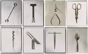
Walker Evans’ was a photographer in the early 1900s who was born on the 3rd of November 1903. His photography is very ‘simple’. He used only black and white shades to accentuate shadows and depth in his work. He uses low light in his work which helps create the shadows he accentuates. The repetition of the use of tools in these photos bring an almost ‘angry’ mood to the pieces. The spacious area the photos have been taken in give a calming feeling to the art because of almost the freeness of the tools.

Darren Harvey-Regan-

Darren Harvey was born in 1974 in the UK. His photography has a different ‘vibe’ as the colours used in the photo to the left show that his work uses a lot of brighter colours or more light involved to make the picture lighter almost making it look soft. Especially in this photo the linework is very jagged making the photo seem harsh which contrasts the idea of it being a ‘soft’ feeling picture.

The differences –

Harvey and Evans have very similar but different styles of photography in the way that shadowing is very important to show depth and dimension in the photos but because of the time difference of technology between the photos have an obvious clarity and quality difference.

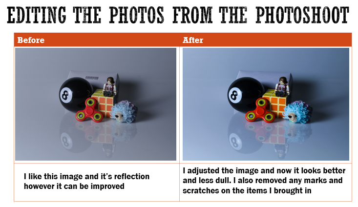
Still Life Editing-

what is still life?

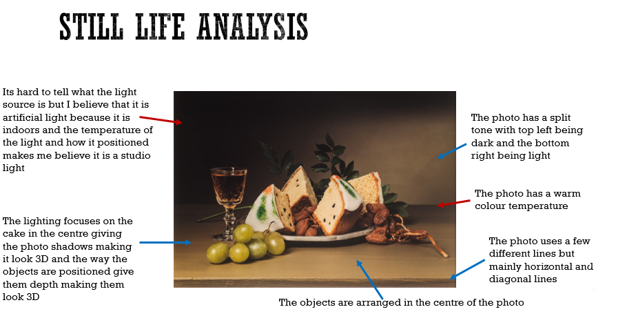
By definition, still life is a painting or drawing of an arrangement of objects, usually flowers fruit or random objects depending on what the artist is trying to show.

my interpretation of still life:

before :

after editing :

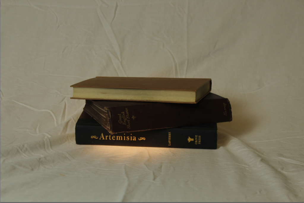
For this photo, I stacked 3 ‘old’ books in almost a careless looking way to give the sense of ease. I used a small spotlight to almost give the illusion of a glowing sensation from underneath the books to bring some light into the photo.

The original photo was a lot brighter overall because of the large lights that were used in the studio, so to improve the quality, I lowered the brightness of the photo and heightened the saturation where the spotlight hit to give an ominous effect.

After going over some feedback I decided to re-edit the photo bringing more light and clarity to it. I kept the spotlight bright and slightly added highlight to the spotlight to enhance the light and let it light up the book.

before :

after editing :

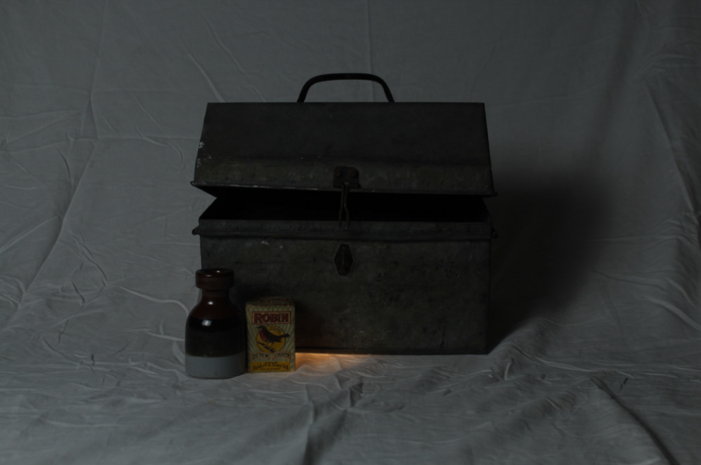
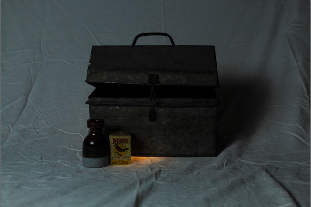
For this photo, the original, seemed too gloomy and didn’t have the right light to shadow ratio that I wanted. So on light room, and decided to reduce the brightness and add more depth to she shadows.

I made sure highlights and important parts of my image were highlighted like the ceramic pot just to give the picture some dimension and something for the viewer to focus on since its ‘so dark’.

I did make the photo of the tool box brighter then the original just to make the photo more clear an visible. Now I’m looking at it again, I do need to brighten the photo a lot so that you can actually clearly see the photo and the objects in the photo.

I revisited the photo again and decided to add more light again to make the photo brighter and more clear. I kept the shadows and darkness of the photo but still added the brightness.

If I could retake the photo, I would remove the warm spotlight because it clashes with the cold light on the main lighting and doesn’t compliment the photo how I wanted it too.

Camera Handling Skills – George Blake

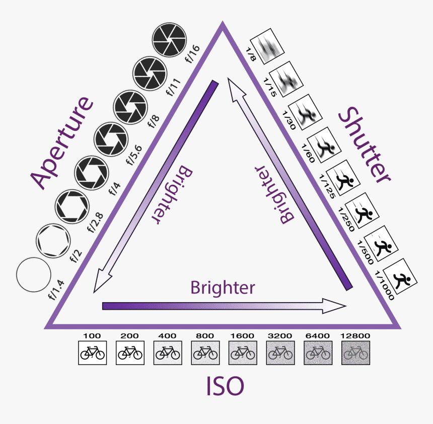
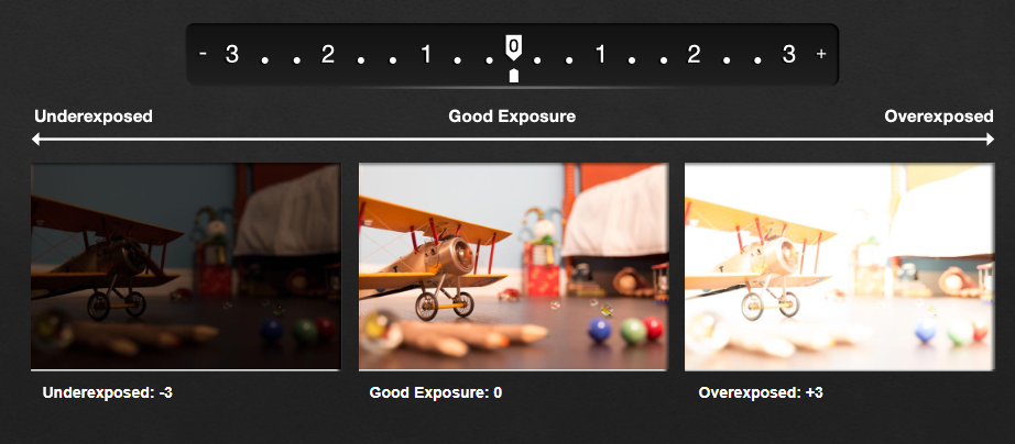
Exposure – the amount of light a digital cameras sensors captures when a photo is taken. Too much = over exposed, Too little = under exposed.

Exposure is determined off ISO and Shutter speed.

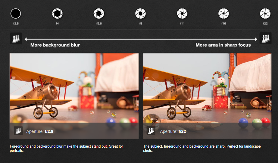
Aperture – Controls the amount of blur or sharpness around your subject.

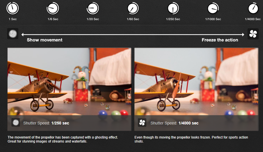
Shutter speed – Shows the movement of a fast moving object.

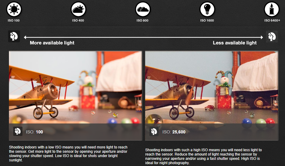
ISO – select the right amount of light you need for your visual effects.

Exposure Metre – shows what level your exposure is at.

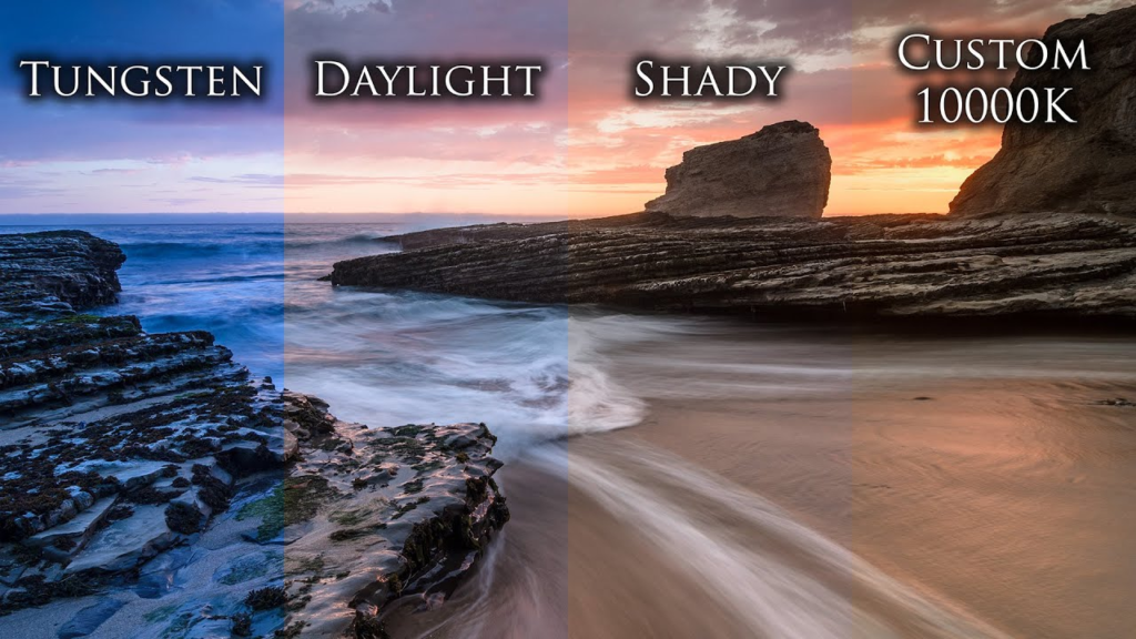
White balance – The intensity of colours in an image.

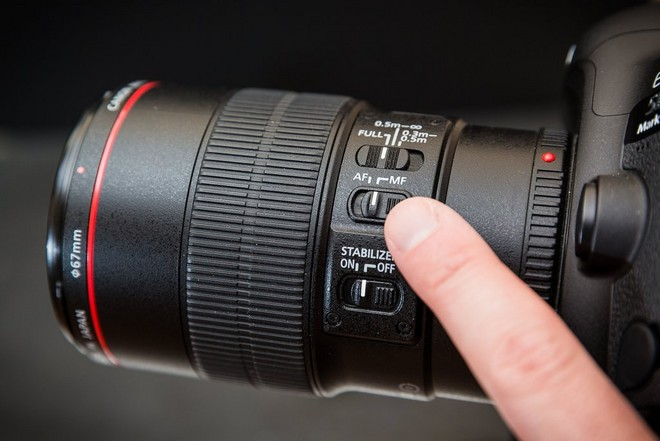
Auto focus – Atomically focuses the camera on the subject of the image.

Manual focus – by adjusting the depth of field and using the focus wheel, an image can be brought into focus without auto-aid.

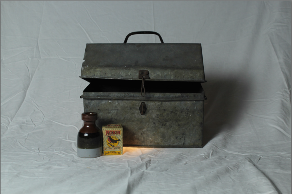
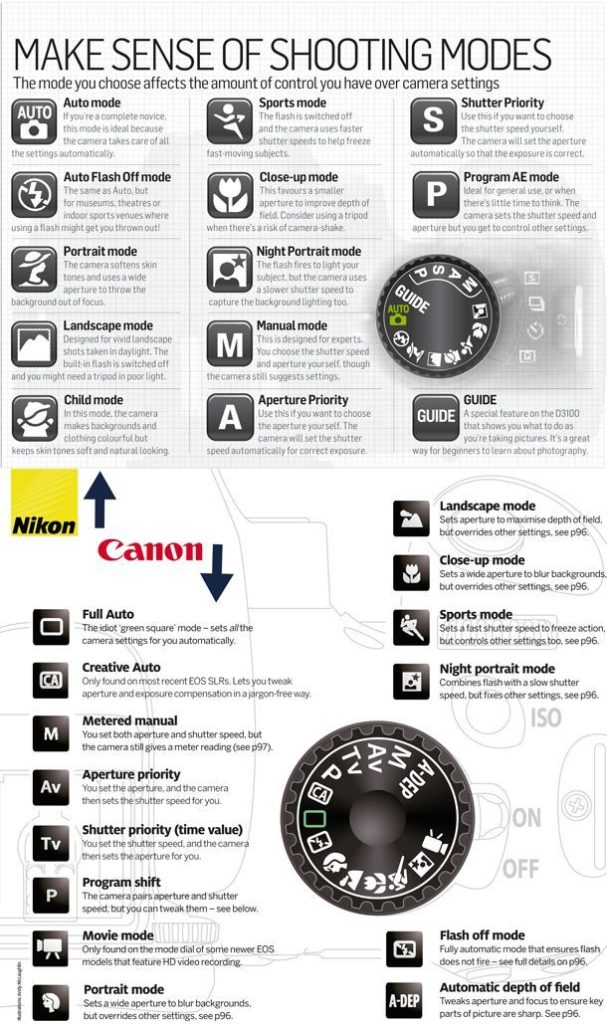
The set up in the photo is the one I used for my ‘Objects’ photoshoot, this is an example of the type of studio set up that would be used to match with the settings above.

Formalism

formalism:

Formalism describes the critical position that the most important aspect of a work of art is its form. The seven basic elements explored in formalism are:

  1. Line
  2. Shape
  3. Form
  4. Texture
  5. Colour
  6. Size
  7. Depth

Line:

A straight or curved geometric element that is generated by a moving point and that has extension only along the path of the point. Lines can be: straight, curved, solid, dashed, implied, psychological, vertical, horizontal or somewhere in-between.

Vertical or horizontal lines convey a sense of stability or a static feel to an image. Horizontal lines can indicate distance and vertical lines can indicate height, balance, strength. Diagonal lines convey a more dynamic scene.

Shape:

Shapes are two-dimensional. They can be familiar or unfamiliar. A familiar shape can transform into an unfamiliar or unrecognisable shape based on the viewpoint of the photographer.

There are two basic types of shapes: geometric (regular) and organic. Geometric shapes include: circles, squares, triangles, dodecahedrons, and more. Organic shapes include: the outline of a bird, an elephant, a flower, a tree, etc. Fluids can create organic shapes that cannot be permanently defined eg. the shape of a cloud or a rain puddle.

Form:

Form is three-dimensional and has an overall height, width and depth. The two types of form are: geometric (eg cylinder, cone, sphere and cube) and organic (eg objects that surround us in our three-dimensional world).

Forms create negative and positive space. In a photograph, positive space is basically that which is occupied by forms and negative space is what remains.

Texture:

Texture is the visual or tactile surface characteristics and appearance of something. It can be felt with both the fingers (the print) and virtually (with the viewer’s eye). Some examples of textures are: rough, smooth, soft, wet, slimy, bumpy and shiny. In a photograph, smooth objects might have reflections or specular highlights. Rough objects might have aggressive areas of light and shadow without reflections.

Colour:

Colour can be defined as:

  1. A phenomenon of light (such as red, brown, pink, or grey) or visual perception that enables one to differentiate otherwise identical objects
  2. The aspect of the appearance of objects and light sources that may be described in terms of hue, lightness, and saturation for objects and hue, brightness, and saturation for light.

Light itself has no perceived colour. But, send light through a prism or a drop of water and we can see that it is comprised of a literal rainbow of colours.

Colour has three properties: hue (the description of colour), value (the relative brightness/ darkness of a colour), and saturation (the intensity or purity of a colour. Bold/ bright colours tend to capture people’s eyes more which is why commercials often use brighter colours in order to engage the public.

Size:

 Size can be defined as: physical magnitude, extent, or bulk : relative or proportionate dimensions.

Size in a photograph is relative and can be an illusion.

When a familiar object appears in the frame of a photograph (car, basketball, streetlamp, etc.) we immediately get a feel for the scope of the entire scene. Without a familiar object in the image, we struggle to determine the scale shown in the photograph.

The size of common objects in the photograph gives the scene a sense of scale. But a single object in space might not accomplish this since there is no means for comparison. There are times when another object, maybe sitting atop our subject, serves to confirm the scale in the image—eliminating the possibility of confusion.

In order to emphasize the size of an object in a photograph in relation to its surroundings, you should get closer to the object.

Depth:

Depth is the direct linear measurement from front to back.

We are given a sense of depth due to various visual cues, to which most people rarely give much thought to. However, by learning what those cues are, photographers can use them to create more compelling images.

Depending on the quality of the surrounding air or atmosphere, distant objects in a photograph will have less clarity and contrast than objects in the foreground. This aerial perspective is indicative of depth in a photograph.

Texture gradient shows depth in a photograph as relatively distinct foreground textures. Whether it’s the surface of a road, sand on the beach, leaves or needles on a tree, crashing waves, and even clouds overhead, texture gradients in a photograph smooth out as they recede into the distance.
Formalism, basically. – Tama Coxshall

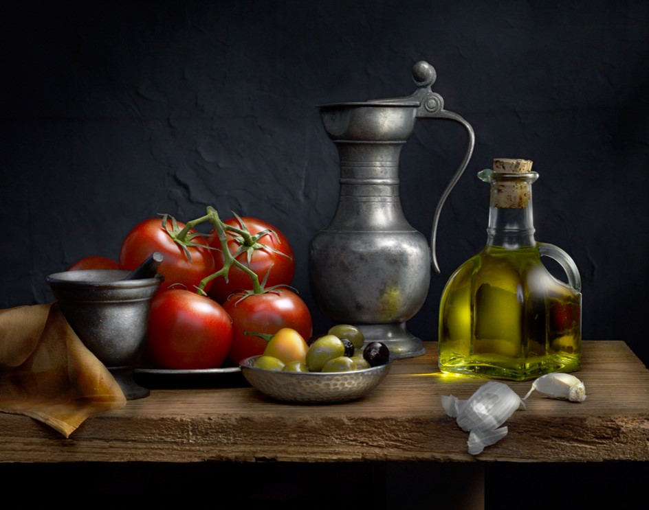
Formalism is when a photographer prioritises lighting, composition, photography techniques and overall design of the image over the subject whilst eliminating all factors in the image other than the subject.

There are 7 fundamentals in formalism; line, shape, form, texture, colour, size, depth.

Examples:

Lines

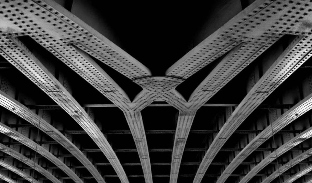
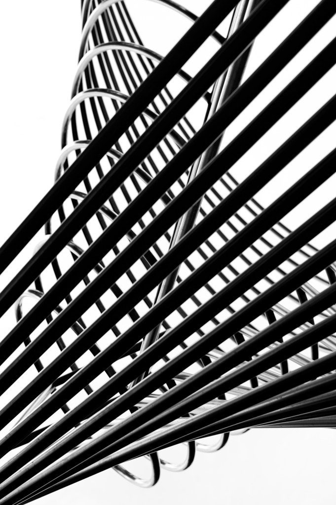
Lines A straight or curved element that is made between two points on an image

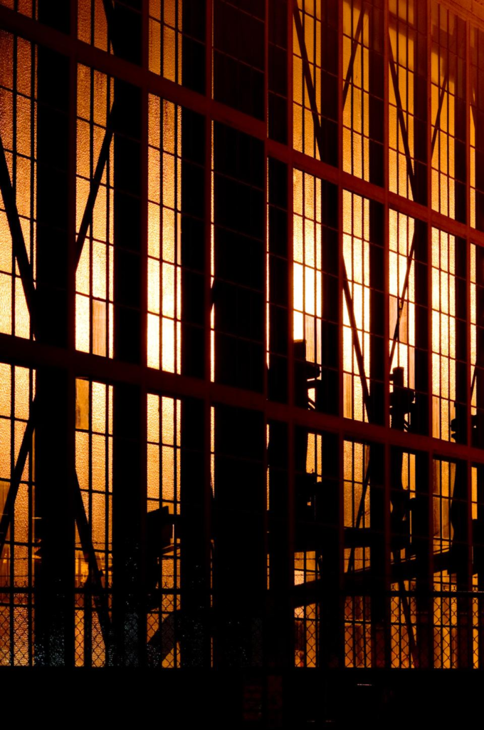
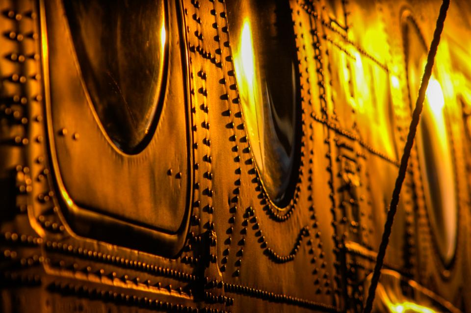
These bars of warped metal have created lines across the image.
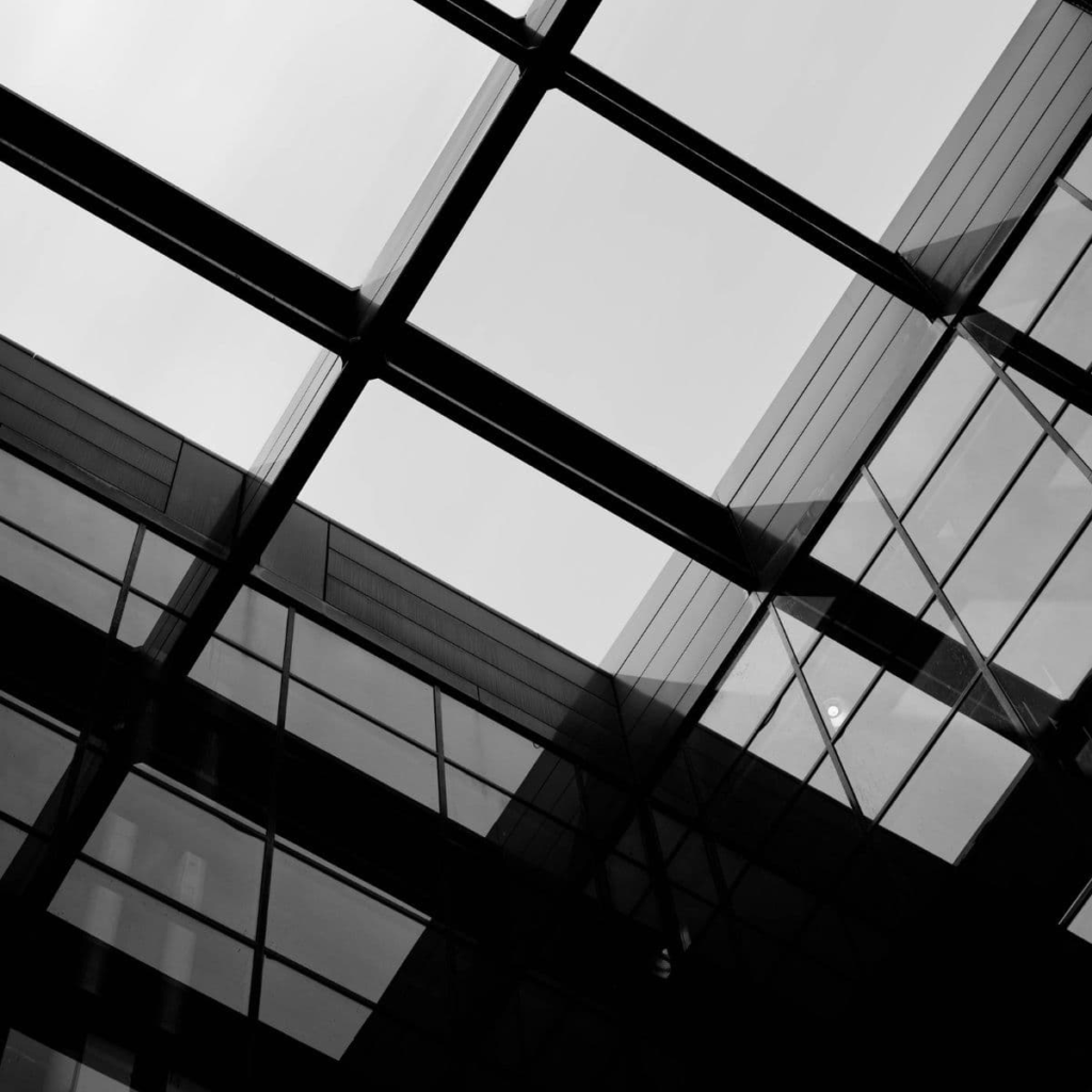
Shape

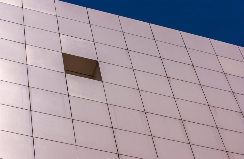
Shape – Shapes are formed when one or more lines connects. These shapes are usually familiar shapes and 2D.
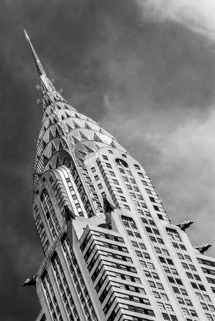
The lines in this image have connected to make a grid of parallelograms.

Form

Form – Unlike shape, form takes 2D shapes and brings them into 3 dimensions. Form takes the shape and structure of something and distinguishes it from its material.

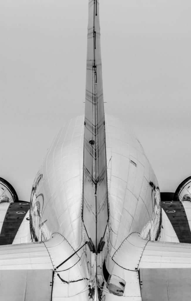
In form there are geometric shapes which are familiar like cones, spheres and cubes whereas organic shapes are infinitely simple or complex like the shape of a plane.

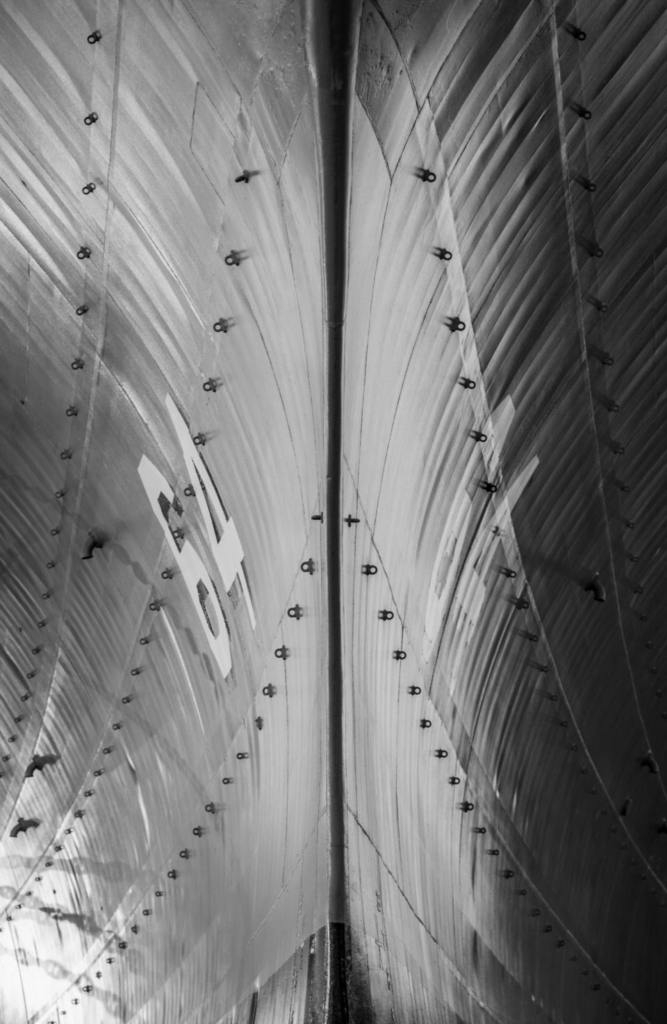
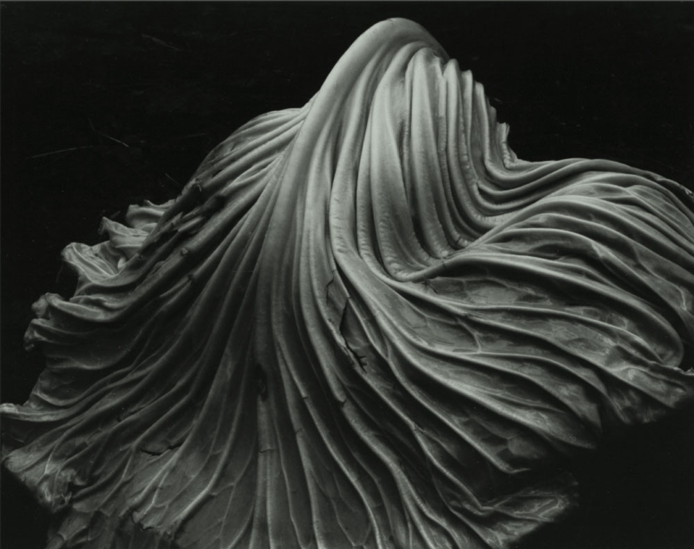
The texture of the plane creates lines with come to form shapes which are then given form by shadows, reflections and value.

Texture

The characteristics of the surfaces and appearance of objects. Textures can be felt virtually/visually or by touch (when the image has been printed)

Texture can be effected by lighting, the subject, forms or other fundamentals of formalism.

Colour

Colour has three properties; the hue, saturation, brightness of the objects and their contrast with their surroundings.

Colour can describe the mood of an image and is present in most photographs unless they are using a greyscale colour scheme.

Hue is the description of a colour. for example; red, blue, green or purple.

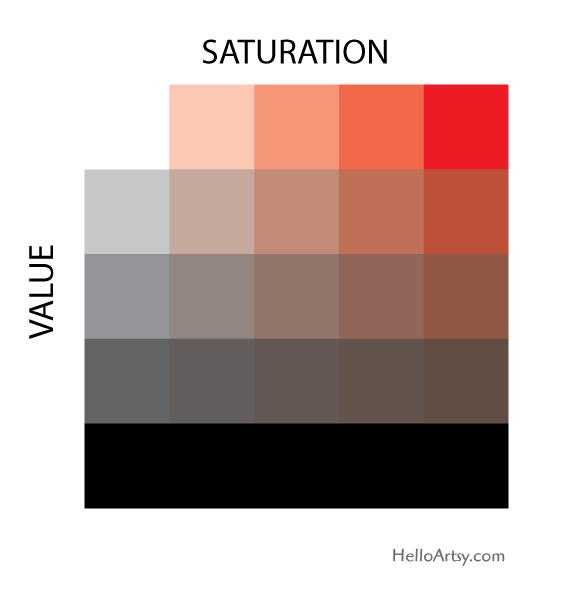
Saturation is the harshness or softness of a colour. Pastel colours like a light pink, baby blue or lavender could be described as a lowly saturated colours and are soft. Neon colours like electric orange, “UFO” green and “proton” purple are an example of a highly saturated colours and are harsher.

Value or brightness is how dark or light a colour is. Navy blue is an example of having a low value.

Here you can see how combinations of saturation and value can affect a hue.

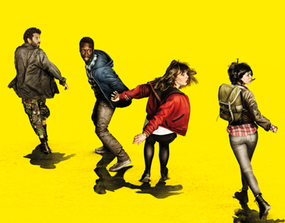
The highly saturated, bright yellow colour conveys a feelings of an unsettling nature and also works as the base structure for the composition of the subjects as it helps infer that the subjects are panicked and distraught. Furthermore, the contrast between low and high values (the shadows verses the bright yellow) create a disjointed sense in the image.

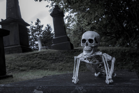
The dark values and lowly saturated colour scheme are being used to describe the eerie atmosphere of a graveyard.

Size

Size is the magnitude of objects in an image and gives the image most of its sense of scale. Our sense of scale can be made different by introducing familiar or unfamiliar objects into the scene and altering the way the image is composed.

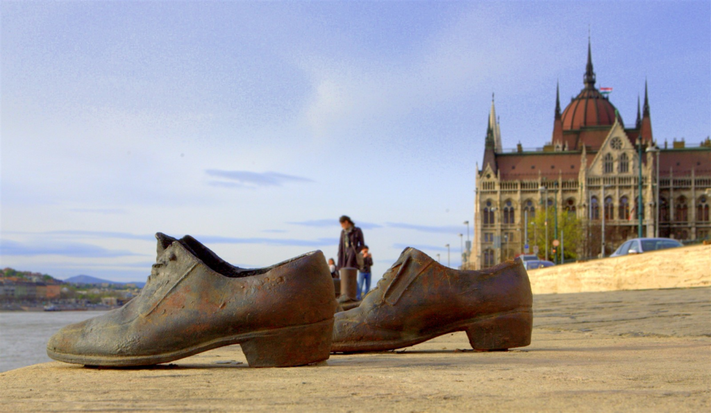
Here the shoes, a small pair of objects, have been positioned in the foreground and all the typically large components of the image, the people, building and cars, have been positioned in the background presenting the shoes as if they have a larger magnitude.

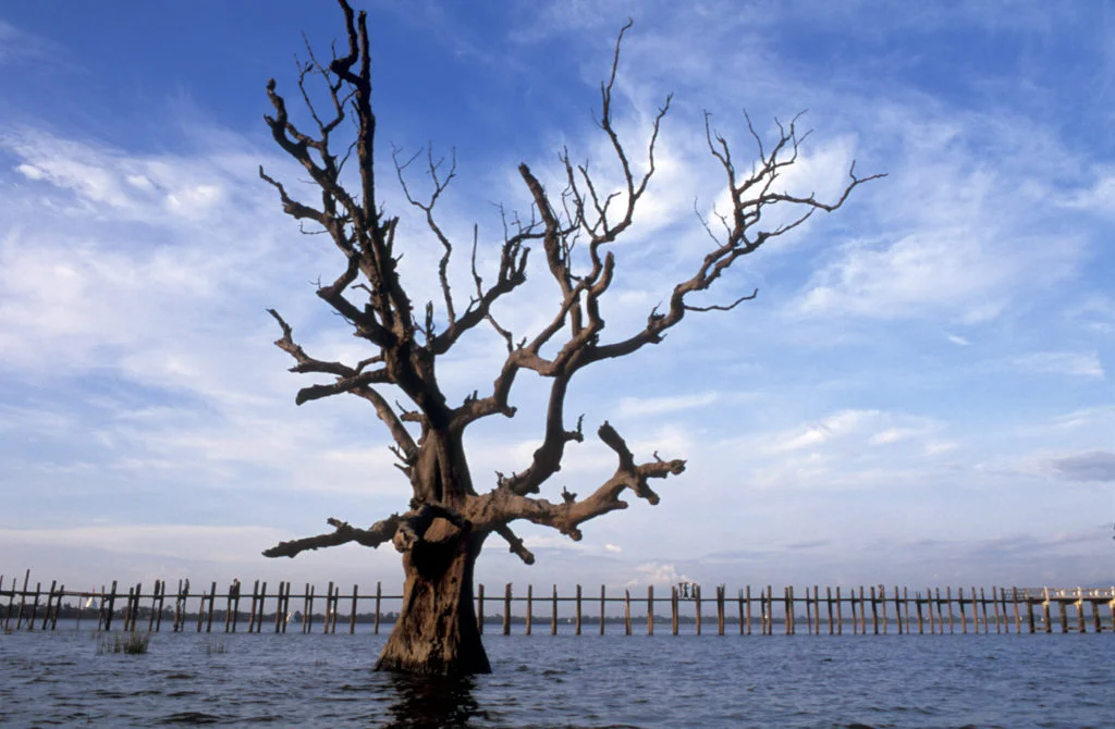
The size of objects in this image is highly ambiguous because the photo lacks a strong sense of depth and comparable objects to gather an idea of the size of the subjects in the image.

Depth

Depth is distance from the front to the back of an image. It can give the image a sense of size, shape and form.

The stronger the distinguishability between the foreground, midground and background in an image is determines how large or small its depth can be. Depth can be enhanced with diagonal lines and vanishing points.

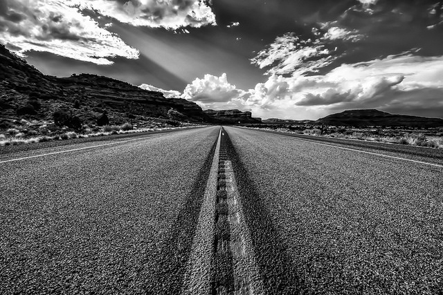
There is a strong sense of depth in this image because the foreground, middle ground and background are all distinguishable by lines and blurs. The lines converging also enhance the depth of field.

Here there is a weaker depth of field. The foreground and middle ground are easily distinguishable but the background is entirely blurred and is harder to tell where things like the road end. There is less of a sense of a vanishing point and overall feels more flat.

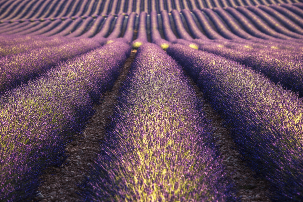
There is no depth of field in this image because it lacks layers, only consisting of a foreground and a single texture.