Walker Evans
‘Stare, pry, listen, eavesdrop. Die knowing something. You are not here long.’ -Walker Evan
Evans was an American photographer, capturing everyday, working class citizens.
Evan’s had many unique approach that were benefitted from his slight frame, allowing him to take many photos unnoticed, perfectly capturing things and people completely unaware. He was also a close friend of Ernest Hemingway who also ended up shaping much of Evan’s early style. He was one of the first to use portable cameras which got increasingly more modern with faster shutter speeds only further benefitting his style of quick snaps, expertly timed and framed. He actually began his career wanting to be a writer, which the literacy style stuck with him though all of his work as in himself he could not fully identify with the poor, rural farmers he portrayed in his work, so he often used literature to help understand and present his work.


Tin Building, Moundville, Alabama, Walker Evans, 1936.

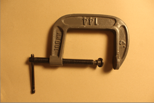
Beauty of Common Tools – Walker Evans

Darren Harvey Regan

Beauty of the common tools – Darren Harvey Regan
Darren Harvey Regan is a photographer who was also a mixed media artist combing sculpture and photography. He wants to break the constraints of photography hence the mixed media. Many of his images are comedic and his aim is to get people to study the subjects of the photos. He is often linked to the style of formalism as his work is heavily focused around: lines, shape, colour and texture. The style he uses forces people to study each part of the image and look for meaning and reasoning behind the photo.

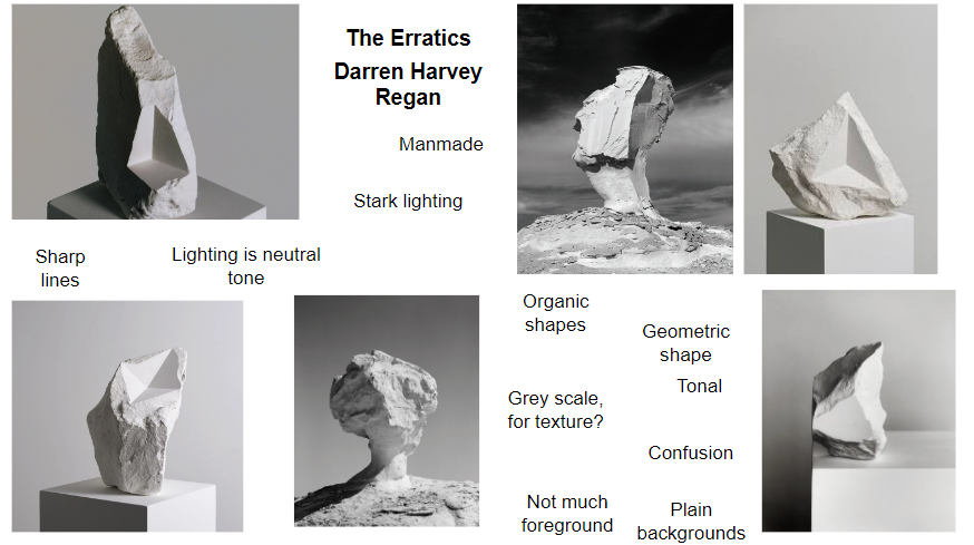
Darren Harvey-Regan – The Erratics
Analysing Regan’s style
Regan’s work tends to be black and white, with a wide grey scale. He heavily focuses on lines and textures in his work, for example the image above has a chalk on a stand adding further lines and direction to the photo. It also has a triangular shape carved out of it, which has a very different texture to compared the rest of the chalk as it appears smooth like the surrounding area where as the rest of the chalk looks very rustic with organic textures. The lighting is soft but well lit with sharp edges when the lighting changes in the image appearing very satisfying to the viewer.
Comparing Regan and Evans Work


Regan’s photo is o the left and Evan’s photo is on the right. There are obvious similarities between the two images, with them both being clack and white although this is reflective of the period of time Evan’s took his photos. There are other similarities like the subjects both being a tool and that it is on a plain white background. I believe the background is to get people to stop over looking an everyday tool and appreciate how interesting it is with the lines and patterns. There are differences like Evan’s photo has the tool on an angle like it had just been thrown on the floor, where as Regan’s photo appears well thought out and structured. There is the other big difference between the two images is that Regan’s photo has been edited as it is actually two tools merged together that you wouldn’t notice unless you actually looked at the photo due to the grey scale and similar shapes of the tools. While they are technically both photos, are Evan’s photo as Regan used Evan’s photos to make new collages and new experiments.

