Formalism is a photography technique that describes the design, lighting and composition over the main subject matter. More simply the attention to detail over the main subject and how it is presented.
Analysing of photos has it’s own specific language to describe each element of the photo. All photos consist of formal and visual elements which is similar in all art but the language used is not all related to art, for example timing, framing and focusing aren’t things that relate to art pieces but mainly photography.
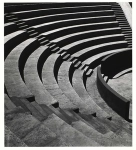
Imogen Cunningham
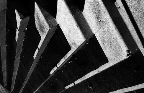
Aaron Haines
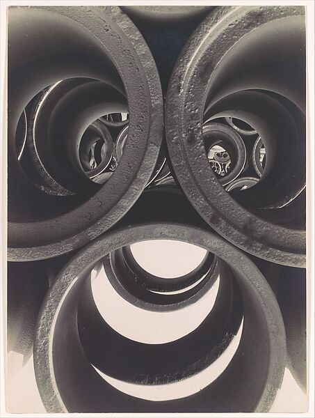
Water pipe Abstraction – Brett Weston
Basic Elements of Photography

There are many different types of lines, straight, curved, a mix of both, or there can be lines like psychological lines and implied lines. Straight and curved lines are a great example of manmade lines often found in many photos. Psychological and implied lines are a great tool to add context and a story to a photo.
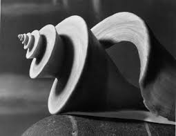
Shapes within photos are 2D, they bare easily manipulated from familiar to an unfamiliar shape by the photographer changing the lighting, angles and general form of a photo. Within an image new shapes can be made when the separate shapes combine with the use of techniques when structuring the photo. There are different types of shapes, geometric and organic shapes within photos, quite often a mix of natural and manmade appears in photos.
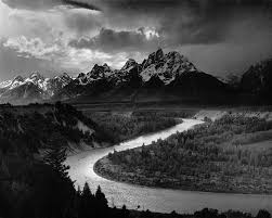
‘the shape and structure of something as distinguished from its material’ Like shape, there are two types of form geometric and organic it can also be complex or simple. Form has overall height, depth and width as it is 3D. Tone is incredibly important for photos that are focused around form as it helps show off the different lines and shapes as well as the general composition of a photo.
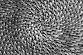
Texture is one of the few elements in a photo that can be 3d as while it relates to what you can see in the image it can also be the feeling of the print as some photos are edited by hand to add depth, texture and feel. Texture is a very useful tool in photography dramatically changing images. Texture can be a subject in many photos the aim is, by using lighting and angles to benefit the image to, make the photo appear you can reach out and touch it.
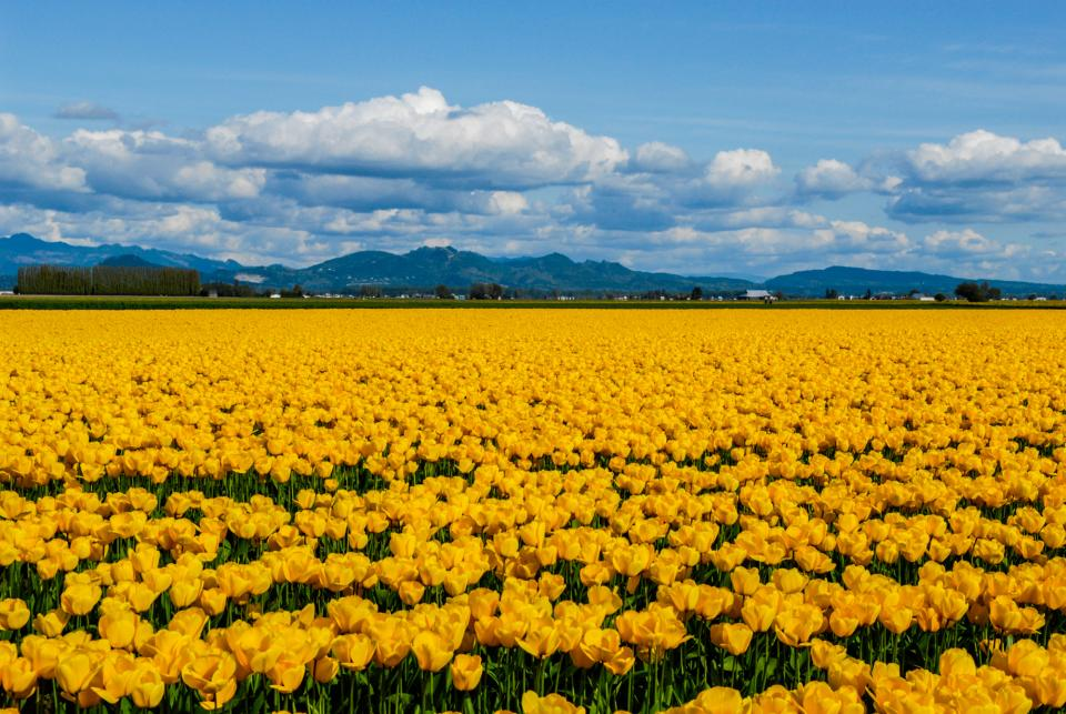
Light is often thought of as colour, however this is not the case, actually light doesn’t become colour in a photo until it has been shone through something to give the originally colourless light colour. It is widely used in a variety of different ways; it has three properties, hue, saturation and value, each heavily contributing to the image often used to help put across a mood in a photo and to help benefit other elements.

‘physical magnitude, extent, or bulk : relative or proportionate dimensions’ Merriam – Webster. Size is important in photography as it is often used to give scale. Within a photo size can be a relative or an illusion, noting it can be a great tool to perceive scale within a photo. If there is a familiar object within the photo like a dog or a football, or even a door it helps us make sense and be aware of the other objects or things within the frame and their scale. It does mean size can also be used to create optical illusions within a photo making for something extremely unique and interesting to look at.

A photograph is a 2D representation of a 3D scene. We as photographers can manipulate the appearance of depth in photos to create something compelling and sometimes emotional to look at. Depth is often used to get the viewer to look deeper at the photo and start to search for more. Rendering depth is a crucial part of a photo as while pretty much every photo will have depth it does not mean it won’t look flat and uninteresting depending on how the photo has been rendered. Rendering can come in many forms during and post production, many photographers use things like leading lines and lighting to create depth. Textures and patterns are another hugely useful tool when it comes to creating depth in even a simple photo.
Analysis of Formal Elements
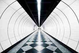
This photo is a great example of the formal elements working well together. When you first glance at the photo the depth of the shot it what first catches your eye pulling the viewer to look at the middle of the photo following the curved lines that are the walls, and the lines and depth being used to make a 2D photo appear very 3D and continue beyond the shot. While the shot is in black and white the two colours have been used in varying ways to create a unique and interesting shot as the squares of f the flooring are matched in tone to the ceiling creating a round feel to the shot working with the depth and lines already making the shot feel 3D. The size is used to benefit the surreal feeling even further as the corridor is round the size of the corridor feels huge in comparison to what it potentially is. There doesn’t appear to be any rough textures and instead everything appears smooth, quiet and surreal, which is helped by the overall shape as while the shot is a landscape rectangle it encourages the viewer to believe it’s round due how the rest of the formal elements have been used to influence the viewer of the photo.

Great work. You could develop this further by including images for each formal element.
You could also analyse one of your example photos by using as many of the formal elements as possible.
https://hautlieucreative.co.uk/photo25al/2023/09/29/formalism-26/