STILL LIFE

Still life is a painting or drawing of an arrangement of objects, typically including fruit, flowers and objects contrasting with these in texture, such as bowls and glassware.

Still life photography is a form of professional photography that depicts inanimate objects or subject matters. Still life is a unique genre of photography. One thing that makes it so special is that often the subjects aren’t very interesting. The effect of this can make the photograph slightly a mystery and can tell its own story, sort of like a book as you imagine the way you want too.

Still life photography is important for several reasons. It can capture beautiful images that can be enjoyed for years to come. It can serve as a way to document and preserve history. Still life photography can be used to create art and has been a popular art subject for centuries.
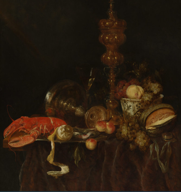
Abraham van Beveren (Dutch, The Hague 1620/21–1690 Overschie) This photo presents the themes of wealth and high class which is shown through the lobster and the metal work reflecting on the lush fruit. This photograph can tell us many things but a main theme is wealth especially around the timing it was published.
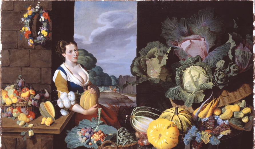
Cookmaid with Still Life of Vegetables and Fruit c.1620-5 Sir Nathaniel Bacon 1585-1627

Sir Nathaniel Bacon did not paint professionally, although he was a skilled amateur artist. Very few works attributed to him survive, so the appearance of this work on the art market presented the Collection with a rare opportunity for acquisition. Furthermore, the subject matter, a cookmaid surrounded with lavish produce, more usually associated with Dutch and Flemish art, is highly unusual in England for the period and associated only with Bacon. Every item depicted is known to have been growing in England: Bacon himself grew melons on his Suffolk estate.

Fruits can symbolize prosperity, wealth, abundance, pleasure, fertility, and the fleeting nature of life, depending on the composition, colour, and presentation of the fruit. Although  fresh fruit, represents fertility, vitality, youth, and abundance. When the fruit is in a state of decay, however, it characterises the inevitable and undeniable mortality of our presence in the world.

As we are on the topic of symbolic meanings and metaphors. There are Vanitas
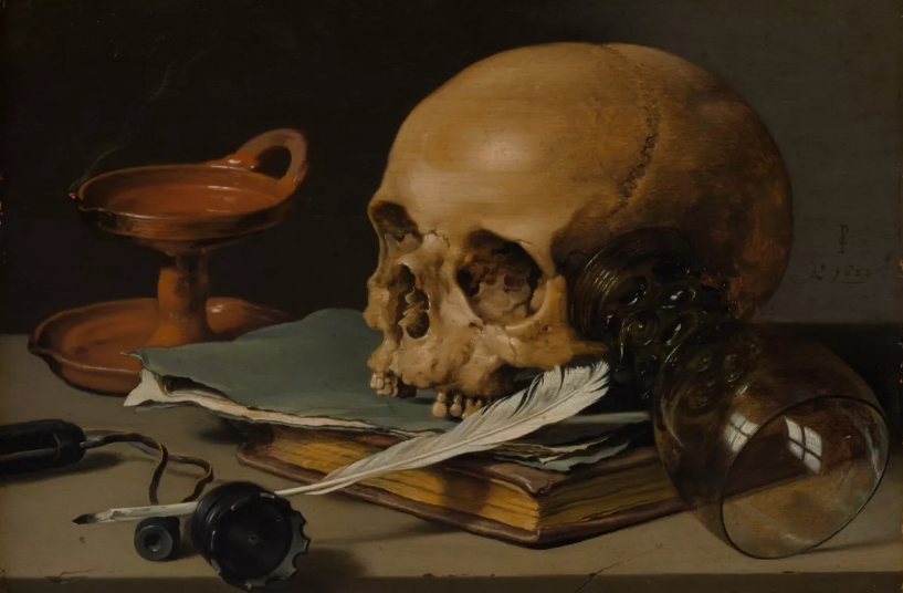
Pieter Claesz, Still Life with a Skull and a Writing Quill, 1628

vanitas is a symbolic work of art showing the transience of life, the futility of pleasure, and the certainty of death, often contrasting symbols of wealth and symbols of ephemerality and death. Vanitas remind the viewer of the shortness, fragility and uncertainty of death, which often include symbols such as skulls and extinguished candles. 

However, they can also include other symbols such as musical instruments, wine and books to remind us explicitly of the vanity (in the sense of worthlessness) of worldly pleasures and goods.
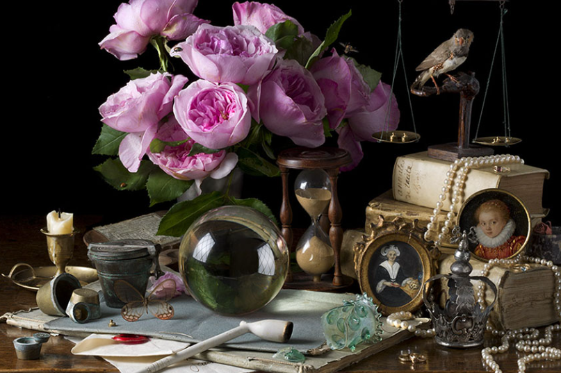
Although there are also light Vanitas which bring a more positive mood and outlook. Which although they are very different, they are actually similar within symbols and metaphors.
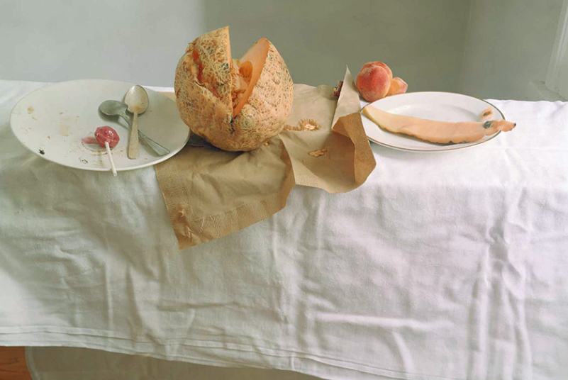
Still Life inspired – My photo
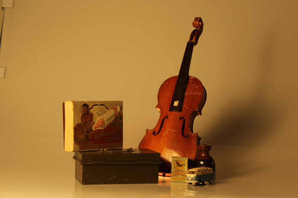
In this photo I used random objects and created an arrangement of the objects to create a meaning. The typical thing about still life is that the objects aren’t very exciting which makes it interesting. However my objects aren’t the typically used objects and don’t have a symbolic meaning. I also used an orangey-warm tone which created a significant and eye-catching shadow to make the photograph more interesting. The objects put together don’t explain the story behind them which is the beauty of still life, as it can be personal to you or how you imagine it to be. However, because I did not use dark lighting in the studio it contrasts and is different to the typical still life photographs, which is in my opinion less effective. Overall, it is still a still life photo but I would like to change some qualities to make it more like the professionals such as add symbolic objects and use natural or darker artificial lighting in the studio.
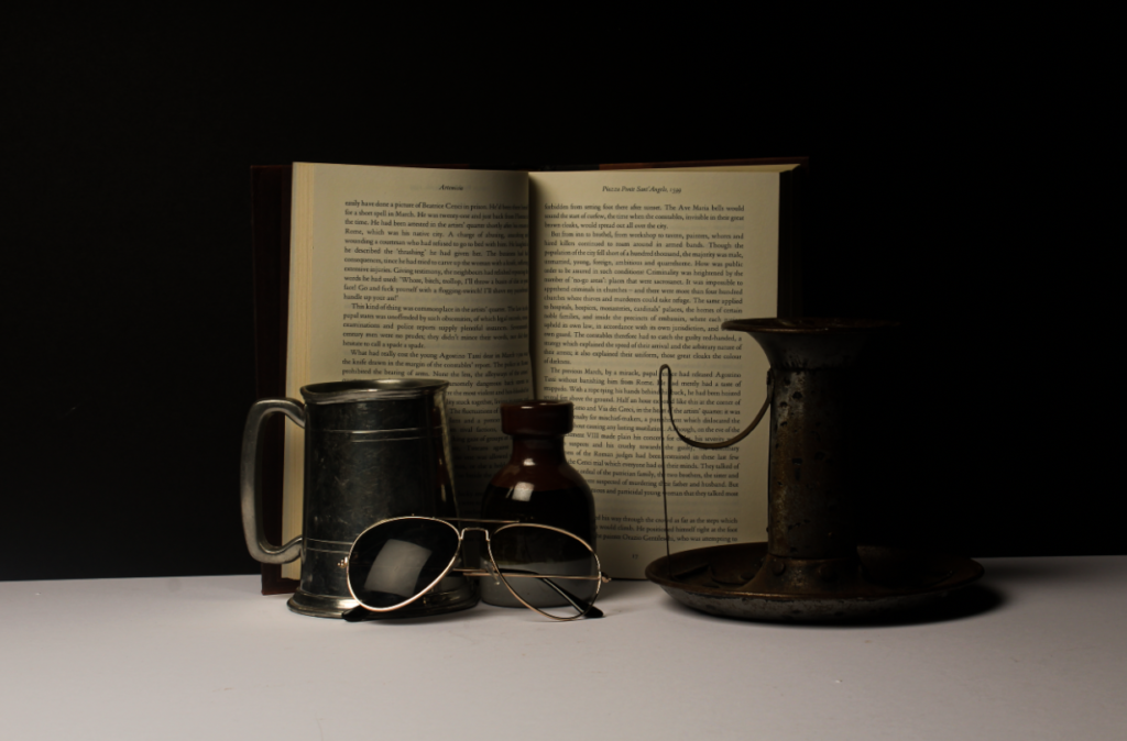
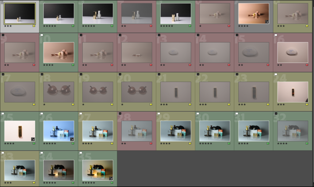
still life photoshoots and contact sheet

In this picture I rated, coloured and flagged my photos so that I could have an idea of what photos I liked most and so that I could edit the pictures that I liked without editing the unnecessary pictures.

In some pictures I used the copy-stand and in other i used an infinity screen.

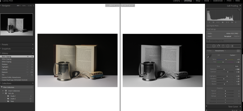
For this photo I chose objects that I picked from the studio that portrayed a mysterious atmosphere. I wanted to give the photo more life so I added some techniques to the photo to reach its minimum peak. I kept the tint, temperature, contrast, highlights, shadows, whites, blacks, texture, dehaze and saturation untouched because I felt like the photo didn’t need them. I increased exposure to expose more the light in the photo, clarity to show more of the details in the photo, and finally increased the vibrancy to give the photo more colour. This picture was taken in an infinity screen with continuous light from the left and from a small light on the bottom of the infinity screen.

For this photo I wanted to create a warm and cosy tone to it. when I took this picture I looked at it and I really liked how it looked in general. I strongly believed that it showed the cosy feel to it yet it also was warm which, so I decided not to touch it and leave the picture just as it is . This picture was taken from an infinity screen with continuous light from the left and a small light on the bottom of the infinity screen.

Again for this photo I kept it untouched because I liked how it looked by itself. I wanted to have a photo that showed a slight off white look to it and was cool. I think that the photo naturally is cold and bleak so there was no need to edit it. This photo was taken in an infinity screen without the bottom light which gave it a cooler tone.

For this picture I wanted to play around with the white balance on the camera. I didn’t want the photo to have different lighting. I decreased the white balance to give the photo a more cool tone to it and finally to edit it, I increased the exposure the to make it lighter and cooler. This photo was taken from an infinity screen with a continuous light on the left.

For this photo I wanted to enhance the gold colour off the lipstick and also increase the white in the photo. I kept the temperature, tint, contrast, highlights, shadows, whites, blacks, texture, dehaze and saturation untouched because it did no good to the photo and didn’t help my aim with the photo. I increased the exposure to expose the brighter parts of the photo, clarity to show more off the texture in the photo and show the gold that the the original photo wasn’t showing and finally I increased the saturation to increase the saturation of the gold on the lipstick. This photo was taken from a copy-stand with continuous light coming from the sides.
For this photo, I wanted a homely and summery feel to it. When I took this photo I felt like I had already achieved what I wanted, without editing I think that it already had a homey feel to it so I left it unedited. This photo was taken from an infinity screen with a continuous light coming from the left

For this photo, I wanted to produce a clean and posh tone to the photo because I felt like the objects had that posh tone. When I took this photo I liked how it was very bright and illuminated the colours of the objects. I zoomed in the photo to show more of the details of the objects. Because I was happy with the photo unedited, I left the photo as it is and didn’t edit any of it. This photo was taken free hand with a black background and a white ‘floor’. The camera had a Flash setting so every time I took a photo, the light on the left flashed.

Again, For this photo I wanted to produce a clean and posh tone to the photo because I felt like the objects had that posh tone. When I took this photo I liked how it was very bright and illuminated the colours of the objects. I didn’t zoom in the camera lens, I kept my distance from the objects but made sure you couldn’t see the outside from the set up. Because I was happy with the photo unedited, I left the photo as it is and didn’t edit any of it. This photo was taken free hand with a black background and a white ‘floor’. The camera had a Flash setting so every time I took a photo, the light on the left flashed.

This is the set up I used to take the last two photos.

Formalism

Formalism describes the critical position that the most important aspect of a work of art is its form, the way it is made and its purely visual aspects, rather than its narrative content or its relationship to the visible world.

There are seven basic elements of photographic art: line, shape, form, texture, colour, size, and depth.

Line is a point that continues; it implies motion. Lines are either straight, curved, or a combination of the two. Lines can be solid, dashed or interrupted, implied, or psychological. They can be vertical, horizontal, or somewhere in-between.

The type and general direction of lines in your image convey meaning inside the photograph. Lines are everywhere in photographs. Lines surround us, and every photograph contains lines.

Shape photography is the two-dimensional appearance of objects as your camera captures them. When a line, or more than one line, closes or connects, a shape is formed.

The Merriam-Webster definition of “shape” that we are concerned with as photographic artists is:

-the visible makeup characteristic of a particular item or kind of item

-spatial form or contour

-a standard or universally recognized spatial form

What separates form from shape? Form takes shape from the two dimensional and brings it into the three dimensional. Form has overall height, width, and depth.

Just as with shapes, there are two basic types of form geometric and organic.

Geometric forms are the familiar sphere, cube, cone, cylinder, etc. We are also, of course, familiar with organic forms they are the objects that surround us in our three-dimensional world.

In photography, texture can be felt with both the fingers (the print) and virtually (with the viewer’s eye). Texture is the next part of our Elements of a Photograph series.

The definition of texture is the visual or tactile surface characteristics and appearance of something.

Texture in real life can be smooth or rough etc.

Texture in the photograph is similar to form in that it is revealed by variations in tonality and presented in two dimensions.

In a photograph, smooth objects might have reflections or specular highlights. Rough objects might have aggressive areas of light and shadow without reflections.

Texture can be elusive in a photograph, depending on the subject, the lighting, and the forms in the image.

definition of “colour” that we, as photographic artists, are concerned with is:

a phenomenon of light (such as red, brown, pink, or grey) or visual perception that enables one to differentiate otherwise identical objects

the aspect of the appearance of objects and light sources that may be described in terms of hue, lightness, and saturation for objects and hue, brightness, and saturation for light.

a specific combination of hue, saturation, and lightness or brightness

 a colour other than and as contrasted with black, white, or grey

Light itself has no perceived colour. But, send light through a prism or a drop of water and we can see that it is comprised of a literal rainbow of colours.

Colour has three properties: hue, value, and saturation.

Hue is simply the description of the colour (e.g., blue, red, yellow, etc.).

Value is the relative brightness or darkness of a colour.

Saturation is the intensity or purity of a colour. The purest colour is a hue with no white, black, or grey added to it.

Separate the different colours of the rainbow and we can see these varied colours elicit different emotional responses.

Size, the most elusive of these, is the topic of this sixth part of our Elements of a Photograph series.

The definition of size is the physical magnitude, extent, or bulk : relative or proportionate dimensions.

Size in a photograph is relative and can be an illusion.

Large, medium, or small. The camera, lens, and print can render large objects small, or small objects large.

Depth, one of the most compelling elements, is the topic of this final part in our Elements of a Photograph series. Including a distant horizon is not required to give a sense of depth to your image. Depth is provided by visual cues. Depending on the quality of the surrounding air or atmosphere, distant objects in a photograph will have less clarity and contrast than objects in the foreground. This aerial perspective is indicative of depth in a photograph. Where you place an object in a frame also offers clues toward depth. The higher an object is in the frame relative to the horizon (seen or implied), the greater is the perceived distance to that object.

Still Life

This is a mood board of still life. They are very traditional.

Throughout its long history, still life has taken many forms, from the decorative frescoes of antiquity to the high art of the Renaissance. Traditionally, a still life is a collection of inanimate objects arranged as the subject of a composition. Nowadays, a still life can be anything from your latest Instagram latte art to a vase of tulips styled like a Dutch Golden Age painting.

Creating a beautiful and successful still life image is an impressive feat, but just as painting a bowl of fruit is a good introduction for new painters, still life photography is a wonderful training ground for new photographers. It gives you an opportunity to experiment with light, materials, textures, and subjects in a controlled setting. Whatever your creative vision and artistic goals, still life is a great place to start.

Still life photography has opportunities to experiment with different styles, such as:

Assortment of glass containers with dried plant stems captured with still-life photography

Composition. First, play with your composition and test different layouts and arrangements of your objects. Consider composition styles like the rule of threes when composing your still life image. Tweak and adjust your layout as you go to refine your composition skills and identify what makes a photo pleasing.

Trinkets from around the world as still-life photographic art

Subject and materials. Compose your photo with diverse textures and materials. It doesn’t matter whether it’s a handful of random objects from your home or a curated collection of sterling silver candlesticks. Explore how shadows and light reflect off of various surfaces, and see how it affects your final composition.

Still-life image of plant on digital camera optical viewfinder

Different lighting. Experiment with different lighting, both in the studio and in natural light. Avoid shooting with the traditional overhead lights in your home, as light colours will mix and produce odd and unintentional shadows. Different light sources can subtly change the mood and atmosphere of an image.

Woman in a red-checkered shirt taking a still-life picture of denim shirt

Camera angle. Try moving your camera as well, and see how the composition changes. Shoot both with a tripod and with your camera in your hand. You might just find an even better angle of your subject than the one you had in mind. When shooting handheld, make sure your shutter speed is fast enough to avoid camera shake.

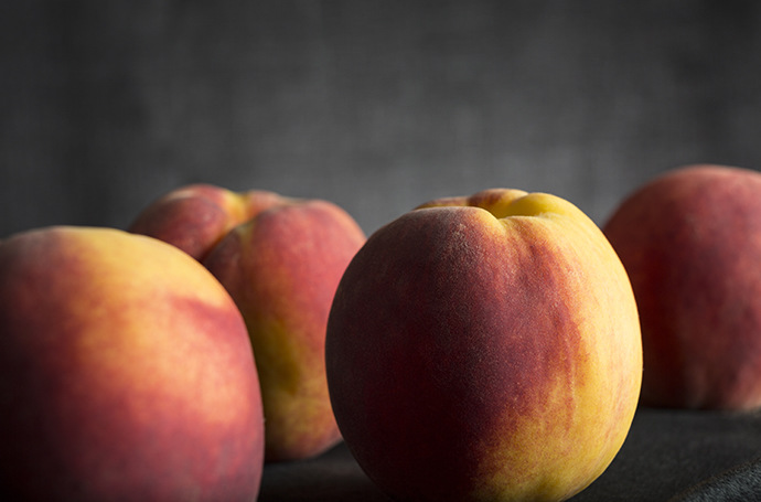
Still life photo of an assortment of fresh peaches on a dark background

Focus and depth of field. Experiment with depth of field. Consider focal length, and try using a prime lens or a zoom lens to mix things up. Focusing on one small point rather than having the entire frame in focus can change your composition dramatically. Many cameras are designed to focus on the human face, so try using manual focus instead.

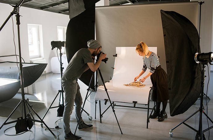
Still-life picture of a professional photographer shooting in his studio

Add motion. While traditionally a still life is just that, “still,” you can add elements of motion to your still life photography. Reach your hand into the shot and move something mid-photo. Or slow down your shutter speed and catch motion blur with a spinning ballerina music box. It’s up to you.

History

The creation of still life painting in the sixteenth century, perhaps with religious motives, continued through current time. This may be because the freedom this art offers in placing the elements where the artist wants, which generates control on the structure of work. Still life works gradually included anything that did not move as well as those that are dead. In addition to creating still life work normally, artists also included elements of still life in other genres of work, such as portraits, in supporting roles. The still life has witnessed a transformative and interesting evolution from the bottom of the hierarchy of artistic genres. In France, still life photography came back in the late nineteenth century, when modernist painters discovered it as the perfect subject for the formal exploration of different styles, colours and compositions. 

There were different styles of still life, for example:

  • Product photography: used to showcase products, such as electronics, jewellery, and clothing.
  • Food photography: a subset of still life that often centres on depictions of food in an attractive way.
  • Flower photography: focuses on capturing the beauty of flowers.
  • Abstract photography: focuses on the shapes, colors, and textures of objects.
  • Table-top photography: a great way to get started in still life photography and can include any of the above types of photography.

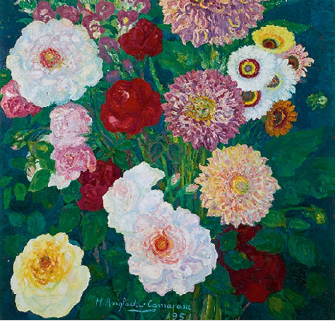
HERMENEGILDO ANGLADA-CAMARASA, DAHLIAS AND OTHER FLOWERS, 1951

This still life painting shows joy. The different colour bouquet shows the happiness through its bright colours. It is flower photography focusing on the beauty of the flowers but comparing them to the beauty if life.

Timeline of still life photography

The English term “Still Life” originates from within the 17th century when still-life art was at the height of European popularity. Still-life has existed since the 17th century until the modern day but, in the 19th century, artists adapted photography as a new medium for still life art, to express there concepts. Still life became less popular at one point, but regained its commonness again. Even today, still life photography is still very popular within many photographers.

What is Vanitas?

Vanitas is a still-life painting of a 17th-century Dutch genre containing symbols of death or change as a reminder of their inevitability. This genre began in the 16th century and continued into the 17th but has since lost its popularity.

What is Memento Mori?

The phrase “memento mori” is Latin for “remember you must die.” It is a reflection on the impermanence of life and a constant reminder not to take your time on earth for granted and not to worry about things beyond your control. Memento Mori is an object kept as a reminder of the inevitability of death, such as a skull.

What kind of metaphors and symbols are used in still life and why?

From flowers to seashells, decoding the symbols in still-life paintings can reveal a hidden world of deeper meaning.

Fruits are some of the most ubiquitous subjects in still-life paintings over the centuries. Not only does a basket of fruit offer the artist a variety of colours and textures to utilize, but it also offers a variety of religious and mythical symbols.

Made famous by Dutch and Flemish artists of the sixteenth and seventeenth centuries, ‘vanitas’ still-life paintings express the transience of life and the futility of materialism. This tradition also provided a justification for painting beautiful and expensive objects instead of more overtly moralizing subjects.

A beautiful bouquet of flowers in full bloom can signify life, faith, growth, and power. Wilting flowers, on the other hand, serve as grim reminders that life, material goods, and beauty are fragile.

In ancient times, it was believed that a person’s soul was contained in their reflection. Mirrors have been included in a variety of paintings throughout history. They can represent either truth and self-assurance or vanity and distortion, the difference depends on who is looking at their reflection. A broken mirror is universally recognized as a bad omen.

Camera Handling Skills

In photography, I use a DLSR Canon camera to take photos, because it ensures they all have good quality and there are various different ways I can adjust my images. This camera is extremely beneficial for photography as it allows me to change the shutter speed, ISO and aperture.

  • The shutter speed is the length of time from the moment the shutter opens and this then allows light into the camera. A fast shutter speed will create a short exposure, whereas as a slower shutter speed will create a long exposure. This is because the shutter is open for a longer period of time which allows more light into the camera.
  • The aperture is the opening of the lens’s diagram through which light passes through. Having a smaller aperture creates a sharper image.
  • The ISO ( International standard organization) is an image sensitivity in a numerical value. Having a higher ISO can lower the quality of your photo and degrade is which will cause your photos to be grainy or “noisy”.

We used this app to begin experimenting with different apertures, shutter speeds and ISO, which was helpful because it allowed us to decide which ones look best for each specific photo. We then could apply these skills to when we actually use the cameras, which saves time and we could identify which ones would benefit the photos most.

Aperture

Aperture controls the size of the lens opening which allows light into your camera.

Opening the lens more or having a low f-stop number (e.g. f/1.4) blurs the background/foreground around your subject. This is known as a shallow depth of field.

Keeping the lens more closed or having a high f-stop number (e.g. f/16) keeps the photo sharp throughout. This is known as a wide depth of field.

Shutter Speed

Shutter Speed is the amount of time the shutter is open to expose the image sensor to light.

Slow shutter speeds expose more light to the image sensor so still objects will have more detail and moving objects will appear to have more motion/be blurry.

Faster shutter speeds means less light is exposed to the image sensor and moving objects appear more still.

ISO

The ISO of a camera selects how much light the image sensor detects.

Too much light on a sunny day can cause overexposed shots so a lower ISO would be preferred.

Too little light in a shady room or day can cause grainy images.

The general rule is to use the lowest ISO possible to get the most detail possible.

Exposure Meter

 The Exposure Meter is your final check before you snap a shot. It shows you how well your aperture, ISO and shutter speed are working together. It is used as a guide to show exposure.

Formalism

Photographs consist of formal and visual elements and have their own ‘grammar’. Examples of visual and formal elements consist such as line, shape, repetition, rhythm, balance and many more. Steiglitz and Strand, “often abstracted reality by eliminating social or spatial context; by using viewpoints that flattened pictorial space, acknowledging the flatness of the picture plane; and by emphasising shape and tonal rendition in highlights and shadows as much as in the actual subject matter.”

Light– e.g. where’s the brightest areas, any shadows, can you tell the time of day through the picture, natural light or artificial, harsh or soft and directed or reflected light.

You can see in this photo that the whole photo is dark but their is a light that shines straight across the objects to show, that’s the importance and main focus in the photo.

Line– Any objects in the picture that acts like lines. Straight or curvy, thin or thick.

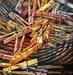
There are multiple lines in this picture, all different sizes. But the thin lines are used to just outline shapes whilst the thick lines are used to stand out.

Repetition/Shape– Any objects, shapes, lines or other subjects that repeat and create a rhythm or pattern. Echoes, reflections that also are in photos.

The repetition of all of the pegs are used to create structure to the photo without layering it and piling the picture too much.

Space– Any geometric (straight edged) or organic, (curvy) shapes? What shapes are they and how they relate to each other.

Texture/Value/Tone– Are there important negative (empty) spaces in addition to positive (solid) space. Ground or background, if you could touch the surface of the photograph how would it feel? How do the objects in the picture look like they would feel, is there a range of tones from dark to light. Where is the darkest part of the image, where is the lightest.

Colour– Where is the darkest part of the image? Where is the lightest? Are the tones in the photograph balanced or does the image tend towards darkness or lightness overall. How does this affect the mood or atmosphere?
What kind of colours can you see e.g. saturated, muted, complementary, primary? Is there a dominant colour? How would this image be different if it was in black and white?

Composition– Does the use of colour help us understand the subject or does it work independently?
How have the various elements in the picture been arranged? Does the image seem balanced or unbalanced? Is it possible to superimpose geometrical shapes on the image to better understand the composition e.g. a pyramid? Has the photographer used the Rule of Thirds?

Walker Evans and Darren Harvey-Regan artist referance

The works of both Walker Evans and Darren Harvey-Regan are both important pieces of art in the field of Still Life, and both artists bring interesting qualities to still life that were not done before. However, both photographers use similar techniques in their work.

Photo by Walker Evans
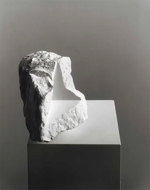
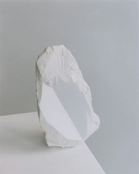
Photo by Darren Harvey-Regan

As you can see, both of these photos feature similar qualities. Both photos are in black and white, which adds a quality of stillness to the photos. Both feature a flat white background that isolates the subjects in both photos. Also, in both of these photos a triangle is featured. Geometric shapes like triangles and squares are something that is commonly found in both Darren Harvey-Regan’s and Walker Evans’s work.

To delve further into my study, I have aligned these 3 photos from Darren Harvey-Regan to analyse what is common in each of these photos. Immediately what strikes the viewer is the use of the geometric shapes carved out of the rocks that align with the edges of the box. This adds a very unique aspect to the photos and makes them very visually appealing. As well as this, the shapes create a very large contrast between the rocky surfaces and the sharp edges of the shapes. Also, the objects in the photos seem to have been carefully balanced. A good example of this is the photo in the middle, which looks like something that you would find in nature, maybe on a beach as a broken away piece of cliff. The sharp surface on the object also works perfectly with the edge on the box below it, which emphasises how each of these photos have to be to perfectly aligned so that the shapes align with the edges on the box. Overall, Darren Harvey-Regan utilises this idea very well throughout his still life photography.

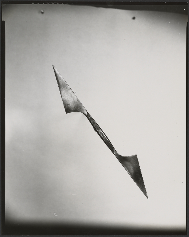
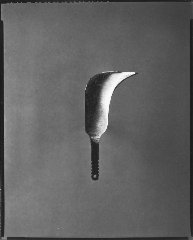
These are 3 still life photos from Walker Evans. Each depict a tool, an adjustable wrench on the top, a kind of double sided blade in the middle and some sort of warped blade knife at the bottom. Clearly, Walker Evans likes to use tools as the subjects in his still life photography, and he utilises them in very interesting ways. Firstly, all of the tools are elevated from the background, hung from a string. This is an interesting idea because it detaches the object from the background. This allows Walker Evans to use aperture to blur the background and completely separate the subject from it. Secondly, all of the tools are metallic, which provides an interesting texture to each of the photos that is different in each. The wrench seems quite solid, thick and put together. The double sided blade looks quite messy and thin, and the knife on the bottom appears quite shiny and sharp. With the addition of the objects being elevated, this allows Walker Evans to use lighting in different ways to make the objects appear in different textures. It also helps that there is no shadow created from the object.

Putting all of the images that I have analysed together demonstrates that both photographers give unique ideas, perspectives and inspirations to Still Life and overall they both provide perfect examples of Still Life photography that outline exactly what a Still Life image is, a still object with little to no context, just something that looks visually appealing.

Formalism

Formalism is a photography technique that describes the design, lighting and composition over the main subject matter. More simply the attention to detail over the main subject and how it is presented.

Analysing of photos has it’s own specific language to describe each element of the photo. All photos consist of formal and visual elements which is similar in all art but the language used is not all related to art, for example timing, framing and focusing aren’t things that relate to art pieces but mainly photography.

Imogen Cunningham

Aaron Haines

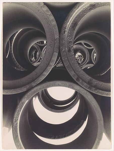
Water pipe Abstraction – Brett Weston

Basic Elements of Photography

Line

There are many different types of lines, straight, curved, a mix of both, or there can be lines like psychological lines and implied lines. Straight and curved lines are a great example of manmade lines often found in many photos. Psychological and implied lines are a great tool to add context and a story to a photo.

Shape

Shapes within photos are 2D, they bare easily manipulated from familiar to an unfamiliar shape by the photographer changing the lighting, angles and general form of a photo. Within an image new shapes can be made when the separate shapes combine with the use of techniques when structuring the photo. There are different types of shapes, geometric and organic shapes within photos, quite often a mix of natural and manmade appears in photos.

Form

‘the shape and structure of something as distinguished from its material’ Like shape, there are two types of form geometric and organic it can also be complex or simple. Form has overall height, depth and width as it is 3D. Tone is incredibly important for photos that are focused around form as it helps show off the different lines and shapes as well as the general composition of a photo.

Texture

Texture is one of the few elements in a photo that can be 3d as while it relates to what you can see in the image it can also be the feeling of the print as some photos are edited by hand to add depth, texture and feel. Texture is a very useful tool in photography dramatically changing images. Texture can be a subject in many photos the aim is, by using lighting and angles to benefit the image to, make the photo appear you can reach out and touch it.

Colour

Light is often thought of as colour, however this is not the case, actually light doesn’t become colour in a photo until it has been shone through something to give the originally colourless light colour. It is widely used in a variety of different ways; it has three properties, hue, saturation and value, each heavily contributing to the image often used to help put across a mood in a photo and to help benefit other elements.

Size

‘physical magnitude, extent, or bulk : relative or proportionate dimensions’ Merriam – Webster. Size is important in photography as it is often used to give scale. Within a photo size can be a relative or an illusion, noting it can be a great tool to perceive scale within a photo. If there is a familiar object within the photo like a dog or a football, or even a door it helps us make sense and be aware of the other objects or things within the frame and their scale. It does mean size can also be used to create optical illusions within a photo making for something extremely unique and interesting to look at.

Depth

A photograph is a 2D representation of a 3D scene. We as photographers can manipulate the appearance of depth in photos to create something compelling and sometimes emotional to look at. Depth is often used to get the viewer to look deeper at the photo and start to search for more. Rendering depth is a crucial part of a photo as while pretty much every photo will have depth it does not mean it won’t look flat and uninteresting depending on how the photo has been rendered. Rendering can come in many forms during and post production, many photographers use things like leading lines and lighting to create depth. Textures and patterns are another hugely useful tool when it comes to creating depth in even a simple photo.

Analysis of Formal Elements

This photo is a great example of the formal elements working well together. When you first glance at the photo the depth of the shot it what first catches your eye pulling the viewer to look at the middle of the photo following the curved lines that are the walls, and the lines and depth being used to make a 2D photo appear very 3D and continue beyond the shot. While the shot is in black and white the two colours have been used in varying ways to create a unique and interesting shot as the squares of f the flooring are matched in tone to the ceiling creating a round feel to the shot working with the depth and lines already making the shot feel 3D. The size is used to benefit the surreal feeling even further as the corridor is round the size of the corridor feels huge in comparison to what it potentially is. There doesn’t appear to be any rough textures and instead everything appears smooth, quiet and surreal, which is helped by the overall shape as while the shot is a landscape rectangle it encourages the viewer to believe it’s round due how the rest of the formal elements have been used to influence the viewer of the photo.

Single Object Photoshoots –

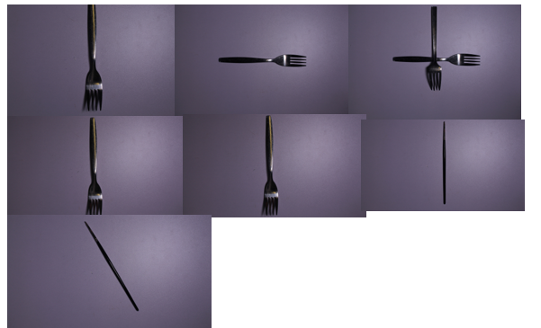
first photoshoot :

For this photoshoot I wanted to use inspiration from Walker Evans and how he photographs single objects using different lighting and shadows.

As you can see the quality of some of the photos are not the best but that is going to happen with every photoshoot. I changed the perspective of the photo after every few I took just to give some variation.

The lighting was also changed as well as lighting techniques to give different shadows and ‘feelings’ to each photo.

second photoshoot :

This photoshoot was not very successful. The lighting and angles were not good or flattering and the photo quality was a bit dodgy too.

With the last photo in the shoot I tried too change the lighting slightly to make the photo brighter and more clear but overall, the photos were not great.

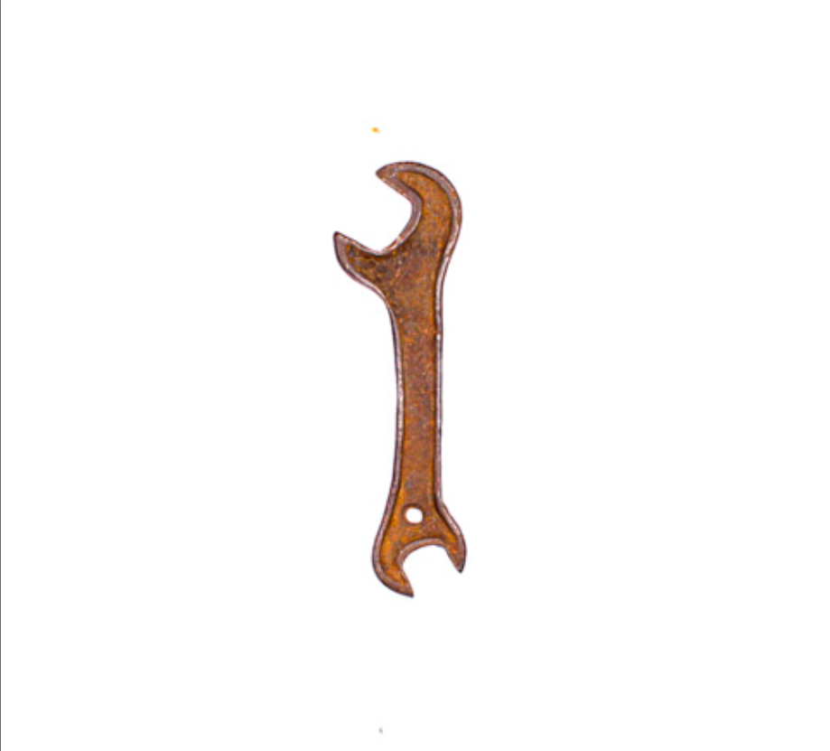
third photoshoot :

For this photoshoot, I managed to get the lighting a bit better and include in one of the photos, more then one object to give the photo dimension.

I like the shadows created and the almost glass like look to the metal that was created through the lighting. I focused again on the inspiration from Walker Evans for the single object photos, changing the perspective and placement of the objects.

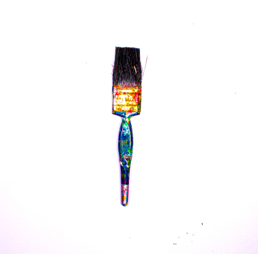
fourth photoshoot :

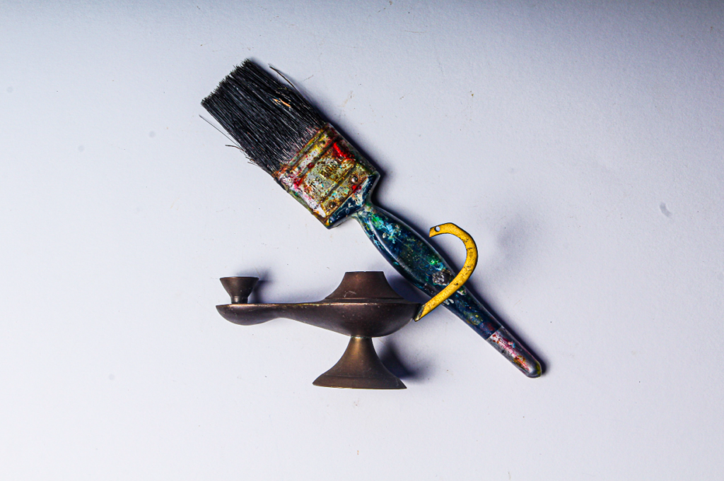
This final photoshoot was the most successful. The lighting was working perfectly for the type of photos I wanted and the two different backgrounds used gave a kind of contrast to the paintbrushes and other objects I used.

I used two different perspectives for this photoshoot:

  • birds eye view
  • free hand photo

The birds eye view was used with a set of equipment to hold the camera above to get a clear, stable photo, while the free hand photos are seen as more ‘ wobbly ‘ and ‘ unstable ‘.

The use of free hand doesn’t change the quality of the photos however if I used the equipment the photos would have been to a better standard.

My use of warm lighting accentuated the idea of the tools being worn down and obviously used.

Final Photographs

Tools

These are my best nine final photographs, after they have been taken in the studio and edited in Lightroom.

Mood Board

Conclusion

In conclusion these were my best nine photographs, because they were the brightest and were the most colourful, after I edited them. They were also all in focus and I was able to experiment with more than one object and single objects.