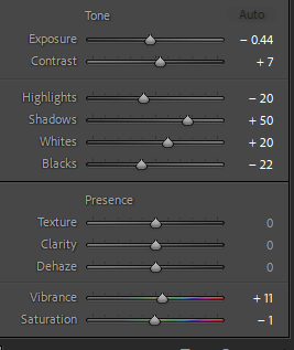
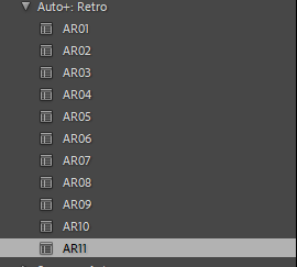
I started by looking at how different presets effect the photo. Presets are pre made sets of edits almost like a filter. Using them can be very beneficial as it allows for many edits to be put on one photo very quickly, it also allows for similar lighting and style of editing on a set of images or a singular shot. I used pre made presets as I hadn’t yet tried editing the shot myself, if I had I could have made my edits into a custom preset.
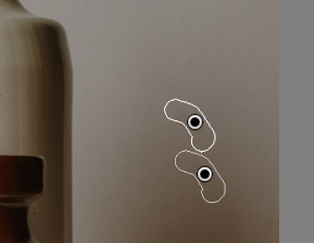
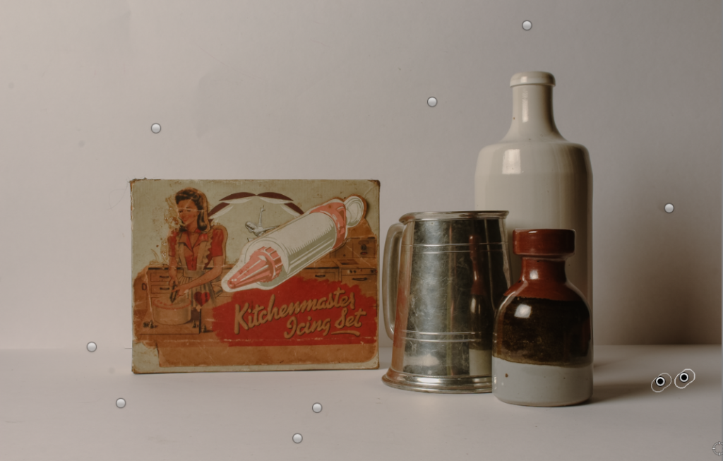
I then wanted to remove the small scuffs and marks from the background. To do this I used the spot heal tool on Lightroom and if something didn’t look right I would then correct it by moving the selection replace patch.
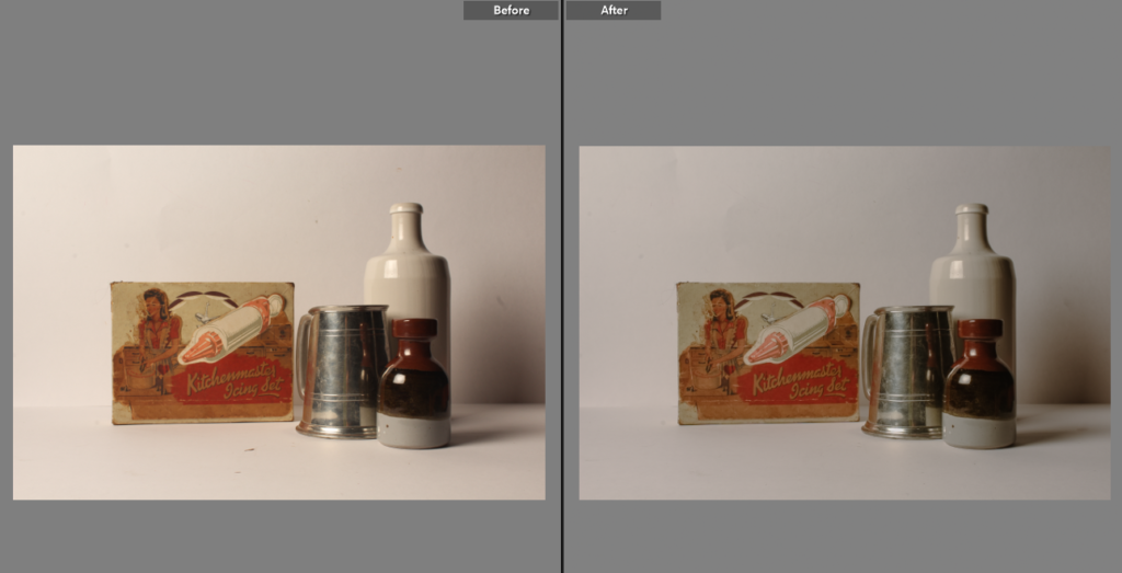
The final edit (as pictured above) doesn’t have a huge contrast in look than the before (the left picture above) but as you start to look at the shot in detail you can notice the small improvements like: there is no longer scuffs distracting and leading the view away from the objects, there is less yellowing on the icing set highlighting the details in the box while keeping the used look, the bottle is a brighter cream colour, truer to real life.
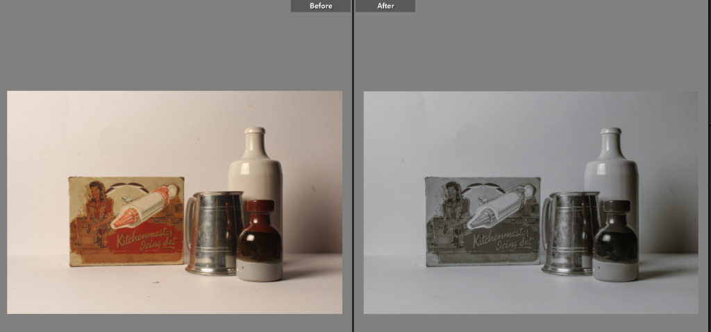
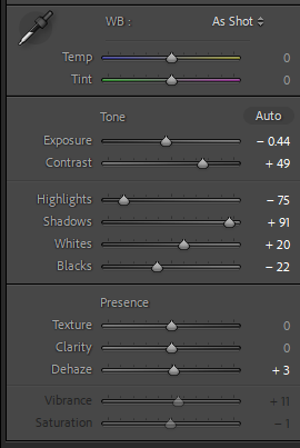
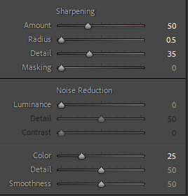
I was then curious as to how a black and white version might look as it is a great way of making photos feel more nostalgic and feel older. I used the black and white option in Lightroom and then compared the original shot and the black and white version. While I like the black and white version I then felt some of the lighting and colouring needed changing. To do this I increased the contrast to add to the definition of objects, I then furthered this by using the sharpening tool as well. By decreasing the highlights and increasing the shadows it allowed for more tone in the image making a successful black and white image.
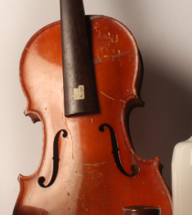
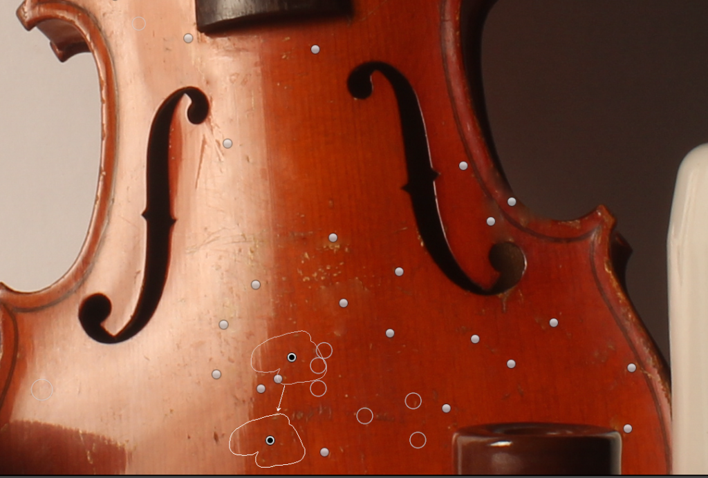
The next step was to remove all the scuffs on the violin as well as the yellowing sticker on the neck of the violin. I did this by using the spot heal tool to camouflage the replaced part with the actual parts of the photo.
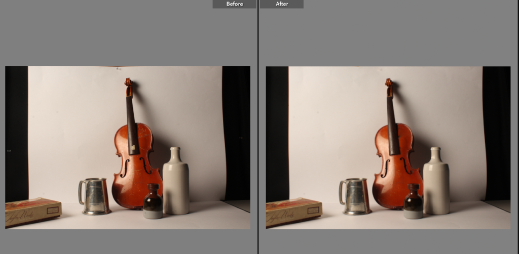
This is the before and after of the finished edit, I noticed the black parts of the background showing though takes away from the overall appearance of the photo as it quite distracting to the eye and takes the focus away from the subject in the photo.
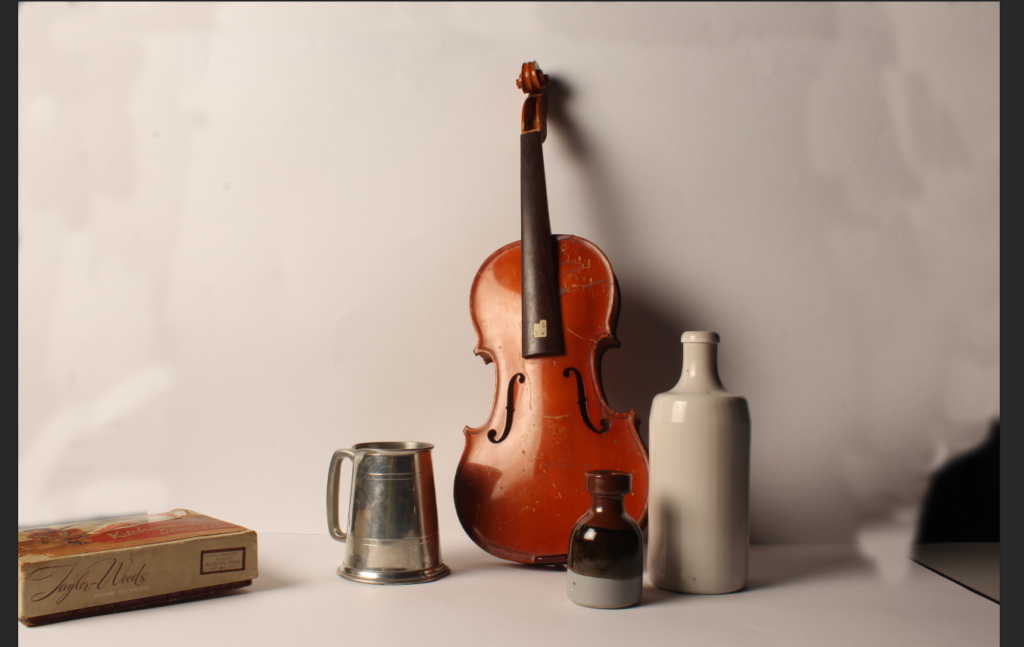
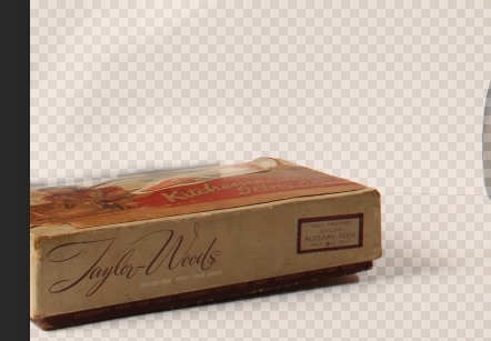
To amend the previously mentioned background showing I used the spot heal tool to attempt to cover up the black sections without cutting the box out of the photo as I think it adds depth and great lines in the shot. However it didn’t quite work as the spot healed background didn’t completely match the rest of the shot making the photo look messy.
Photoshop Editing of the same shot
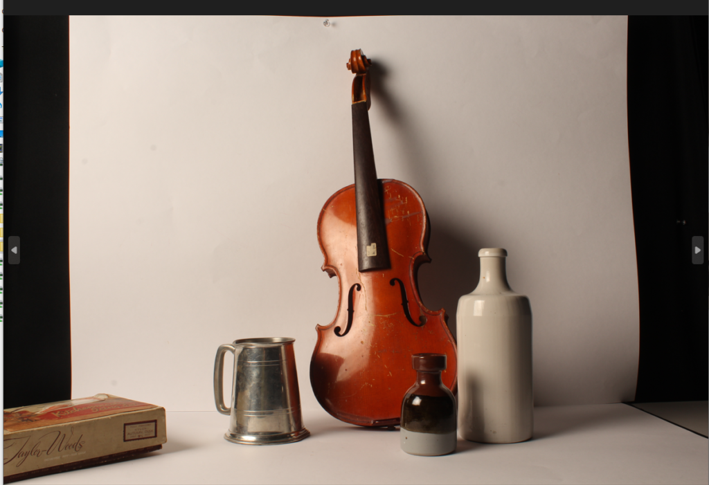
Although I have already edited this shot in Lightroom I felt photoshop could have a better effect on redoing the background.
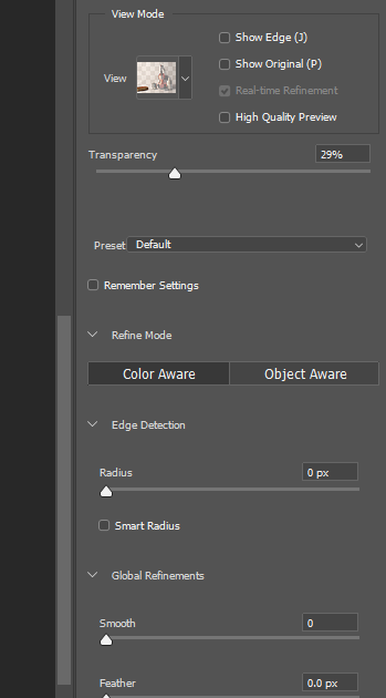
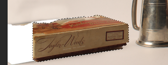
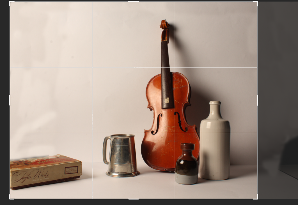
I started by selecting the edge of the box and moving it towards the mug. This allows me to remove additional blank space while still keeping the different depths in the photo.
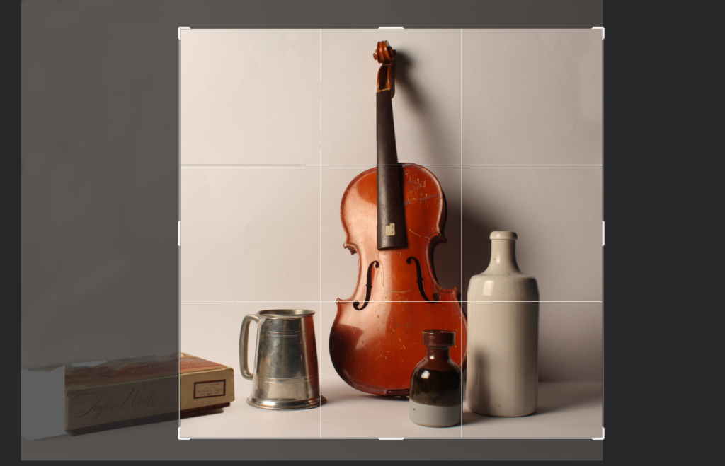
I then chose to crop the image, keeping the edge of the box in so it still added to the photo, drawing the viewers eye into the image with an additional leading line from an object that isn’t in direct, front on view in the shot. I also chose to crop the height and the side of the shot to keep it equal and make the shot feel more personal. This helps tell a story within the photo as it’s not just emphasising the objects as if it was it wouldn’t be over lapping or have some of the object cut out of the frame.

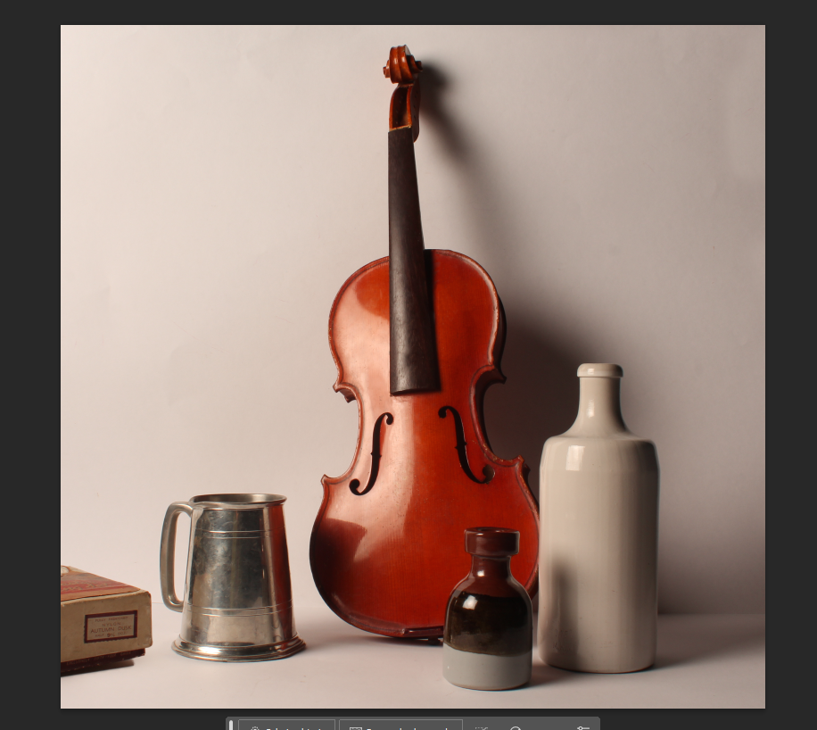
My last couple of alterations for this shot included, using the spot heal and clone tools to fill in scuff and remove marks on the image overall particularly on the violin. The editing actually made this photo look complete as before it looked very unfinished. I love how the shadows are only enhanced by editing adding, to the tone of the image. As this is a still life image, I focused on composing a story within the photo, to benefit this during the editing I fixed the background and left little room to be distracted when looking at the photo. Shape plays a big part in this image, making sure I used different shapes, some with smooth curving lines that lead around the image making it feel soft and almost safe like nostalgia does. To harsher more abrupt lines pointing to other elements in the photo. In general there is a smooth appearance to the objects, after editing and removing the scuffs, as our memory tends to manipulate smaller factors and seeing how scuffed something really is can make the photo look unappealing and take away from the image as a whole. Warm colours are focused on as the image as a whole and by using the ‘hue’ slider within photoshop I very slightly warmed the image while keeping the cool toned things like the metal tankard looking realistic. Depth within the image is always important during still life photos, to make sure the image didn’t appear flat I staggered the objects, I also took into consideration the size of each object putting the smaller ones at the front pulling the viewer to the back of the photo.
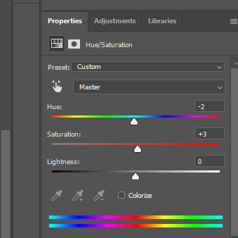
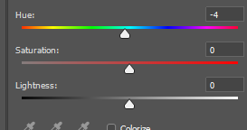
For this shot I felt it was rather flat as an image on the whole. before editing. To improve this I adjusted the hue to balance the image before then changing the image to black and white.


After making then image black and white I noticed that the bottle on the left had beleneded intot he background, to alter this I used the dodge and burn tool
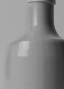
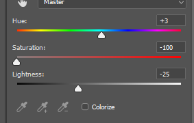
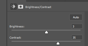
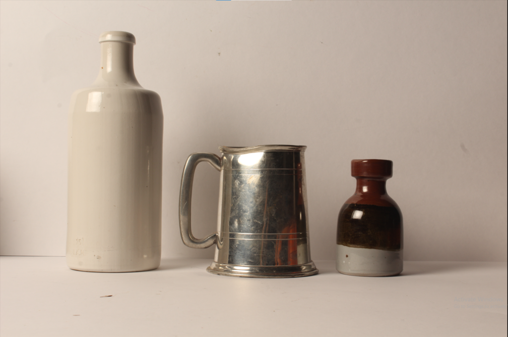
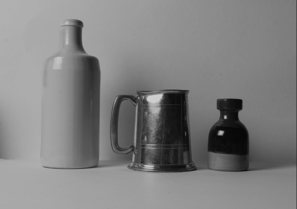
Before After
For this last shot I chose to turn the shot black and white to add different tonal elements and by also removing some of the blemishes on the sheet of paper used as a background adds a smoothness to the overall look of the final photo. I did this editing in Lightroom as I didn’t feel it needed further editing in photoshop and instead I wanted to look at the colouring and lighting of the shot which Lightroom is great for.
