Formalism

There are 7 basic elements to photographic art, they are:

1.Line

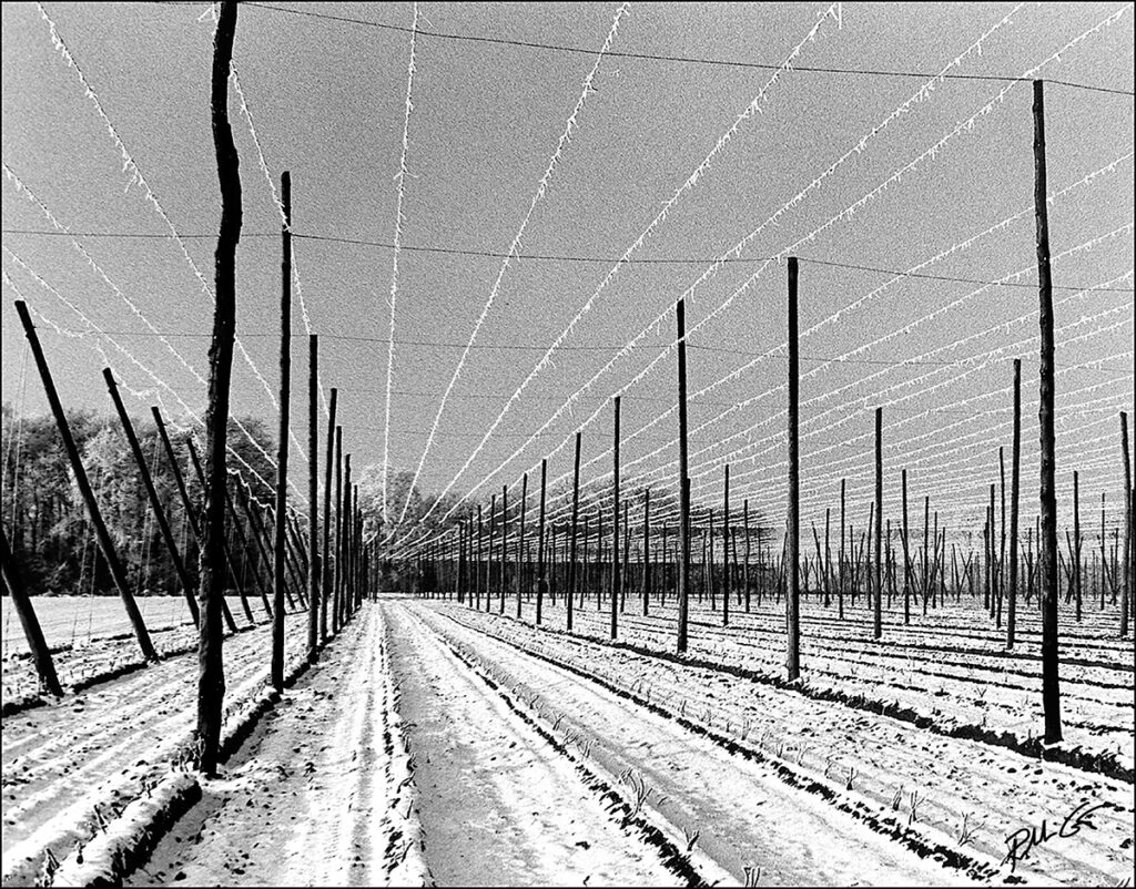
Lines in photography can be either curved, straight or both. Solid, dashed of part of a line. Vertical or horizontal. In photographs, when the viewer notices straight lines, it is not uncommon for the object to be manmade. however, curved lines would more likely be organic in nature. the direction of lines convey meaning inside the photograph. vertical or horizontal lines are seen to create a sense of stability. Vertical lines usually represent height, whereas horizontal would focus more in distance. Lines are very common in almost every photograph. Lines could be used to make the viewer focus on something the photographer wants them to see, the pathway of the line will lead the viewers eyes.
2. Shape

1 a : the visible makeup characteristic of a particular item or kind of item

1 b (1) : spatial form or contour

1 b (2) : a standard or universally recognized spatial form

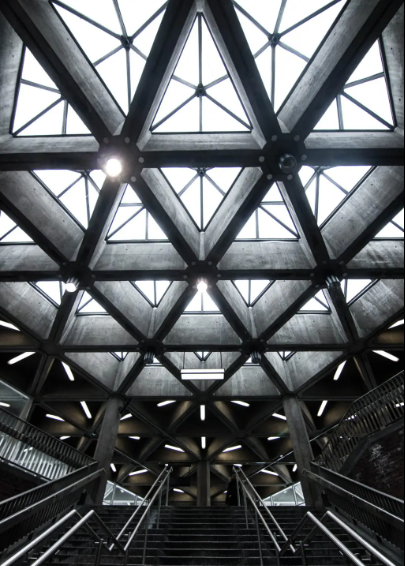
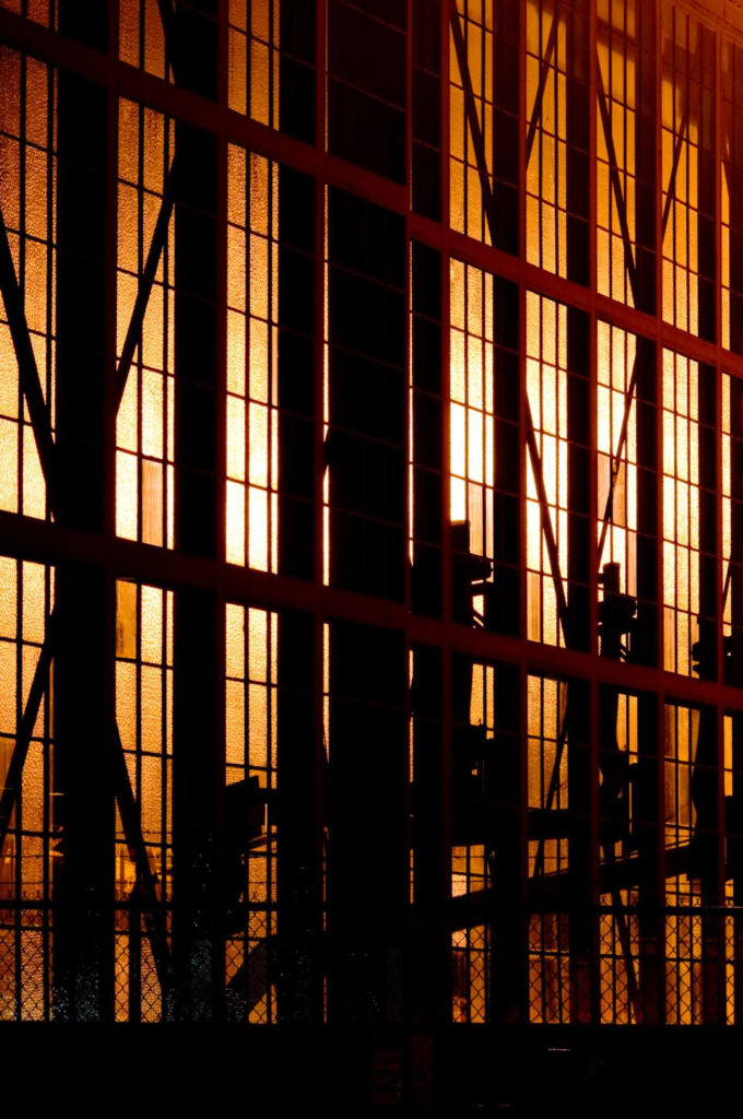
Shapes are created by the joining of lines. these lines can usual shapes such as a simple circle or shapes but can also make unrecognisable ones based on the photographers viewpoint. in photographs with shapes it may be important to the photographer to take it from different angles as different angles could be completely different shapes. shapes can be created with things such as the structures of buildings but as well as this, the black space surrounding the structures also has its own space. This shows that shapes are everywhere in photography.
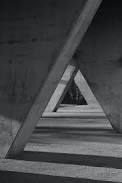
3. Form

unlike shape, form is 3-dimensional and it can be geometric (or regular) and organic. geometric forms are the the familiar shapes we know. organic are objects that surround us in our 3-dimensional world. forms can be complex like shapes. in photography, positive and negative forms of space are created. positive space is what is occupied by forms and negative space is what remains. Forms are everywhere in photography as the photograph captures all the forms in the field of view of the lens.
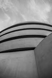
4. Texture

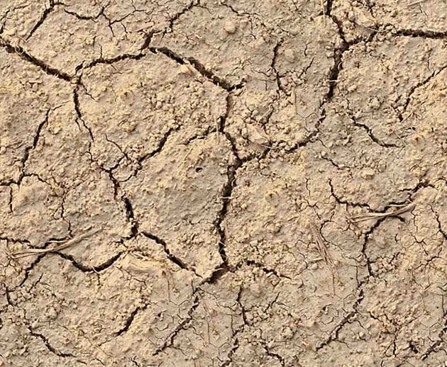
Texture can be felt with physical touch of the photo print or even just with the viewers eye. basically, texture can be smooth or rough as well as other descriptions. we can make our the feeling if photographs by our own experiences. for example, if someone has never touched gravel/stones then they are not going to be able to easily feel what that photo of a rough gravel path as well as someone who has.

5. Colour

Red, brown, pink or grey can be viewed as a phenomenon of light or visual perception that a person will have top differentiate otherwise identical objects. light has no per4cieved colour but it moments when light is send through water, it will create a rainbow effect of colours (like the sun at a water fountain for example).

The three properties of colour are Hue (description of the colour), Value (relative brightness or darkness of colour) and Saturation (intensity of colour). many colours have meanings, for example, Red can mean anger whereas blue can represent calm. colour can also bring across feelings of happiness. you would get a more brighter and happier feeling if you saw a field with bright yellow flowers rather than a black ands white photo of the flowers.
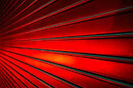
6. Size

if a familiar object is the main focus of a photo (meaning its the largest aspect of it and most likely what your eye catches first) then you are more likely going to be more interested in that photo rather than one that is difficult to find something you are familiar with. a camera lens can created the illusion of an object being larger than it actually is.

If the object takes up most of the frame then the viewer will assume its the largest aspect of the image. however, the photographer could have simply made that object closer to the lens or only zoomed up on that object.

7. Depth

in a usual photograph, we are given a sense of depth due to the visual cues. an image will always have depth (unless its a black smooth wall). but the amount of depth in your photo depends on the objects in your photograph. in most photos you will find there’s a foreground, middle ground, and background. the stronger the delineation between those three, the stronger the sense of depth is in your image. in a two dimensional photograph, depth is created by the use of linear perspective where we follow the distance of, for example a road, and perceive that its actually getting deeper in the photo.

Formalism

What is formalism?

Formalism describes the critical position that the most important aspect of a work of art is its form – the way it is made and its purely visual aspects – rather than its narrative content or its relationship to the visible world.

Lines

Lines in photography are extremely important. A good arrangement of lines are able to lead the viewers eyes to certain areas of the image. However a poorly arrangement of lines could guide the viewers eyes away from the main subject of the photo.

As you can see this image has lines due to the train tracks which causes your eyes to be led towards the middle of the photo. This also adds depth.

Depth

Depth in photography in simpler terms means how much of your image is in focus. In more complicated terms it is the distance in a photo where the subject appears.

The depth in these photos gives the photos dimension. It also causes your eyes to be drawn to the object that is in focus for example the leaf and the daisies.

Shape

Shape photography is the two-dimensional appearance of objects as your camera captures them. For instance, if you look at an image of a ball, you’ll find its shape as a circle. Likewise, if you look at a picture of a cube-shaped suitcase, you’ll find its shape like a square.

In a photograph, a silhouette is the purest essence of a shape, they have no form, texture, or colour. Due to its stark contrast with its surroundings, a silhouette is also the most visually obvious.

The photo above is an example of a silhouette.

Form

There are two types of form:

Geometric form in photography focuses on the geometric lines, shapes, and patterns that exist in the world. While geometric images are often found in architectural photography, the subject matter can be anything from vast cityscapes to patterns in nature.

Organic photography includes shapes which are full of curves and may not be geometrically perfect. They’re natural and non-uniform. We find organic shapes in nature. For example, you’ll find them in the curve of a tree branch or the shape of a flower petal.

Texture

Texture in “real life” can be, basically, smooth or rough. We can use other descriptors as well such as slimy, wet, hard, soft, bumpy, shiny, etc. Texture in photography is similar to form in that it is revealed by variations in tonality and presented in two dimensions.

In photography things such as patterns can give texture to an image, for example scales. The physical print of a photo also has its own texture such as glossy and matte.

Colour

Color in photography composition is one of the main tools a photographer can use to create mood in their images. How you combine various colours or exclude them from your photographs influences how people might feel when they look at them. This is why understanding colour in photography is so important.

Warm colours:

In photography, the dominant colours are the warm colours, such as red, yellow, and orange. These colours are considered dominant because they reach our eyes before the cooler colours.

Cool colours:

The cooler colours are the receding colours, e.g. blue, green and purple.

Size

Size in photography describes the physical magnitude, extent, or bulk of the contents in the photo. Size in a photograph is relative and can be an illusion. When a familiar object appears in the frame of a photograph for example a car, basketball, streetlamp. We immediately get a feel for the scope of the entire scene. Without a familiar object in the image, we struggle to determine the scale shown in the photograph.

Camera Simulator

My shutter speed for this photo is fast so it makes it look like the propeller is not moving, if I wanted the viewer to know that this way a moving plane then I would decrease t6he speed of the shutter speed. I have a shallow depth of field so the plane/ a few of the marbles are clear to see whereas everything else in blurry. 

In this attempt, my photo is very underexposed which means it does not have enough light. I know that to fix this I should increase my IOS 

(A few other attempts)

Image making, selection and editing…prompts and evidence

Studio set-up and Lighting arrangements

1,2,3 point lighting

Flash setting

Static / continuous lighting

Copy-stand

Infinity Screen

Coloured gels / filters

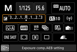
Camera settings + exposure values

Focal Length

Aperture

Shutter Speed

ISO

White Balance

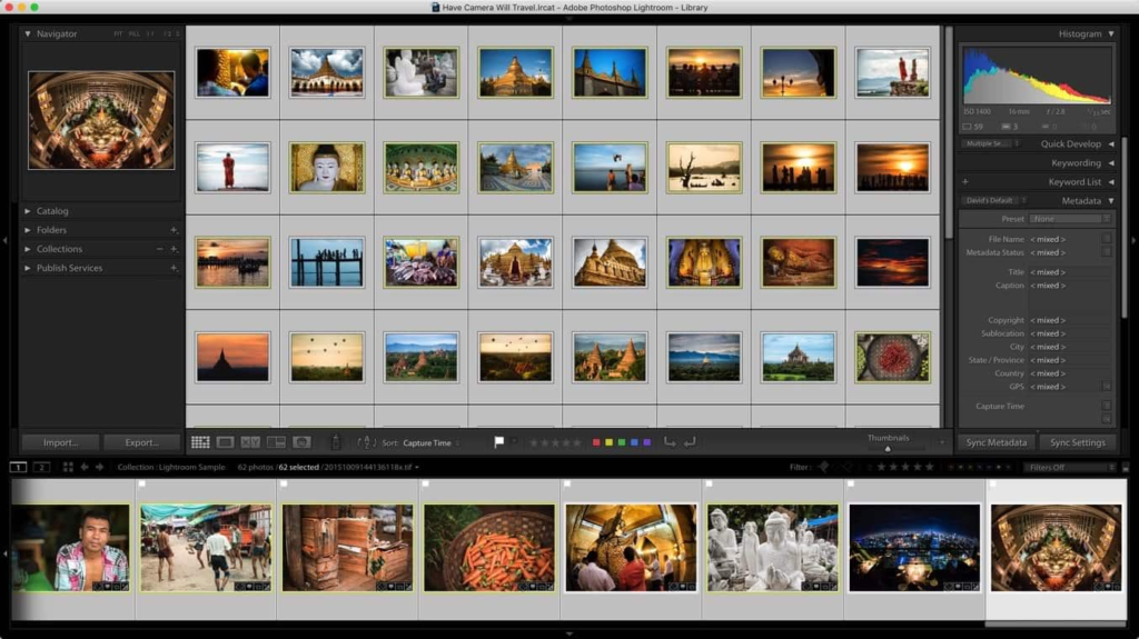
Adobe Lightroom Library Mode Contact Sheet and Selections

P + X (select + discard)

Star Rating

Colour Rating

Generic editing / batch editing

Adobe Lightroom Develop Mode Deeper Editing and Image Enhancement

Before and after image comparison

Exposure values (dark – light) over, under, balanced

Colour adjusments

Saturation

Tone

Contrast

Cropping

Pre-sets and filters

Still Life photoshoots –

first photoshoot:

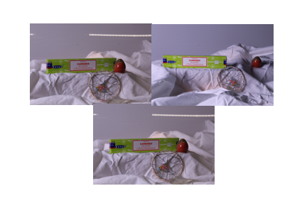
This was the first photoshoot I’ve done and I tried to vary the lighting so they would be somewhat different to each other.

I brought in some objects that reminded me of the theme of nostalgia such as the incense and dream catcher which remind me a lot of my childhood because I always had incense burning in my house and constantly had dreamcatchers above my bed.

second photoshoot :

For my second photoshoot I wanted to focus a lot more on the theme of nostalgia and use the lighting techniques and ideas talked about in lesson.

I took a considerably more photos then the first shoot to give myself more options to edit because with the first shoot I only had 3 photos to choose from. I took some photos using the tripod and some others by hand to get different angles and options.

third and final photoshoot :

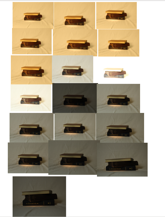
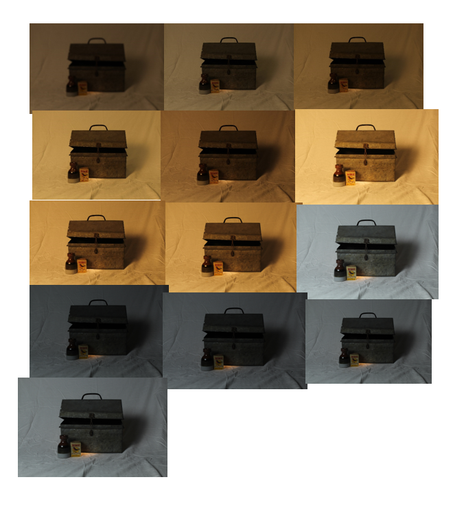
This photoshoot I would say is my best one, because it has multiple different colour lighting used from warm light to colder light because I wanted to see what kind of light would look better for the silver box in the photo.

I also had the warm spotlight in the cold lighted photos to give some contrast in the lighting. I also changed the ISO on the camera too, so that I could see what kind of light I needed to produce the most impressive photos.

The Formal Elements

By Yann Lock-Livramento

Line

Line is a key part of photography as it can be used to add depth or as leading lines which help point to the subject of a photo. Or to connect points in an image.

There are many different types of lines such as curved, dashed, zigzagging or straight lines.

Direction is also important as the lines could be horizontal, vertical or diagonal.

Converging lines are two lines that meet at a point to give an image depth and Diverging lines move further away from a point.

Shape

When multiple lines connect together it can create a shape.

shape is photography are usually 2 dimensional.

Shapes can be Geometric or Organic with geometric shapes being basic shapes such as: squares, rectangles and triangles. Organic shapes are more natural and can be outlines of objects like a leaf or an animal.

Shapes are usually defined by lines in a photo but they can defined by areas which are brighter or darker or by different colours in in a photo.

Form

Form is 3 Dimensional compared to Shape which is 2 dimensional.

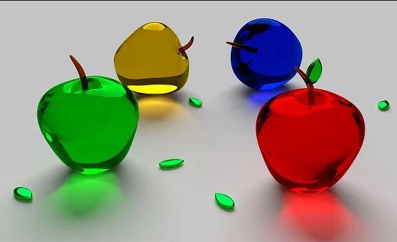
The different shades of colour on the apples create depth and the shadows gives us the impression that the apples on the left are 3D.

Like with shape there are two types of form Geometric and Organic with geometric being Cubes and Cones or any 3D shape.

Texture

Texture could refer to the texture of the objects in the photo and could be indicated by the pattern of the object.

Texture gives the objects in the photo more detail and can change the way we perceive something in the photo.
You could describe the textures as being: Rough, Soft, Smooth, Bumpy, Dry, Wet, Shiny.

Colour

Colour can be due to the colour of the objects being photographed or the lighting in a photo.
The properties of colour:

  • Hue which is the colour e.g. red
  • Value which is how bright/ dark the colour is
  • Saturation is how intense/pure the colour is

The photo on the left uses saturated pinks, purples and yellows/oranges to make the sunset seem beautiful and vibrant.

Colours can also be harmonic which means they compliment each other (go well together) and can be used to affect the mood of a photo.

Size

Size really does matter when it comes to photography as larger objects can draw the readers attention and smaller objects are good for adding more detail to a photo.

Size is good as it adds scale to a photo so you can determine how big the subject in a photo is. In the image on the left the tree shows that the sand dune is really big as it gives scale.

Size can also be used as an illusion as you can take photos in angles which make objects look bigger or smaller then they actually are.

Distance from an object can also affect how big the object looks in a photo as they closer you are to what your photographing can make the object seem bigger and vice versa. Size can be described as being Big/Large, medium and Small.

Depth

Because photos are 2 Dimensional Depth is what makes objects in photos look 3D

Photos Usually have 3 types of depth: Foreground, Middle ground and Background. Having your objects/ subject in any of these grounds will give it a sense of depth

Converging and Diverging lines give the image a linear perspective which is also a good way to give the illusion of depth to an image.

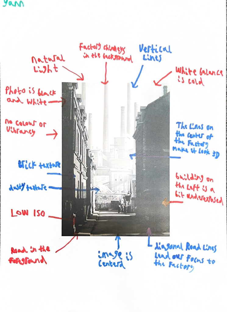
Analysing using the formal elements

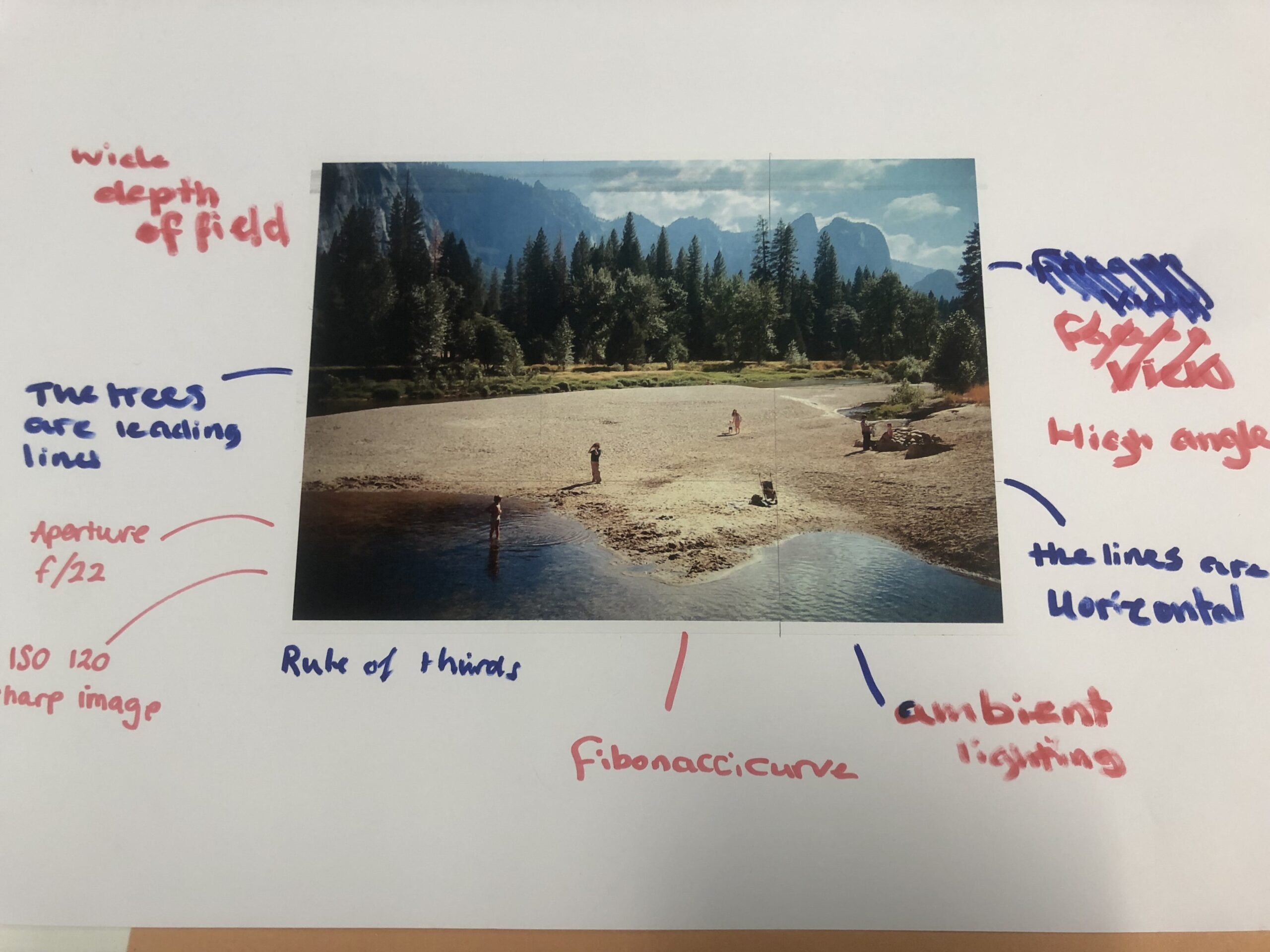
I analysed a photo using the formal elements to apply my knowledge and try it out.

Still Life

Definition

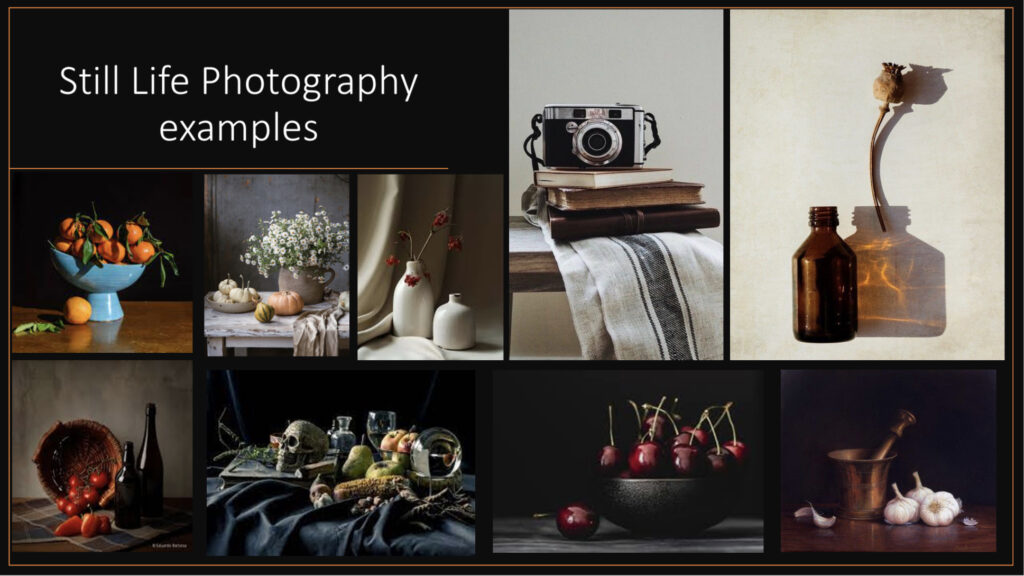
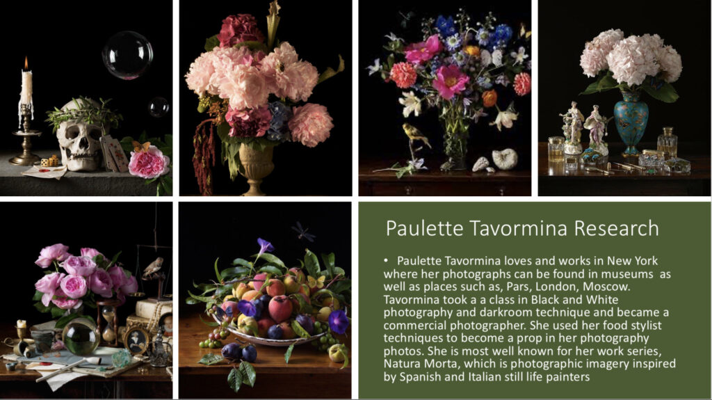
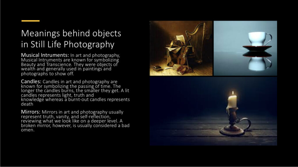
 Traditionally, still life is a collection of inanimate objects arranged as the subject of a composition. Nowadays, a still life can be anything from your latest Instagram latte art to a vase of tulips styled like a Dutch Golden Age painting. It is a tradition full of lavish, exotic and sometimes dark arrangements, rich with symbolic depth and meaning.  Many of the objects depicted in these early works are symbolic of religion and morality reflecting on the increasing urbanization of Dutch and Flemish society, which brought with it an emphasis on the home and personal possessions, commerce and trade. Paintings depicting burnt candles, human skulls, dying flowers, fruits and vegetables, broken chalices, jewellery, crowns, watches, mirrors, bottles, glasses, vases etc are symbolic of the transience and brevity of human life, power, beauty and wealth, as well as of the insignificance of all material things and achievements.

Where did it come from?

Still life derives from the Dutch word stilleven, coined in the 17th century when paintings of objects enjoyed immense popularity throughout Europe. The energy for this term came as artists created compositions of greater complexity, bringing together a wider variety of objects to communicate allegorical meanings.

A new Medium

Still life was mainly featured in the experiments of photography inventors Jacques-Louis-Mandé Daguerre and William Henry Fox Talbot, as far back as the 1830s. They did this for practical reasons, because the exceptionally long exposure times of their processes prevented the use of living models.

Symbolism and Metaphors

A vanitas is a symbolic work of art showing the transience of life, the futility of pleasure, and the certainty of death, often contrasting symbols of wealth and symbols of ephemerality and death.

The term originally comes from the opening lines of the Book of Ecclesiastes in the Bible- ‘Vanity of vanities, saith the Preacher, vanity of vanities, all is vanity.’

Vanitas are closely related to ‘memento mori’ still lifes which are artworks that remind the viewer of the shortness and fragility of life. Memento mori is a Latin phrase meaning ‘remember you must die.’ These include symbols such as skulls and extinguished candles. However, vanitas still-lifes also include other symbols such as musical instruments, wine and books to remind us explicitly of the vanity, in the sense of worthlessness, of worldly pleasures and goods.

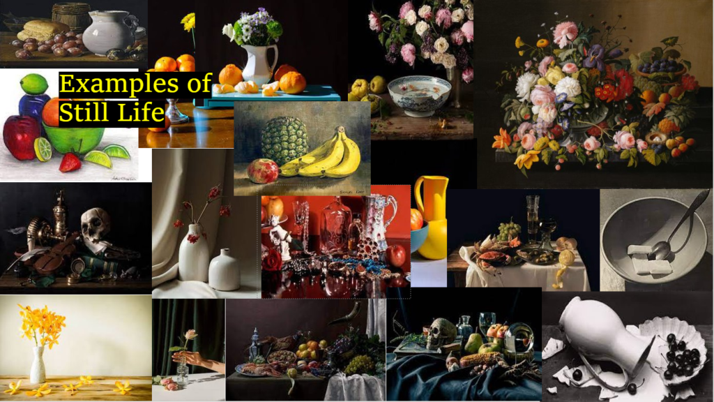
Examples of Still Life

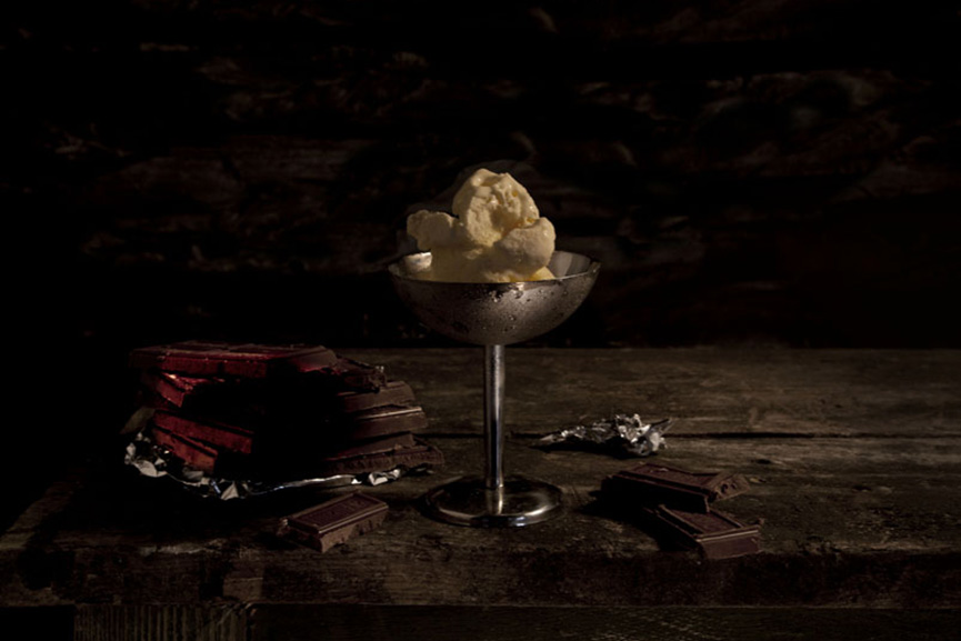
This photograph, which was taken by Matt Collishaw uses the old technique combined with modern-ages ideas. This photograph is his ‘Last meal on death row series of works.’ This appears as a meticulously arranged staged photograph of still life of food, but each image is actually based on death row inmates’ last meals before they are executed. This photo delivers a strong dramatic effect through an excellent use of chiaroscuro.
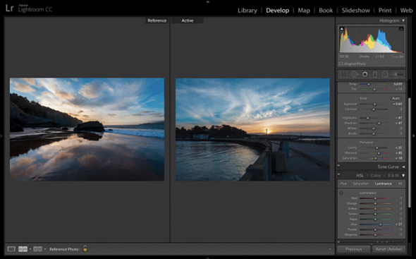
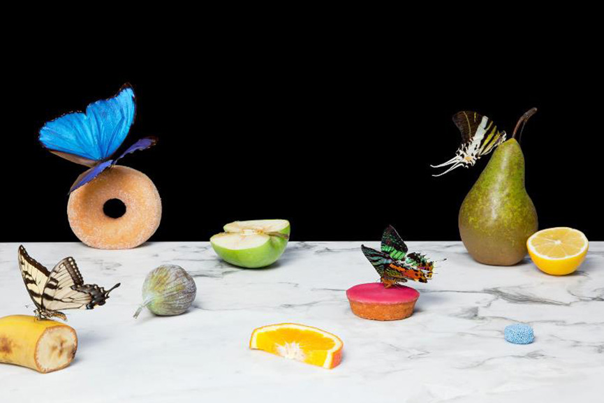
Dutch photographer Krista van der Niet, whose compositions often include fruits and vegetables mixed with mundane objects such as socks, cloths and aluminium foil, giving it all a contemporary feel. Her photos often carry a feel of satire as well, which references consumerism and popular culture through a clever use of objects within a carefully composed scenery.
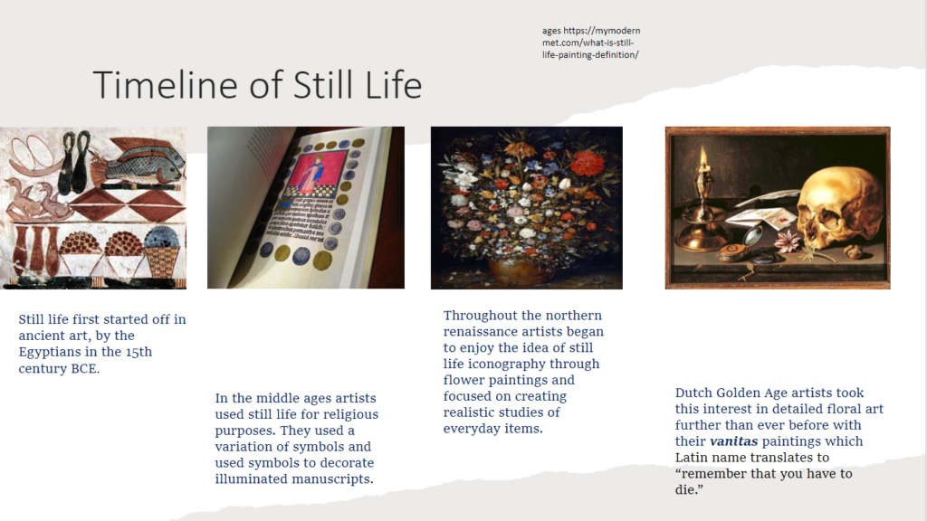
Still Life Timeline

  1. Still life art has existed from the 17th century until the modern day, but in the 19th century , artists adopted photography as a new medium.
  2. Jacques-Louis Mande Daguerre and William Henry Fox Talbot were some of the first photographers to take still life photos in the 1830s.
  3. Still life photography followed the same past of using nature Morte, which was dead nature and produced many classical works. Photography even recorded the dead as a reminder of death and mortality.
  4. Today, photographers produce still life in various ways. It could be things like flower arrangements, old and found objects, food etc.