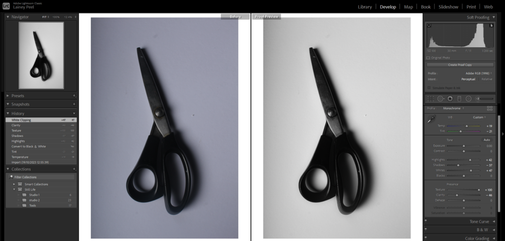
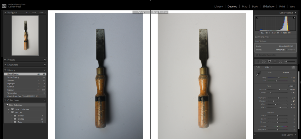
My Response to Still Life

I have taken photos for Still Life under the theme of Nostalgia. To do this, I collected some old objects from when I was younger and arranged them in multiple ways.

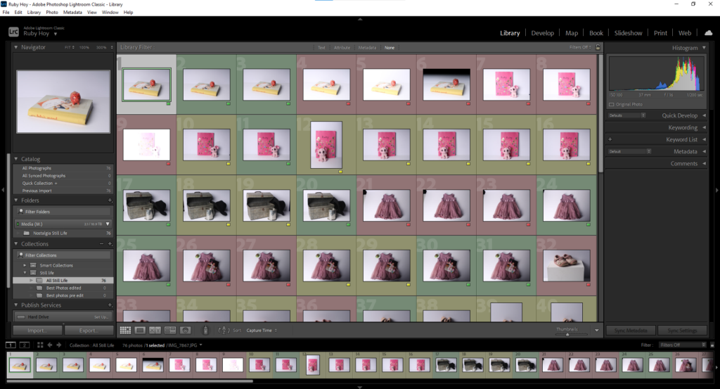
Lightroom

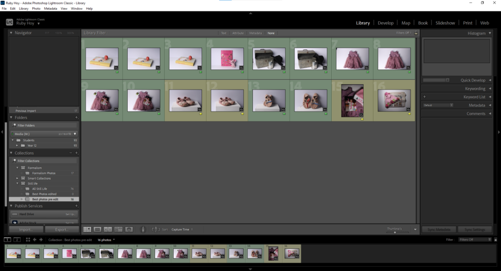
This is my Adobe Lightroom Classic setup, I uploaded my photos and made a folder for them then arranged them by colour coding them. Green being good, yellow alright and red bad.
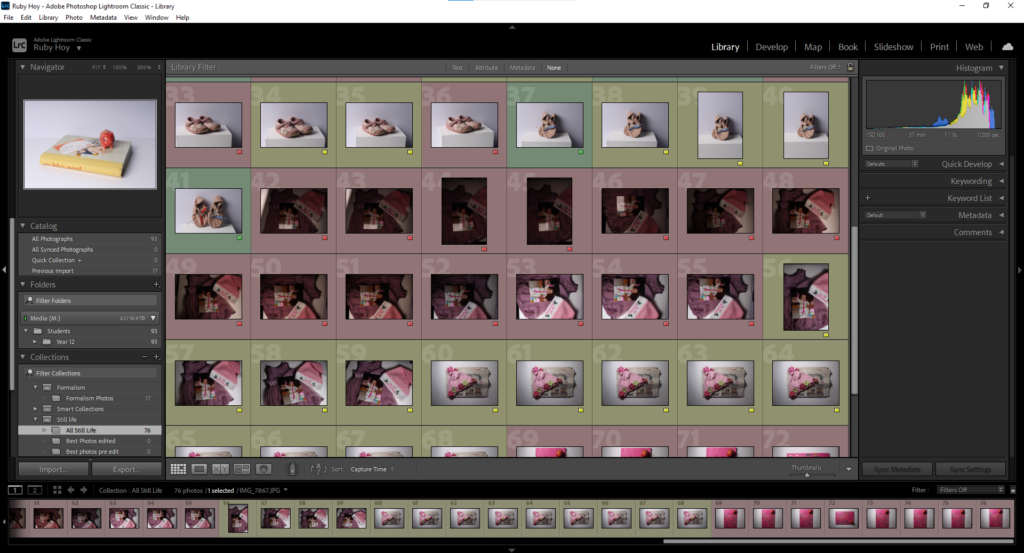
This is the folder I created showing my best Still Life Photos before editing:
Camera Settings

When taking the photos I made sure that the image had a good exposure by lowering the ISO and increasing the shutter speed when taking photos in a bright environment. I also made sure that the image was focussed, switching between both manual and auto focus. I took the photos with a low aperture as only a low depth of field was needed due to the objects being close to the lense.

Editing process

Edit 1

To edit this photo, firstly, I cropped it then decreased the exposure, contrast and whites. This made the image less vibrant, therefore I increased the saturation because, to me, nostalgia is colourful and not dull, therefore I want my image to reflect that.

My intention for this image was to show the early events of my life as the baby journal is a record of my first experiences, such as my first step or my first smile, the pig is from the first time I ever went pottery painting and the ticket is from the first show I ever went to. I could improve this photo by making the background more white as, due to the decrease in exposure, it has become greyish blue.

Edit 2

To edit this photo, I began my cropping it then using the adjustment brush tool to balance out the background by changing the exposure in different areas. I then decreased the overall exposure and used the adjustment brush over the dress to increase the exposure and saturation. I also decreased the contrast .
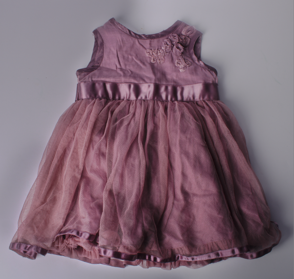
This is a photo of my first ever dress. I had no intention for this photograph, I just thought I would be effective. I think this image links to nostalgia as the subject of the photograph is an outfit which holds many memories from when I was a baby.

Edit 3

To edit this photo, I started off by cropping it then I increased the texture and made slight adjustments to the whites and vibrancy. I decided to leave the exposure as it was as I believe that the photograph already has good exposure.

My intention for this photo was to arrange my nostalgic objects in a way similar to Still Life Paintings, where artists gathered various objects, often fruit and arranged them to paint. This image links to nostalgia because it includes many objects from when I was a baby which all have significant meaning to me.

Edit 4
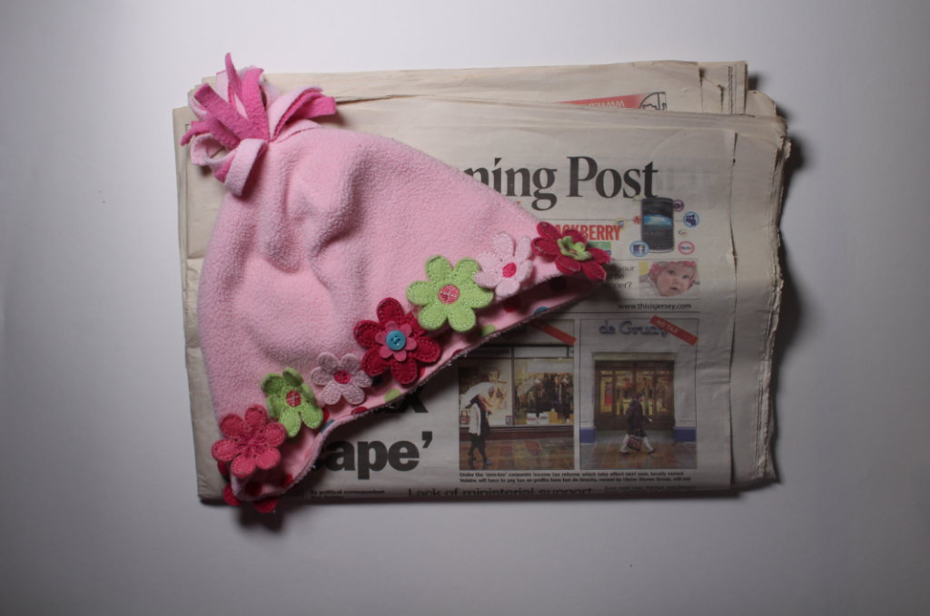
To edit this photo, I rotated in to make the newspaper straighter then increased shadows, whites and texture. Once completed, I cropped the edges of the image as I wasn’t satisfied.
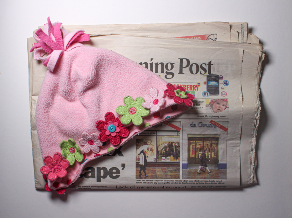
My intention for this photo was to make the bottom of the hat lead your eye towards the small image on the newspaper, which was a photo of me as a baby wearing the same hat.

Edit 5

For this edit, firstly, I cropped the top of the photograph as you could see the edge of the table. Next, I used the brush adjustment tool to increase the exposure at top of the image because I believe it was too dark. Finally, I finished off by increasing the texture and clarity of the entire photo.

My intention for this image was to represent my first Christmas. I did this by gathering objects such as the dress I wore later on that day, my 1st Christmas hat and a photo of me on that day.

Edit 6
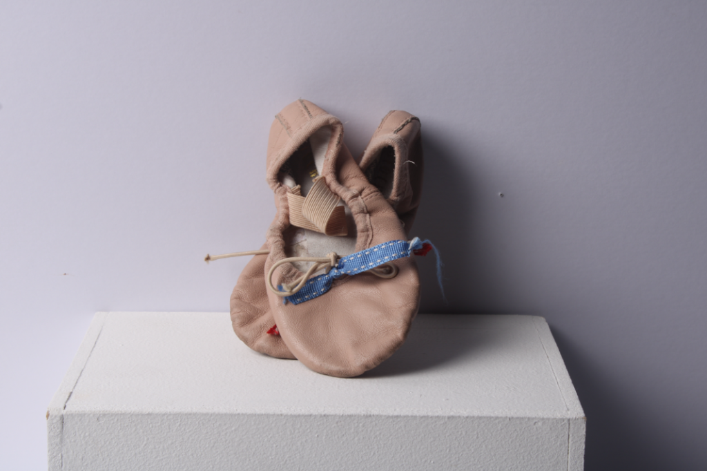
For this edit, firstly, I rotated and cropped the photograph. Then, I decreased the contrast because I think that it was a bit too dark. Lastly, I increased highlights, texture and clarity to make the ballet shoes a lighter colour. This makes the photo more nostalgic rather than sombre.
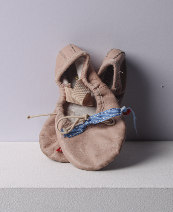
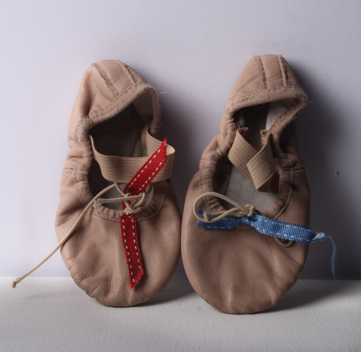
Both this image and the one below had no intention, however I think that they relate to nostalgia as they are my first ever ballet shoes and I used to love ballet. I personally think that these are effective images as these shoes hold many memories to me. For example, when we would do little shows in our classes for our parents and when I used to dance around the house wearing them.

Edit 7

I edited this photo by, firstly, cropping it. Then, I used the brush tool to balance out the exposure of the bottom of the image. After that, I slightly adjusted the overall clarity and, lastly, used the brush tool to increase the exposure of the background.
Final Images

Image diagnosis of my own image

This is my personal favourite of my images. This image looks to be in focus, possibly indicating that it was taken with a normal depth of field as the objects aren’t very far from the camera lense and all of them are in focus, as well as the background. This photo was taken using a softbox that’s triggered by the push of the shutter button on the camera. You can tell by the shadows that the softbox was to the left of the objects. Perhaps, the lighting would have been more effective if it were straight on to the objects so that there would be no shadows. I would say that this image has an unbalanced exposure due to the shadows and how the image looks darker from left to right. I used a low ISO for this photo and high shutter speed to make the image clear and not too over-exposured. The image has a slight tint off yellow, giving off the effect that it was taken within tungsten lighting. In conclusion, this photo could be improved by positioning the softbox straight on to the objects.

Formalism

Formalism is the structure in a photograph. There are seven basic elements in formalism.

Lines – Lines are either straight, curved or a combination of the two. They can also be solid, dashed, interrupted, implied, or psychological. Horizontal lines can indicate distance and vertical lines can indicate height, balance, strength. Diagonal lines convey a more dynamic scene.

Shape – When a line connects to other lines it creates a shape. Shapes are two-dimensional. They can be measured by overall height and width. Shapes are defined by their value e.g. brighter or darker than their surroundings, differences in colour, texture and patterns. There are two different kind of shapes, geometric (circle, square) or organic (tree, bird)

Form – Form takes shape from the two-dimensional and brings it into the three-dimensional, form has overall height, width and depth. there are two different kinds of forms, geometric (sphere, cube) or organic (surroundings). The photograph shows form by capturing the spectrum of tonality from highlights, through the midtones, and into the core shadow on any object.

Texture – texture can be felt with both touch and virtually. Texture in “real life” can be smooth or rough. Other descriptions can be slimy, wet, hard, soft, bumpy, shiny, etc. In a photograph, smooth objects might have reflections or specular highlights. Rough objects might have aggressive areas of light and shadow without reflections.

Colour – Light itself has no perceived colour. But, send light through a prism or a drop of water and we can see that it is comprised of a literal rainbow of colours. Colour has three properties: hue, value, and saturation. Bold and bright colours are known for grabbing our eye. Harmonic colours are colours that compliment each other.

Size – Size in a photograph is relative and can be an illusion. The camera, lens, and print can render large objects small, or small objects large. Even objects familiar to our eyes can be rendered relatively large in a photograph, while things we know to be enormous are rendered small.

Depth – This perception of three-dimensional space is what our eyes experience whenever they are open, and that is what our eyes try to experience when looking at a photograph. Depending on the quality of the surrounding air or atmosphere, distant objects in a photograph will have less clarity and contrast than objects in the foreground. This Ariel perspective is indicative of depth in a photograph.

Formalism

There are seven basic elements to photographic art in formalism. Formalism is that photographers have to impose order, bring structure to what they photograph. ” A photograph without structure is like a sentence without grammar.”

These formal and visual elements (such as line, shape, repetition, rhythm, balance etc.) are shared with other works of art. But photographs also have a specific grammar – flatness, frame, time, focus etc. 

The seven basic elements of formalism are:

Line – line is one of the most important elements considered in photography, as they guide the eye around the image. improper arrangement of lines can take away the strength of the subject matter of the photo. Lines are either straight, curved, or a combination of the two. Lines can be solid, dashed or interrupted, implied, or psychological. They can be vertical, horizontal, or somewhere in-between.

Shape – shape in photography is the 2D appearance of objects captured by the camera. Shape can be highly influenced by the lighting of your photo: by taking a photo where the shape is emphasised, place the lighting either directly in front or behind the object. There are two basic types of shapes: geometric (or regular) and organic.

Form – form refers to when shape takes on 3D. Form is created by shadows and highlights on an object in the photograph. Form is very important, because without the 3d effect, most images can look flat and dull.

Texture – texture in photography refers to the visual quality of the surface of an object, revealed through a variety of colour, tone and depth. texture brings life and vibrancy to images which would otherwise appear uninspiring and perhaps boring.

Colour – colour is one of the main compositions a photographer can use in their images, as other elements such as tone and mood are dependent on it. How a photographer combines various colours in their work has an influence on how the viewer looks at the image, and how they evoke emotion.

Size – size in photography is the term given to describe the height and width of an image, although it can be manipulated by the camera. Larger camera sensors gather more light, which is excellent for low light photography.

Depth – simply, depth of field in photography is how much your image is in focus. It is the photographers job to tell a story through their images, so how the image is focused is important for the photographer to consider. If an object is close to the camera and is in focus, the photographer is telling the viewer where to look.

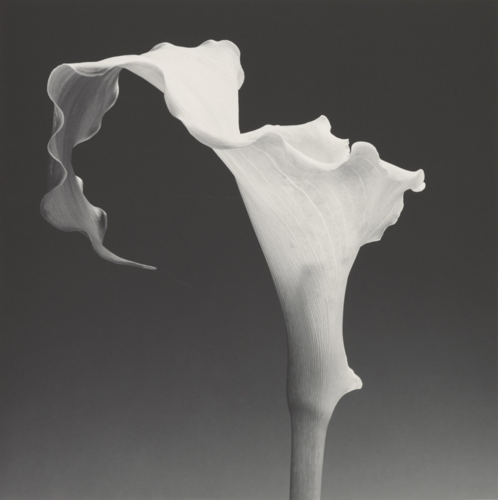
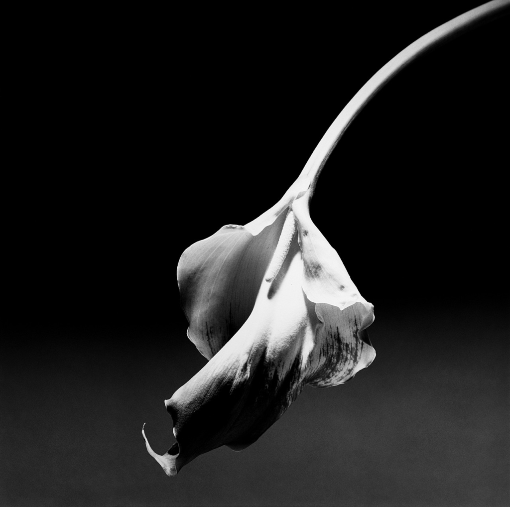
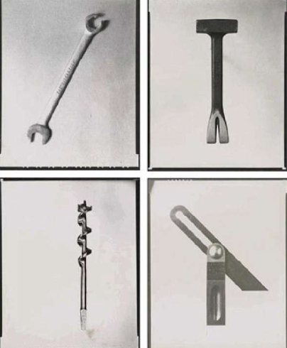
Examples of Formalism:

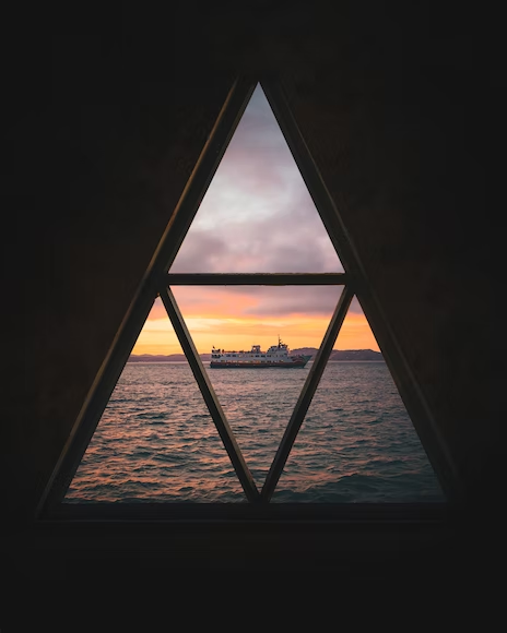
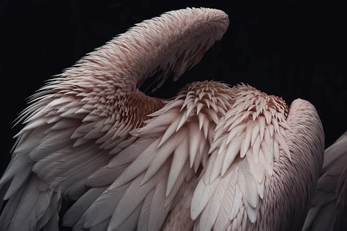
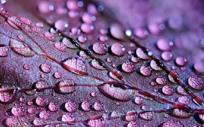
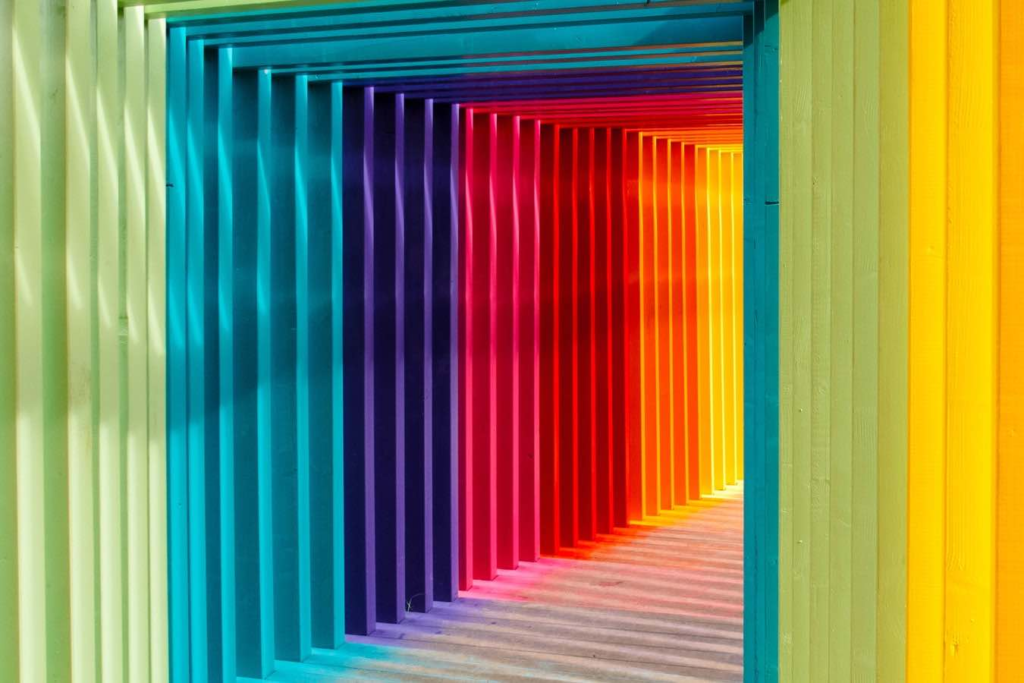
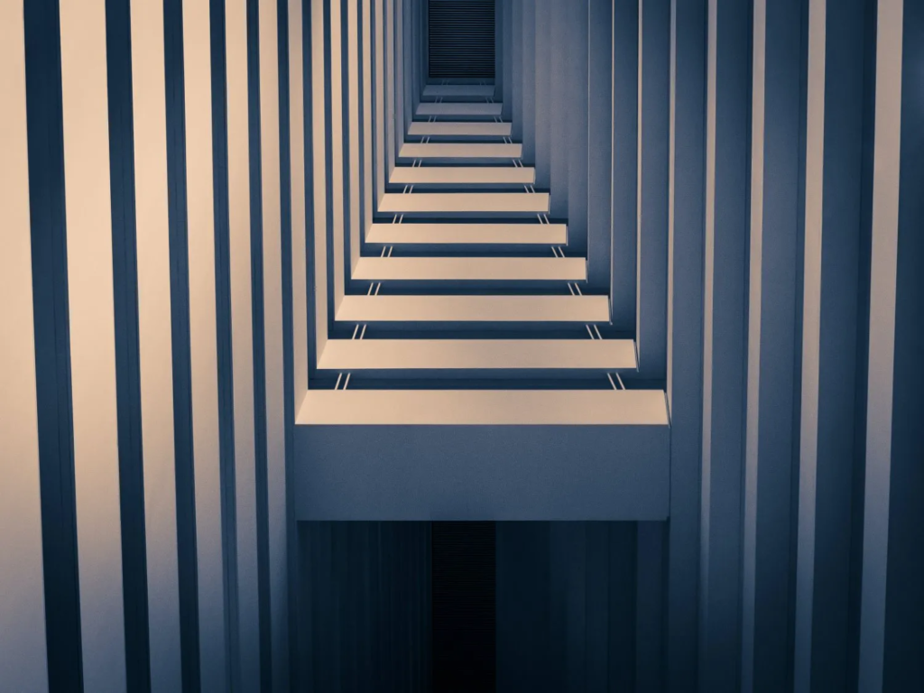
These images are great examples of formalism in photography, as they portray abstract reality by eliminating social and spatial context. This means the viewer is able to focus on only the object in the image and will not get distracted by the background.

Formalism Poster:

Formalism

There are seven basic elements to photographic art in formalism. Formalism is that photographers have to impose order, bring structure to what they photograph. ” A photograph without structure is like a sentence without grammar.”

These formal and visual elements (such as line, shape, repetition, rhythm, balance etc.) are shared with other works of art. But photographs also have a specific grammar – flatness, frame, time, focus etc. 

The seven basic elements of formalism are:

Line- line is one of the most important elements considered in photography, as they guide the eye around the image. improper arrangement of lines can take away the strength of the subject matter of the photo. Lines are either straight, curved, or a combination of the two. Lines can be solid, dashed or interrupted, implied, or psychological. They can be vertical, horizontal, or somewhere in-between. Lines are either straight, curved, or a combination of the two. Lines can be solid, dashed or interrupted, implied, or psychological. They can be vertical, horizontal, or somewhere in-between.

Shape– shape in photography is the 2D appearance of objects captured by the camera. Shape can be highly influenced by the lighting of your photo: by taking a photo where the shape is emphasised, place the lighting either directly in front or behind the object. There are two basic types of shapes: geometric (or regular) and organic. We all know geometric shapes—circle, square, triangle, dodecahedron, and so on. We are also familiar with organic shapes—the outline of a bird, elephant, flower, tree, etc. Fluids can create organic shapes that cannot be permanently defined—the shape of a cloud or a rain puddle, for instance.

Form– form refers to when shape takes on 3D. Form is created by shadows and highlights on an object in the photograph. Form is very important, because without the 3d effect, most images can look flat and dull.

Texture- texture in photography refers to the visual quality of the surface of an object, revealed through a variety of colour, tone and depth. texture brings life and vibrancy to images which would otherwise appear uninspiring and perhaps boring.

Colour– colour is one of the main compositions a photographer can use in their images, as other elements such as tone and mood are dependent on it. How a photographer combines various colours in their work has an influence on how the viewer looks at the image, and how they evoke emotion.

Size– size in photography is the term given to describe the height and width of an image, although it can be manipulated by the camera. Larger camera sensors gather more light, which is excellent for low light photography.

Depth– simply, depth of field in photography is how much your image is in focus. It is the photographers job to tell a story through their images, so how the image is focused is important for the photographer to consider. If an object is close to the camera and is in focus, the photographer is telling the viewer where to look.

Photo Literacy – Superficially, it might suggest an ability to ‘read’ a photograph, to analyse its form and meanings. But what about the making of photographs? We would argue that literacy is more than just a command of the mechanics of a particular ‘language’. It also takes into account fluency of expression and sensitivity to material. Words and images are different. A photograph of a particular subject is different to a description of the same subject in words. It is surely possible to see, understand and appreciate a photograph without the need for words. And what about the other possible ‘literacies’ such as emotional and physical literacy?

My own inspired photo:

Formalism

What is Formalism?

Formalist photography is when the design, composition and lighting are dominant over subject matter. The photographer becomes a visual designer whenever a frame is captured. Camera cropping concentrates on the desired subject while eliminating everything else. Formalism in photography is an approach that emphasizes the visual elements of an image rather than its content or narrative. This style focuses on the composition, shapes, lines, colors, textures, and overall design of a photograph.

Line

Line is the most fundamental of the seven basic elements of photographic art, in almost all photographic art there will most likely always be some element of lines. Lines are considered to be “A straight or curved geometric element that is generated by a moving point and that has extension only along the path of point” There are many different types of lines, they can be solid, dashed, intterupted, implied or physcological. The horizion is an example of an implied line. Lines are everywhere in photographs. Lines surround us, and every photograph contains lines.Lines in photographs often connect points inside the image.

Shape

The Merriam-Webster definition of “shape” that we are concerned with as photographic artists is:

1 a : the visible makeup characteristic of a particular item or kind of item

1 b (1) : spatial form or contour

1 b (2) : a standard or universally recognized spatial form.

Shapes are two-dimensional. Sometimes a familiar shape can transform into an unfamiliar or unrecognizable shape based on the viewpoint of the photographer Different shapes, when they intersect and overlap, can combine to create a new shape. Shapes can also surround an area to create another shape. In a photograph, a silhouette is the purest essence of a shape—no form, texture, or colour. There are two basic types of shapes: geometric (or regular) and organic. Shapes can be as simple as a triangle or infinitely complex.

Form

What separates form from shape? Form takes shape from the two-dimensional and brings it into the three-dimensional.”the shape and structure of something as distinguished from its material” Form is three-dimensional. Form has overall height, width, and depth.Just as with shapes, there are two basic types of form—geometric (or regular) and organic.Like shapes, forms can be simple or infinitely complex.A photograph captures all the forms in the field of view of the lens.Three-dimensional forms are rendered in two dimensions by the photograph. Whether on the print or on the screen, the final image does not have depth. 

Texture

In photography, texture can be felt with both the fingers (the print) and virtually (with the viewer’s eye). “the visual or tactile surface characteristics and appearance of something”

Texture in “real life” can be, basically, smooth or rough. We can use other descriptors as well: slimy, wet, hard, soft, bumpy, shiny, etc. Texture in the photograph is similar to form in that it is revealed by variations in tonality and presented in two dimensions. In a photograph, smooth objects might have reflections or specular highlights. Rough objects might have aggressive areas of light and shadow without reflections. Texture can be elusive in a photograph, depending on the subject, the lighting, and the forms in the image. A lack of visual texture might mean that the object is smooth. It could mean that it is too far away from the camera and the texture cannot be resolved. A photograph of a full moon does not show much in the way of surface texture, but the oblique lighting of a crescent or gibbous moon, viewed through a telephoto lens with sufficient resolution, will show incredible texture on the surface.

Colour

” a phenomenon of light (such as red, brown, pink, or grey) or visual perception that enables one to differentiate otherwise identical objects” Light itself has no perceived colour. But, send light through a prism or a drop of water and we can see that it is comprised of a literal rainbow of colours. Colour has three properties: hue, value, and saturation: Hue is simply the description of the colour (e.g., blue, red, yellow, etc.). Value is the relative brightness or darkness of a colour. Saturation is the intensity or purity of a colour. The purest colour is a hue with no white, black, or grey added to it. Bold and bright colours are known for grabbing our eye. Harmonic colours are colours that complement each other—serve to create distinct feelings in photographs. Mainstream colour film was not available until the 1930s—around 100 years after photography was invented. A key to approaching colour in photography is to recognize the colours in a scene, and evaluate your composition based on including or excluding the range of colours in your field of view. Frame your image to highlight the colours you think will enhance your subject and best convey the mood of your image.

Size

“physical magnitude, extent, or bulk : relative or proportionate dimensions” Size in a photograph is relative and can be an illusion. When a familiar object appears in the frame of a photograph (car, basketball, streetlamp, etc.) we immediately get a feel for the scope of the entire scene. The camera, lens, and print can render large objects small, or small objects large. Even objects familiar to our eyes can be rendered relatively large in a photograph, while things we know to be enormous are rendered small. With a casual snapshot, size might not be something one even considers when composing the image. The size of common objects in the photograph gives the scene a sense of scale. But a single object in space might not accomplish this since there is no means for comparison. If you want to emphasize the size of an object in the photograph in relation to its surroundings, you should get closer to that object. Overlap is another way to render a scene virtually in three dimensions, and overlap can also give hints to size.

Depth

the direct linear measurement from front to back” Naturally, even in a casual snapshot, we are given a sense of depth due to various visual cues. This perception of three-dimensional space is what our eyes experience whenever they are open, and that is what our eyes try to experience when looking at a photograph. How well the depth is rendered is dependent on the objects in the frame, your choice of composition, and your perspective in relation to the objects in the frame. Most images have a foreground, middle ground, and background. The stronger the delineation between those successive “grounds,” the stronger the sense of depth in your image. We have all seen the photographs of the highway heading toward the horizon or the train tracks narrowing as they become more distant (do not take photos on train tracks!). This convergence of lines is called linear perspective. Where you place an object in a frame also offers clues toward depth. The higher an object is in the frame relative to the horizon (seen or implied), the greater is the perceived distance to that object. This is called upward dislocation.

Formalism | The Essence of Things

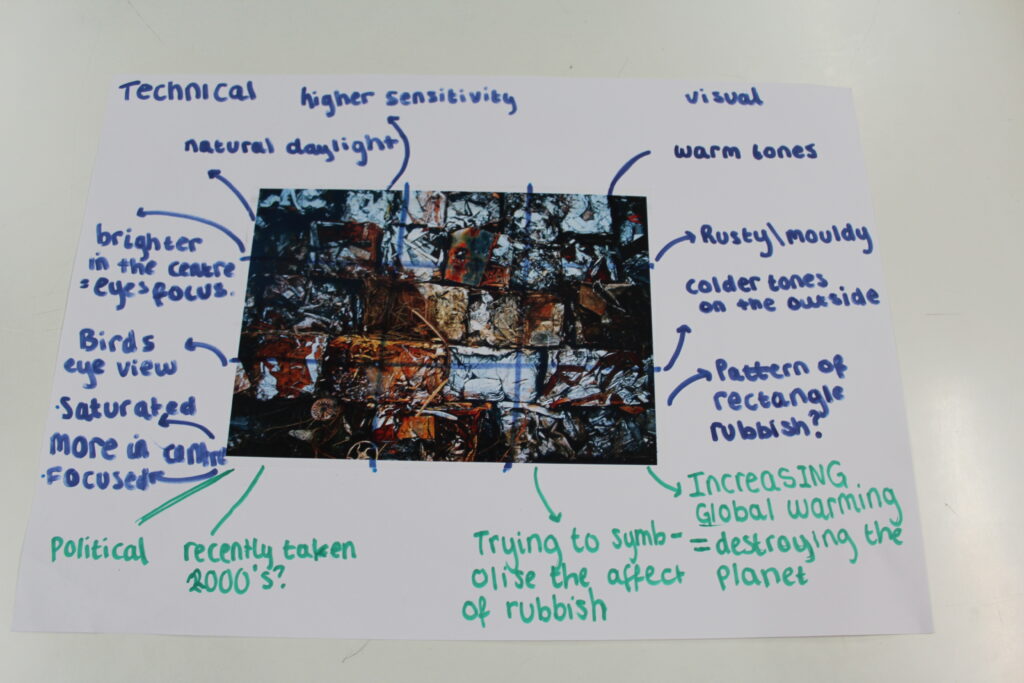
Evaluation Of Images –

Evaluating formalist images involves analyzing various visual elements and how they contribute to the overall impact of the photograph. Here are some key aspects to consider:

  1. Composition: Assess how the photographer arranges elements within the frame. Look for balance, symmetry, and the use of space. Consider whether the composition guides the viewer’s eye effectively.
  2. Use of Lines: Examine the lines in the image—are they straight, curved, or leading? Lines can create movement and direct attention to focal points, contributing to the overall dynamism of the image.
  3. Color Palette: Analyze the color choices and their relationships. Are the colors harmonious or contrasting? Consider how color influences the mood and emotional response of the viewer.
  4. Light and Shadow: Observe how light is used to shape forms and create depth. Look for highlights and shadows that enhance texture and add dimension to the composition.
  5. Texture and Detail: Pay attention to the textures captured in the image. Is there a rich detail that draws the viewer in? Textural elements can create a tactile quality that adds interest.
  6. Abstraction: Consider the level of abstraction in the image. Does the photograph transform ordinary subjects into something more visually compelling? Evaluate how effectively it communicates form over function.
  7. Mood and Atmosphere: Reflect on the emotional response elicited by the image. Does the formal composition create a specific atmosphere or feeling?
  8. Minimalism: If the image employs minimalism, assess how effectively it conveys meaning through simplicity. Does it succeed in highlighting essential forms without distractions?
  9. Conceptual Depth: Even though formalism emphasizes form over content, think about any underlying concepts or ideas that emerge from the composition. What might the photographer be communicating through the arrangement of visual elements?

By focusing on these aspects, you can gain a deeper understanding of how formalist images operate and appreciate their artistic value. This evaluation encourages an engagement with photography that prioritizes visual language and aesthetics.