Definition
Formalism photography is where the design, composition and lighting are dominant over the subject matter. Formalism photographs have a structure. These formal and visual elements are; line, shape, form texture, colour, size and depth.
Mood Board
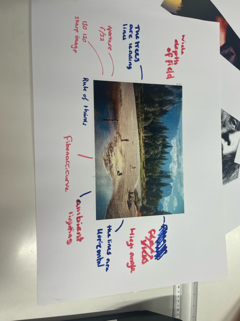
Lines
A straight or curved geometric element that is generated by a moving point and that has extension only along the path of the point.

The orientation of lines
The type and direction of lines in an image present meanings inside the photograph. Vertical or horizontal lines present a sense of stability or a static feel to an image. Horizontal lines can present distance and vertical lines can present height, balance, strength. A level horizon or a vertical building in a photograph can give a sense of calm, but when angling the horizon or building, the photograph presents movement or action. Diagonal lines present a more dynamic scene.
Shape
When a line, or more than one line, closes or connects, a shape is formed.
Characteristics of shapes
Shapes are two-dimensional and can be measured by their height and width. Shapes can also be the outline of an object, which may be familiar or unfamiliar. Sometimes a shape you may find familiar can be changed into an unfamiliar shape by changing the view point of the photograph. For example the shape of a standard lightbulb is recognisable from the horizontal viewpoint, but is not recognisable when viewing it from directly overhead or below, which shows a nondescript circle.
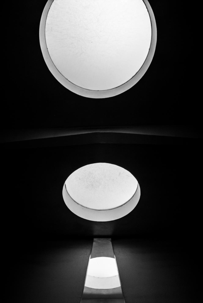
Different shapes, when they intersect and overlap, can combine to create a new shape. Shapes can also surround an area to create another shape. In a photograph a silhouette is the purest form of a shape. Shapes are often visually defined by the intersection, and/or closing/ joining of lines. Shapes can be defined by other shapes surrounding an area, such as the arrow in the logo of a popular shipping company. The area containing a shape is often referred to as positive space, and the outside area is called negative space. However, sometimes the negative space creates a shape of its own.
Types of shapes
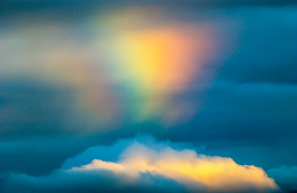
There are two basic types of shapes, which are organic or geometric (regular). Geometric shapes consist of circles, squares, triangles etc. and organic shapes consist of things such as an outline of a bird, elephant, flower tree etc. Fluids can also create organic shapes that cannot be permanently defined, such as the shape of a cloud or rain puddle.
Where are shapes in a photograph?
Shapes are everywhere in a photograph, and the physical photograph is a shape. It is usually a square or a rectangle, but can occasionally be a circle or an oval or a random shape. Inside the photograph are shapes captured in the scene by the photographer on their camera. Shapes can be simple or very complex.
Form
Form takes a shape from two-dimensional and makes it three-dimensional and also has height, width and depth. It is the shape and structure of something as distinguished from its materials.
Types of form
Form also has geometric (regular) and organic, just like shape. Geometric forms consist of cones, spheres, cube, cylinder, etc. and organic forms consist of objects that surround us in our three-dimensional world. Forms can be simple or very complex. Forms also create positive and negative space. In a photograph positive space is which is occupied by forms and negative space is what remains.
Where are forms in photographs?
Forms are often everywhere in photographs. A photograph captures all the forms in the view of the lens. Three-dimensional forms are rendered in two dimensions by the photograph. Whether printed or on the screen, the final image does not have depth, so we perceive three- dimensional forms by using shadow. Photographs show form by capturing highlights, through the midtones, and into the core shadow of any object.
Texture
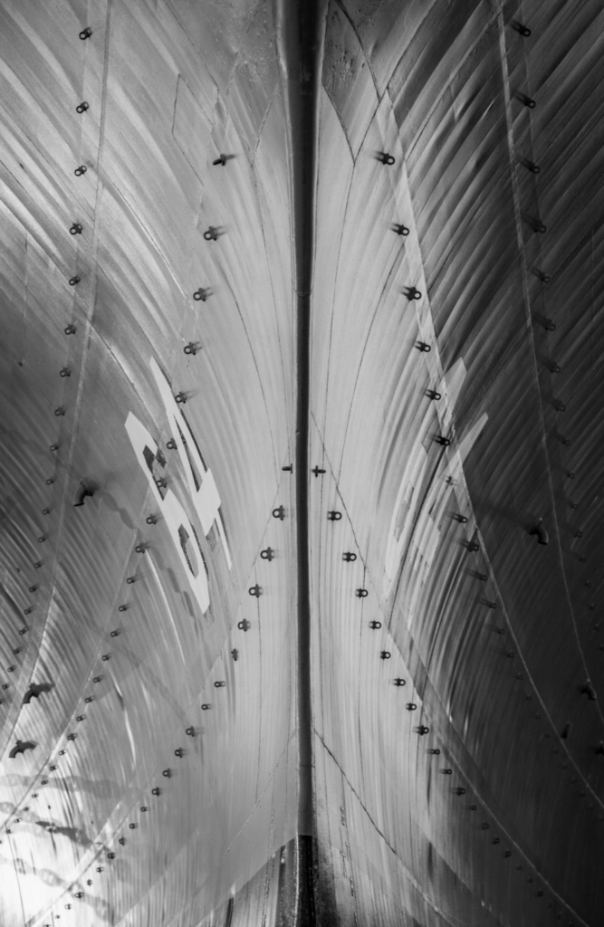
In photography, texture can be felt with both the fingers (the print) and virtually (with the viewer’s eye). Texture is the visual or tactile surface characteristics or appearance of something.
Characteristics of texture
Texture in ‘real life’ can be smooth or rough, but can also be described as slimy, wet, hard, soft, bumpy, shiny etc. However, in photographs it is similar to form as it is revealed in tonality and presented in two dimensions.
Types of texture
In a photograph, smooth objects might have reflections or specular highlights. Rough objects might have aggressive areas of light and shadow without reflections. However, in a photograph we cannot ‘feel’ the texture of whatever the photo is, but if it is familiar we can recognise how it would feel. However, if it is not familiar to the viewer they would not be able to imagine the ‘feel’ of the texture. Patterns can also indicate textures in photos. The physical print has its own texture, which may be glossy versus matte, or even canvas-textured printing papers, for example, which may or may not be aligned with the texture of the objects in the photograph.

Where is texture in photographs?
Texture can be elusive in a photograph, depending on the subject, the lighting, and the forms in the image. A lack of visual texture might mean that the object is smooth, or It could mean that it is too far away from the camera and the texture cannot be resolved. It could also mean that the light is diffused or lit from head-on and the texture is hidden. Form and shadow is what emphasizes texture. Even the tiny shadows of the texture on a plaster wall. A photograph of a full moon does not show much surface texture, but the oblique lighting of a crescent or gibbous moon, viewed through a telephoto lens with sufficient resolution, will show incredible texture on the surface. Despite the texture of the object in the photograph there are factors that will emphasise or obscure how this object is perceived.
Colour
Colour is a phenomenon of light or a visual perception that enables someone to differentiate between identical objects. The appearance of objects and light sources that may be described in terms of hue, lightness, and saturation for objects and hue, brightness, and saturation for light.
Characteristics of colour
Light itself has no perceived colour, but when sent through a prism or a drop of water it is comprised of a literal rainbow of colours. Colour has three properties, which are hue, value, and saturation.
Hue– The description of the colour (e.g., blue, red, yellow, etc.).
Value– The relative brightness or darkness of a colour.
Saturation– The intensity or purity of a colour. The purest colour is a hue with no white, black, or grey added to it.

Types of colour
Many different colours can have very different meanings, based of emotional responses, genetic responses or cultural programming. Red can mean danger, blue symbolizes calm, yellow is happy, black is mournful, white is innocent, and purple can symbolize wealth. Bold and bright colours are known for grabbing our eye. A bold and bright-coloured subject in a photo can be a good thing, but if your subject is not bold and bright, while other things in the frame are, then it can detract from your subject. A solution for bright and bold distractors is to make the photograph black and white. Muted colours might elicit indifference or even melancholic feelings, but muted tones abound in such calm/ happy moments, often make for powerful photographs. Harmonic colours are colours that compliment each other serve to create distinct feelings in photographs, because subjects in the photo can visually connected through their colours.
Where is colour in photographs?
Mainstream coloured photographs did not exist until the 1930s, but now colour can be seen everywhere in photos, unless the photo is in black and white.
Size
Size is physical magnitude, extent, or bulk : relative or proportionate dimensions.
Characteristics of size
Size in a photograph is relative and can be an illusion. When a familiar object appears in the frame of a photograph, we immediately get a feel for the scope of the entire scene. Without a familiar object in the image, we struggle to determine the scale shown in the photograph. However, there are optical illusions and some that are unique to two-dimensional renderings of three-dimensional scenes and some illusions that are enhanced by rendering them in two dimensions.
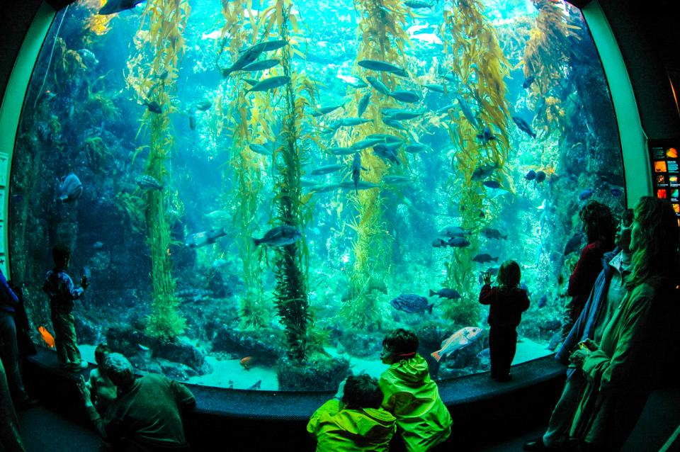
Types of size
Different types of sizes include small, medium and large. The camera, lens, and print can render large objects small, or small objects large. Even objects familiar to our eyes can be rendered relatively large in a photograph, while things we know to be enormous are rendered small. We can fit our entire planet onto a small photographic print. We can also print a photograph the size of a highway billboard or a single grain of sand. We can even use a 1:1 macro lens to reproduce objects at ‘life-size.’
Size in photographs
With a casual snapshot, size might not be something one even considers when composing the image. The size of common objects in the photograph gives the scene a sense of scale, but a single object in space might not accomplish this since there is no means for comparison. There are times when another object, maybe sitting atop our subject, serves to confirm the scale in the image, which eliminates the possibility of confusion. If you want to emphasize the size of an object in the photograph in relation to its surroundings, you should get closer to that object. When a three-dimensional scene is rendered in two dimensions, as your view extends out toward the horizon, objects closer to the horizon are farther away than those near the top, bottom, or sides of the image. Overlap is another way to render a scene virtually in three dimensions, and overlap can also give hints to size. When one object is in front of another, and it is smaller than the object behind it, we generally know the relative sizes of the two objects in question, as long as those two objects are close to each other in three-dimensional space.
Depth
Depth is the direct linear measurement from the front to the back.
Characteristics of depth
We already discussed depth when adding the concept of depth to shape to create form. The depth of a scene, which relates to its size, and adding the element of space. We are given a sense of depth due to various visual cues, to which we rarely give much thought or analysis, but these ques can create more compelling photographs, which the viewer will find themselves looking deeper. This perception of three-dimensional space is what our eyes experience whenever they are open, and that is what our eyes try to experience when looking at a photograph.
Types of depth
Unless you are photographing perpendicular to a blank and smooth wall, your image will have depth. How well the depth is rendered is dependent on the objects in the frame, your choice of composition, and your perspective in relation to the objects in the frame. Most images have a foreground, middle ground, and background. The stronger the delineation between those successive ‘grounds,’ the stronger the sense of depth in your image. Including a distant horizon is not required to give a sense of depth to your image. Depth is provided by visual cues.
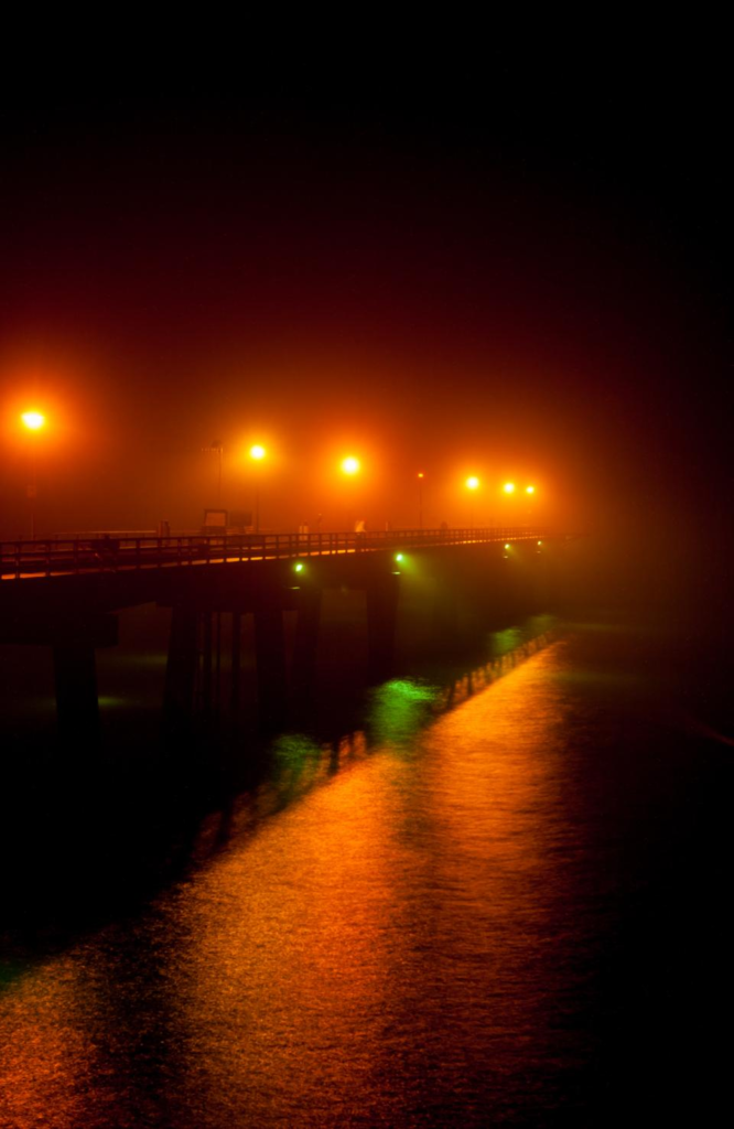
Visual indicators of depth
Photographs taken of roads/ train tracks show depth, as they show the road or tracks narrowing as they become more distant. This convergence of lines is called linear perspective. This is because as the road/ train gets further from the eye/ camera it appears to converge, which shows depth. Depending on the quality of the surrounding air or atmosphere, distant objects in a photograph will have less clarity and contrast than objects in the foreground. This aerial perspective is indicative of depth in a photograph. Texture gradient shows depth in a photograph as relatively distinct foreground textures and texture gradients in a photograph smooth out as they recede into the distance. The overlap of objects also show depth as they show which object is closer and which object is further away. Size also helps show depth, because the smaller an object the further away it is/ seems, assuming the viewer is familiar with the object. Where you place objects in the frame can also show depth, because the higher an object is in the frame relative to the horizon (seen or implied), the greater is the perceived distance to that object. This is called upward dislocation.

Jessica, a very good blog post that can achieve more marks if you respond to each formal element with your own images and add to blog post for further analysis/ comparison.