Formalism

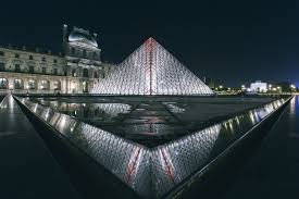
Formalism describes that the most important aspect of a work of art is its form, the way its made and its visual aspects, Formalism includes line, shape, form, texture, colour, size and depth.

Line – The lines on an image or whether the photo has leading lines or lines that guide your eye to the focal point.

Shape – How interesting the shape of the image is, has the photograph been taken at a specific angle to make it look more interesting.

Form – Is the photography 3 dimensional, how is the object displayed or positioned.

Texture – The surface of an object is it smooth shiny, rough. How can that be photographed to make it look as interesting as it can.

Colour – The composition of the photograph is one of the most important things of a photograph, it guides the viewer to wear you want them to look on the photograph and where the main focus of the photograph is.

Size – How do you take pictures of the object to make it look larger than it is or smaller than it is or making it look like the same size it is in real life.

Depth – How much of the photograph is in focus and how much of it is in detail. Is the main focal point of the image in focus and the background blurred to make the focal point standout .

Walker Evans v Darren Harvey-Regan: Analysis and Comparison

Walker Evans

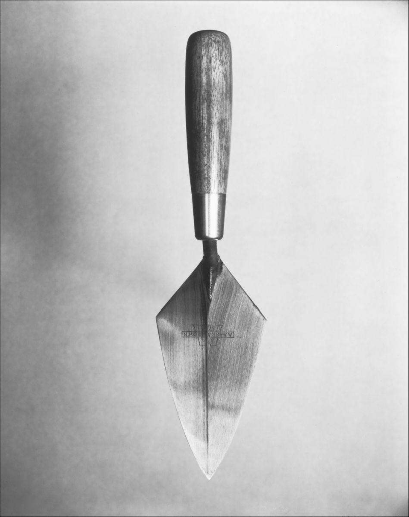
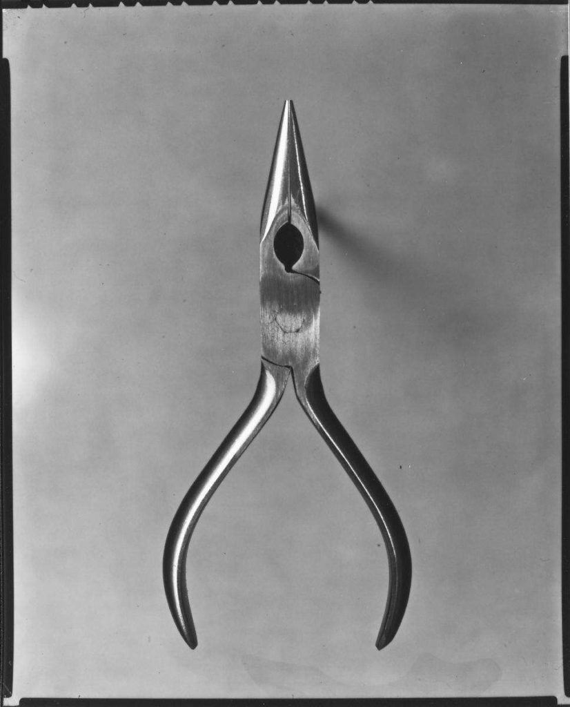
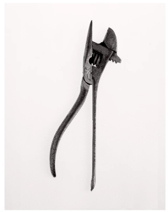
1955 – “Beauties of the common tool.”

Darren Harvey-Regan

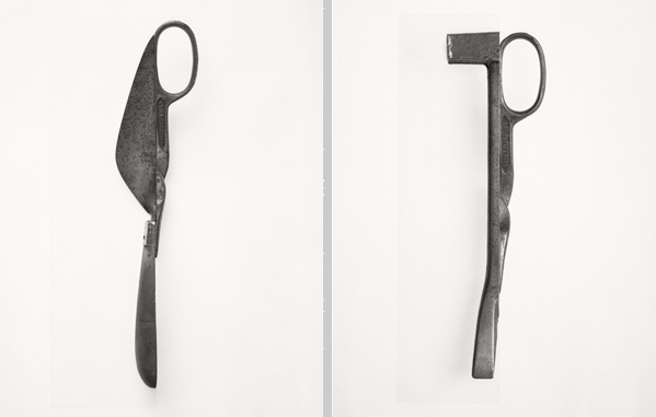
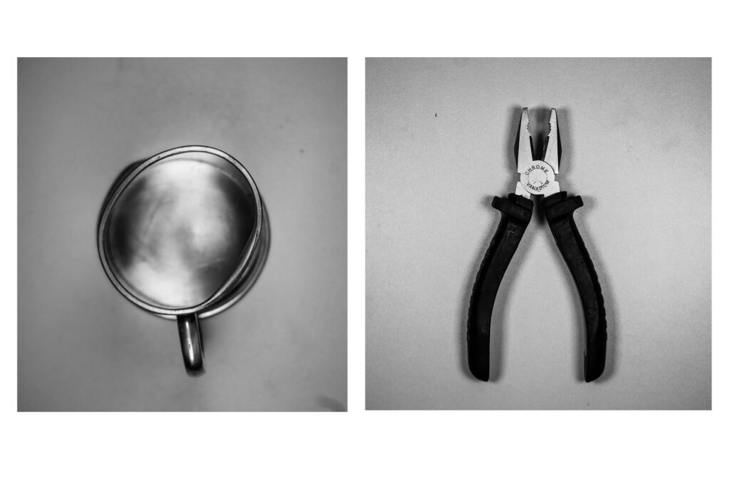
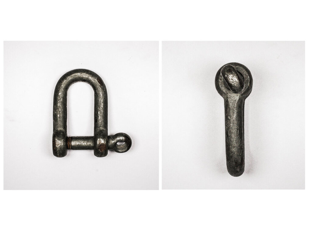
2013 – “Beauties of the common tool, Rephrased II.”

Taking inspiration from Walkers work in the 1950’s, Darren Harvey-Regan made his own attempt on his original photoshoot.

Walker Evans

As Walker Evans puts it, “Among low-priced, factory-produced goos, none is so appealing to the senses as the ordinary hand tool. Hence, a hardware store is a kind of offbeat museum show for the man who responds to good, clear ‘un-designed’ forms”. This can be vividly shown through his portfolio he named “beauties of the common tool”. Using Objects he had in his home, Evans was able to create his photos, using props to make the tools look as if they have a 3D levitated affect. Using what he had, his overhead lighting of his home, was the desired effect he wanted to use to diminish the opacity of shadows had on the objects, This allowed lots of texture and clarity to be seen on the tools.

(His portfolio can be found here).

https://fotoform.co/walker-evans-beauties-of-the-common-tool

Darren Harvey-Regan

Inspired by Evans work, Harvey-Regan put together his own portfolio named ‘Beauty of the common tool, rephrased II’, in which he sawed and then re-welded separate tools together. Advantaged by the modern era, he was also able with studio lighting and editing software to alter his photos to reduce shadows from his photoshoot, Rather than relying on what was around like Evans.

(Under the same name of Evans portfolio, Harvey-Regans work can be found here)

https://www.theravestijngallery.com/artists/

comparison

Photographing the same genre of still life, both photographers are similar in their composition, however they differ in lighting, texture and clarity. Lighting is noticeably different as Walkers objects shine with the reflection of light, whilst Harvey-Regan’s do not or just slightly.

A similarity they both share can be seen with the use of a Birds Eye shot, capturing their still life images from a camera angle of 90 degrees.

By Using a plain white background Harvey-Regan’s photos are able to be directly focused on whilst Evans allows the grainy texture of the film he used to generate an aesthetic to the objects within the picture.

my personal attempt

Walker Evans style:

Inspired by the Evans use of partial shadows and reflections of light, i tried to recreate that in this photo.

Darren Harvey-Reagan style:

By using photoshoot i attempted to remove any noticeable details leaving a plain white background and limited shine on the tools like Harvey-Regans work.

Formalism

Formalism is the basic structure made up of 7 basic elements:

Line

A line through an image which creates a path from one specific point. Lines can be straight, curved, solid, implied or even psychological. Implied lines can be seen in the horizon line and psychological could be the point of a finger. These lines can also hold meaning i.e. Vertical – stability/static, Horizontal – distance, Diagonal – dynamics and Curved – fluidity. This is especially true with the horizon line which creates a sense of calm.

Shape

A shape is a universally recognised formation of lines and space. These can be an outline of an object or a gap in a surface. Shapes can overlap to create new ones or change in angle and appear completely different. A silhouette contrasts with its backgrounds and contains no textures – this is the most visually obvious use of shape in photography and is clearly 2D.

Form

Shape and structure distinguished from its material. It is 3D with height, width and depth. Shadow creates depth that would otherwise be missing in a photograph. Highlights, midtones and shadows capture the spectrum of tone.

Texture

Characteristics and appearance of something. Texture can be described as: soft, shiny, wet, bumpy etc. These can effect factors like light, reflections, shadows. Similar to form this is shown with shadow.

Colour

Colour is the aspect of appearance of an objects that differentiates between objects with hue, lightness and saturation. Colour has 3 properties: hue (description of colour), value (relative brightness or darkness of a colour) and saturation (intensity of a colour). Colour can draw different emotional responses for example: red – danger, blue – calm and purple – wealth. Bold and bright colours are good for catching attention however take away from the subject which is where black and white shines.

Size

Size is the physical size or bulk of an object seen in its proportions and dimensions. Size is often manipulated in photographs to create illusions. Using familiar objects is useful to create proportion in the eye of the viewer (a basketball for example). Without a recognisable object it can be difficult to understand the scale.

Depth

Depth is the direct linear measurement from front to back. Depth is broken down into 3 parts: Foreground, middle ground and background. The clearer it is between, the stronger the sense of depth. It is provided by visual cues: further away objects will have less clarity.

Image Analysis

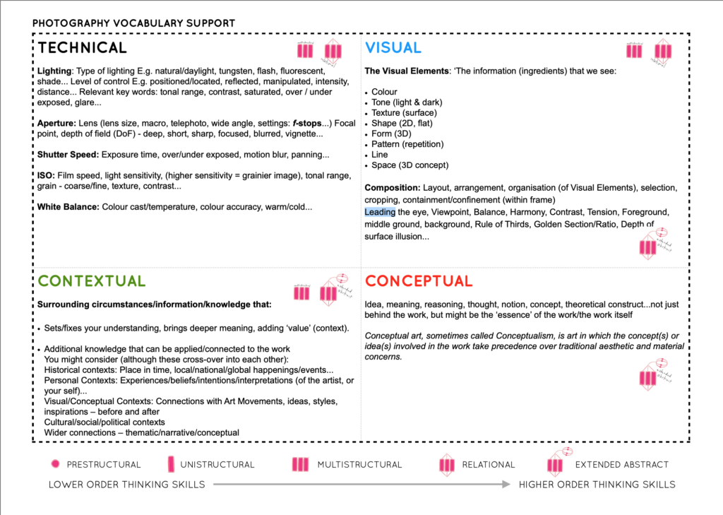
We broke down these photographs into four sections whcih allows for great detail analysis of images:

  • Techincal (i.e lighting and ISO),
  • Visual (colour and pattern),
  • Contextual (significance and inspiration) and
  • Conceptual (meaning and ideas).

Still Life

Still life is a work of art depicting of inanimate/non-living factors.

It originated in Ancient Egypt then resurfaced and became more popular in the classical period, during the 1700s. Although this is when it became more popular, there is evidence that Jacopo de’Barbari, an Italian Painter, painted a still life piece in 1504.

Still Life Timeline

https://www.metmuseum.org/toah/hd/nstl/hd_nstl.htm

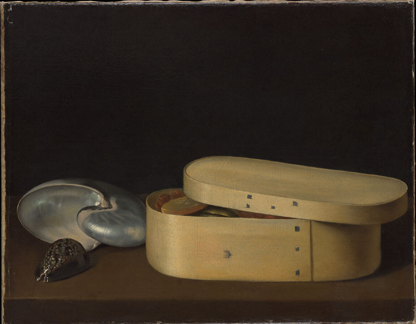
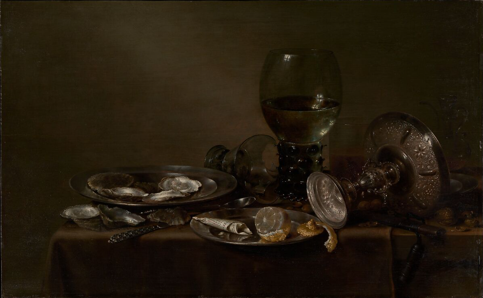
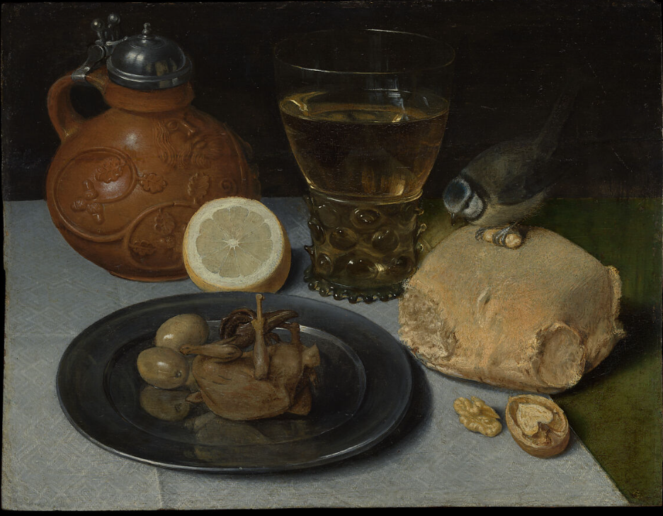
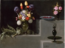
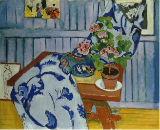
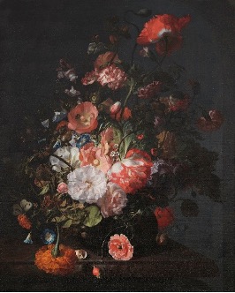
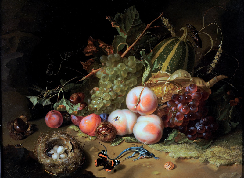
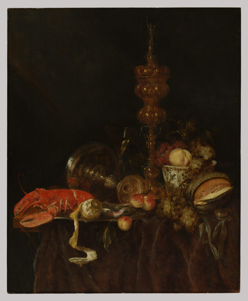
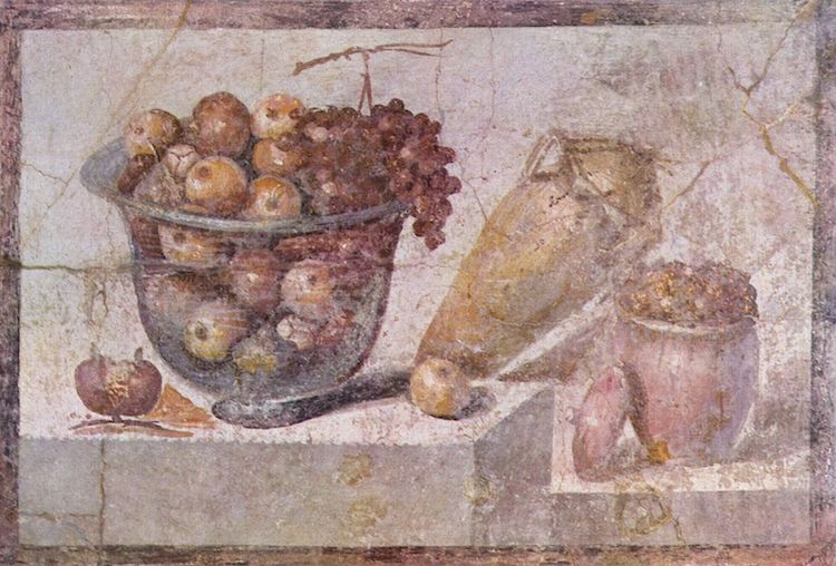
Examples of Still Life Paintings

Still Life Artists

Pieter Claesz
Caravaggio
Henri Matisse
Rachel Ruysch

Analysis of Painting

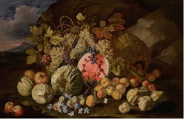
This is a Still Life Painting which features many, from the time it was taken, exotic fruits. These fruits were probably gained by traveling and trading with people from different countries. The lighting in this painting looks to be tungsten light, however it’s hard to tell as there’s a background of mountains where the sky is slightly illuminated. This could indicate that the photo was taken at dusk/dawn. The colours in this painting are relatively contrasting between dull and bright. For example, the watermelon is a very bright colour, however towards the top of the painting it consists of mostly dark green/brown. There’s lots of texture in this painting as the fruits are 3D and their lines and edges are prominent. The way in which the objects within the painting have been arranged shows that it is staged. The watermelon is the focal point in this painting as it is the most vibrant and within the center. The grapes above almost look as if they are pointing towards the watermelon, leading your eye, as they drop down in its direction. This painting may be a symbolism for religion, due to the apples and grapes (explained at the end of this blog post).

Examples of Still Life Photography

Still Life Photographers

Krista van der Niet
Mat Collishaw
Paulette Tavormina
Henry Hargreaves

Analysis of Photo

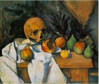
This is a Still Life photograph of objects which were often featured in paintings. For example, the skull was often used to symbolize the inevitability of death and the instrument to symbolize beauty and transience. These objects together create a juxtaposing effect, however, the fact that they are facing towards each other may symbolize the peacefulness of death. The lighting gives the impression that a continuous light was pointed straight on to the objects. The image is in focus, which indicates that the photo was taken with a large depth of field, fast shutter speed and a relatively low ISO. The colours in this image are all very dark and dull which creates a sombre mood. The skull is the focal point of this photo as itself and the material underneath it are the brightest in the image, creating a contrasting effect. The instrument can be interpreted as leading lines towards the skull. The textures in this image all look relatively smooth and the forms are all organic rather than geometric.

Colonialism

Colonialism is when there is control by one power over a dependent area or people. For example, a country having control over people or different areas of the world.

Colonialism impacted still life as new materials and techniques were shared across the world, such as oil paints, canvases and paper becoming more widely available.

Early still life paintings consisted of mainly rich foods and materials, such as exotic fruits and wine, which links to how people used to travel to different places and trade, coming home with many things not commonly found where they live.

Vanitas and Memento Mori

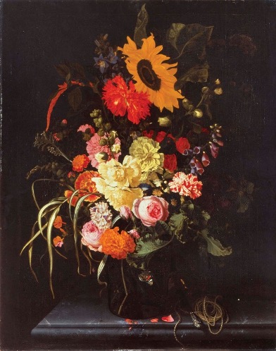
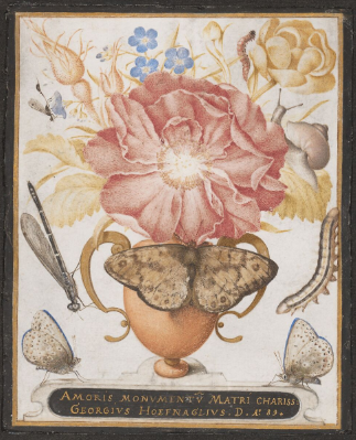
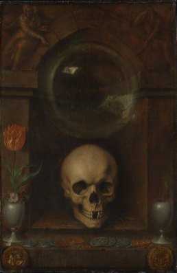
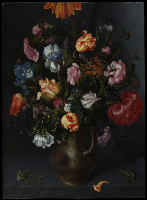
Vanitas is a genre of art which uses symbolism to show death or change as a reminder of their inevitability. This artwork usually features Memento Mori, which is an object kept as a reminder of the inevitability of death, such as a skull. In still life there are also many other objects and symbols used for metaphors such as:

  • Religious and mythical symbols – For example, apples signify temptation and knowledge in reference to the Old Testament account of Eve eating the forbidden fruit. Grapes can symbolise pleasure and lust as they are the main ingredient in most wine, associated with Bacchus, the Roman God of wine.
  • Candles – passing of time
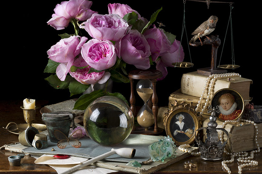
  • Flowers – symbol of life and growth
  • Seashells – birth, purity and fertility
  • Mirrors – the soul in reflection
  • Insects – transformation and decay
  • Musical instruments – beauty and transience
  • Silver and gold – luxury in still life painting

Photo Analysis

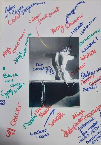
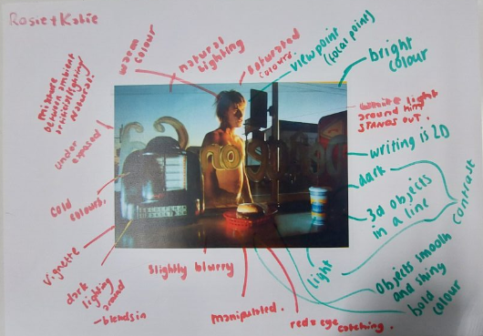
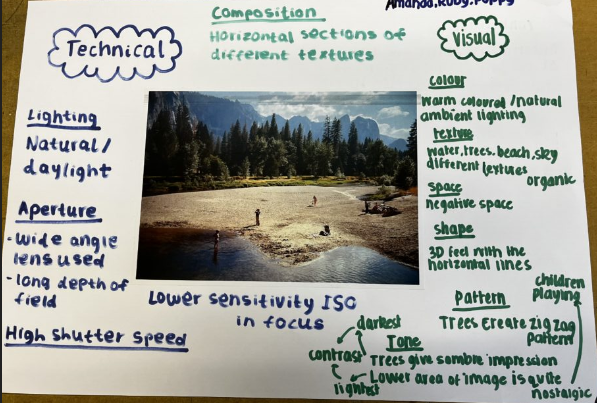
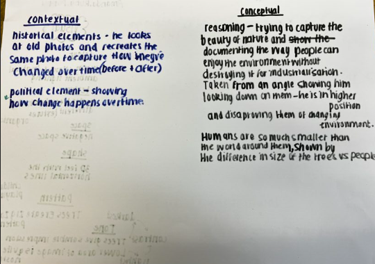
These sheets are my first attempt at using analysis techniques to look at a photo and in depth elements of the photo. Each different colour of writing looks at a different elements of photo analysis. The green looks at visual elements, and the blue looks at technical elements. Then looking more at concepts and contexts in blue and black pen. The photo itself appears quite basic however looking at the context to the photo, a photographer comparing old and his photos, looking at how land changes. Then using the different elements to look at the smaller details of the photo helps me explore different ideas and start to develop my thinking when it comes to technicalities of photos, for example how they were taken and what settings were used.

Formalism

There are seven basic elements of photographic art: line, shape, form, texture, colour, size, and depth.

Line: lines in photography are either straight, combined or a mixture of both. Different type of lines can mean lots of different things.

Shape: When a line, or more than one line, closes or connects, a shape is formed. there is lots of ways of defining what shape is but a definition that stands out to be is ‘spatial form or contour’

Form: Just as with shapes, there are two basic types of form, geometric (or regular) and organic. Geometric forms are the familiar sphere, cube, cone, cylinder…etc Organic forms are the objects that surround us in our three-dimensional world.

texture: In photography, texture can be felt with both the fingers (the print) and virtually (with the viewer’s eye). Texture can be described as many things and texture often enhances an image, showing its ‘vulnerable’ side.

colour: showing colour in a photograph can bring life to a photograph. a definition for colour that really stand out is, ‘a colour other than and as contrasted with black, white, or grey’.

size: size is the most elusive topic. showing how small/big something is can show the reality of an object/thing. types of size: Large, medium, or small

depth: depth is the most eye opening topic. a simple definition for depth is ‘the direct linear measurement from front to back’. looking at the depth of something can create a ‘form’ to the photography.

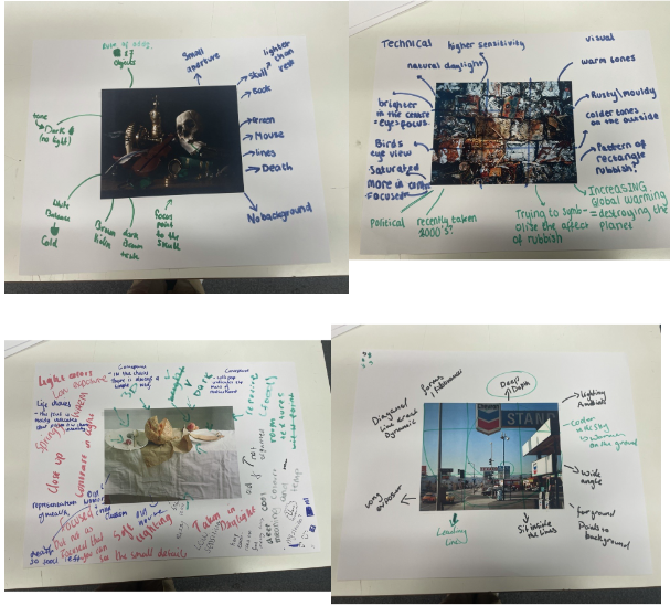
Formal analysis on posters:

Formalism.

Formalism

describes the position that is the most important aspect of a work of art in its natural form, the way it is made and its purely visual aspects rather than its narrative content or its relationship to the visible world and what we can see. For example, formalists within mathematics claim that mathematics is no more than the symbols written down by the mathematician on a piece of paper, which is based on logic and a few elementary rules alone.

Photographers have to impose order, bring structure to what they photograph. A photograph without structure is useless.

  Formal and visual elements (such as line, shape, repetition, rhythm, balance etc.) are shared with other works of art. But photographs also have a specific grammar , such as flatness, frame, time, focus etc.

There are seven basic elements to photographic art that we must explore over the coming weeks:

  1. Line
  2. Shape
  3. Form
  4. Texture
  5. Color
  6. Size
  7. Depth

Darren Harvey-Regan, Walker Evans –

Beauties of the common tool – 1955 photographs. This shows the softness and rough shapes to this photo. The tool seems to be quiet big because of the position and angel the camera was placed and how the photo was taken. The tone of this picture is quiet dark and there is a lot of back round space. The photo is in focus and has a cool temperature to it. This photograph could have a deeper meaning such as loneliness or fear as its quiet a dull photograph with a broken tool which could symbolise pain too.,  both artists paid careful attention to choice of objects, composition, lighting and exposure values.

Line in photography is the use of lines to create visual interest and convey a message in an image. Lines can be used to direct the viewer’s attention, create a sense of depth and can even be used to create a sense of movement.

Shape photography is the two-dimensional appearance of objects as your camera captures them. For instance, if you look at an image of a ball, you’ll find its shape as a circle. Likewise, if you look at a picture of a cube-shaped suitcase, you’ll find its shape like a square.

Form refers to when shape takes on three dimensions. Form is created by shadows and highlights on an object in the photograph. You can see in these two photos how shape becomes form when light hits the subject.

When talking about photography texture refers to the visual quality of the surface of an object, revealed through variances in shape, tone and color depth. Texture brings life and vibrance to images that would otherwise appear flat and uninspiring.

Red can mean danger, blue symbolizes calm, yellow is happy, black is mournful, white is innocent, and purple can symbolize wealth. Here, we will briefly discuss types of color in photographs. If you want to dive deeper into color theory, please enjoy Cory Rice’s fantastic article here.

The Basics:

Image Size is the term given to describe the height and width of an image in pixels. Maximum Image Size is determined by the megapixels of a given camera – for example, a 10-megapixel camera will give a maximum image size of 2592 by 3872 pixels.

In simplest terms, depth of field is how much of your image is in focus. In more technical terms, depth of field is the distance in an image where objects appear “acceptably in focus” or have a level of “acceptable sharpness

Steiglitz and Strand, “often abstracted reality by eliminating social or spatial context; by using viewpoints that flattened pictorial space, acknowledging the flatness of the picture plane; and by emphasising shape and tonal rendition in highlights and shadows as much as in the actual subject matter.”

Still Life – Research

Still Life – Research

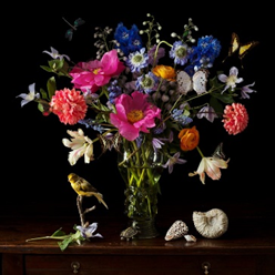
Still life describes a photograph that shows inanimate objects from the natural or man-made world. 

Examples of still life paintings/photos:

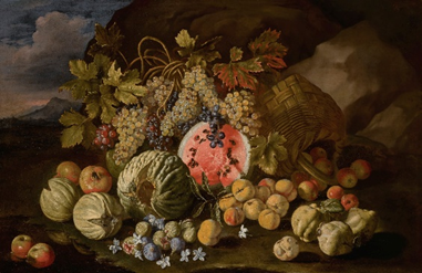
Abraham van Beyeren
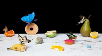
Laura Letinsky
  • The top image, by Abraham van Beyeren, includes objects and foods which symbolise wealth and luxury. This photo appears to be created longer ago than the photo by Laura Letinsky, yet still including similar objects, such as fruit which is seen as ‘exotic’, which symbolises wealth.
  • The image on the bottom, by Laura Letinsky, includes fruits and vegetables and presents plates of leftover food. The source of light seems to be natural and the image follows the rule of thirds. This photo appears to be more modern than the image created by Abraham van Beyeren.

Still life derives from the Dutch word ‘stilleven’, from the 17th century. This is when paintings of objects became widely popular throughout Europe. This term was used more often as artists created more complex pieces, communicating a wider variety of objects and allegorical meanings.


Chronological timeline of still life photography:

The earliest known still life artwork originates from Ancient Egypt. These paintings were made in temples as offerings to the gods and did not apply to realism.

Still life in Ancient Greece and Rome appeared in mosaics on the floors and paintings. Colours and shading became realistic, unlike the Egyptians’ still-life artworks.

Interest in still life dissipated after the fall of Rome until the 1500s in Northern Europe, where they developed oil paint, allowing for a much greater detail in paintings. The Northern European Renaissance is when people began to take on symbolism and depicting wealth in still life artworks. A specific type of still life is the vanitas painting, where artists used skulls, flowers, candles, etc. to symbolise the inevitability of death.

After the renaissance ended, impressionist and post-impressionist artists in the 1800s continued to paint still life, This became impressionism, where these artists experimented with colour and shapes and symbolism became less important.

Pablo Picasso and Georges Braque invented Cubism in the early 1900s as a way of showing several sides of an object at once, as they felt it was a better representation of objects because more of it was in view.

Modern still life painting is more so a reflection of an artists personal style, so 20th century paintings do not tend to be realistic and are instead more abstract.


Symbolism and Metaphors

Vanitas Vanitas is a 17th-century Dutch genre of still-life photography which symbolises the transience of life and serves as a reminder for the inevitability of death. 

Memento Mori – Memento Mori is an artistic and symbolic trope which serves as a reminder of the inevitability of death. This concept roots from philosophers of classical antiquity and Christianity. Furthermore, the concept has also appeared in funerary artwork and architecture beginning from the Medieval period and onwards. 

Symbolism/Metaphors in Still Life photography – Some common symbols and metaphors used in still-life photography and paintings are fruit (wealth- exotic fruits), candles (the passing of time), skulls (the inevitability of death), flowers (life and growth), seashells (purity, birth and fertility), etc.  

Camera settings and understanding

Camera settings 

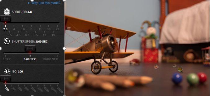
For the first image I made the aperture quite low and then changed the exposure to a lot lower so it wouldn’t make the image too exposed like it is here where I had the exposure a lot higher again.

For this image I changed the shutter speed which effects how blurry the image is basically so the propeller on the plane when the shutter speed is really high so 1/4000 of a second means it’s not blurry at all but if it was 1 second you wouldn’t really even be able to see it because of how blurry it would be. ​

The main idea that you want is for the exposure meter to be around the middle on the 0 because that checks that your image won’t be too under or over exposed 


So as you can see here the white arrow is pointing at the 0 meaning everything is balanced and it even says above “good exposure” so this is something you will want to check whenever you change some of the camera settings.  

Still Life Quiz

A-level photography quiz

1: What is the etymology (origin & history) of the word photography?

Writing with light

2. What year was the first photograph made in camera made?

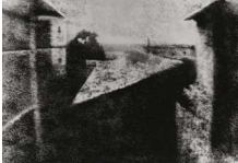
1826 (Joseph Nicéphore Niépce)

3. When did the first photograph of a human apear?

1838

4. who made the first selfie?

Robert cornelious (1839)

5.  When did the first colour photo appear

1861

6. what do we mean by the word genre?

A style or catogorey of art

7. What do we mean by the genre of still-life?

An image that shows inanimate objects from the natural or man-made world

8. What was the main purpose of the Pictorialist movement?

To affirm photography as an art form

9. How do we describe the term documentary photography?

Capture images that truthfully portray people, places and events. Staging images for maximum effect. Provide in-depth information about a subject over a long period time. An interpretation of reality as witnessed by the photographer

10. What is exposure in photography?

The amount of light that reaches your camera’s sensor.

11. What controls exposure on your camera?

Aperture, shutter speed, ISO.

12. What control on our camera records moving objects?

Shutter

13. How do we explain depth of field?

How much of your image is in focus.

14. What factors affect Depth of Field?

Lens aperture, distance from camera to subject, and lens focal length.

15. What is composition in photography?

The arrangement of visual elements within the frame.

16. What is your understanding of aesthetics in art?

Concerned with the nature of beauty and taste. It is subjective and in the eye of the beholder. Aesthetic qualities refer to the way and artwork looks and feels. Making a critical judgement based on observation and understanding.

17. What are contextual studies in photography?

To provide historial, cultural and theoterical understanding of images.

18. How many images are captured on average every day worldwide?

4.7 billion

19. Which portrait is the most reproduced in the world?

The Queen (Elizabeth II)

A-level photography quiz

1: What is the etymology (origin & history) of the word photography?

Writing with light

2. What year was the first photograph made in camera?

1826 (Joseph Nicéphore Niépce)

3. When did the first photograph of a human apear?

1838

4. who made the first selfie?

Robert cornelious (1839)

5.  When did the first colour photo appear

1861

6. what do we mean by the word genre?

A style or catogorey of art

7. What do we mean by the genre of still-life?

An image that shows inanimate objects from the natural or man-made world

8. What was the main purpose of the Pictorialist movement?

To affirm photography as an art form

9. How do we describe the term documentary photography?

Capture images that truthfully portray people, places and events. Staging images for maximum effect. Provide in-depth information about a subject over a long period time. An interpretation of reality as witnessed by the photographer

10. What is exposure in photography?

The amount of light that reaches your camera’s sensor.

11. What controls exposure on your camera?

Aperture, shutter speed, ISO.

12. What control on our camera records moving objects?

Shutter

13. How do we explain depth of field?

How much of your image is in focus.

14. What factors affect Depth of Field?

Lens aperture, distance from camera to subject, and lens focal length.

15. What is composition in photography?

The arrangement of visual elements within the frame.

16. What is your understanding of aesthetics in art?

Concerned with the nature of beauty and taste. It is subjective and in the eye of the beholder. Aesthetic qualities refer to the way and artwork looks and feels. Making a critical judgement based on observation and understanding.

17. What are contextual studies in photography?

To provide historial, cultural and theoterical understanding of images.

18. How many images are captured on average every day worldwide?

4.7 billion

19. Which portrait is the most reproduced in the world?

The Queen (Elizabeth II)