Formalism is the basic structure made up of 7 basic elements:
Line

A line through an image which creates a path from one specific point. Lines can be straight, curved, solid, implied or even psychological. Implied lines can be seen in the horizon line and psychological could be the point of a finger. These lines can also hold meaning i.e. Vertical – stability/static, Horizontal – distance, Diagonal – dynamics and Curved – fluidity. This is especially true with the horizon line which creates a sense of calm.
Shape
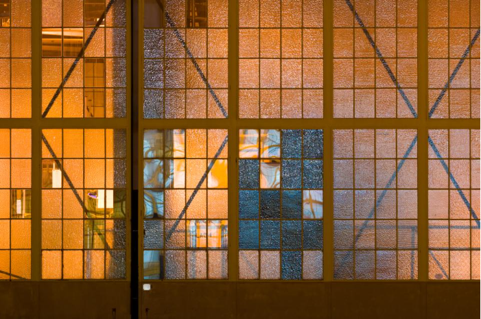
A shape is a universally recognised formation of lines and space. These can be an outline of an object or a gap in a surface. Shapes can overlap to create new ones or change in angle and appear completely different. A silhouette contrasts with its backgrounds and contains no textures – this is the most visually obvious use of shape in photography and is clearly 2D.
Form
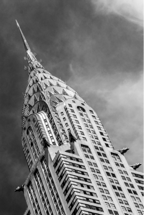
Shape and structure distinguished from its material. It is 3D with height, width and depth. Shadow creates depth that would otherwise be missing in a photograph. Highlights, midtones and shadows capture the spectrum of tone.
Texture

Characteristics and appearance of something. Texture can be described as: soft, shiny, wet, bumpy etc. These can effect factors like light, reflections, shadows. Similar to form this is shown with shadow.
Colour

Colour is the aspect of appearance of an objects that differentiates between objects with hue, lightness and saturation. Colour has 3 properties: hue (description of colour), value (relative brightness or darkness of a colour) and saturation (intensity of a colour). Colour can draw different emotional responses for example: red – danger, blue – calm and purple – wealth. Bold and bright colours are good for catching attention however take away from the subject which is where black and white shines.
Size

Size is the physical size or bulk of an object seen in its proportions and dimensions. Size is often manipulated in photographs to create illusions. Using familiar objects is useful to create proportion in the eye of the viewer (a basketball for example). Without a recognisable object it can be difficult to understand the scale.
Depth
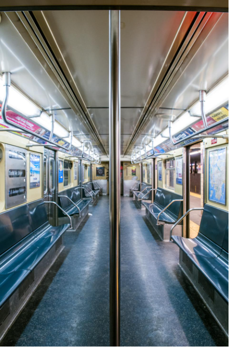
Depth is the direct linear measurement from front to back. Depth is broken down into 3 parts: Foreground, middle ground and background. The clearer it is between, the stronger the sense of depth. It is provided by visual cues: further away objects will have less clarity.
Image Analysis
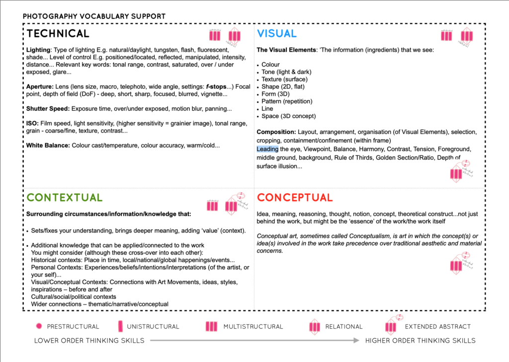
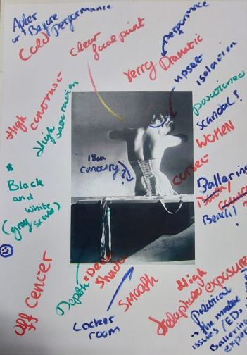
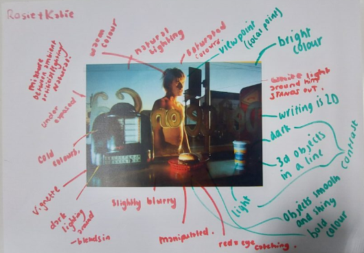
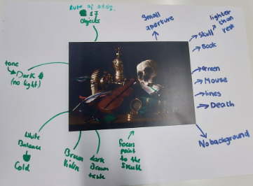
We broke down these photographs into four sections whcih allows for great detail analysis of images:
- Techincal (i.e lighting and ISO),
- Visual (colour and pattern),
- Contextual (significance and inspiration) and
- Conceptual (meaning and ideas).


Good start…but you can improve your blog by adding the following
1. A blog post that explores camera handling skills and lighting techniques that we have used. The Canon camera simulator examples are useful for this too.
2. More description and analysis of images (your own and others) in each blog post that has only images
3. A blog post that clearly shows your initial images in lightroom (like a contact sheet)…this can highlight your selections too (as well as edits)