


These images are from my Still Life photoshoot, for my Nostalgia Project.
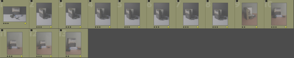
4 – 5 star rated photos:
(These are also white flagged – meaning they consist of clearly taken photos).

These images, to me best represent the idea of nostalgia, this is identified through good camera positioning, lighting and arrangement of objects within the photo.
3 – 2 star rated photos:
(These are also white flagged – meaning they consist of mostly clearly taken photos).

These images, are on the middle ground of appearances, being taken well but not quite to the standard of being rated higher.
(These are also yellow coloured but have been black flagged – meaning they consist of some partially blurry photos but have been taken with a good angle or lighting).
2-1 star rated photos:
(These are black flagged meaning they do not appeal to what I was aiming for during the nostalgia photoshoot).
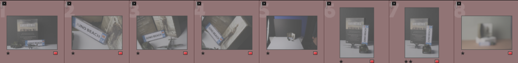
These images are either poorly taken, blurry or not what wanted to achieve.
Camera settings and lighting –
For these photos i took them on a Canon EOS 4000D, using the manual focus to then adjust the, using a lens size of 55m.
Using artificial studio lighting and a flash adapter, I was able to get strong lighting, creating interesting shadows.

In this photoshoot, my studio set up consisted of a tripod for the camera, studio lighting and a white and black backdrop to create a pop effect for my items in the photographs.


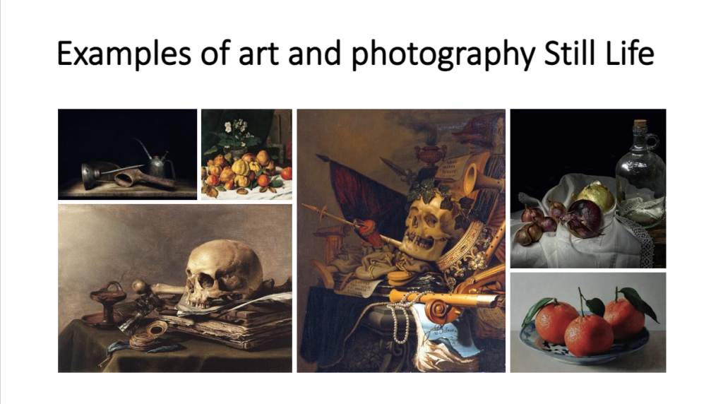


For this photoshoot, I was inspired by my previous research on Still Life and so decided to take some pictures of old/ vintage looking objects that I found in a box in the studio. I also used some of my own objects that bought up feelings of nostalgia to me. I chose to use old looking objects as a common theme in the still life images I looked at is that most of the objects looked old and expensive, so I thought I would try and recreate that tone in my photographs too.
Whilst in the studio, I used a variety of the setups such as the infinity curve. I then tested out using different lighting eg a warmer toned light and cooler toned light. There was also a light that I put on underneath the objects in some of the photographs.
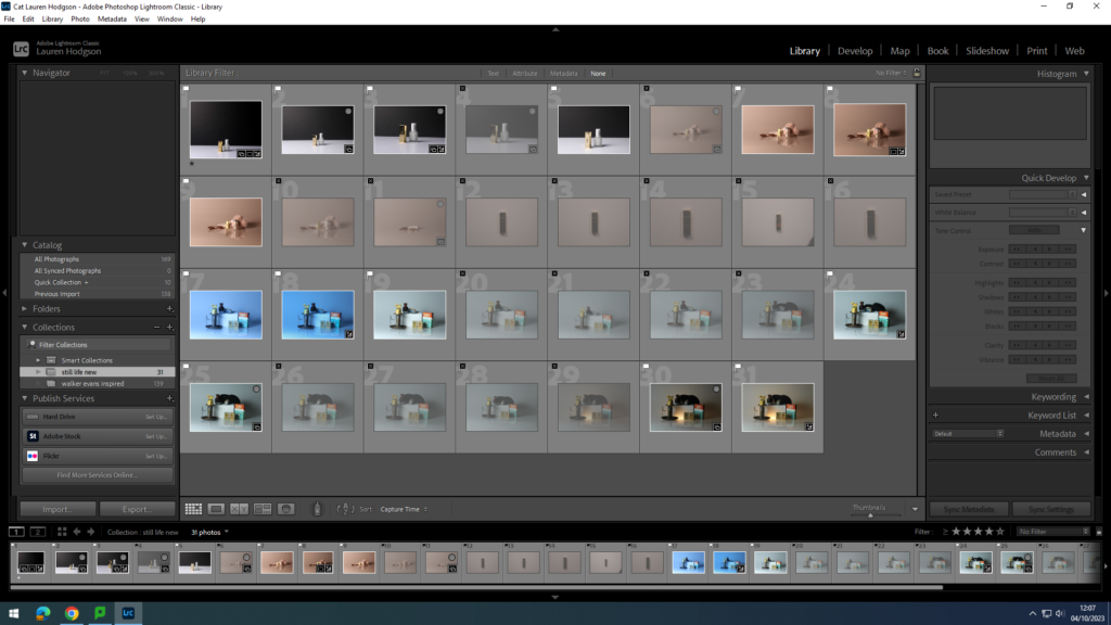
Once I had taken the photographs, I put them into my media folder and imported them into Lightroom. I then gave them either a white flag (if I liked the picture) or a black flag (if I didn’t like it). Once I had decided what pictures I liked I rated them out of 5 and gave them a colour (green=good, yellow=alright and red=bad). By doing this, it allowed me to narrow down my selection and make it easier to see what images I wanted to use as my final images and edit.
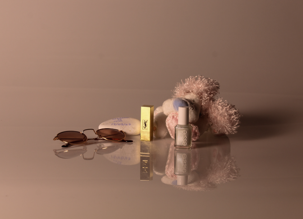
For this photograph, I decided to use more of a warm tone as that is what I associated those objects and memories with. I like the clarity of the photograph and the reflection of the objects on the infinity curve. When editing it on Lightroom, I went onto the develop tab and then experimented with different settings eg bringing the contrast and highlights down and trying different levels or clarity/ texture.
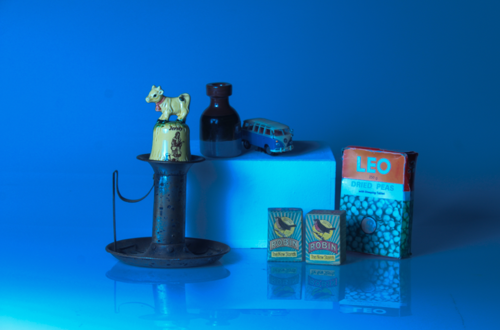
For this image, I decided to attempt to create a cool toned image utilising an abstract approach in the style of Daniel Sigg recreating the monochromatic effect of his photography. I did this by going onto the colour setting and enhancing the blue in the image. I then changed the exposure and contrast of the image too.

Daniel Sigg- The Blue Series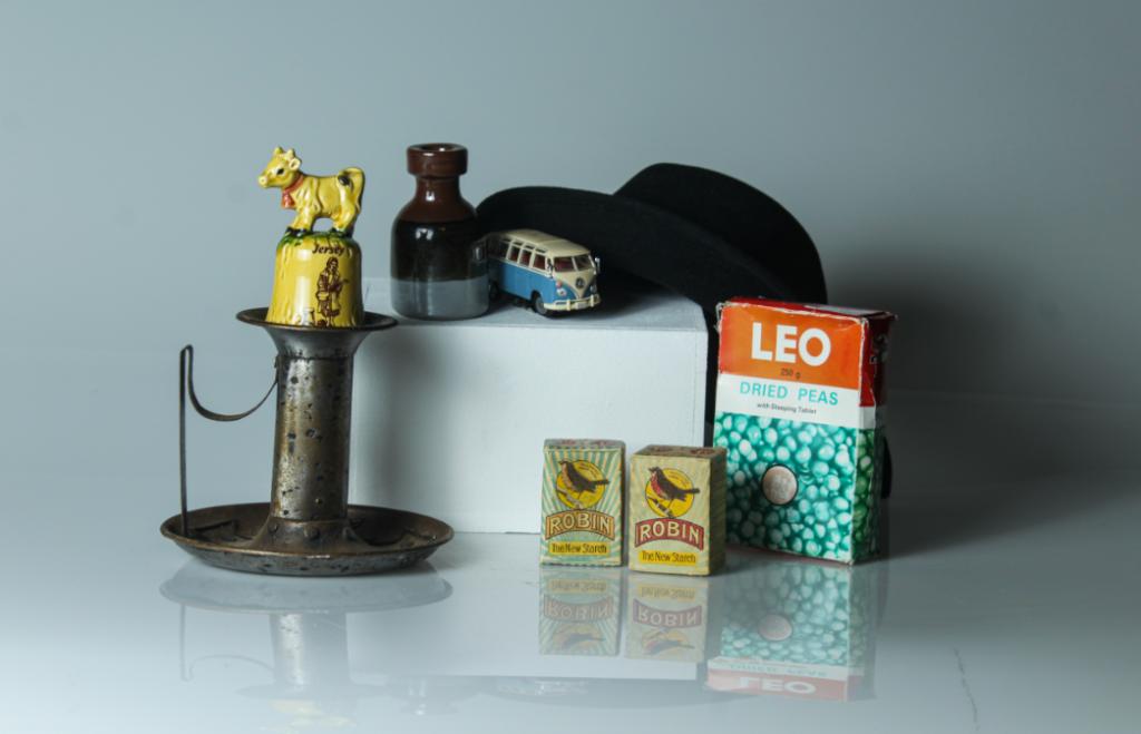
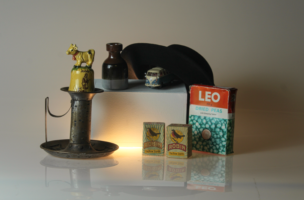
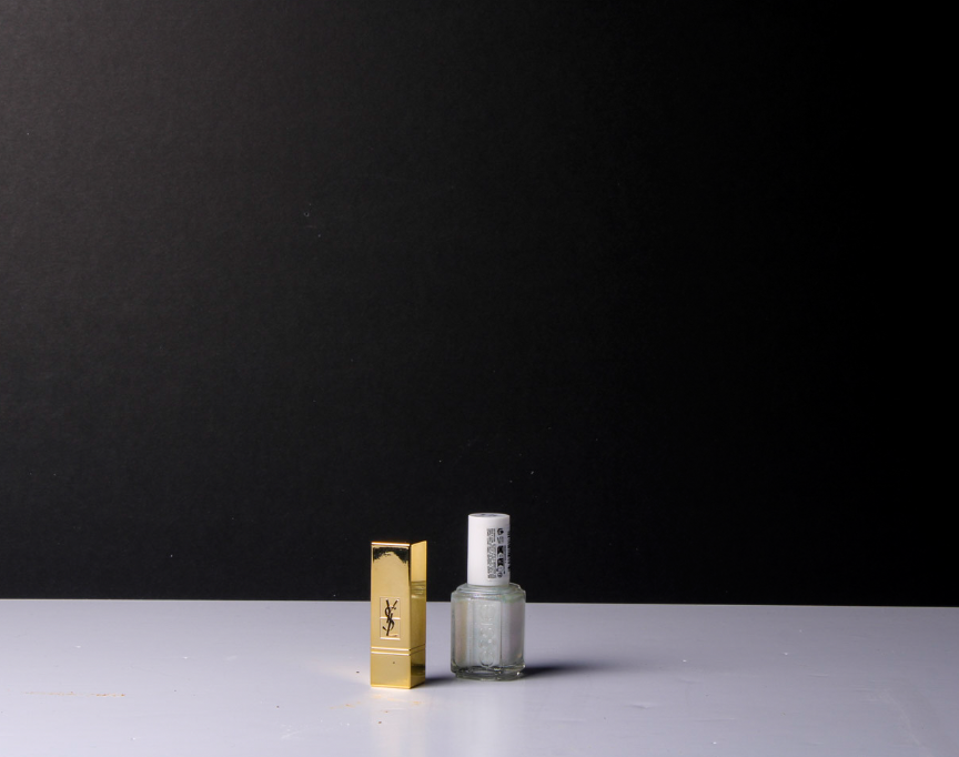
In this picture, I decided to add a light underneath my objects. I think this helped to bring more of a soft, comfy feel to image. However, if I were to edit this again, I would make the clarity of the image more clear as the objects look a bit blurry making it look less professional.
Overall, I like how this photoshoot came out as a first attempt of recreating still life images because I managed to grasp and understand the essence of still life photography as shown in my earlier blog post on still life. I really enjoyed using the infinity curve and will remember that for future projects, as well as beginning to experiment with other setups and attempting to refine my images further.


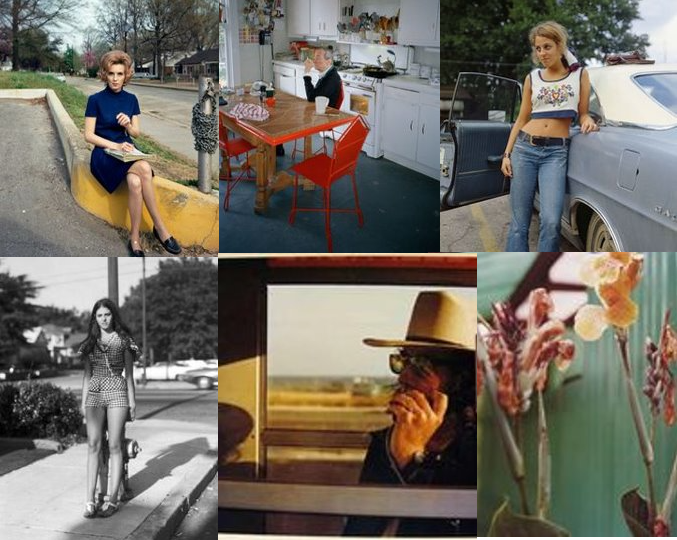
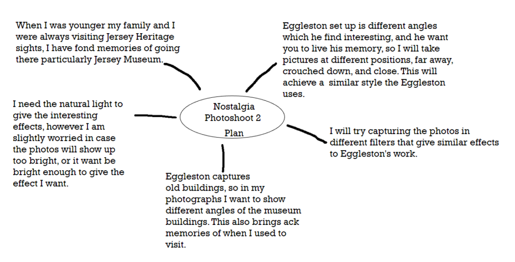
William Eggleston
Eggleston began his work by taking snapshots of the world changing around him during the 1940s and 50s, where he lived in South America. Eggleston was fascinated by the cultural shift, so he began capturing this on his camera; cars, shopping malls, and new suburbs. During the 70s he wanted to experiment with colour, he wanted an in-depth saturated colour, so to achieve this he began to experiment with dye-transfer. Eggleston captured things that were happening around him such as, drugs, booze, guns and women, he experimented with Polaroids, automatic photo-booth portraits, and video art, but became particularly inspired by Pop art and how it was advertised with bright saturated colouring and how it was displayed. I have chosen Eggleston because I love his simple but effective snapshots he captures, I like how each photograph has its own unique composition and style, each expressing their own story

William Eggleston style is documenting his life, he shoots from unexpected angles or when people are looking away, this shows a more realistic view on his photographs as they portray a more meaningful and engaging message.

Eggleston captured the present day as he wanted to show this in his photography, his iconic work is captured in South America, where he was born. When he began experimenting with colour, Eggleston also combined his new style with Southern Gothic imagery. I think Eggleston’s work is mainly fact, as he captures his current memories. However, his work is a perfect example of Southern Gothic imagery because his work has a vintage theme, with colour that brings it to a more modern print but still is old.
Eggleston’s work really inspires me as I love the snapshots he captures in his day-to-day life; I like how each photo has a unique formation and how each one shows a different memory or experience.

My Ideas:


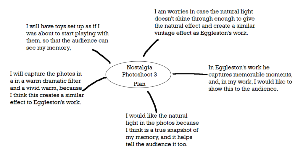
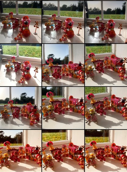


These images are my favourite because I love how each shows my memory of playing with the toys in different ways. I was inspired by Eggleston to keep the set up simple, which also has an interesting effect as it shows nostalgia. For the first photo, the dramatic warm filter exaggerates the train giving that nostalgic theme of being in the past. It brings back the memory for me but also for the audience, as they get an insight into my memory.
Final 3 Images:
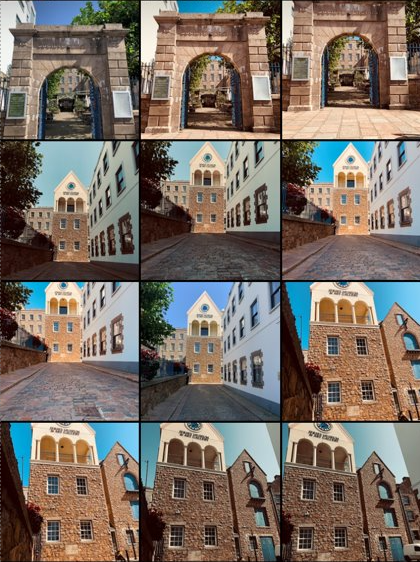
For the second photo, I used a lightly brighter filter to elevate the natural light and the shades created. This is like Eggleston’s work as he captures his photos from the natural light. I really like this effect as it shows what I saw in that moment.
For this photo I decided I wanted to create more of a focus point. The cut-out shape explains more of what my memory was because it is showing you the story.
For this photo I didn’t angle the camera. This was because I thought it was an interesting position to capture, as it shows a more focused and direct snapshot. I used the same dramatic warm filter and I think it engages you from a different perspective, having the photo at a different point of view.
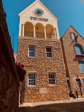
I used vivid warm for the filter; I captured this by crouching and at an angle. This was because it created an interesting composition which showed the building from a different angle. I think this is effective because it has a more in-depth and intricate look as this draws you into the picture catching your full attention.
Final Photo
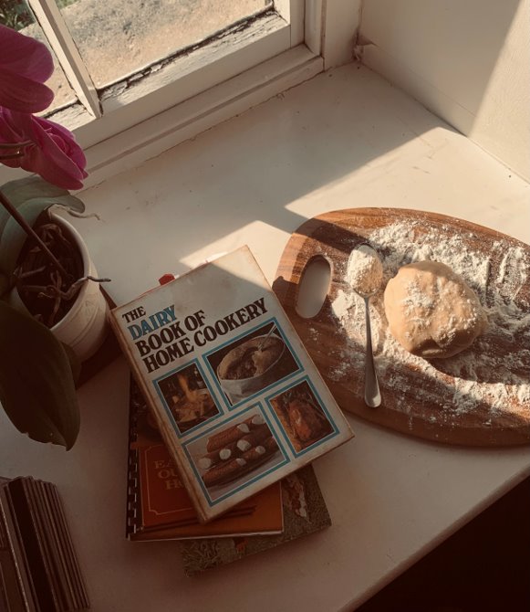
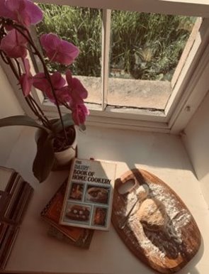
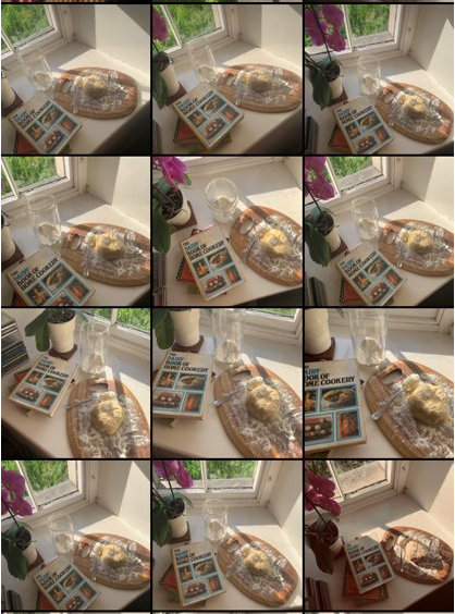
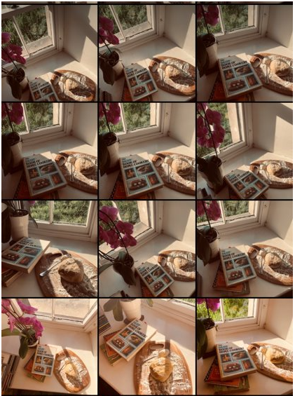
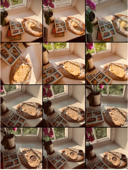
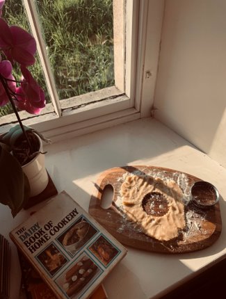
Here is my final photo, the filter is dramatic warm. I chose this image because by looking at the photo it reminds me of my memory of baking. I was inspired by Eggleston’s work, and the vintage style he uses. As he uses dye-transfer I thought I could create this in my own way by adding the dramatic warm filter, where is gave a similar effect. It gave it the vintage style I was hoping for and had dark areas which really highlights the focus point. I like how is an old rustic style, but still has a lot of colour. The tones created by the filter compromise each other, as together they create a unique photograph. Overall, I am really pleased with the result, because it showcases nostalgia as I am instantly reminded of my childhood. I think this engages the audience as it tells them a story of my memory, like Eggleston’s work does.

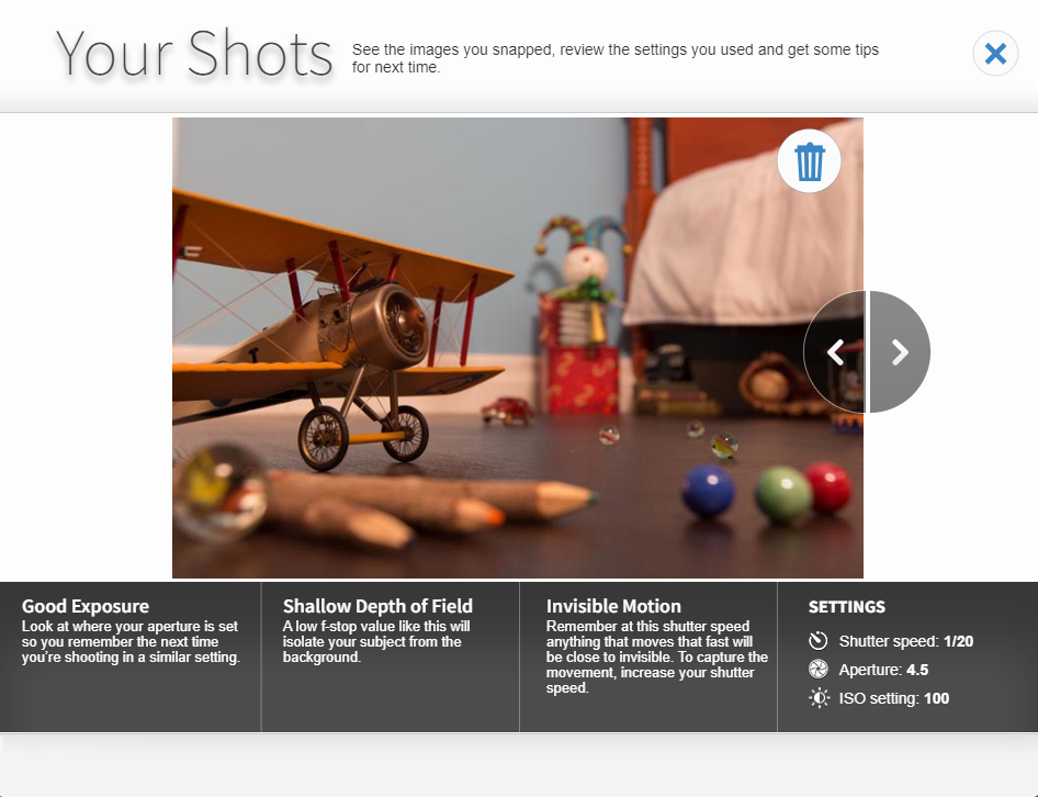
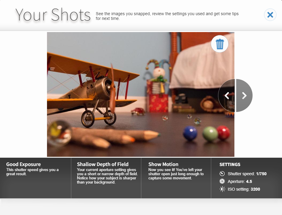
By making the depth of field wider and decreasing the shutter speed it makes the propeller blurred and not in focus. By Increasing the Shutter Speed the propeller will become more visible and will be in focus.
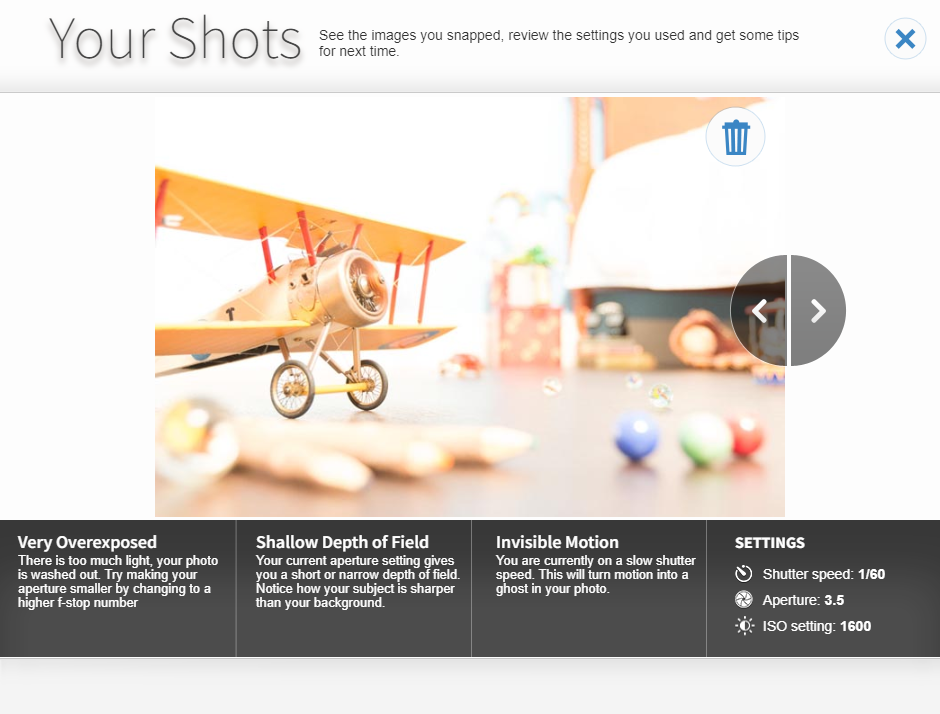
This picture is very overexposed as there is too much light in this picture and where there is motion in the photo it has been blurred out due to the slow shutter speed. To make this photo not overexposed I need to make my aperture smaller by changing it to a higher f-stop.
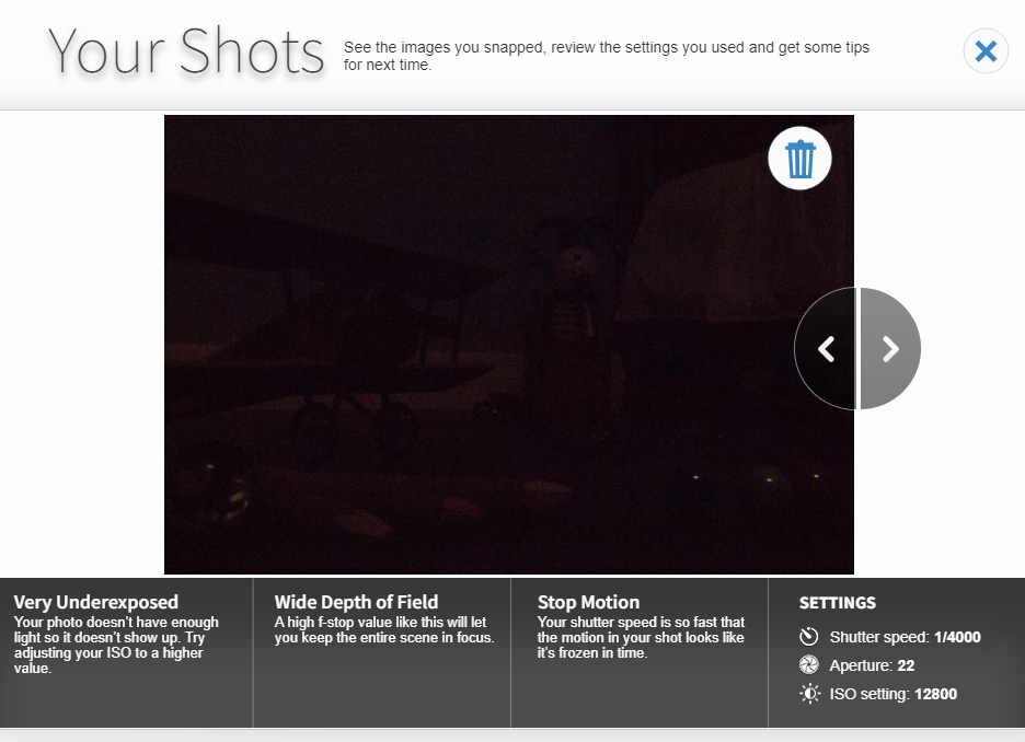
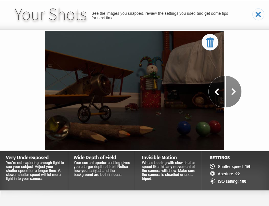
This image is very underexposed as the picture doesn’t have enough light so the image is not visible. The shutter speed is so fast that the motion in the image looks like its frozen. To make this image not underexposed I would have to adjust the ISO by making it higher to give the image the light back.