Nostalgic Photographs:
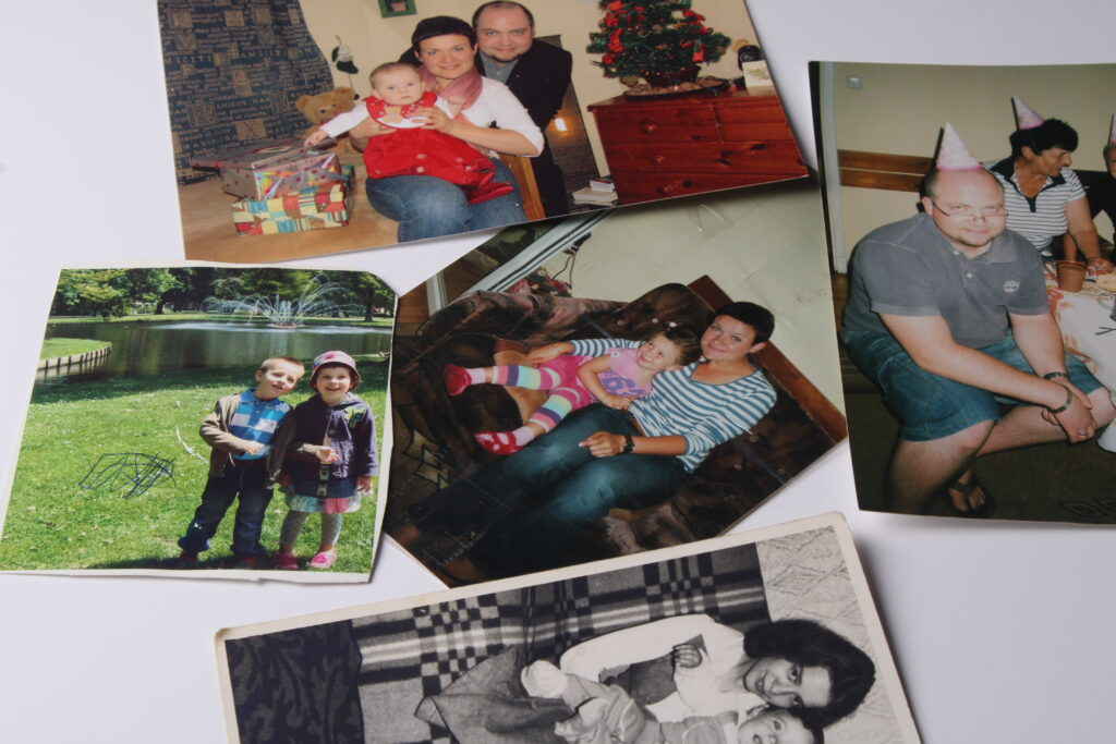
Throughout the couple of lessons, my class and I took photographs with different camera modes, angles and lighting qualities. I brought photographs from different of my family background e.g. photographs when my mum and grandmother wee younger, myself as a child (nostalgia) and childhood and memorable photographs in general which are special to me. I tried to adjust the photographs to my liking and bringing the different settings like ISO, shutter speed, aperture and other manual settings we played around with. My mum mentioned that I had scribbled on the further left photograph so I as well think of the pen damage as a memorable and funny childhood thought.
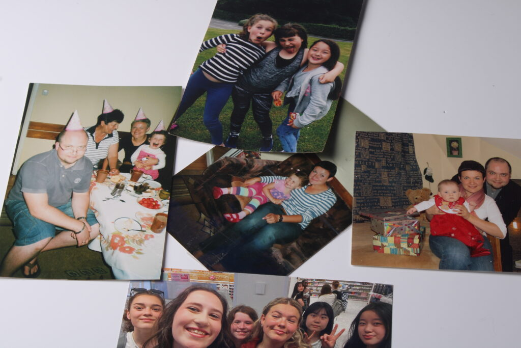
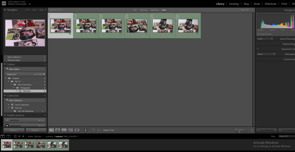
In our previous lesson the class was introduced to Adobe Lightroom classic and learned skills such as selecting colour label and making collections and collections set in order to clearly identify where the photographs are and if you prefer one from the other using the contrasting colours.
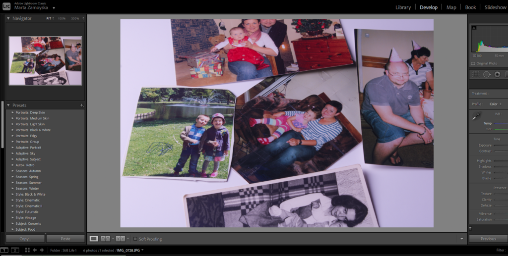
It is seen in this print screen I started to develop the photographs temperature and the tonality and exposure settings. I didn’t want the photograph to dark yet too light so that the slightly pink features popping through the photograph come out, the slightly pink atmosphere gives the photograph a sweet and positive outlook and feeling when looked on especially on terms of the theme of Nostalgia, looking back on childhood memories and reflecting to the earlier years.
Objects:
As well as taking photographs of arrangement of photos, I took photographs of objects. When composing these photos, I focused on the objects being framed in the centre of the image. I narrowed down/cropped the image so that it is clearer to see the details of the subject and to not have a lot of blank space.
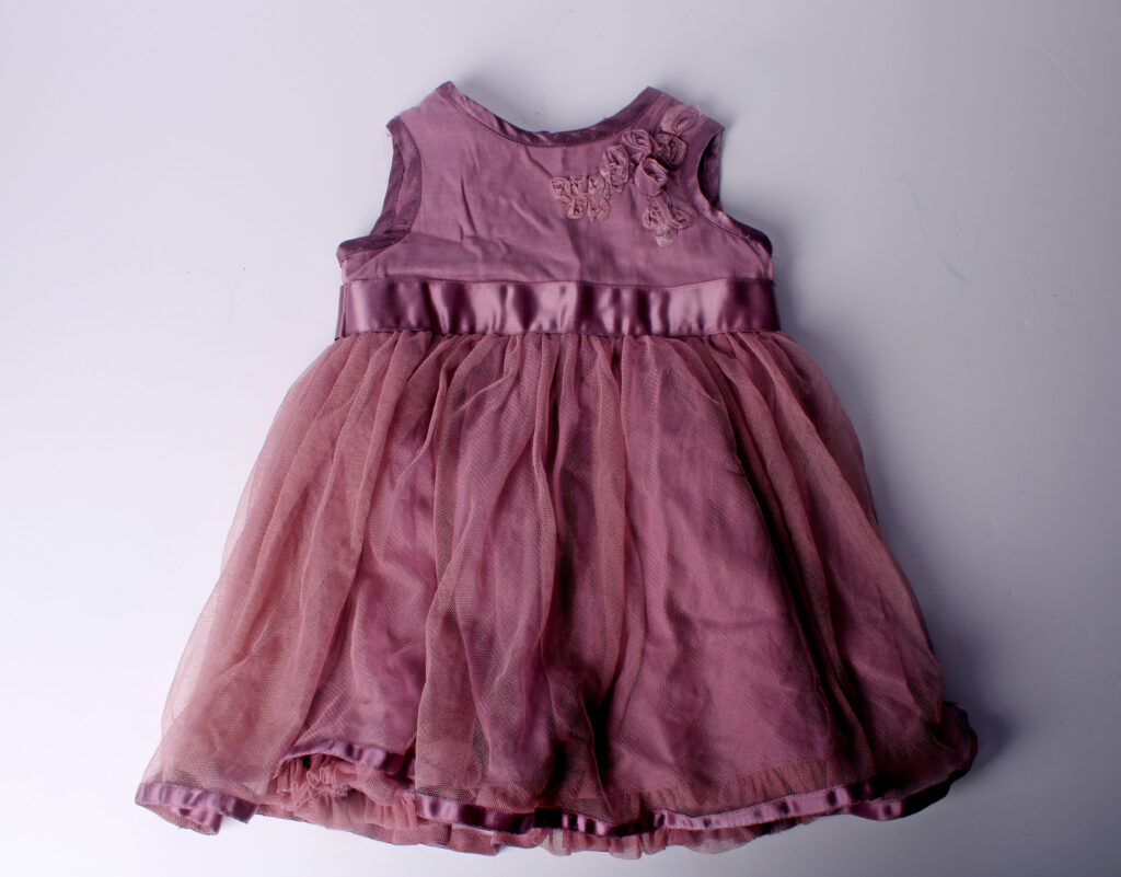
I believe having a photograph of a singular object can make the outlook on it a lot more interesting, mysterious, and a lot more compelling as it may raise a lot of questions: Why is it only the dress? Is the dress abandoned? Is used? What is the backstory of it? What does it tell us as a viewer? Looking at the photograph having only one subject may give the viewer a lot more to say and may give a greater emotional impact.
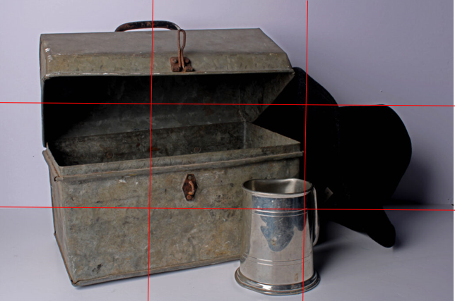
In this photograph there are three objects included and as it is presented by the rule of thirds, it is clear that the focus is in the centre of the middle column. Many of the darker tones of the photograph are located in the middle creating an atmosphere of emptiness, unsolved matters and enigma.
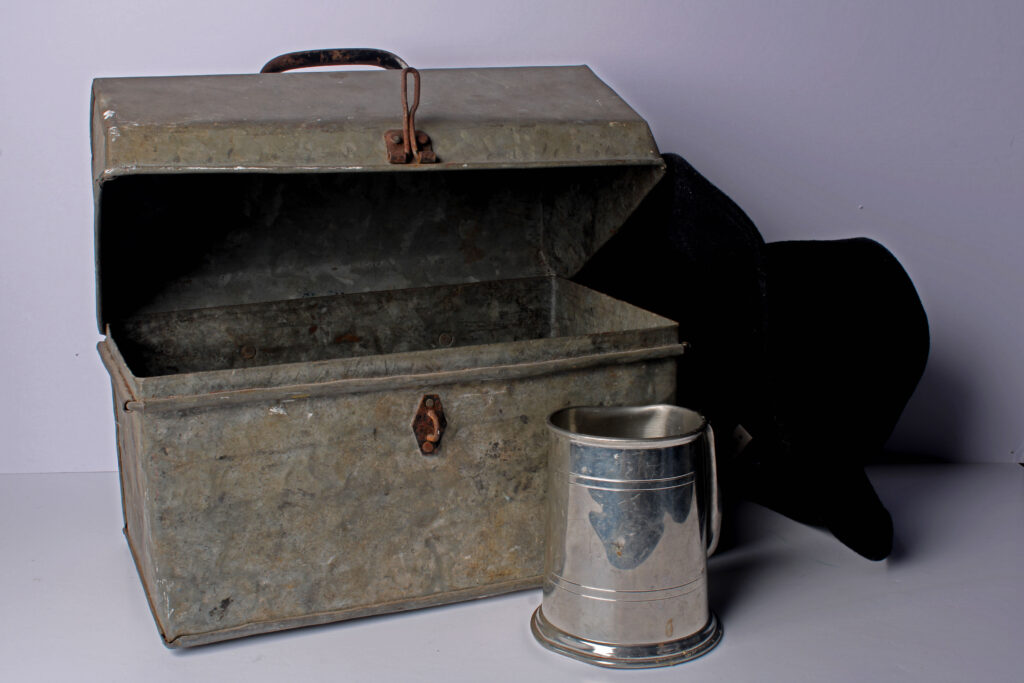
Above I have presented the photograph without the lines. This photograph consists of three objects instead of just a singular one so the story or backstory behind the object’s meaning may be more developed by the viewer as there’s more to say about it. Questions like: Why do they link? What does the old box have to do with the black hat? What was the odd box used for? How old is the silver mug?
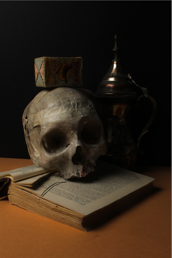
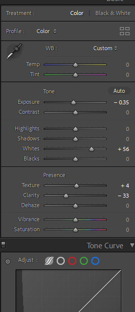
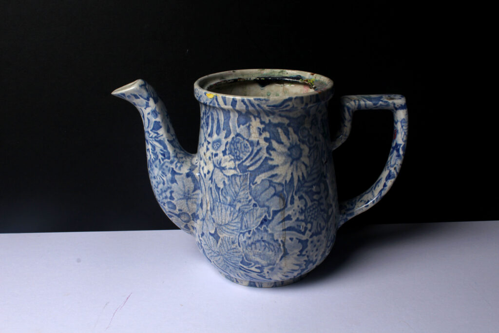
In this photograph, I experimented with other objects and backdrops’ colour schemes (which ones paired better with the undertones of the objects). I paired the skull object, open book and vintage-like patterned vase with a black and orange coloured piece of card so that the shadows and discreet tonalities of the skull especially can come out. I increased the white tonalities so that the lighter areas of the photograph can pop out as well as the clarity and textures as seen on the right image editing selection panel.
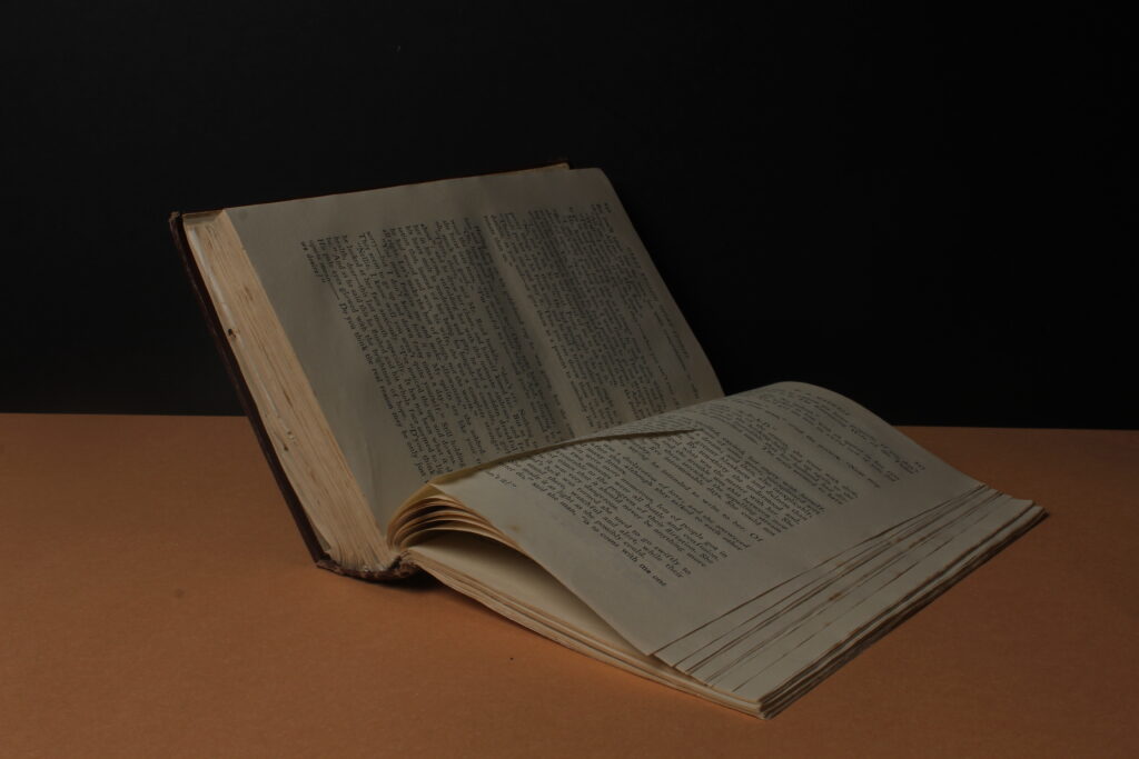
In this photograph, I decided to take the image in a landscape formation as the subject expanded in width rather than in height. I find the photograph a good mixture of tonalities and colour scheme as I believe the dusty white/yellow tones of the pages pair well with the orange and black background colour. I believe the outlook on the pages flicking over, especially in this specific photograph where the page in the book has been already flipped further increases the meaning and background of “still life”.
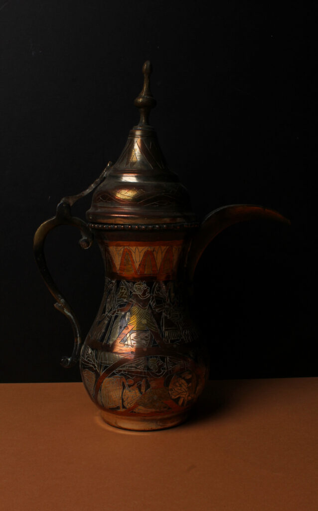
In this photograph, I kept the background and the same colour scheme. I figured that the black and orange scheme would play well with the colours of the pattern and similar warm tones shades on the lamp. I like how the photograph turned out and the highlighted area on the lamp as it appears shiny and gleaming. Anything that I would change in this photograph would be to look first photograph the object with a brighter light so that the photograph doesn’t appear as bright as first and when editing the photograph so that it doesn’t appear even more darker.
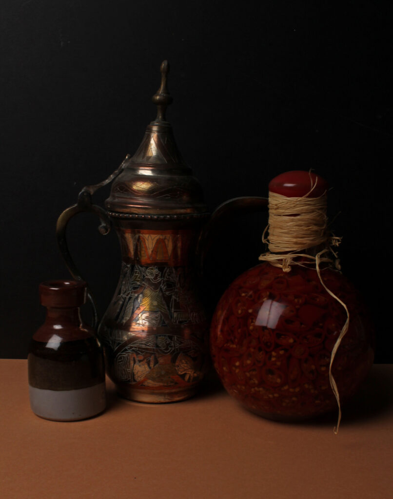
In this photograph I combined both elements into a trio, I added the vintage-like lamp from the previous photograph and brought together other unique and one-of-a-kind objects complimenting each other with the colour scheme, pattern and size and shape e.g., if it looks distorted or funky.
The three different objects are positioned closely together and, in the centre, when looking at the rule of thirds. When the object is closely put together the lighting can be seen being presented from the left side of the photograph, there are more shadows presented in the lower right of the photograph clearly showing the light source from one direct area, and the lighting reflects onto all three of the objects in all similar area, the middle to top of each of the items shown.
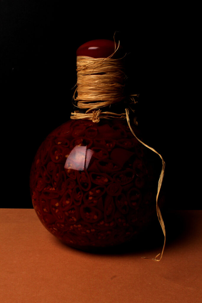
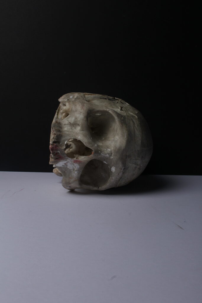
In this photograph, I have presented another one of the objects in a singular formation as well as with the orange and black back set. I believe if the background would have changed colours, especially by implementing the colour white the photograph wouldn’t have the same effect as it does despite it being under-exposed as it appears quite dark despite the editing and brightening the warm saturated aspects. If I were to change anything with the photograph, I would not change the background I would change the lighting brightness as I believe to make the photograph a bit more effective, I would need to implement a slightly brighter artificial light.
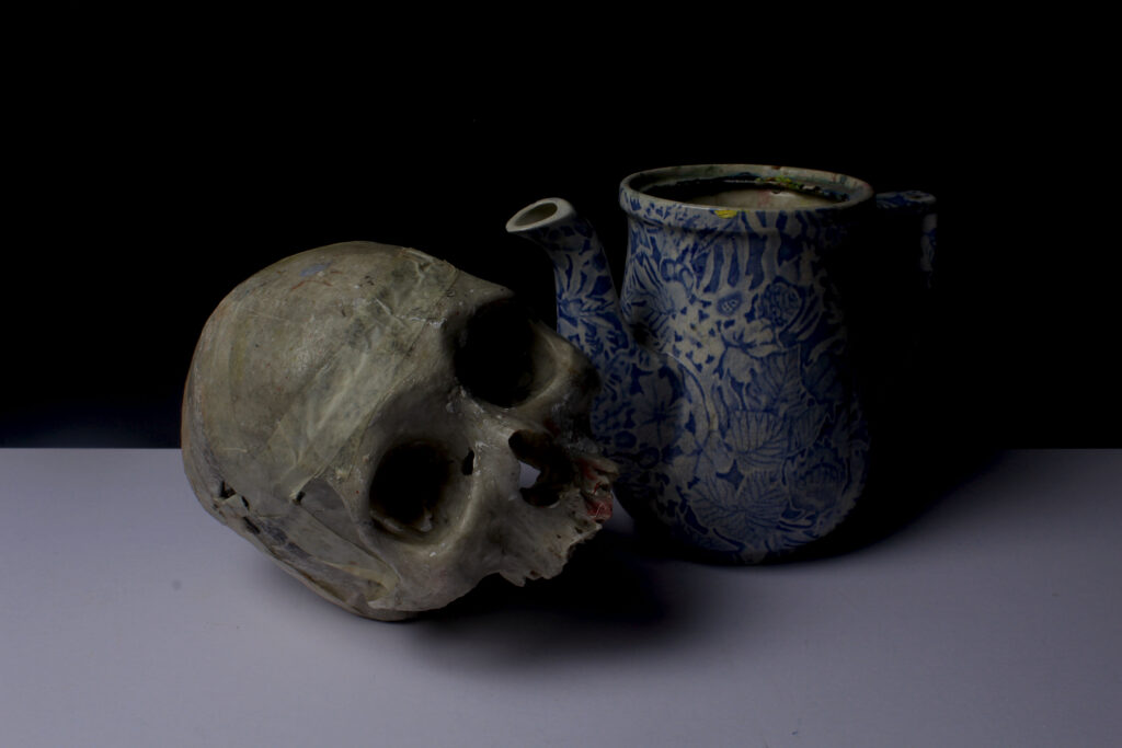
In the image above and images below, I have tried to create different scenarios and formations with unique and abnormal skull figures to make different stories and through them images to have different meanings. In all the skull-similar images I experimented with directions and where the shadows would face to create a specific outlook on the photographs shown.
