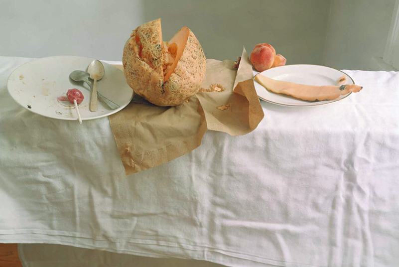
Walker Evans and Darren Harvey-Regan

Walker Evans

‘Stare, pry, listen, eavesdrop. Die knowing something. You are not here long.’ -Walker Evan

Evans was an American photographer, capturing everyday, working class citizens.

Evan’s had many unique approach that were benefitted from his slight frame, allowing him to take many photos unnoticed, perfectly capturing things and people completely unaware. He was also a close friend of Ernest Hemingway who also ended up shaping much of Evan’s early style. He was one of the first to use portable cameras which got increasingly more modern with faster shutter speeds only further benefitting his style of quick snaps, expertly timed and framed. He actually began his career wanting to be a writer, which the literacy style stuck with him though all of his work as in himself he could not fully identify with the poor, rural farmers he portrayed in his work, so he often used literature to help understand and present his work.

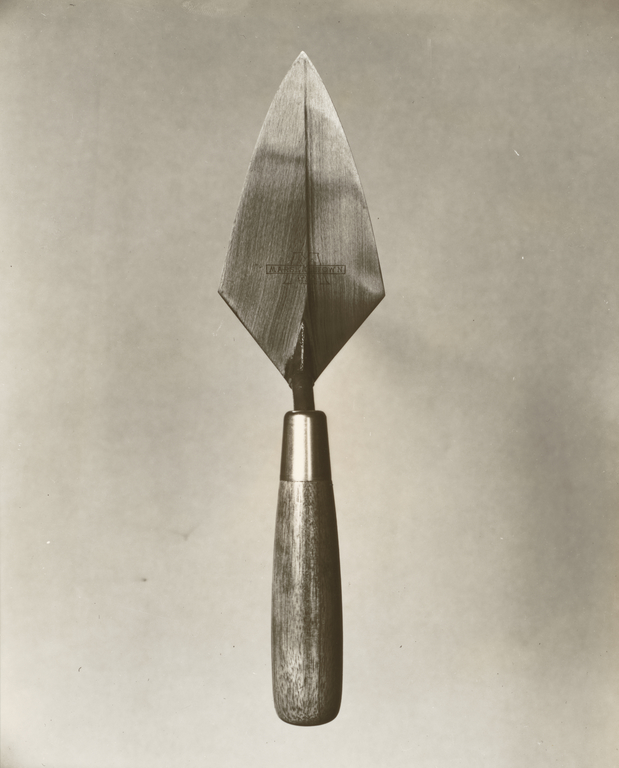
Tin Building, Moundville, Alabama, Walker Evans, 1936.

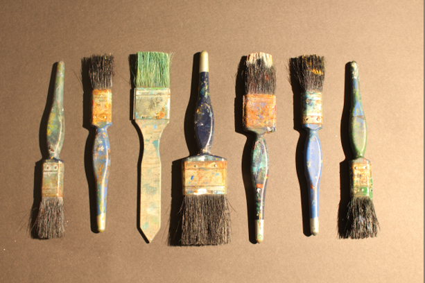
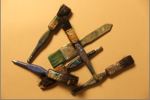
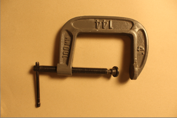
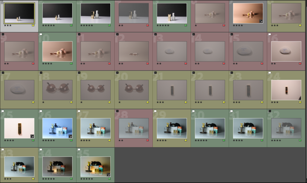
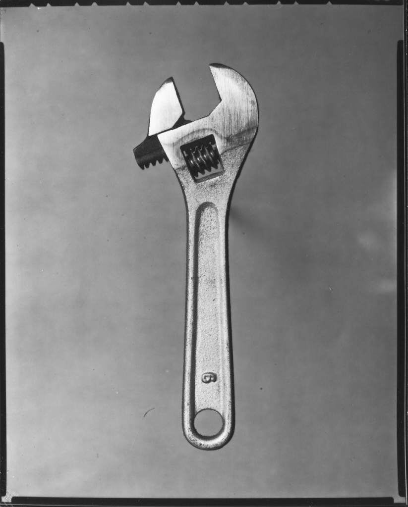
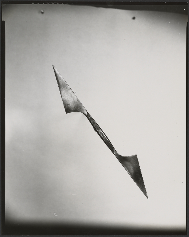
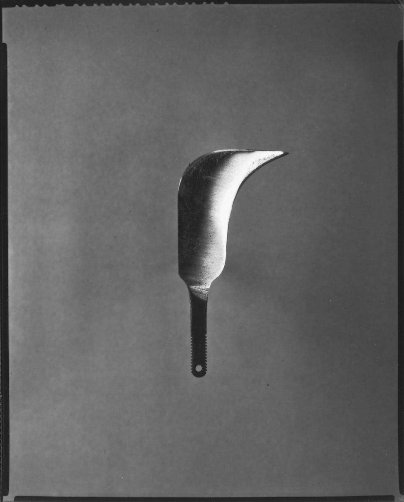
Beauty of Common Tools – Walker Evans

Darren Harvey Regan

Beauty of the common tools – Darren Harvey Regan

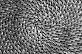
Darren Harvey Regan is a photographer who was also a mixed media artist combing sculpture and photography. He wants to break the constraints of photography hence the mixed media. Many of his images are comedic and his aim is to get people to study the subjects of the photos. He is often linked to the style of formalism as his work is heavily focused around: lines, shape, colour and texture. The style he uses forces people to study each part of the image and look for meaning and reasoning behind the photo.

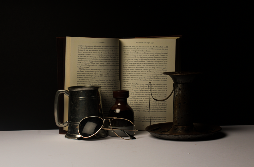
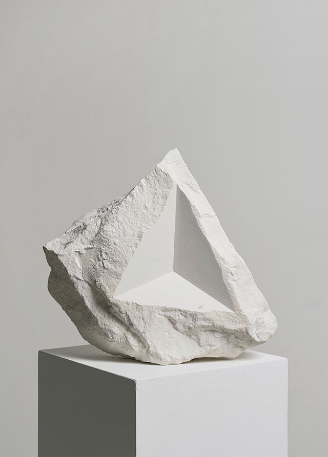
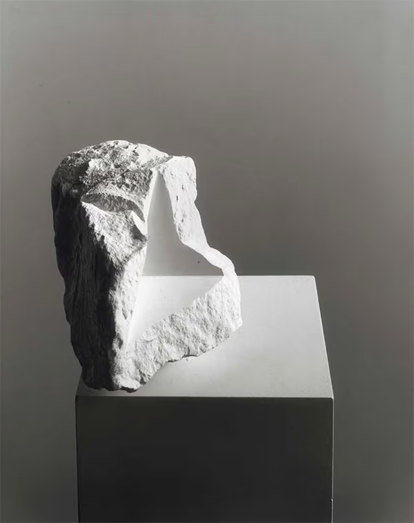
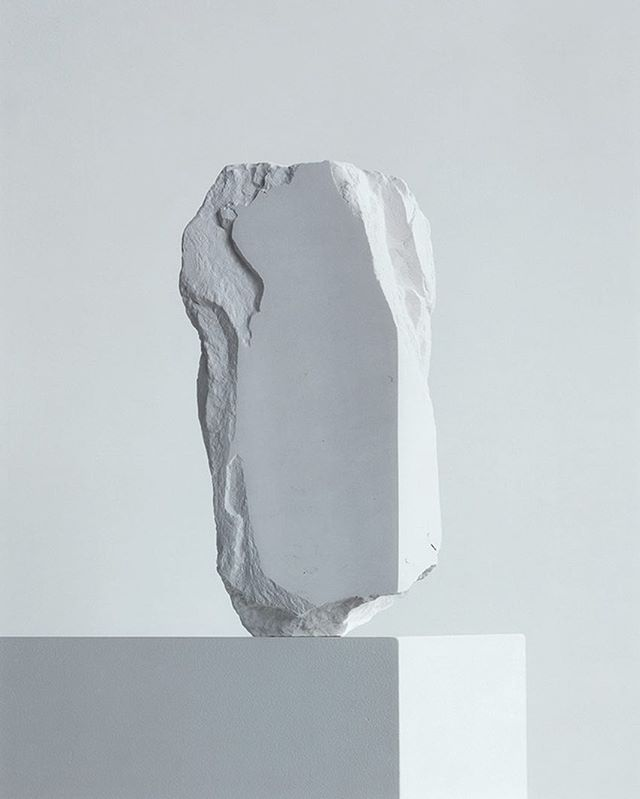
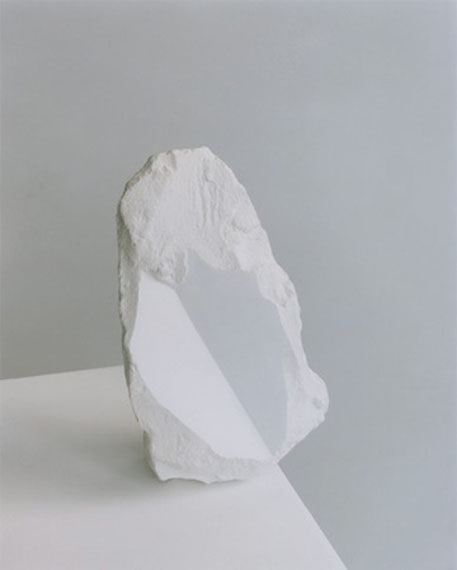
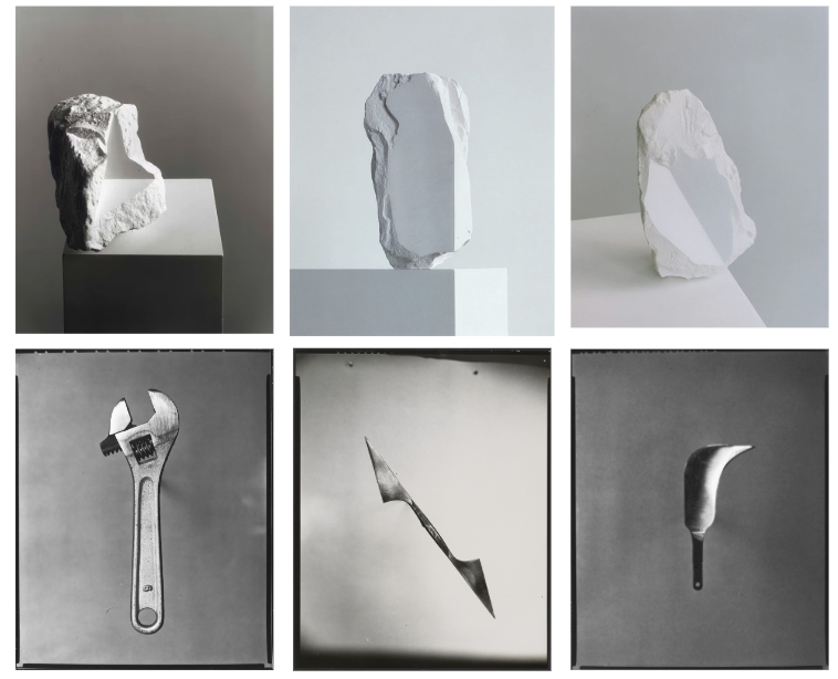
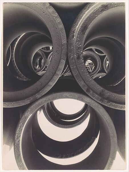
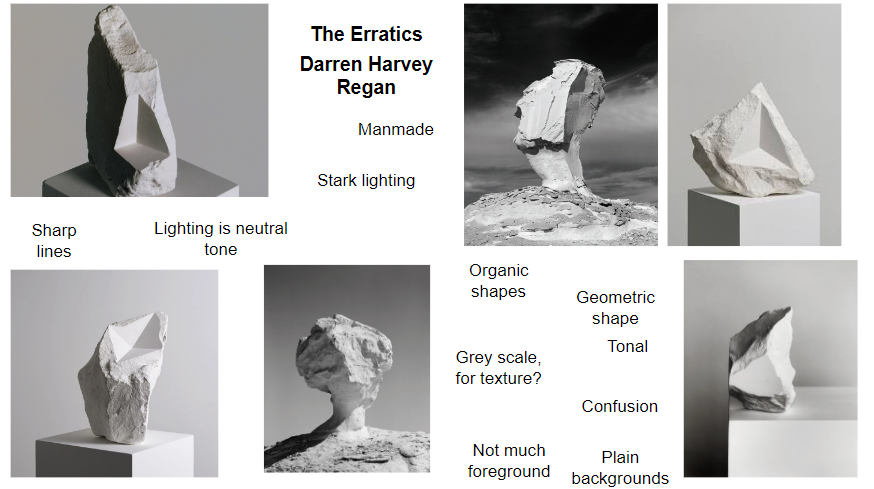
Darren Harvey-Regan – The Erratics

Analysing Regan’s style

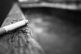
Regan’s work tends to be black and white, with a wide grey scale. He heavily focuses on lines and textures in his work, for example the image above has a chalk on a stand adding further lines and direction to the photo. It also has a triangular shape carved out of it, which has a very different texture to compared the rest of the chalk as it appears smooth like the surrounding area where as the rest of the chalk looks very rustic with organic textures. The lighting is soft but well lit with sharp edges when the lighting changes in the image appearing very satisfying to the viewer.

Comparing Regan and Evans Work

Regan’s photo is o the left and Evan’s photo is on the right. There are obvious similarities between the two images, with them both being clack and white although this is reflective of the period of time Evan’s took his photos. There are other similarities like the subjects both being a tool and that it is on a plain white background. I believe the background is to get people to stop over looking an everyday tool and appreciate how interesting it is with the lines and patterns. There are differences like Evan’s photo has the tool on an angle like it had just been thrown on the floor, where as Regan’s photo appears well thought out and structured. There is the other big difference between the two images is that Regan’s photo has been edited as it is actually two tools merged together that you wouldn’t notice unless you actually looked at the photo due to the grey scale and similar shapes of the tools. While they are technically both photos, are Evan’s photo as Regan used Evan’s photos to make new collages and new experiments.

Edits and development –

For my Formalism work I wanted to interpret what I saw in Walker Evan’s work where he used tools and almost ‘handy’ objects. I took a variety of photos and moved them to light-room to edit them slightly, just to change how the lighting effected the photo in certain ones.

Here are some examples :

before :

after editing :

before :

after editing :

before :

after editing :

I edited the last two slightly differently adding more saturation to make the photos bright and more contrasting, while on the other one, I lowered the saturation to almost make the photos look more gloomy and dark.

For this photo, the original photo was slightly unclear so while I was editing, I increased the exposure and clarity on the photo to make it more clear while also adding highlights and shadows to give the photo more dimension making the photo looking almost more ‘clean’ and clear.

This photo was very dark before editing so I wanted to add better lighting that wasn’t produced in the studio. I also increased the saturation on the picture to give more clarity and to make the background colour ( purple ) more intense.

The use of brightening the photo was to make it more appealing to the viewer and more aesthetically pleasing as well. As you can see the shadows in the corner of the photo show depth and still give the kind of ominous feeling to the photo which I want to include in the photos I take as my own personal touch to them.

Overall :

overall, with help from teachers, I managed to improve the way I edited. At the beginning, I wanted to intentionally make the photos darker and less contrasting but towards the end I manged to keep the almost shadowy darkness but still adding highlights and keeping the picture bright and clear.

Walker Evans and Darren Harvey-Regan

“The Beauty of the Common Tool”

Walker Evans greatly influenced Darren Harvey-Regan, and both artists paid careful attention to choice of objects, composition, lighting and exposure values.

WALKER EVANS:

“Among low-priced, factory-produced goos, none is so appealing to the senses as the ordinary hand tool. Hence, a hardware store is a kind of offbeat museum show for the man who responds to good, clear ‘undesigned’ forms.”

-Walker Evans-

‘Beauties of the Common Tool’ is a portfolio by Walker Evans, commissioned by Fortune Magazine, originally published in 1955. This image has an empty alt attribute; its file name is image-1515-1024x635.png

Walker said “Aside from their function- each of these tools lures the eye to follow its curves and angles and invites the hand to test its balance”

By saying this, Evans is articulating his intentions and ideas behind the photos he is producing. This sentence sums up what he thinks make these photos interesting and lets us know what it is about these tools that evokes emotion in himself.

Evans collection has at least 22, though, images of a reamer, an awl, a bill hook, an auger, various pliers, and a couple of variations on a T-square and some wrenches.

DARREN HARVEY-REGAN:

“It’s a means of transposing material into other material, adding new meaning or thoughts in the process. I think photographing materials is a way to consider the means of creating meaning, and it’s a tactile process with which I feel involved. Touching and moving and making are my engagement with the world and my art”

-Darren Harvey-Regan-

Harvey-Regan first constructed a montage of Evans’s images to make new forms. However, unlike Evans, he then sourced matching tools, cut them in half and re-joined various halves together, with the resulting physical objects being photographed to create his final work. The montaged tools become both beautiful and bizarre objects, in which a ratchet wrench is combined with a pair of pliers and a Mason’s trowel joined with a pair of scissors.

The portraits of welded, mismatched industrial tools appear pristine and polished, captured on film like a collection of precious and revered objects.
Harvey-Regan’s work started with Walker Evans’s Beauties of The Common Tool. Harvey-Regan made collages of Evans’ tool images, before sourcing matching tools, cutting them in half and then re-joining them to create his digital montages.

Darren Harvey-Regan said “Photography typically starts with capturing the image of something material, but here I start with pre-existing images and make something physical from them instead. As much as I need to think about the conceptual underpinning of ideas, there’s always a completely subjective investment to the act of making, or finding something to invest feeling and meaning into.”

Still-Life —photoshoot

I filtered my catalog into just my flagged images (ones i’d picked) To further refine my image selection I gave the images a colour grading. I used the X and Y tool to compare similar photos and choose my final ones for editing.

CONTACT SHEET PRE-EDIT:

BEFORE AND AFTER SHOTS FROM LIGHTROOM EDITING:

I am happy with all of my final edits and feel that I have been able to somewhat achieve my desired look for each of them.

However, I am not in love with them and feel that some of them are a bit dull even after the editing. Although as this is my first shoot and first time using Adobe Lightroom I am pretty happy with what I was able to accomplish and now know things that I can improve for next time.

When editing, I focused on bringing out the vibrance of the different colours making them more prominent in the photo. For example, I enhanced the purple in the card.

I also worked on fixing the white balance in the images where appropriate and just in general fixing the black and white tones within, alongside the colours in the images.

Once i’d edited my images, I could identify which ones i’d edited my looking at the little symbol in the corner of each image.

CONTACT SHEET POST-EDITING:

MY FAVOURITE FINAL IMAGES:

<————–BEFORE

AFTER—————->

When taking this photograph I used the infinity screen and a tripod in the studio. I also used 2 point continuous lighting with a warm tone setting. I chose an ISO of 100 as there was sufficient lighting already and the image didn’t need brightening more. As I was using a tripod, I didn’t have to worry about camera shake and so I was able to have a slightly longer shutter speed (1/4sec). This also helped balance out the ISO because a longer shutter speed allows more light to be let in and so a high ISO isn’t necessary to light the objects. I used an aperture of f/8.0 because it meant that the focus was balanced. I did this as I was using very plain backgrounds anyway and so my objects would already be the main focus without having the lower the f stop number.

When going into light-room I increased the contrast slightly in order the bring out my objects more. I also adjusted the shadows and highlights to make the image more appealing and expressive as it tells a very emotional story about moving from England to Jersey. Another thing I adjusted was the vibrance and saturation. I did this as I wanted the sharpen the colours in my objects as the lighting had made them appear as quite dull compared to the real life version.

Overall I am happy with my image and feel that it successfully tells the story I want it to tell. I believe that it can evoke emotion or curiosity in the viewer. I also believe that I have been able to achieve the still-life genre intended as I created an image using multiple objects that tells a deeper story about life.

<————-BEFORE

AFTER—————>

When taking this photograph I used 1 point flash lighting. I chose an ISO of 100 with a fast shutter speed (1/125sec). This was because I was using the flash setting. By setting up my camera light that I was allowing enough light into the camera to capture the objects but preventing too much light being let in and overexposing the image. I used an aperture of f/16 for similar reasons as I did for the above photo- due to the background being so plain and the objects being more set back using a high aperture would be ok and would enable all the objects to be in focus without the background taking focus away from them as it was so plain.

When going into light-room I increased the contrast and adjusted the shadows, highlights and white+black tones. I did this in order to bring out the objects as the main focus and get the correct white balance in order to really make the image pop. I also adjusted the vibrance and saturation to bring out the colours of the highland cow as that was a key part of the story behind the image.

Overall I am happy with my image and like the above, feel it successfully meets the still-life genre. However, I do feel that it may not be as clear as to the story i’m trying to tell. Although this may be effective in giving multiple different meaning to different people and how they inturpret it.

Still Life

What is Still Life?​

A painting or drawing of an arrangement of objects, typically including fruit and flowers and objects contrasting with these in texture, such as bowls and glassware.

​What is Still Life photography?​

Still-life photography is a genre of photography used for the depiction of inanimate subject matter, typically a small group of objects. Similar to still-life painting, it is the application of photography to the still-life artistic style.​​

It has captured the imagination of photographers from the early 19th century to the present day. It is a tradition full of lavish, exotic and sometimes dark arrangements, rich with symbolic depth and meaning.

How did Still Life come about?

Still-life emerged as an independent genre, in particularly during the early 1600s Dutch and Northern European paintings. Many of the objects depicted in these early works are symbolic of religion and morality reflecting on the increasing urbanisation of Dutch and Flemish society, which brought with it an emphasis on the home and personal possessions, commerce and trade.

Traditionally, a still-life is a collection of inanimate objects arranged as the subject of a composition. Nowadays, a still-life can be anything from your latest Instagram latte art to a vase of tulips styled like a Dutch Golden Age painting.

What are some of the different categories of Still-Life?

There are many different catagroies. Examples include; Fruits, Flowers, Breakfast pieces, Trompe L’Oeil and Vanitas.

Here is a mood board of Still-Life including paintings and photographs, modern and old:

Still-Life today:

In traditional still-life arrangements, objects are carefully selected and ordered to create a visually pleasing or meaningful image. This tradition has continued in contemporary practice, with photographers using props, designing sets and constructing elaborate scenes to photograph.

Other photographers search for striking arrangements to provoke thought. These photographers see extraordinary pattern and meaning in everyday things. Some images are cluttered, but there is an implied order among the chaos.

Timeline of Still-Life photography:

Examples of Still-Life Photographers:

Mat Collishaw:

A perfect example of the old technique getting combined with modern-age ideas is Mat Collishaw’s Last Meal on Death Row series of works. Although they appear as meticulously arranged staged photography still-lifes of food, each image is actually based on death row inmates’ last meals before they are executed. Apart from the eerie subject, the pictures deliver a strong dramatic effect through an excellent use of chiaroscuro.

Richard Kuiper:

Think paintings by Pieter Claesz or Adriaen Coorte, only in plastic. That’s how one could describe the photographs of Richard Kuiper, whose objects are all made of this everlasting, widely used material, including water bottles, floral arrangements, even the feathers. The artist tries to draw our attention towards the excessive use of plastic in our everyday lives, with the hope we will be able to decrease it before it takes over completely.

Krista van der Niet:

On a much more lighter, even pastel note, we have Dutch photographer Krista van der Niet, whose compositions often include fruits and vegetables mixed with mundane objects such as socks, cloths and aluminium foil, giving it all a contemporary feel. Her photos often carry a dose of satire as well, which references consumerism and popular culture through a clever employment of objects within a carefully composed scenery.

What is Memento Mori?

Still-lifes that remind the viewer of the shortness and fragility of life and include symbols such as skulls, clocks, hourglasses and extinguished candles. (memento mori is a Latin phrase meaning ‘remember you must die’)

What are Vanitas?

A still-life of a 17th-century Dutch genre containing symbols of death or change as a reminder of their inevitability. 

Vanitas grew out of the long artistic tradition known as the memento mori. Vanitas include other symbols as well as skulls etc, such as musical instruments, wine and books to remind us explicitly of the vanity of worldly pleasures and goods. Whereas memento moris are typically just skulls and extinguished candles liking directly to death.

Vanitas utilize the still-life form to show the fleeting quality of life and the vanity of living

What kind of metaphors and symbols are used in still-life and why?

10 common symbols in still life are:

Fruits- varying symbolism in still-life- offer a variety of religious and mythical symbols. For example, in Christianity, apples signify temptation and knowledge in reference to Eve eating the forbidden fruit. Grapes symbolise the themes of pleasure and lust associated with Bacchus, the Roman god of wine. Pomegranates are associated with Persephone, the Greek goddess of spring and queen of the underworld.

Skulls- the certainty or morality- a striking reminder of the certainty of death. Such a symbol is called a memento mori

Candles- the passing of time- represent the inevitability of the passing of time, the longer they burn, the smaller they get until there is nothing left. A lit candle symbolises light, truth, and knowledge. An extinguished candle symbolises loss and death.

Flowers- symbols of life and growth- a beautiful bouquet of flowers in full bloom can signify life, faith, growth, and power. Wilting flowers, on the other hand, serve as grim reminders that life, material goods, and beauty are fragile. Specific flowers have more specific meanings. For example, poisonous nightshade symbolises danger and deception, daisies symbolise innocence, poppies symbolise sleep or death, and a red rose symbolises love and seduction. 

Seashells- birth, purity and fertility- in addition to being associated with femininity, seashells can symbolise birth and good fortune. In Christianity, seashells also symbolise baptism and resurrection. Pearls are symbols of purity and perfection. When hidden between the oyster’s shells, the pearl represents hidden knowledge and awareness.

Mirrors- the soul in reflection- they can represent either truth and self-assurance or vanity and distortion, the difference depends on who is looking at their reflection.

Insects- transformation and decay- as a group, insects symbolise greed or decay, but specific types of insects have their own associations. For example, butterflies represent transformation. When included alongside fruits or flowers, each insect draws attention to the impending decay of the fruit and flowers, which, due to the infestation, is already underway. 

Musical instruments- beauty and transcience- they’re often included to show off the wealth of talent of a patron but they could also carry deeper meaning. In vanitas, a violin can remind viewers of the threads of time and the fact that all beautiful things must come to an end. Violin strings that are snapped or missing can indicate discord or death. The curving shapes of many instruments, such as the guitar, parallel the organic and seductive shapes of the human body.

Dead animals- contradiction and the hunt- during the Dutch Golden Age, hunting for sport became less exclusive to the wealthy, and international trade became more abundant. As a result, still life paintings of highly detailed hunting trophies and exotic animal carcasses were in very high demand. When depicted alongside other food items, dead animals could also represent the culinary specialties of a certain region or patron.

Silver and gold- luxury in still life paintings- may heighten the tension between materialism and morality.

Below are some of my images in the style ‘Still Life’ with a theme of nostalgia:

These photographs represent my recent relocation to Jersey. They symbolise where I came from (Hertfordshire, England) and where i’ve come too (Jersey). I used warm lighting in a few of them which I feel is representative to the topic as moving can be a big thing so its nice to feel some warmth and comfort after doing so and reflecting upon it all. I find the composition of my images comforting as you can clearly see each item and your eyes are taken on a nice journey through the different parts of the image. The composition helps to tell the story. I believe there is a sort of metaphor coming across in these images in that even though something like moving country can feel so big, it is in fact just a small part of your life.

Formalism

Photographers have to impose order, bring structure to what they photograph. It is inevitable. A photograph without structure is like a sentence without grammar—it is incomprehensible, even inconceivable.​

— Stephen Shore

LINE-

A straight or curved geometric element that is generated by a moving point and that has extension only along the path of the point

Lines are either straight, curved, or a combination of the two. They can be solid, dashed, implied, or psychological. They can be vertical, horizontal, or somewhere in-between. Straight lines often show up in manmade objects. Curved lines can be manmade but are often organic in nature. Solid lines are common in scenes.

SHAPE-

The visible makeup characteristic of a particular item or kind of item. This includes its spatial form or contour- a standard or universally recognized spatial form

Shapes are two-dimensional. They can be measured by overall height and width. Shapes can be the outline of an object-familiar or unfamiliar.

Sometimes a familiar shape can transform into an unfamiliar or unrecognizable shape based on the viewpoint of the photographer. 

FORM-

The shape and structure of something as distinguished from its material. Form is three-dimensional. It has overall height, width, and depth.

There are two basic types of form- geometric and organic. Geometric forms are the familiar sphere, cube, cone, cylinder, and so on. Organic forms are the objects that surround us in our three-dimensional world.

Like shapes, forms can be simple or infinitely complex. Forms create positive and negative space. In a photograph, positive space is basically that which is occupied by forms; negative space is what remains.

TEXTURE-

The visual or tactile surface characteristics and appearance of something. Texture in “real life” can be smooth or rough. We can also describe things as, slimy, wet, hard, soft, bumpy, shiny, etc.

Texture in a photograph is similar to form in that it is revealed by variations in tonality and presented in two dimensions. Smooth objects might have reflections or specular highlights. Rough objects might have aggressive areas of light and shadow without reflections.

Of course, in a photograph, we cannot experience the tactile surface characteristics, but we can “feel” them through the mind’s eye. Implied texture can cause an association with the familiar, assuming that it is familiar. Visually, a pattern might indicate texture like the scales of a fish or ripples on a pond.

COLOUR-

A phenomenon of light or visual perception that enables one to differentiate otherwise identical objects- the appearance of objects and light sources that may be described in terms of hue, lightness, and saturation for objects and hue, brightness, and saturation for light.

Light itself has no perceived colour. But, send light through a prism or a drop of water and we can see that it is comprised of a literal rainbow of colours.- It is a colour other than black, white, or grey

Hue is simply the description of the colour (e.g., blue, red, yellow, etc.).

Value is the relative brightness or darkness of a colour.

Saturation is the intensity or purity of a colour. The purest colour is a hue with no white, black, or grey added to it.

Different colours evoke different emotional responses

SIZE-

Physical magnitude, extent, or bulk- size in a photograph is relative and can be an illusion.

When a familiar object appears in the frame of a photograph (car, football, bed, etc.) we immediately get a feel for the scope of the entire scene. Without a familiar object in the image, we struggle to determine the scale shown in the photograph. The camera, lens, and print can render large objects small, or small objects large. Even objects familiar to our eyes can be rendered relatively large in a photograph, while things we know to be enormous are rendered small. 

DEPTH-

The depth of a scene—relating it to size, and adding the element of space.

How well the depth is rendered is dependent on the objects in the frame, your choice of composition, and your perspective in relation to the objects in the frame. Most images have a foreground, middle ground, and background. The stronger the delineation between those successive “grounds,” the stronger the sense of depth in your image.

Photography Grammar:

These formal and visual elements are shared with other works of art. But photographs also have a specific grammar – flatness, frame, time, focus etc. ‘Mistakes’ in photography are often associated with (breaking) the ‘rules’ and expectations of this grammar e.g. out of focus, subject cropped, blur etc. Some photographers enjoy making beautiful images but others are more critical of what beauty means in today’s world.

Photo Literacy:

It takes into account fluency of expression and sensitivity to material.

Words and images are different- a photograph of a particular subject is different to a description of the same subject in words. It is possible to see, understand and appreciate a photograph without the need for words.

STILL LIFE

Still life is a painting or drawing of an arrangement of objects, typically including fruit, flowers and objects contrasting with these in texture, such as bowls and glassware.

Still life photography is a form of professional photography that depicts inanimate objects or subject matters. Still life is a unique genre of photography. One thing that makes it so special is that often the subjects aren’t very interesting. The effect of this can make the photograph slightly a mystery and can tell its own story, sort of like a book as you imagine the way you want too.

Still life photography is important for several reasons. It can capture beautiful images that can be enjoyed for years to come. It can serve as a way to document and preserve history. Still life photography can be used to create art and has been a popular art subject for centuries.

Abraham van Beveren (Dutch, The Hague 1620/21–1690 Overschie) This photo presents the themes of wealth and high class which is shown through the lobster and the metal work reflecting on the lush fruit. This photograph can tell us many things but a main theme is wealth especially around the timing it was published.

Cookmaid with Still Life of Vegetables and Fruit c.1620-5 Sir Nathaniel Bacon 1585-1627

Sir Nathaniel Bacon did not paint professionally, although he was a skilled amateur artist. Very few works attributed to him survive, so the appearance of this work on the art market presented the Collection with a rare opportunity for acquisition. Furthermore, the subject matter, a cookmaid surrounded with lavish produce, more usually associated with Dutch and Flemish art, is highly unusual in England for the period and associated only with Bacon. Every item depicted is known to have been growing in England: Bacon himself grew melons on his Suffolk estate.

Fruits can symbolize prosperity, wealth, abundance, pleasure, fertility, and the fleeting nature of life, depending on the composition, colour, and presentation of the fruit. Although  fresh fruit, represents fertility, vitality, youth, and abundance. When the fruit is in a state of decay, however, it characterises the inevitable and undeniable mortality of our presence in the world.

As we are on the topic of symbolic meanings and metaphors. There are Vanitas

Pieter Claesz, Still Life with a Skull and a Writing Quill, 1628

vanitas is a symbolic work of art showing the transience of life, the futility of pleasure, and the certainty of death, often contrasting symbols of wealth and symbols of ephemerality and death. Vanitas remind the viewer of the shortness, fragility and uncertainty of death, which often include symbols such as skulls and extinguished candles. 

However, they can also include other symbols such as musical instruments, wine and books to remind us explicitly of the vanity (in the sense of worthlessness) of worldly pleasures and goods.

Although there are also light Vanitas which bring a more positive mood and outlook. Which although they are very different, they are actually similar within symbols and metaphors.

Still Life inspired – My photo

In this photo I used random objects and created an arrangement of the objects to create a meaning. The typical thing about still life is that the objects aren’t very exciting which makes it interesting. However my objects aren’t the typically used objects and don’t have a symbolic meaning. I also used an orangey-warm tone which created a significant and eye-catching shadow to make the photograph more interesting. The objects put together don’t explain the story behind them which is the beauty of still life, as it can be personal to you or how you imagine it to be. However, because I did not use dark lighting in the studio it contrasts and is different to the typical still life photographs, which is in my opinion less effective. Overall, it is still a still life photo but I would like to change some qualities to make it more like the professionals such as add symbolic objects and use natural or darker artificial lighting in the studio.

still life photoshoots and contact sheet

In this picture I rated, coloured and flagged my photos so that I could have an idea of what photos I liked most and so that I could edit the pictures that I liked without editing the unnecessary pictures.

In some pictures I used the copy-stand and in other i used an infinity screen.

For this photo I chose objects that I picked from the studio that portrayed a mysterious atmosphere. I wanted to give the photo more life so I added some techniques to the photo to reach its minimum peak. I kept the tint, temperature, contrast, highlights, shadows, whites, blacks, texture, dehaze and saturation untouched because I felt like the photo didn’t need them. I increased exposure to expose more the light in the photo, clarity to show more of the details in the photo, and finally increased the vibrancy to give the photo more colour. This picture was taken in an infinity screen with continuous light from the left and from a small light on the bottom of the infinity screen.

For this photo I wanted to create a warm and cosy tone to it. when I took this picture I looked at it and I really liked how it looked in general. I strongly believed that it showed the cosy feel to it yet it also was warm which, so I decided not to touch it and leave the picture just as it is . This picture was taken from an infinity screen with continuous light from the left and a small light on the bottom of the infinity screen.

Again for this photo I kept it untouched because I liked how it looked by itself. I wanted to have a photo that showed a slight off white look to it and was cool. I think that the photo naturally is cold and bleak so there was no need to edit it. This photo was taken in an infinity screen without the bottom light which gave it a cooler tone.

For this picture I wanted to play around with the white balance on the camera. I didn’t want the photo to have different lighting. I decreased the white balance to give the photo a more cool tone to it and finally to edit it, I increased the exposure the to make it lighter and cooler. This photo was taken from an infinity screen with a continuous light on the left.

For this photo I wanted to enhance the gold colour off the lipstick and also increase the white in the photo. I kept the temperature, tint, contrast, highlights, shadows, whites, blacks, texture, dehaze and saturation untouched because it did no good to the photo and didn’t help my aim with the photo. I increased the exposure to expose the brighter parts of the photo, clarity to show more off the texture in the photo and show the gold that the the original photo wasn’t showing and finally I increased the saturation to increase the saturation of the gold on the lipstick. This photo was taken from a copy-stand with continuous light coming from the sides.

For this photo, I wanted a homely and summery feel to it. When I took this photo I felt like I had already achieved what I wanted, without editing I think that it already had a homey feel to it so I left it unedited. This photo was taken from an infinity screen with a continuous light coming from the left

For this photo, I wanted to produce a clean and posh tone to the photo because I felt like the objects had that posh tone. When I took this photo I liked how it was very bright and illuminated the colours of the objects. I zoomed in the photo to show more of the details of the objects. Because I was happy with the photo unedited, I left the photo as it is and didn’t edit any of it. This photo was taken free hand with a black background and a white ‘floor’. The camera had a Flash setting so every time I took a photo, the light on the left flashed.

Again, For this photo I wanted to produce a clean and posh tone to the photo because I felt like the objects had that posh tone. When I took this photo I liked how it was very bright and illuminated the colours of the objects. I didn’t zoom in the camera lens, I kept my distance from the objects but made sure you couldn’t see the outside from the set up. Because I was happy with the photo unedited, I left the photo as it is and didn’t edit any of it. This photo was taken free hand with a black background and a white ‘floor’. The camera had a Flash setting so every time I took a photo, the light on the left flashed.

This is the set up I used to take the last two photos.

Formalism

Formalism describes the critical position that the most important aspect of a work of art is its form, the way it is made and its purely visual aspects, rather than its narrative content or its relationship to the visible world.

There are seven basic elements of photographic art: line, shape, form, texture, colour, size, and depth.

Line is a point that continues; it implies motion. Lines are either straight, curved, or a combination of the two. Lines can be solid, dashed or interrupted, implied, or psychological. They can be vertical, horizontal, or somewhere in-between.

The type and general direction of lines in your image convey meaning inside the photograph. Lines are everywhere in photographs. Lines surround us, and every photograph contains lines.

Shape photography is the two-dimensional appearance of objects as your camera captures them. When a line, or more than one line, closes or connects, a shape is formed.

The Merriam-Webster definition of “shape” that we are concerned with as photographic artists is:

-the visible makeup characteristic of a particular item or kind of item

-spatial form or contour

-a standard or universally recognized spatial form

What separates form from shape? Form takes shape from the two dimensional and brings it into the three dimensional. Form has overall height, width, and depth.

Just as with shapes, there are two basic types of form geometric and organic.

Geometric forms are the familiar sphere, cube, cone, cylinder, etc. We are also, of course, familiar with organic forms they are the objects that surround us in our three-dimensional world.

In photography, texture can be felt with both the fingers (the print) and virtually (with the viewer’s eye). Texture is the next part of our Elements of a Photograph series.

The definition of texture is the visual or tactile surface characteristics and appearance of something.

Texture in real life can be smooth or rough etc.

Texture in the photograph is similar to form in that it is revealed by variations in tonality and presented in two dimensions.

In a photograph, smooth objects might have reflections or specular highlights. Rough objects might have aggressive areas of light and shadow without reflections.

Texture can be elusive in a photograph, depending on the subject, the lighting, and the forms in the image.

definition of “colour” that we, as photographic artists, are concerned with is:

a phenomenon of light (such as red, brown, pink, or grey) or visual perception that enables one to differentiate otherwise identical objects

the aspect of the appearance of objects and light sources that may be described in terms of hue, lightness, and saturation for objects and hue, brightness, and saturation for light.

a specific combination of hue, saturation, and lightness or brightness

 a colour other than and as contrasted with black, white, or grey

Light itself has no perceived colour. But, send light through a prism or a drop of water and we can see that it is comprised of a literal rainbow of colours.

Colour has three properties: hue, value, and saturation.

Hue is simply the description of the colour (e.g., blue, red, yellow, etc.).

Value is the relative brightness or darkness of a colour.

Saturation is the intensity or purity of a colour. The purest colour is a hue with no white, black, or grey added to it.

Separate the different colours of the rainbow and we can see these varied colours elicit different emotional responses.

Size, the most elusive of these, is the topic of this sixth part of our Elements of a Photograph series.

The definition of size is the physical magnitude, extent, or bulk : relative or proportionate dimensions.

Size in a photograph is relative and can be an illusion.

Large, medium, or small. The camera, lens, and print can render large objects small, or small objects large.

Depth, one of the most compelling elements, is the topic of this final part in our Elements of a Photograph series. Including a distant horizon is not required to give a sense of depth to your image. Depth is provided by visual cues. Depending on the quality of the surrounding air or atmosphere, distant objects in a photograph will have less clarity and contrast than objects in the foreground. This aerial perspective is indicative of depth in a photograph. Where you place an object in a frame also offers clues toward depth. The higher an object is in the frame relative to the horizon (seen or implied), the greater is the perceived distance to that object.

Still Life

This is a mood board of still life. They are very traditional.

Throughout its long history, still life has taken many forms, from the decorative frescoes of antiquity to the high art of the Renaissance. Traditionally, a still life is a collection of inanimate objects arranged as the subject of a composition. Nowadays, a still life can be anything from your latest Instagram latte art to a vase of tulips styled like a Dutch Golden Age painting.

Creating a beautiful and successful still life image is an impressive feat, but just as painting a bowl of fruit is a good introduction for new painters, still life photography is a wonderful training ground for new photographers. It gives you an opportunity to experiment with light, materials, textures, and subjects in a controlled setting. Whatever your creative vision and artistic goals, still life is a great place to start.

Still life photography has opportunities to experiment with different styles, such as:

Assortment of glass containers with dried plant stems captured with still-life photography

Composition. First, play with your composition and test different layouts and arrangements of your objects. Consider composition styles like the rule of threes when composing your still life image. Tweak and adjust your layout as you go to refine your composition skills and identify what makes a photo pleasing.

Trinkets from around the world as still-life photographic art

Subject and materials. Compose your photo with diverse textures and materials. It doesn’t matter whether it’s a handful of random objects from your home or a curated collection of sterling silver candlesticks. Explore how shadows and light reflect off of various surfaces, and see how it affects your final composition.

Still-life image of plant on digital camera optical viewfinder

Different lighting. Experiment with different lighting, both in the studio and in natural light. Avoid shooting with the traditional overhead lights in your home, as light colours will mix and produce odd and unintentional shadows. Different light sources can subtly change the mood and atmosphere of an image.

Woman in a red-checkered shirt taking a still-life picture of denim shirt

Camera angle. Try moving your camera as well, and see how the composition changes. Shoot both with a tripod and with your camera in your hand. You might just find an even better angle of your subject than the one you had in mind. When shooting handheld, make sure your shutter speed is fast enough to avoid camera shake.

Still life photo of an assortment of fresh peaches on a dark background

Focus and depth of field. Experiment with depth of field. Consider focal length, and try using a prime lens or a zoom lens to mix things up. Focusing on one small point rather than having the entire frame in focus can change your composition dramatically. Many cameras are designed to focus on the human face, so try using manual focus instead.

Still-life picture of a professional photographer shooting in his studio

Add motion. While traditionally a still life is just that, “still,” you can add elements of motion to your still life photography. Reach your hand into the shot and move something mid-photo. Or slow down your shutter speed and catch motion blur with a spinning ballerina music box. It’s up to you.

History

The creation of still life painting in the sixteenth century, perhaps with religious motives, continued through current time. This may be because the freedom this art offers in placing the elements where the artist wants, which generates control on the structure of work. Still life works gradually included anything that did not move as well as those that are dead. In addition to creating still life work normally, artists also included elements of still life in other genres of work, such as portraits, in supporting roles. The still life has witnessed a transformative and interesting evolution from the bottom of the hierarchy of artistic genres. In France, still life photography came back in the late nineteenth century, when modernist painters discovered it as the perfect subject for the formal exploration of different styles, colours and compositions. 

There were different styles of still life, for example:

  • Product photography: used to showcase products, such as electronics, jewellery, and clothing.
  • Food photography: a subset of still life that often centres on depictions of food in an attractive way.
  • Flower photography: focuses on capturing the beauty of flowers.
  • Abstract photography: focuses on the shapes, colors, and textures of objects.
  • Table-top photography: a great way to get started in still life photography and can include any of the above types of photography.

HERMENEGILDO ANGLADA-CAMARASA, DAHLIAS AND OTHER FLOWERS, 1951

This still life painting shows joy. The different colour bouquet shows the happiness through its bright colours. It is flower photography focusing on the beauty of the flowers but comparing them to the beauty if life.

Timeline of still life photography

The English term “Still Life” originates from within the 17th century when still-life art was at the height of European popularity. Still-life has existed since the 17th century until the modern day but, in the 19th century, artists adapted photography as a new medium for still life art, to express there concepts. Still life became less popular at one point, but regained its commonness again. Even today, still life photography is still very popular within many photographers.

What is Vanitas?

Vanitas is a still-life painting of a 17th-century Dutch genre containing symbols of death or change as a reminder of their inevitability. This genre began in the 16th century and continued into the 17th but has since lost its popularity.

What is Memento Mori?

The phrase “memento mori” is Latin for “remember you must die.” It is a reflection on the impermanence of life and a constant reminder not to take your time on earth for granted and not to worry about things beyond your control. Memento Mori is an object kept as a reminder of the inevitability of death, such as a skull.

What kind of metaphors and symbols are used in still life and why?

From flowers to seashells, decoding the symbols in still-life paintings can reveal a hidden world of deeper meaning.

Fruits are some of the most ubiquitous subjects in still-life paintings over the centuries. Not only does a basket of fruit offer the artist a variety of colours and textures to utilize, but it also offers a variety of religious and mythical symbols.

Made famous by Dutch and Flemish artists of the sixteenth and seventeenth centuries, ‘vanitas’ still-life paintings express the transience of life and the futility of materialism. This tradition also provided a justification for painting beautiful and expensive objects instead of more overtly moralizing subjects.

A beautiful bouquet of flowers in full bloom can signify life, faith, growth, and power. Wilting flowers, on the other hand, serve as grim reminders that life, material goods, and beauty are fragile.

In ancient times, it was believed that a person’s soul was contained in their reflection. Mirrors have been included in a variety of paintings throughout history. They can represent either truth and self-assurance or vanity and distortion, the difference depends on who is looking at their reflection. A broken mirror is universally recognized as a bad omen.