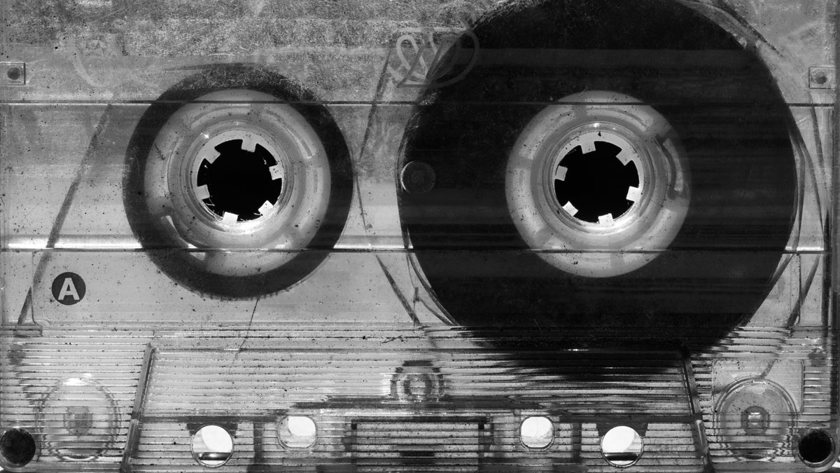
Throughout Year 12 we will explore aspects of the theme Nostalgia. This will include photographing and making imagery from a range of aspects of your life, experiences and environment…as well as finding out how various artists, researchers and even scientists respond to the concept of Nostalgia
Autumn | Part 1 objects, detritus and ephemera
Winter | Part 2 landscape and surroundings
Spring | Part 3 people, community and identity
To start with, we will be looking at how we can photograph a range of objects, surfaces and documents in different ways.
This is a plan for the first half term and will help you to develop some key skills and competencies.
Key creative outcomes…
- Still-life: Collect at least 5 different objects/ debris (natural/ man-made) that are linked to the theme of Nostalgia and photograph as object in-situ (where you find them) and also create a mini-studio at home using black/white paper or other materials as a backdrop. Bring these objects to class too to photograph in THE STUDIO
- Shapes & Form: Look for interesting found objects to help you explore line, shape, form, texture, pattern and colour (the formal elements
- Abstract & close-up: move in closer and look for textures/ patterns/ colourisation/ surfaces/ repetition within the objects.
- Photo-montage: create a range of outcomes that incorporate aspects of cut-n-paste, juxtapositions, overlays and multi-exposures
Still Life
Still life has captured the imagination of photographers from the early 19th century to the present day. It is a tradition full of lavish, exotic and sometimes dark arrangements, rich with symbolic depth and meaning.
However, before we begin making images of our objects we need to learn about how still-life emerged as an independent genre, in particularly during the early 1600s Dutch and Northern European paintings. Many of the objects depicted in these early works are symbolic of religion and morality reflecting on the increasing urbanization of Dutch and Flemish society, which brought with it an emphasis on the home and personal possessions, commerce and trade. Paintings depicting burnt candles, human skulls, dying flowers, fruits and vegetables, broken chalices, jewelry, crowns, watches, mirrors, bottles, glasses, vases etc are symbolic of the transience and brevity of human life, power, beauty and wealth, as well as of the insignificance of all material things and achievements.
Throughout its long history, still life has taken many forms, from the decorative frescoes of antiquity to the high art of the Renaissance. Traditionally, a still life is a collection of inanimate objects arranged as the subject of a composition. Nowadays, a still life can be anything from your latest Instagram latte art to a vase of tulips styled like a Dutch Golden Age painting. Read here for more details about the different categories within still-life paintings such as Fruits, Flowers, Breakfast pieces, Trompe L’Oeil and Vanitas.
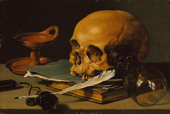

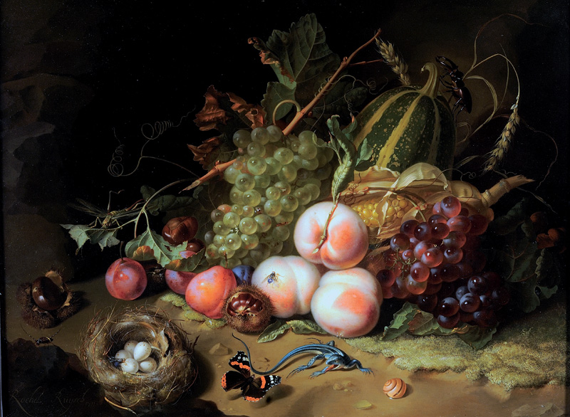
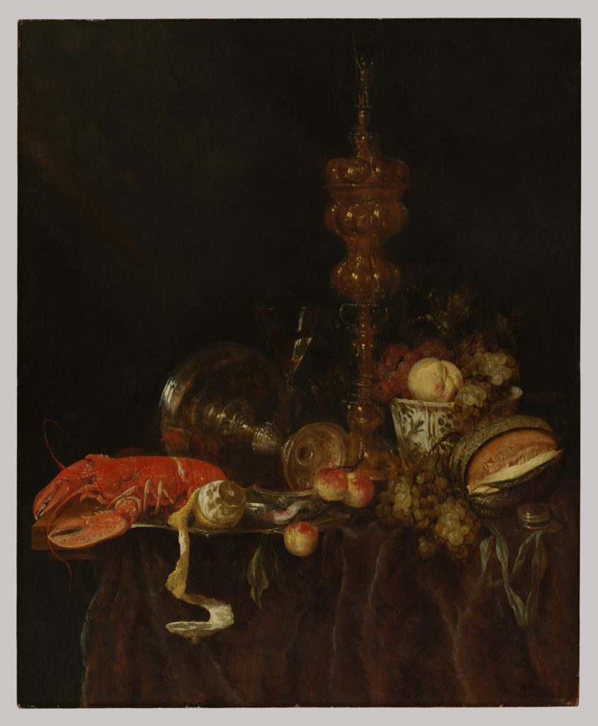
Brilliant surfaces of metalwork and glass reflect lush fruits and a lobster in this still life. Heavily laden tables like this one, boasting both foodstuffs and imported luxuries such as the blue-and-white porcelain bowl from China, typify Dutch still life in the second half of the seventeenth century. Such paintings represent a shift away from the reminders of immortality and vanity in earlier still lifes and toward a wholehearted embrace of earthly pleasures.
Still life derives from the Dutch word stilleven, coined in the 17th century when paintings of objects enjoyed immense popularity throughout Europe. The impetus for this term came as artists created compositions of greater complexity, bringing together a wider variety of objects to communicate allegorical meanings.
A New Medium
Still life featured prominently in the experiments of photography inventors Jacques-Louis-Mandé Daguerre and William Henry Fox Talbot, as far back as the 1830s. They did this in part, for practical reasons: the exceptionally long exposure times of their processes precluded the use of living models.
Study this exhibition: ART OF ARRANGEMENT: PHOTOGRAPHY AND THE STILL LIFE TRADITION
READ the following two short essay linked with the exhibition above for more understanding of still life in art and photography—with its roots in the vanitas tradition.
Brian Liddy: ‘ART OF ARRANGEMENT’: ON THE SHORTNESS OF LIFE
Roy Exley: ‘ART OF ARRANGEMENT’: STILL LIFE IN THE STILL-LIFE
Here is a link to an overview of still-life definition.
https://mymodernmet.com/what-is-still-life-painting-definition/
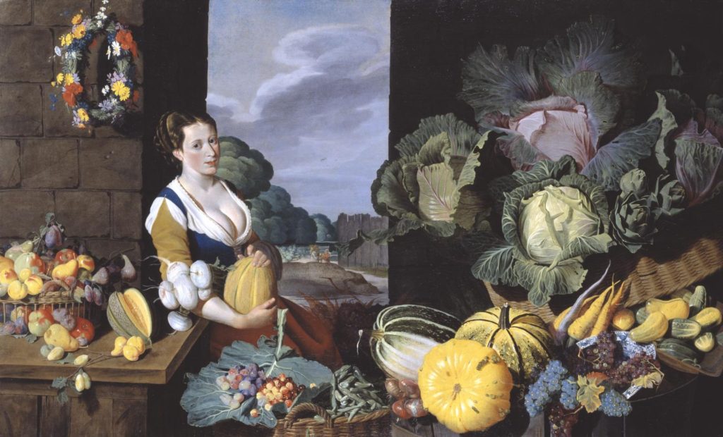
Lets take a closer look at the painting, Cookmaid with Still Life of Vegetables and Fruit by British painter Sir Nathaniel Bacon.
Listen to curator Tim Batchelor discussing the painting
For further insights into the symbolic meaning of food and objects in still-life paintings
Symbolism and Metaphor – Vanitas
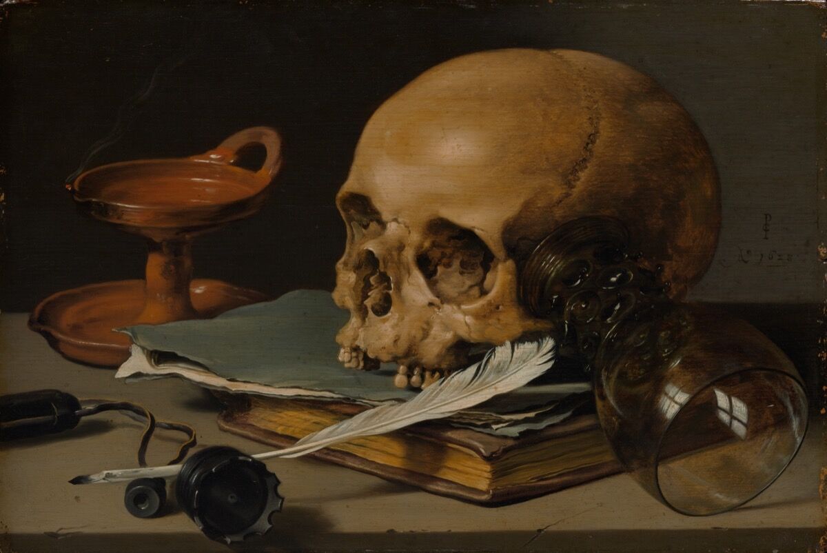
A vanitas is a symbolic work of art showing the transience of life, the futility of pleasure, and the certainty of death, often contrasting symbols of wealth and symbols of ephemerality and death.
The term originally comes from the opening lines of the Book of Ecclesiastes in the Bible: ‘Vanity of vanities, saith the Preacher, vanity of vanities, all is vanity.’
Vanitas are closely related to memento mori still lifes which are artworks that remind the viewer of the shortness and fragility of life (memento mori is a Latin phrase meaning ‘remember you must die’) and include symbols such as skulls and extinguished candles. However vanitas still-lifes also include other symbols such as musical instruments, wine and books to remind us explicitly of the vanity (in the sense of worthlessness) of worldly pleasures and goods.
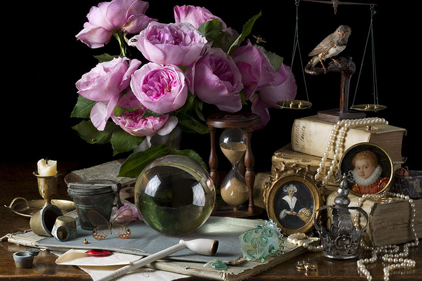
Inspired by the works of 17th century Old Master still life painters such as Giovanna Garzoni and Maria Sibylla Merian, American photographer Paulette Tavormina creates stunningly lit imagery of fruits and vegetables immersed in dark atmosphere
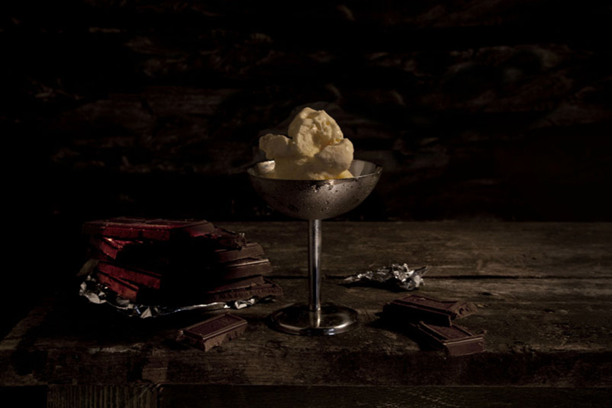
A perfect example of the old technique getting combined with modern-age ideas is Mat Collishaw’s Last Meal on Death Row series of works. Although they appear as meticulously arranged staged photography still lifes of food, each image is actually based on death row inmates’ last meals before they are executed. Apart from the eerie subject, the pictures deliver a strong drammatic effect through an excellent use of chiaroscuro.
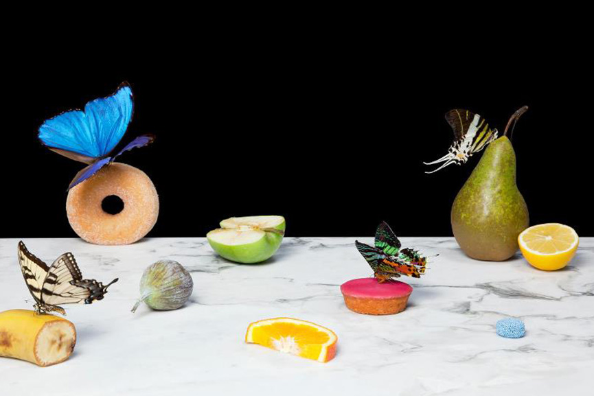
On a much more lighter, even pastel note, we have Dutch photographer Krista van der Niet, whose compositions often include fruits and vegetables mixed with mundane objects such as socks, cloths and aluminum foil, giving it all a contemporary feel. Her photos often carry a dose of satire as well, which references consumerism and popular culture through a clever employment of objects within a carefully composed scenery.
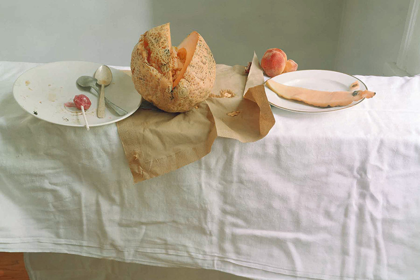
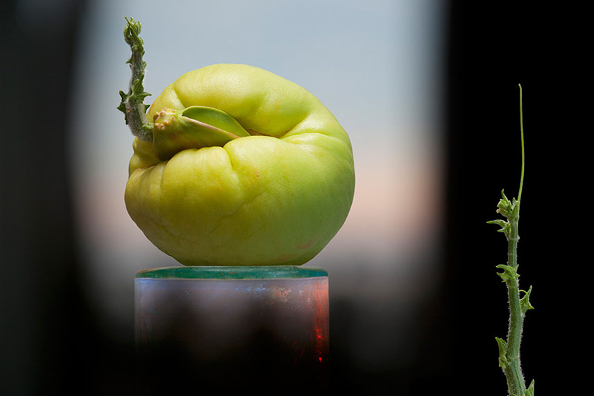
Experimenting with the endless possibilities of light, self taught photographer Olivia Parker makes ephemeral constructions. She started off as a painter, but soon turned to photography and quickly mastered the way to incorporate an extensive knowledge of art history and literature and reference the conflicts and celebrations of contemporary life in her work. Over the many years of her artistic career, her style remained fluid, yet consistent

Think paintings by Pieter Claesz or Adriaen Coorte, only in plastic. That’s how one could describe the photographs of Richard Kuiper, whose objects are all made of this everlasting, widely used material, including water bottles, floral arrangements, even the feathers. The artist tries to draw our attention towards the excessive use of plastic in our everyday lives, with the hope we will be able to decrease it before it takes over completely.
What you must do…blog post on still life
- Define what still life is
- Show examples of still life painting and photography
- Include specific artist references and choose one image for analysis using matrix
- Provide a chronological timeline of still life photography
Then Answer
- What is Vanitas?
- What is Memento Mori?
- What kind of metaphors and symbols are used in still life and why? (Include connections to trade, slavery, colonialism, wealth, status…)
Photo-assignment: Creatively respond to one of the artists above and create a set of images that clearly shows your understanding of…
Light – Shape- Shadow – Composition – Metaphor – Symbolism – Memento Mori
A series of blog posts should now show a combination of still life research and history, image analysis methods, visual experiments, Adobe Lightroom selections and adjustments (screen shots as evidence), Canon Camera Simulator and Camera Handling Skills
Week 4 + 5 Formalism and New Objectivity
There are seven basic elements to photographic art that we must explore over the coming weeks:
Blog Post – design and publish a blog post that introduces, defines and explores the key aspects of formalism / the formal elements / the visual elements
Ensure your blog post has visual references and examples
FORMALISM
Photographers have to impose order, bring structure to what they photograph. It is inevitable. A photograph without structure is like a sentence without grammar—it is incomprehensible, even inconceivable.
— Stephen Shore
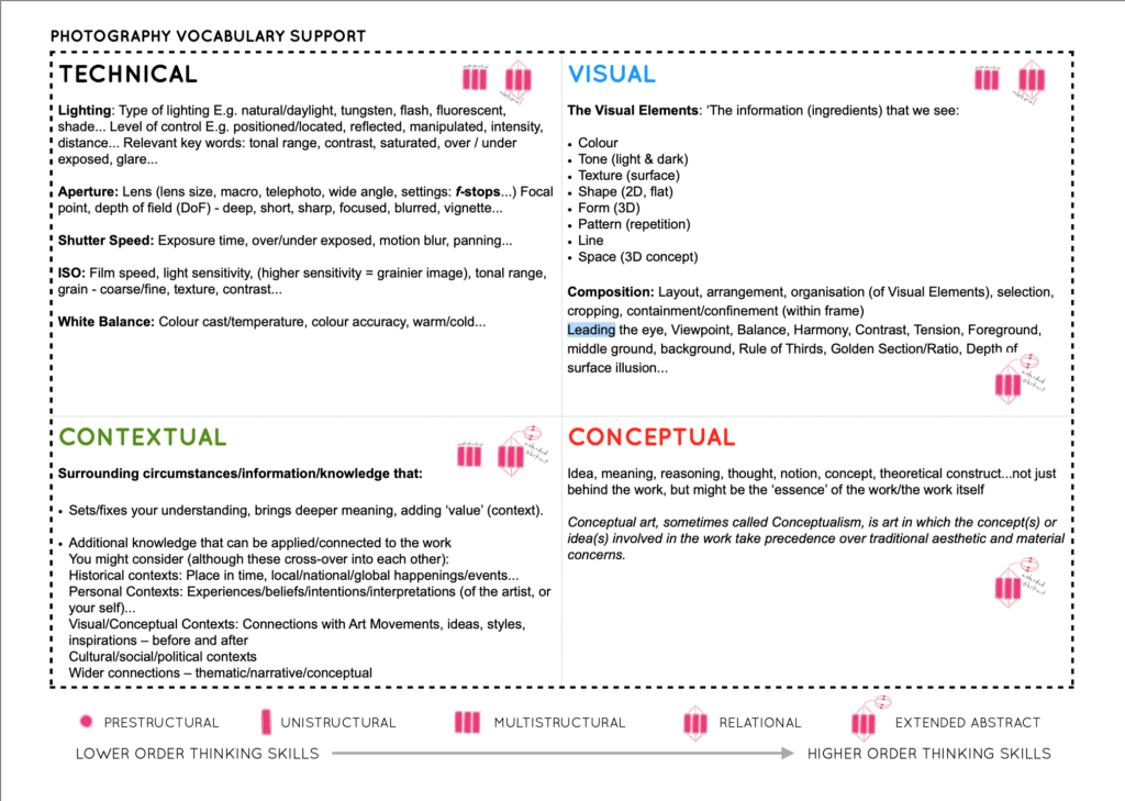
Photographs consist of formal and visual elements and have their own ‘grammar’. These formal and visual elements (such as line, shape, repetition, rhythm, balance etc.) are shared with other works of art. But photographs also have a specific grammar – flatness, frame, time, focus etc. ‘Mistakes’ in photography are often associated with (breaking) the ‘rules’ and expectations of this grammar e.g. out of focus, subject cropped, blur etc. Some photographers enjoy making beautiful images but others are more critical of what beauty means in today’s world.
Let’s us take a close look at photography’s visual language and grammar using Photo Pedagogy’s Threshold Concept #8
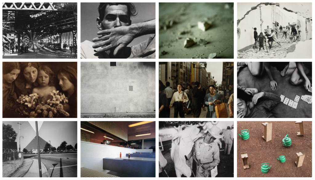
Photo Literacy?
What does it mean to be literate in photography? Superficially, it might suggest an ability to ‘read’ a photograph, to analyse its form and meanings. But what about the making of photographs? We would argue that literacy is more than just a command of the mechanics of a particular ‘language’. It also takes into account fluency of expression and sensitivity to material. Words and images are different. A photograph of a particular subject is different to a description of the same subject in words. It is surely possible to see, understand and appreciate a photograph without the need for words. And what about the other possible ‘literacies’ such as emotional and physical literacy?
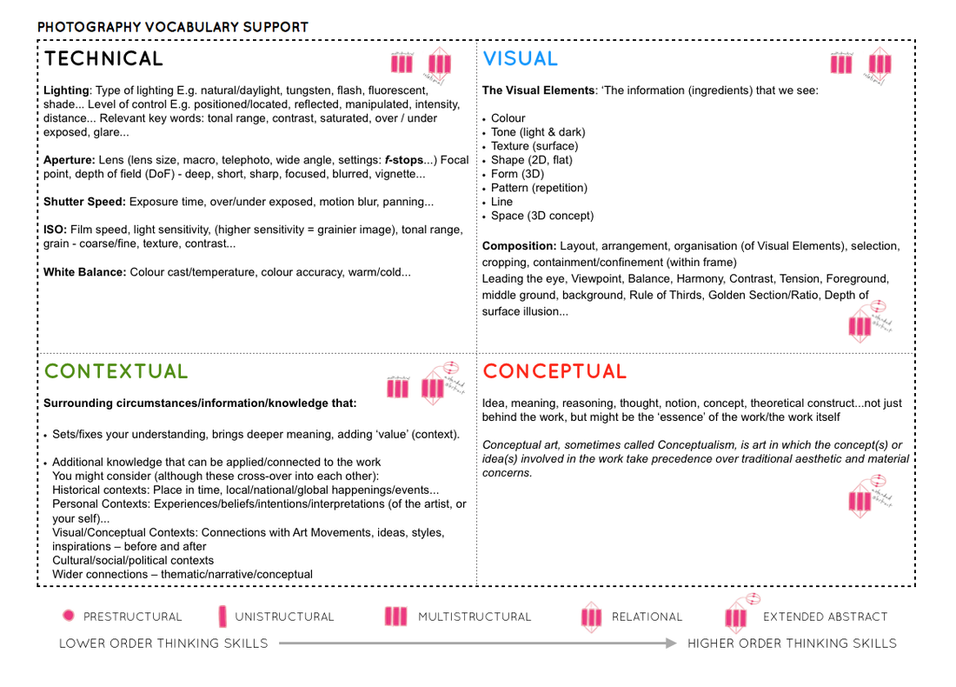
Most photography courses require some evidence of understanding in the form of words. As the year progresses we would like you to be able to analyse images using these four categories TECHNICAL, VISUAL, CONTEXTUAL, CONCEPTUAL.
PHOTOGRAPHIC IMAGE ANALYSIS
Image analysis is very important in your understanding of photography. Both from learning how an image is composed or structured to the actual content and meaning of an image. You may need to understand or find out its social, historical, or political context. Click on link below for more information
Image Analysis | 2024 Photography Blog (hautlieucreative.co.uk)
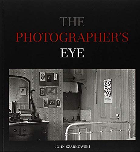
EXTRA READING: In photography Formalism was advocated by John Szarkowski (Curator of Photography at Museum on Modern Art, New York) who is his book; The Photographer’s Eye (1966) identified five elements involved in the formalist approach to the analysis of photography, they are: the thing itself, the detail, the frame, time and the vantage point. Read an essay here where this is discussed in more detail:
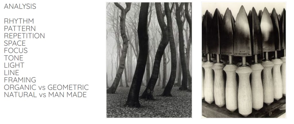
Creative Examples
Walker Evans
Task 1 “The Beauty of the Common Tool”


Beauties of the Common Tool, Rephrased II, 2013
Fibre-based handprint, mounted, wooden frame with museum glass
ca. 90 x 70 cm

What you must do…
Walker Evans greatly influenced Darren Harvey-Regan, and both artists paid careful attention to choice of objects, composition, lighting and exposure values.
You must explore the work of both artists (create a blog post that compares and contrasts their work) and develop a range of images in response to their outcomes.
For this, you will need to use the selection of objects you have brought in to class from your own collections, or alternatively use those we have provided for you.
Be experimental with choosing different apertures settings and creative with lighting set-up; key light, reflected light, back light etc. and we will show you various lighting arrangements too.
The New Objectivity – Albert Renger Patszch
- a specific attitude to photography and the advantages of the camera as a way of seeing called…
- The New Objectivity (Neue Sachlichkeit).
- Research :The types of subjects he preferred to photograph
- Research : The ways in which he explored the formal elements in his work e.g. form, light, rhythm, line, texture, repetition etc.
- His famous book ‘The World is Beautiful’
- Other photographers at the time who were similarly interested in objectivity
- Contemporary photographers who have been influenced by the idea that ordinary objects and scenes can be photographed to reveal their beauty.
Historical context
There are numerous reasons why some photographers in the 1920s (along with other artists) began to represent the world with “objective, sober eyes”:
- a response to the chaos of the First World War and a rejection of the culture leading up to it
- a rejection of the emotional and spiritual concerns of Expressionism and an interest in the rational and political
- a response to rapid industrialisation in Europe and America
- a response to the particular qualities of the camera and a move away from painterly effects like soft focus
Karl Blossfeldt

Never formally trained in photography, Blossfeldt made many of his photographs with a camera that he altered to photograph plant surfaces with unprecedented magnification. His pictures achieved notoriety among the artistic avant-garde with the support of gallerist Karl Nierendorf, who mounted a solo show of the pictures paired with African sculptures at his gallery in 1926 and, subsequently, produced the first edition of Blossdeldt’s monograph Urformen der Kunst (Art forms in nature), in 1928. Following the enormous success of the book, Blossfeldt published a second volume of his plant pictures, titled Wundergarten der Natur (The magic garden of nature), in 1932. The clarity, precision, and apparent lack of mediation of his pictures, along with their presentation as analogues for essential forms in art and architecture, won him acclaim from the champions of New Vision photography. His work was a central feature of important exhibitions, including Fotografie der Gegenwart and Film und Foto, both in 1929.
Blossfeldt’s work adheres to the rules of TYPOLOGIES
Anna Atkins
In October 1843, the botanist and photographer Anna Atkins (1799–1871) wrote a letter to a friend. “I have lately taken in hand a rather lengthy performance,” revealed Atkins. “It is the taking photographical impressions of all, that I can procure, of the British algae and confervae, many of which are so minute that accurate drawings of them are very difficult to make.”1 Atkins proceeded to inquire whether a mutual acquaintance, also interested in aquatic plants, would care to receive a copy of her recently completed book, Photographs of British Algae: Cyanotype Impressions.

Atkins learned of photography through its British inventor, William Henry Fox Talbot. Only months after Talbot patented his most successful photographic process, in 1841, Atkins and her father, a respected scientist, decided to replicate the “talbotype” at their home. “My daughter and I,” Atkins’s father wrote to Talbot, “shall set to work in good earnest ’till we completely succeed in practicing your invaluable process.”3 Ultimately, it was a different photographic process—the cyanotype—that captivated Atkins. Developed by her friend and neighbor Sir John Herschel, the cyanotype process produced blue-and-white prints that Atkins prized for their sharp contours and striking colors. Atkins added hundreds of new plates to Photographs of British Algae throughout the 1840s and early 1850s, all the while refining cyanotype chemical solutions and exposure times.
Contemporary Examples of Formalism
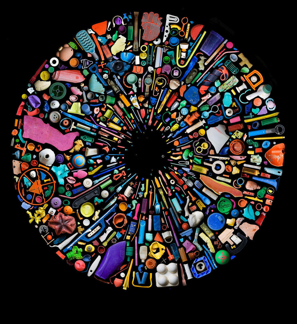
Mandy Barker
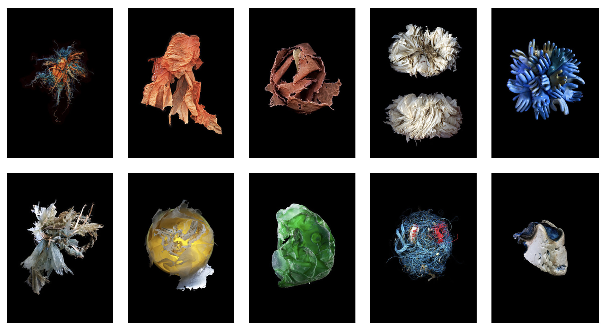
Matthew Brown (ex-student)
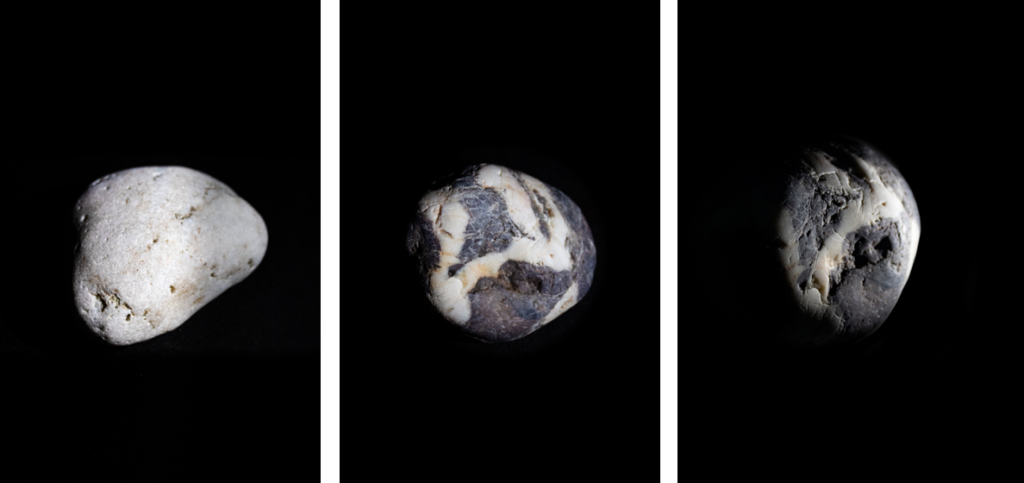
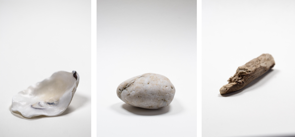
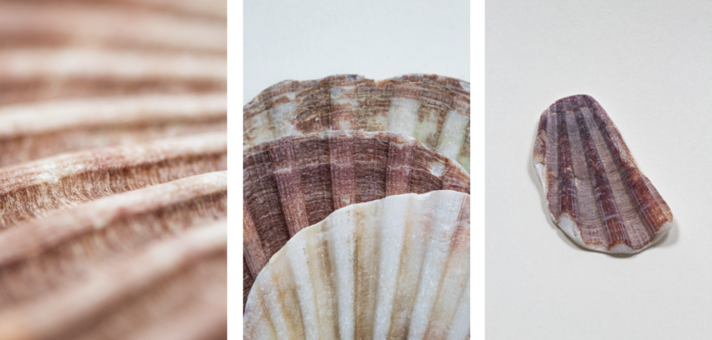
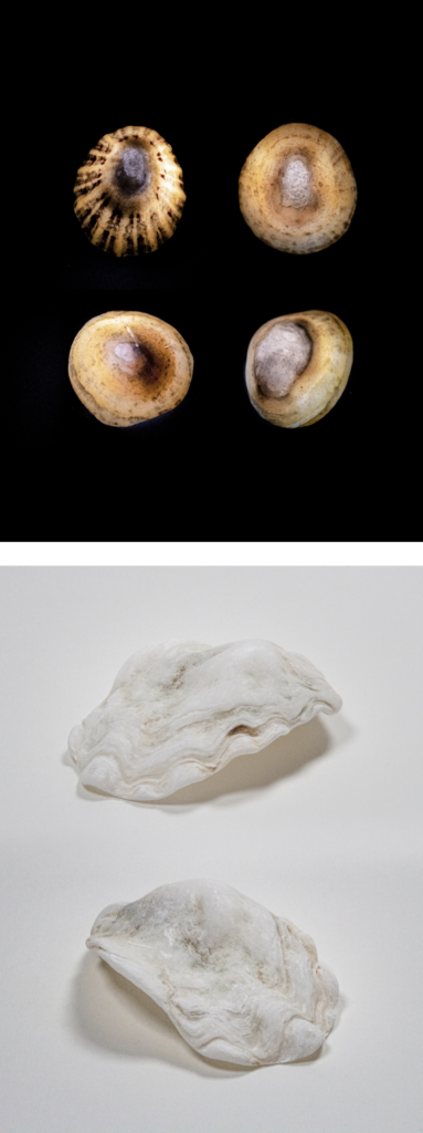
Here is a selection of images made by Matt Brown last year as part of his Personal Study: Bouley Bay.
Have a look at his blog here for more ideas around his research, artists inspirations and further experimentation.
Here is the link the the online version of his photobook, Bouley Bay – by Matthew Brown
Darren Harvey Regan
Entwining image and object, the work of Darren Harvey-Regan (b. 1974 Exeter) often sees a hybridisation of the conventions of photography and sculpture. As quietly humorous as they are frustrating his works challenge the viewer to distinguish where representation ends and the object begins. “The presentation of photographs in interaction with objects serves to highlight the inherent tensions within representation; between the photograph as an object and the image of the world it contains. In this way, I consider the photograph as being something not only to think about, but to think with.”
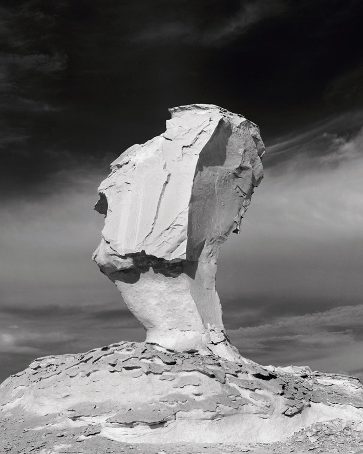
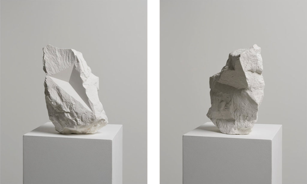
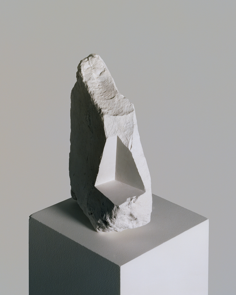
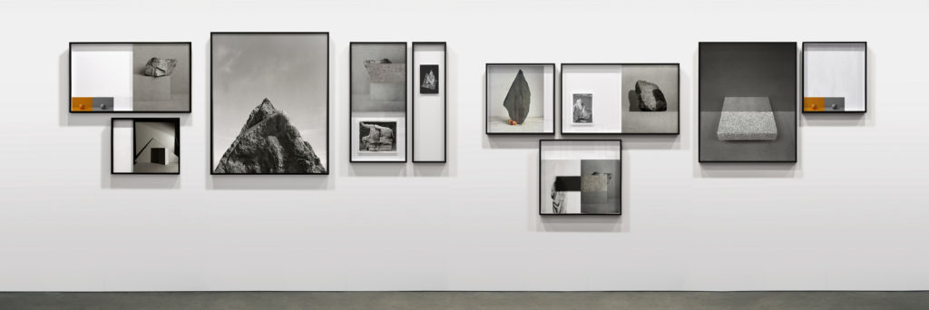
“As a medium reliant on how the natural world appears to it, can a photograph ever be truly abstract? Yet what process is more abstract than collapsing mass, depth and time into a single surface?” – Harvey-Regan
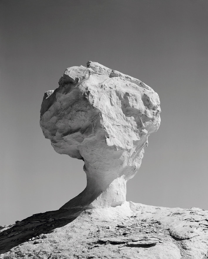
In geology an ‘erratic’ refers to a rock that differs from its native environment, having been carried and deposited there by a long-vanished glacier. Similarly Darren Harvey-Regan in his latest series executes both the photographic and physical act of lifting something out of its context, playing on overlapping appearances and processes.
The Erratics (Exposures) presents images of natural chalk rock formations eroded by wind and sand. Using an old large format field camera, Harvey-Regan sought out the monolithic chalk forms of Egypt’s Western Desert, a vast natural parallel to the singular studio-bound objects that frequently recur in his practice.
Both The Erratics (wrest) and (chalk fall in white) use sculptural compositions made by the artist from chalk collected from the rock falls along England’s South Coast. By carving smooth planes and shapes into rough rocks, Harvey-Regan works with and against perception of its natural forms. In the photographic works – (wrest) – the chalk is shaped towards the two-dimensional image surface of the print, while in the installation (chalk fall in white), the perception of a flattened image surface is created within the three-dimensional forms themselves.
Harvey-Regan uses art historian Wilhelm Worringer’s essay Abstraction and Empathy as both a background for the work and as a means to consider the nature of the photographic medium. For Worringer, ‘empathy’ describes our need to connect to the visible world, identifying with it and representing it. Conversely, ‘abstraction’ is proposed as a means of coping with the overwhelming phenomena of the world by extracting things from their place in space and time whilst distilling them to purified line, form and colour.
Both abstraction and empathy are captured in these works and their photographic process. The forms exposed in their natural surroundings in Erratics (Exposures) remain curiously abstract while tending more towards empathy, while forcefully sculpted objects in Erratics (Wrest) are balanced on the edge of the organic and abstract.
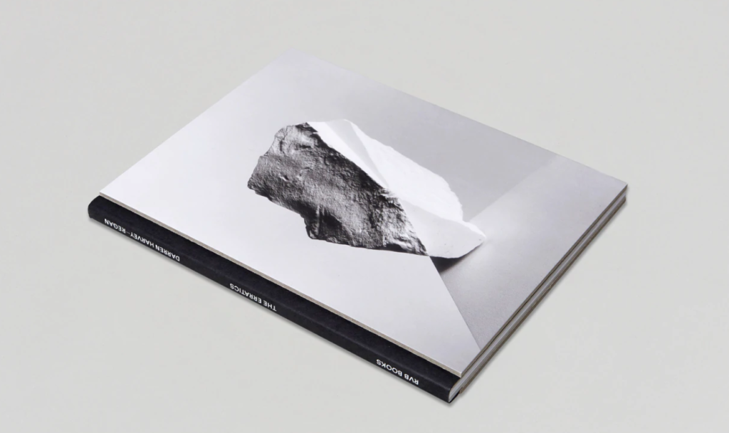
Photobook: The Erratics
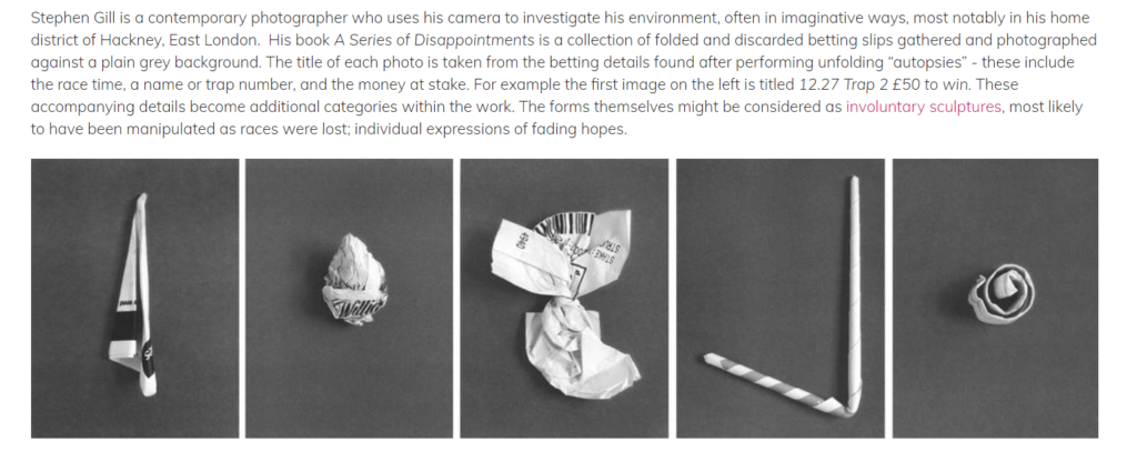
Stephen Gill
Week 6+7 Moving towards photomontage
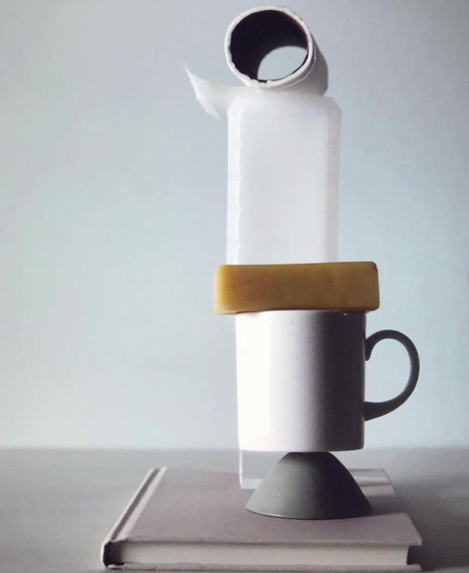
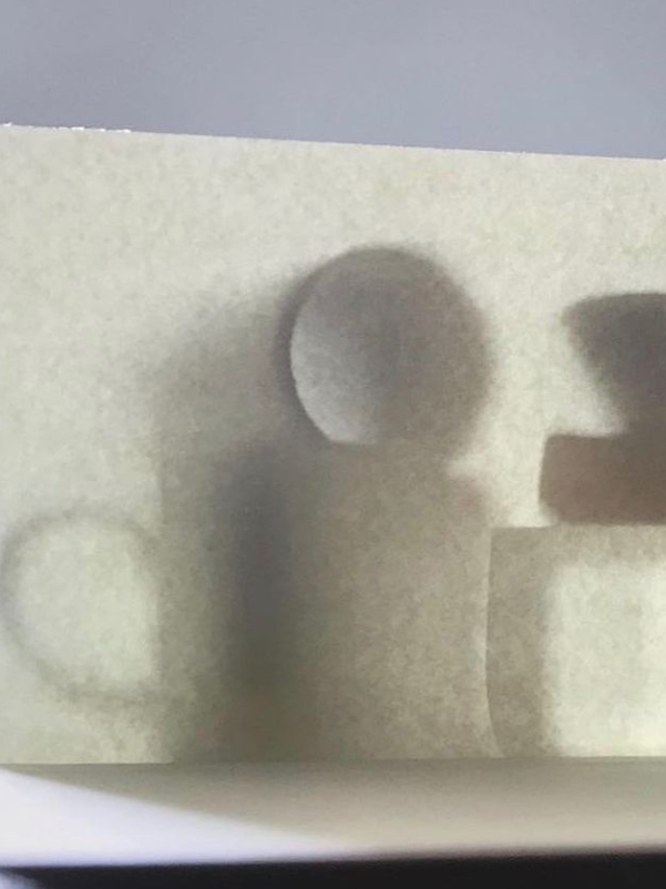
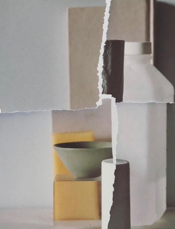
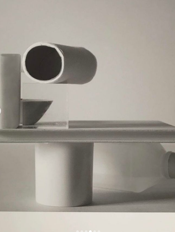
Developing still life ideas…a closer look at Mary-Ellen Bartley
Mary-Ellen Bartley “7 Things again and again”.
Inspired by minimalist sculpture and painting, these simple but effective still life studies encapsulate the formal elements . Artists such as Giorgio Morandi have a clear influence here…and again there is a strong connection between painting and photography, historically and traditionally.
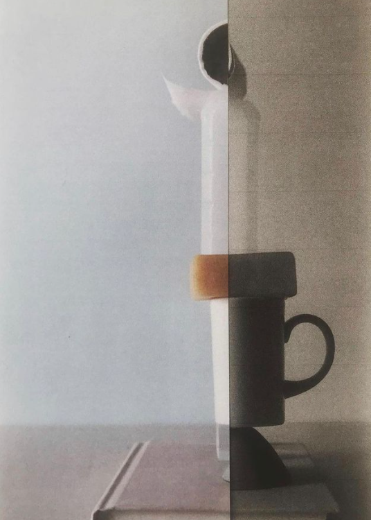
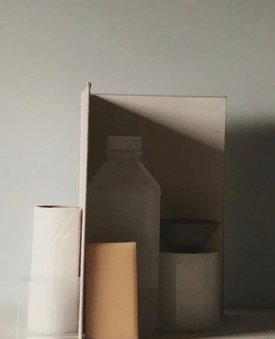
What you must do…
Collect a group of objects that you think combine well. Consider shape and size, colour, texture etc.
Then look carefully at what / how Mary Ellen Bartley groups, lights and photographs her objects. Aim to create a set of images by altering the layout, lighting, focus, composition etc.
Print some of the results off — and then rip, tear, cut-n-paste to create a photo-montage. Re-photograph this and develop the composition into a final outcome.
Create a blog post that introduces Mary Ellen Bartley and her approach.
Creative Developments
A closer look at ….Layering / overlays / multi-exposures and more…
Make do and mend…click here for ideas
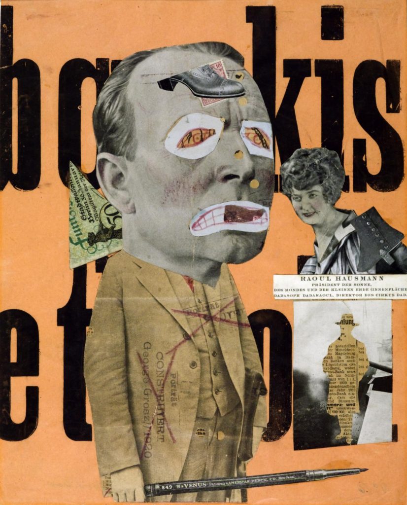
Photo-Montage
- A photomontage is a collage constructed from photographs.
- Historically, the technique has been used to make political statements and gained popularity in the early 20th century (World War 1-World War 2)
- Artists such as Raoul Haussman , Hannah Hoch, John Heartfield employed cut-n-paste techniques as a form of propaganda…as did Soviet artists like Aleksander Rodchenko and El Lissitsky
- Photomontage has its roots in Dadaism…which is closely related to Surrrealism
Here are simple definition of photomontage and here is a more comprehensive review of the different historical and contemporary approaches to combining images together to form collages and composites. Read also the Art Story site here which has a good summary of photomontage
Some quotes from artists using photomontage…
The cutting and assemblage of the parts is applied here on a static plane. The effect is that of a real scene, a synopsis of actions, produced by originally unrelated space and time elements juxtaposed and fused into a reality.
Laszlo Moholy-Nagy
[Photomontage] is my way of connecting with the word and I like the idea that I cam invent a reality that, for me, is personally more meaningful than the one that’s literally given to the eye
Jerry Uelsmann
I’ve always made a distinction between collage and photomontage. Montage is about producing something seamless and legible, whereas collage is about interrupting the seam and making something illegible
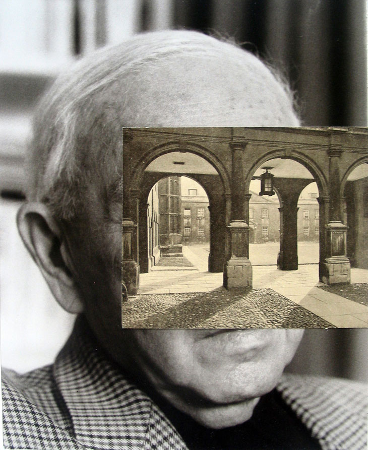
John Stezaker
You’re going to use your images from the studio object shoot and other material you have created recently for this…
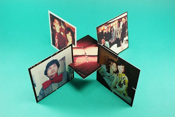
Using your OBJECTS photographs to create experimental new images either by hand or using image manipulation software OR both!!!
Cut / Slice / Trim / Slide / Join / Add / Combine / Match / Mix / Tear / Scrunch / Fold / Stick / Stitch / Sew / Weave / Holes / Burn / Singe / overlap
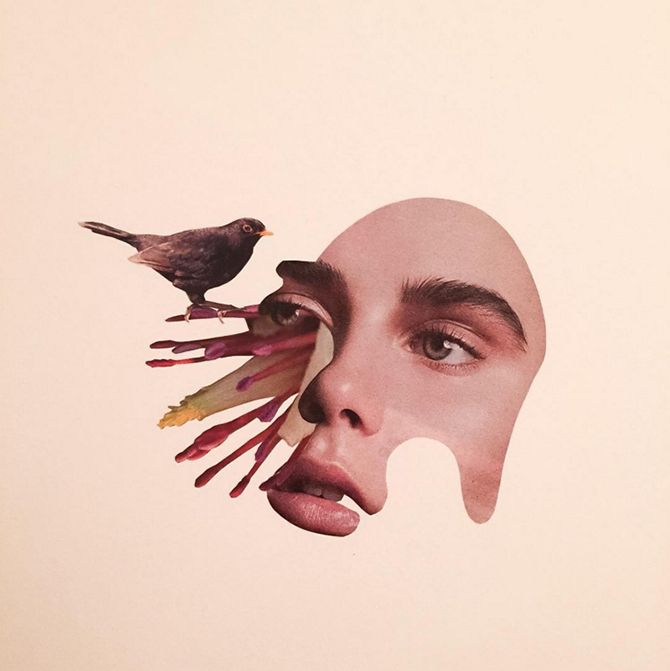
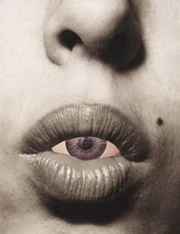
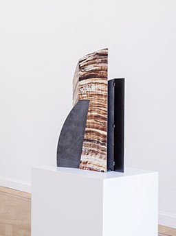
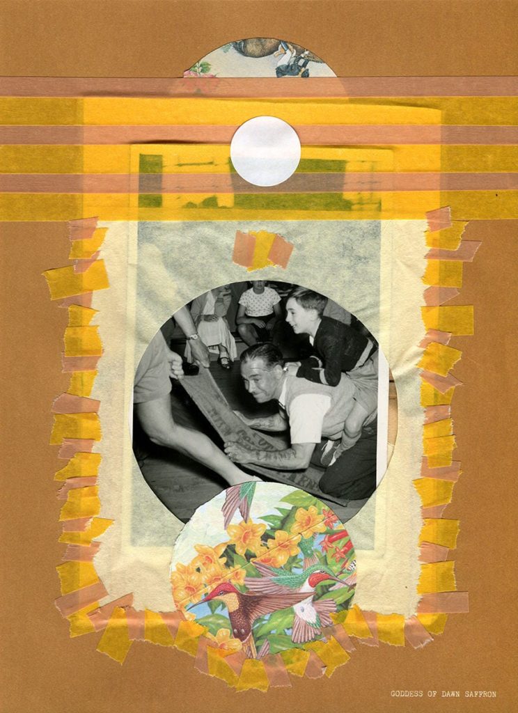
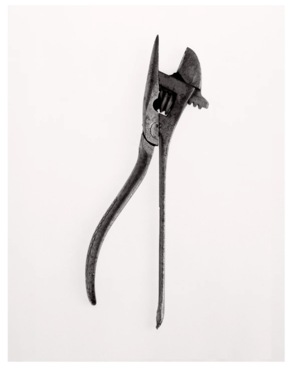
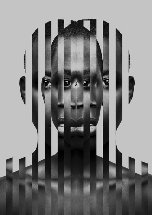
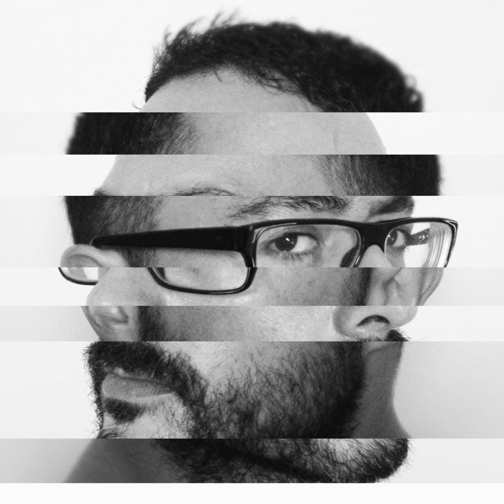

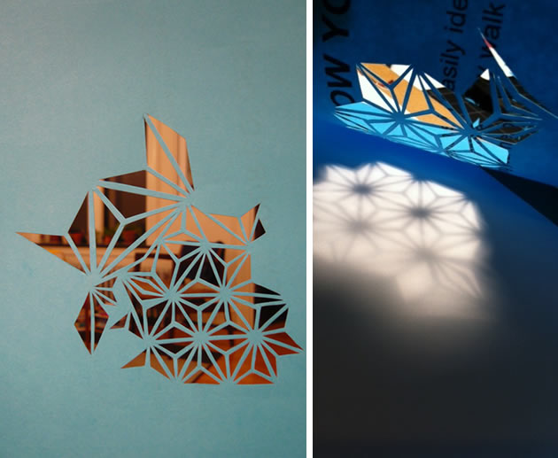
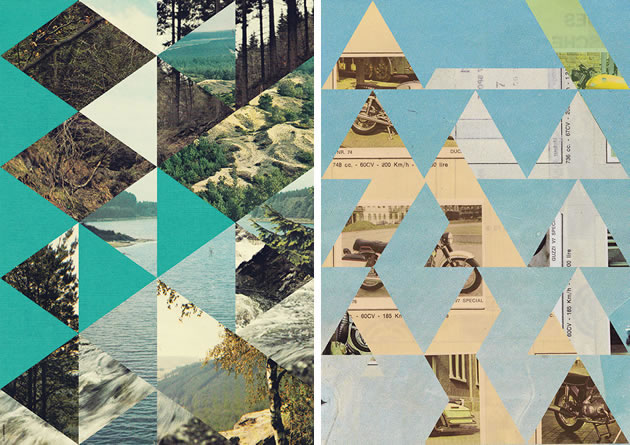
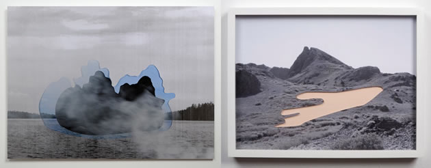
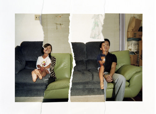
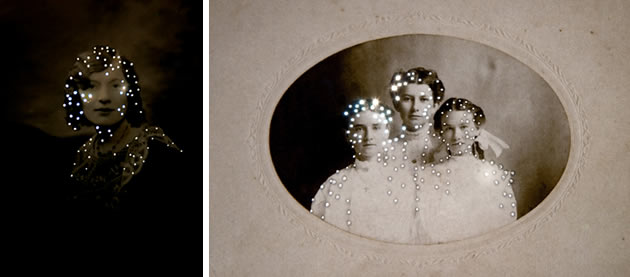

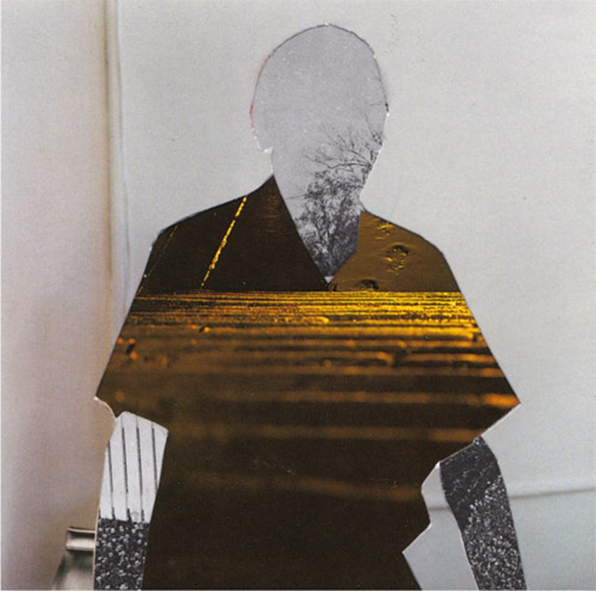
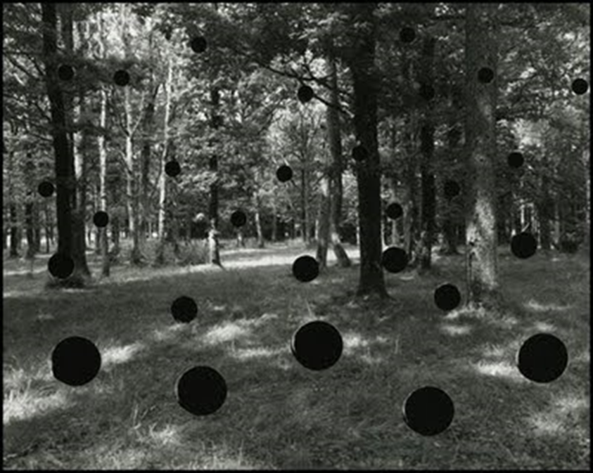
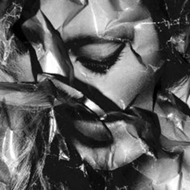
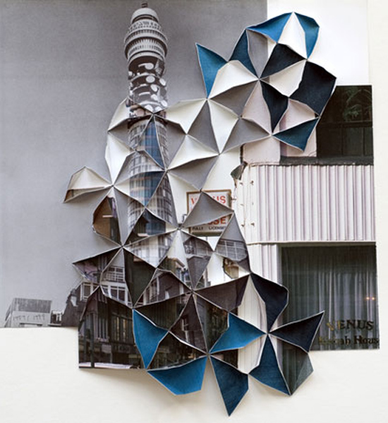
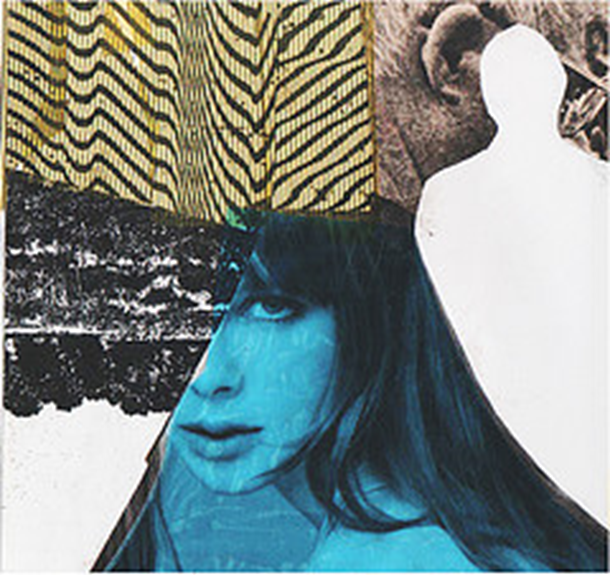
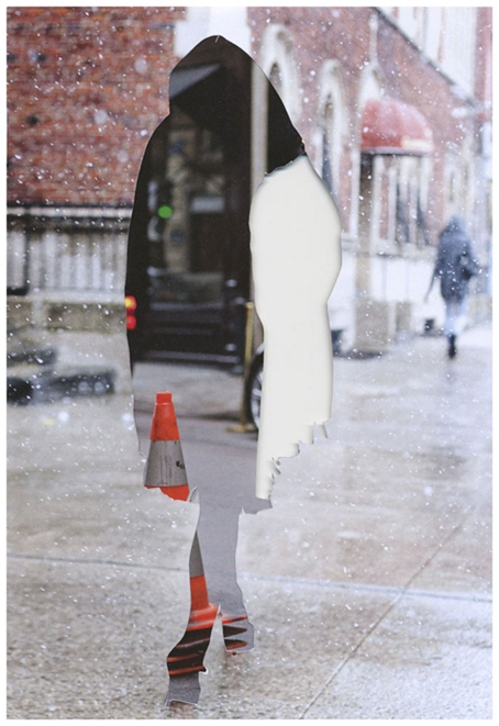
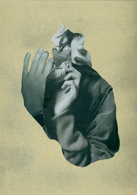
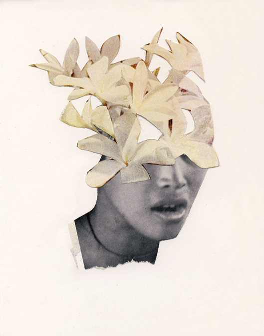
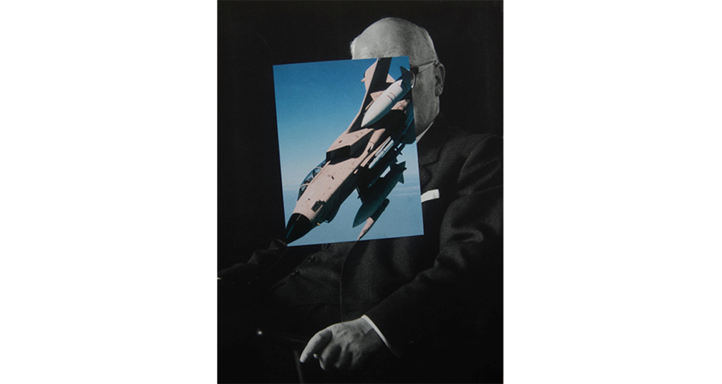
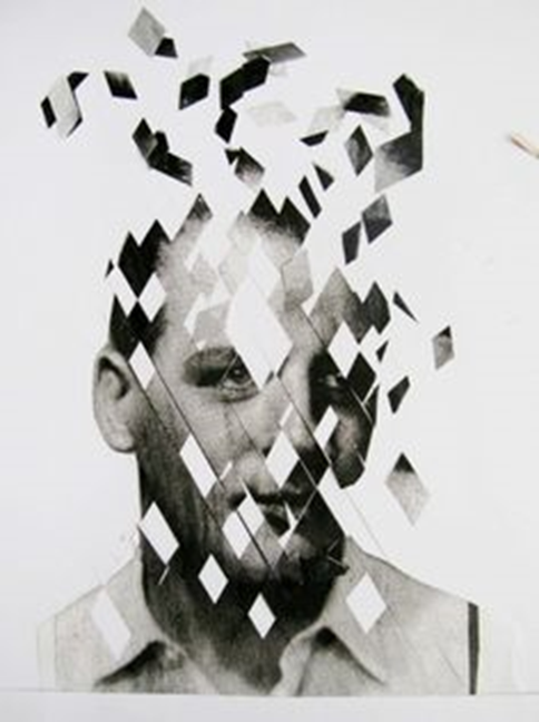
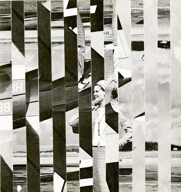
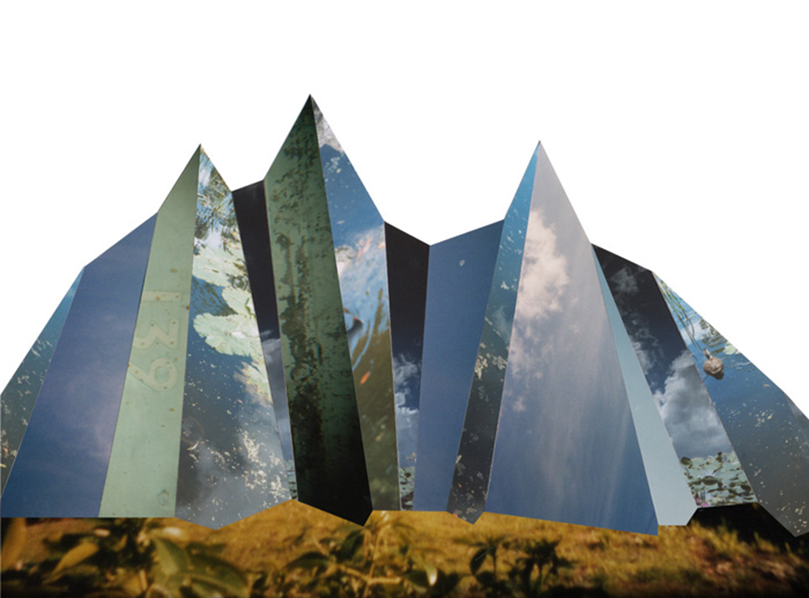
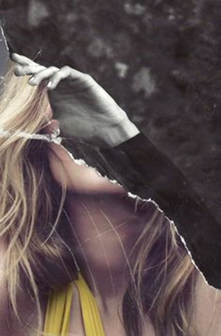
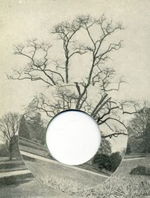

Photographers you should look at include:
•John Stezaker •Bobby Neal Adams •Linder Sterling •Johanna Goodman •Max-o-matic •Luis Dourabo •Joe Castro •Bela Borsodi / Kensuoke Koike / Sarah Eisenlohr / Jesse Treece / Jesse Draxler / Joachim Schmidt /
http://www.artnet.com/artists/john-stezaker/
https://www.bobbyneeladams.com/
https://www.tate.org.uk/art/artists/linder-10844
http://www.johannagoodman.com/#/
SOME EXAMPLES – CUT N PASTE
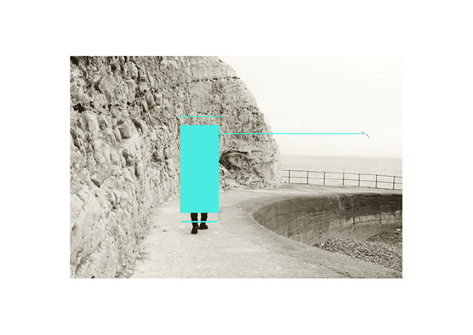
The examples below were created using five images. The figure was cut out leaving an interesting negative shape and outlined. Other images could be slid underneath until connections and interesting compositions started to occur.
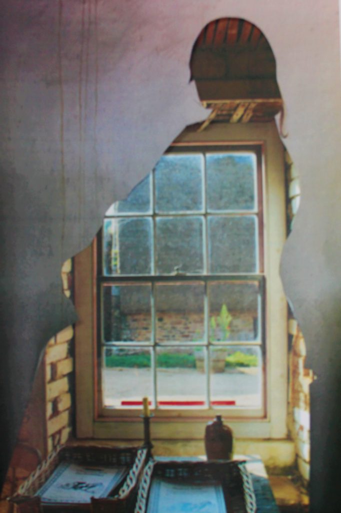
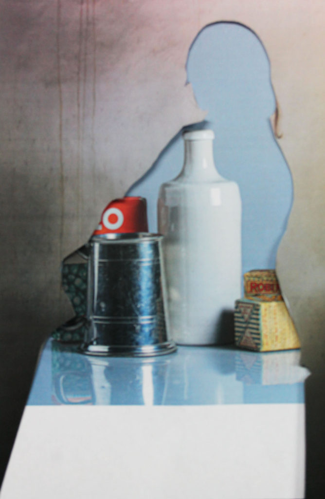
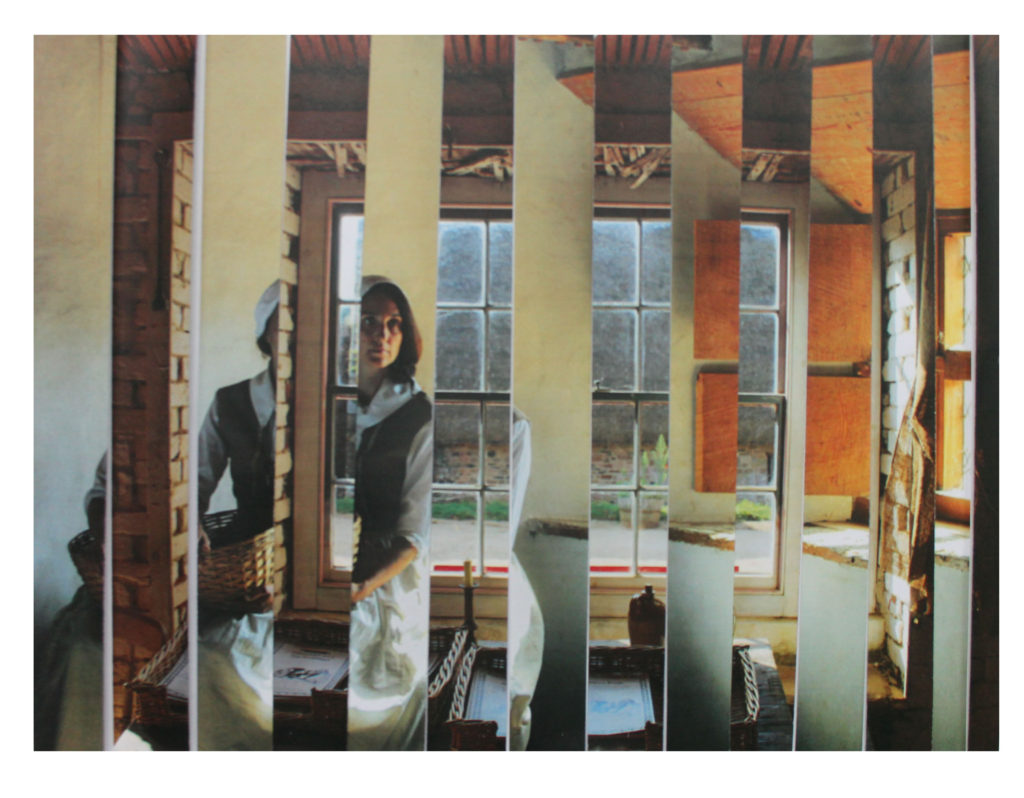
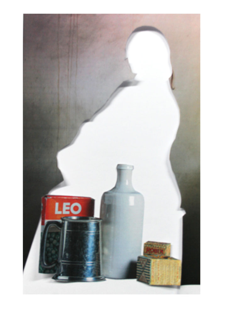
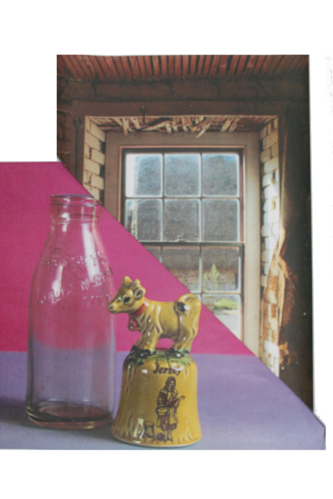
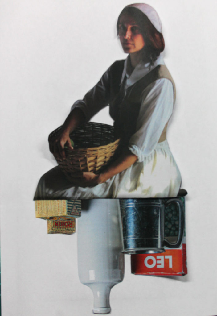
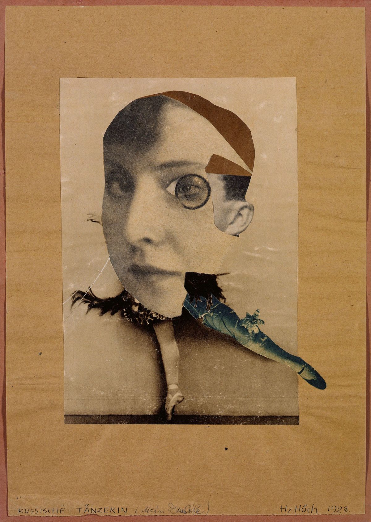
MORE ON PHOTOMONTAGE FOR YOU HERE
Extension Experiment
How to make a GIF in Photoshop
1. Create layer for each image
2. Window > timeline
3. Select > Create Frame Animation
4. Drop Menu > Make frames from Layers
5. Timeline > select Forever
6. File > Export > Save for Web Legacy > reduce image size to 720 x 720 pixels
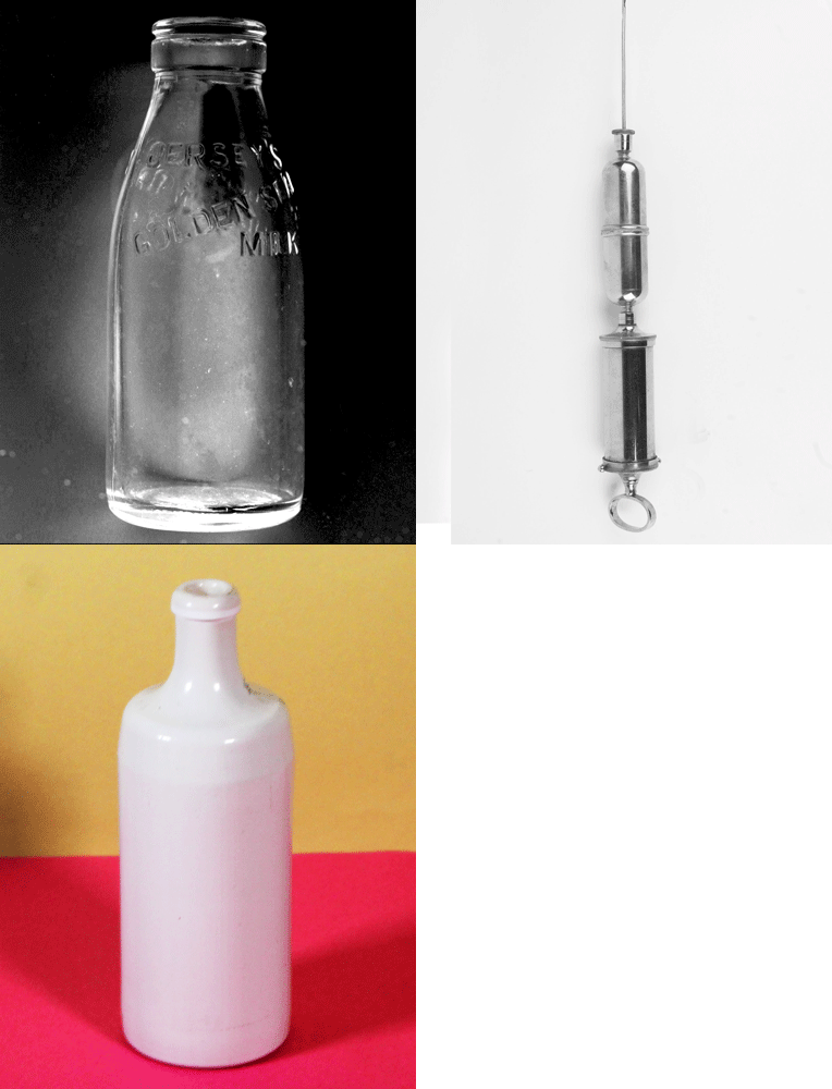
A gif created using just three images.
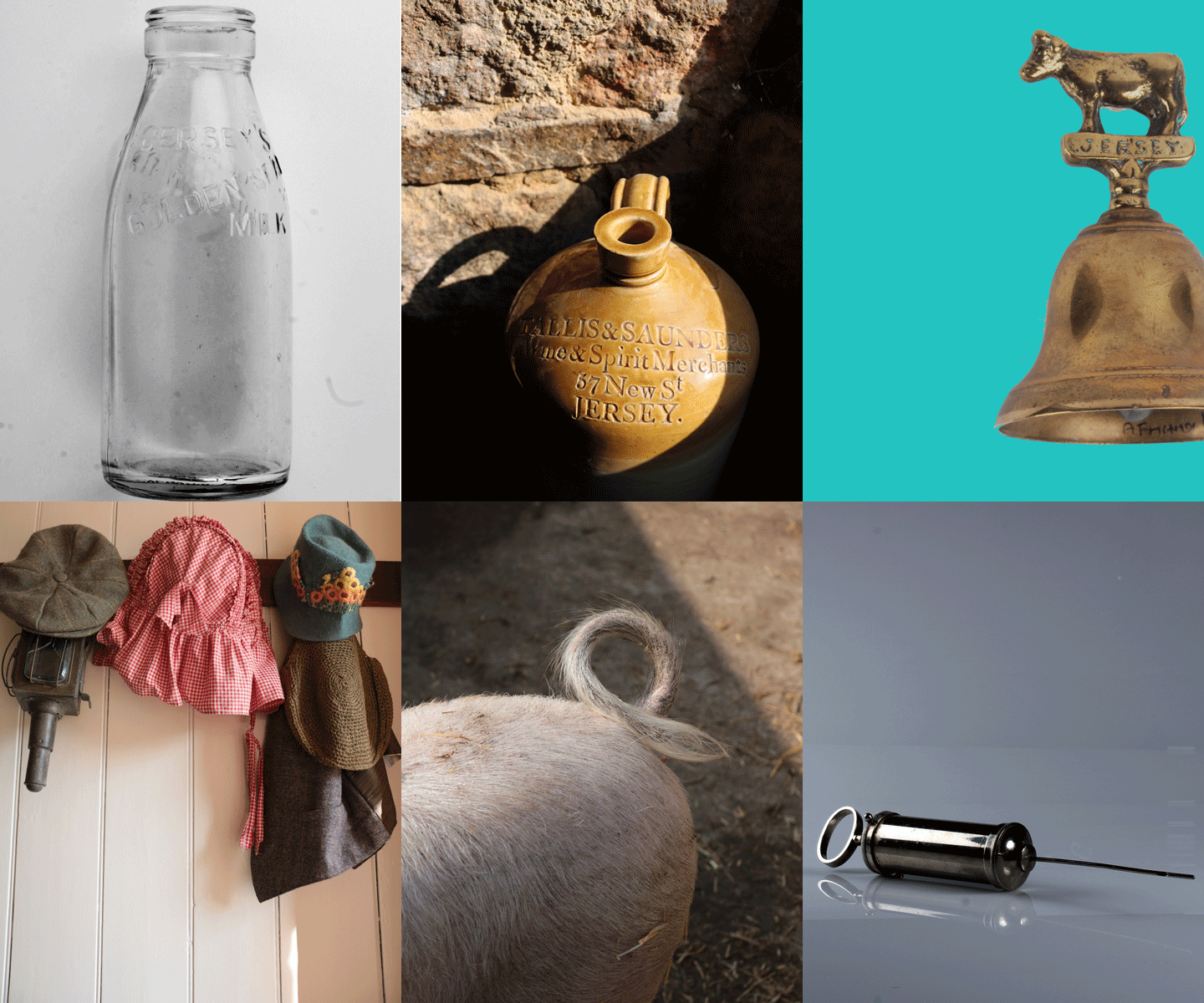
Always follow the 10 Step Process and create multiple blog posts for each unit to ensure you tackle all Assessment Objectives thoroughly :
- Mood-board, definition and introduction (AO1)
- Mind-map of ideas (AO1)
- Artist References / Case Studies (must include image analysis) (AO1)
- Photo-shoot Action Plan (AO3)
- Multiple Photoshoots + contact sheets (AO3)
- Image Selection, sub selection, review and refine ideas (AO2)
- Image Editing/ manipulation / experimentation (AO2)
- Presentation of final outcomes (AO4)
- Compare and contrast your work to your artist reference(AO1)
- Evaluation and Critique (AO1+AO4)
Final Outcomes for Nostalgia Part 1
You must edit and save / export a range of images for printing to the PRINT FOLDER found here by Thursday 19th October
M:RadioDepartmentsPhotographyStudentsImage TransferYear 12 NOSTALGIA objects Oct 2023
- Still Life Photos 1-3 images
- Single Object Photos 1-3 images
- Optional Extension Ideas
- Photomontage Analogue 1-3 images
- Photomontage Digital 1-3 images
Remember to include a range of sizes
A3 / A4 / A5 and black and white images too
Image Resolution and Sizing
Final Outcomes for NOSTALGIA Part 1
Remember to include a range of sizes
A3 / A4 / A5 and black and white images too
File Handling and printing...
- Remember when EXPORTING from Lightroom you must adjust the file size to 1000 pixels on the Short edge for “blog-friendly” images (JPEGS)
- BUT…for editing and printing when EXPORTING from Lightroom you must adjust the file size to Short edge for “high resolution” images (JPEGS) like this…

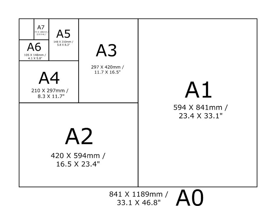
- A5 Short Edge = 14.8 cm
- A4 Short Edge = 21.0 cm
- A3 Short Edge =29.7 cm
This will ensure you have the correct ASPECT RATIO
For a combination of images, or square format images you use the ADOBE PHOTOSHOP > NEW DOCUMENT + PRINT PRESETS on to help arrange images on the correct size page (A3, A4, A5)
You can do this using Photoshop too…
Set up the page sizes as templates and import images into each template, then you can see for themselves how well they fit… but remember to add an extra 6mm for bleed (3mm on each side of the page) to the original templates. i.e. A4 = 297mm x 210 but the template size for this would be 303mm x 216mm.
Half Term
Week 8
Mounting and framing final images
Mounting and framing final images
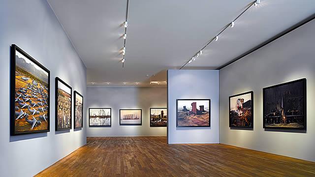
Making a Virtual Gallery in Photoshop
Download an empty gallery file…then insert your images and palce them on the walls. Adjust the persepctive, size and shape using CTRL T (free transform) You can also add things like a drop shadow to make the image look more realistic…
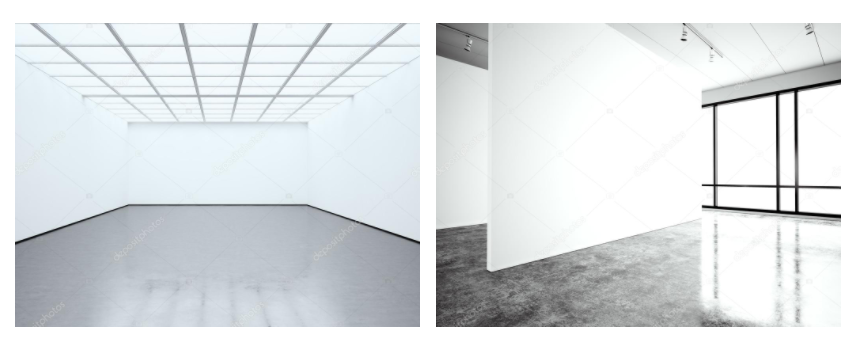
…or using online software
How I did it:
Step 1: Go to www.artsteps.com
Step 2: Sign in / up.
Step 3: Create.
Step 4: Create your own location or choose a template.
Step 5: Upload your images, put them in your exhibition, name it and give it a description.
Step 6: Present / view your Exhibition.
YOUR FINAL BLOG POST SHOULD CLEARLY SHOW 3-5 POSSIBLE FINAL OUTCOMES , INCLUDING YOUR PRESENTATION METHOD
- sequencing of images
- grouping of images -grids , triptych, diptych, dioramas, predellas
- sculptural / multi-media approaches
- framing methods
- blog (show examples of frames / borders + process)
- clarity of final outcomes—which images are your final outcomes?
- coursework round – up and evaluation

