

This was the first photoshoot I carried out so I was experimenting with a few different places and angles to find what I really want to focus on. I went down to Corbiere and took images in and around a bunker and also of the old quarry stone crusher, which is abandoned.

Out of the images I took I analysed every one and have chosen to edit these ones. I think, looking at them before the editing stage, some will be successful outcomes and a few can be used as filler images; such as the picture of the ‘KEEP OUT’ sign.

This is the final outcome of images from this photoshoot.


Due to the overcast weather on the day I did this photoshoot, the lighting in all the images are very dull. The whole sky was white and cloudy and therefore just reflected off the ground in my images. This particular image was bound to be under exposed anyway as it was taken inside a dark bunker, however I like the composition of the graffitied walls, the rubble amongst the puddles of dirty water, oil floating within it making that swirly effect on the right hand side. The square of light at the end of the path/ tunnel creates a focal point.
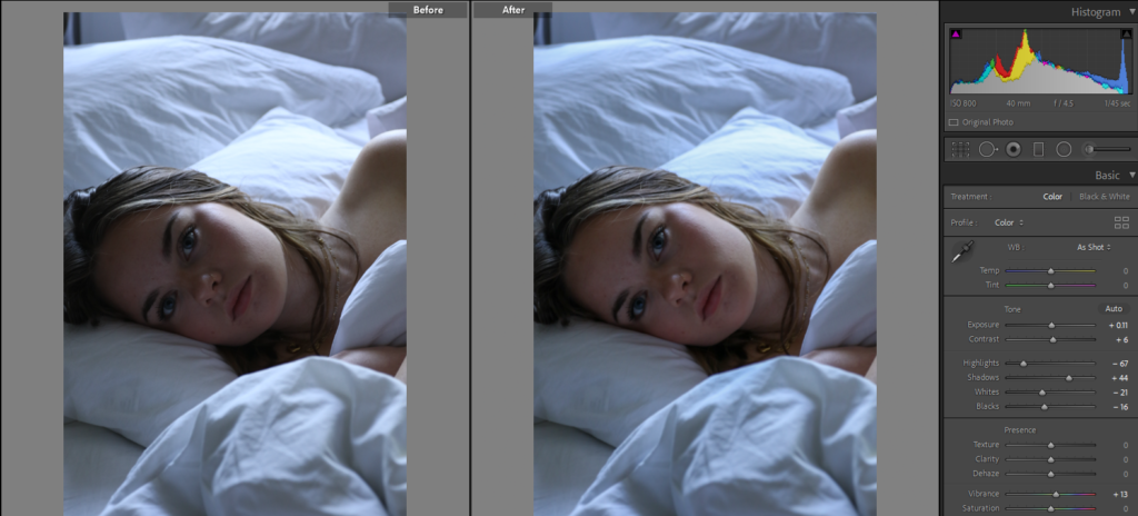
I increased the exposure and turned down the ‘highlights’ and ‘whites’. This brought more brightness to the image, however the quality of the image isn’t all great so I plan on going back to see if anything will improve.

I think this image draws a viewer in as it is very colourful and saturated. As shown, I lowered the shadows in the image and tempered with the colours’ hue, saturation and luminance. I believe this image successfully portrays my chosen theme of ‘seek’

This is an example showing how changing little things in an image can make a significant difference. I like the perspective of this image, how the camera is in focus of the background and not the right hand side foreground. To amplify this I increased the texture and clarity, this created the focused parts of the image to be more clear and detailed.

When I studied Matt Emmett’s work, This particular photo of his caught my eye. I like the composition and how he used symmetry to create a focal point at the end of the tunnel. I took inspiration from this image and tried to recreate it in my own way. Inside the bunker was puddles of water and old broken rubble within it, it immediately reminded me of Emmett’s photo when I saw the setting. I experimented with different angles, and I tried to take the image so that the square of natural light at the end was centre of the image; however this was impossible due to the layout of the walls. The lighting and quality of my image is not the best anyway due to how little light was able to get into the bunker, but I like the composition and maybe could improve the image another time.
On a whole I think this photoshoot went okay, I used it more for experimenting as it was my first photoshoot and therefore I think only a few are worthy of being final images. The weather being overcast effected my photos a lot, it was the only form of lighting I had and therefore caused my images to be quite dull and underexposed. For my next photoshoots I am going to try to take theme on brighter days.


this photoshoot was a good one I got a lot of photo and I will be using them in my photobook some of these photo turnout really good and I want to do more photoshoot like this one just because I like how these photo make the view feel there very creepy and gives the view a sense of not knowing what the photo is or why this place looks like this.


these photographs where taken in St peters valley they turned out alright and I quiet like the feel and look of the photographs


Final Outcomes


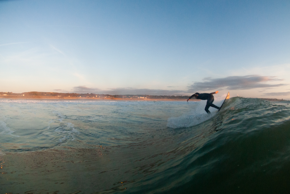

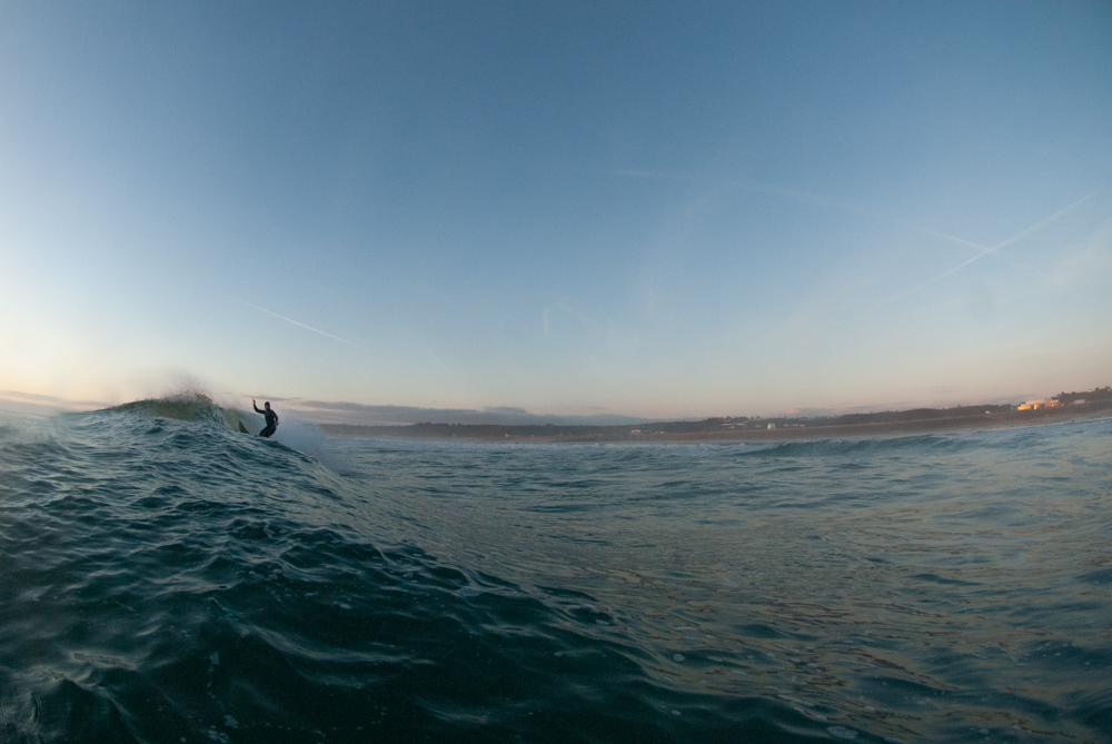


this mood board just shows what words I corelate to observe, challenge and seek I think my project will be more about observing and seeking rather them challenging just because the style of the photos I take they don’t really challenge any stereotypes or governments or anything really.

I don’t intend on making my photo look or even feel like Chris Burkard however he is a photographer that I have research and look in to I like how his images look however there not my style but they do look very good the reason I looked into him is because I am trying to get more nature and natural order of thing in my photos this could be tree and leaf’s to nature taking over abandoned places and thing left to rot what I like about Chris he only shows the beautiful side of nature which is good I would like to see if I can do the opposite to see how it look and to see if it looks any good.
green- will edit, yellow- might decide to edit (if more edits are needed), red- won’t edit
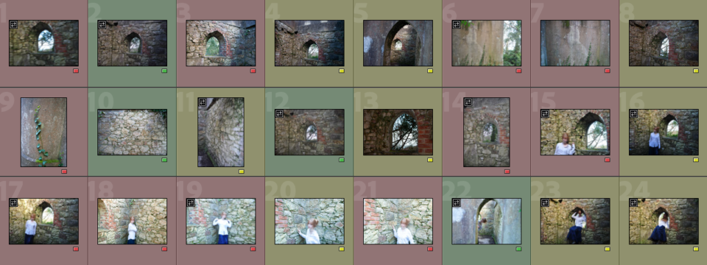
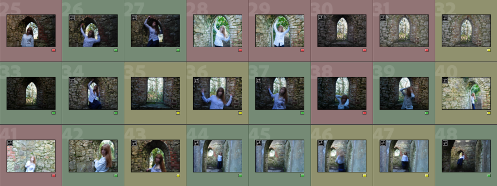
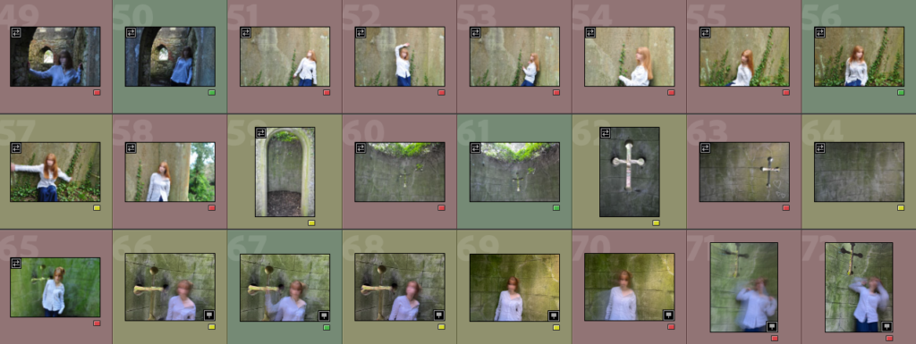

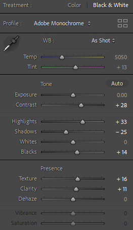
I made every picture black and white and I enhanced the contrast of the images by changing the contrast, highlights and shadows as well as increasing the texture and clarity of the photographs. I either lowered or increased the exposure, depending on the lighting in each image.
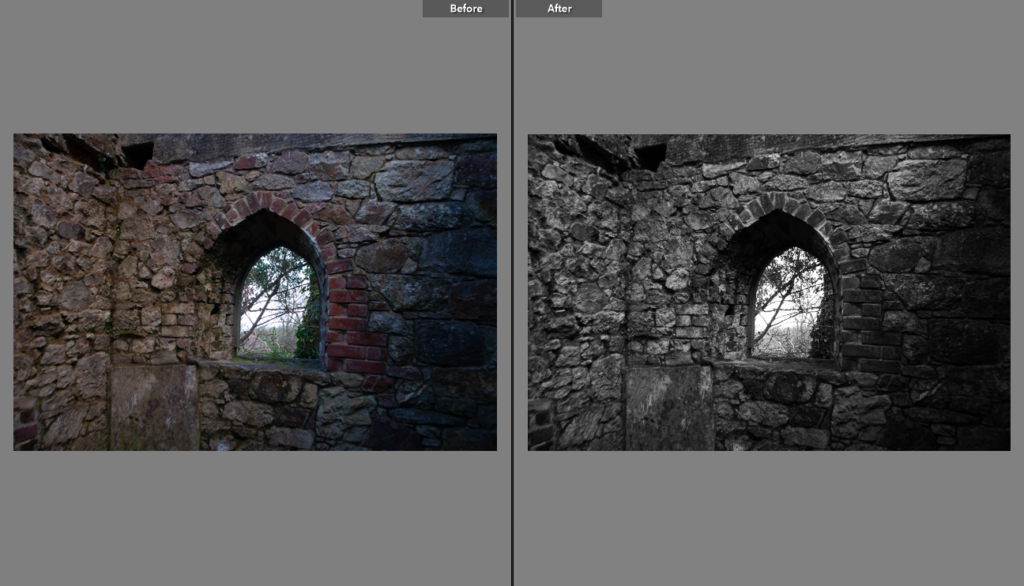
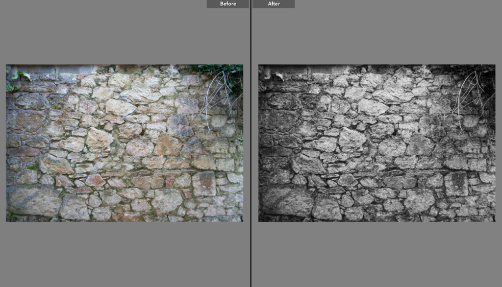
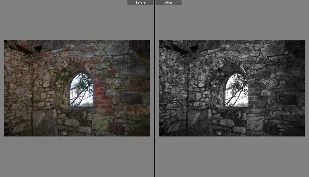
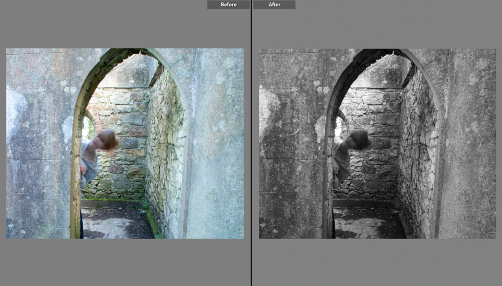
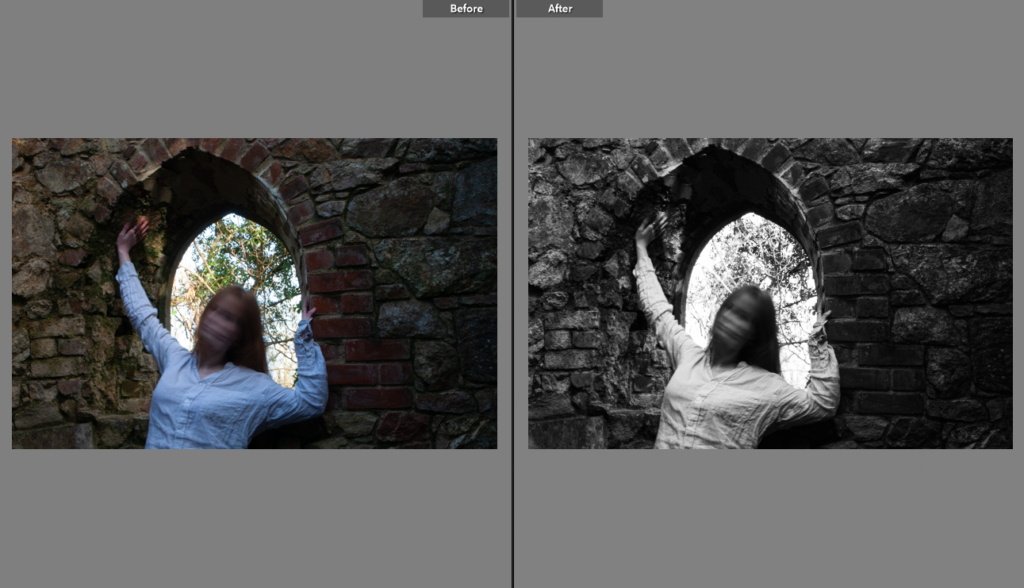
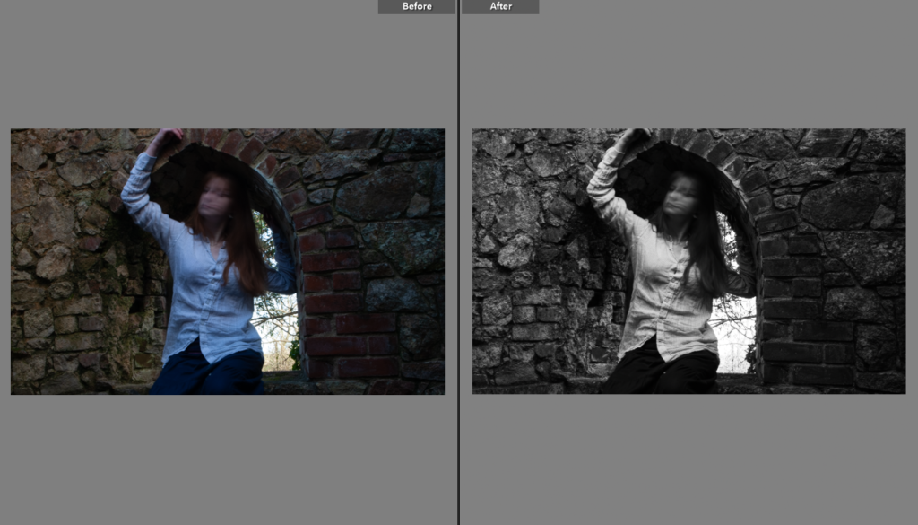
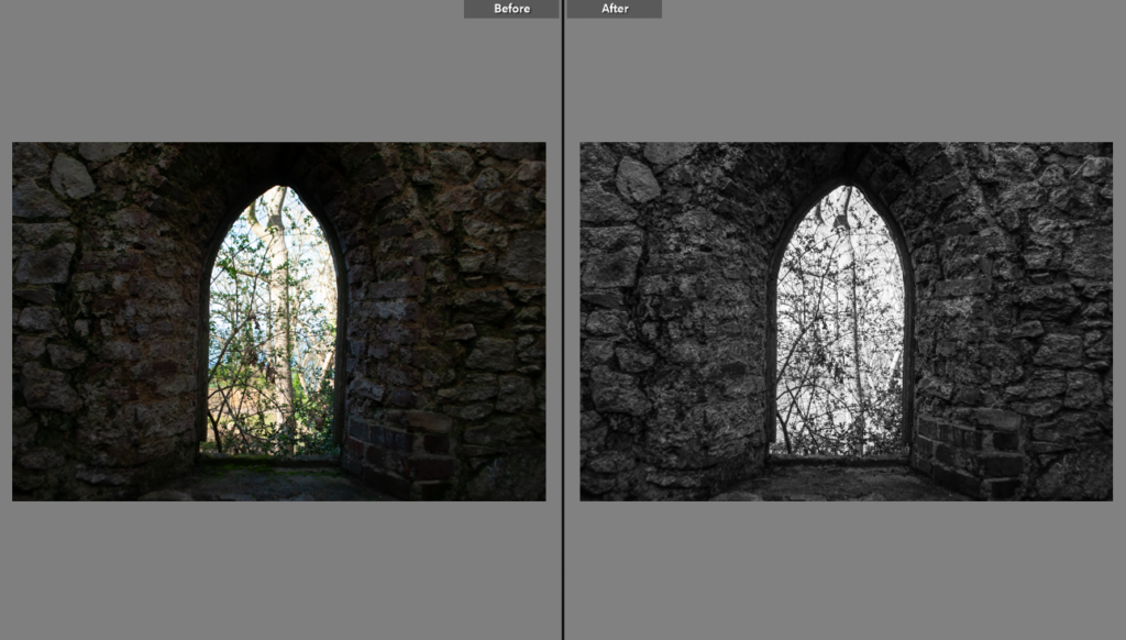
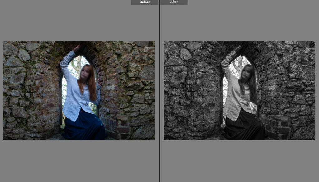
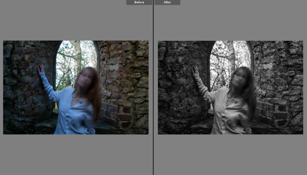
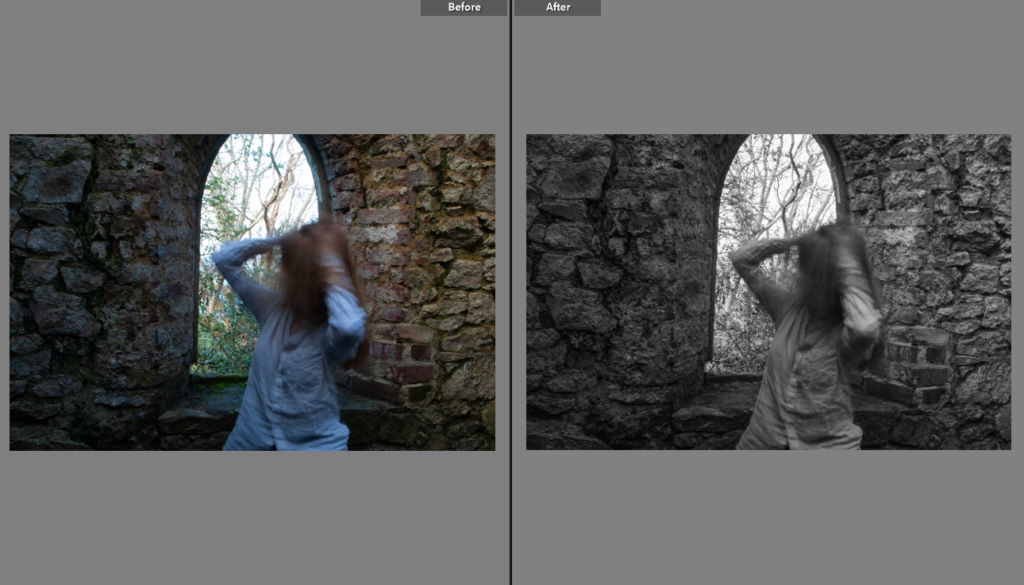
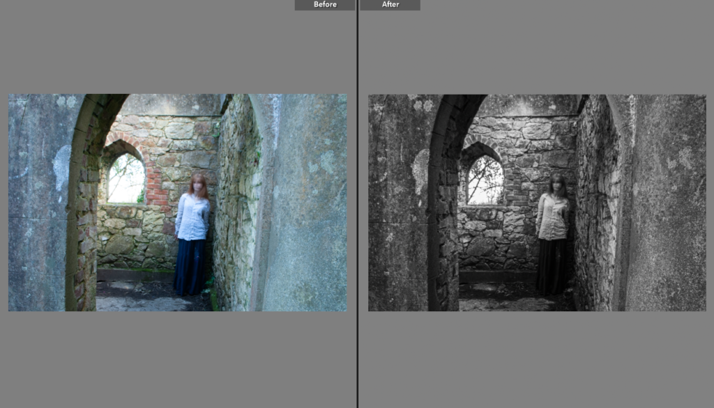
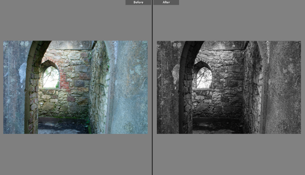
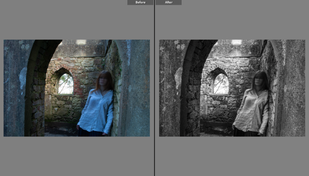
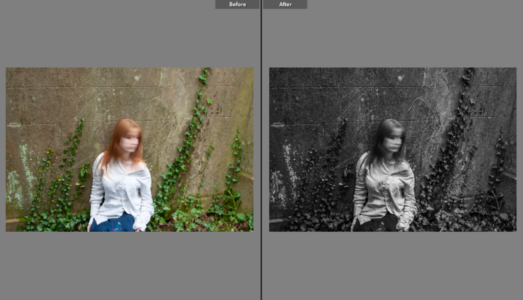
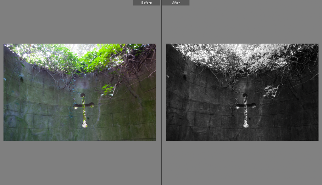
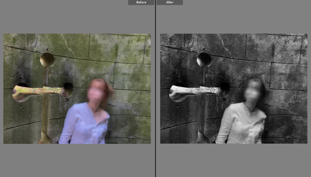
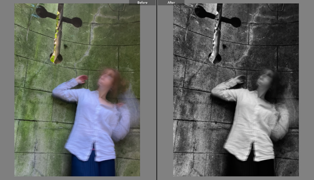
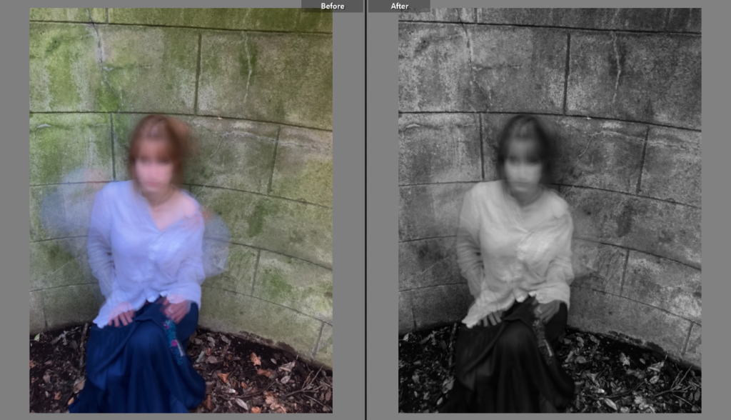
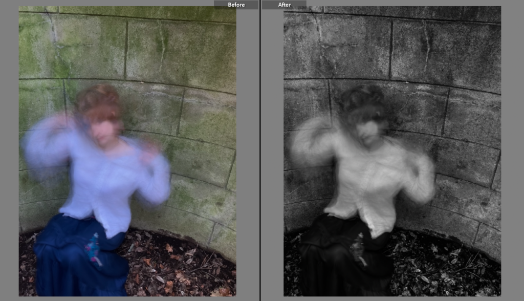
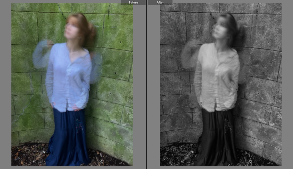
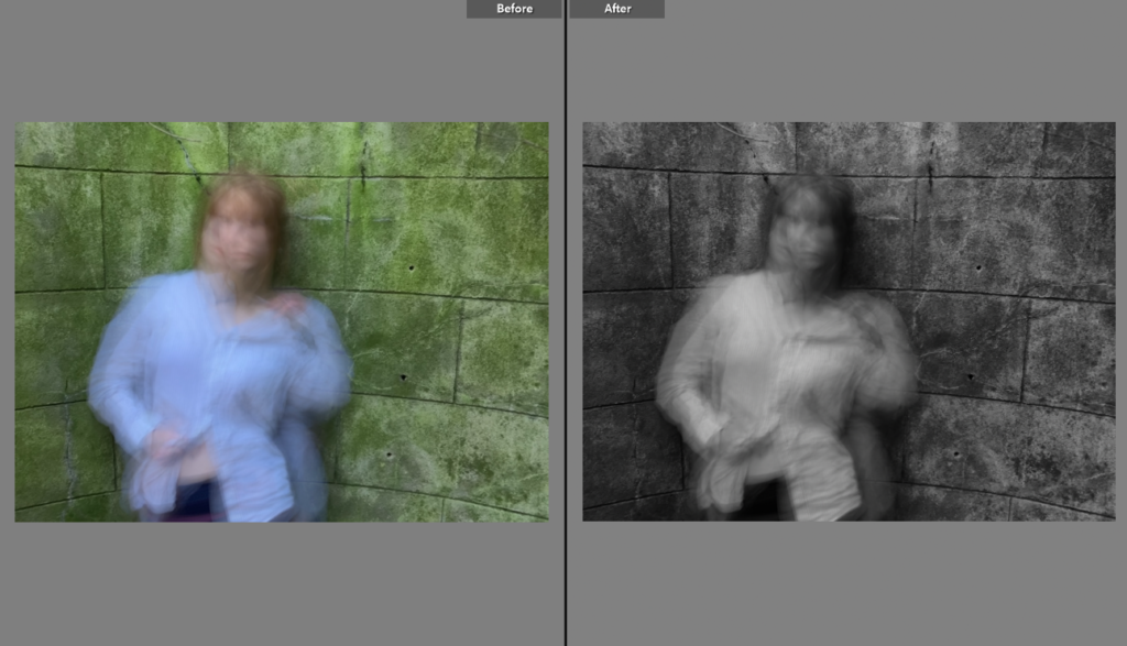
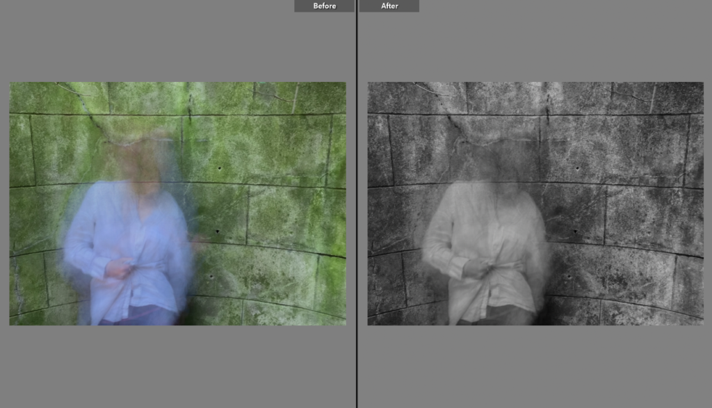
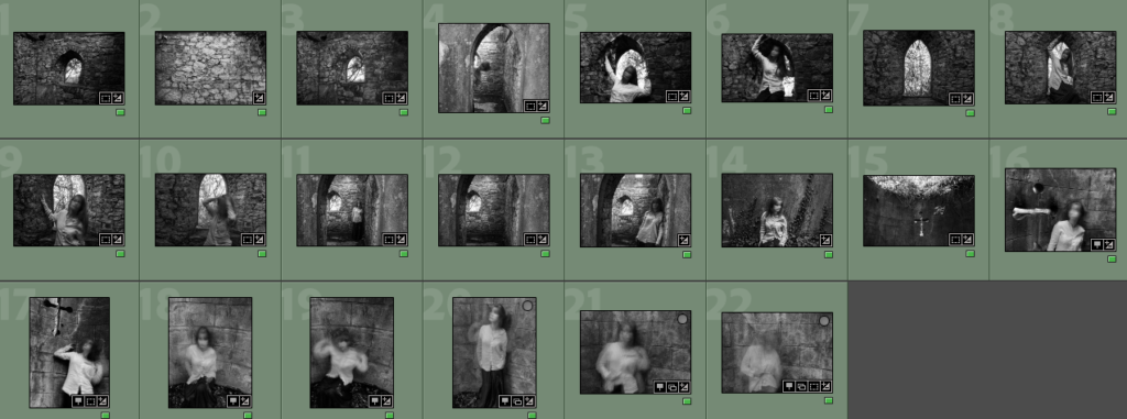
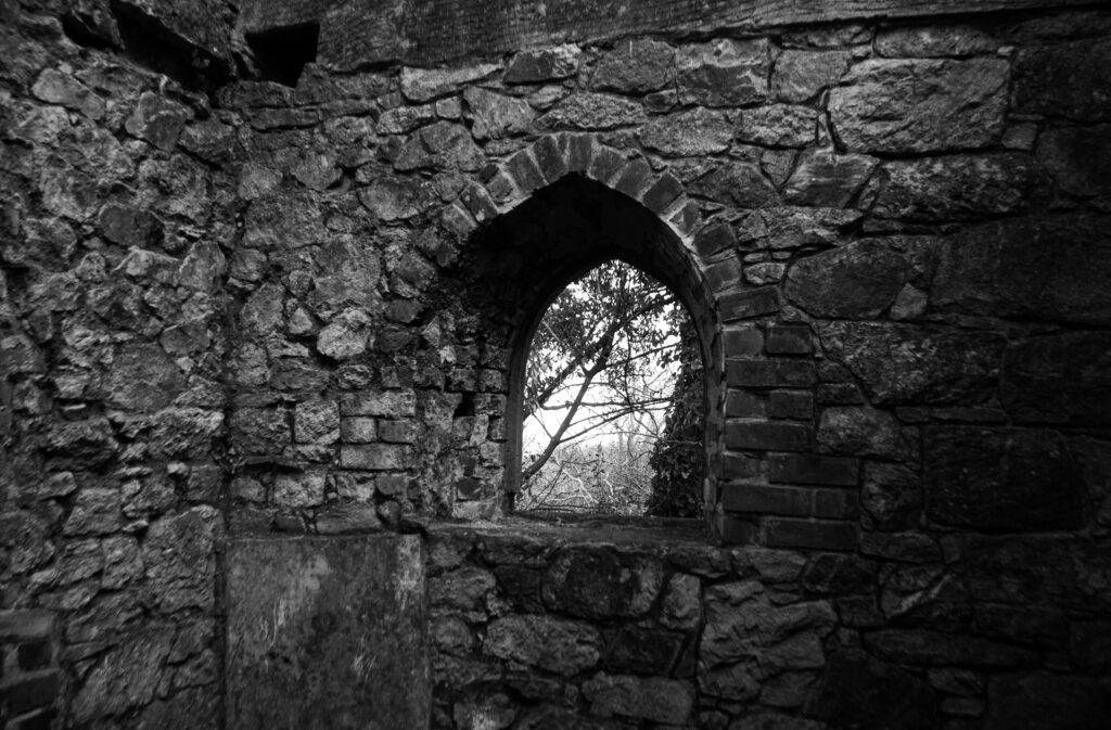
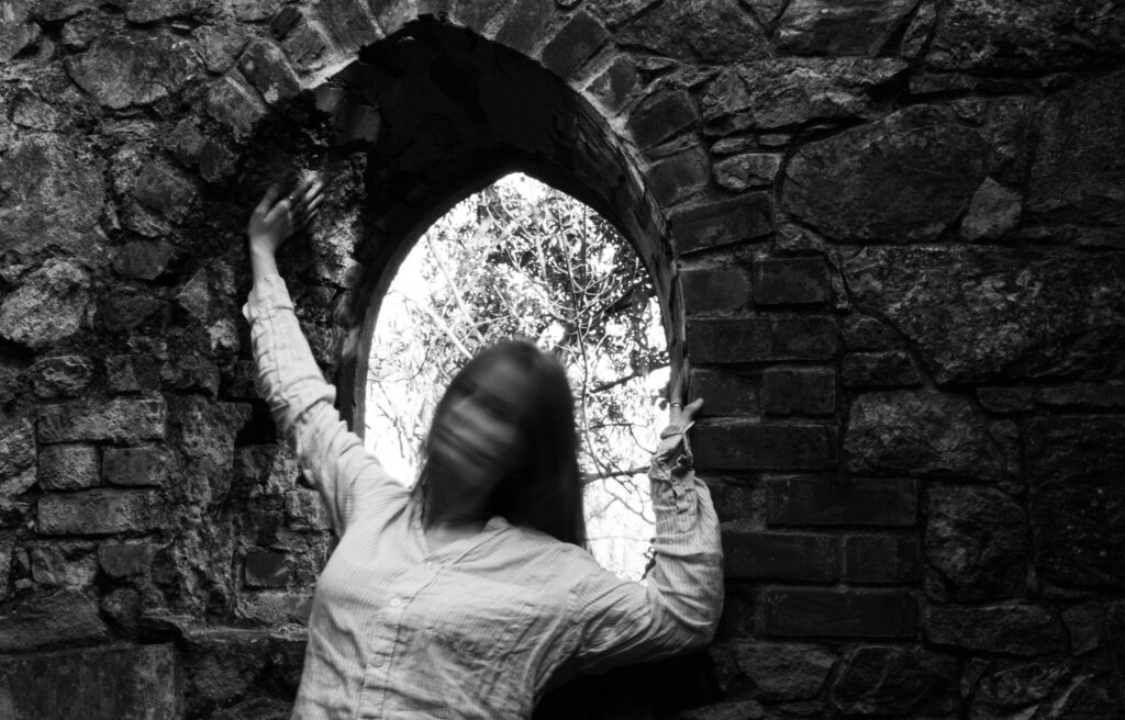
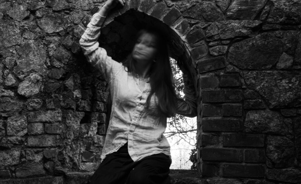
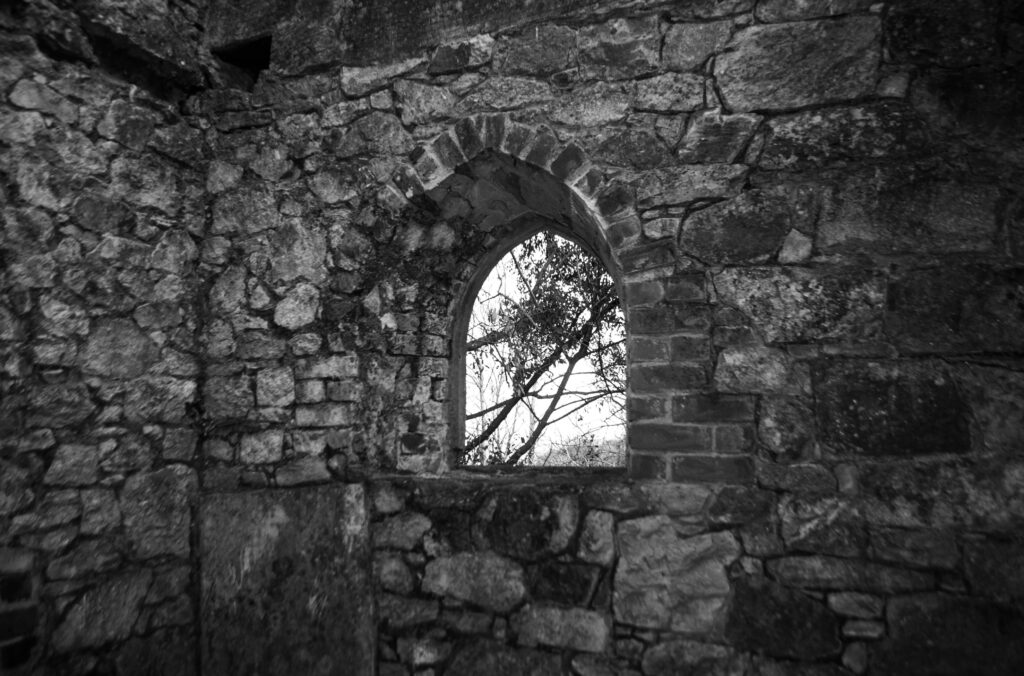
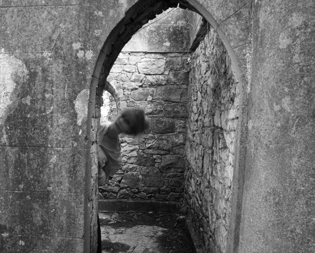
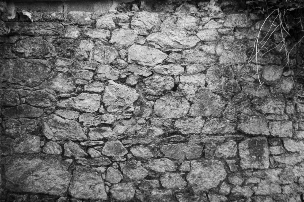
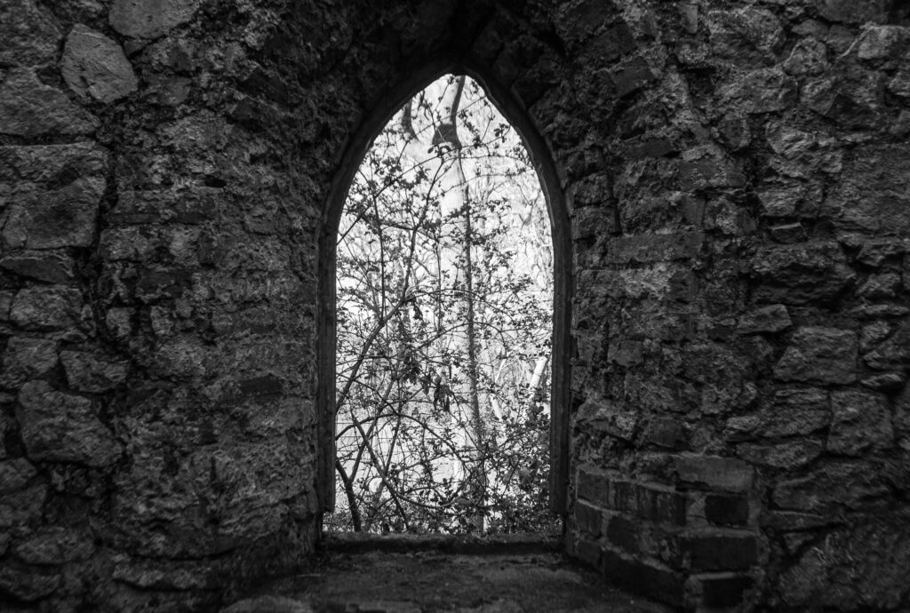
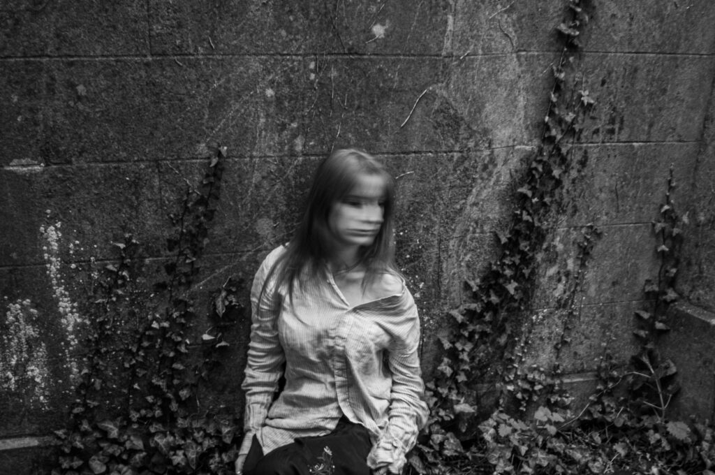
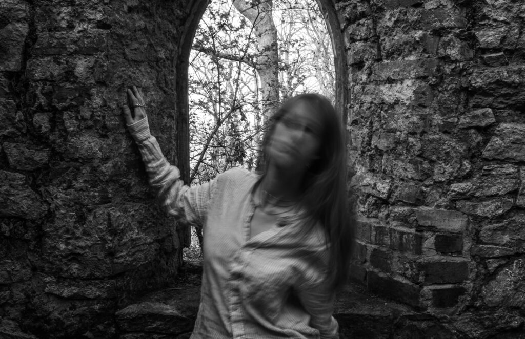
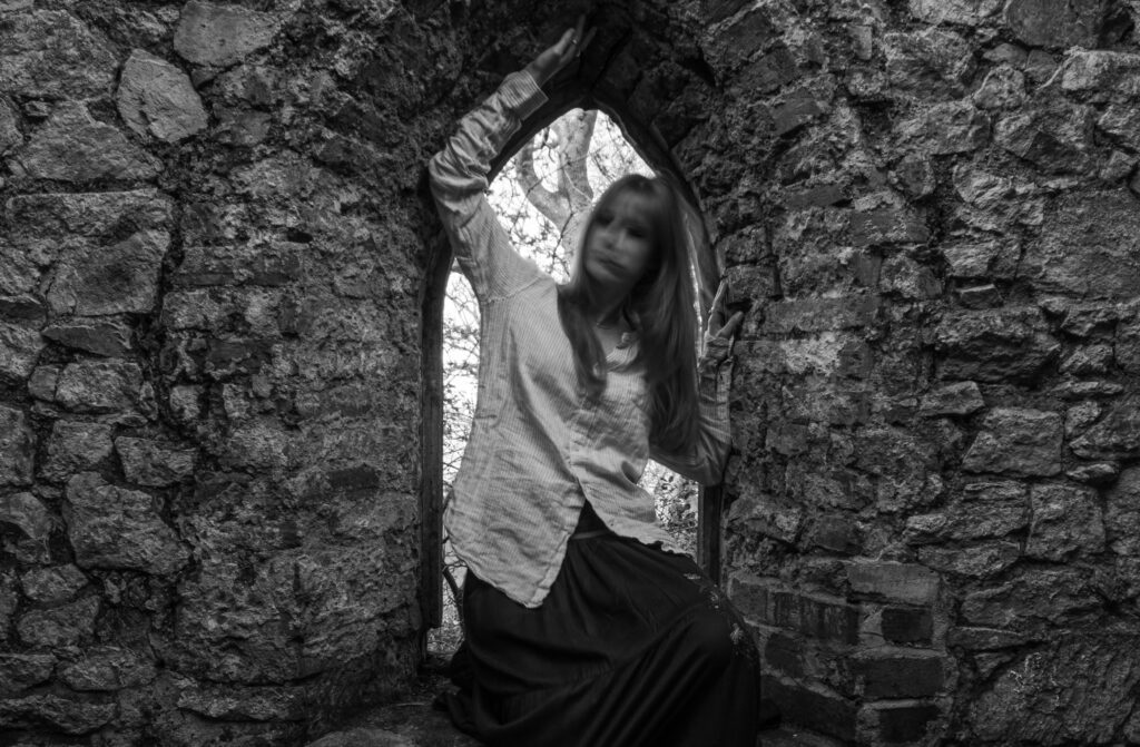
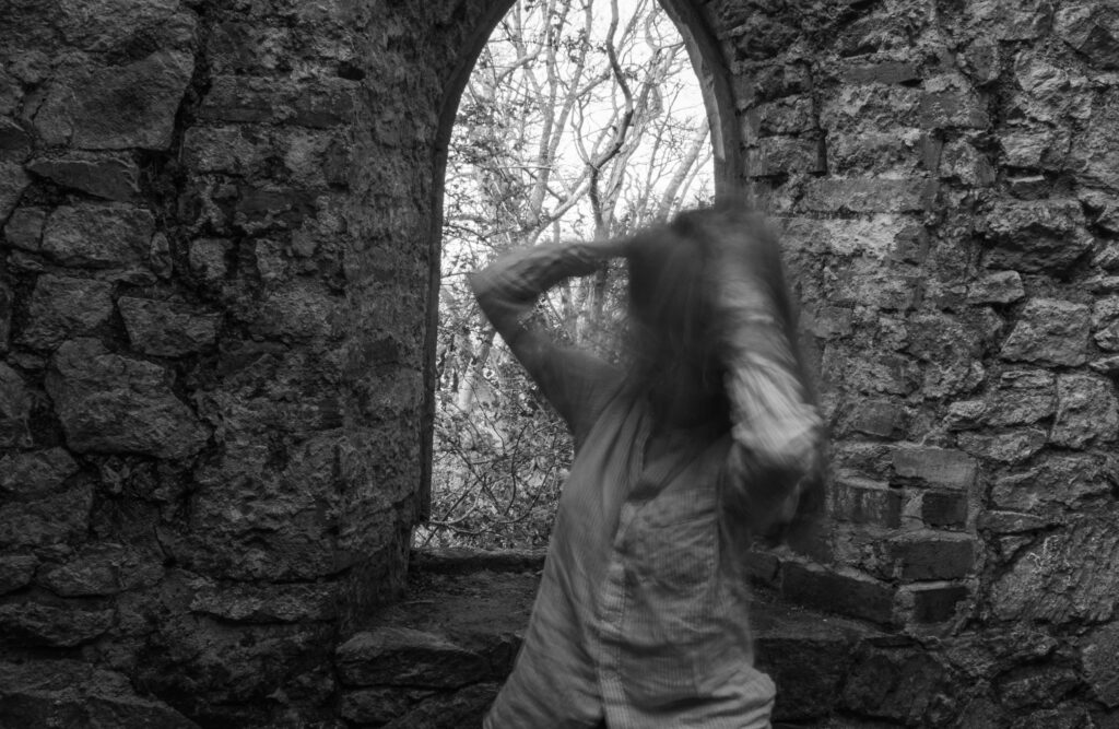
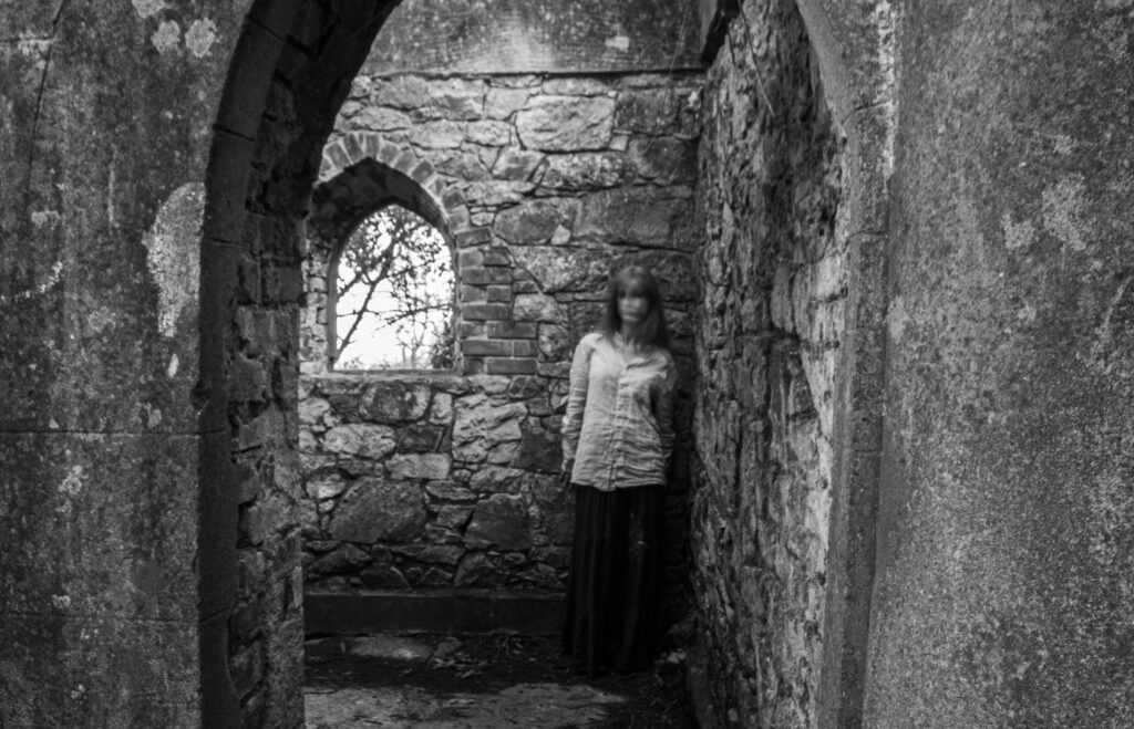
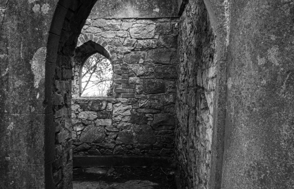
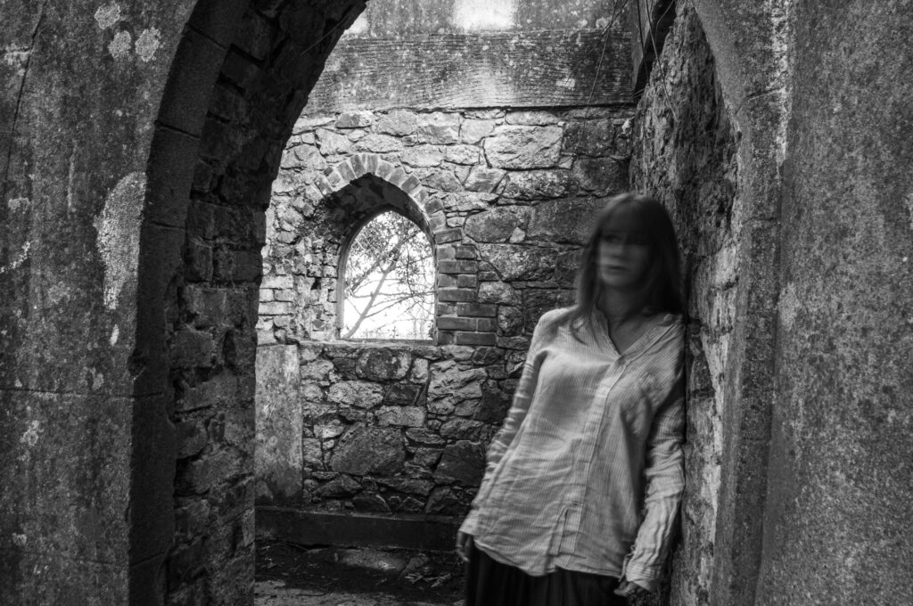
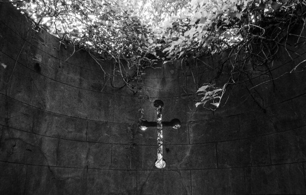
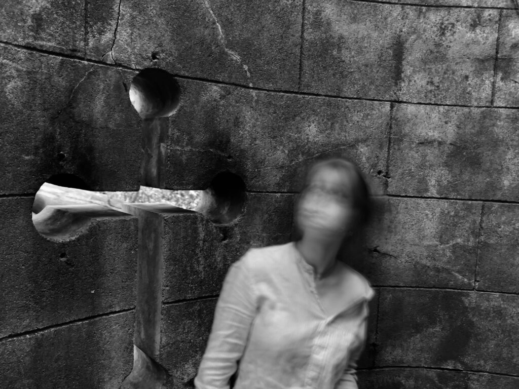
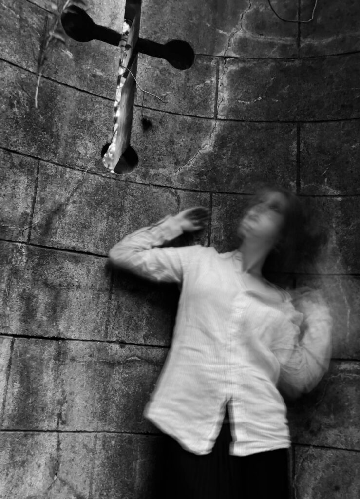
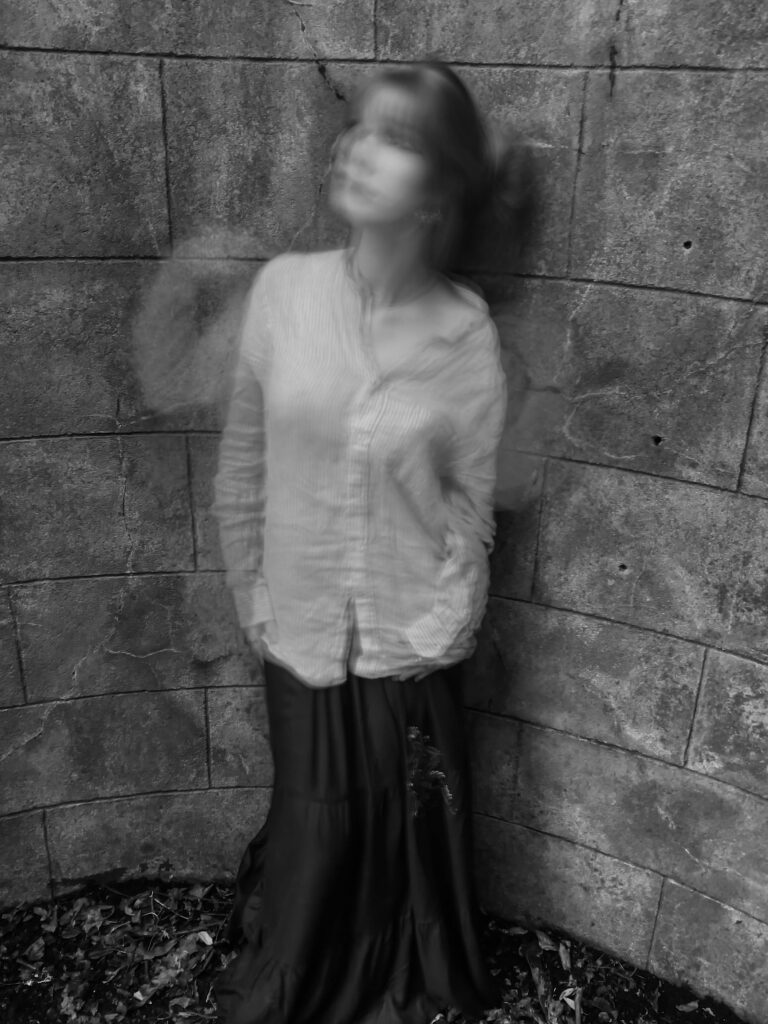
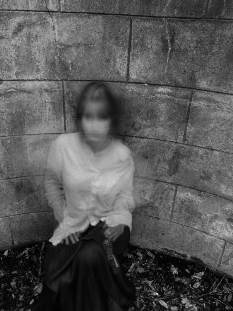
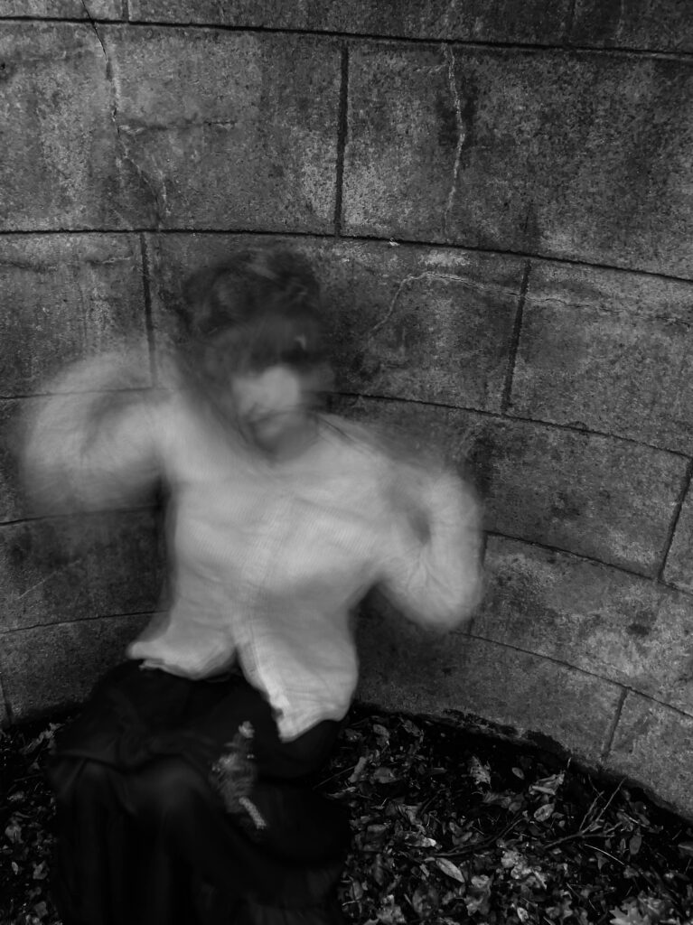
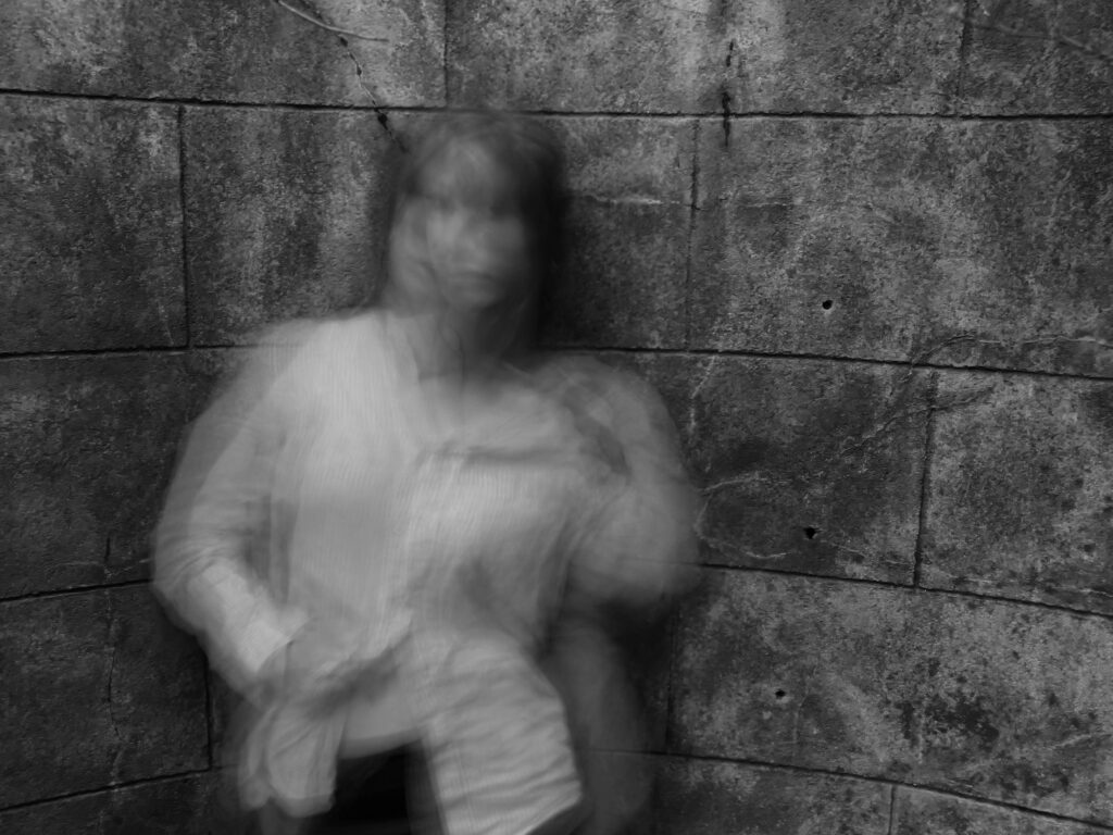
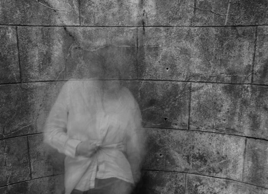
I think the editing was effective, since it improved the quality of the images as well as made them much more similar to my inspiration, Francesca Woodman. The increasing of the contrast made the details of the blurring stand out, emphasising the multiple exposures present in the photos.