Category Archives: Uncategorised

Filters

Author:
Category:

Artist Study – Mickalene Thomas

Mickalene Thomas is a contemporary African American Artist best known for her elaborate collages and paintings of similar style, she uses scraps of magazines and rhinestones to embellish her work. Her depictions of African American women explores both her relationship to her femininity as a black woman but also empowering black women in a broader social setting.

Thomas references classical portraiture and borrows scenes from popular culture – Combining traditional genres with African American women combatting the Eurocentric view large amounts of art and history has had placing Black women in the spotlight.

“Positioning black women — artists, actresses, characters, and her own family — as mentors and muses, and as heroic figures in a lineage of their own, Thomas overrides oppressive narratives.” 1

She takes ques from artists such as Manet,  Gustave Courbet and Henri Matisse. Often directly pulling poses from their works. “She models her figures on the classical poses and abstract settings popularized by these modern artists as a way to reclaim agency for women who have been represented as objects to be desired or subjugated.

Much of her work is a criticism and rejection to the male gaze specifically the over-sexualisation and miss representation of Black women and culture in art. Her subjects often look directly at the viewer challenging the dominant male gaze in art. This more assertive posing of her models shows a confidence in their skin and bodies which is essential to her combatting the ideas of typically gentle and submissive portrayals of women.

She creates elaborate mixed media paintings often incorporating Acrylic, Rhinestones and enamel. She often uses Collage to obscure bodies of her models and rebuild them into new settings. She uses bright block colours as a result of her collage he models are often dressed in bright outfits reminiscent of the 1970’s – she often does this in reference to her childhood growing up in the 70s. Thomas mentions being inspired by the work of contemporary artist Romare Bearden known for his abstract brightly coloured oil paintings. she also sights much of her inspiration coming from movements such as dada and cubism.

A good example of Thomas’s process is her 2010 works ‘Le déjeuner sur l’herbe: Les Trois Femmes Noires‘ (The Luncheon on the Grass: The Three Black Women) based of off Manets ‘Le déjeuner sur l’herbe‘ – This painting caused intense controversy when first completed depicting two nude women with two fully clothed men – Thomas now responds to this painting to challenge to notion of the male gaze all her figures are fully clothed looking to wards the viewer giving them agency and personality when compared to the female figures of Manets work. The ‘Le déjeuner sur l’herbe: Les Trois Femmes Noires‘ went through 3 stages before becoming the fully complete painting.

Thomas started by photographing her models in the MoMA sculpture garden, in poses reminiscent of Manets work.

She then created multiple versions of the same collage with differing materials.

The final painting is 10 x 24 ft based of the original photo but painted on wooden panels with oil, acrylic and enamel. Thomas has stated that she chose the large size to “take up space” in traditionally white male dominated spaces.

I would like to incorporate Thomas’s style of collage into my work as I am drawn to her use of texture in her work and her ability to create entirely new images from scratch.

  1. Byrd, Rikki (November 27, 2017). Hyperallergic ↩︎

Shoot five

This shoot was re-done in those half cave / bunker type tunnels but with better lighting and where we went deeper into the caves, it showed a lot of decay and a huge sense of eeriness, and a sense of place which has been left to exist without ever being touched again. I like how it has not only materials in there but also how a presence of people were in there as u can see the spray paint on the walls.

Shoot four

The fourth shoot was done in an abandoned hotel which suits the concept of liminal space perfectly through its transition between one thing to another, for example hotels are used to get between one place and another, this decaying hotel also has the transition between new to abandoned/old and decaying. I liked these images a lot because of its sense of presence by people who left it behind.

Photoshoot 3

Due to this photoshoot being similar to my first, My inspiration was again Andreas Varro. This is due to our similar use of artificial lighting and the dystopian look that we both aimed to get.

For this photoshoot I decided to do it after the sun went down, I did this to eliminate all natural lighting that could intrude into my pictures, I did this photoshoot in a bedroom at my house to create a natural setting. I used 1 model who was a female and took various images of her in bed while on her mobile phone. To achieve the outcome that I wanted I took multiple images of her in different positions and asked her to represent her ‘Natural state’ meaning to portray what she is usually like when she in in bed on her phone.

Conclusion

In conclusion I feel that this photoshoot really portrays the dystopian reality of todays consumption of technology from an outside point of view of how isolated a person is/looks in their usual day to day life’s. I am very happy with how the images turned out and I am looking forward to editing them in the future.

Final edits

I edited all of the above images above on Lightroom classic.

photoshoot one

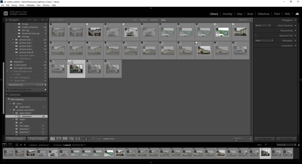
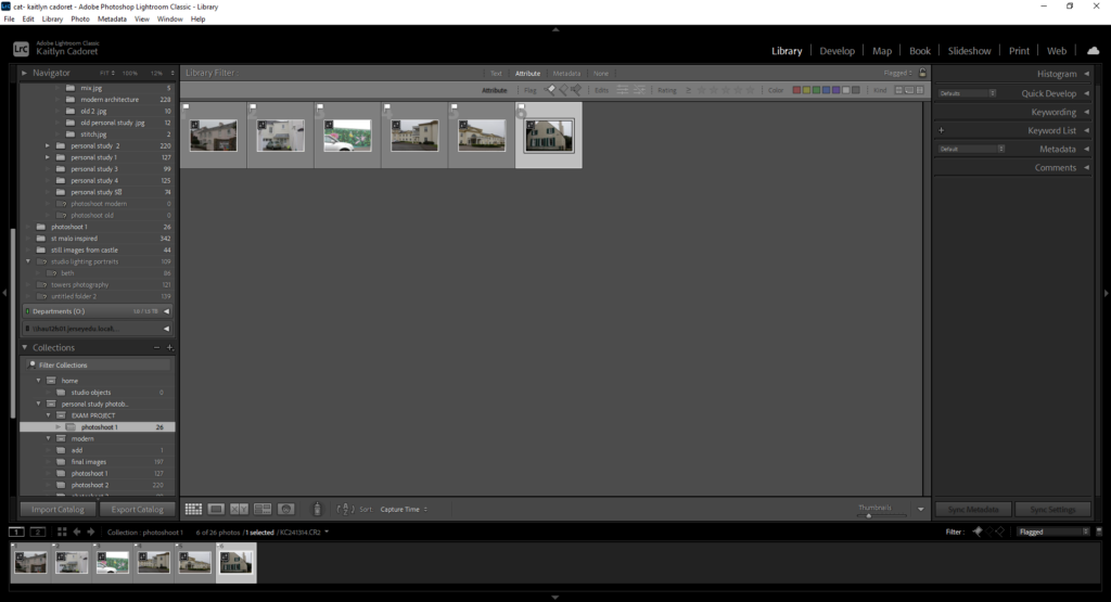
Firstly I uploaded my images to Lightroom classic and I looked through my images and use ‘X’ and ‘P’ to select the ones I thought would be good to use.

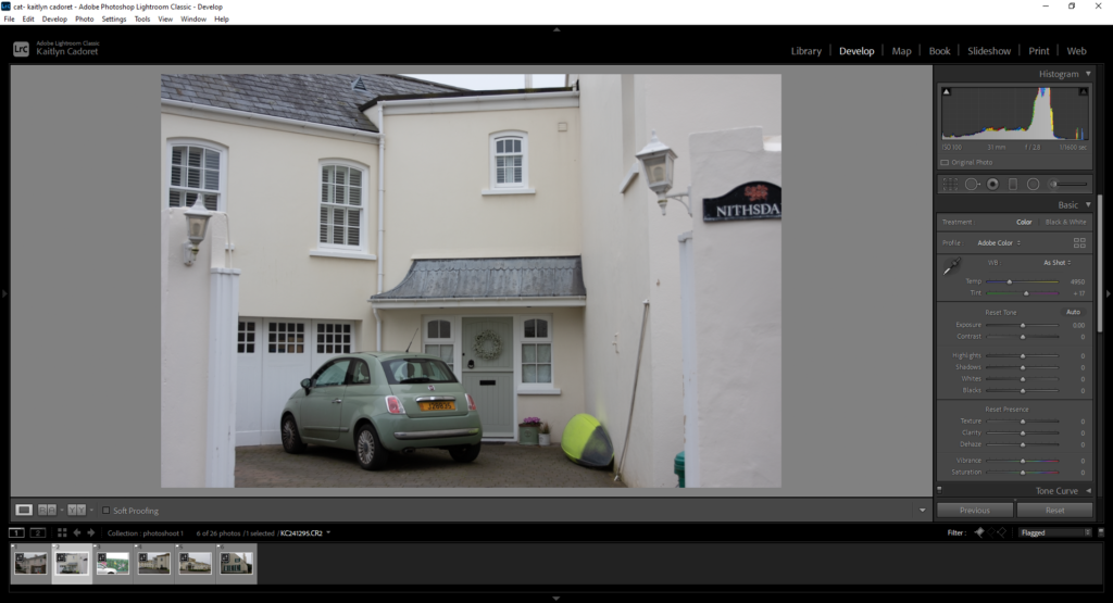
Once I had done that, I began editing them to adjust the lighting, make sure the image was straight and get rid of and marks on the image until I was happy with them.

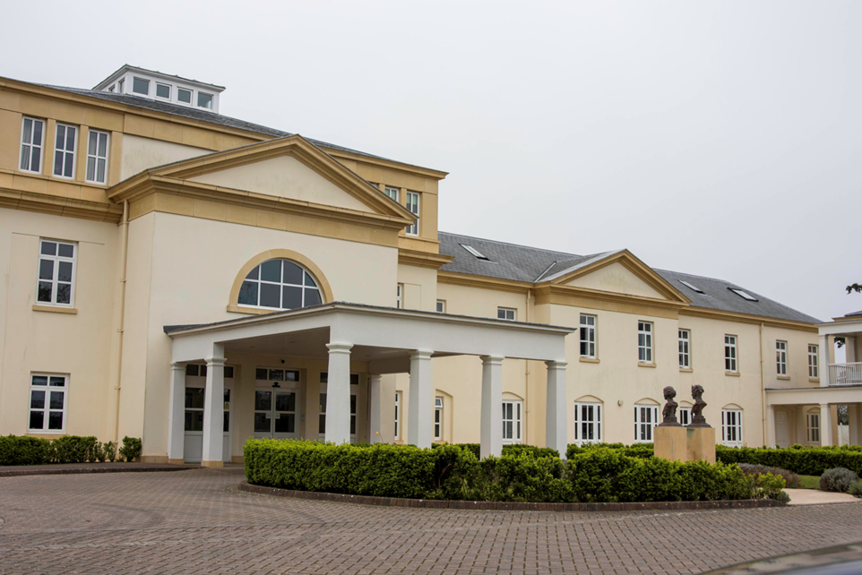
Final images:

Overall, I think a few of these images turned out nicely. As the shoot was only small it meant that I had less images to work with and now know for next time to take more images to give myself more options. I think that the colours are quite bright and are the main focus in all my images, but think that some of them could be more obvious.

Shoot three

Similar to the first and second shoot my third attempt wasn’t as interesting as I wanted it to be, which makes sense because this was the first week of trying to explore liminal spaces. This first image was made from paper, and was inspired through some of my artist references who had made models of environments and imaged them.

I also like this last image because of vibrant colours and how it contrasts each other through height, and editing a colder more contrasted wet look the image has a good use of liminality.

Shoot two

The best of my first and second shoot didn’t really include much content that I liked besides a couple images which closely portray this essence of Liminal space because of its grainy cliff hanger effect it has, because of its familiarity and uncomforting emotions, it feels like there is something hiding in the image, or about to happen.

Shoot one

For my first shoot I explored an abandoned, half bunker half cave, which had a lot of decaying equipment inside like railway tracks, old barrels, and rubbish, but I liked these first two images the most but couldn’t decide if it should be cold or warm so I done both. And I believe it presents a sense of loneliness, as it shows the tracks fading off into the darkness, as a way of presenting uncomforted emotions.