Nicholas Goodden – Photoshoot

– Nicholas Gooden

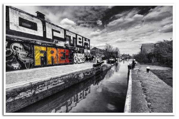
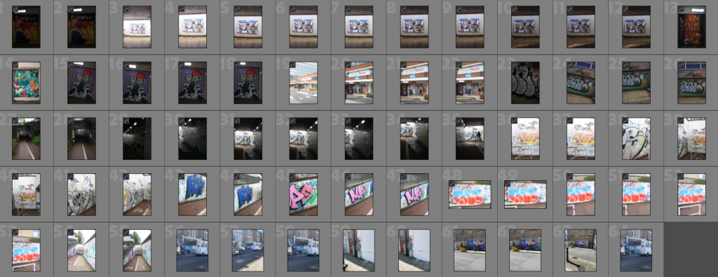
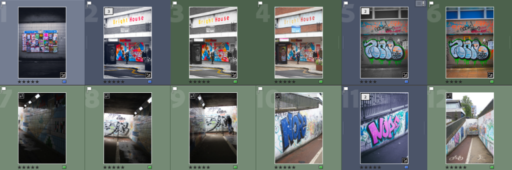
I spent a few days in the UK, and took it as an opportunity to photograph some graffiti in different cities. Norwich is a city covered in art instalments and graffiti, where I found myself taking the most images. The pedestrian underpasses, in particular, bore plenty of work from local artists and university students, hired by the council in most cases – otherwise, people had put their own work up, tagging the walls wherever they could find free space.

After sorting through my photos, I kept a small number of images that I felt could be edited to fit the style of Goodden’s work. The idea was to make the graffiti the focal point of each composition, by desaturating the rest of the image and increasing the saturation on the art itself. Because of this, it was difficult to find an image where the background was dull enough or where the graffiti was colourful enough to separate from the rest of the scene.

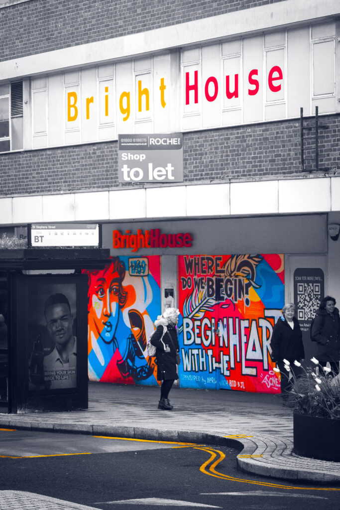
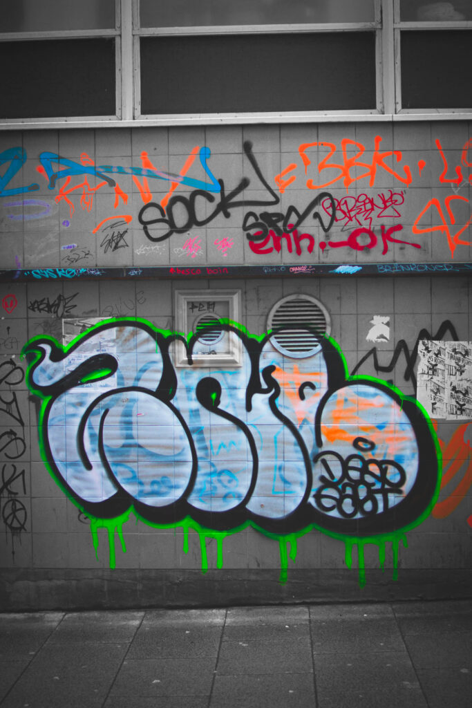
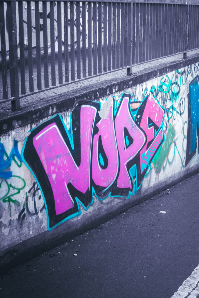
These were my final 4 images from this shoot. I ended up just using my images that I took in Norwich, as the other cities/areas I visited – Clapham, Brixton, Central London – I didn’t shoot from better angles and only used my phone as I passed by.

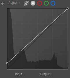
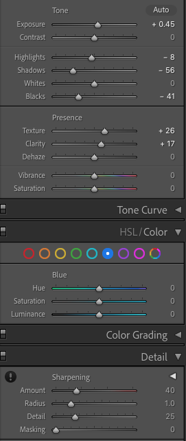
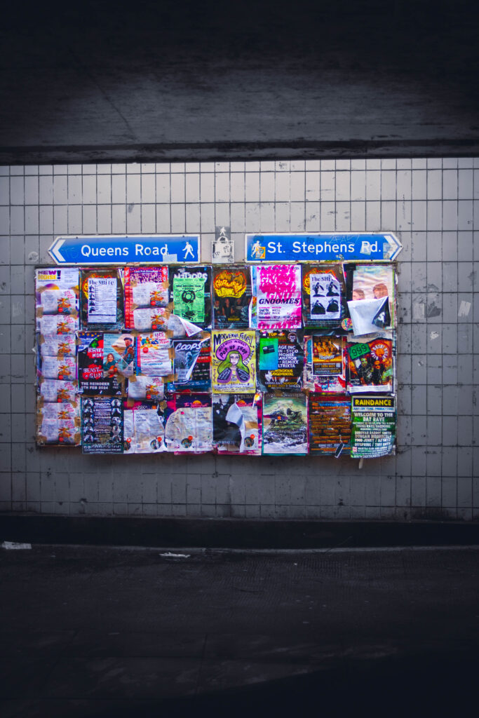
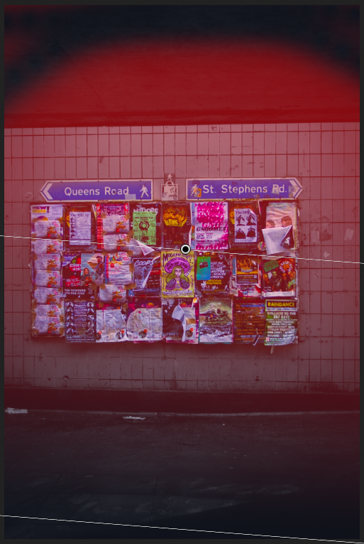
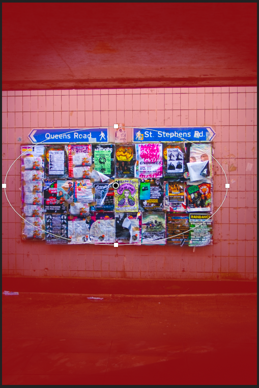
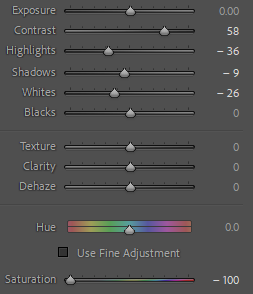
For this first image, I felt it would be easier to work with as I experimented with working out Goodden’s editing techniques, learning how to keep my focal point saturated whilst leaving the rest of the image in monochrome. I first adjusted the point curve of the photograph, increasing the output of the blacks to lighten the darkest areas of the composition, and lower the overall contrast, before completing any basic adjustments. I started with the image in black and white, so that I could see how the background would appear once desaturated, before moving it back into colour.

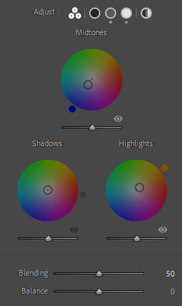
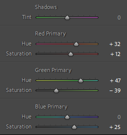
I didn’t want to overcomplicate the colour grading for this piece, as it would impact the entire image and I didn’t like the look of it. I adjusted the midtones toward blue slightly, which gave the image a soft blue tint when the monochrome filter was applied. I then calibrated the rest of the colours in the image, which I had more freedom with as it would only affect the noticeboard once the rest of the image was desaturated. I wanted to make the colours on the noticeboard more prominent, which I did by calibrating pinks and greens to a more saturated tone, which left me with these really nice neon colours on the noticeboard. I felt the neon colours were fitting as the noticeboard displayed a lot of advertisements for music events and concerts, often to do with the punk scene.

To finish off my composition, I added a vignette, and used the linear gradient tool to increase the strength of the light source, and to darken the darkest areas of the image, in order to create more contrast.

Photoshoot 1 – Playing pieces.

This photo shoot aims to use lighting in order to make the game pieces appear more interesting. This, in turn, will balance out the other more complex images making it more visually pleasing for the viewer, since having too much going on will confuse the viewer on where to direct their attention. I took these images at home, creating a set up studio and using a floor light to create my lighting.

For editing, I plan to keep the consistent theme throughout all my shoot’s of having my photographs contrasted and the colours more muted down to make the images more aesthetically pleasing to look at as well as creating a connection between them.

I have selected this photo as one of my best images due to the way it focuses our attention onto the playing pieces through the lighting and the blurring of the opposing pieces. I also really like the amount of detail that can be seen here, for example the reflection on the board, as well as the angle that the image was taken.

This is one of my best images as I find it appears very clean and concise. While there inst a whole lot going on in the photograph itself I think it is still very successful in how nothing takes our focus away from the playing pieces. It also doesn’t feel crowded which means it will be a useful image to have when paring it up beside a more complex.

I chose this image as one of my best images also due to the composition and layout of it. While lighting isn’t a key factor here, the way that the checker’s pieces are sprawled out across the board creates an interesting arrangement that draws in the viewers attention.

Here we are able to see the texture of the board as well as how the lighting highlights the left side of the board, casting the shadows of the chess pieces. Overall, I think that the image is visually pleasing and provides us with a good account of the aesthetic of the game. I am also fond of the angle that the image was taken since I feel as though this helps to create more dramatic feel for the image.

Lastly, I selected this photograph since I find the muted colours create a more calming feel which contrasts against the many different games being shown in the picture. I also find the lighting here to be engaging and helps the viewer to focus their attention so the rest of the image doesn’t become too distracting.

Case Study – Nicholas Goodden

– Nicholas Goodden

Nicholas Goodden, otherwise known as Nico, is a London-based photographer and drone videographer. Considered “A total Swiss army knife, able of covering any visual requirements thrown his way” by Beavertown Brewery Creative Director Nick Dwyer, Goodden’s work holds an incredible amount of range to it, from dramatic monochrome compositions to intense, vivid long-exposure photographs on the streets of London.

– Nicholas Goodden

My interest in Goodden’s work is his black and white pieces, where he always leaves some part of the composition in highly saturated colour, either he drawing over it in post-production or leaving the original colour. Take the above image for example, displaying a small riverside walkway, the left-hand side bearing a wall covered in graffiti, Goodden’s particular focus being the word ‘FREE’ painted across the wall. The immediate connotations of this word, and the fact that it’s the only part of the image with any colour, imply restrictions within maybe the photographer’s own life, or generally speaking society as a whole. The use of highlighting the graffiti in the image may also further the message of the original artist, who might be challenging the government by painting there illegally. It suggests freedom through art and self-expression, and a monotony in everyday life that needs to be broken out of.

– Nicholas Goodden

In my own work, I want to attempt recreating Goodden’s stylistic conventions within the work he’s done using black and white, as I think it would be a challenge for me to replicate, but also graffiti and vandalism as a subject presents the concept of ‘challenge’ perfectly, as more often than not the artists want to protest something.

Observe, Seek and Challenge- Photoshoot 3

For this photoshoot, I decided to take landscape photographs of the abandoned St. Saviour’s Hospital, formally named the Jersey Lunatic Asylum, to contrast with the self- portraits I have taken. I decided to do this to experiment with different photographic styles for this project, linking in a historical building with the topic of hysteria.

Research

The foundation stone for the asylum was laid on Saturday 29 July 1865 and opened in 1868. The institution was named the Jersey Lunatic Asylum, and was called this for nearly 100 years. However, in 1952, the name was changed to the Jersey Mental Hospital and then in 1963, when attitudes began to change towards mental health, the current name, St. Saviour’s Hospital, was adopted.  The architect was Thomas Gallichan, who was responsible for the design of other States projects such as the Royal Court House and the General Hospital. Unfortunately, he drowned while bathing in 1866 and never saw the asylum completed.

The original architect’s drawing for the lunatic asylum

The States Assembly were extremely reluctant to spend money on a purpose-built lunatic asylum, and Sir Robert Percy Douglas Lieutenant Governor of Jersey was forced to intervene since Whitehall complained about the lack of care of islanders with learning disabilities and mental health issues. The states were first criticised in 1847, yet still took nearly 20 years to act on Whitehall’s complaint. Having convinced the States to finally build the asylum, Douglas was also instrumental in selecting Queen’s Farm at St Saviour as the ideal site, negotiating the lease of the farm and land from the Crown for £84 per annum.

The asylum used to hold an annual picnic, during which it would take its ‘inmates’, as the press described them, on an excursion around the island. Each year, the papers reported the fine weather and good behaviour of the patients, but it sounded like a somewhat stiff and rather militaristic affair, with the patients called back to their vehicles with a bugle call, at the sound of which they would all fall in.

The main part of the hospital closed when a new facility opened in 2014 and it was left unused until the decision was made to sell the building and site. Unfortunately, this attracted the interest of vandals, who broke a window and started a fire inside the building in January 2017. There have been several proposals to sell the site, which is said to be worth as much as £15 million.

Contact Sheets

Sub- Selection

Carolle Bénitah

I want to edit some of my archived images in the style o f Benitah because I find her work can present feelings and storied through her editing process. I am going to experiment with her ideas in my own style to present loss and highlight my grandparents in images. Here is some of Benitah’s work that has inspired me:

Rather than prints, I am going to experiment in photoshop because it leaves more room for experimentation and I can produce multiple outcomes.

I selected the images I want to use for these edits in Lightroom using the colour selection, and rating them green.

Basic edits

The two main things in the images that I focused on was blacks/ whites and detail. I didn’t edit them too much apart from correcting the amount of shadow and highlights. I then sharpened the images a bit, adding some noise reduction to reduce grain. I also added texture and clarity to define some images and make the details more prominent. Whilst editing I had to think about the quality for printing, and I know (from my previous prints) that adding too much clarity/ texture/ sharpening can cause the image to look worse when printing.

example of basic image

I began editing an image in photoshop in the style of Benitah, focusing on the different shapes she uses to cut out the faces, the tones of red, and how she constructs her edits.

inspiration image

I tried removing the face using the quick selection tool to cut completely along the lines on the face. However I felt this didn’t look right and tried circles – like Benitah.

I selected circles, and selected ‘create layer via cut’ to show the background through. However I feel like this would work better with an image with more faces in, so I experimented more.

I tried adding the red thread sewing technique that she uses, but with the pen tool. I added a drop shadow to make it slightly more realistic.

I tried drawing with a darker red on their faces, and made it coe from the wine glass. I have seen Benitah do this a few times in her work, giving the ‘string’ a place where it has come from. I like this edit more than removing the faces, and feel like it fits the tones more.

More edits- I experimented with different editing for these images until I found a final result that I liked. I want to keep some subtle because when putting the book together overall I don’t want it to be too much.

quick select subject, create layer via copy, new layer, colour fill – red, low opacity, bring copy layer forward.
place image over old paper, erase chosen areas.
Draw a row of ‘x’ in pen, duplicate to make a large amount, combine layers, duplicate the combine layers, erase area over subject.
place image over old paper, erase in dots, add a drop shadow to look like leftovers from a hole punch – similar to Benitah’s work. I decided the paper was too saturated so I lowered the saturation.
Carolle Benitah’s work

For this image I’m not sure if I should have the thread around just my grandad to emphasise his loss, or if it creates a better composition with them both outlined.

I want some basic edits so I made this image look like burnt paper – inspired by Jessa Fairbrother

I edited this image of my grandad and his sister, attempting to focus the image on him, however I don’t like the edit and I decided it doesn’t link to the project.