Contact Sheet
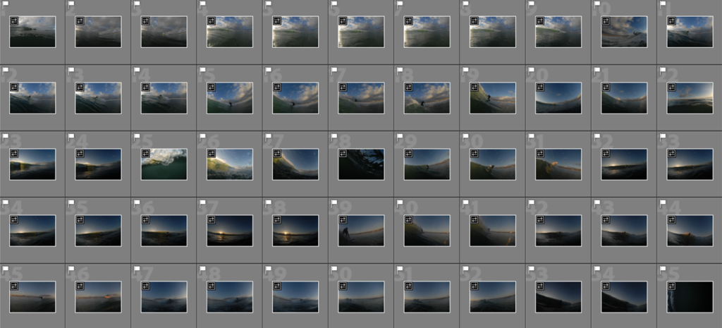
Image Selection – Narrowed down to a series of strongest outcomes
Editing Process
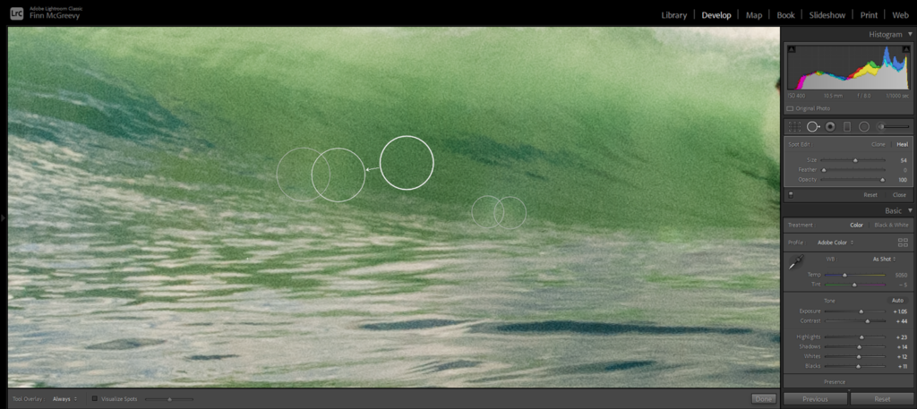
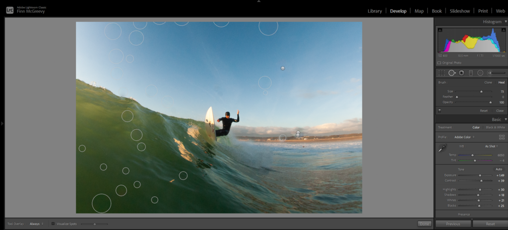
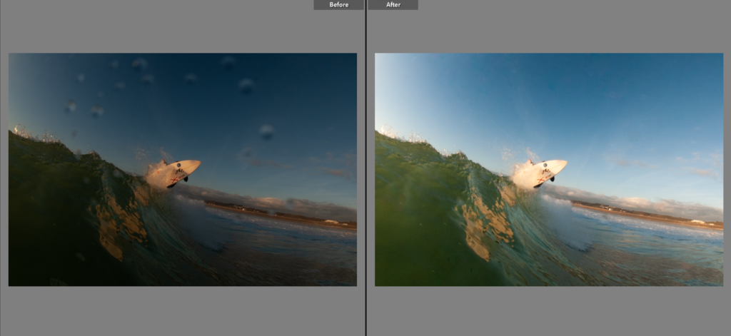
Spot Removal Tool – Glare/Blemishes/Water Droplets
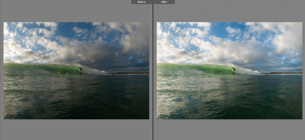
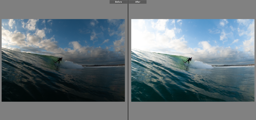
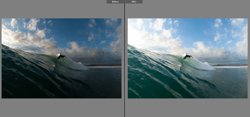
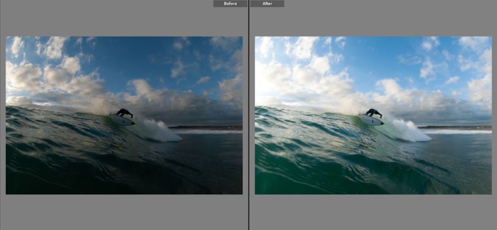
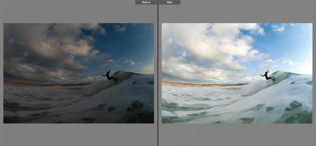
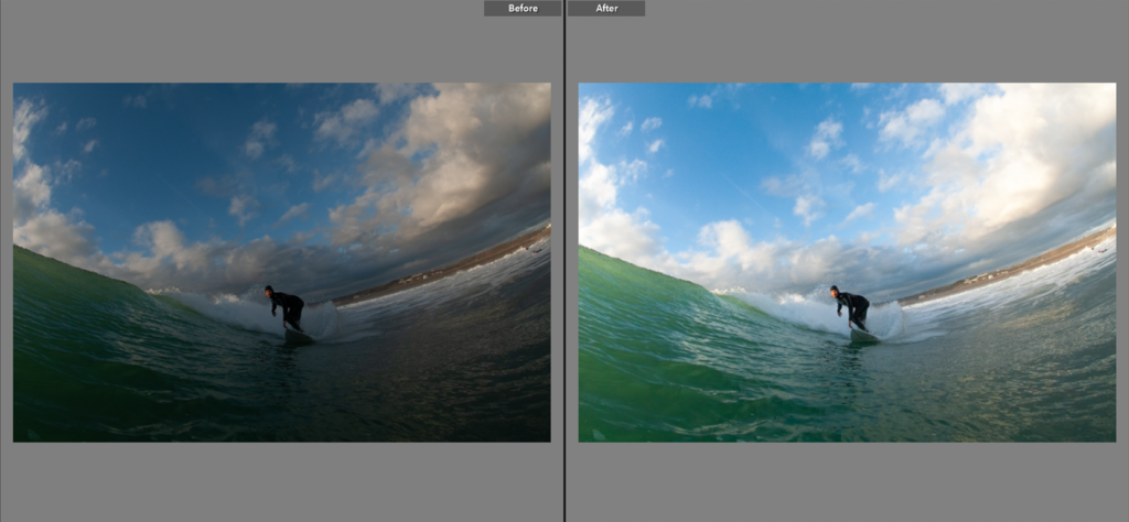
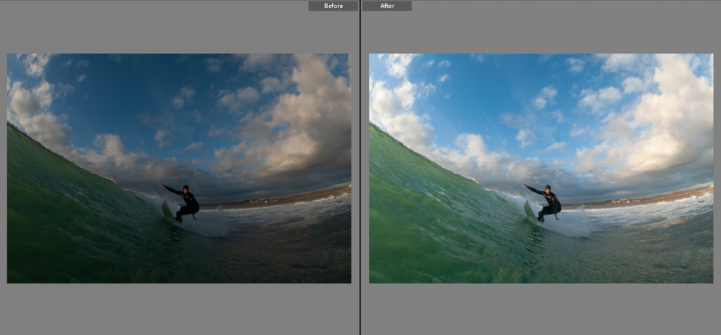
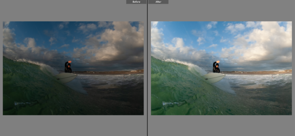
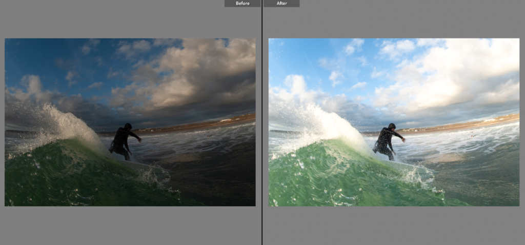
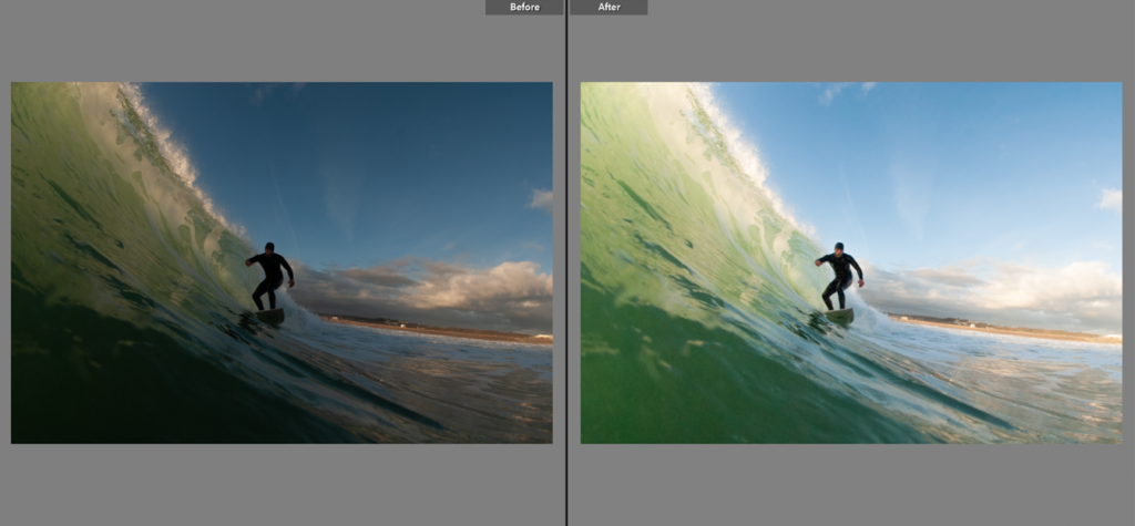
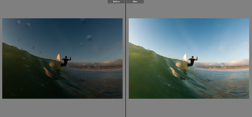
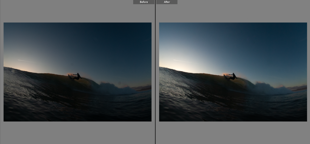
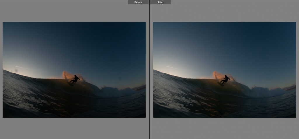
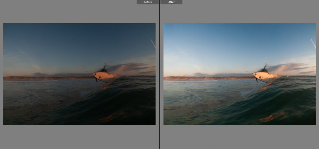
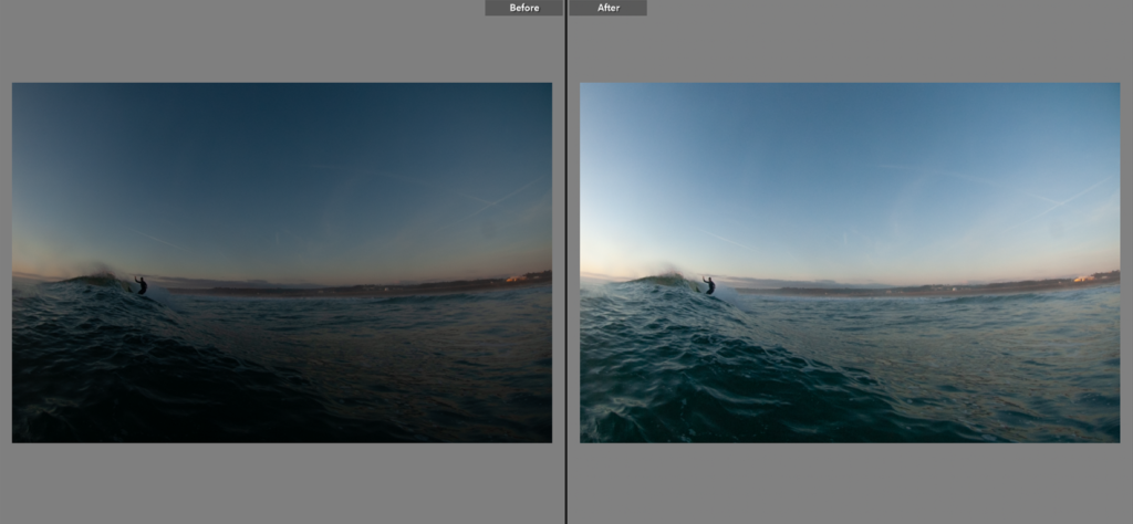
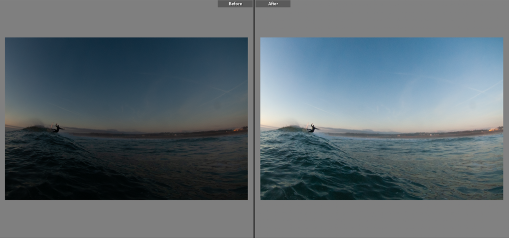
Before/After – Tonal Adjustments

Contact Sheet

Image Selection – Narrowed down to a series of strongest outcomes
Editing Process


Spot Removal Tool – Glare/Blemishes/Water Droplets
Before/After – Tonal Adjustments


For the second photoshoot, I produced 210 images.


Some of my favourite images:
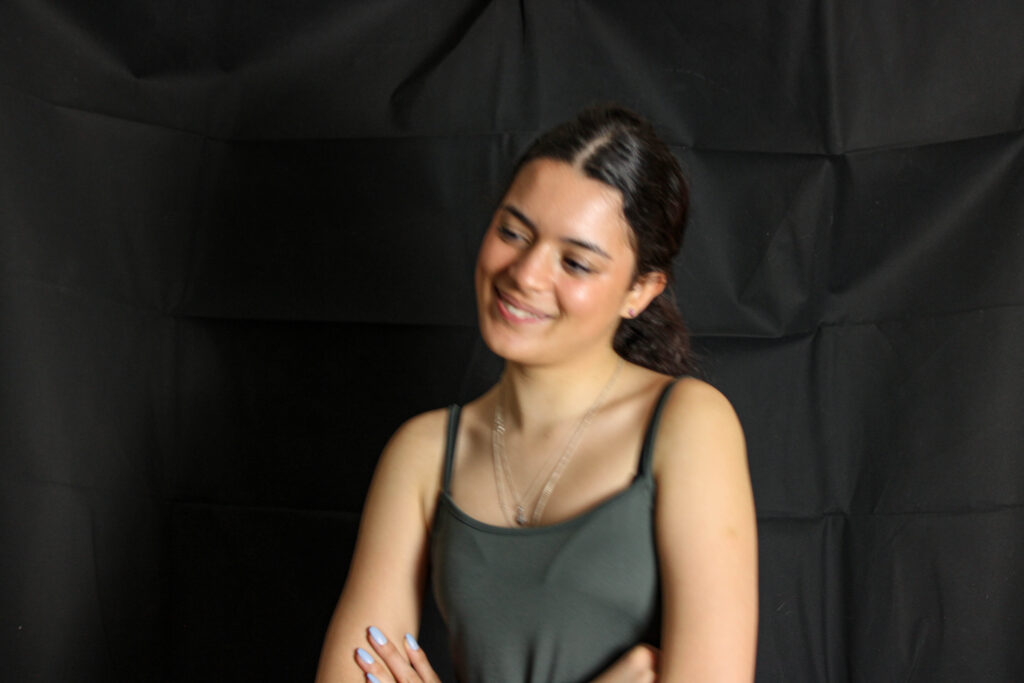
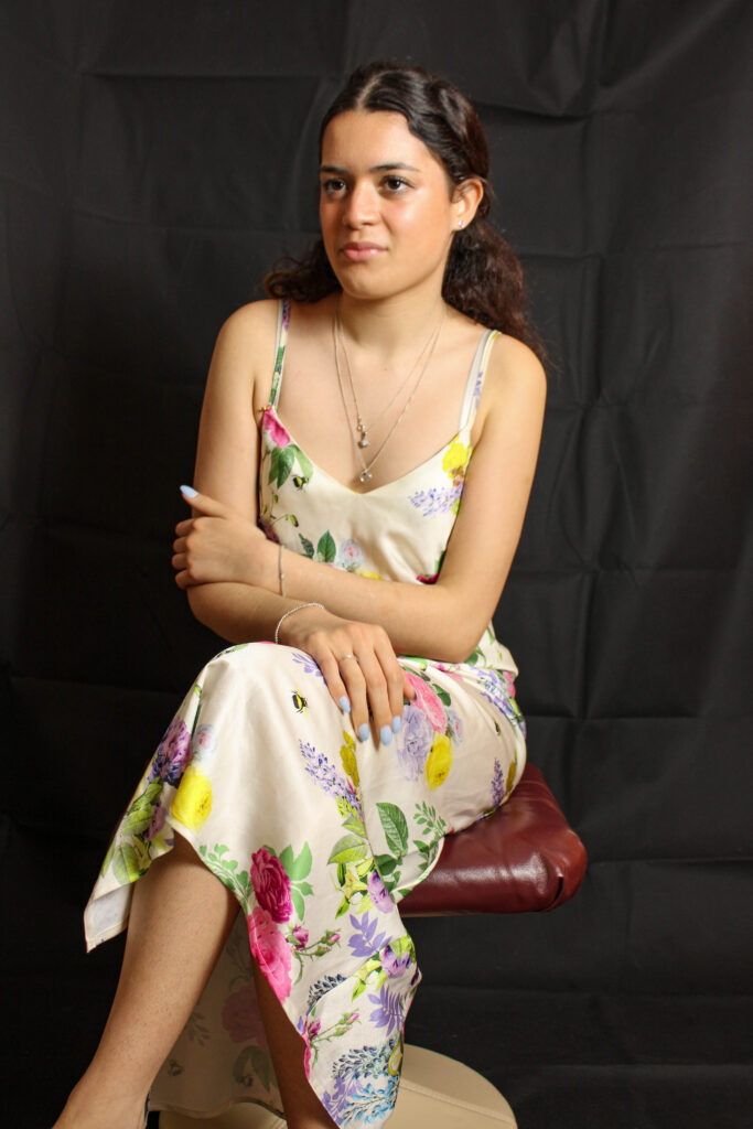
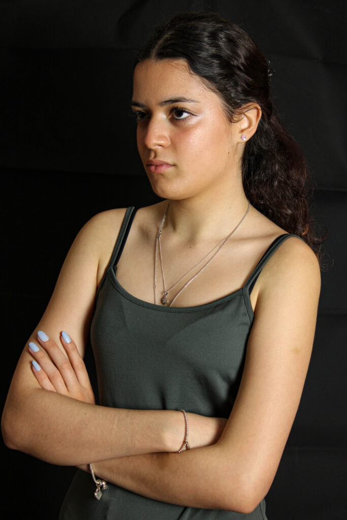
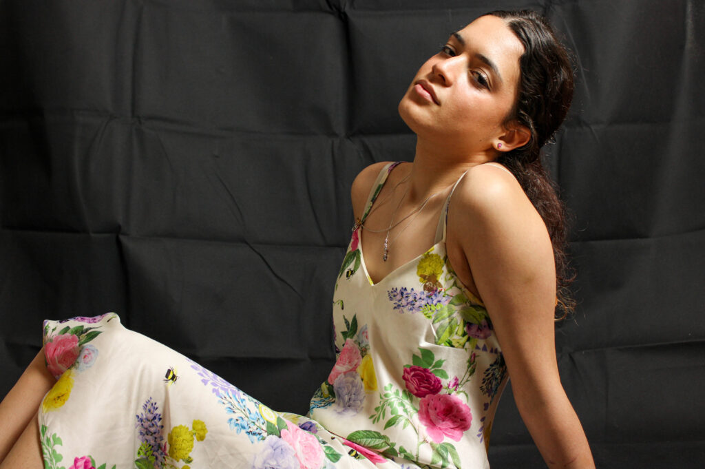
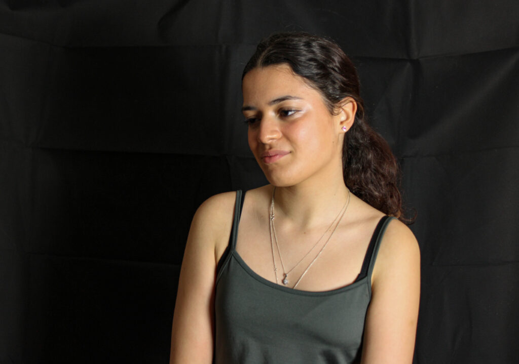
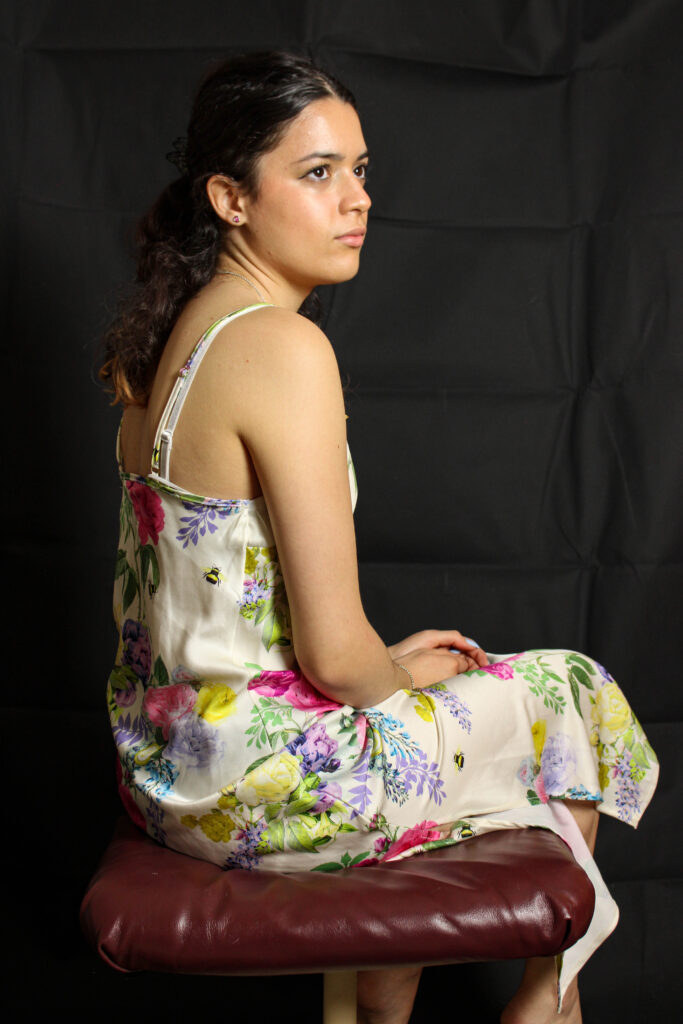
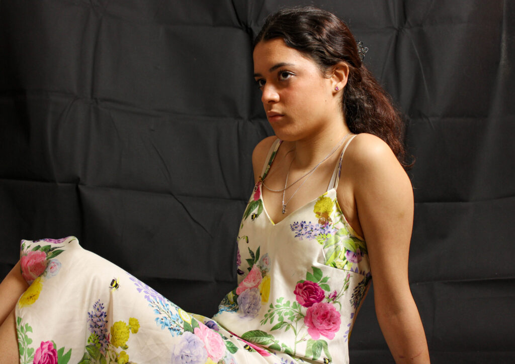
For this photoshoot i explored areas around where i live during the last hour before sunset to try capture shadows forming on the street and the buildings, overall im not very happy with my outcomes as i believe the lighting just want right and the photos just dont match the aesthetic i was hoping to achieve.

However as you can see in the above screenshot I marked my images with a star rating, you can see some images I really liked however others were test or just very weak.
My first photoshoot started out with 442 images, after narrowing that down to 104 images, I began to edit them.


Most of the images that were of the same person were edited the same or in similar manners.


The images I have put in this post are my personal favourites from each person’s different shoots.

Bart Koetsier’s work, particularly his street photography, maintains a strong sense of drama, that often feels straight out of a film. His photographs depict various scenes around Paris, from picturesque compositions of people and their dogs, to grittier, morbid imagery of people passed out on the streets late at night. The common theme throughout all of his photographs is that Koetsier remains the observer, simply providing the angle for the audience to look through.

In the above image, a couple is pictured facing each other, having a conversation sat on a railing, against a backdrop of a vast city scene. Compositionally, the use of the rule of thirds is well executed, centring the woman’s whole body in the photograph, whilst the man is off to the right-hand side, although his positioning is mirrored by the tree to the left. The railing and cityscape fills the bottom third of the image, whilst the horizon and sky occupies parts of the central and upper thirds. The photo is shot from a 90 degree angle, displaying the side profile of both people as they face each other. The colour palette is monochrome, with dark, dramatic greys and blacks dominating the lower half of the composition, and softer lighter tones in the upper. The couple, in conversation, both use very open body language, although the man appears more relaxed, and face each other head on, interested in what the other has to say. The woman wears a lighter outfit, whilst the man appears to wear a darker outfit. Whilst it can simply be assumed that the composition portrays a couple, the juxtaposition of their clothing could relate to many different ideologies and conflicts, such as good vs. evil, and potential religious ideals. The piece also develops a healthy contrast between nature and manmade structures, the two people potentially representing how humans build over natural environments.
In my own work, I enjoy creating dramatic pieces that involve people, such as in my street photography from the St. Malo trip, but I think that it’s still something that I can improve on with this project.
For my first photoshoot, I produced 442 images.


Some of my favourites:

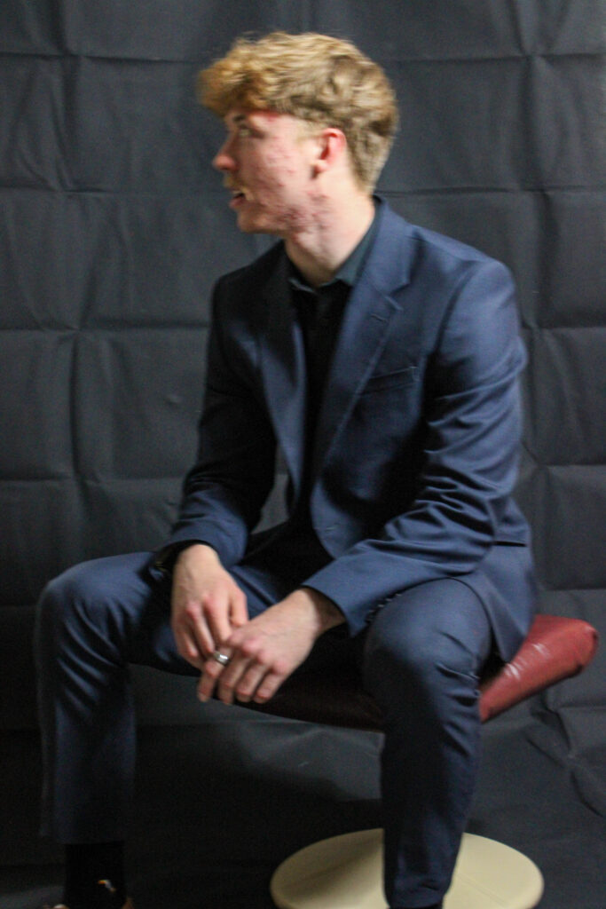
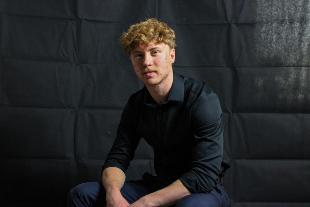

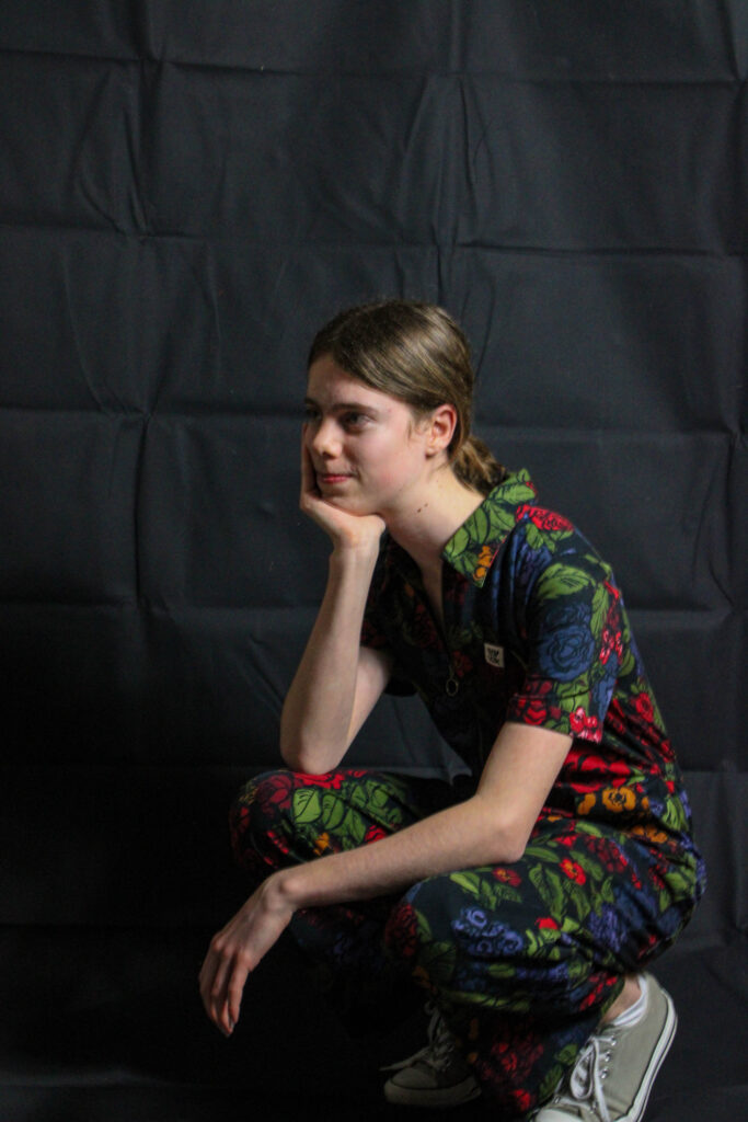
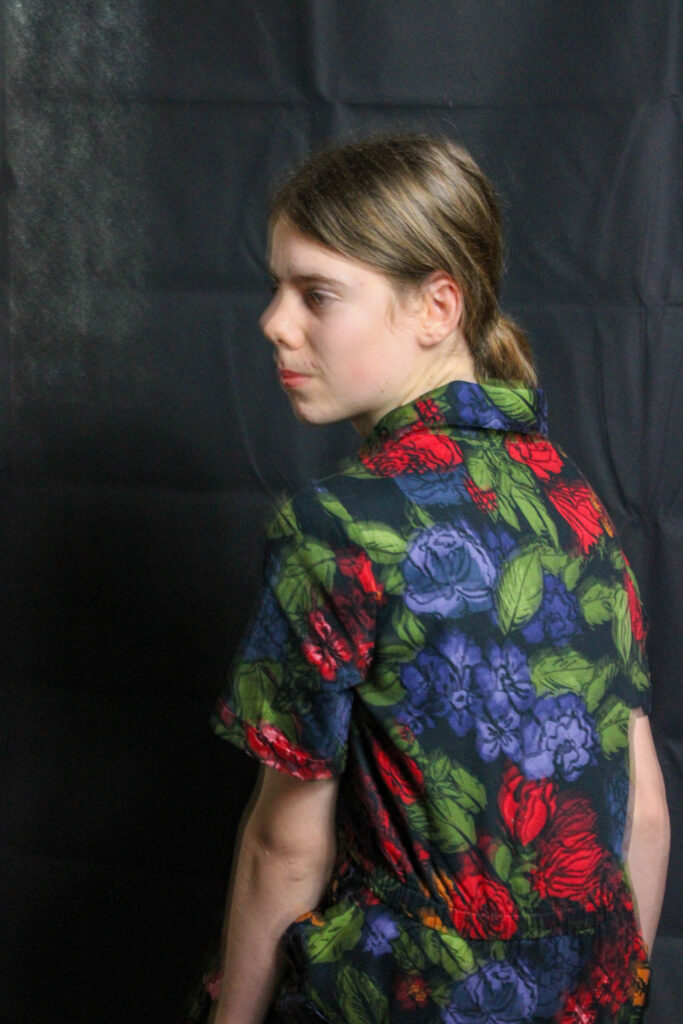


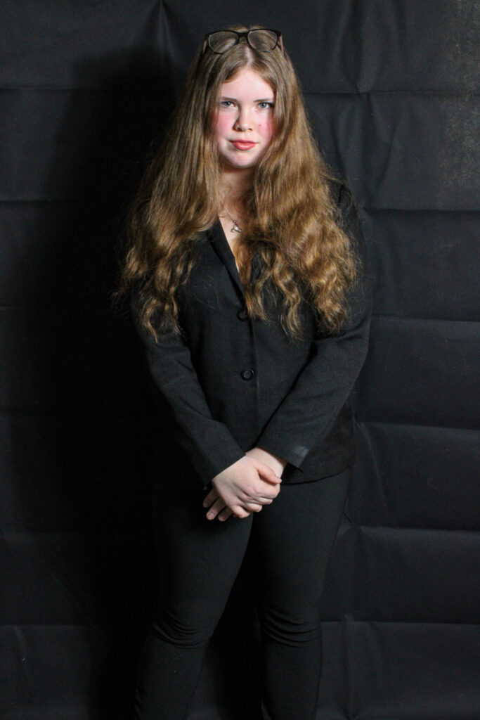


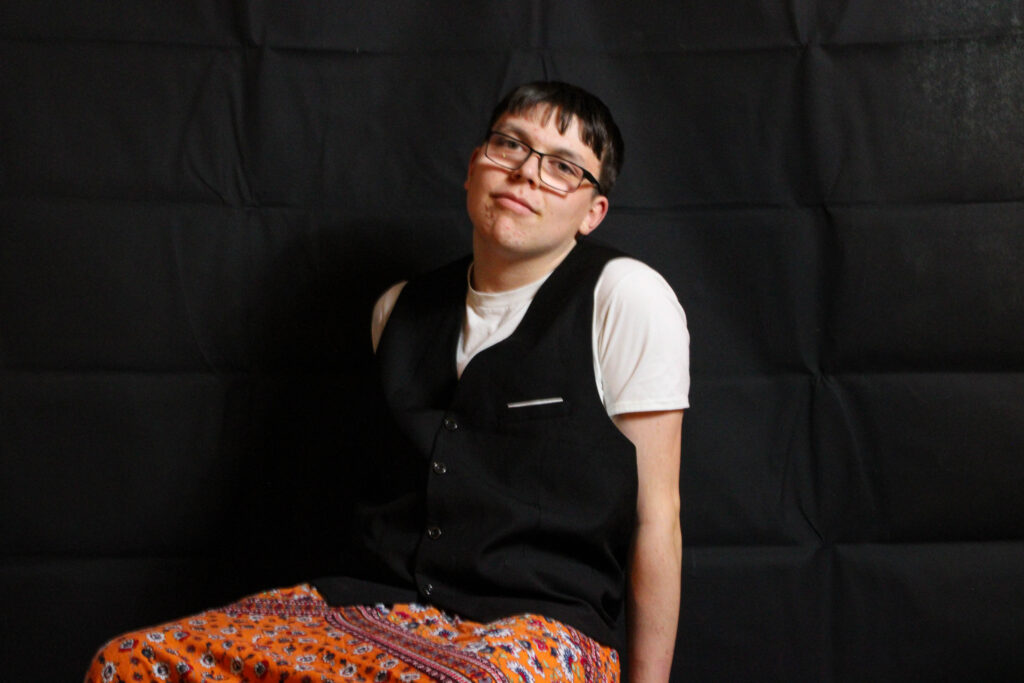
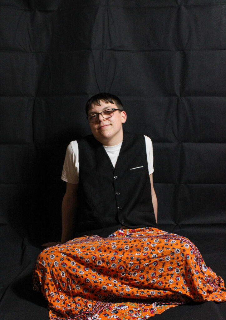
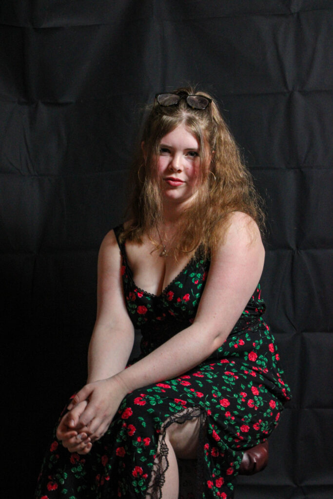

With these photographs I have layered other mages on top to get a double exposed look in inspiration from Tamara Lichtenstein I have done this by using photoshop and creating layers and then turning down the opacity to make the top later opaque.


green- will edit, yellow- might decide to edit (if more edits are needed), red- won’t edit
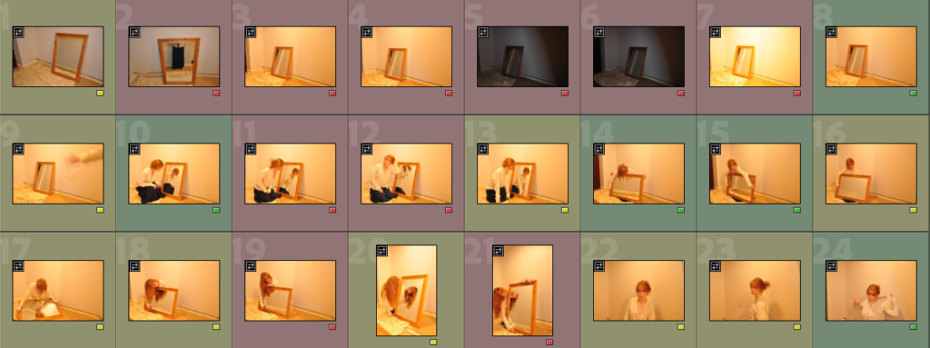

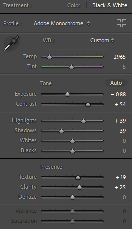
I made every picture black and white, lowered the temperature and exposure, creating a gloomier mood. I enhanced the contrast of the images by changing the contrast, highlights and shadows as well as increasing the texture and clarity of the photographs.
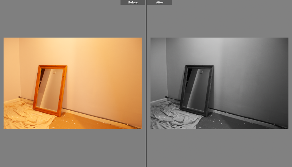
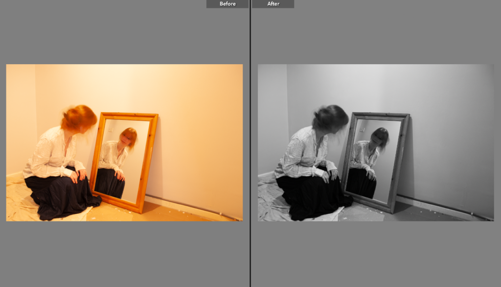
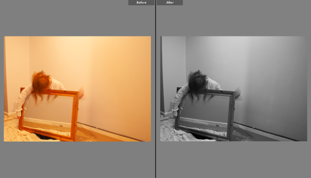
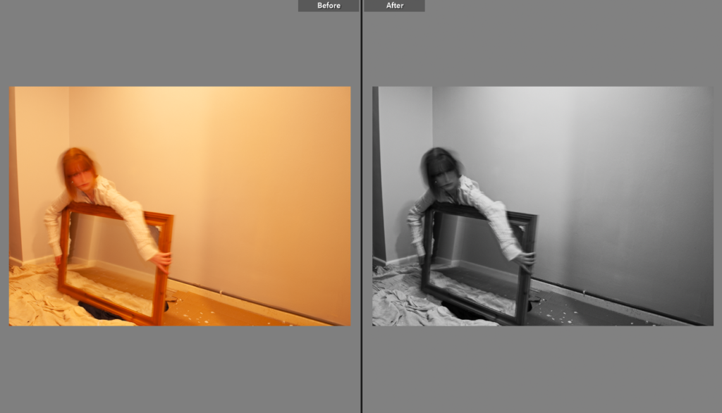
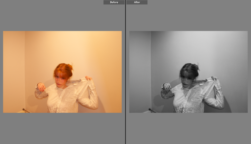
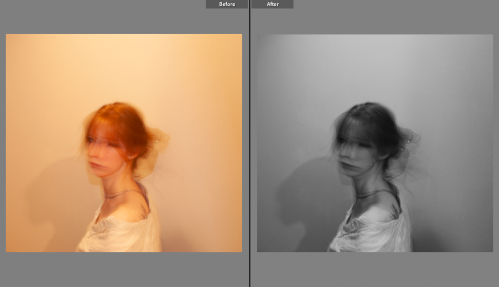
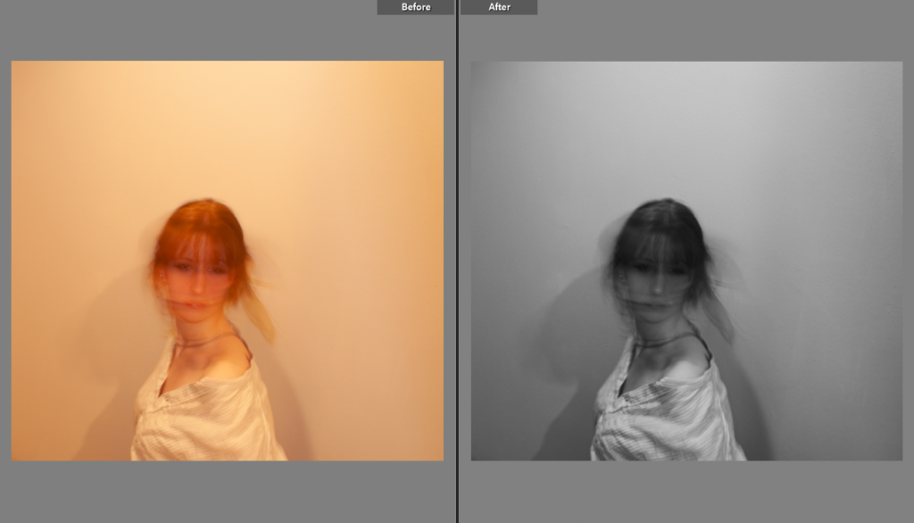
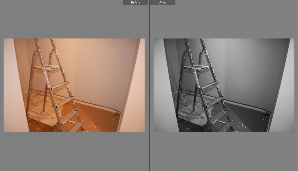
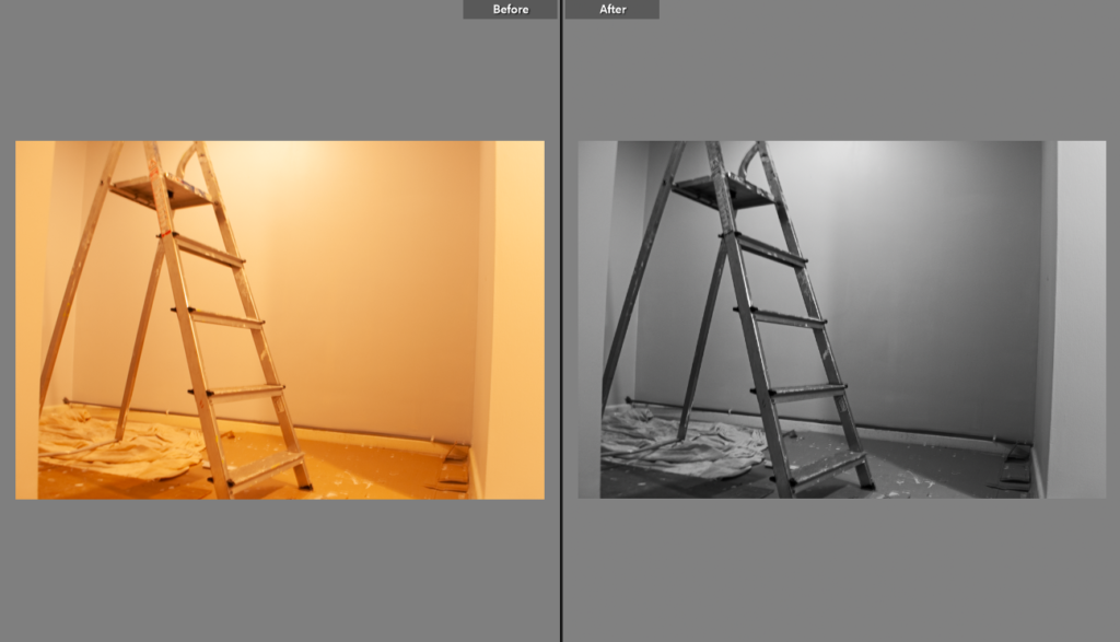
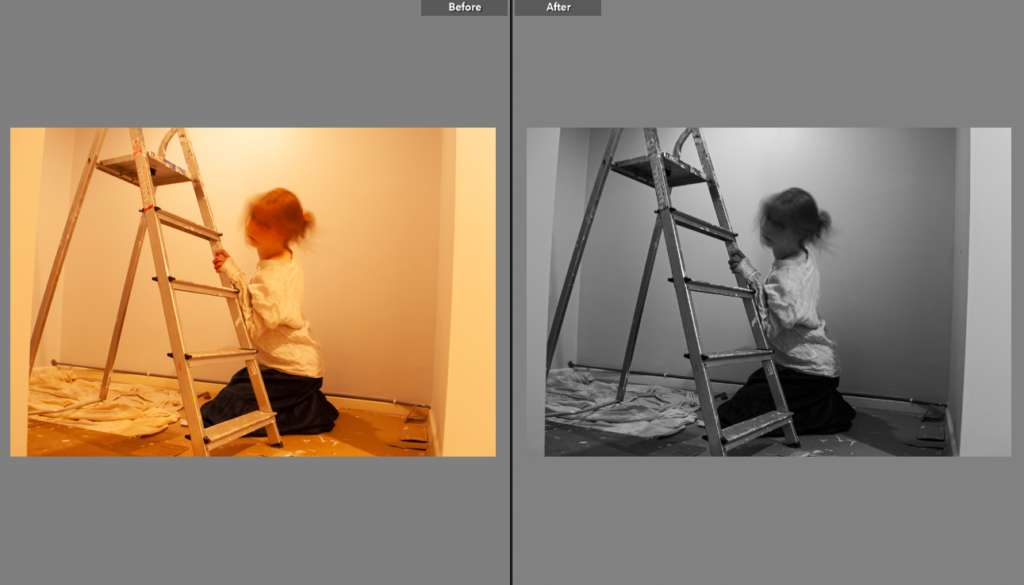
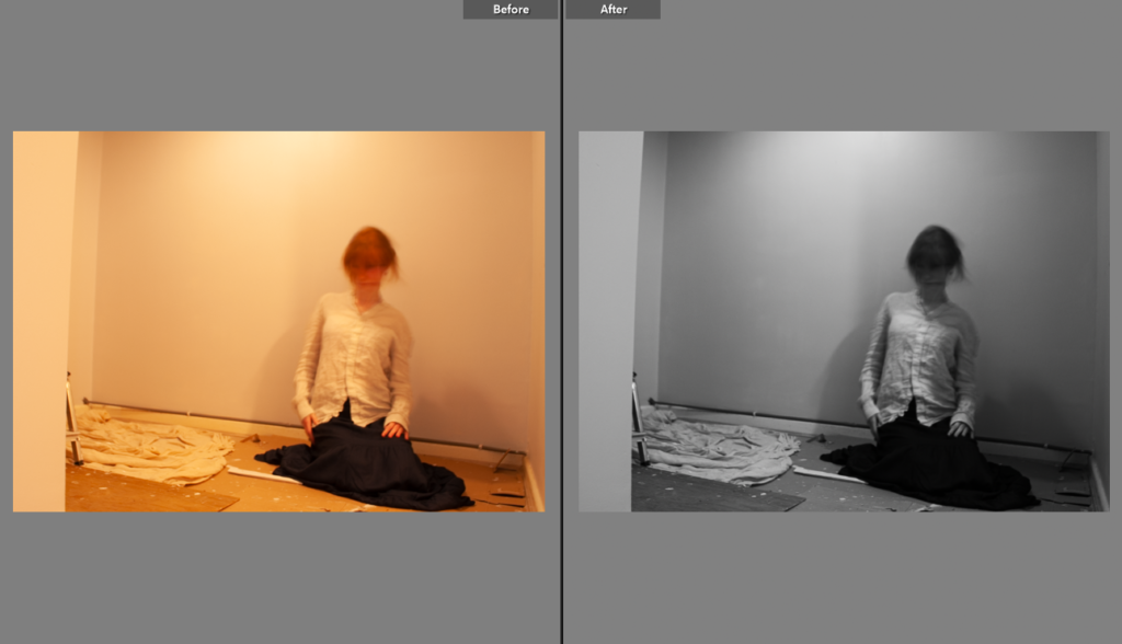

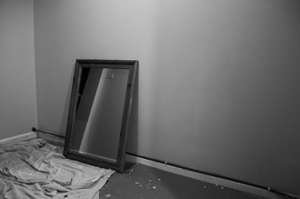
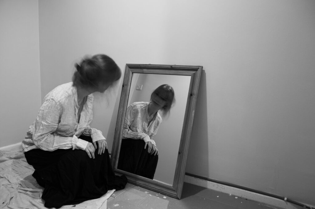
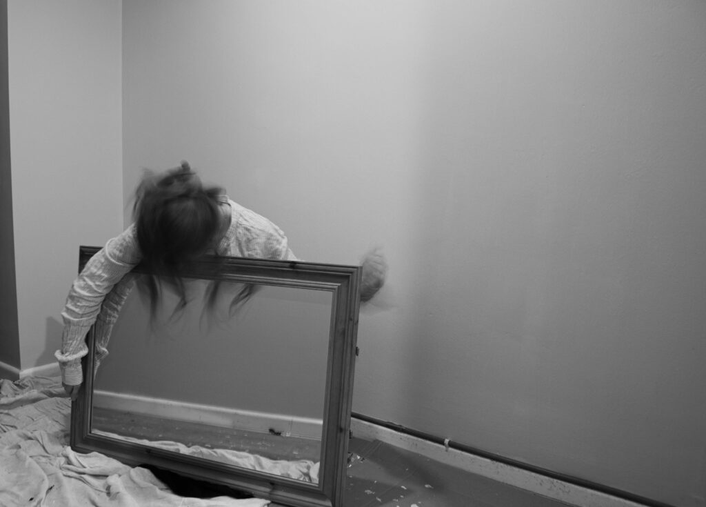
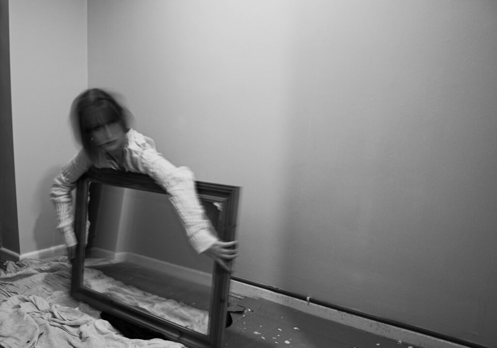
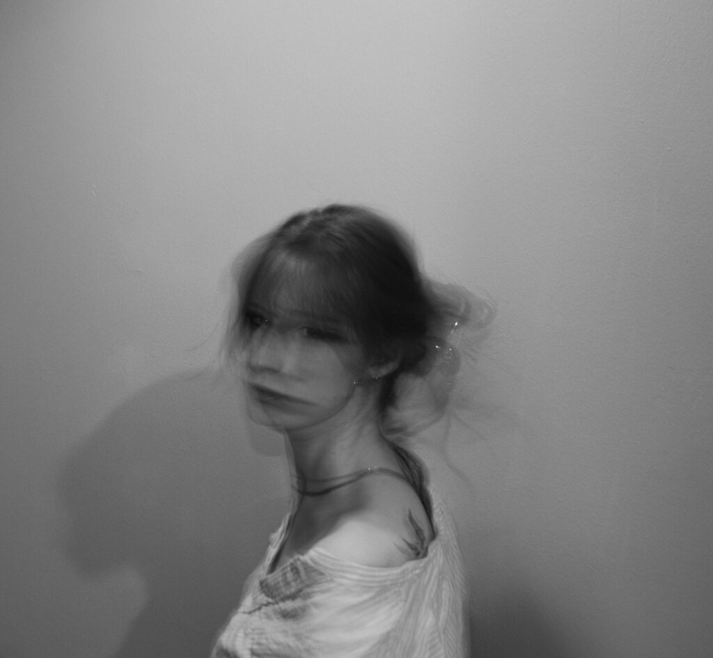
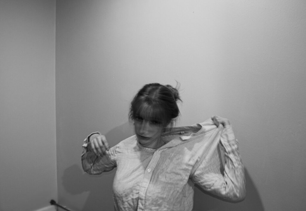
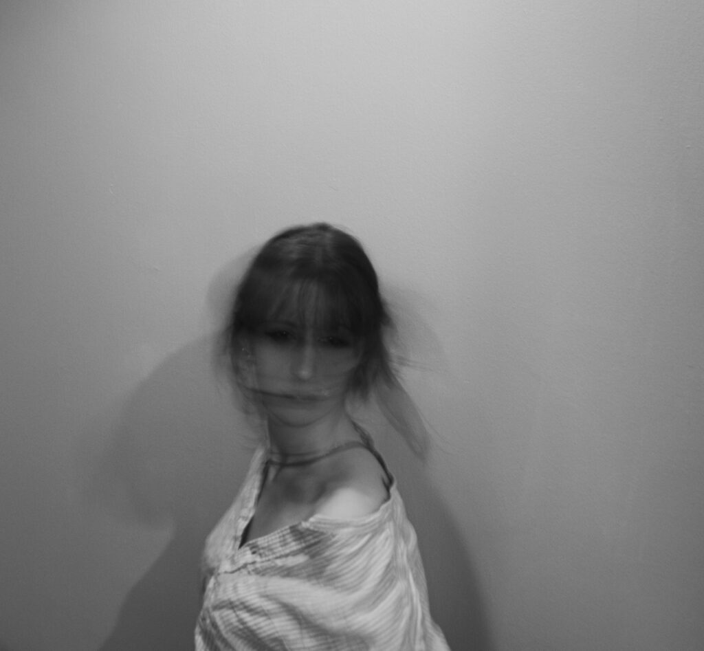
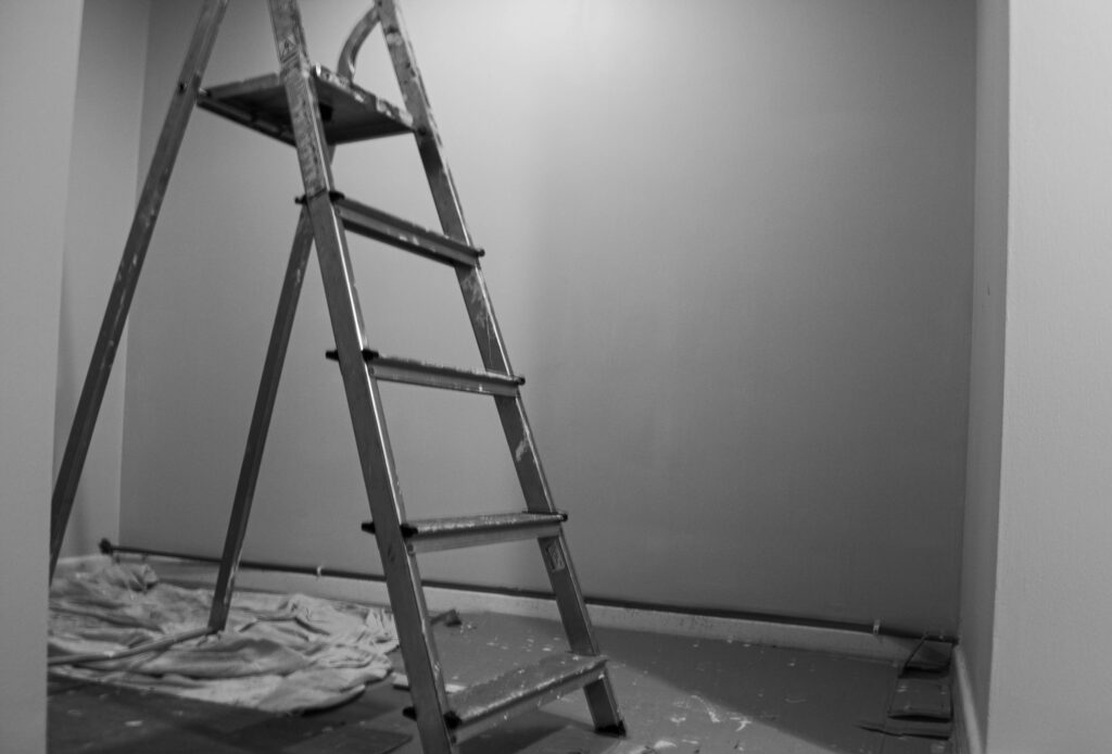
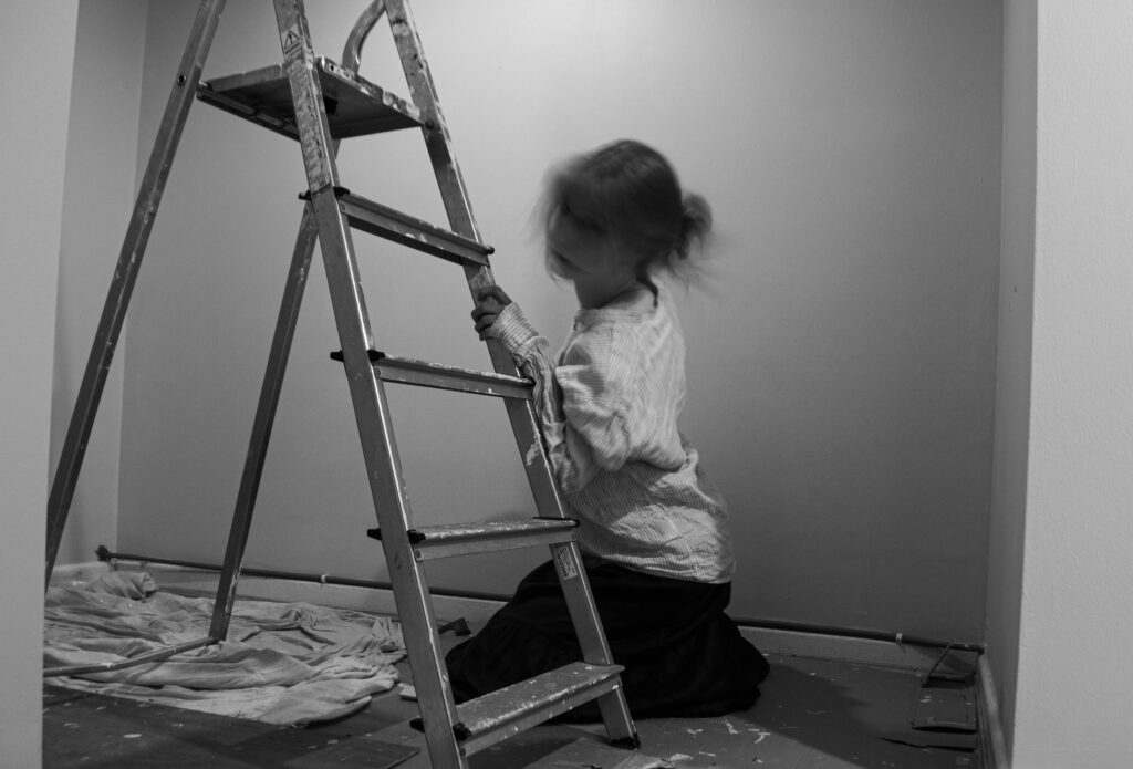
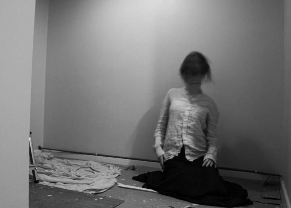
I think the editing was very effective, since it improved the quality of the images as well as made them much more similar to my inspiration, Francesca Woodman. The increasing of the contrast made the details stand out even more which caused the pictures to gain more grain and texture.
I only ended up with three images from this camera that I felt were good enough to be used in my photobook. I want to make sure I have the best image selection, so I will use most of my images from my digital camera. However I like these images, and the depth they have, as well as the look it gives, relating to my archives. They aren’t the highest quality either, but I don’t think this matters too much because I am attempting to make a nostalgic book, that tells a story and seeks into my grandparents relationship.


For this photoshoot I used my Papershoot camera, which is a digital camera that replicates a film cameras. I used 3 of the different colour settings: black and white, orange tint and blue tint. I wanted to experiment with it so I can create photos that look old, linking with the archived. It is difficult to know the exposures and light because the camera is basic, so there is no way of controlling shutter or aperture. I found some of my images were over-exposed so I adjusted the lighting manually in the room. The viewfinder is closer than the lens, so I had difficulty working out the composition.

Example of over exposure

I pulled the curtains to try and control this but it was still top bright – in my next shoot with this camera I will close the curtains fully
Contact sheet

Selected images – flagging

From my selection:
GREEN – best images
YELLOW – I could use but they aren’t the best compared to my digital images


Best images:


