Assessment Objectives A2 Photography: (Edexcel)

1. Produce a mood board with a selection of images and write an overview of their work, its visual style, meaning and methods. Describe why you have selected to study their work and how it relates to the exam themes of OBSERVE, SEEK, CHALLENGE
2. Select at least one key image and analyse in depth using methodology of TECHNICAL>VISUAL>CONTEXTUAL>CONCEPTUAL
3. Incorporate quotes and comments from artist themselves or others (art/ media /film critics, art/ media/ film historians, curators, writers, journalists etc) using a variety of sources such as Youtube, online articles, reviews, text, books etc. Make sure you reference sources and embed links in your blog post.
4. Compare and contrast your chosen artists in terms of similarities and differences in their approaches, techniques and outcomes of their work.
STATEMENT OF INTENT
Write a Statement of Intent that clearly contextualise;
- What you want to explore?
- Why it matters to you?
- How you wish to develop your project?
- When and where you intend to begin your study?
Make sure you describe how you interpret the exam themes; OBSERVE, SEEK, CHALLENGE, subject-matter, topic or issue you wish to explore, artists references/ inspirations and final outcome – zine, photobook, film, prints etc.
AO3 RECORD IDEAS, OBSERVATIONS AND INSIGHTS RELEVANT TO INTENTIONS, REFLECTING CRITICALLY ON WORK AND PROGRESS
PHOTO-SHOOTS
Each week you are required to make a photographic response (still-images and/or moving image) that relates to the research and work that you explored in that week. Sustained investigations means taking a lot of time and effort to produce the best you can possibly do – reviewing, modifying and refining your idea and taking more pictures to build up a strong body of work with a clear sense of purpose and direction
PLANNING & RECORDING: Produce a number of photographic responses to your exam theme and bring images from new photo-shoots to lessons:
- Plan at least 3-5 shoots in response to your ideas and artists references. What, why, who, how, when, where?
- Save shoots in folder on Media Drive: and import into Lightroom
- Organisation: Create a new Collection from each new shoot inside Collection Set: EXAM
- Editing: select 8-12 images from each shoot.
- Experimenting: Adjust images in Develop, both as Colour and B&W images appropriate to your intentions
- Export images as JPGS (1000 pixels) and save in a folder: BLOG
- Create a Blogpost with edited images and an evaluation; explaining what you focused on in each shoot and how you intend to develop your next shoot.
- Make references to artists references, previous shoots, experiments etc.
EXPERIMENTING:
- Export same set of images from Lightroom as JPEG (4000 pixels)
- Experimentation: demonstrate further creativity using Photoshop to make composite/ montage/ typology/ grids/ diptych/triptych, text/ typology etc appropriate to your intentions
- Zine design: Begin to explore different layout options using InDesign and make a new zine/book. Set up new document as A5 page sizes.
- Photobook design: Make a rough selection of your 40-50 best pictures from all shoots.
- Make sure you annotate process and techniques used.
EVALUATION: Upon completion of photoshoot and experimentation, make sure you evaluate and reflect on your next step of development. Comment on the following:
- How successful was your photoshoot and experimentation?
- What references did you make to artists references? – comment on technical, visual, contextual, conceptual?
- How are you going to develop your project from here? – comment on research, planning, recording, experimenting.
- What are you going to do next? – what, why, who, how, when, where?
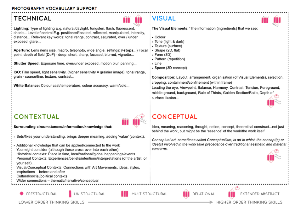
For more help and guidance on image analysis go to Photo Literacy
ONLINE SOURCES > WEBSITES > MAGAZINE/JOURNALS > BLOGS/ PODCASTS > AGENCIES/ COLLECTIVES > PHOTOBOOK MAKERS/ PUBLISHERS
USEFUL WEBSITES
Lensculture – great source for new contemporary photography from all over the world
Photographic Museum Humanity
Landscape Stories
Sony World Photography Awards 2024
Photography magazine and journals
Aperture Magazine – American based publication
Aperture BLOG – in-de[th interviews with artists
British Journal of Photography (BJP) – Journal on Contemporary Photography
Huck Magazine
GUP Magazine
FOAM Magazine
Blogs and podcasts for writing and talking about contemporary photographic practice:
1000 WORDS
MAGIC HOUR
A SMALL VOICE
SAINT LUCY
Conscientious Photography Magazine
COLIN PANTALL BLOG
American Suburb X – look at home as it is blocked by Education
The Photobook Review
Photography Agencies and Collectives
World Press Photo – the best news photography and photojournalism
Magnum Photos – photo agency, picture stories from all over the world.
Panos Picture – photo agency
Agency VU – photo agency
INSTITUTE – photo agency
Sputnik Photos – photo collective made of Polish and East European photographers
A Fine Beginning – photo collective in Wales
Document Scotland – photo collective in Scotland
NOOR – a collective uniting a select group of highly accomplished photojournalists and documentary storytellers focusing on contemporary global issues.
Photobook makers and publishers
Aperture
MACK
Steidl
Chose Commune
Self Publish Be Happy
Dewi Lewis Publishing
Akina Books
Skinnerboox
Kehrer
Void
Witty Kiwi
Dalpine
Kodoji Press
Super Labo
Fw: Books
Editions Xavier Barrel
Morel Books
PhotoBookStore – Independent bookshop with good video browsers
STARTING POINTS > IDEAS > INTERPRETATIONS > INSPIRATIONS
Below are inspirations and artists references exploring the exam themes of OBSERVE, SEEK, CHALLENGE.
See page 25-28 in exam booklet which provide creative starting points that may help you form ideas. Use them as a source information or produce your own individual response to the theme. Make sure you read the whole paper as any section, eg. Fine art or Textile design or Three-dimensional design may provide you with inspiration.
PEOPLE / PORTRAITS > OBSERVE, SEEK, CHALLENGE
The exam paper offers a number of creative starting points that may help you form and develop ideas. You can follow them closely, use them as a source of information or produce your own individual response to the theme. Please read the whole exam paper as there may be other sections apart from Photography, such as Fine Art, Graphic Design or Textile Design that may provide you with inspiration.
On page 25 in the exam paper specific starting points for Photography begins with a quote by writer, critic and artist, John Berger.

This quote by John Berger from his radical 1972 book and TV series ‘Ways of Seeing’ criticised the ‘male gaze’, arguing that it has an indirect influence, forcing women to unconsciously ‘self-police’ their own behaviour.

Berger asked some important questions related to art. For whom are paintings made? Who is supposed to look at them? Who is supposed to enjoy them? Where, when, and under which circumstances was an image looked at and how does that influence the way it’s perceived?
Read here an article on the influence of Berger’s work in its 50th anniversary year. The quote by John Berger is in chapter 3 of Ways of Seeing. Here is a pdf of his book. To learn more about the theory of the photographic gaze, click below.
Read also recent article She’d Got the Look in Aperture magazine 253 on the theme of DESIRE (winter 2023) that discusses how a generation of women photographers, drawing on feminist art of the past, reconsiders the dynamics of being seen. Artists mentioned includes, Sophie Thun, Tarrah Krajnak, Talia Chetrit, Tokyo Rumando, Nydia Blas, Karla Hiraldo Voleau, Whitney Hobbs and B. Ingrid Olson


In her early work Cindy Sherman explored the conventions and stereotypes of how women are portrayed in films and TV.

Cindy Sherman works play with female stereotypes. Masquerading as a myriad of characters, Cindy Sherman (American, born 1954) invents personas and tableaus that examine the construction of identity, the nature of representation, and the artifice of photography. To create her images, she assumes the multiple roles of photographer, model, makeup artist, hairdresser, and stylist. Whether portraying a career girl, a blond bombshell, a fashion victim, a clown, or a society lady of a certain age, for over thirty-five years this relentlessly adventurous artist has created an eloquent and provocative body of work that resonates deeply in our visual culture.
For an overview of Sherman’s incredible oeuvre see Museum Of Modern Art’s dedicated site made at a major survey exhibition of her work in 2012.

This exhibition surveys Sherman’s career, from her early experiments as a student in Buffalo in the mid-1970s to a recent large-scale photographic mural, presented here for the first time in the United States. Included are some of the artist’s groundbreaking works—the complete “Untitled Film Stills” (1977–80) and centerfolds (1981), plus the celebrated history portraits (1988–90)—and examples from her most important series, from her fashion work of the early 1980s to the break-through sex pictures of 1992 to her monumental 2008 society portraits.


Sherman works in series, and each of her bodies of work is self-contained and internally coherent; yet there are themes that have recurred throughout her career. The exhibition showcases the artist’s individual series and also presents works grouped thematically around such common threads as cinema and performance; horror and the grotesque; myth, carnival, and fairy tales; and gender and class identity.


Sherman’s ground-breaking photographs have interrogated themes around representation and identity in contemporary media for over four decades. Since the early 2000s, Sherman has constructed personae with digital manipulation, capturing the fractured sense of self in modern society—a concern the artist has uniquely encapsulated from the outset of her career. As critic and curator Gabriele Schor writes on her process, ‘Sherman’s complex analysis of her face and her subtle employment of expression indicates that the working method of making up and costuming the self enables two processes: an intuitive and fluid process motivated by curiosity, and an intended process whose stimulus is conceptual and which has a ‘subject matter’.’
See and read about Cindy Sherman’s latest work here
Cindy Sherman – Hauser & Wirth (hauserwirth.com)
Further reading and context:
Krauss_Rosalind_E_Bachelors
Johanna Burton (ed) Cindy Sherman, October Files, MIT Press A few articles/ reviews
Hal Foster https://www.lrb.co.uk/v34/n09/hal-foster/at-moma
The Guardian: https://www.theguardian.com/artanddesign/2016/jul/03/cindy-sherman-interview-retrospective-motivation
See how students in the past have responded to Cindy Sherman
Shannon O’Donnell and her book: Shrinking Violet


Here is link to Shannon’s blog showing all her research, analysis, recordings, experimentation and evaluations
Chrissy Knight portraits of Women of Yesterday

Read more here on Chrissy’s BLOG
Nancy Honey used the format of groups of three photographs linked by colour in her book Woman to Woman. Explore her work here


In this body of work I set out to define and separate the various strands that make up my sense of my own femininity. How does sexuality manifest itself in me and what is the difference between what I feel and the ubiquitous stereotypical mass cultural images that surround me? How conditioned are my responses?
Nancy Honey
As a challenge to stereotypes of male behaviour, Sam Taylor-Johnson created a photographic series called Crying Men, which showed male actors breaking down in tears.


LOOKING AT LOOKING: THE PHOTOGRAPHIC GAZE
The act of photographing people involves a process of observation, scrutiny and looking. At times photographers remain detached and anonymous. Other times they are complicit, directing their subjects and encouraging specific actions and poses. Sometimes the gaze is returned, and sometimes it is denied. The power of the gaze can create complex relationships between the subject, the photographer and the audience.
From people observed in a crowd, to surveillance photographs from war zones, and images that ‘split’ our gaze, the exhibition will present the work of a range of photographers who have explored ideas of looking. It includes international and Australian photographs drawn from collections at the National Gallery of Victoria in Melbourne, Australia, and features works by Brook Andrew, Chi Peng, Anne Ferran, Ashley Gilbertson, Charles Green and Lyndell Brown, Bill Henson, John Immig, Thomas Struth, and David Thomas.
link to exhibition here


In the museum photographs Thomas Struth (website) elevates an apparently informal event to the scale of a religious painting. Arresting a fleeting moment, he evokes the passage of time and gives the scene an enduring presence. He asks those who look at his work to spend time with his images, just as the people in his photograph do with the paintings they are looking at. In exploring the activity of viewing, Struth invites us as spectators to become aware of our own role as viewers. Read more here


Australian artist, Brook Andrew’s interdisciplinary practice ranges across installation, performance and museum intervention, interweaving Wiradjuri language and actions of memory and history with the imagery and devices of museum practice. Unpacking racist stereotypes is an important aspect of Andrew’s practice. Andrew’s work has often featured shiny, sensuous materials: from the glistening night sky in Kalar Midday (2002–03), to the Swarovski crystals in Hope and Peace (2005), and the metallic leaf in Gun Metal Grey (2007),The Island (2008) and AUSTRALIA (2013). Here, as in many of his works that have followed, Andrew alerts the viewer to the power structures that shape society. Explore his work here


Anne Ferran, Longer than Life, Digital C-types and gelatin silver photograms, various dimensions, 1998. Explore her work here


Melbourne-born Ashley Gilbertson has crafted a career from his human, empathetic approach to photojournalism, most recently channelled through his images of New York City in 2020, when the metropolis was in the deepest throes of the COVID-19 pandemic. Gilbertson’s astute eye captured both sadness and moments of joy. Explore Ashey Gilbertson’s creative practice here


One of Australia’s landmark collaborative artistic duos, LYNDELL BROWN and CHARLES GREEN have worked together since 1989. A fundamental characteristic of Brown & Green’s work is their bravura compositions, painted with astonishing trompe l’oeil methods. Created through the layering, modifying and copying of found images, the artists select their source material specifically for its visual charge and historical context. Art, culture, and turmoil are three large, related themes that reoccur in their work. Brown and Green make art for our troubled world. Read more here


Bill Henson is one of Australia’s leading contemporary artists. His powerful and edgy photographs approach the painterly and the cinematic, bringing together the formal and classical with the gritty, casual dramas of the everyday. Henson defines and redefines his subjects with a rigour that is inseparable from his technical command. He is a master of the use of light and dark in the tradition of the great European masters. Beautiful, confronting, and unforgettable his images capture a universal essence and enliven our own sense of being.


John IMMIG, No title (T.V. images) from the Vietnam series 1975-76

I pull from archival images to see subjects from the past, then with new images change the viewers’s perception of what they knew. These complicated, complex and challenging histories need to be brought forward.’
Brooklyn artist Mickalene Thomas (website) is best known for her elaborate, collage-inspired paintings, embellished with rhinestones, enamel, and colorful acrylics. Her depictions of African American women explore a spectrum of black female beauty and sexual identity while constructing images of femininity and power. She also produces photographic collages, film and video. Here is a selection of her work.


Thomas’s production is informed by the classical genres of portraiture, landscape, still life, and the female nude. She combines careful borrowings from historical painting with contemporary popular culture, taking cues from such artists as Romare Bearden, Gustave Courbet, David Hockney, Édouard Manet, and Henri Matisse. In combining traditional genres with African American female subjects, Thomas makes a case for opening up the conventional parameters of art history and culture. Among the pieces on view are contemporary riffs on Courbet’s Origin of the World and Manet’s Le Dejeuner sur l’herbe.


Barbara Krüger
STAGED PHOTOGRAPHY > PERFORMING IDENTITIES > ACTING OUT
Claude Cahun play with gender identities.
Born Lucy Schwob, Claude Cahun was a French photographer, sculptor, and writer. She is best known for her self-portraits in which she assumes a variety of personas, including dandy, weight lifter, aviator, and doll.

In this image, Cahun has shaved her head and is dressed in men’s clothing. She once explained: “Under this mask, another mask; I will never finish removing all these faces.”1 (Claude Cahun, Disavowals, London 2007, p.183)
Cahun was friends with many Surrealist artists and writers; André Breton once called her “one of the most curious spirits of our time.”2 (See Guardian article below by Gavin James Bower, “Claude Cahun: Finding a Lost Great,)
While many male Surrealists depicted women as objects of male desire, Cahun staged images of herself that challenge the idea of the politics of gender. Cahun was championing the idea of gender fluidity way before the hashtags of today. She was exploring her identity, not defining it. Her self-portraits often interrogates space, such as domestic interiors and Jersey landscapes using rock crevasses and granite gate posts.
The Jersey Heritage Trust collection represents the largest repository of the artistic work of Cahun who moved to the Jersey in 1937 with her stepsister and lover Marcel Moore. She was imprisoned and sentenced to death in 1944 for activities in the resistance during the Occupation. However, Cahun survived and she was almost forgotten until the late 1980s, and much of her and Moore’s work was destroyed by the Nazis, who requisitioned their home. CaHun died in 1954 of ill health (some contribute this to her time in German captivity) and Moore killed herself in 1972. They are both buried together in St Brelade’s churchyard.
A few articles to read:
https://www.theguardian.com/books/2012/feb/14/claude-cahun-finding-great
http://www.bbc.com/culture/story/20160629-claude-cahun-the-trans-artist-years-ahead-of-her-time
Link to Jersey Heritage: https://www.jerseyheritage.org/collection-items/claude-cahun
For further feminist theory and context read the following essay: Amelia Jones: The “Eternal Return”: Self-Portrait Photography as Technology of Embodiment – pdf Jones_Eternal Return
In 2017 the National Portrait Gallery in London brough the work of Claude Cahun and Gillian Wearing together for the first time. Slipping between genders and personae in their photographic self-images, Wearing and Cahun become others while inventing themselves. “We were born in different times, we have different concerns, and we come from different backgrounds. She didn’t know me, yet I know her,” Wearing says, paying homage to Cahun and acknowledging her presence. The bigger question the exhibition might ask is less how we construct identities for ourselves than what is this thing called presence?
Gillian Wearing and Claude Cahun: Behind the Mask, Another Mask is at the National Portrait Gallery, London, 9 March-29 May


Behind a mask, Wearing is being Cahun. Previously she has re-enacted photographs of Andy Warhol in drag, the young Diane Arbus with a camera, Robert Mapplethorpe with a skull-topped cane, hard-bitten New York crime photographer Weegee wreathed in cigar-smoke. Among these doubles, you know Wearing is in the frame somewhere, under the silicon mask and the prosthetics, the wigs and makeup and the lighting. Going through her own family albums, she has become her own mother and her father. It is a surprise she has never got lost in this hall of time-slipping mirrors, among her own self-images and the faces she has adopted. Wearing has got others to play her game, too – substituting their own adult voices with those of a child, putting on disguises while confessing their secrets on video.
Read articles in relation to exhibition here:
http://aperture.org/blog/feminism-gillian-wearing-claude-cahun/
Cahun has been described as a Cindy Sherman before her time. Wearing’s art undoubtedly owes something to Sherman – just as Sherman herself is indebted to artist Suzy Lake. Looking back at Cahun, Wearing is both tracing artistic influence, and paying homage to it, teasing out threads in a web of relationships crossing generations.
Clare Rae came to Jersey in 2017 and made a series of work, Never Standing on two Feet in response to Claude Cahun

Find more images and information here on Clare Rae’s website.
Exhibited in Entre Nous: Claude Cahun and Clare Rae at the Centre for Contemporary Photography, Melbourne Australia 22 March – 6 May 2018, and subsequently at CCA Galleries in Jersey, UK, 7–28 September 2018.
An accompanying book, Never Standing on Two Feet with an introduction by Susan Bright and essay by Gareth Syvret was published by Perimeter editions in April 2018. Purchase online via Perimeter.
See this blog post Photography, Performance and the Body for more details and context of the above artists work
NARRATIVE PHOTOGRAPHY > TABLEAUX PHOTOGRAPHY
Narrative photography, also referred to as Tableaux photography often have an element of performing for the camera. See artists such as, Duane Michaels, Tom Hunter, Anna Gaskell, Jeff Wall, Gregory Crewdson, Philip- Lorca diCorcia, Sam Taylor Johnson (former Sam Taylor-Wood), Hannah Starkey, Tracy Moffatt, Vibeke Tandberg. Read also page 26 in exam booklet that lists other artists, Sandy Skoglund, Carrie Mae Weems, Deana Lawson and Laurie Simmons who are using photography to create complex narratives using staged events and artificial set ups. The historical context of this type of photography is Pictorialism – make sure you reference this in your research and provide examples from this period of photographic history and experimentation.
Duane Michaels: photo-stories eg. The Bogeyman, The Spirit Leaves the Body. A self-taught photographer, Duane Michals broke away from established traditions of the medium during the 1960s. His messages and poems inscribed on the photographs, and his visual stories created through multiple images, defied the principles of the reigning practitioners of the form. Indeed, Michals considers himself as much a storyteller as a photographer.

Tom Hunter: Headlines, Life and Death in Hackney
Since 1997, Tom Hunter has turned his camera on his surrounding neighbourhood of Hackney, showing empathy without being polemic. He is known for a remarkable blend of political commentary, history of art and the technicalities of photography. Working to create photographs that are the result of an exaggerated link between newspaper headlines, paintings from The National Gallery’s permanent collection and Hackney lifestyle, Hunter often seems to ask more questions than he can answer visually.

Read more here about Tom Hunter’s work in The Guardian

Anna Gaskell crafts foreboding photographic tableaux of preadolescent girls that reference children’s games, literature, and psychology. She is interested in isolating dramatic moments from larger plots such as Lewis Carroll’s Alice in Wonderland, visible in two series: Wonder (1996–97) and Override (1997). In Gaskell’s style of “narrative photography,” of which Cindy Sherman is a pioneer, the image is carefully planned and staged; the scene presented is “artificial” in that it exists only to be photographed. While this may be similar to the process of filmmaking, there is an important difference. Gaskell’s photographs are not tied together by a linear thread; it is as though their events all take place simultaneously, in an ever-present. Each image’s “before” and “after” are lost, allowing possible interpretations to multiply. In untitled #9of the wonder series, a wet bar of soap has been dragged along a wooden floor. In untitled #17 it appears again, forced into a girl’s mouth, with no explanation of how or why. This suspension of time and causality lends Gaskell’s images a remarkable ambiguity that she uses to evoke a vivid and dreamlike world.


MIRRORS and WINDOWS
The exhibition Mirrors and Windows, an exhibition of American photography since 1960, opened at The Museum of Modern Art, New York (MoMa) in July of 1978. The curator John Szarkowski’s attempted to categorise photographers whose work largely reflected the subjectivity of the artist in comparison with those whose work largely sought to see outside themselves. Szarkowski wrote in the catalogue essay that accompanied the exhibition:
“The two creative motives that have been contrasted here are not discrete. Ultimately each of the pictures in this book is part of a single, complex, plastic tradition. Since the early days of that tradition, an interior debate has contested issues parallel to those illustrated here. The prejudices and inclinations expressed by the pictures in this book suggest positions that are familiar from older disputes. In terms of the best photography of a half-century ago, one might say that Alfred Stieglitz is the patron of the first half of this book and Eugène Atget of the second. In either case, what artist could want a more distinguished sponsor? The distance between them is to be measured not in terms of the relative force or originality of their work, but in terms of their conceptions of what a photograph is: is it a mirror, reflecting a portrait of the artist who made it, or a window, through which one might better know the world?”
— John Szarkowski, 1978
MIRRORS AND WINDOWS has been organized around Szarkowski’s thesis that such personal visions take one of two forms. In metaphorical terms, the photograph is seen either as a mirror – a romantic expression of the photographer’s sensibility as it projects itself on the things and sights of this world; or as a window – through which the exterior world is explored in all its presence and reality. Go to blog post below for more information.
ORDINARY, EVERYDAY, MUNDANE, OVERLOOKED: OBSERVE, SEEK, CHALLENGE
Photography is a way of seeking out what normally goes unnoticed. At first sight Rinko Kawauchi’s photographs of soap bubbles may seem ordinary. However, the combination of narrow depth of field, compositional rhythm, and the sense that there is a portal through the bubble to another place hints at spiritual possibilities, linking to her belief
in Shinto philosophy.

In 2001, Rinko Kawauchi published three astonishing photobooks simultaneously—Utatane, Hanabi, andHanako—establishing herself as one of the most innovative newcomers to contemporary photography. Other notable monographs include Aila (2004), The Eyes, the Ear (2005), and Semear (2007). Now, ten years after her precipitous entry onto the international stage, Aperture has published Illuminance, the first volume of Kawauchi’s work to be published outside of Japan. Kawauchi’s work has frequently been lauded for its nuanced palette and offhand compositional mastery, as well as its ability to incite wonder via careful attention to tiny gestures and the incidental details of her everyday environment. In Illuminance, Kawauchi continues her exploration of the extraordinary in the mundane, drawn to the fundamental cycles of life and the seemingly inadvertent, fractal-like organization of the natural world into formal patterns.


Clare Gallagher, William Eggleston and Josef Sudek also seek out beauty and truth in the quiet, the mundane and the overlooked.
William Eggleston: Photographing the Mundane
Artists see the world through different eyes to most people; they see the beauty in things that may be considered boring or mundane, and there are no photographers who capture this beauty as well as William Eggleston. Eggleston is a pioneering photographer and is credited with introducing colour to art photography in the late 1960s. To understand how avant-garde this was, it must be acknowledged that most art photography at the time was shot in black and white, and colour was considered to be ugly; no serious photographer would photograph in colour.
The reason behind art photographers shooting in black and white is summed up best by John Szarkowski, writing in the introduction to the book “William Eggleston’s Guide.” He stated”
“For the photographer who demanded formal rigor from his pictures, color was an enormous complication of a problem already cruelly difficult. And not merely a complication, for the new medium meant that the syntax the photographer had learned – the pattern of his educated intuitions – was perhaps worse than useless, for it led him toward the discovery of black-and-white photographs. Most serious photographers, after a period of frustrating experimentation, decided that since black and white had been good enough for David Octavius Hill, Brady, and Stieglitz, it was good enough for them. Professionals used color when they were paid to, doing their very best, without quite knowing what they meant by that.”
Below is a photograph by Eggleston, taken before he started shooting in colour.
Eggleston was born in Memphis, Tennessee, and it is here that he has done the majority of his work. According to his wife Rosa, when he was first getting started in photography he told his friend that in Memphis everything was ugly and he didn’t know what to photograph; his friend responded “well, photograph the ugly stuff.” So this is exactly what he did. He began photographing otherwise unremarkable subjects yet achieving remarkable results.
He has been said to photograph democratically, where he treats everything he sees equally and produces pictures out of nothing.
His subject matter could be described as banal, boring, mundane and everyday, however he shoots it with such beauty, and what at first seems simple turns out to show quite a complex message where nothing in the frame can be taken for granted. His wife has said, “One thing that I will never forget in my mind what Bill did say to me earlier on when he was talking to me, ‘Now you must not take anything for granted when you are looking at a picture. Never do that. Every single little tiny space on that page works and counts.”
Eggleston has gone on to achieve great recognition, however, in the beginning of his career he had a show at the Museum of Modern Art (MoMA) in New York City and one art critic deemed it “the most hated exhibition of the year.” There were a lot of negative reviews by critics who simply did not get what it was he was doing. Another critic stated that it was “totally boring and perfectly banal” which is ironically the intention of the exhibition, and something that he went on to become recognised for.
In the documentary “William Eggleston-Imagine,” he said in response to his critics at his MoMA show, ““I think it was wonderful having a first major show at MOMA, of all places. It got tremendous recognition, great amount of it—-negative. I really felt sorry for them, because it was so obvious –-it was like they had the wrong time. They didn’t understand what they were looking at. And their job was to understand it. Modern art, it is the museum of modern art. And, they wrote pretty stupid things. Then it became known all over the world, so, the critics who wrote all that stuff later apologized [laughed] that they were wrong.”
Eggleston is truly great at what he does and his photographs are a joy to look at. What might be considered as mundane by some, his images transport us to a time where we are stuck in the moment that each photograph was taken. Despite living in an “ugly & boring” place, he has transformed it through his photography, and he is truly a master of his art.
To conclude, here is a great quote by Eudora Wetley that perfectly sums up the work of Eggleston, “The extraordinary, compelling, honest, beautiful and unsparing photographs all have to do with the quality of our lives in the ongoing world: they succeed in showing us the grain of the present, like the cross-section of a tree. The photographs have cut it straight through the center. They focus on the mundane world. But no subject is fuller of implications than the mundane world!”
More recently, Anastasia Samoylova constructs intricate installations from images of nature. Have a look at her Landscape Sublime and read an interview here where she talks about her new work. Check out some of her other work on her website too.


10 questions with Anastasia Samoylova
Anastasia answers questions and discusses her project, Floodzone.
Anastasia Samoylova moves between studio practice, observational photography, installation and public art projects. Although her work takes many forms, a central concern is the place images occupy in our understanding and misunderstanding of the world. The epic project FloodZone, photographed in the Southern United States, reworks our expectations of coastal paradise into a psychological portrait of communities faced with rising sea levels.
ORDINARY, EVERYDAY, MUNDANE, OVERLOOKED: OBJECTS / STILL-LIFE
Photography’s rich and experimental history paves the way for many to think about objects – both as subject matter ad as finished products – in provocative ways. For example as a simple idea you can explore objects in your home environment where you live; kitchen utensils, food (fruit/ vegetables), tools etc exploring shapes, colours, textures in your home. Another idea is to empty your cupboards and a make still-life arrangement of its content – recording details, up close, shadow / light, reflections etc.


Peter Fischli and David Weiss


Jan Groover


Laura Letinsky


FILM, CINEMA, MOVING IMAGES: OBSERVE, SEEK, CHALLENGE
On page 27 of the exam paper it provides creative starting points for those of you who wishes to make a film or work with moving images. It says that movies do not always needs words or a traditional story.
The 1982 film Koyaanisqatsi by Godfrey Reggio is an hour long observation of the natural and man-made world. Without dialogue it uses time-lapse and slow-motinon shots of America with minimalist music by Philip Glass
It is influenced by earlier films, such as the inventive Man with a Movie Camera, made by Soviet-Russian director Dziga Vertov, edited by his wife Elizaveta Svilova. It cover a day in the life of a Russian city from sunrise until sun set, but it is much more than that. This film is famous for the range of cinematic techniques Vertov invents, deploys or develops, such as double exposure, fast motion, slow motion, freeze frames, jump cuts, split screens, Dutch angles, extreme close-ups, tracking shots, footage played backwards, stop motion animations and self-reflexive visuals (at one point it features a split-screen tracking shot; the sides have opposite Dutch angles)
24 Hour Psycho is a 1993 art installation video by Scottish artist Douglas Gordon. It is an appropriation of Alfred Hitchcock‘s 1960 psychological thriller film Psycho, slowed down to approximately two frames per second from its original 24. As a result, the film lasts for precisely 24 hours, rather than the original running time of 109 minutes (1 hour, 49 minutes).
A major work by New York–based artist Christian Marclay, The Clock mines the history of film for moments from everyday life and thrilling only-in-the-movies events that indicate the passage of time. Synchronized with local time, cinematic and actual time run parallel in a 24-hour montage.
DOCUMENTARY APPROACH TO: OBSERVE, SEEK, CHALLENGE
On page 28 of the exam paper the starting point is about photographers who show a lengthy commitment to a particular idea, whether recording a place, a group of people, or a story. This approach is often adopted by photographers who work within a documentary practice where a story is developed over time.

Tom Wood (website) has spent decades photographing the community where he lives in Liverpool. He observes life on the streets, at work, in clubs and at home, always showing respect, compassion and wit. In Beans and Chips, the humour of the photograph is complemented by skilful use of scale, light, shadow and colour.
Explore some of his other photo series, such as Looking for Love and Bus Journeys photographed over several decades.


A contemporary of Tom Wood is Martin Parr who also uses humour to challenge what Britishness in his series The Last Resort: Photographs of New Brighton on the Merseyside near Liverpool.


Leisure, in all its manifest forms, has occupied Martin Parr for his entire career. But from funfairs to food to flower shows, nowhere is the pursuit of pleasure more nakedly apparent than on the beach. “The beach is always going to be an integral part of what I do – it just goes on and on,” says Parr. “I’m off to the beach tomorrow.”
Parr’s most enduring photographs of the British coast were taken between 1983 and 1985, when he visited the Liverpool beach resort of New Brighton. His now characteristic use of saturated color and on-board flash illuminated a country in a state of decay, but still finding pleasure where it could. The deterioration of the British economy—and society as a whole— seemed to be writ large in the litter-strewn, concrete promenade of New Brighton.
Contemporary photographers with a similar commitment to observing peopleinclude Vanley Burke, Sunil Gupta, Rhiannon Adam, Nan Goldin, Ryan McGinley, Soumya Shankar Ghosal and Alec Soth.


Alec Soth: For over two decades, Alec Soth’s images – of disenchanted youth, religious fervour and rural poverty – have come to define our image of contemporary America. In a recent book, I Know How Furiously Your Heart Is Beating, sees him bring his distinctive eye away from the great outdoors and into the privacy of the bedroom, photographing friends and acquaintances in a project that explores how we as humans connect with one another.
“When I started again I didn’t want to do a big American project, a complicated narrative and all this stuff coming together,” he explains. “I just wanted to be a photographer. I really wanted to strip everything down to just being in a room with another person. I wanted to get away from this feeling of exploitation and all those ethical quandaries you have to work out on the fly.”


See also his other long-term projects, Sleeping By the Mississippi, Niagara, Broken Manual, Songbook – all conceived and published as photobooks. On his website you can read and study his work more in detail, including several video podcasts, such as Pictures & Words, Real Time vs Storytime where Soth talks about the art of photography, storytelling and photobook making.
A simple and direct approach to portrait photography can be very powerful. August Sander was a very influential photographer who made hundred of portraits of citizens in Cologne (Germany) where he lived and worked all his life. People of the 20th Century presents the fullest expression of Sander’s lifelong work: an endeavor to amass an archive of twentieth-century humanity through a cross-section of German culture. Here is a link to the entire set of images (619 in total) that he classified into 7 groups, The Farmer, The Skilled Tradesman, The Woman, Classes and Professions, The Artists, The City and The Last People.


Sander photographed subjects from all walks of life, capturing bankers and boxers, soldiers and circus performers, farmers and families, to create a catalog of the German people, arranged by their profession, gender, and social status. First imagined in the 1920s, he pursued the project for more than fifty years during a politically charged and rapidly changing time, fraught by two world wars and the devastating repercussions of Nazism. Sander never finished the seven-volume, forty-nine portfolio magnum opus, continually refining and shaping it to convey an understanding of the world in which he lived. The photographs, remarkable for their unflinching realism and deft analysis of character, provide a powerful social mirror of Germany between the wars and form one of the most influential achievements of the twentieth century.
The influence of August Sander’s series of portraits was a major influence (incl. Karl Blossfeldt’s studeis of plants and Albert Renger-Patszh images of German industry) on Bernd and Hilla Becher developing the concept of Typology – see more examples of this under ideas for Place / Landscape. Watch shirt film here where renowned German fashion and portrait photographer Jürgen Teller discusses Sander’s work
Environmental portraits: Sander mainly made formal and environmental portraits, often photographing his subject frontally using a deadpan approach meeting the gaze of the camera in a direct and straight forward manner. For more ideas and suggestions of activities around environmental portraits – see link here to Yr 12 task that you explored last year.
Key features to consider with formal/ environmental portraiture:
- Locations: inside and outside
- Environment: choose a location or setting that can add context to your portrait > tell a story about the sitter, eg. lifestyle, social class, gender etc.
- Framing: full length body / three quarter length / half body
< angle > low angle / deadpan / canted angle - Lens: standard lens (50mm) / wide-angle lens (35mm)
- Camera setting: Aperture priority f/5.6 – f/8 – camera will adjust shutter speed automatically.
< camera shake > minimum 1/60 sec, otherwise increase ISO to allow for faster shutter speeds.
< ISO > outside 100-400 ISO / inside 400-1600 ISO
< White balance > outside daylight / inside either daylight or tungsten/ tube light – depending on light conditions. If in doubt, choose AUTO. - Lighting: Use natural light where possible and direction of light from the side/ 45 degree angle.
< Inside > use window light where possible
< Outside > be aware of the position of the sun and harsh shadows, better to shoot in overcast weather as clouds acts as soft box and diffuses the light.
< Avoid frontal and back light.> - Pose: formal (posed) / informal (natural, un-posed) /neutral pose and facial expression / no smiles
- Gaze: eye contact / engagement with the camera
- Props: Consider using objects, such as personal items, tools of the trade etc. that can add further context to the portrait and ‘story’ about the subject. Hands can act as props and add real value to a portrait – be creative!
Here are others suggestions of photographers influenced by August Sander and the deadpan approach to portraiture where the sitter is presented in a simple manner often using minimal gestures, pose, expression, props, location and lighting.


Richard Avedon: When renowned New York City fashion and portrait photographer Richard Avedon agreed in late 1978 to take on a commission from the Carter to create a portrait of the American West through its people, he was filled with uncertainty about whether the project would succeed. The following spring he went to the Rattlesnake Round-Up in Sweetwater, Texas. That weekend he created six evocative portraits that would set the tone and bar for five more years of photographing. In these sittings, he discovered people who conveyed through their faces, clothes, and postures not merely hard living but the full embrace of existence. Read article here


Matthew Finn: When artists find inspiration in a muse, it’s usually a wife or a lover – but for photographer Matthew Finn it has always been his mother. Read article here in The Guardian where Finn talks about photographing his mother over a 30 year period.


Over a thirty year period, from 1987 onwards, Matthew Finn collaborated with his mother, Jean, to document her everyday life through a series of portraits taken in her home in Leeds. This is a record of the ordinary, of a daily routine with which we are all familiar. It is also a record of the gradual shift from middle age to old age, and, in Jean’s case, to the onset of mixed dementia and a move from the family home into residential care. It is a poignant body of work, filled with warmth yet conscious of the fragility of life. Quiet domestic interiors act as a stage for life’s everyday details, and though the focus is on the individual the bond between mother and son is a powerful constant, even as the balance of that relationship begins to change.
Jitka Hanzlová: is a Czech artist who lives and works in Essen, Germany produced a series of photographs, entitled ‘Female’, showing a compilation of approximately 50 portraits of women of various ages. The series was created between 1997 and 2000 and shows a multifaceted portrait of contemporary female identity.


In her photographs Jitka Hanzlová percieves everyday and incidental events. For this series she photographed women she met on her various travels to European and American cities. The images often arose spontaneously at the place of the meeting, or by appointment the next day. The women are portrayed as individuals with specific irregularities and facial features, which do not allow for stereotypical classification.
The people we meet in these portraits are anonymous. In most cases the title only mentions their first name, in some instances even this has been left out. The identity, the profession and the living conditions of these models remain unknown to us. Even when Hanzlová seemingly reveals some biographical details about the subjects she observes, her images never become voyeuristic. On the contrary, as an artist she has the utmost respect for the women she portrays and cautiously tries to capture their self-assertion on film. Though the emphasis is on the women, they are always related to mostly urban surroundings, its colours and atmospheres. Subject and background interact directly. This synthesis gives each of Hanzlová’s photographs a unique expression.
Roni Horn: A girl’s luminous face rises again and again from the hot springs of Iceland. Watch the slight changes of her expression. Observe closely the face’s opaque surface that will not yield the soul. An enigma without solution. You know nothing about her. All you can see are her ever shifting moods and the water. It’s always the same face and yet never alike. Like the weather. Always changing and beyond meaning. A surface that invites you to project your own desires, thoughts, and dreams; and yet it will always resist the power of your gaze. Like the sky, the clouds, the rain.
‘These photographs were taken in July and August of 1994. For a six-week period I traveled with Margrét throughout Iceland. Using the naturally heated waters that are commonplace there, we went from pool to pool.’


Photo-shoot > Suggested activities
Produce a series of portraits (full-body/ half-body) of your family members/ or friendship group using deadpan approach (straight-on) meeting the gaze of the camera in a direct manner. Make a variation and produce a second series of headshots/ profile shots from the side and a third set where you get up-close and frame only parts or areas of a face. You can follow instructions and guidelines here from previous headshot task from Yr 12.
Photobooks to study where a theme or narrative is explored in subtle vairiations
Sophie Calle: The Address Book
In the early nineteen-eighties, the French artist Sophie Calle, who is known for projects that involve immersing herself in the lives of strangers or allowing strangers a view of her own life, found an address book on the street in Paris. Before mailing it back to its owner—a filmmaker called Pierre D.—she photocopied the contents and then proceeded to call each person listed in it to ask questions about him. “I will try to discover who he is without ever meeting him, and I will try to produce a portrait of him over an undetermined length of time that will depend on the willingness of his friends to talk about him—and on the turns taken by the events,” she wrote. She turned her encounters into short pieces, which were published almost daily over the course of a month in the newspaper Libération. When Pierre D. discovered what Calle was doing, he threatened to sue her for invasion of privacy, and she agreed not to re-publish the work until after his death. Siglio Press has just brought out the project—consisting of Calle’s writings and accompanying photographs—as a book, giving readers the chance to peer, along with Calle, into the touchingly elusive figure at the center of her investigations.


W. Eugene Smith: photoessay – classical storytelling
Although he was only a member of Magnum for four years between 1955 and 58, acclaimed photographer W. Eugene Smith had a lasting impact on both the agency and photojournalism in general. Smith compared his mode of working to that of a playwright; the powerful narrative structures of his photo essays set a new benchmark for the genre. His series, The Country Doctor, shot on assignment for Life Magazine in 1948, documents the everyday life of Dr Ernest Guy Ceriani, a GP tasked with providing 24-hour medical care to over 2,000 people in the small town of Kremmling, in the Rocky Mountains. The story was important at the time for drawing attention to the national shortage of country doctors and the impact of this on remote communities. Today the photoessay is widely regarded as representing a definitive moment in the history of photojournalism.


Anders Petersen: Café Lehmitz, a beer joint at the Reeperbahn, was a meeting point for many who worked in Hamburg’s red-light district: prostitutes, pimps, transvestites, workers, and petty criminals. Anders Petersen was 18 years old when he first visited Hamburg in 1962, chanced upon Café Lehmitz, and established friends that made an impact on his life. In 1968 he returned to Lehmitz, found new regulars , renewed contact and began to take pictures. His photographs, which we first published in book form in 1978, have become classics of their genre. Their candidness and authenticity continue to move the viewer. The solidarity evident in them prevents voyeurism or false pity arising vis-á-vis a milieu generally referred to as asocial. The other world of Café Lehmitz, which no longer exists in this form, becomes visible as a lively community with its own self-image and dignity.

Read article here in The Guardian where Anders Petersen talks bout his famous photobook

Raymond Meeks: Halfstory Halflife
Every summer, since as long as anyone in the area can remember, groups of teenage boys and girls have been congregating by a single-lane bridge that spans the tributaries of Bowery and Catskill Creeks in the Catskill Mountain region of New York. Just below it, in the wilderness, a waterfall drops sixty feet above a pond. Those daring enough to take the leap usually take a small run-up before flinging themselves off the precipice. Within the act of the jump and its timeless ritual lingers the last fleeting moments of youth, of endless summer days and reckless abandon. Beyond that, the unknown.
Known for his slow-burning chronicles of rural America, Raymond Meeks turns his attention to Furlong and its intrepid summer dwellers in his most recent book Halfstory Halflife. Sketching out his local area with a sensitive lyricism, Meeks observed its energy and atmosphere over the course of three years; the spectacle of the wait, the anticipation of the climb and the final leap into darkness, where time comes to a standstill as bodies are frozen in motion. These everyday experiences and rituals, simple and carefree in their nature, gain a weight and significance through the lens, as the bodies fall somewhere beyond the threshold of youth and into adulthood.
Read interview here on Lensculture with Raymond Meeks


Theo Gosselin: Sans Limites
Deliberately cinematic, Gosselin’s photography reveals friends in the act of escaping from their regular lives into newly enticing and perilous modes of existence, ever in search of the persistent though elusive idea of freedom. The result of the photographer´s most recent road trips across the US, Spain, Scotland and native France, Sans Limites presents a significant evolution of Gosselin´s long term project; photography sur le motif (“of the object(s) or what the eye actually sees”) and his attempt to communicate the actual visual conditions seen at the time of the photographing.
At times, Gosselin´s work approaches something akin to poésie bucolique; his photographs representing modern day pastoral landscapes that resemble 21st century equivalents of Poussin’s Et in Arcadia ego, Manet’s Déjeuner sur L’herbe or Cézanne’s Les Grandes Baigneuses. At other times, his images capture moments more resonant of Bacchanalian scenes painted by Titian, Rubens or Levêque.


EXPERIMENTAL FILM > VIDEO ART > PLAY > CHANCE . REPETITION
Andy Warhol: The films Andy Warhol made in the 1960s are among the most significant works in the career of this prolific and mercurial American artist. In the short span of five years, from 1963 through 1968, Warhol produced nearly 650 films, including hundreds of silent Screen Tests, or portrait films, and dozens of full-length movies, in styles ranging from minimalist avant-garde to commercial “sexploitation.” Warhol’s films have been highly regarded for their radical explorations beyond the frontiers of conventional cinema. With works such as Empire (1964), his notorious eight-hour film of the Empire State Building, My Hustler (1965), a social comedy about gay life on Fire Island, and the double-screen The Chelsea Girls (1966), the first avant-garde film to achieve extensive commercial exhibition, Warhol redefined the film-going experience for a wide range of audiences and attracted serious critical attention as well as much publicity. In 1970, the artist withdrew his films from distribution; for the next twenty years, most critics and scholars could only reconstruct these works from reviews and other verbal accounts.
Since the beginning of her career in Belgrade during the early 1970s, Marina Abramović has pioneered performance as a visual art form. She created some of the most important early works in this practice, including Rhythm 0 (1974), in which she offered herself as an object of experimentation for the audience, as well as Rhythm 5 (1974), where she lay in the centre of a burning five-point star to the point of losing consciousness. These performances married concept with physicality, endurance with empathy, complicity with loss of control, passivity with danger. They pushed the boundaries of self-discovery, both of herself and her audience. They also marked her first engagements with time, stillness, energy, pain, and the resulting heightened consciousness generated by long durational performance.
In this performance Rosler takes on the role of an apron-clad housewife and parodies the television cooking demonstrations popularized by Julia Child in the 1960s. Standing in a kitchen, surrounded by refrigerator, table, and stove, she moves through the alphabet from A to Z, assigning a letter to the various tools found in this domestic space. Wielding knives, a nutcracker, and a rolling pin, she warms to her task, her gestures sharply punctuating the rage and frustration of oppressive women’s roles. Rosler has said of this work, “I was concerned with something like the notion of ‘language speaking the subject,’ and with the transformation of the woman herself into a sign in a system of signs that represent a system of food production, a system of harnessed subjectivity.”
Bruce Naumann: early video works
For more than 50 years Naumann has worked in every conceivable artistic medium, dissolving established genres and inventing new ones in the process. His expanded notion of sculpture admits wax casts and neon signs, bodily contortions and immersive video environments. Coming of age amid the political and social upheavals of the 1960s, Nauman never adhered to rigid distinctions between the arts, but rather has staked his career on “investigating the possibilities of what art may be.
Nauman’s 1991 Anthro/Socio (Rinde Facing Camera) is one of his most powerful works. Rinde is seen in closeup, repeating three phrases: “Feed me/Eat Me/Anthropology”, “Help me/Hurt me/Sociology” and lastly “Feed me/Help me/Eat me/Hurt me”. In a surprising essay in 1999, British painter Bridget Riley talks of the intelligence and humour in Rinde’s face, and that it “ensures that the work is not experienced as either menacing or threatening”, and she describes the polyphony created by Rinde’s classically trained voice, overlayed and competing with itself as it chants the one-man roundelays: “rather like a madrigal resounding in the space of a cathedral.”
Bruce Nauman discusses his video work “Poke in the Eye/Nose/Ear” (1994). The artist filmed himself poking his face and then slowed the footage down, forcing viewers to pay attention to the formal qualities of each frame. Nauman reflects on how fellow artists such as John Cage, Merce Cunningham, and Andy Warhol also reconsidered time and duration. Bruce Nauman finds inspiration in the activities, speech, and materials of everyday life. Working in the diverse mediums of sculpture, video, film, printmaking, performance, and installation, Nauman concentrates less on the development of a characteristic style and more on the way in which a process or activity can transform or become a work of art.


John Baldessari: Throwing Three Balls in the Air to Get a Straight Line (Best of Thirty-Six Attempts)
Andy Warhol was a leading figure in the Pop Art movement. Like his contemporaries Roy Lichtenstein and Robert Rauschenberg, Warhol responded to mass-media culture of the 1960s. His silkscreens of cultural and consumer icons—including Marilyn Monroe, Elizabeth Taylor, Campbell’s Soup Cans, and Brillo Boxes—would make him one of the most famous artists of his generation. “The best thing about a picture is that it never changes, even when the people in it do,” he once explained. Born Andrew Warhola on August 6, 1928 in Pittsburgh, PA, he graduated from the Carnegie Institute of Technology in 1949. Moving to New York to pursue a career in commercial illustration, the young artist worked for magazine such as Vogue and Glamour. Though Warhol was a gay man, he kept much of his private life a secret, occasionally referencing his sexuality through art. This is perhaps most evident in his drawings of male nudes from the 1950s, and later in his film Sleep (1963), which portrays the poet John Giorno nude. In 1964, Warhol rented a studio loft on East 47th street in Midtown Manhattan which was later known as The Factory. The artist used The Factory as a hub for movie stars, models, and artists, who became fodder for his prints and films. The space also functioned as a performance venue for The Velvet Underground. During the 1980s, Warhol collaborated with several younger artists, including Jean-Michel Basquiat, Francesco Clemente, and Keith Haring. The artist died tragically following complications from routine gall bladder surgery at the age of 58, on February 22, 1987 in New York, NY. After his death, the artist’s estate became The Andy Warhol Foundation and in 1994, a museum dedicated to the artist and his oeuvre opened in his native Pittsburgh. Today, his works are held in the collections of the Art Institute of Chicago, the Whitney Museum of American Art in New York, and the Tate Gallery in London, among others.


William Klein is an American artist known for his unconventional style of abstract photography depicting city scenes. Although similar in subject matter to other street photographers such as Diane Arbus and Saul Leiter, as well as fashion photographers Irving Penn and Richard Avedon, Klein’s images break from established modes. “I came from the outside, the rules of photography didn’t interest me. There were things you could do with a camera that you couldn’t do with any other medium—grain, contrast, blur, cock-eyed framing, eliminating or exaggerating grey tones and so on,” he reflected. “I thought it would be good to show what’s possible, to say that this is as valid of a way of using the camera as conventional approaches.” Born on April 19, 1928 in New York, NY, Klein studied painting and worked briefly as Fernand Léger’s assistant in Paris, but never received formal training in photography. His fashion work has been featured prominently in Vogue magazine, and has also been the subject of several iconic photo books, including Life is Good and Good for You In New York (1957) and Tokyo (1964). In the 1980s, he turned to film projects and has produced many memorable documentary and feature films, such as Muhammed Ali, The Greatest (1969). Klein currently lives and works in Paris, France. His works are held in the collections of The Museum of Modern Art in New York, the National Gallery of Art in Washington, D.C., and the Art Institute of Chicago, among others.


“No image-maker has fed on the energy and chance of the urban scene with quite the same appetite as William Klein,” David Campany in his recent book On Photographs.

In Painted Contacts (published by Delpire Éditeur on October 15), Klein upends the notion of archives as fixed and inviolable. He playfully defiles them with bright colors and graphic reframing that refocuses the viewer’s gaze, making the reupholstered contact sheet a new art form in and of itself.
During the late 1980s, Klein was commissioned to do a series of short films on photography. In a post-script to Painted Contacts, he explained his idea was to “have a camera track along a strip of contacts, stopping at the chosen image with the commentary of the photographer explaining why for him that frame was ‘successful’… As the camera moved you’d see the misses, the nothing photos and then the hit.” This approach—no… no… no… not yet… YES!—created a remarkable feeling of anticipation, in the viewer and even in Klein himself. “As the frames rolled by, a certain excitement would develop and if you knew my work you could guess what was coming and a suspense would build up,” he noted. “The red grease pencil marks started to appear and the camera would slow down and stop.”

Niall McDiarmid: Crossing Paths, Town to Town, Via Vauxhall

PLACE / LANDSCAPE: OBSERVE, SEEK, CHALLENGE
PHOTOGRAPHY AND COLOUR > SHAPES > GEOMETRY
Following on from William Kleins’s Painted Contacts and Niall McDiarmid’s street portraits colour as a focus could be explored further in the urban environment.
Sigfried Hansen: Hold the Line
Street photography exists as a genre in incredibly many facets and manifestations. It is always about the right time to release the shutter, at a moment that captures and accurately reflects what is fleeting and coincidental. For Siegfried Hansen, street photography is not so much in the nature of reportage and documentation. What he is interested in is graphic elements, shapes, interwoven lines and structures that, when harmoniously related to oneanother, yield an abstract image. Whereas in the photographs of such prominent role models as Henri Cartier-Bresson and André Kertész people play a major role, in the works of this Hamburg photographer faces and people are only suggested and are at best only dimly visible. No more is shown than is needed to create an interesting and balanced combination of people and objects.


Ricardo Cases: el porque de las naranjas
At first sight, reality appears chaotic and anarchic. If events have any kind of logic to them, it lies well hidden behind an overlay of banality so thick as to make it invisible. And yet, at certain exceptional moments, life slackens and reveals itself. The automaton allows its innards be glimpsed, and its mechanism becomes momentarily evident as the logic of chaos.
In his new work, El porqué de la naranjas, Spanish photographer Ricardo Cases does not document the surface symptoms of reality, but instead renders the non-visible, the mechanistic. In his immediate surroundings – the fertile region of Levante in Spain – the photographer reveals ephemeral moments that might otherwise go unnoticed. Out on the streets he sets out to make visible the laws that regulate the universe, hunting down the elementary participles in the same vein as a nuclear physicist attempting to identify the Higgs particle. Cases uses the landscape as a laboratory, a place where these mechanisms can manifest themselves freely. The work is not a portrait of Levante itself, but of the spirit of Levante, and thus of the spirit of Spain as a whole.


Historical context: In the 1948 Danish photographer Keld Helmer Petersen published his ground breaking photobook 122 Colour Photographs. A decade later Saul Leiter roamed New York streets and made iconic colour photographs often exploring reflective surfaces. Later in the 1970s William Eggleston in Memphis and Stephen Shore on numerous roadtrips across America made colour photographs that were to influence a whole new generation of photographers, such as Joel Sternfeld, Richard Misrach and Martin Parr, one of UK’s most celebrated colour photographers exploring British culture.


Ray K Metzker – graphic monochrome street photography
Metzker was born in 1931 in Milwaukee and attended the Institute of Design, Chicago–a renowned school that had a few years earlier been dubbed the New Bauhaus– from 1956 to 1959. He was thus an heir to the avant-garde photography that had developed in Europe in the 1920’s. Early in his career, his work was marked by unusual intensity. Composites, multiple-exposure, superimposition of negatives, juxtapositions of two images, solarization and other formal means were part and parcel of his vocabulary. He was committed to discovering the potential of black and white photography during the shooting and the printing, and has shown consummate skill in each stage of the photographic process. Ray Metzker’s unique and continually evolving mastery of light, shadow, and line transform the ordinary into a realm of pure visual delight


Typology means the study and interpretation of types and became associated with photography through the work of Bernd and Hilla Becher, whose photographs taken over the course of 50 years of industrial structures; water towers, grain elevators, blast furnaces etc can be considered conceptual art. They were interested in the basic forms of these architectural structures and referred to them as ‘Anonyme Skulpturen’ (Anonymous Sculptures.) Each industrial structure was photographed from eight different angles on an overcast day with light grey sky mimicking the detached white background in a photographic studio. Their aim was to capture a record of a landscape they saw changing and disappearing before their eyes so once again, Typologies not only recorded a moment in time, they prompted the viewer to consider the subject’s place in the world.
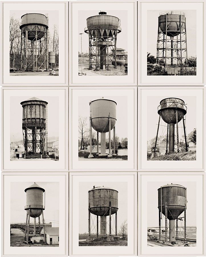

The Becher’s were influenced by the work of earlier German photographers linked to the New Objectivity movement of the 1920s such as August Sander, Karl Blossfeldt and Albert-Renger-Patzsch.
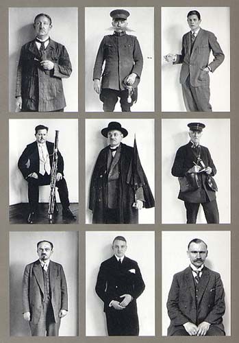
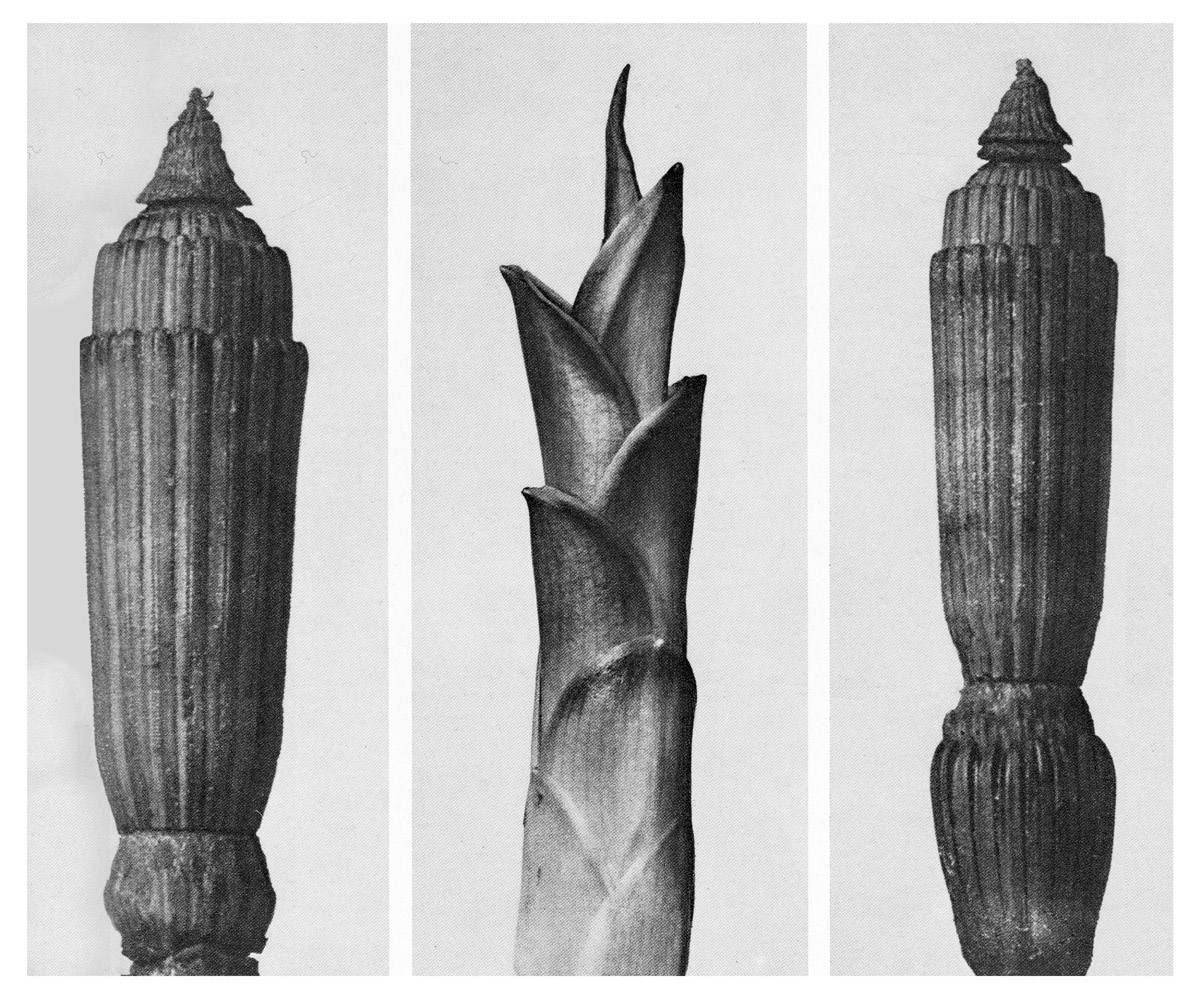

See also the work by Americans, William Christenberry and Ed Ruscha’s photographic works on types e.g. Twentysix Gasoline Stations (1964). Every building on the Sunset Strip (1966). Or Idris Khan‘s appropriation of Bechers’ images.


Not least of the Bechers’ legacy is their lasting influence on subsequent generations of artists who use the photographic medium today, most notably the students taught by Bernd Becher at the Düsseldorf Art Academy between 1976 and 1996. Among his most renowned students are Andreas Gursky, Candida Höfer, Thomas Ruff, and Thomas Struth.


Contemporary approaches to views of horizons between sky and sea, see inspiration from Japanese photographer Hiroshi Sugimoto whose monochrome images are minimalist and spiritual in their expression.
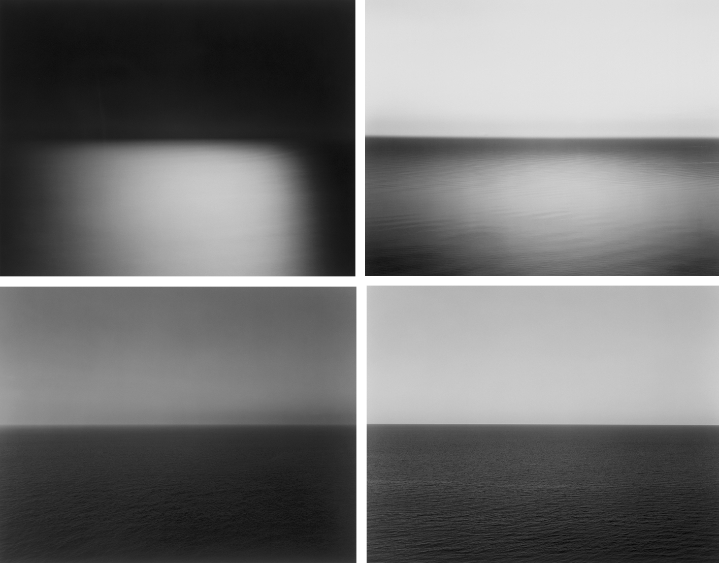
If you intend to explore sea landscapes you must do contextual research in relation to the art movement of Romanticism – see below. Technically you must make images exploring diverse quality of light, expansive views and weather patterns at different times of the day. Make sure to use a tripod, cable release and apply exposure bracketing and experiment with HDR techniques in post-production. Other techniques such as panoramic images and Hockney ‘joiners’ and Typology studies are also appropriate.
Jersey west coast has unique identity and geography. For many it is place of refuse from work, school and where they go for relaxation, leisure, beach, surfing, walking. If we think about Jersey and an island surrounded by water and with a one of the fastest tidal moments in the world you can look at photographers who has explored the notion of sea or water in interesting ways.
Michael Marten: Sea Change
Excellent use of diptych and triptych and exploring low vs high tides to see how it changes a landscape scene


Mark Power: The Shipping Forecats
Intangible and mysterious, familiar yet obscure, the shipping forecast is broadcast four times daily on BBC Radio 4. For those at, or about to put to sea, the forecast may mean the difference between life and death. In The Shipping Forecast, Mark Power documents the 31 sea areas covered by the forecast,

Roni Horn: Dictionary of Water
Water is a series of photographs of the surface of the Thames. It is ever-changing: now swirling, now scrunched like black tin foil, now in Turneresque lemon and flame colours, now plucked up into dune shapes. Each is annotated with tiny numbers, which refer to footnotes. The footnotes, hundreds in total, worry away in small type under the images – they happen, in other words, under the surface, and concern what the water suggests and conceals. (“Black water is sexy. / What is water? / What do you know about water? Only that it’s everywhere differently. / Disappearance: that’s why suicides are attracted to it. / You can’t talk about water without talking about oneself. / Down at the river I shot my baby.”)

Robert Adams: Summer Nights, Walking


Kyler Zeleny: Out West


Helge Skodvin: 240 Landscape


Thom and Beth Atkinson: Missing Buildings

Daniel Stier: A Tale of One City


Tom Wood: All Zones off Peak – Using public transport as a method of exploration


George Georgiou: Last Stop


CONSTRUCTED LANDSCAPE > NATURE / CULTURE > UTOPIA / DISTOPIA > JUXTAPOSITION
Explore some of the ideas here in Constructed Landscape by Photopedagogy, or revisit artists, ideas and photographic tasks from Anthropocene project in Yr 12
A bit of research…
Read the following descriptions about the making of these images:
| Gustave Le Gray – The Great Wave, 1857 | Dafna Talmor – from Constructed Landscapes II |
| ‘The Great Wave’, the most dramatic of his seascapes, combines Le Gray’s technical mastery with expressive grandeur […] At the horizon, the clouds are cut off where they meet the sea. This indicates the join between two separate negatives […]Most photographers found it impossible to achieve proper exposure for both landscape and sky in a single picture. This usually meant sacrificing the sky, which was then over-exposed. Le Gray’s innovation was to print some of the seascapes from two separate negatives – one exposed for the sea, the other for the sky – on a single sheet of paper. | This ongoing body of work consists of staged landscapes made of collaged and montaged colour negatives shot across different locations, merged and transformed through the act of slicing and splicing […] ‘Constructed Landscapes’ references early Pictorialist processes of combination printing as well as Modernist experiments with film […] the work also engages with contemporary discourses on manipulation, the analogue/digital divide and the effects these have on photography’s status. |
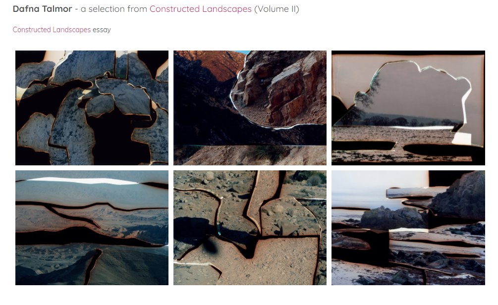
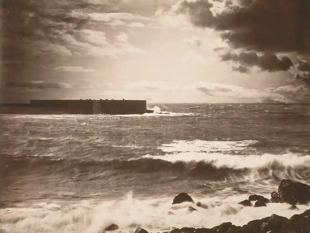
Illustration: Gustave le Gray
Dafna Talmor: This ongoing body of work consists of staged landscapes made of collaged and montaged colour negatives shot across different locations that include Israel, Venezuela, the UK and USA. Initially taken as mere keepsakes, landscapes are merged and transformed through the act of slicing and splicing. The resulting photographs are a conflation, ‘real’ yet virtual and imaginary. This conflation aims to transform a specific place – initially loaded with personal meaning, memories and connotations – into a space that has been emptied of subjectivity and becomes universal.
In dialogue with the history of photography, Constructed Landscapes references early Pictorialist tendencies of combination printing as well as Modernist experimental techniques such as montage, collage and multiple exposures. While distinctly holding historical references, the work also engages with contemporary discourses on manipulation, the analogue/digital divide and the effects these have on photography’s status and veracity. Through this work, I am interested in creating a space that defies specificity, refers to the transient, and metaphorically blurs space, memory and time.
Tanja Deman is a Croation artists who was Archisle’s International Photographer-in-Residence in Jersey in 2017. Her art is inspired by her interest in the perception of space, physical and emotional connection to a place and her relationship to nature. Her works, incorporating photography, collage, video and public art, are evocative meditations on urban space and landscape. Observing recently built legacy or natural sites her work investigates the sociology of space and reflects dynamics hidden under the surface of both the built and natural environment.

Fernweh series explores the concept of a modernist city through its extreme relations to the landscape. The images are placed on a blurred line between a past which reminds us of a future and a future which looks like a past. Scenes are referring to the modernist ideas and aspiration of a man conquering the natural wild land and subordinating it to the rational order, and the consequences of those aspirations, which switched into the longing for an escape from urban environments.

Collective Narratives is a series staging a moment of contemplation of nature and built environment. Natural spectacles, framed in theatrical space are contemplated by an audience. These constructed images consolidate: geological formations; a projection of an urban environment; an arena; a deep chasm; a theatre and a crumbling slag-heap through a very active kind of watching. Deman says about her work, ‘while making the series ‘Collective Narratives’ I was interested in different types of spectatorship and architectural settings in which they are taking place. Moreover, the notion of a ritual in which a large group of people gathers and participates in order to experience something together by observing, intrigued me. I see these spaces for cultural and sports spectacles, as zones of pure potential, where the world must be rebuilt or re-imagined every time they are in use. Having liberated them from their utilitarian, commercial restrains, and the environments in which they were created, I allow them to cross the boundary of reality.
Together these scenes examine time and the strange modes of spectatorship attached to the inanimate world. A collective witnessing of phenomena that are usually experienced in private atmospheres.
ARCHIVES: In the Photographic Archive at the Society Jersiaise there are significant works by early Jersey landscape and architectural photographers such as Thomas Sutton

Remains of ruined coastal defence tower, Tour du Sud, La Carrière, St Ouen’s Bay, Jersey. Plate from Souvenir de Jersey, published 1854.
Other photographesr in the Photo-Archive who explored Jersey landscapes, topographical views, town, countryside, build-environments etc . Samuel Poulton, Ernest Baudoux, Albert Smith , Edwin Dale, AK Lawson, Paul Martin, Godfray, Frith (put in surnames first for searching online catalogue here.

NATURE: In their most recent collection of work, The Meadow, photographers Barbara Bosworth and Margot Anne Kelley explore the connections and relationships formed between humans and the natural world. Over the course of a decade, the two have taken numerous photographs of an area of land in Carlisle, Massachusetts. Combined with Kelley’s writing, the collaborative project resulted in this uniquely-crafted work. The land they have chosen serves as an ideal subject, composed of paths and abandoned farmland reclaimed by the vibrant foliage.


Embodying a diaristic style, the final product has the feeling of a handcrafted scrapbook recollected from someone’s bookshelf. Tucked as if by accident between the pages are small booklets bearing the photographers’ experiences, and the occasional fold-out triptych which embellishes the arts-and-crafts vibe. A detailed appendix documents the numerous foliage, fungi, and pebbles found during the exploration of the meadow. They even transcribe the logs of the previous property owner, who chronicled day-to-day the teeming life he discovered on a series of wooden doors.
link: http://barbarabosworth.com
Zoe Leonard


As part of our ROCK project and last year as part of your HERITAGE project you make a series of different still life images. It may be useful for you to re-visit some of these projects and also produce blog posts on the historical context of still-life paintings developed in Dutch/ Flemish 17th century.
Anna Atkins was an English botanist and photographer. She is often considered the first person to publish a book illustrated with photographic images, British Algae. Photographs of British Algae was published in fascicles beginning in 1843 and is a landmark in the history of photography. Using specimens she collected herself or received from other amateur scientists, Atkins made the plates by placing wet algae directly on light-sensitized paper and exposing the paper to sunlight. Her nineteenth-century cyanotypes used light exposure and a simple chemical process to create impressively detailed blueprints of botanical specimens.


See how contemporary artist, Tom Pope has responded to Anna Atkins plant studies and work with cyanotypes, uncovering her family links with plantation economy in the Caribbean and slave ownership during British colonial history in his ongoing research and performative work, Almost Nothing But Blue Ground


Wolfgang Tillmans is a German photographer. His artistic work is based on an irrepressible curiosity, intensive preparatory research and continual engagement with the technical and aesthetic potential of the medium of photography. His visual language is characterized by a close observation that opens up a deeply humane approach to our surroundings. Familiarity and empathy, friendship, community and closeness can be seen and felt in his pictures.


Tillmans’ is also a prolific photobook maker and has made many (40+). One of his most celebrated is Concorde which was published by Walther König, Cologne. The photographs were taken at a number of sites in and around London, including close to the perimeter fence at Heathrow airport. consists of images of the Concorde flying over Tillmann’s home in west London. Study his series here at Tate Modern which has also been exhibited in various museums as an installation.


Michael Wolf, Hongkong books


Lorenzo Venturi: Dalston Anatomy
Lorenzo Vitturi’s vibrant still lifes capture the threatened spirit of Dalston’s Ridley Road Market. Vitturi – who lives locally – feels compelled to capture its distinctive nature before it is gentrified beyond recognition. Vitturi arranges found objects and photographs them against backdrops of discarded market materials, in dynamic compositions. These are combined with street scenes and portraits of local characters to create a unique portrait of a soon to be extinct way of life.
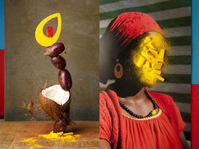
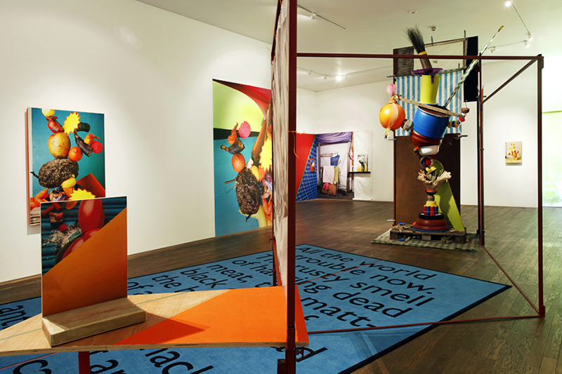
His installation at the Gallery draws on the temporary structures of the market using raw materials, sculptural forms and photographs to explore ideas about creation, consumption and preservation.
Mark Dion: Archeaology
Archaeological excavations aren’t limited to ancient Egypt or Stone Age villages. In 1999 during the Tate Thames Dig artist Mark Dion and volunteers collected found objects from the river bed and displayed in the cabinets.


See previous work by students Matt Brown who explored Bouley Bay using normal camera, drone photography and underwater photography and Megan exploring La Motte / Green Island collecting objects and experimenting with cyanotypes
Matthew Brown: Bouley Bay
Link to his essay: How can photography capture and explore an environment, and accurately record it’s atmosphere to a viewer?


My idea is to make a photobook in which I explore the area Bouley Bay, overall I want to capture the activity, views, and close ups of key feature such as rocks, shells, heritage, the hill climb, and the bay. I could also look into the history of the bay and the Jersey Folklore, involving the Black Dog. It is important to me as I grew up in that area, and have many memories of it. And I hope to capture it in the same way in which remember it. I wish to develop my project by exploring the bay and collecting lots of objects to photograph in a studio, and also to take long exposure, aerial, and underwater of the bay, as I have been inspired by many photographers, such as, Martin J Patterson (@ mjplandscapes on Instagram), Jaun Munoz (@ drjuanmdc on Instagram), and David Aguilar (@ davidaguilar_photo).
Read more on his BLOG
Megan Woolsgrove: La Motte
Essay: How do the photographers Chrystel Lebas and Mandy Barker explore issues of the changing environment?


I started my project with the intention of exploring issues of pollution and plastic specifically, taking inspiration from the photographer Mandy Barker and experimented in my first shoot by taking images with string infront of the lens looking at rules of manipulation. I then found the photobook ‘The Meadow’ by photographers Barbara Bosworth and Margot Anne Kelley which is what first interested me in photographing and exploring specific areas, as well as gathering objects and photographing them. I also discovered the photographer Chrystel Lebas and her photobook ‘Field Studies: Walking through Landscapes and Archives’ which is where I read about the changing environment. She compared her modern images to the photography of Edward James Salisbury in the early 20th century and walked in his footsteps, going to the same areas he did to explore how the environment had changed over 100 years. This is where I decided that the concept for my project would be looking at how the natural environment had changed over 90 years at the location La Motte. I found archival images from this area and thought i would build my photobook around them, comparing and contrasting them to my own images. I noticed Lebas’ influences from sublime ideologies by Edmund Burkina his book ‘Enquiry into the Origin of our Ideas of the Sublime and the Beautiful’,with her images being vast and other-worldly, which is an aspect I wanted to reflect in my own work. From then on, I did an additional five shoots where i went and took landscape images of La Motte and at the same time gathered natural objects that i found on the island and the beach i.e. rocks, seaweed, flowers. I did multiple shoots where I photographed these objects formally with plain background and edited them to reflect the work of early botanists where they used light sensitive paper to create photograms. I did this as i thought it would give my project and photobook a scientific appearance and reflect that of an investigation into a specific area. Towards my final shoots, I walked around La Motte and tried to find man made objects that I could photograph to perhaps represent how the natural landscape had changed.
Link to Megan’s Blog
Nicholas Gallery: Waste
Essay: In what way have Mandy Barker and Keith Arnatt explored the concept of Anthropocene in their work?


In the final version, I changed the cover images to what was originally the first pages in the book. I felt that these images were more powerful in portraying my ideas as well as captivating the essence of my project.
I summed the topic of my project in one word being ‘Waste’ as it reflects the three concepts behind my work:
- The ‘Waste’ featured in the images
- The action behind humans throwing away the things they do not consider important.
- The consequences of disposing items to ‘Waste’ away.
- The title is written sideways to give a ‘scientific document’ feel.
I repeated the same pattern of images throughout the book, to give an organised aesthetic. The circle images are placed alongside their close-up comparisons to show the detail in the items depicted. I chose to make many of my images full scale, as they all have dark backgrounds. Black is used in a minimalistic style to emphasize the items, as well as being associated with darkness and negativity to reflect the topic of pollution.
Link to Nick’s Blog
PHOTOGRAPHY AND SCULPTURE
James Casebere pioneering work has established him at the forefront of artists working with constructed photography. For the last thirty years, Casebere has devised increasingly complex models that are subsequently photographed in his studio. Based on architectural, art historical and cinematic sources, his table-sized constructions are made of simple materials, pared down to essential forms. Casebere’s abandoned spaces are hauntingly evocative and oftentimes suggestive of prior events, encouraging the viewer to reconstitute a narrative or symbolic reading of his work.

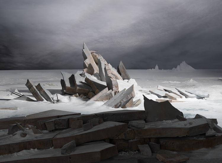
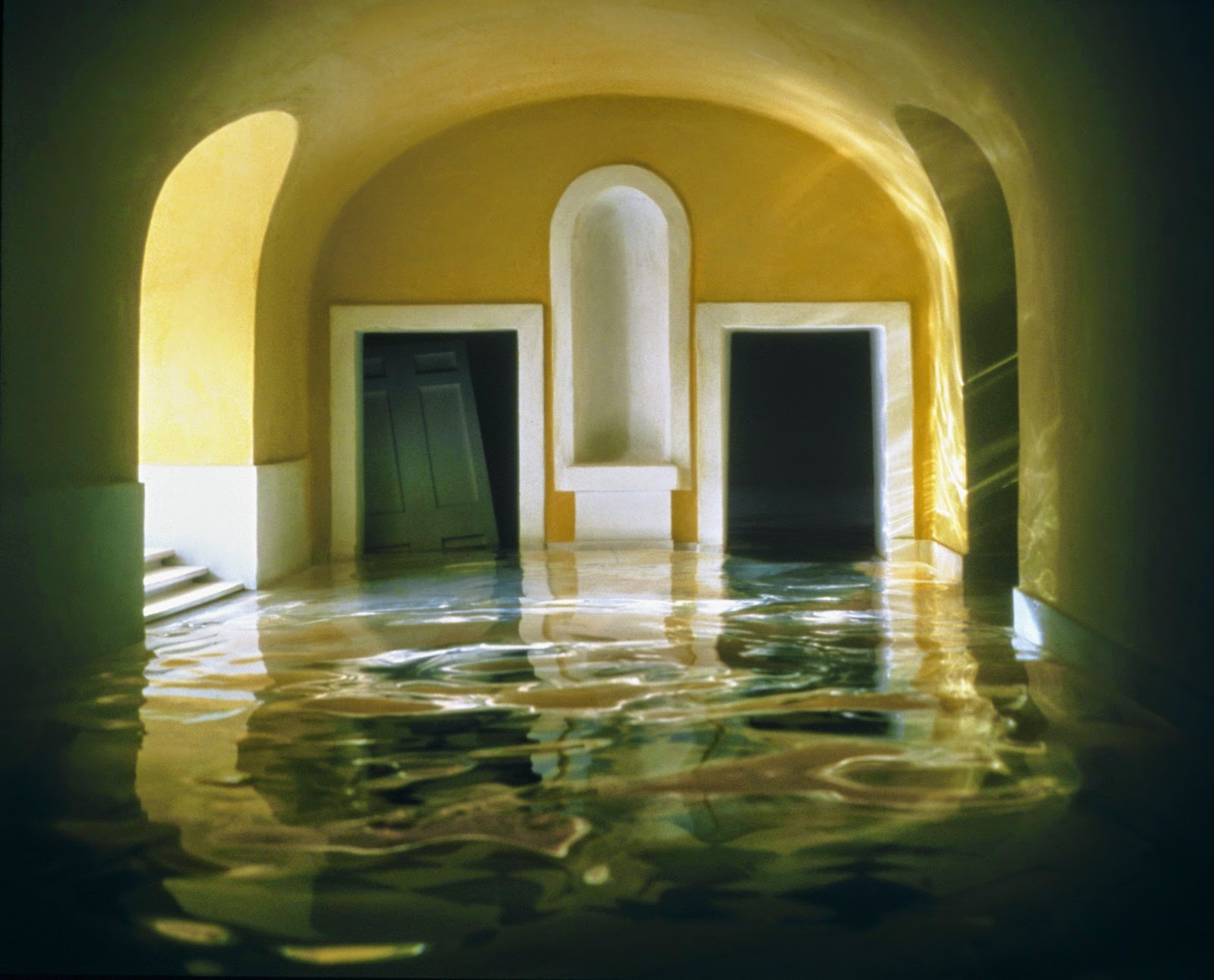

While earlier bodies of work focused on American mythologies such as the genre of the western and suburban home, in the early 1990s, Casebere turned his attention to institutional buildings. In more recent years, his subject matter focused on various institutional spaces and the relationship between social control, social structure and the mythologies that surround particular institutions, as well as the broader implications of dominant systems such as commerce, labor, religion and law.
Thomas Demand studied with the sculptor Fritz Schwegler, who encouraged him to explore the expressive possibilities of architectural models at the Kunstakademie Düsseldorf, where Bernd and Hilla Becher had recently taught photographers such as Andreas Gursky, Thomas Struth, and Candida Höfer. Like those artists, Demand makes mural-scale photographs, but instead of finding his subject matter in landscapes, buildings, and crowds, he uses paper and cardboard to reconstruct scenes he finds in images taken from various media sources. Once he has photographed his re-created environments—always devoid of figures but often displaying evidence of recent human activity—Demand destroys his models, further complicating the relationship between reproduction and original that his photography investigates.
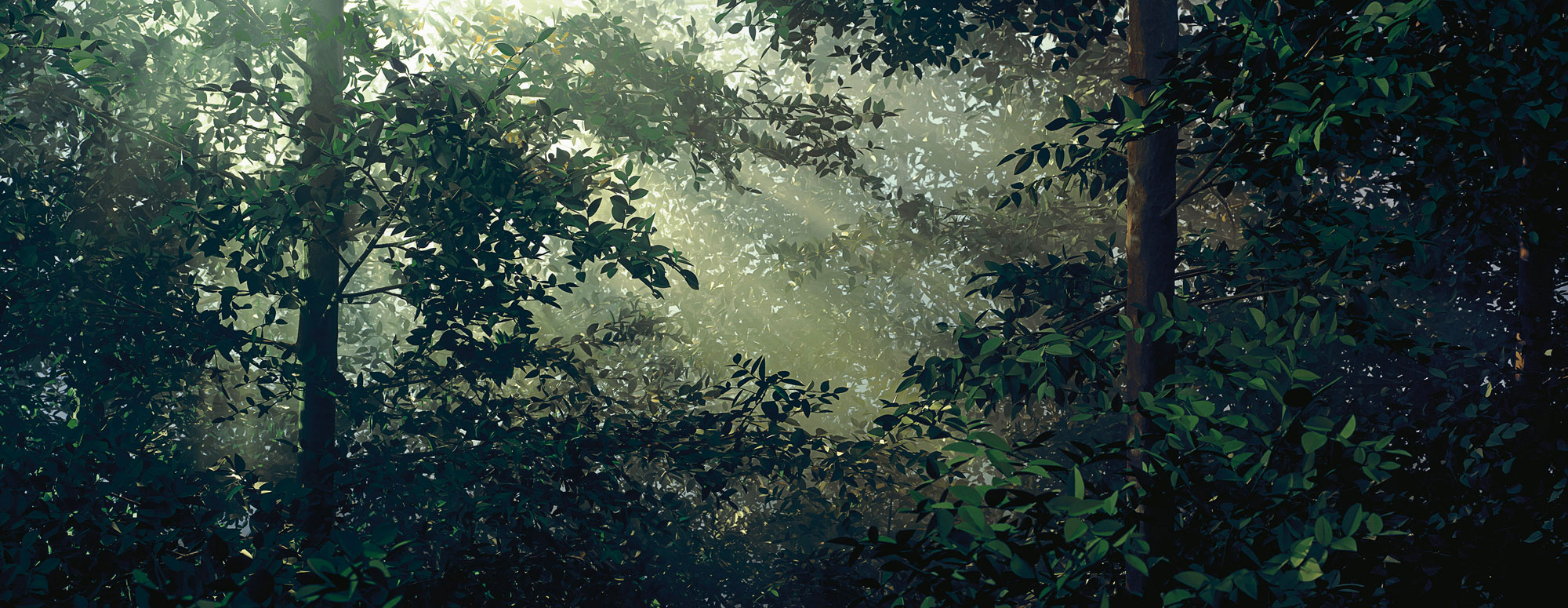
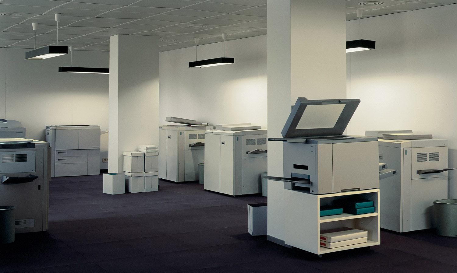
PHOTOGRAPHY AND FOUND IMAGERY
Mishka Henner, Trevor Paglen and Doug Rickard all use found images from the internet, Google earth and other satellites images as a way to ask questions and raise awareness about our environment, state operated security facilities, social and urban neighbour hoods and prostitution.

US oil fields photographed by satellites orbiting Earth.

Mishka Henner: I’m not the only one, 2015
Single channel video, 4:34 mins
Photographer Trevor Paglen has long made the advanced technology of global surveillance and military weaponry his subject. This year he has been nominated for the prestigious The Deutsche Börse Photography Foundation Prize which aims to reward a contemporary photographer of any nationality, who has made the most significant contribution (exhibition or publication) to the medium of photography in Europe in the previous year. The Prize showcases new talents and highlights the best of international photography practice. It is one of the most prestigious prizes in the world of photography. Read more here

Doug Rickard is a north American artist / photographer. He uses technologies such as Google Street View and YouTube to find images, which he then photographs on his monitor, to create series of work that have been published in books, exhibited in galleries.

PHOTOGRAPHY AND MOVEMENT > TIME > SPEED
Eadweard Muybridge was the man who famously proved a horse can fly. Adapting the very latest technology to his ends, he proved his theory by getting a galloping horse to trigger the shutters of a bank of cameras. This experiment proved indisputably for the first time what no eye had previously seen – that a horse lifts all four hooves off the ground at one point in the action of running. Seeking a means of sharing his groundbreaking work, he invented the zoopraxiscope, a method of projecting animated versions of his photographs as short moving sequences, which anticipated subsequent developments in the history of cinema.
British-born Muybridge, who emigrated to the United States in the 1850s, is one of the most influential photographers of all time. He pushed the limits of the camera’s possibilities, creating world-famous images of animals and humans in motion. Just as impressive are his vast panoramas of American landscapes, such as the Yosemite valley, and his documentation of the rapidly growing nation, particularly in San Francisco. His dramatic life included extensive travels in North and Central America, a career as a successful lecturer, and the scandal of his trial for the murder of his wife’s lover.
This exhibition brings together the full range of his art for the first time, and explores the ways in which Muybridge created and honed his remarkable images, which continue to resonate with artists today. Highlights include a seventeen foot panorama of San Francisco and recreations of the zoopraxiscope in action. His influence has forever changed our understanding and interpretation of the world, and can be found in many diverse fields, from Marcel Duchamp‘s painting Nude Descending a Staircase and countless works by Francis Bacon, to the blockbuster film The Matrix and Philip Glass’s opera The Photographer.


Etienne-Jules Marey (French, 1830–1904); Chronophotography
Unlike the motion studies of Eadweard Muybridge, who depicted movement as a series of discrete moments on separate, sequential negatives, Marey’s analyses of motion are characterized by multiple exposures on a single photographic plate. In this photograph, Charles Fremont, a civil engineer who assisted Marey in his laboratory, used Marey’s method to study blacksmiths at the anvil; the dynamic synthesis of their arced blows traced the pattern of manual effort involved in the task. Fremont’s photographic investigations into the conservation and expenditure of energy during human labor established principles that laid the foundation for modern industrial production.

ARCHIVES
Henry Mullins is one of the most prolific photographers represented in the Societe Jersiase Photo-Archive, producing over 9,000 portraits of islanders from 1852 to 1873 at a time when the population was around 55.000. The record we have of his work comes through his albums, in which he placed his clients in a social hierarchy. The arrangement of Mullins’ portraits of ‘who’s who’ in 19th century Jersey are highly politicised.
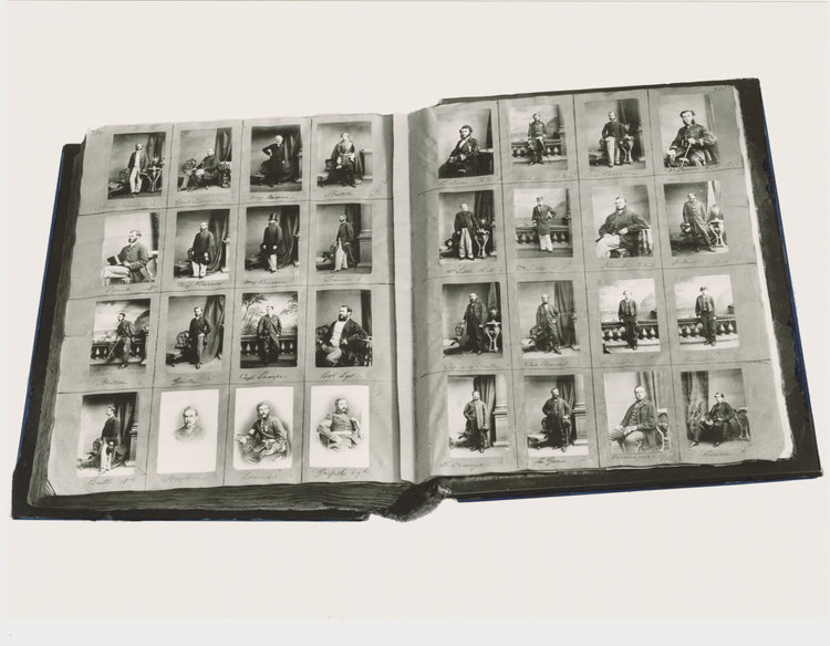
Henry Mullins started working at 230 Regent Street in London in the 1840s and moved to Jersey in July 1848, setting up a studio known as the Royal Saloon, at 7 Royal Square. Here he would photograph Jersey political elite (The Bailiff, Lt Governor, Jurats, Deputies etc), mercantile families (Robin, Janvrin, Hemery, Nicolle ect.) military officers and professional classes (advocates, bankers, clergy, doctors etc).
His portrait were printed on a carte de visite as a small albumen print, (the first commercial photographic print produced using egg whites to bind the photographic chemicals to the paper) which was a thin paper photograph mounted on a thicker paper card. The size of a carte de visite is 54.0 × 89 mm normally mounted on a card sized 64 × 100 mm. In Mullins case he mounted his carted de visite into an album. Because of the small size and relatively affordable reproducibility cartes de visite were commonly traded among friends and visitors in the 1860s. Albums for the collection and display of cards became a common fixture in Victorian parlors. The immense popularity of these card photographs led to the publication and collection of photographs of prominent persons.

